6,500 search results
(0.701 seconds)
- FF Letter Gothic Mono by FontFont,
$62.99 Italian type designer Albert Pinggera created this sans FontFont in 1998. The family has 6 weights, ranging from Light to Bold (including italics) and is ideally suited for editorial and publishing, logo, branding and creative industries as well as software and gaming. FF Letter Gothic Mono provides advanced typographical support with features such as ligatures, alternate characters, case-sensitive forms, super- and subscript characters, and stylistic alternates. It comes with tabular oldstyle and tabular lining figures. This FontFont is a member of the FF Letter Gothic super family, which also includes FF Letter Gothic Slang and FF Letter Gothic Text.
 - Bitterbrush by Hanoded,
$17.00I needed a name with ‘brush’ in it and most have already been taken, so I did a little digging and found out that Purshia tridentata, a flowering plant native to the mountainous areas of western North America is called bitterbrush. It is also known as antelope brush, quinine brush and buckbrush - but I settled on Bitterbrush. There’s nothing bitter about Bitterbrush. It is actually a very sweet hand brushed font. It comes with ligatures for double letter combinations and a truck load of diacritics. And (something I am very proud of): it supports the Vietnamese language! - Xaver Nature by Xaver Design Studio,
$25.00 Xaver Nature is inspired by nature. Thus, it is characterized by curves and dynamic thickness of the stroke. At the same time, all letters are anchored on the baseline, which makes the font look calm despite its organic appearance. The Schrit contains two weights: a basic weight that guarantees great legibility even in small sizes. A decorative cut that integrates plants into the typeface as decorative elements. This is particularly suitable for headlines and titles. Furthermore, it offers language support for the entire European region, the North American region, as well as for South America and Oceania.
 - Baka Expert by Positype,
$25.00 Why Baka Expert? There’s actually a simple answer. The original Baka was done as an experiment of sorts. I wanted to quickly capture a rough, frenetic handwriting style that broke normal conventions. Commercially, it was successful, received some accolades ... but I wasn’t completely satisfied, so I went back to the master art and the lettering explorations and produced Baka Too. This addressed some of the line items I wanted to refine in Baka. I liked it. Each font has been out for a few years now, and I have seen them in use. I’m very critical of my work, and I could still see things—modulations of strokes, angle of the nib, ink swell, and so on—that I wanted to change, refine, and reorder. For me, it is typographic indulgence, but I wanted to take this handwriting ‘font’ and turn it into a robust ‘typeface.’ So I did just that and a bit more by adding back more of my initial flourish concepts; attaining tighter, consistent control of the modulation; optimizing points; adding titling options; and expanding the character language set. Baka and Baka Too had to exist to produce this entirely new re-envisioning of an old friend ... and they all play well together :)
 - The Black Cow font, masterfully created by the talented David F. Nalle, stands out as a testament to the intersection of artistic flair and typographic innovation. Nalle, known for his ability to inf...
- Bohemian Initials by Kaer,
$24.00 I’m happy to present you the Bohemian initials font family. Regular and Colored styles (Uppercase & Numbers) based on Codex Gigas originated in medieval Bohemia. The manuscript has been dated 1230. The elaborate initials are at the beginning of the main texts and their principal divisions. The painter was aiming to achieve a plastic depiction of the trailing vines of the initials, and he painted with solid colours. He used only four of the primary colours cinnabar red, blue, green and yellow, brightly toned, as well as white accents and contours. The trailing vines of the initial letters are painted in a decorative, advanced Romanesque style, already bordering on naturalism. The plant taken as the starting point is the acanthus, a thistle-like plant which grows wild in the Mediterranean countries. The decoration of the Devil’s Bible is not the work of an amateur. Scholars have concurred: it is book illuminations created in Northeast France and Southern England in the so-called Channel style which provided the starting point for the coiled trailing-vine shapes in the initials of the Devil’s Bible. --- You can use color fonts in PS CC 2017+, AI CC 2018+, ID CC 2019+, macOS 10.14 Mojave+ Please note that the Canva & Corel & Affinity doesn't support color fonts! --- Please feel free to request any help you need: kaer.pro@gmail.com Thank you!
 - Night Scream by Ditatype,
$29.00 Night Scream is a spine-chilling display font that brings a horrifying twist to your designs. With its big letters and bold weight, this font commands attention and instills fear. The details of the letters are carefully crafted to resemble menacing plant roots, adding a nightmarish and eerie touch to the font. Each letter in this font is bold and impactful, demanding to be noticed. The large size of the letters adds to the font's imposing presence. The root-like details in Night Scream give the font an organic and otherworldly appearance, reminiscent of sinister, twisted plant life. These details add an element of the unknown and create an atmosphere of dread, immersing the viewer into a world of dark and chilling horrors. For the best legibility you can use this font in the bigger text sizes. Enjoy the available features here. Features: Multilingual Supports PUA Encoded Numerals and Punctuations Night Scream fits in headlines, logos, movie posters, flyers, invitations, branding materials, print media, editorial layouts, headers, and any project that requires a terrifying touch. Find out more ways to use this font by taking a look at the font preview. Thanks for purchasing our fonts. Hopefully, you have a great time using our font. Feel free to contact us anytime for further information or when you have trouble with the font. Thanks a lot and happy designing.
 - Telidon Ink by Typodermic,
$11.95 Introducing Telidon Ink, the dot-matrix typeface that takes you back in time to the glory days of retro computing. With its upright and legible structure, Telidon Ink boasts a distinctive textured ink impression that will transport you back to the age of the dot-matrix printer. Not only does Telidon Ink look retro, but it also has a fast and easy vibe that adds a sense of momentum to your phrases. And with its versatile range of widths, weights, and italics, you have the flexibility to create a unique and dynamic look for your designs. But that’s not all—Telidon Ink also has a clean and straight-laced companion, Telidon, which complements its retro style perfectly. Together, these typefaces will give your designs a classic and timeless look that is sure to impress. So if you’re looking to add a touch of vintage charm to your graphic design projects, Telidon Ink is the perfect choice. Let it transport you back in time to the golden age of computing and bring a touch of nostalgia to your designs. Most Latin-based European writing systems are supported, including the following languages. Afaan Oromo, Afar, Afrikaans, Albanian, Alsatian, Aromanian, Aymara, Bashkir (Latin), Basque, Belarusian (Latin), Bemba, Bikol, Bosnian, Breton, Cape Verdean, Creole, Catalan, Cebuano, Chamorro, Chavacano, Chichewa, Crimean Tatar (Latin), Croatian, Czech, Danish, Dawan, Dholuo, Dutch, English, Estonian, Faroese, Fijian, Filipino, Finnish, French, Frisian, Friulian, Gagauz (Latin), Galician, Ganda, Genoese, German, Greenlandic, Guadeloupean Creole, Haitian Creole, Hawaiian, Hiligaynon, Hungarian, Icelandic, Ilocano, Indonesian, Irish, Italian, Jamaican, Kaqchikel, Karakalpak (Latin), Kashubian, Kikongo, Kinyarwanda, Kirundi, Kurdish (Latin), Latvian, Lithuanian, Lombard, Low Saxon, Luxembourgish, Maasai, Makhuwa, Malay, Maltese, Māori, Moldovan, Montenegrin, Ndebele, Neapolitan, Norwegian, Novial, Occitan, Ossetian (Latin), Papiamento, Piedmontese, Polish, Portuguese, Quechua, Rarotongan, Romanian, Romansh, Sami, Sango, Saramaccan, Sardinian, Scottish Gaelic, Serbian (Latin), Shona, Sicilian, Silesian, Slovak, Slovenian, Somali, Sorbian, Sotho, Spanish, Swahili, Swazi, Swedish, Tagalog, Tahitian, Tetum, Tongan, Tshiluba, Tsonga, Tswana, Tumbuka, Turkish, Turkmen (Latin), Tuvaluan, Uzbek (Latin), Venetian, Vepsian, Võro, Walloon, Waray-Waray, Wayuu, Welsh, Wolof, Xhosa, Yapese, Zapotec Zulu and Zuni.
 - Cloister Black BT is a distinctive and historic typeface that traces its origins back to the late 19th and early 20th centuries, embodying the transition from Gothic to modern type designs. Character...
- Ramelik by Letterena Studios,
$17.00 Proudly present Ramelik, a modern and classy black letter font that has a unique style and modern look. This typeface is perfect for an elegant & luxury logo, book or movie title design, fashion brand, magazine, clothes, lettering, quotes, and so much more. ** Uppercase
 - Ice Flowers by kapitza,
$69.00 Kapitza's 2009 Ice Flowers font is a derivative of their snowflake font Snow. It is a much bolder interpretation of the theme, with strong black and white contrasts. The graphic style of Ice Flowers is inspired by 1960s folk art and embroidery.
 - Lino by Kmaz,
$10.00 Lino is a unique typeface with elegant modern edge, designed by Khalid Al-Mazrouei and published by Kmaz. Lino packs a complete set of uppercase and lowercase letters, numbers and punctuation, it comes in 5 weights: Regular, Thin, Extra Thin, Bold and Solid.
 - Paz by Sudtipos,
$29.00 Paz, a squarish 4-weight industrial family, ranging from extreme hairline to black. It is ideal for editorial headlines where type plays a major role in the overall design. The fonts were designed by Ariel Di Lisio and digitized by Alejandro Paul.
 - Odishary by Motokiwo,
$15.00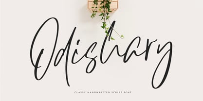 Odishary, classy handwritten font that designed for minimalist design projects. It's perfect for fashion project, logo, branding, quote, posters, movie or cinema. Odishary packed with uppercase, lowercase, numeral & punctuation, accents (Multilingual Support). This font will handle your minimalist design project with simplicity.
 - Summerhaven JNL by Jeff Levine,
$29.00Summerhaven JNL and Summerhaven Italic JNL were partially inspired by sign lettering spotted in an old black and white movie. These fonts are somewhat reminiscent of the Art Deco style, and their casual look can be applied to both formal and informal messages. - Eingrantch Mono by Harmnessless Type,
$30.00 Eingrantch Monospaced is a monospaced sans serif based typeface, inspired by an old Continental typewriter in sans serif version. Available in 7 weights from thin to black. Well suited for modern logotypes, branding, editorial design as well as web and screen design.
 - Linea Nera NF by Nick's Fonts,
$10.00Here's another Disco-era darling, based on Wolf Magin's contemporary offering, originally called Black Line. It's a natural choice for sassy headlines with a cool Retro vibe. Both versions contain the complete Latin 1252, Central European 1250 and Turkish 1254 character sets. - Sluggo by Patricia Lillie,
$29.00Sluggo, a loose, 3D-ish face with the look of a slightly sloppy brush line, comes with attitude to spare. Has five styles: Regular, Lefthook, Righthook, Open, and Black--all spaced and kerned so that you can stack them for special effects. - Oksana Text Swash Cyrillic by AndrijType,
$25.00 These Oksana Text Swash Cyrillic fonts have swashed initials and ampersand for Oksana Text italics in six weights from Thin to Black. They support basic Latin and European Cyrillic. For all-in-one fonts please look at that OpenType version of Oksana Text.
 - Raifin by Hooper Type,
$9.99 Out with the old in with the BOLD. Raifin is a messy, gory and fantastical piece of work which shoves two fingers up at conformity. A title font, a copy font, a bonkers font. An experimentation of the rules, or lack thereof. Enjoy!
 - Pensle Caligraf by Ingrimayne Type,
$8.95 PensleCaligraf is a wild and exuberant calligraphic script. It may lack the elegance for formal invitations and certificates but its quirkiness may make it suitable for invitations and documents that are casual or humorous such as children's birthday announcements or participation awards.
 - Steclo by Pepper Type,
$30.00 Steclo is a semi-closed narrowed display sans-serif typeface with pronounced technical character. It comes in 9 weights from Thin to Black accompanied by corresponding oblique italics. Steclo features rich language support including pan-European Latin and basic Cyrillic glyph sets.
 - Old English by URW Type Foundry,
$35.00 Old English Old English is related to Black Letter styles from early printed books and have a distinguished, historic look. The Old English font is used in advertising, invitations, greeting cards, and wherever a formal hand-lettered or engraved look is desired.
 - Ribelano by Frantic Disorder,
$12.00 Ribelano is a serif display font that represents clear, contrast, and sharpness. The font comes in 6 different weight styles from Light to Black and it comes with 300+ glyphs. Perfectly suited for display needs such as heading, branding, logos, poster, etc.
 - Remedia by Kent Barns,
$5.00 Remedia is a simple linear typeface with a wide range of font weights, from a hairline Ultra Light to Extra Black. Legible in body copy and a great starting point for a unique logo, Remedia is a creative typeface for everyday uses.
 - Folio by Bitstream,
$29.99Designed by Konrad Bauer and Walter Baum in 1956, Folio was the first popular Swiss Sanserif; the positive black shapes of the letters appear to be locked inevitably into the correct position by the firm and positive white shapes that surround them. - Krom Mono by ATK Studio,
$15.00 Krom Mono is a modular monospaced font built with pixel shapes. Designed for headlines, posters, and small size body text. This family consist of 9 weights from thin to black plus variable font with a character set that covers over 90 languages.
 - Renova Pro by Elsner+Flake,
$40.00 Renova was designed by Elsner+Flake in the late 90s as a contractual work. The font family comes as a typical Office pack in EuropePlus layout for at least 72 Latin languages. It is optimized for good legibility in small point sizes.
 - Ductus by Thomas Jockin,
$35.00 Ductus is a five weight typeface that is both ancient and contemporary. Drawing on various sources such as rustic capitals, Naskh arabic calligraphy, and black-letter, Ductus is a reflection on how the broad-nib pen can be relevant for today’s designer.
 - Carlgine by Muksal Creatives,
$10.00 Carlgine is a unique and modern family of serif fonts. Carlgine has 18 families Regular and italic font, starting from the small thin to the largest black. This typeface is versatile and can be used successfully in magazines, posters, branding, websites, etc.*
 - Olivier by Letters&Numbers,
$28.00 Olivier is based on painted black ink letters. Inspiration for this typeface is fluidity of wine. Shifting base-, mean- and cap lines, varying tails and ascenders give it an organic, playful feel. The font is suitable for logo types, short paragraphs and headings.
 - Losta Nova by Creativemedialab,
$20.00 Minimal and modern sans serif consists of 10 weights from hairline to black as well as variable versions. Works great for branding, fashion, modern, and casual valentine design theme. Designing a logo is made easy with lots of alternates to play with.
 - RM Random by Ray Meadows,
$19.00 A fun design, useful for many informal applications. Based on hand-drawn letters. Due to the nature of this design there may be a very slight lack of smoothness to the curves at extremely large point sizes (around 200 pt and above).
 - Carltine by Muksal Creatives,
$10.00 Carltine is a unique and modern family of Sans serif fonts. Simply Conception has 18 families Regular and italic font, starting from the small thin to the largest black. This typeface is versatile and can be used successfully in magazines, posters, branding, websites.
 - Spartacus by Alan Meeks,
$45.00 A further development of the Colosseum range but this with a slab serif. Visually monoline and modern in appearence it still retains its Trajan characteristics. The addition of Spartacus black with its unusual Italic gives a the face a strong original headline font.
 - Diaconia Old Style by Hackberry Font Foundry,
$24.95Diaconia Old Style is a new rendition of my workhorse body copy font that I originally designed to use for the body copy of "Printing in a Digital World." I became increasingly upset with the lack of lowercase numbers and true small caps. Diaconia started life as a modification of one of the Dutch Bible fonts I traced. It has changed a lot since then (although I have a hard time telling how much because I have lost the original). The plain and italic work especially well when used in very large sizes as display faces. The other four variants (small caps, heavy, heavy italic, and black) are designed for use in book production. Because I format all my own books, I was able to design fonts that met my needs exactly: lowercase numbers, SMALL CAPS font, Mac Command, Option, and Control symbols, ballot box in the section slot, and several other special characters. DiaconiaPro is the OpenType family of my body copy workhorse. This is the first font family I ever created: classic, elegant, easy to read. 583 characters: small caps, oldstyle figures, numerators, denominators, lining figures, accents and a lot more. - Mimix by FSdesign-Salmina,
$39.00 Mimix is designed especially for comic fans and all typographers who like to play. It’s ideal to express spontaneity and the joy of life. Where Mimix is used, there’s life. The characters are lined in a row, a face looks out from the page. Big ears surround an oval head. A mouse moves without haste, but dynamic and modern through the lines. Mimix skillfully combines the elegance of a modern roman with the spontaneity of a casual handwriting. The mouse shows its versatile character in its broad range of use. Without exaggeration, it’s always delicate and elegant. The quiet form and good readability is a result of its moderate inclination. Well developed, Mimix includes ten weights from Ultrathin through Black. The free trial pack includes two weights with a reduced number of glyphs. If you like it you will be then be able to buy the fonts itself complete with ligatures, special characters for Eastern European languages, uppercase, lining and old style figures as well as fractions and different Opentype features. Declare war on desert lead – with Mimix, those with charm. Download a free trial version of Mimix with a reduced character set. Check it out!
 - TessieOddsNends by Ingrimayne Type,
$9.00 A tessellation is a shape that can be used to completely fill the plane—simple examples are isosceles triangles, squares, and hexagons. Tessellation patterns are eye-catching and visually appealing, which is the reason that they have long been popular in a variety of decorative situations. These Tessie fonts have two family members, a solid style that must have different colors when used and an outline style. They can be used separately or they can be used in layers with the outline style on top of the solid style. For rows to align properly, leading must be the same as point size. To see how patterns can be constructed, see the “Samples” file here. TessieOddsNEnds contains shapes that did not fit into the other Tessie fonts: TessieStandingBirds, TessieFlyingBirds, TessieMoreBirds, TessieXtraBirds, TessieSpinners, TessiePuzzlePieces, TessieAnimals, TessieBugs, TessieMiscellaneous, and TessieMoreStuff. (Earlier tessellation fonts from IngrimayneType, the TessieDingies fonts, lack a black or filled version so cannot do colored patterns. The addition of a solid style that must be colored makes these new fonts a bit more difficult to use but offers far greater possibilities in getting visually interesting results.)
 - Fer by ParaType,
$30.00 Fer is a sans-serif font for body text, not lacking in its own distinctive voice. The aftertaste of reading the text set in Fer is like reading the letters on old rusty plates somewhere in Southern Europe, hence the name (Fer means iron in French). Being a modern system that includes a variable font with weight and optical size axes, Fer combines the features of geometriс sans serifs and old sans serifs with closed apertures. The typeface contains three sets of styles: for captions, text and headings, — with the weight ranging from regular to black. Fer was created with the idea to unite nations. The Latin character set supports all European languages, most African languages and Vietnamese. Cyrillic has support for all living Cyrillic languages and some obsolete characters too. The font also supports the Greek language. Additionally, the character set includes currency signs of all supported languages’ countries, old style, lining, tabular and proportional figures as well as numbers in squares and circles. Lastly, the font has lots of localized letterforms and stylistic sets. Fer was designed by Dmitry Goloub for Paratype in 2020–2023.
 - Beni by Nois,
$18.00 Beni is a bold & strong sans serif font family beautifully crafted to perform in short headlines in posters or contemporary interface design. Each character has been optically adjusted for maximum effect in the space between; as such, this is a strong contender for movie posters, titling, album artwork, and any design project that needs a clean sans serif that makes an impact wherever it is applied. This type family is available in four unique weights that stand well apart from one another in visual style. Beni Light is the runway model of the family, standing with a narrow posture and towering height. It’s a fantastic choice for conveying a message in a limited horizontal space. Beni Regular and Beni Bold are shorter in stature but both pack a punch, carrying bold strokes that speak with confidence and offer great legibility. The heaviest of the heavy, Beni Black is the super-bold, go-to type design for projects that need an impossibly strong type design at the helm. Beni extends multilingual support to Basic Latin, Western European, Euro, Catalan, Baltic, Turkish, Central European, Pan African Latin, Igbo Onwu, and Basic Greek for design projects intended for an international audience.