6,517 search results
(0.012 seconds)
- Bank Sans EF by Elsner+Flake,
$35.00 With its extended complement, this comprehensive redesign of Bank Gothic by Elsner+Flake offers a wide spectrum for usage. After 80 years, the typeface Bank Gothic, designed by Morris Fuller Benton in 1930, is still as desirable for all areas of graphic design as it has ever been. Its usage spans the design of headlines to exterior design. Game manufacturers adopt this spry typeface, so reminiscent of the Bauhaus and its geometric forms, as often as do architects and web designers. The creative path of the Bank Gothic from hot metal type via phototypesetting to digital variations created by desktop designers has by now taken on great breadth. The number of cuts has increased. The original Roman weight has been augmented by Oblique and Italic variants. The original versions came with just a complement of Small Caps. Now, they are, however, enlarged by often quite individualized lower case letters. In order to do justice to the form changes and in order to differentiate between the various versions, the Bank Gothic, since 2007 a US trademark of the Grosse Pointe Group (Trademark FontHaus, USA), is nowadays available under a variety of different names. Some of these variations remain close to the original concept, others strive for greater individualism in their designs. The typeface family which was cut by the American typefoundry ATF (American Type Founders) in the early 1930’s consisted of a normal and a narrow type family, each one in the weights Light, Medium and Bold. In addition to its basic ornamental structure which has its origin in square or rectangular geometric forms, there is another unique feature of the Bank Gothic: the normally round upper case letters such as B, C, G, O, P, Q, R and U are also rectangular. The one exception is the upper case letter D, which remains round, most likely for legibility reasons (there is the danger of mistaking it for the letter O.) Because of the huge success of this type design, which follows the design principles of the more square and the more contemporary adaption of the already existing Copperplate, it was soon adopted by all of the major type and typesetting manufacturers. Thus, the Bank Gothic appeared at Linotype; as Commerce Gothic it was brought out by Ludlow; and as Deluxe Gothic on Intertype typesetters. Among others, it was also available from Monotype and sold under the name Stationer’s Gothic. In 1936, Linotype introduced 6pt and 12pt weights of the condensed version as Card Gothic. Lateron, Linotype came out with Bank Gothic Medium Condensed in larger sizes and a more narrow set width and named it Poster Gothic. With the advent of photoypesetters and CRT technologies, the Bank Gothic experienced an even wider acceptance. The first digital versions, designed according to present computing technologies, was created by Bitstream whose PostScript fonts in Regular and Medium weights have been available through FontShop since 1991. These were followed by digital redesigns by FontHaus, USA, and, in 1996, by Elsner+Flake who were also the first company to add cursive cuts. In 2009, they extended the family to 16 weights in both Roman and Oblique designs. In addition, they created the long-awaited Cyrillic complement. In 2010, Elsner+Flake completed the set with lowercase letters and small caps. Since its redesign the type family has been available from Elsner+Flake under the name Bank Sans®. The character set of the Bank Sans® Caps and the Bank Sans® covers almost all latin-based languages (Europe Plus) as well as the Cyrillic character set MAC OS Cyrillic and MS Windows 1251. Both families are available in Normal, Condensed and Compressed weights in 4 stroke widths each (Light, Regular, Medium and Bold). The basic stroke widths of the different weights have been kept even which allows the mixing of, for instance, normal upper case letters and the more narrow small caps. This gives the family an even wider and more interactive range of use. There are, furthermore, extensive sets of numerals which can be accessed via OpenType-Features. The Bank Sans® type family, as opposed to the Bank Sans® Caps family, contains, instead of the optically reduced upper case letters, newly designed lower case letters and the matching small caps. Bank Sans® fonts are available in the formats OpenType and TrueType.
 - Jack Lady Script by Bosstypestudio,
$14.00 Jack Lady Script is a cool and scary decorative font. Use it for each of your October designs and notice how they instantly come to life. Jack Lady Script is PUA encoded which means you can access all of the glyphs and swashes with ease!
 - Banks and Miles by K-Type,
$20.00 K-Type’s ‘Banks & Miles’ fonts are inspired by the geometric monoline lettering created for the British Post Office in 1970 by London design company Banks & Miles, a project initiated and supervised by partner John Miles, and which included ‘Double Line’ and ‘Single Line’ alphabets. The new digital typeface is a reworking and extension of both alphabets. Banks & Miles Double Line is provided in three weights – Light, Regular and Dark – variations achieved by adjusting the width of the inline. Banks & Miles Single Line develops the less used companion sans into a three weight family – Regular, Medium and Bold – each with an optically corrected oblique. Although the ‘Banks & Miles Double Line’ and ‘Banks & Miles Single Line’ fonts are based on the original Post Office letterforms, glyphs have been drawn from scratch and include numerous adjustments and impertinent alterations, such as narrowing the overly wide Z and shortening the leg of the K. Several disparities exist between the Post Office Double and Single Line styles, and K-Type has attempted to secure greater consistency between the two. For instance, a wide apex on the Double Line’s lowercase w is made pointed to match the uppercase W and the Single Line’s W/w. Also, the gently sloping hook of Single Line’s lowercase j is adopted for both families. The original Single Line’s R and k, which were incongruously simplified, are drawn in their more remarkable Double Line forms, and whilst the new Single Line fonts are modestly condensed where appropriate, rounded letters retain the essentially circular form of the Double Line. Many characters that were not part of the original project, such as @, ß, #, and currency symbols, have been designed afresh, and a full set of Latin Extended-A characters is included. The new fonts are a celebration of distinctive features like the delightful teardrop-shaped bowl of a,b,d,g,p and q, and a general level of elegance not always achieved by inline typefaces. The Post Office Double Line alphabet was used from the early 1970s, in different colours to denote the various parts of the Post Office business which included telecommunications, counter services and the Royal Mail. Even after the Post Office was split into separate businesses in the 1980s, Post Office Counters and Royal Mail continued use of the lettering, and a version can still be seen within the Royal Mail cruciform logo.
 - Sack and Jelly by Maulana Creative,
$12.00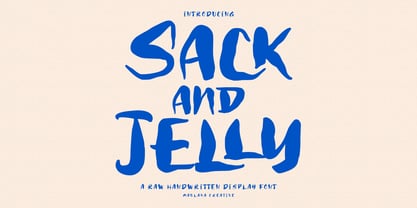 Sack and Jelly is a fancy handwritten font. With bold contrast stroke, fun character with a bit of ligatures. To give you an extra creative work. Sack and Jelly font support multilingual more than 100+ language. This font is good for logo design, Social media, Movie Titles, Books Titles, a short text even a long text letter and good for your secondary text font with sans or serif. Make a stunning work with Sack and Jelly font. Cheers, Maulana Creative
 - Hand Shop Pack by Fontscafe,
$29.00 We’re really excited to unveil our all-new line of ‘HAND SHOP FONTS’. As the name suggests, these are fonts that have a hand-made or hand-typography feel reminiscent of shop signboards from the past with an attentive focus by the shop owners, always looking to discover exciting and unique ways to promote their products or services. While for decades typography has strived hard for perfection, one of the routes taken by the typography world as a whole has been to eliminate any form of ‘human imperfection’ in the typesets, but what about the times when you DO want to send across emotions of a personal human touch through your fonts? We did a step back...these fonts will give your shop-signs a personal touch, telling your buyers that they will get personalized attention, be it through an online or an offline business…We hope you love them as much as we do. The “Hand Shop EXTENDED Pack” containing a total of 14 fonts from the “Hand Shop Banners & Elements Pack” (3 fonts) , the “Hand Shop Typography Pack 01” (8 fonts) and the “Hand Shop Typography Pack 02” (3 fonts)
 - Bold Pressing Pack by Fontscafe,
$39.00 Fonts Café is offering a brand new pack of fonts and elements; The Bold Pressing Pack, full of bold, strong, powerful, vintage fonts which really stand out to make a strong impact. These fonts bring us back to a time when ink was placed onto wooden blocks, which were then pressed down onto the paper, creating big, bold letters, with the beautiful flaws of a time when things of import were given the due attention they deserved. This pack is designed to quickly capture the attention of anyone who sees it, while making a statement that says you mean business. It includes five different font styles, as well as two different element styles. There's everything from a standard letterpress font, to a font which truly emulates the imperfections of those days, as well as one that stands out above the rest to make a truly bold statement, and more. Check below these powerful fonts in more detail.
 - MBF Neutral Jack by Moonbandit,
$6.00 A powerful, versatile and multipurpose font family with modern typeface. Consist of 10 fonts, from extra light for the elegant feel, to black for the biggest impact. Neutral Jack is ready to elevate your brand image.
 - Hacky Sack NF by Nick's Fonts,
$10.00Ross George in his numerous Speedball chapbooks called the pattern for this typeface Stunt Roman. A studious observer may discern that many of the wackier letterforms were tamed to produce the popular font University Roman; however, this version remains unapoligetically true to the original. All versions of this font include the Unicode 1250 Central European character set in addition to the standard Unicode 1252 Latin set. - Back In The USSR DL - Personal use only

- KR Back To School Dings - Unknown license

- British Block Flourish, 10th c. - Unknown license

- KR Back On The Farm - Unknown license

- GA Clock Dial Round - Unknown license

- MTF Jumpin Jack EXT by Miss Tiina Fonts,
$10.00 Jumpin’ Jack Extended is a fun, cartoon-like display font capable of taking any product out of the ordinary! Use it on bold and bright creations such as banners, posters, covers, titles, magazines, etc. This bouncy fun font is a perfect addition to your collection!
 - Spinner Rack Pro BB by Blambot,
$10.00 Spinner Rack Pro BB is a new and improved version of the classic Blambot typeface, Spinner Rack BB! New spacing, kerning, manga characters, barred-I correction, additional accented characters, autoligatures, contextual alternates, and a plain bold weight for the first time!
 - Bank Sans Caps EF by Elsner+Flake,
$35.00 Based on Bank Gothic designed by Morris Fuller Benton in the 30th, Bank Sans Caps from Elsner+Flake offers a wide variety of weights from Light to Bold with Compressed, Semi Condensed and Condensed widths. All weights are also available with Cyrillic character sets.
 - ITC Digital Woodcuts by ITC,
$29.99ITC Digital Woodcuts font is the work of Timothy Donaldson. Although made on a computer, each character has the look of a block of wood with a character cut into it. The forms are made entirely of lines, typical of how the result would be if they were truly cut into wood. ITC Digital Woodcuts is a capital letter alphabet including both white letters on a black background and black letters on a whitish background which looks as though the bark of the piece of wood was chiseled away for the effect. Donaldson suggests alternating the black version with the white to create a three dimensional effect. - Mauer by Klaudia Krynicka,
$19.00 Mauer is a proportional, block, geometric font inspired by the advertisement in the polish weekly from 1937 "Tygodnik powszechny". This typeface family contains 3 styles: Regular, Black and Italics.
 - Deep Rising by BA Graphics,
$45.00A very black letter packs a lot of punch, great for paperbacks, posters and most powerful headlines - Cabana Club JNL by Jeff Levine,
$29.00Bring back the glory of winters in Miami Beach, exotic summer vacations or Deco-era night spots with Cabana Club JNL - a retro-Deco font, complete with contour outline and solid black characters. - KR Jack In The Box - Unknown license

- Just Fall Holidays by Outside the Line,
$19.00 Lots of Fall fun, many Halloween icons... black cat, haunted house, witch hat, ghost, scary masks, pumpkins, bat, BOO! and more. Plus back to school icons... bus, pencil, flashcards, paste, leaves and an apple for the teacher.
 - Warrior by CastleType,
$59.00 Warrior is a chunky typeface design inspired by a Russian Egyptian-style block alphabet (original designer unknown). Now available in seven weights (Hairline, Extra Light, Light, Medium, Regular, Bold, Black) in addition to three decorative styles: Shaded (3-dimensional), Inline, and Open. With its blocky letters and stable slab serifs, Warrior will add a bold, masculine look to your design. All members of the Warrior family support most European languages including modern Greek, and, of course, languages that use the Cyrillic alphabet.
 - Action Man - Unknown license

- Advertiser JNL by Jeff Levine,
$29.00Advertiser JNL is a simple A-Z only font used to make retro-styled titles and names. Based on a popular style of retail signage from the 1950s and 1960s, alternating keystrokes will create a contrast of positive and negative letters. The capital letters have the alphabet in white on black boxes, the lower case have the black letters alone—with the white space conforming to the width of the black boxes. In a pinch, the boxed characters can also be used as initial caps. For a more complete character set with the same style of lettering, use DuBois Block JNL. - Umidus Font by Softulka,
$10.00 Umidus font - Trippy wavy liquid decorative font, which works perfectly for bold titles, Festival posters, as a graphic element for bright T-shit or hoodies, or even backgrounds! This weird and ugly font likes an experiment with spacing and different deformation. Please, don't hold back on your bold modern ideas! ------------------- You will receive: - 3 OTF files (3 font styles: plane black, transparent outline, black with highlights) - ATTENTION! font comes WITHOUT any photos, textures, or effects.
 - Rogue Hero Italic - Unknown license

- Dampfplatz Solid - 100% free

- MD-Type Rounded by MD-Type,
$25.00 MD-Type Rounded is a modern, stylish font family. The family consists of five fonts (Regular, Bold, Light, Block, Black) which are formed by all capital letters. The strong and accented letters were rounded on the corners and therefore softened. The font family supports Turkish language as well.
 - Powder Script by Fenotype,
$35.00 Powder Script is a showy brush style script family of three weights -regular, bold and black plus matching Ornament and Pattern set. Powder Script is packed with almost 800 glyphs per weight and is full of features. To activate alternate characters click on Swash, Stylistic or Titling Alternates in any OpenType savvy program or manually select from even more characters from the Glyph Palette. Inside each weight is a set of block capitals that you can activate by turning on Small Caps. You can use Small Caps to create evenly lined text blocks to support your design. Engage Powder Ornaments and Powder Patterns to complete your designs while using Powder Script. For the best price purchase the complete Powder Script Family.
 - Checker by Shinntype,
$29.00 Checker is an all-cap ‘three-D’ font which automatically alternates white letters on black tiles with black letters on white tiles, by means of the Contextual Alternates feature. Checker is an attention grabber suitable for logos, titles and short headings. With its tiled construction, it's a natural for colorful interpretation. The letters are properly italicized and back-slanted, and adjusted for maximum readability within the constraints of the font’s concept. The letter style is bold grotesque, so Checker will mix smoothly with any other fonts in a layout.
 - Eklipse by Neder,
$29.00 Eklipse is a ultra-black typeface from Neder Type. Designed to defy the limits of legibility it is also a journey into a universe of strange possibilities. With multi-lingual support, contains more than 60 ligatures and contextual alternates! Eklipse fits perfect in headlines, logos and small blocks of text.
 - Cooper BT by ParaType,
$30.00Bitstream Cooper was designed at Bitstream in 1986 by means of adding light, medium, and bold styles, with the corresponding italics, to the existing black ones. Based on Cooper Black, 1919, by Oswald Bruce Cooper, which was firstly released as a hand composition font in 1922 by Barnhart Brothers & Spindler of Chicago and later spread by ATF. Cooper Black is an extra bold face based on Cooper Old Style. Bitstream Cooper is an old style face with rounded serifs and tilted back ovals. For use both in text (normal weights) and in advertising and display typography (heavy weights). Cyrillic version was developed for ParaType in 2000 by Manvel Shmavonyan and based on TM Oswald face of TypeMarket, 1996, by Victoria Grigorenko. - Qbicle 2 BRK - Unknown license

- LT Sculpture - 100% free

- Lichtspielhaus by Typocalypse,
$19.00 Lichtspielhaus is an ultra condensed Lichtspiele spin-Off with 8 weights. It still transports you back to a time where neon lights and marquee letters decorated cinema facades. There are 8 styles: Hairline, Thin, Light, Regular, Medium, Bold, Black and Heavy. "Lichtspielhaus" is the first part of a new Type Noir Quadrilogy.
 - Hel Grotesk Gothiq - Personal use only

- DS Quadro - Unknown license

- DS Nova - Unknown license

- Fidel by Latinotype,
$25.00 Fidel Black Essential is a heavily weighted, condensed, sans-serif typeface with a large x-height. Ideal for short, high-impact headlines, its design is inspired by Russian Constructivism and old Cuban communist posters. Variants include Fidel Black, Fidel Black Italic and Fidel Black Stencil. Fidel Black Essential is an excellent choice for headlines, subheadings, posters and logotypes. Languages: Basic Latin, Euro, Mac OS Roman.


