10,000 search results
(0.037 seconds)
- Meteor Condensed MF by Masterfont,
$59.00 A practical font family with 8 weights for all your day by day design needs: headlines, body text, signage etc. High legibility at small sizes. An extended serif typeface with elegant endings that provide unique softness appearance without losing legibility.
 - MPI No. 510 by mpressInteractive,
$5.00 No. 510 is a friendly, slim gothic face. Strokes have a gentle inward curve at the median with the tops and bottoms of the letters slightly wider and thicker. The design was first introduced by William H. Page & Company around 1887.
 - Aventura by Sudtipos,
$59.00 Aventura is burlesquely round, stylishly seductive, eternally sugar-fixed, and loving to a fault. Plenty of stylistic alternates are included to heighten the mood or soften it. Either way you look at it, there's a lot of love in the air.
 - Coffee by Abedavera,
$20.00 From love into a fontface. Font with the taste of coffee. Made from coffee plant anatomy at local farmer. Hope you enjoy to purchase with price of our "200gr premium green bean" :) Arabica Variety. Dokan, Region Karo - North Sumatra. Indonesia.
 - Wire Mesh JNL by Jeff Levine,
$29.00Wire Mesh JNL is an outline variation of the same design that produced Shady Characters JNL (lettering printed over a simulated halftone). This time around, the end effect gives the impression of looking at lettering cut out of a mesh screen. - Flomic by Sergey Melnikov,
$24.00 Ukrainian type designer Melnikov Sergey created Flomic font between 2015 and 2016. Flomic is a geometric sans built from a folded lines. Most effective when used in short words or phrases at larger sizes, where the details can be appreciated.
 - Monticello by Linotype,
$40.99 Linotype Monticello was designed by C.H. Griffith in 1946. Its design is based on James Ronaldsons Roman No.1 and Oxford Typefaces from American Type Founders and was revised by Matthew Carter while he was working at Linotype between 1965 -1981.
 - Smile Darling by Prioritype,
$19.00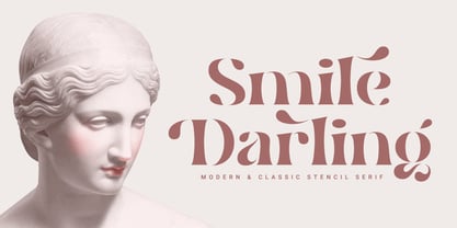 Introducing. Smile Darling: Modern and classic style that allows your project to be more beautiful to look at. Perfect for branding, social media posts, magazines, wedding invitations and more. Features: Uppercase, Lowercase, Numeral, Punctuation, Multilingual, Ligature, Alternates & PUA Encoded. Thanks.
 - Whipsnapper by Pink Broccoli,
$14.00 A wild at heart offbeat sansserif family inspired not by any single pulp or vintage source but a varied collection of influences. Just an all-around fun typeface with the widths and weights to offer a wide variety of uses.
 - Fairway by Alan Meeks,
$45.00 The thinking behind Fairway was to create a relatively conventional soft sans with a certain amount of movement at the top of the x-height line. The face is casual and quirky but can still be used as a text face.
 - Regency by Studio K,
$45.00 Regency is named after the style associated with the period, which is at once elegant and luxurious. A modern classic, it is influenced by Americana and Optima and combines the style of a serif face with the simplicity of sans serif.
 - SK Bade by Salih Kizilkaya,
$9.99 SK Bade is a demi serif and condensed font. It was designed by Salih Kızılkaya in 2020. This is a completely decorative font, but legibility is at the forefront. In this way, it can be used easily in long texts.
 - Digitalika by PizzaDude.dk,
$15.00 Inspired by some scribbles I made as a young kid in the 80'ies at school - when I should have paid attention to the teacher! Comes with a complete multilingual set of letters with alternate versions of both upper- and lowercase
 - Catch Words JNL by Jeff Levine,
$29.00In the days of wood type, suppliers offered words such as 'and', 'at', 'for', 'each' and numerous others as stock cuts called "catch words". This collection of twenty-six were re-drawn using a vintage type catalog page as a model. - Black Rovers by Pandanwangi,
$16.00 Black Rovers is a striking sans serif font with a bold and modern charm. It will add a touch of minimalism to any design project. If there is anything you need to ask, you can contact me at suratnokang@gmail.com
 - Altogether Ooky by Comicraft,
$19.00 It’s Creepy and it’s Kooky, it’s Altogether Ooky! Created by Comicraft’s Festering Fontmeister, John Roshell, for “The New Addams Family” TV series, Altogether Ooky is just The Thing you'll be looking for when Gomez and Morticia come knocking at your door.
 - Typewriter Olympia SM8 by Simeon out West,
$25.00 This font, based on old Olympia SM and SF typewriters from the 50’s and 60’s provides a nice clean, yet quirky look for your documents. Being a reproduction inspired by a typewriter, it works better at smaller sizes.
 - Modularico 4F by 4th february,
$30.00 Modularico was initially designed in 1991 for the logotype of a sound recording studio in Kremenchuk city. At the end of 2008 I decided to make a digital version of this font. Final design of font was finished in June 2009.
 - Fertigo Pro by exljbris,
$- Enjoy Fertigo Pro. The font nobody was waiting for. It’s a bit like Laphroaig; they say that the more you’ll get to know it, the more you will (probably) appreciate it. Don't forget to have a look at the script version.
 - Black Grotesk by ParaType,
$30.00 Designed at ParaType in 1997 by Tagir Safayev. Based on Gasetny Chorny (“Newspaper Black”), of Ossip Lehmann foundry, St.-Petersburg, 1874, and Kompakte Grotesk of Haas. An old-fashioned German sans serif “Grotesque”. For use in advertising and display typography.
 - Metal Core by Vozzy,
$10.00 Metal Core is a set of strong and nervous fonts and perfect for lettering on vintage music (and not only for these) style labels, posters, t-shirts, logo etc. All available characters with sample designs you can see at the preview.
 - Okra Cubo by Cool Fonts,
$24.00 OkraCubo in a distressed font with a cubist bent. This font work nicely for both grunge and modern styles. Used at large point sizes the cubist look really comes out. This font is as strange as Okra is a vegetable????
 - Rollback by Wildan Type,
$15.00 Rollback- a clean and smooth typeface with a rounded touch at each end of the caracter. looks lighter, more relaxed and humanist. This font has many alternative options and ligatures, perfect for creating designs such as packaging, logos or titles.
 - Vintage Whiskey by Vozzy,
$10.00 Introducing a vintage look layered label typeface named "Vintage Whiskey". This typeface includes six styles (including effect styles), for sample look at 4th preview. This font will good viewed on any retro design like poster, t-shirt, label, logo etc.
 - Clarendon Rough by Jeff Kahn,
$29.00 Clarendon Rough is suitable for display and text. Its large x-height provides excellent legibility at small point sizes. Clarendon Rough is extended, aged to perfection, iconic, rugged, distressed, direct, and suitable for packaging, restaurant use, websites, magazines, lively headlines.
 - Spring LP by LetterPerfect,
$39.00 Spring is a lively contemporary script that designer Garrett Boge modeled after his own brush lettering. It was released in 1988 at the launch of LetterPerfect's font collection, and has seen increasing use in advertising, packaging, and point-of-display promotions.
 - Digital Clock by Beast Designer,
$15.99 Digital Clock Font is a typeface designed specifically for use in digital alarm clocks and other timekeeping devices. It is characterized by clear, legible numerals and symbols, and a modern, minimalistic design that is easy to read at a quick glance.
 - Compact by ParaType,
$25.00 The typeface was designed at ParaType (ParaGraph) in 1991 by Vladimir Yefimov. Based on Anons by Gennady Baryshnikov. An extra condensed sans serif. For use in advertising and display typography. The decorative styles were added in 1997 by Alexander Tarbeev.
 - Kitra 77 by LightHouse,
$49.00Kitra 77 was one of the studies to Hamuel Nine Five. Though at first glance we can find several similarities, a closer look will reveal a completely different font in color and proportion. Kitra 77 is an OpenType/TTF Unicode font. - Vapor by The Hiscott Foundry,
$35.00This font was inspired by the swirling steam drawn on a chalkboard at a coffee shop. Not actually a script font though it has a similar feel. This font dances and twirls the way a wisp of smoke or steam would. - Five Star Final by Solotype,
$19.95Introduced by the American Type Founders Co. at the time of the Spanish American War and advertised as suitable for "War Scare Headlines"! Used by many papers for years after because the narrow type was suitable for narrow single column heads. - Toolbox by Adobe,
$29.00Brian Strysko, a graphic design student at California Polytechnic State University, came up with an idea for a typeface crafted from everyday gadgets and tools. After much poking around in do-it-yourself" books and friends' garages, Brian created Toolbox." - Bell Ring by Seemly Fonts,
$12.00 Warmth and friendliness are at the heart of Bell Ring, a handwritten font that captures the essence of the season. Its distinct charm makes it an ideal choice for a wide spectrum of design projects, where your creativity knows no bounds.
 - Kitcat by Solotype,
$19.95This was a favorite of the old time job printers; decorative but readable. The MacKellar foundry was the largest and most creative of the old foundries, and decorative fonts like this one came out at the rate of several every year. - Nikaia by Miller Type Foundry,
$- Nikaia started as an experimental typeface (the script weights) and was then expanded to its logical conclusions (italic & regular), producing the fastest look typeface in the world. Nikaia looks clean and sharp at any size, with 5 weights for contrast.
 - Celtic Knots by Clanbadge,
$20.00 While it is obvious that this is an ornamental style font, it is more than that: it is a Celtic Knotwork design tool! Irish, Scottish, Welsh, even Norse and Viking cultures have used knotwork designs for millenia. These ancient traditional interwoven designs are experiencing a revival as Celtic culture gains exposure in the modern world. Intricate Celtic knots are featured everywhere from jewelry to tattoos. While many enjoy them simply for their beauty and fascinating twists, they can also be used to add an air of myth, magic and mystery to any project. The interlaced lines make them perfect for wedding invitations, borders, dividers and rules, web graphics, and logos. I began using Celtic knotwork designs in my own work as part of my knifemaking and jewelry making hobbies. I read all of the books I could find about Celtic knots and at first I drew them by hand with pencil and paper. Then as I realized how nice it would be to have "undos" I switched over to using Corel Draw. Draw proved to be a natural for this type of artwork with tools like contour and the trim function. But even with these great tools, it was still tedious to create these designs. I noticed that I was able to reuse a lot of parts in repetitive sections. I developed a small library of reusable bits and chunks of Celtic designs. I found them so useful and fun to work with that I began thinking about ways to market my Celtic design kit. I thought about CDR and EPS formats, but then I thought of creating this toolset as a True Type Font. That way anyone with ANY program that uses fonts could easily create Celtic knotwork designs. Word processors, embroidery programs, engraving programs, jewelry design programs, CAD/CAM programs...almost every program can use fonts. I was also interested in CNC work and thought that this font would work well for applications such as laser etching, vinyl signs, and machining. With that in mind, I designed each character of the font with extremes of accuracy. If one character from the font is used at one inch tall, every control point will be placed to an accuracy of better than 0.0001 inch. I wanted every piece to meet exactly with the next, with no possibility for misalignment. The different styles are all very carefully created to fit accurately with each other. So the Filled Style fits exactly into the Outline Style, and the Inverse Style fits precisely around the Outline Style so as to make up the background behind the knotwork. Combining the styles allows you to have complete creative control. By assembling the nearly 200 pieces it is quite easy to produce very complex designs. It is actually a bit like playing with a puzzle and many people really enjoy putting the pieces together to make designs. In fact, I have had many customers tell me of how they love playing with this font and making knots into the wee hours of morning. If you like puzzles then you will absolutely love this font! And creating the patterns is just the beginning of the fun! If you apply your favorite Photoshop tricks on them you can make anything from dazzling chrome knotwork to carved stone. Photoshop plug-ins like SuperBladePro are great for converting knotwork text into corroded bronze or rusted iron. Use your knotwork to add texture to a virtual landscape, or add them as surface embelishments on architecture and furniture. You can also make round knotwork by using this font with "WordArt" (WordArt is included with every copy of Microsoft Word. See http://clanbadge.com/round_knots.htm for a tutorial on how to make round knotwork). For Crafters there are limitless uses for this font. It has been used for embroidery, jewelry, leatherwork, stencils, stained glass, quilting, painting, pyrography, woodcarving and lots more. We have even sold copies to monks for use in decorating handmade books!
 - Ysobel by Monotype,
$29.99 The Ysobel™ typeface family is not only elegant; it is also exceptionally legible and space economical. A collaborative design effort between Robin Nicholas, as lead designer and project director, Delve Withrington and Alice Savoie of Monotype Imaging, the project had the primary design goal of creating a typeface family for setting text in newspapers and periodicals. The result, however, is also ideal for any application that requires quick and easy assimilation of text. According to Nicholas, “The idea for the design started when I was asked to develop a custom version of Century Schoolbook. I wanted to give the design a more contemporary feel, although the client ultimately decided to keep their typeface closer to the original. The project nevertheless gave me ideas for a new design. Since designing Nimrod, some 30 years ago, I had wanted to make a more modern typeface family for newspapers and magazines – this seemed the ideal candidate.” Ysobel (pronounced “Isabel”) has the soft, inviting letter shapes of Century Schoolbook but contrasts these with more incised serifs and terminals. Its capitals are also narrower than those of Century Schoolbook, and care was taken to ensure that they harmonize perfectly with the lowercase. Ysobel’s x-height is full-bodied without disrupting lowercase proportions. In addition, curved terminals, such as those in the “C,” “c” and “e,” were drawn more open as an aid to legibility and readability in text copy. Weight stress is near vertical, and hairlines are robust to ensure character fidelity in small point sizes. Development began with the text version of the family, which has four weights, each with an italic companion. All weights feature lining and old style numerals, fractions, superiors and extended Latin language coverage. Small caps are also available in the Roman Regular design. Ysobel Display is a completely redrawn version of the typeface; it is narrower, and has a slightly smaller x-height, thinner hairlines and subtle design changes to improve its appearance when set at large sizes. The Display Italic received particular attention to make it ideal for setting headlines, subheads and short blocks of copy. Changes include a slightly greater italic angle and more cursive treatment of some letter shapes. Alternative styles of capital “J” and “Q,” to provide variation, are available in all weights.
 - Joanna Sans Nova by Monotype,
$50.99 The Joanna® Sans Nova family is the only typeface in the Eric Gill Series that was not initially designed by Gill. Created by Monotype Studio designer Terrance Weinzierl over a three-year period with digital applications at the forefront of the design criteria, Joanna Sans Nova is a humanist sans serif based primarily on Gill’s original Joanna. The design comprises 16 fonts, from thin to black, each with a complementary italic. Joanna Sans Nova has a larger x-height to ensure high levels of legibility – even on small digital screens. Due to its inherent humanist proportions, Joanna Sans Nova is surprisingly comfortable for longer form reading. Its low contrast in character stroke weights also improves imaging in a variety of environments. In addition, the calligraphic and fluid details enable the roman and italic designs to shine in headlines and other display uses. Joanna Sans features a robust range of OpenType features for fine typography, including small caps, old style figures, proportional figures, ligatures, superscript and subscript figures and support for fractions. With over 1000 glyphs per font, Joanna Sans supports more than 50 languages – in Latin, Greek and Cyrillic scripts. “I've always been a fan of Gill’s work, explains Weinzierl, and found the simple, humanist qualities of Joanna really fitting for a sans serif design. I wanted to make something with Gill flavor, but with more harmony in the extreme weights than Gill Sans – and with my twist on it. I went through six or seven different italic designs before landing on the current direction.” “The original Joanna had a very distinct italic, Weinzierl continues. “It’s very condensed, and has a very shallow angle. I wanted to have an italic that stood out, but in a different way. I took a cursive direction for the italic details, which are wider and slanted more, both improving character legibility.” The Joanna Sans Nova typeface family is part of the new Eric Gill series, drawing on Monotype’s heritage to remaster and expand and revitalize Eric Gill’s body of work, with more weights, more characters and more languages to meet a wide range of design requirements. The series also brings to life new elements inspired by some of Gill’s unreleased work, discovered in Monotype’s archive of original typeface drawings and materials of the last century.
 - Ethnocentric - Unknown license

- Good Times - Unknown license


