10,000 search results
(0.024 seconds)
- Jerk Chicken BT by Bitstream,
$50.99British designer Thomas Oldfield, who brought you Hombre BT and Reaper, has scratched out another typeface, this one called Jerk Chicken BT. I guess, if you can imagine a quill tip pen somehow wedged 'tween a scrawny chicken's toes, you'd end up with the scrawl, blobs, blotches and bleeds that would make most type designers run for the hen house. Not Thomas; he saw only commercial potential. So lay down some scratch and order up some Jerk Chicken BT. Hey, while you're at it, why not extend the license to a dozen users? Available as an OpenType font, Jerk Chicken BT includes of a couple of ornaments, well parts, namely a drumstick and a whole fryer, and its extended character set supports Baltic and Central European languages. - VAG Rounded BT by Bitstream,
$34.99
- OCR-B BT by Bitstream,
$29.99Adrian Frutiger’s distinguished and successful 1966 design for the European Computer Manufacturers’ Association improving readability of letters for both machines and humans. OCR-B is replacing OCR-A. - Kuenstler 165 BT by Bitstream,
$29.99 - Big Limbo BT by Bitstream,
$50.99This freeform exercise in typographic design echoes the looseness of early 1960's advertising. Brian breaks almost every typographic rule we can think of — but so what? The bold letterforms of Big Limbo are anything but stuck! - Fat Albert BT by Bitstream,
$50.99 Ray Cruz releases another typeface family, this time inspired by 1970's pop culture. Fat Albert Regular, Outline and Shadow are bold poster types that evoke the fun and funk of an era gone by. Go on bro, get Fat Albert and get down.
 - Ang Thong BT by Bitstream,
$29.99Bitstream developed Ang Thong for the Microsoft Windows operating system. The font is encoded with a Microsoft defined Thai character set, Thai Code Page 874. The font includes Thai glyphs and Latin glyphs from Dutch 801. Ang Thong (basin of gold) is a province in central Thailand which consists mostly of flat agricultural land used for growing rice. - Picayune Intelligence BT by Bitstream,
$50.99The unusual name for this Deco style typeface comes from the playful and pun-laden 1960s Rocky & Bullwinkle TV show. It is the name of the newspaper in the mythical town of Frostbite Falls, MN, home of the two cartoon stars. The name, Picayune Intelligence, literally means “pretty dumb”, but we don’t think that describes Nick’s competent design at all. It is comforting to know that someone is still watching quality television. - Full Moon BT by Bitstream,
$50.99A collaboration based on lettering by Vermont illustrator/artist Mary Trafton and brought to typographic life by Charles Gibbons, the Full Moon Suite is a collection of casual typefaces called after folk names for full moons. A winner of the TDC2 2003 Type Design Competition. Family members include: Falling Leaves, Rustling Branches, Black Cherry, Black Cherry Alternate, Black Cherry Ligatures and Black Cherry Doubles. - Chervonec Uzkj BT by Bitstream,
$50.99Possessing a distinctive Russian appearance, Chervonec Uzkj, or Chervonec Condensed, is a hybrid semi-serif designed by Russian designer Oleg Karpinsky. The typeface family includes three weights with drawn italics. - News Gothic BT by Bitstream,
$29.99 The standard American sanserif of the first two thirds of the twentieth century, prepared for ATF by Morris Fuller Benton in 1908 under the name News Gothic, with a matching lightface known as Lightline Gothic. Linotype’s Trade Gothic follows News Gothic except for its widely-spaced straight-sided boldface based on ATF Alternate Gothic No.3. Linotype matches News Gothic Bold, a boldface version that originated at Intertype, with Trade Gothic Bold No.2. Ludlow Record Gothic follows News Gothic more loosely. News Gothic BT™ font field guide including best practices, font pairings and alternatives.
 - Engravers' Roman BT by Bitstream,
$29.99A set of capitals popular with American engravers and typefounders through the last third of the nineteenth century, shown under this name by ATF in 1903. - Drescher Grotesk BT by Bitstream,
$50.99 Mr. Gogoll's successful revival of Arno Drescher’s Super Grotesk was awarded the 1999 Kurt Christians Award. The Drescher Grotesk family consists of seven roman weights, including a version designed for use at small point sizes. Drescher Grotesk is a classic German geometric design, complete with the original “angled” brackets.
 - Artane Elongated BT by Bitstream,
$50.99Artane, Tony Fahy's first typeface for Bitstream Inc., has a specific philosophy at the core of it's creation. He decided he would try to create a Roman sans that would have the elegance of a serifed italic, such as Stempel Garamond, Bembo, or Baskerville. - Engravers' Gothic BT by Bitstream,
$29.99 Gothic capitals of the same form as Copperplate Gothic, lacking only the oversharpened corners.
 - Lindisfarne Nova BT by Bitstream,
$50.99 Lindisfarne Nova is an uncial-like design based on the script found in the Lindisfarne Gospels. Created by Harry Pears and Margaret Layson, it is available in two weights, regular and bold. Lindisfarne Nova is Harry’s first completed font. There are also two companion styles, Lindisfarne Nova Incised and Lindisfarne Runes.
 - Cruz Cantera BT by Bitstream,
$50.99 Cruz Cantera is a crisp and stylish yet informal sans serif typeface created by NYC type designer Ray Cruz. It is a slightly condensed design. The vertical strokes have rounded terminals, and there are some characters with serifs. Notable characters include the upper and lowercase E. There are three weights and each works equally well alone, or together for both display and text. Original design by Ramon Cruz completed in 2002.
 - Wavy Rounded BT by Bitstream,
$50.99Wavy Rounded is a stylized sans serif display typeface by Japanese designer Hajime Kawakami. Some of the characters possess quirky features that randomly create fun visual “waves”. There is a handful of alternate characters including an old style figure set. Catch the Wave. - Frank Ruehl BT by Bitstream,
$29.99Frank-Rühl (or Ruehl) is the ubiquitous Hebrew text font style. There are many fonts that belong to this style, and all are based on an early 20th-century design by Raphael Frank. Some of the fonts are actually called Frank-Rühl (or Ruehl) and some are not. It was originally designed in a single weight. Bitstream developed Frank Ruehl for the Microsoft Windows operating system. The font is encoded with a Microsoft defined Hebrew character set, Hebrew Code Page 1255. Within the TrueType fonts, the characters are assigned Unicode character IDs. The font includes Hebrew characters, and Latin glyphs from Dutch 801 bold. - Bluenote Demi by Wiescher Design,
$39.50 Bluenote is a font based on Franklin Gothic condensed. In the 60s and 70s the record label Blue Note published all those classic jazz records of my youth. Someone at their arts department cut letters to ribbons and designed wonderful record covers with those fragmented glyphs. I recently had a look at my music collection and rediscovered these letters. Being a hard-working type designer I couldn't resist the challenge, here is the result from your dilligent designer Gert Wiescher
 - DeJi - Unknown license

- Demos by Linotype,
$29.99 - Demine by Craft Supply Co,
$20.00 Introducing Demine – Condensed Bold Sans Serif Font The Perfect Typeface for Large Displays Demine – Condensed Bold Sans Serif Font is an ideal choice for meeting your large display typography needs. With its distinct features, this font stands out in the world of design. Bold Impact for Attention Demine’s bold design unquestionably captures attention. Whether it’s billboards, posters, or signage, this font excels in conveying a powerful message that can’t be ignored. Furthermore, it ensures that your content immediately seizes the viewer’s gaze. Optimal Readability Even at Scale Despite its condensed form, Demine prioritizes readability. Each character is thoughtfully crafted to remain clear and legible, ensuring your message is effectively communicated, even at larger sizes. Consequently, it guarantees that your audience can easily comprehend the content. Versatile Design Applications Demine’s versatility shines through in various design applications. It’s not limited to headlines; it also excels in branding, packaging, and any project where making a bold statement is essential. As a result, it can adapt to a wide range of creative endeavors. In Conclusion Demine – Condensed Bold Sans Serif Font epitomizes typography that marries boldness with clarity. When you need your message to shine large and clear, Demine is your go-to choice. Elevate your designs with Demine’s impactful presence, and witness your message soar to new heights, leaving an indelible impression on your audience.
 - Dexy by Zang-O-Fonts,
$25.00Dexy is an interesting font that seems reminiscent of car model brandings. - Bemis by Leksen Design,
$29.00 I accidentally fell in love with type design, and more specifically, the inscription on the historic Bemis building in Seattle. A high waist and great contrast are characteristics of this classic caps lettering that inspired my debut typeface, with additions of 3/4 caps and ornaments to boot. Read and hear more about the creation of this digital revival.
 - Rare Bird Specimen II by Rare Bird Font Foundry,
$100.00 RARE BIRD SPECIMEN II Specimen II is an elegant hand by Karla Lim of Written Word Calligraphy. It floats across the page on gossamer wings. Specimen II pairs well with classic typefaces like Baskerville, Garamond and Bodoni. OBSERVATIONS Specimen II is exquisitely delicate but not fragile. Best suited for unforgettable affairs. DEFINING CHARACTERISTICS Opentype programming, formal title & preposition wordart, 7 alternate ëandí options, Roman numerals, in and out-stroked letterforms at beginning and end of words, multiple alternate lowercase t cross-strokes, realistic double-letter ligatures, seamlessly connecting calligraphic letters, alternate capital letters, old style numerals, basic Latin encoding. POTENTIAL SIGHTINGS Wedding stationery suites, logo design, luxury product packaging, fragrance, wine labels.
 - Polytype Brutus II Frames by Prime Graphics,
$45.00 - Polytype Medoc II Frames by Prime Graphics,
$45.00 - Polytype Artimus II Frames by Prime Graphics,
$45.00 - Polytype Dumas II Frames by Prime Graphics,
$45.00 - Face Your Fears II by Hanoded,
$15.00 When I created Face Your Fears some years ago, it was an instant hit. I have seen it on Gangsta Rap albums, metal albums, books and on movie posters. It has been used for T-shirts, websites and, believe it or not, for a beer label as well. I have always toyed with the idea of redoing the original font, as some of the glyphs were a bit off. Face Your Fears II is similar in nature to the original font, but comes with a lot of improvements, has slightly altered glyphs and (probably) better kerning. But maybe, just maybe, it isn't your cup o' tea. In that case, you can always just go for the original!
 - ITC Stone Sans II by ITC,
$45.99 The ITC Stone Sans II typeface family is new from the drawing board up. Sumner Stone, who designed the original faces in 1988, recently collaborated with Delve Withrington and Jim Wasco of Monotype Imaging to update the family of faces that bears his name. Sumner was the lead designer and project director for the full-blown reworking – and his own greatest critic. The collaborative design effort began as a relatively simple upgrade to the ITC Stone Sans family. As so often happens, however, the upgrade proved to be not so simple, and grew into a major design undertaking. “My initial intent,” recalls Sumner, “was to provide ITC Stone Sans with even greater versatility. I planned to add an additional weight, maybe two, and to give the family some condensed designs.” As Sumner began to look more closely at his twenty-year-old typeface, he decided that it would benefit from more extensive design improvements. “I found myself making numerous refinements to character shapes and proportions,” says Sumner. “The project scope expanded dramatically, and I’m pleased with the final result. The redesign has improved both the legibility and the overall appearance of the face.” The original ITC Stone Sans is part of the ITC Stone super family, along with ITC Stone Serif and ITC Stone Informal. In 2005 ITC Stone Humanist joined the family. All of these designs have always offered the same three weights: Medium, Semibold, and Bold – each with an italic counterpart. Over time, Stone Sans has emerged as the godfather of the family, a powerful design used for everything from fine books, annual reports and corporate identity programs, to restaurant menus, movie credits and advertising campaigns. ITC Stone Sans, however, lacked one attribute of many sans serif families: a large range of widths and weights. “These fonts had enjoyed great popularity for many years – during which graphic designers repeatedly asked for more weights and condensed designs in the family,” says Sumner. “Their comments were the impetus.” ITC Stone Sans II includes six weights ranging from an elegant Light to a commanding Extra Bold. An italic counterpart and suite of condensed designs complements every weight. In all, the new family encompasses 24 typefaces. The ITC Stone Sans II family is also available as a suite of OpenType Pro fonts, allowing graphic communicators to pair its versatile design with the capabilities of OpenType. These fonts offer automatic insertion of ligatures, small caps and use-sensitive figure designs; their extended character set also supports most Central European and many Eastern European languages. ITC Stone® Sans II font field guide including best practices, font pairings and alternatives.
 - Cry Kitty - Unknown license

- Cry Uncial - Unknown license

- Angel Cry by Stefani Letter,
$12.00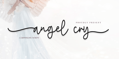 Angel cry is a beautiful monoline script font that will effortlessly add a perfect look to any craft! Your imagination and this font will make a perfect combination. Get inspired by its unique charm and create amazing greeting cards, Weddings, books, logos, stationery, and much more! This font is PUA encoded which means you can access all of the cute glyphs with ease! It also features a wealth of including ligatures.
 - Cry One by Sinograff,
$20.00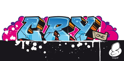
- Battle Cry by Comicraft,
$19.00 As Titans Clash in The Final Battle of Good versus Evil, Man versus Machine, God versus Mortal and Coke versus Pepsi, ace lettering artist, Ferran Delgado from Spain teams up with our very own John ‘JG’ Roshell for one last attack on the assembled Cover Lettering Styles of Yore. Fill your lungs and prepare for... BATTTTTTLECRRRRRYYYYYYYYYYY! See the families related to Battle Cry: Battle Scarred & Battle Damaged .
 - Metal Cry by Fabulous Rice,
$25.00 Metal Cry is a font family that was inspired by countless hours spent playing video games, watching old movies or reading comic books. And even more hours closely analysing the design of all these things. The art of creating beautiful letters has slowly declined with the rise of the digital age and its solid-colour, 2D fonts. And most of the time, the care given to typography in cultural products just isn't what it used to be anymore. This was the inspiration for Metal Cry, a family of 4 layerable fonts that can bring a feeling of depth to its letters, and offers endless possible combinations. Metal Cry Outlands is the basic shape of all the characters, it can be used as the bright side of the bevel. Metal Cry Front is the inline border font that can be used as the front side of the bevel. Metal Cry Shadow can be used as the dark side of the bevel. Metal Cry Depth can be used to flash out the inside shape of the letter. But of course, any font can be combined with any other font(s) to obtain various results. The planets in the above visuals are courtesy of 3D artist Thomas Veyrat / veyratom.com
 - Cry Wolf by Hanoded,
$20.00 When I was a kid, I loved the story of The Boy Who Cried Wolf. I thought it was pretty stupid of the boy to trick the villagers into believing wolves are attacking his flock of sheep. But I also thought it was a bit sad that the sheep are eaten by a wolf in the end. I didn’t really feel sorry for the boy (he really was stupid), nor the wolf (he just does what he is supposed to do in life), but I did feel sorry for those poor sheep. I guess this is what disinformation leads to in the end. Cry Wolf is a bit of a scary font: it was made with a really old and battered brush, using Chinese ink and some quality French paper. It has a slight tilt to the right and I added some inky splatter for dramatic effect. Use Cry Wolf for your book covers, product packaging and headlines; use if to spice up you invitations and your halloween posters. Comes in a slightly tilted Regular style and an outright Italic style.
 - New Lincoln Gothic BT by Bitstream,
$50.99New Lincoln Gothic is an elegant sanserif, generous in width and x-height. There are twelve weights ranging from Hairline to UltraBold and an italic for each weight. At the stroke ends are gentle flares, and some of the round characters possess an interesting and distinctive asymmetry. The character set supports Central Europe, and there are three figure sets, extended fractions, superior and inferior numbers, and a few alternates, all accessible via OpenType features. Back in 1965, Thomas Lincoln had an idea for a new sanserif typeface, a homage of sorts, to ancient Roman artisans. The Trajan Column in Rome, erected in 113 AD, has an inscription that is considered to be the basis for western European lettering. Lincoln admired these beautiful letterforms and so, being inspired, he set out to design a new sanserif typeface based on the proportions and subtleties of the letters found in the Trajan Inscription. Lincoln accomplished what he set out to do by creating Lincoln Gothic. The typeface consisted only of capital letters. Lincoln intentionally omitted a lowercase to keep true his reference to the Trajan Inscription, which contains only magiscule specimens. The design won him the first Visual Graphics Corporation (VGC) National Typeface Competition in 1965. The legendary Herb Lubalin even used it to design a promotional poster! All this was back in the day when typositor film strips and photo type were all the rage in setting headlines. Fast forward now to the next millennium. Thomas Lincoln has had a long, illustrious career as a graphic designer. Still, he has one project that feels incomplete; Lincoln Gothic does not have a lowercase. It is the need to finish the design that drives Lincoln to resurrect his prize winning design and create its digital incarnation. Thus, New Lincoln Gothic was born. Lacking the original drawings, Lincoln had to locate some old typositor strips in order to get started. He had them scanned and imported the data into Freehand where he refined the shapes and sketched out a lowercase. He then imported that data into Fontographer, where he worked the glyphs again and refined the spacing, and started generating additional weights and italics. His enthusiasm went unchecked and he created 14 weights! It was about that time that Lincoln contacted Bitstream about publishing the family. Lincoln worked with Bitstream to narrow down the family (only to twelve weights), interpolate the various weights using three masters, and extend the character set to support CE and some alternate figure sets. Bitstream handled the hinting and all production details and built the final CFF OpenType fonts using FontLab Studio 5.


