10,000 search results
(0.046 seconds)
- Ryan BT by Bitstream,
$50.99 - Ambule BT by Bitstream,
$50.99Huxley Vertical meets Peignot in this stylized cap/lowercase hybrid design called Ambule. French designer Julien Janiszewski has created a clean, straightforward design that is strikingly effective in both text and display settings. Ambule Oblique and Ambule Outline complete the typeface family, extending its range of possible uses. - Richfont BT by Bitstream,
$50.99Based on Mr. Hubbard's own hand printing, Richfont Medium is an extremely casual design. Actually light in weight, it renders best at 14 point and above. Richfont Light and Bold are available from the designer. - Clarendon BT by Bitstream,
$50.99 The new Clarendon BT Pro typeface family features 450 glyphs in each font with expanded support for Central and Eastern European languages, and enhanced OpenType features including ligatures, diagonal fractions, superscript/subscripts and Case-Sensitive Forms. Clarendon BT is an updated revival of the square serif (also called Ionic or Egyptienne styles) with bracketed serifs, ball terminals and high xheights. These attributes give Clarendon BT a timeless appearance for a wide range of contemporary uses from websites, ads, publications and signage.
 - Melina BT by Bitstream,
$50.99Melina Plain and Melina Fancy are characterized by graceful lines, strong contrast and nostalgic overtones. These typefaces are patterned after two members of a type family named Greco, released by Fundición Tipográfica Richard Gans of Madrid, Spain, in the 1920s. Melina Plain is a refined version of Greco Bold, and Melina Fancy is based on Greco Adornado, with the notable addition of a lowercase, which was not a part of the original design. Melina is based on two typefaces (ca. 1920) from the Fundición Tipográfica Richard Gans in Madrid, Spain. Nick Curtis first found Greco Adornado in a type specimen at the Library of Congress. It was a cap only design. He made a cut of the original (Melina Fancy) and created his own lowercase, and many other characters to support contemporary character sets. Later he came across Greco Bold, which had a lowercase, but he chose not to use it and instead, adapted his Melina Fancy to create Melina Plain. - Tannarin BT by Bitstream,
$50.99Futuristic and spacey, Tannarin is a modular, cap-only typeface. Many letters are constructed of repeated components with the added twist of the round characters being shorter than the square characters. - EuroMachina BT by Bitstream,
$50.99The boss of extended typefaces, Brian Bonislawsky, has belted out this ultra wide design, EuroMachina, that looks like an odd meld of OCR-A, Microgramma and Bank Gothic. And if that wasn't enough, Brian then felt the need to distort it in various ways, creating Broken, Eroded and OverGreased. A little something for everyone. - Cooper BT by ParaType,
$30.00Bitstream Cooper was designed at Bitstream in 1986 by means of adding light, medium, and bold styles, with the corresponding italics, to the existing black ones. Based on Cooper Black, 1919, by Oswald Bruce Cooper, which was firstly released as a hand composition font in 1922 by Barnhart Brothers & Spindler of Chicago and later spread by ATF. Cooper Black is an extra bold face based on Cooper Old Style. Bitstream Cooper is an old style face with rounded serifs and tilted back ovals. For use both in text (normal weights) and in advertising and display typography (heavy weights). Cyrillic version was developed for ParaType in 2000 by Manvel Shmavonyan and based on TM Oswald face of TypeMarket, 1996, by Victoria Grigorenko. - Ingram BT by Bitstream,
$50.99Ingram BT might be described as Deco, or Arts & Crafts, in style. Created by Alex Marshall, it is a very condensed design with high-waisted uppercase glyphs that feature dots rather than straight lines for the middle hairlines. There are two sets of alternate glyphs accessible via stylistic and contextual OpenType features. The contextual alternates offer the most interesting glyph substitutions. There are also oldstyle and tabular figures, superiors and inferiors, as well as unlimited fractions. Ingram is a very handsome, casual typeface, with a slightly rough finish. The compact lowercase remains very readable at text sizes and it is a pleasure to turn on the earth tone colors and typeset left and right justified paragraphs! The extended character set supports Baltic and Central European languages. - Sketchley BT by Bitstream,
$50.99Ronna Penner's Sketchley is a 2001 winner of ATypI's bukva:raz! design competition, held recently in Moscow. Inspired by handwriting samples and unable to find a typeface to satisfy her needs, Ms. Penner decided to create her own. The result is this warm, casual script. The compliment of characters demanded the creation of two fonts. Sketchley is considered the base font and should be used for basic layouts. Sketchley Swash has numerous initial, medial and final swash characters that, when used thoughtfully with Sketchley, can recreate the look of hand drawn calligraphy. - Irakly BT by Bitstream,
$50.99Perhaps one of the more difficult typeface styles to space convincingly, Irakly, a serif-sans by Russian designer Oleg Karpinsky imparts an unfamiliar elegance. The odd mixture of superficial details such as the half serifs and the protruding horizontal strokes confuse your visual senses, yet the simple geometric roots of the letterforms are apparent and ultimately reassuring. Irakly Light and Bold make a great addition to any library. The OpenType versions have alternates that are more conservative in design and broaden the usefulness of the typefaces - Chianti BT by Bitstream,
$29.99 Chianti was designed at Bitstream by senior designer Dennis Pasternak in 1991 and initially released in 1995. The intent behind the design was to provide a humanist sanserif of high readability at a wide range of sizes and weights. Humanist sanserifs (others that fall into this category are Linotype’s Frutiger and Optima, and Monotype’s Gill Sans) are an attempt to improve the readability of sanserifs by applying classical roman structure to the letterforms. To enhance its versatility, Mr. Pasternak designed a wide variety of alternate characters, rare ligatures, ornaments and swashes. Chianti is a friendly sanserif useful for a broad range of typographic needs.
 - Islander BT by Bitstream,
$50.99The hand-hewn Islander looks like it could have been liberated from granite blocks.These demonstrative letter forms leave no doubt when it comes to conveying your message, yet they remain playful. - VeraCruz BT by Bitstream,
$50.99Introducing VeraCruz BT, a fanciful display typeface by Ray Cruz. A tasteful, flair serif design, VeraCruz BT is available as an OpenType font. By selecting the Contextual Alternates feature in OT savvy applications, many of the cap and lowercase characters will change automatically as you type to give the text an informal, animated look. There are also tabular and proportional figure sets, and the extended glyph set supports Central Europe. - Ecliptica BT by Bitstream,
$50.99Ecliptica is an extended family of five very condensed typefaces in a single bold weight. The creation of Australian designer Robert Bell. Ecliptica has a Sans, a Semi-Serif, a Serif and a single Cursive that can be used with any of the other three styles. As an added bonus, Robert also designed a modern Blackletter companion. The Ecliptica family is an unusual layout of styles and all work equally well with one another. The OpenType versions of the Ecliptica fonts support an extended Latin character set that includes a full array of fractions as well as additional ligatures. The Sans and Cursive fonts contain some cap and lowercase alternates. - Aphasia BT by Bitstream,
$50.99A meeting of Byzantine and Art Deco forms, Aphasia began as a series of handwritten captions to accompany drawings in the early 1990s. The drawings were abandoned to allow the lettering to become the real composition. Playfully set in blocks of verse with each line shaped through free-association, the only visual rule was that all the lines of capitals be of equal length. The challenge of the game required extensive abbreviations, ligatures, small caps, and superiors. With the advent of Letraset’s FontStudio program, the project moved into the typographic realm. - Alan Den - Unknown license

- Lions Den by Jesse Tilley,
$19.95 A font inspired by 40s movie posters. Enjoy!
 - cbe - 100% free

- Kremlin Kourier II - Unknown license

- Thundergod II Shadow - Unknown license

- Coca Cola ii - Unknown license

- Thundergod II Italic - Unknown license

- Christian Crosses II - Unknown license

- Kitchen Kapers II - Unknown license

- Edible Pet II - Unknown license

- Archive Modern II by Archive Type,
$19.95An antiquated modern display typeface. - Kremlin II Pro by CheapProFonts,
$10.00 Most uppercase letters of these constructivist fonts are made to look like cyrillic letters, so by carefully interspersing those you can set your text and headlines with it and make it look Russian! To a native Russian this of course looks very silly indeed, so to make amends for toying with their letters I have also included a full proper and genuine cyrillic character set. So these are the first CheapProFonts fonts to support languages using the cyrillic script in addition to the usual 65 latin-based languages. Check out Kremlin Pro for a version with different designs for these glyphs: ¡ ¿ 0 3 6 9 K k M m N n R r V v X x ? ! ALL fonts from CheapProFonts have very extensive language support: They contain some unusual diacritic letters (some of which are contained in the Latin Extended-B Unicode block) supporting: Cornish, Filipino (Tagalog), Guarani, Luxembourgian, Malagasy, Romanian, Ulithian and Welsh. They also contain all glyphs in the Latin Extended-A Unicode block (which among others cover the Central European and Baltic areas) supporting: Afrikaans, Belarusian (Lacinka), Bosnian, Catalan, Chichewa, Croatian, Czech, Dutch, Esperanto, Greenlandic, Hungarian, Kashubian, Kurdish (Kurmanji), Latvian, Lithuanian, Maltese, Maori, Polish, Saami (Inari), Saami (North), Serbian (latin), Slovak(ian), Slovene, Sorbian (Lower), Sorbian (Upper), Turkish and Turkmen. And they of course contain all the usual "western" glyphs supporting: Albanian, Basque, Breton, Chamorro, Danish, Estonian, Faroese, Finnish, French, Frisian, Galican, German, Icelandic, Indonesian, Irish (Gaelic), Italian, Northern Sotho, Norwegian, Occitan, Portuguese, Rhaeto-Romance, Sami (Lule), Sami (South), Scots (Gaelic), Spanish, Swedish, Tswana, Walloon and Yapese.
 - Hebrew Yiddish II by Samtype,
$59.00 This is a classic early 20th century Yiddish font. This has all the new modern Nikud like: Qamats Katan, ShevaNa, Dagesh Hazak and Holam Chaser.
 - Tribal Dingbats II by Otto Maurer,
$18.00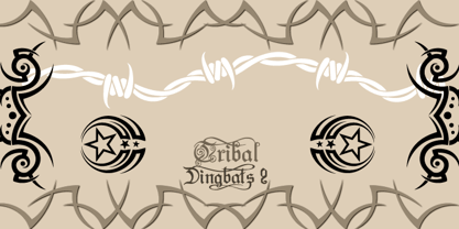
- Flemish Script II by Monotype,
$40.99Based on script handwriting and engraving used in formal announcements and invitations, the Flemish Script font lends itself to typesetting in which an elegant mood is desired. Flemish Script, Citadel, Florentine Script, and Old Fashion Script have similar lowercase letters but unique flourished capitals. Flemish Script makes a very decorative choice for labels and packaging, greeting cards and invitations. - Hebrew Dot II by Samtype,
$34.00 Beautiful font to use in Book covers and Posters.
 - Sketchy Smiley II by Hanoded,
$10.00 Another collection of assorted smileys!
 - Andrea Handwriting II by StuArt,
$9.00 Since the release of the first Andrea Handwriting in 2008, requests have come in for additional weights of the four variants in the font family. Andrea Handwriting II includes 16 fonts featuring four weights of the four original styles in the first release which have been improved for a more polished look, but still with a personal and casual feel. Sixteen styles – what’s your type?
 - II Increments Sans by Increments,
$19.00 Informed by classic grotesk proportions and principles within musical theory, II Increments Sans results in a rhythmic and composed sans-serif. Set within a structured grid, the intonation and harmony between its functional principles and emotive characteristics allow for use at both text and display sizes.
 - Florentine Script II by Monotype,
$29.99Based on script handwriting and engraving used in formal announcements and invitations, the Florentine Script font lends itself to typesetting in which an elegant mood is desired. Florentine Script, Citadel, Flemish Script, and Old Fashion Script have similar lowercase letters but unique flourished capitals. - Rotis II Sans by Monotype,
$50.99 Developed over several years by the late Otl Aicher and first released in the late 1980s, the Rotis® typeface has become a timeless classic. ROTIS II SANS HISTORY Aicher was a renowned German designer and corporate image consultant. He created the four basic designs of Rotis – sans serif, semi sans, semi seif and serif – within an extended typeface family concept, wherein all designs share a common cap height, lowercase x-height, basic stem weight and general proportions. While each version is part of the large, integrated family, each was also designed to function on its own as a distinctive typestyle. The result is that all members of the Rotis family combine smoothly with each other. Aicher, however, did not design the Rotis family with the weights and proportions normal for more contemporary releases. Rotis Sans Serif, for example, was drawn with just six weights and only two italics. Starting in 2010, Robin Nicholas, senior designer for Monotype Imaging in the UK, and freelance designer Alice Savoie collaborated to bring Rotis Sans Serif up to current standards. The result is Rotis II Sans, a completely new addition to the Rotis family. “We devised our approach together,” recalls Savoie, “deciding which weights to start with, what kind of alterations to make to the original Rotis, etc. I went to work on the typefaces, regularly submitting proofs to Robin. We would then decide in tandem on the next steps to take.” Nicholas elaborates, “We revisited the range of weights and added matching italics so that the new additions to the family offer increased versatility. We optimized the outlines, corrected the weight of several letters and re-examined overall spacing and kerning. In addition to a new set of numerals, with a height similar to the capitals, we also drew case-sensitive punctuation.” ROTIS II SANS USAGE The new Rotis II Sans suite comprises 14 typefaces: seven weights, ranging from extra light to black, each with a companion italic. The designs are available as OpenType® Pro fonts, allowing for automatic insertion of ligatures and fractions. Pro fonts also offer an extended character set supporting most Central European and many Eastern European languages. Aicher’s original Rotis designs were widely used for branding and advertising. With the addition of Rotis II Sans, the family is again poised to become a powerful communicator.
 - Capital Ideas NF by Nick's Fonts,
$10.00A new series of eclectic decorative initials, Capital Ideas 1 NF features numbers and uppercase letters rendered in nixietube displays, along with a whimsical walk through the alphabet patterned after Milton Glaser's Hologram. Capital Ideas 2 NF features K. H. Schaefer's eponynmous Versalien for Schriftguss AG in 1927, and Walter Haettenschweiler's Breitfette Unziale from 1958, along with a fancy nine-element box border. Dressing up your next projects with these snappy caps is, indeed, a capital idea. - Gan Eden MF by Masterfont,
$59.00 Fresh round strokes look so childish and happy.
 - Chianti BT WGL by Bitstream,
$49.00Chianti was designed at Bitstream by senior designer Dennis Pasternak in 1991 and initially released in 1995. The intent behind the design was to provide a humanist sanserif of high readability at a wide range of sizes and weights. Humanist sanserifs (others that fall into this category are Linotype’s Frutiger and Optima, and Monotype’s Gill Sans) are an attempt to improve the readability of sanserifs by applying classical roman structure to the letterforms. To enhance its versatility, Mr. Pasternak designed a wide variety of alternate characters, rare ligatures, ornaments and swashes. Chianti is a friendly sanserif useful for a broad range of typographic needs.


