10,000 search results
(0.045 seconds)
- Another by Supersemarletter,
$10.00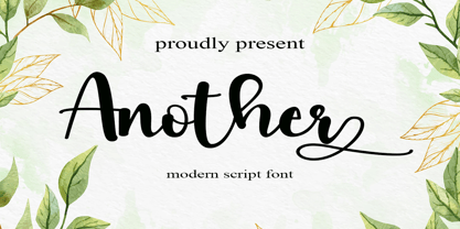 Another is a flowing handwritten font, described by an elegant touch, perfect for your favorite projects. Fall in love with its incredibly distinct and timeless style and use it to create spectacular designs! Provide ligatures with special make the design letter looks incredible. Honestly it works perfectly for headlines, logos, posters, packaging, T-shirts and much more. Font Features : • Regular version • Character set A-Z in uppercase and lowercase • Ligatures in Lowercase and special • Alternates option • Numerals & Punctuation • Accented Characters • Multiple Languages Supported Recommended to use in Adobe Illustrator or Adobe Photoshop with opentype feature. If you have questions, just send me a message and I'm glad to help.
 - Whisky Italics by Corradine Fonts,
$24.95 Whisky is a blackletter font family with a casual touch that makes it look friendly and current. The stroke varies its thickness and angle endings making it form very dynamic bodies of text. Whisky Italics are the corresponding versions to the original Whisky fonts made to complement the family with a new style. Like the original Whisky family Whisky Italics includes seven weights, each with a fill and a inline version that allow you to develope more colorful applications overlaping them as layers. Also by using Open Type features you can access to an extended set of characters wich contains swashes and alternative endings to make more playful compositions.
 - Archipelago - Unknown license

- DigiBo by Volcano Type,
$29.00 Inspired by a scoreboard of the public transport in London our best selling font family is the basic font for the german magazine Starshot and even earned feedback from Sports Illustrated. The technical look of the entire DigiBo family is making the font a worthy member of the Eurostile / DIN -league.
 - Ian Segoe by Ingrimayne Type,
$6.00 The faces of IanSegoe were early attempts by IngrimayneType to construct medieval-looking faces. They drew inspiration from several medieval-themed fonts that were available at the time (1990). The upper-case letters are similar but not identical in the two faces but the lower-case letters are completely different.
 - Barbara Script BH by BluHead Studio,
$25.00 Barbara Script is an OpenType font released by BluHead Studio. Based on the handwriting of a friend, Barbara Script is a connecting typeface that uses the OpenType ligature and contextual swash features to substitute 59 ligatures and 93 alternates to automatically recreate the look and feel of natural variations in handwriting!
 - Creeps by Nerfect,
$30.00Creeps is based on a series of drawings by Britton Walters. You can't escape the Creeps, they are everywhere! Be they looking at you funny on the bus or telling you about their collection of chicken bones in the break room at work. There is a little creep in us all. - Circuito by Katherin Funez,
$10.00 Looking for a font that give you an electrifying feeling? Circuito is a fun display font that can be used in your projects to give some character and style to your design. Inspired by the visual representation of electrical circuits, Circuito is the font that is energetic, happy and daring.
 - Pastry Shop JNL by Jeff Levine,
$29.00 In the 1960 edition of Sam Welo’s “Studio Handbook – Letter and Design for Artists and Advertisers” you’ll find a bold, hand lettered Art Deco sans serif typeface designed by Welo with a decidedly 1930s-1940s look. This is now available as Pastry Shop JNL, in both regular and oblique versions.
 - Practice Sketch by Jehansyah,
$9.00 Practice Sketch This sketch font is perfect for your needs to look elegant and dignified, a luxurious impression will be seen when you use it, aesthetic and modern, very suitable for types of designs that want to look stylish. Thank you very much
 - Redynand Script by Strong,
$21.00 Redynand Script is a soft and sweet Bold typeface, with characters dancing along the baseline. It has a casual and elegant touch. Can be used for various purposes such as logos, wedding invitations, headings, t-shirts, letterheads, signage, labels, news, posters, badges etc. OpenType features with alternative styles, ligatures, and multiple language support. To enable the OpenType Stylistic alternative, you need a program that supports OpenType features such as Adobe Illustrator CS, Adobe Indesign & CorelDraw X6-X7, Microsoft Word 2010 or later. How to access all alternative characters, using the Windows Character Map with Photoshop: https://www.youtube.com/watch?v=Go9vacoYmBw How to access all alternative characters using Adobe Illustrator: http://youtu.be/iptSFA7feQ0 There are additional ways to access alternatives/swashes, using the Character Map (Windows), Nexus Font (Windows), Font Book (Mac) or a software program such as PopChar (for Windows and Mac). Need help? If you need help or advice, please contact me by email. Thank you!
 - Elephant Party by Breauhare,
$19.99 Elephant Party playfully dances along its baseline in bold and rounded style. This warm and friendly whimsical design has lots of trunk space and is reminiscent of groovy ‘60s and ‘70s typography where letter spacing was admittedly tight, but cozy. Like snuggling up to a warm fire while toasting marshmallows. Like snuggling under a warm blanket. Like, well, you get the point. Elephant Party is an equitable font that includes a diversity of multilingual support, and will communicate your message with a funky, retro vibe and festive mood. It’ll break out into a happy dance across a wide variety of your design projects ranging from children’s books, t-shirts, posters, logotypes, product packaging, merchandise, branding and beyond. And it’ll groove across a variety of environments from print to digital media. So come on in, join the “Party”, it’s ELEPHANTASTIC! Digitized by John Bomparte.. ***Breauhare’s My Left Hand font makes a cameo appearance on the poster of Chocolola bars.
 - Arteliria Script by Rifa Studio,
$16.00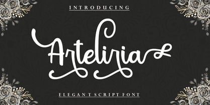 Arteliria Script is a soft and sweet calligraphic typeface, with the characters dancing along the baseline. It has a casual and elegant touch. Can be used for various purposes such as logos, wedding invitations, headings, t-shirts, letterheads, signage, labels, news, posters, badges etc. OpenType features with alternative styles, ligatures, and multiple language support. To enable the OpenType Stylistic alternative, you need a program that supports OpenType features such as Adobe Illustrator CS, Adobe Indesign & CorelDraw X6-X7, Microsoft Word 2010 or later. How to access all alternative characters, using the Windows Character Map with Photoshop: https://www.youtube.com/watch?v=Go9vacoYmBw How to access all alternative characters using Adobe Illustrator: http://youtu.be/iptSFA7feQ0 There are additional ways to access alternatives/swashes, using the Character Map (Windows), Nexus Font (Windows), Font Book (Mac) or a software program such as PopChar (for Windows and Mac). Need help? If you need help or advice, please contact me by email. Thank You!
 - Blantone by Nk Studio,
$18.00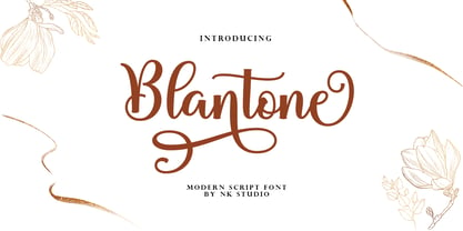 Blantone Script is a soft and sweet calligraphic typeface, with the characters dancing along the baseline. It has a casual and elegant touch. Can be used for various purposes such as logos, wedding invitations, headings, t-shirts, letterheads, signage, labels, news, posters, badges etc. OpenType features with alternative styles, bindings, and multiple language support. To enable the OpenType Stylistic alternative, you need a program that supports OpenType features such as Adobe Illustrator CS, Adobe Indesign & CorelDraw X6-X7, Microsoft Word 2010 or a later version. How to access all alternative characters, using the Windows Character Map with Photoshop: https://www.youtube.com/watch?v=Go9vacoYmBw How to access all alternative characters using Adobe Illustrator: http://youtu.be/iptSFA7feQ0 There are additional ways to access alternatives/swashes, using the Character Map (Windows), Nexus Font (Windows), Font Book (Mac) or a software program such as PopChar (for Windows and Mac). Need help? If you need help or advice, please contact me by email. Thank You!
 - Herencia by Sudtipos,
$39.00 A script designed by Diego Giaccone and digitized by Alejandro Paul. A beautiful and sophisticated rough calligraphy for in packaging, cards, etc.
 - Ace Crikey - Unknown license

- Disco Rendezvous by Wing's Art Studio,
$20.00 Disco Rendezvous: An Adaptive Font Pair Inspired by Neon Soaked Club Culture Combining an elegant script and a tall sans serif font, Disco Rendezvous is a perfectly contrasted design that evokes the golden-age of disco, inspired by neon soaked night clubs and epic dance floor hits. The superstar of this show is the highly customisable script that takes full advantage of OpenType features to offer countless creative options via alternative characters and automatic ligatures, giving your headers and title designs an authentically hand-made look. It features a complete set of uppercase and lowercase characters, along with numerals, punctuation and language support, and used with the included Sans Serif font pair you have a perfectly matched type treatment.
 - Old Miami Beach JNL by Jeff Levine,
$29.00 The grandeur of what was Miami Beach had its golden years peak in the 1940s. One of the grande dame hotels that stood at Collins Avenue and 23rd Street was the Roney Plaza; built in the 1920s and demolished around 1969. An online auction offered a pair of gummed labels provided by the hotel to be used by their guests for shipping souvenir packages back home, thus also giving the hotel a promotional plug. Jeff Levine not only created two typefaces from this hand-lettered label - Old Miami Beach JNL and Old Miami Beach Nights JNL (a solid black version), but painstakingly recreated the look of the label for the promotional flag and banner for the fonts.
 - Blacklist by Great Studio,
$18.00 Blacklist is a high-contrast typography inspired by transitional and contemporary typography. Fonts extend their use by giving weights ranging from thin to black. The natural curve, a swollen and sloping stem, grows in character as the font gains weight. While the thinner weight has lowered contrast and optical correction to create a warm and soft look. Featuring beautiful italics, excellent weight and extensive language support. Blacklist excels in display settings such as headlines, titles, branding projects, Logo design, packaging, magazine headings, advertising, short or long text. Blacklist also comes with two versions of Variable Regular and Italic to make it easier for designers to explore and perfect beautiful designs, unearthing lots of visual tones and hidden secrets.
 - Groovy 3D Caps JNL by Jeff Levine,
$29.00 It all started with a simple idea back in 1998: do a digital version of a "lost" 70's typeface, and make up the missing letters that were not present in the only available example Jeff Levine had to work with. Jeff wasn't yet doing his own digital font creation, so he hooked up with Brad Nelson who owns a small foundry called Brain Eaters Fonts. Together, they collaborated on "Action Is"- a freeware font named after the source of the type example. This was a title page for a commemorative photo album of images from the 60's TV music show "Where the Action Is", formerly hosted by Jeff's employer at the time, singer-writer-producer Steve Alaimo. The free font took off like a rocket, being released just at the peak of the 60’s/70’s retro craze in the late 1990’s, and it was EVERYWHERE! It showed up on TV shows, packaging and web design -- and was even spotted on signage used on the side of a major amusement resort’s retro-themed hotel. From that point on, Jeff kept getting requests for a version with a lower case. Although they shared the copyright in the freeware version, Brad Nelson gave Jeff his blessing to re-work and take Action Is into the realm of commercial type. Newly improved and re-released as Groovy Happening JNL, it became one of Jeff's better selling type designs. A simplified, yet similar font was issued called Groovy Summer JNL. Now, after about a decade, Jeff had decided to clean up the 3-D (drop shadow) version that was originally freeware with many minute design flaws and re-release it commercially. Groovy 3D Caps JNL is an all-caps, limited character set font which ties in well with the previous releases, yet retains itís 1960s-1970s era charm. The font flag art is courtesy of Barbara D. Berney and is used by permission.
 - Shields BKL by Bakeel Studio,
$30.00 Shields is a unique and versatile typeface that can be used for a variety of applications, from branding to editorial design. Its bold and modern look makes it a great choice for titles and headlines. Its letterforms have been carefully crafted to ensure a consistent look across all sizes, while its open counters provide a unique, yet subtle touch. With its refined details and balanced shapes, Shields is the perfect typeface to create an eye-catching presence.
 - Ornate Blackboards by Intellecta Design,
$16.90Ornate Blackboards is a beautiful collection of ornaments from Intellecta Design, excellent for use in works of art and editorial publications, like book covers, headpieces to sections of books, magazines, packaging works, and many other solutions. Good to use with roman versals, chiseled fonts and many other different kinds of typefaces. - Korobok Edgy by FontaZY,
$25.00 Korobok mean "little box" in Russian. Korobok is irregular font with asymmectric serifs and slightly geometric appearance. This font is good for children books, comic books, videogames and package design. Korobok comes in two sub-families - Korobok Soft (with smooth edges) & Korobok Edgy (width straight edges), both includes 4 styles.
 - Korobok Soft by FontaZY,
$25.00 Korobok mean "little box" in Russian. Korobok is irregular font with asymmectric serifs and slightly geometric appearance. This font is good for children books, comic books, videogames and package design. Korobok comes in two sub-families - Korobok Soft (with smooth edges) & Korobok Edgy (width straight edges), both includes 4 styles.
 - Plain Stupid by PizzaDude.dk,
$17.00 Really, there is nothing stupid about this font. In some strange and weird way, I just thought that the name sounded like something eye-catching - in the same way that the font is eye-catching! It may look like your average comic font, but it's not! I carefully put a lot of funk, twist, comic and a spoonful of pizzadude into each and every letter. The result is a bouncy crazy looking comic font. Oh, I almost forgot - I topped the letters with a spoonful of grafitti mixed with the sounds of a party...that's the recipe for this lovely multilingual font! :)
 - Manualist by Invasi Studio,
$19.00 Meet Manulist, your new go-to font for a natural hand-drawn look full of charm! With its all-caps style and big uppercase letters, this font exudes a classic elegant look. But wait, there's more! Manulist also comes with elegant alternates, adding a touch of sophistication to your designs. And that's not all - this font supports multilingual characters, so you can spread the fun and creativity in any language you desire. Plus, every character in Manulist has a delightful imperfect shape, giving your designs a unique and organic feel. It's like having your own personal hand-drawn masterpiece in every letter!
 - Grumpy by Suomi,
$40.00 An extreme headline font with six optical variants. Black 24 is loosely based on ITC Grouch (1970) by Tom Carnase. It has some 2000 hand-adjusted kerning pairs for TNT (that’s Tight, Not Touching), a very popular type treatment from the seventies and eighties. Take your pick, or get them all, so you don’t have to buy another one later on.
 - Plantin Infant by Monotype,
$29.99Plantin is a family of text typefaces created by Monotype in 1913. Their namesake, Christophe Plantin (Christoffel Plantijn in Dutch), was born in France during the year 1520. In 1549, he moved to Antwerp, located in present-day Belgium. There he began printing in 1555. For a brief time, he also worked at the University of Leiden, in the Netherlands. Typefaces used in Christophe Plantin's books inspired future typographic developments. In 1913, the English Monotype Corporation's manager Frank Hinman Pierpont directed the Plantin revival. Based on 16th century specimens from the Plantin-Moretus Museum in Antwerp, specifically a type cut by Robert Granjon and a separate cursive Italic, the Plantin" typeface was conceived. Plantin was drawn for use in mechanical typesetting on the international publishing markets. Plantin, and the historical models that inspired it, are old-style typefaces in the French manner, but with x-height that are larger than those found in Claude Garamond's work. Plantin would go on to influence another Monotype design, Times New Roman. Stanley Morison and Victor Larent used Plantin as a reference during that typeface's cutting. Like Garamond, Plantin is exceptionally legible and makes a classic, elegant impression. Plantin is indeed a remarkably accommodating type face. The firm modelling of the strokes and the serifs in the letters make the mass appearance stronger than usual; the absence of thin elements ensures a good result on coated papers; and the compact structure of the letters, without loss of size makes Plantin one of the economical faces in use. In short, it is essentially an all-purpose face, excellent for periodical or jobbing work, and very effective in many sorts of book and magazine publishing. Plantin's Bold weight was especially optimized to provide ample contrast: bulkiness was avoided by introducing a slight sharpening to the serifs' forms." - Plantin Headline by Monotype,
$29.00Plantin is a family of text typefaces created by Monotype in 1913. Their namesake, Christophe Plantin (Christoffel Plantijn in Dutch), was born in France during the year 1520. In 1549, he moved to Antwerp, located in present-day Belgium. There he began printing in 1555. For a brief time, he also worked at the University of Leiden, in the Netherlands. Typefaces used in Christophe Plantin's books inspired future typographic developments. In 1913, the English Monotype Corporation's manager Frank Hinman Pierpont directed the Plantin revival. Based on 16th century specimens from the Plantin-Moretus Museum in Antwerp, specifically a type cut by Robert Granjon and a separate cursive Italic, the Plantin" typeface was conceived. Plantin was drawn for use in mechanical typesetting on the international publishing markets. Plantin, and the historical models that inspired it, are old-style typefaces in the French manner, but with x-height that are larger than those found in Claude Garamond's work. Plantin would go on to influence another Monotype design, Times New Roman. Stanley Morison and Victor Larent used Plantin as a reference during that typeface's cutting. Like Garamond, Plantin is exceptionally legible and makes a classic, elegant impression. Plantin is indeed a remarkably accommodating type face. The firm modelling of the strokes and the serifs in the letters make the mass appearance stronger than usual; the absence of thin elements ensures a good result on coated papers; and the compact structure of the letters, without loss of size makes Plantin one of the economical faces in use. In short, it is essentially an all-purpose face, excellent for periodical or jobbing work, and very effective in many sorts of book and magazine publishing. Plantin's Bold weight was especially optimized to provide ample contrast: bulkiness was avoided by introducing a slight sharpening to the serifs' forms." - Tambau by Tipogra Fio,
$30.00 Tambau is a display typeface crafted by Matheus “Fio” Gonçalves, a Brazilian design student, still in college, inspired by Brazilian concert urban posters and wood type that I saw at the Oficina Tipográfica São Paulo. The font was first made for a magazine project in design school, making it beautiful on giant pages headlines, billboards, signs, etc. There’s no lowercase, the character set is dramatic and objective. The uppercase is actually expanded letterforms causing some eyes and breathing paths to the very condensed and very modular glyphs, which creates a quite interesting striped texture between form, counterform and spacing. The lots of ligatures come to give it more closure between the letters, when they try to form blank spaces. So do the diacritics, fitting in the space given to them by the dynamic letterforms, making dense rectangular blocks. You may use Tambau as big as you can or do a high tracking to it and still it will be pretty. The titles can be dynamic, just condensed or just large. It’s on your own. Don’t be afraid to play with Tambau, it’s an alive typography. Curiosity: For the magazine in design school, the pilot project of Tambau was cut in a MDF board, to print it with texture and paint. Later was added more characters, languages and special glyphs to it. Set: Tambau is a singular font typeface, with extended and condensed characters, numbers, ligatures, punctuation and symbols for Basic, Western, Central and South Eastern Latin languages.
 - Hand Stamp Gothic Rough by TypoGraphicDesign,
$25.00 “Hand Stamp Gothic Rough” is based on real vintage rubber stamp letters from Germany. A classic american gothic face mixed with a modern condensed sans serif type. Rough & dirty with a authentic hand stamped look for a warm analogue vintage charm. It started analogous with only a few rubber stamps and finally it was digital 776 glyphs. With 4 × A–Z, 4 × 0–9, 4 × a–z and many other alternative glyphs like @. Plus modern OpenType Features like contextual alternates (automatic generated loop for letter variation). The different variations from the dynamic pressure by hand intended to show the hand-made nature and creates a liveliness in the display font. The font has 80 decorative extras in the form of symbols & dingbats like arrows, hearts, smileys, stars, further numbers, lines & shapes. A range of figure set options like oldstyle figures, lining figures, superiors & inferiors. Additionally standard ligatures, decorative ligatures (type the word “show” for ☛ and “love” for ❤ … ), Versal Eszett (German Capital Sharp S) and many emojis & symbols. Example of use It’s your turn … for example everywhere where it makes sense. The hand stamped font would look good at headlines. Advertising (big headlines), Corporate Design (type for logos & branding), Editorial Design (magazine or fanzine headlines), Product Design (typographical packaging) or Webdesign (headline webfont for your website), flyer, poster, music covers or web banner … How To Use – awesome magic OpenType-Features in your layout application: ■ In Adobe Photoshop and Adobe InDesign, font feature controls are within the Character panel sub-menu → OpenType → Discretionary Ligatures … Checked features are applied/on. Unchecked features are off. ■ In Adobe Illustrator, font feature controls are within the OpenType panel. Icons at the bottom of the panel are button controls. Darker ‘pressed’ buttons are applied/on. ■ Additionally in Adobe InDesign and Adobe Illustrator, alternate glyphs can manually be inserted into a text frame by using the Glyph panel. The panel can be opened by selecting Window from the menu bar → Type → Glyphs. Or use sign-overview of your operating system. For a overview of OpenType-Feature compatibility for common applications, follow the myfonts-help http://www.myfonts.com/help/#looks-different ■ It may process a little bit slowly in some applications, because the font has a lot of lovely rough details (anchor points). Technical Specifications ■ Font Name Hand Stamp Gothic Rough ■ Font Weights Regular & Dirty (Bold) ■ Font Category Display for headline size ■ Font Format.otf (OpenType Font for Mac + Win) ■ Glyph Set 776 glyphs ■ Language Support Basic Latin/English letters, Central Europe, West European diacritics, Turkish, Baltic, Romanian, OpenType Features, Dingbats & Symbols ■ Specials Alternative letters, stylistic sets, automatic contextual alternates via OpenType Feature (4× different versions of A–Z & 0–9 + a–z), Euro, kerning pairs, standard & decorative ligatures, Versal Eszett (German Capital Sharp S), 80 extras like Dingbats & Symbols, arrows, hearts, emojis/smileys, stars, further numbers, lines & shapes. ■ Design Date 2016 ■ Type Designer Manuel Viergutz ■ License Desktop license, Web license, App license, eBook license, Server license
 - Let's Jazz by Unio Creative Solutions,
$9.00 Introducing “Let’s Jazz” - a playful typeface which is inspired by iconic mid-century American advertising and lettering. With this project we wanted to homage the dazzling graphics of those booming years and the result is a jazzy typeface that provides a condensed aspect with a bouncy rhythm. As previously said, Let’s Jazz gives the spontaneous vibe of this sensational music genre but it has been also designed with a strong focus to the very distinct look of Saul Bass graphics, which are honestly still fresh and convincing, even nowadays. Let’s Jazz offers two versions, Regular and Stamp. Each version contains more than 450 glyphs and covers several languages based on the Latin alphabet; the jazzy experience is enhanced with OpenType (OTF) support for small caps and includes some neat ligatures and alternates plus the oldstyle bouncy numerals*. This package is a powerful tool in a wide variety of design purposes: headlines, packaging, logotypes, badges, posters and much more. *Let’s Jazz has built-in OpenType features enabled for Adobe® Creative Suite® and any other opentype capable software. All the extra characters has been additionally coded with “PUA Unicode”, which basically means that this font duo is totally accessible without any additional design software. All the extra characters can now be copied straight out the FontBook (Mac) or CharacterMap (Win) and pasted into your favorite text editor. Official mini-tutorials available here: - How to access alternates, ligatures and swashes in Font Book®: https://youtu.be/mGKlvKr0ReI - How to use alternates, ligatures and swashes in Photoshop®: https://youtu.be/46ZtDbHwUAc Specifications: - Multi-language Support (Central, Eastern, Western European languages) - OpenType features (Standard and Discretionary Ligatures, Alternates, Small Caps, OldStyle Numerals) - PUA Coded Extra Characters Thanks for viewing, Unio.
 - Bergamo Std - 100% free

- Mundbind DK by PizzaDude.dk,
$15.00 A few days ago, my good friend David from Hanoded.com visited me for a few days. We drank a lot of coffee and walked the streets of Copenhagen - we even took a trip up in Rundetårn! :) Well, on one of our walk (of course looking for inspiration for new fonts) we spotted this handmade sign. We agreed to make a font of the 7 letters available, using our own imagination and style! I called my font Mundbind DK and David named his Mundbind NL - of course it is the landcodes of Denmark and Holland. As you can tell, the font is uneven and somewhat unpredictable - following only the "rules" of the person who handprinted that sign ... and not many of the rules of the good old and respected painter who make beautiful signs ... however, this sign had it's beauty in a natural and innocent way.
 - Vintage Museum by Putracetol,
$24.00 Vintage Museum - Vintage Sans Display Font. Vintage Museum is inspired by the classic font style and elegant sans. Vintage Museum font makes for more good display, classic and retro lively. Vintage Museum has a surprise from alternate that will make your work even more beautiful. Vintage Museum is perfect for a professional touch which makes it even more unique and classic. But Vintage Museum is also suitable for logos, branding, greeting cards, invitation cards, advertisements, titles, healines, book titles, stickers, packaging, quotes, posters, t-shirts/apparel, billboards and others. The alternative characters were divided into several Open Type features such as Swash, Stylistic Sets, Stylistic Alternates, Contextual Alternates, and Ligature. The Open Type features can be accessed by using Open Type savvy programs such as Adobe Illustrator, Adobe InDesign, Adobe Photoshop Corel Draw X version, And Microsoft Word. This font is also support multi language.
 - Paperlight Script by Putracetol,
$20.00 Paperlight Script - Luxury Calligraphy Font. Paperlight Script is calligraphy font with a classic style and a touch of elegance, inspired by the handwriting of ancient manuscripts. This calligraphy harmony gives the impression of being luxurious, free and sophisticated. The body text of Paperlight Script font has been designed with high details, precisely, smooth and flow. Paperlight Script font carefully designed to work together harmoniously making it perfect for wedding media, book covers, greeting cards, logos, branding, business cards and certificates, even for any design work that requires classic, formal or luxurious The alternative characters were divided into several Open Type features such as Swash, Stylistic Sets, Stylistic Alternates, Contextual Alternates, and Ligature. The Open Type features can be accessed by using Open Type savvy programs such as Adobe Illustrator, Adobe InDesign, Adobe Photoshop Corel Draw X version, And Microsoft Word. This font is also support multi language.
 - MFC Whitworth Monogram by Monogram Fonts Co.,
$19.00 The inspiration source for MFC Whitworth Monogram is an alphabet set from a vintage embroidery alphabets book, Alphabets Broderies No. 238 by N. Alexandre & Cie. What began as 26 referenced capital letters has been expanded to three sets of alphabets within a single typeface. True to the original reference, the Capitals are the stylized cursive capital letters in all their gorgeousness. The lowercase encapsulates the capital letters intertwined within rectangular frame. By enabling Stylistic Alternates and typing any lowercase letter, you get each letter encapsulated and intertwined within an oval frame. A handful of decorative forms are placed in the 0-6 numeral slots. Originally intended to adorn handkerchiefs and other linens, this digital revival opens it up to a whole new realm of possibilities. This is one of many monogram designs from the late 1800's to early 1900’s that is loaded with panache and intricate detailing.
 - Microphone Check by IKIIKOWRK,
$19.00 Proudly present Microphone Check - Marker Type, created by ikiiko Microphone Check is inspired by the bold and expressive signature strokes of the 90s street hip hop movement. In that era, freestyle marking was a method of self-expression that was closely associated with the underground graffiti scene. This typeface perfectly encapsulates the vitality, attitude and resilience of life on the streets. Sharp lines with bold, bold bodies characterize this type of marker, allowing for substantial fills and bright colors to stand out on any surface. It gave them the opportunity to express their originality and creativity while leaving their mark on the urban environment. This type is very suitable for making a street wear brand, book cover, movie title, magazine layout, poster, quotes, or simply as a stylish text overlay to any background image. What's Included? Uppercase & Lowercase Numbers & Punctuation Alternates & Ligature Multilingual Support Works on PC & Mac
 - Classic Cassette by Putracetol,
$22.00 Classic Cassette - Classic Display Font. This font is inspired by the classic style and well display curves. Classic Cassette font makes for more fun, trendy and more lively. Classic Cassette has a surprise from alternate that will make your work even more beautiful. Classic Cassette is perfect for a professional touch which makes it even more unique display and classic themes. But Classic Cassette is also suitable for logos, branding, greeting cards, invitation cards, advertisements, titles, healines, book titles, stickers, packaging, quotes, posters, t-shirts/apparel, billboards and others. The alternative characters were divided into several Open Type features such as Swash, Stylistic Sets, Stylistic Alternates, Contextual Alternates, and Ligature. The Open Type features can be accessed by using Open Type savvy programs such as Adobe Illustrator, Adobe InDesign, Adobe Photoshop Corel Draw X version, And Microsoft Word. Classic Cassette is also support multi language.
 - Timesquare by Campotype,
$25.00 The initial idea of timesquare typeface inspired by Helvetica when presenting the board information on a subway escalator in Time Square, Manhattan, New York. This confirms strength the legend of Helvetica is not lost amid rampant nice fonts in the site. Therefore it should not appropriate that this timesquare fonts come to rival the greatness of Helvetica. Fonts timesquare thrive (since 2008 for self used) of the basic forms of Helvetica to timesquare born in different shapes and sizes. The greatest challenge during development timesquare is both shape similarity to Helvetica directly, as well as to other fonts inspired by Helvetica. Timesquare's main characteristics are the wide character, modern touch and individually, can work well on a wide variety of applications in books, brochures and magazines as well as applications in advertising. This typeface has been developed on the Latin character sets. Hopefully useful.


