10,000 search results
(0.02 seconds)
- Black Stanky by Artisan Studio,
$18.00 Black Stanky a work that is purely a result of handwriting, has a natural characteristic. this is perfect for invitations, signatures, blogs, social media, business cards, product brands. Black Stanky has Stylistic standard, Stylistic Initial, Stylistic Teminal and ligatures. and includes uppercase and lowercase letters, numbers and punctuation marks. Accessed by using : OpenType smart programs such as Adobe Photo Shop, Adobe Illustrator, Adobe Indesign, Corel Draw and Microsoft Office. A Total of 362 Glyphs: Multilingual Support : ŠŒŸÐÀÁÂÃÄÅÆÇÈÉÊËÌÍÎÏÑÒÓÔÕÖØÙÚÛÜÝ àñáâåäãçæìíîïòóôõöøùúûüýÿèéê뢚ߞ Ligature accesed :St dd th gg pp ff wh mm of ck on we are all wr en ex ee ve oo ox ax ss so rr ot al tt ch ll rl ct ol rt at cl az 4 alternative setst accesed : a b c d e f g h i j k l m n o p q r s t u v w x y z special greetings for all, all of us all smoothly in running the routinen
 - Shandy BF by Bomparte's Fonts,
$40.00 Shandy is a cheerful, free-spirited font that dances jauntily along an undulating baseline. Like Gene Kelly merrily cavorting through that rain-soaked street, in the famous dance scene from Singin’ in the Rain. Curiously, it’s got the liveliness of a bouncy brush script, with some elements of a robust Copperplate-style script, that appear to have been defined by a funhouse carnival mirror. In order to promote variety, no two letters are identical within most occurrences of typical lowercase double-letter pairings (bb, dd, ee, ll, nn, oo, tt, etc.) To enhance your typography, Shandy features many automatic OpenType ligatures, beginning and terminal lowercase forms and Stylistic Alternates for letters E, M and N which are accessible in OpenType-capable applications. Suitable for Branding, Logos, Product Packaging, T-shirts, Magazine headlines, Fashion Glossies, and Food Advertising to name a few arenas.
 - ED Muskrat by Emyself Design,
$9.00 ED Muskrat is a display font family that looks elegant classic and modern, this font is designed from a combination of serif and semi blackletter fonts that add a unique feel to the font. ED Muskrat has 9 styles: Thin, ExtraLight, Light, Regular, Medium, SemiBold, Bold, ExtraBold, and Black. ED Muskrat is equipped with ligatures, alternative characters, and supports multiple languages. and also this font is perfect for your design needs such as branding, poster design, books, fashion, social media design, logos, etc. Features: Stylistic alternates ( C, E, F, I, J, N, Q, S, Z ) Ligatures ( fi , fj , tt ) 9 Styles ( Thin, ExtraLight, Light, Regular, Medium, SemiBold, Bold, ExtraBold, and Black ) Multi Language Support 373 Glyphs
 - Garnet Euro Typewriter by Coniglio Type,
$19.95Garnet is a rare TT typewriter face, made digital from analog samples gathered with great care by Coniglio Type. A time and place; type and life. Garnet Euro Typewriter is the first new release by designer Joseph V Coniglio in over 5 years. It is contemporary designer type, made from the struck steel hammers of an art deco san serif face transferred from a mechanical 1926 Royal Portable typewriter. It has an obsessively complete commercial roman character set ––for the pre-opentype environment of the late 1990's. Yes, it has that great “Monopoly Game” question mark -- and all on a period-piece typewriter! You should have no trouble grafting that sorely needed Euro symbol.” –And he very well did! - Okaeri by Struvictory.art,
$14.00 Okaeri is a linear display font inspired by Japanese aesthetics, uppercase is decorated with oriental patterns. Okaeri is suitable for typographic posters in oriental style. The font is also suitable for menu and restaurant design, tourist products, magazine and book covers, thematic events design. The font works great both for printing clothes and craft products branding and packaging. Also use individual letters to create logos and monograms. Okaeri includes stylistic alternates for symbols: a, i, o, u. There are also ligatures: aa, ca, ea, ee, ff, ka, ki, la, li, ra, ri, oo, tt, za.
 - Riseria by Alit Design,
$24.00 Introducing "Riseria" – a bold and avant-garde typeface that seamlessly blends the raw power of brutalism metal with the intricate elegance of blackletter, enhanced by haunting thorn decorations. This font is a striking testament to the fusion of divergent design elements, resulting in a visually arresting and unique typographic experience. With 839 meticulously crafted characters, Riseria stands as a versatile typeface that transcends conventional boundaries. Its design exudes an industrial and unapologetically bold aesthetic, drawing inspiration from the robustness of brutalist architecture and the mystique of blackletter scripts. The fusion of these elements creates a harmonious balance between strength and intricacy, making Riseria an ideal choice for projects that demand a powerful and visually captivating presence. The font boasts a comprehensive set of ligatures, allowing characters to seamlessly merge and create a fluid and organic appearance. Alternatives provide additional flexibility, enabling users to experiment with different stylistic variations for a truly customized look. Riseria's multilingual support ensures its adaptability across a wide range of languages, making it a globally accessible and inclusive typographic tool. One of the most distinctive features of Riseria is its spine-chilling thorn decorations. These frightening adornments add an element of darkness and mystique to the font, elevating it beyond mere letters and transforming it into a visceral and evocative design element. The thorns, intricately intertwined with the characters, create an otherworldly aura that is both mesmerizing and unsettling. In essence, Riseria is not just a font – it's an artistic statement that pushes the boundaries of conventional typography. Whether used in branding, album covers, posters, or other design projects, Riseria is sure to leave an indelible mark with its brutalist metal aesthetics, blackletter charm, and spine-tingling thorn decorations.
 - Shiver Me Timbers NF by Nick's Fonts,
$10.00Avast, me hearties! Here be a serious pirate font, based loosely on several of Victor Hammer’s uncial typefaces, designed between 1925 and 1953, and liberally weathered and corroded for that authentic barnacle-encrusted look. The bullet character is suitable for marking where the treasure is buried, and the section mark is a Jolly Roger. Both versions of the font include 1252 Latin, 1250 CE (with localization for Romanian and Moldovan). - Shmulkas by Fontsoon,
$9.00 Nu?! Vhat else vould you font?! Introduction to the first kosher vant...er...font! Yes, our Board certified rabbis made all the proper blessings so you can use this font guilt free. Just kidding, what's Jewish without a schmear of guilt. This font borrows its style from the 2nd. Avenue Deli all the way down to Guss Pickles on Essex street. If pastrami on white bread with ketchup is for you, this font is NOT. Its strictly pastrami on rye with mustard and slaw on the side.
 - VLNL Bleek by VetteLetters,
$35.00 Bleek started its life as a logo for a rock band with the same name. This makes sense as it has distinct roots in classic rock logo design. Any rock band name set in VLNL Bleek looks instantly cool – profi logo quality! Of coarse Bleek will serve an awesome purpose as a headline font as well. Or gig flyers and posters. Or band backdrops. Just turn it up to 11! DBXL expanded the original logo into the full Heavy weight and added Light and Medium cuts. VLNL Bleek is an all caps font with uppercase and lowercase variations for maximum effect. It has a number of Open type features, like and alternate F, mirrored A and O and a TT ligature to spice up your designs. VetteLetters says: Rock on!
 - Cyberend by Alit Design,
$19.00 Introducing "Cyberend" – a font that seamlessly marries the raw, edgy aesthetic of cyberpunk with the precision of square pixels and the sleek modernity of italic serifs. As the digital world converges with futuristic design, Cyberend emerges as the quintessential typeface for those seeking a cyberpunk-inspired typographic experience. Dystopian Elegance: Cyberend encapsulates the essence of cyberpunk, embodying a dystopian elegance that effortlessly blends chaos and sophistication. The font's italic serifs add a touch of rebellion and forward momentum to every character. Pixelated Precision: Immerse yourself in the pixelated precision of Cyberend, where each character is meticulously designed with square pixels. The result is a sharp, high-tech appearance that resonates with the digital landscapes of cyberpunk aesthetics. Versatile Impact: From gaming interfaces to film titles, Cyberend makes a bold statement in any digital or print medium. Its versatility allows you to infuse cyberpunk vibes into logos, posters, websites, and more, giving your projects a distinctive and immersive feel. Futuristic Legibility: Despite its cyberpunk flair, Cyberend prioritizes legibility. Each character is crafted to ensure readability, maintaining a perfect balance between avant-garde design and practical functionality. Unleash the power of Cyberend to transport your audience into a cyberpunk-inspired future. Whether you're designing for tech enthusiasts, gamers, or cyberpunk aficionados, this font is your gateway to a digital realm where style meets rebellion. Upgrade your typographic game with Cyberend and let your creations transcend the boundaries of conventional design.
 - Full Sans by Bülent Yüksel,
$19.00 Full Sans is a geometric sans in the tradition of Futura, Avant Garde and the like. It has a modern streak which is the result of a harmonization of width and height especially in the lowercase letters to support legibility. Full Sans is the younger brother of original Full Neue, Full Slab and Full Tools. Ideally suited for advertising and packaging, editorial and publishing, logo, branding and creative industries, poster and billboards, small text, wayfinding and signage as well as web and screen design. Full Sans provides advanced typographical support for Latin-based languages. An extended character set, supporting Central, Western and Eastern European languages, rounds up the family. The designation “Full Sans LC 50 Book” forms the central point. The first figure of the number describes the stroke thickness: 10 Thin to 90 Bold. Full Sans LC comes 5 weights and italics also Full Sans SC comes 5 weights and italics total 20 types. The family contains a set of 485 characters. Case-Sensitive Forms, Classes and Features, Small Caps from Letter Cases, Fractions, Superior, Inferior, Denominator, Numerator, Old Style Figures just one touch easy In all graphic programs. Full Sans is the perfect font for web use. You can enjoy using it. UPDATE: 08 March 2019 - Fixed extension of glyhps "y" and "g". - "LineGap" error has been fixed. - Fixed bug in "onum", "pnum", "tnum" and "tnum" software in OpenType feature.
 - Heller Sans JNL by Jeff Levine,
$29.00 Heller Sans JNL is based on the main letterforms of an experimental alphabet designed by Steven Heller; noted author of over 170 books on design and visual culture. Some modifications were made in turning his design into a digital font. In his own words, here is the background to this typeface: “I recently recovered this from the junk heap. It is a yellowing photostat of my first and only typeface design (1969-70). Total folly! At the time I was smitten by Art Moderne lettering. I called it “Klaus Boobala Bold” because I liked the K and B. I’ve lost the letters S through Z, which were made. The letters were drawn with compass, Techno pen (that frequently clogged). as well as a triangle and T-square. The inline and outline made no real logical sense. I based the design, in part, on Kabel, Avant Garde and it was a product of whatever I could accomplish with those tools. The caps-only alphabet was photographed and produced as a film negative that was cut in foot-long strips and spliced to fit on a Typositor reel. Sadly, the negatives made for the font were too brittle and the splice snapped apart in the Typositor. I worked on it for well over a month and used the face only once. I realized with this attempt, like so many other times I attempted different challenges, that type design — indeed mechanical drawing — was not my strong suit.” Heller Sans JNL is available in both regular and oblique versions.
 - Jumping Jess by The Mafia Rabbit Foundry,
$9.99 Jumping Jess is a high quality decorative typeface making use of Stick Figures in various playful jumping poses to depict the letters A-Z. Numbers, symbols and punctuation are composed of elements from the Stick Figure design to visually complement the letters of the alphabet. With a comprehensive set of Ligatures and hundreds of Hand-kerned pairs, Jumping Jess was developed to look great with any string of letters. This font is suitable for greeting cards, sports posters, logos, signage, menus, wedding invitations, product packaging, craft, children's writing, t-shirts, quotes, social media page covers, large format event banners, book covers, magazine title pages and so much more. We highly recommend using an application that supports Open Type features. Ligatures will better display double consonants like "TT" and "LL" and other character combinations like "SH" and "ZY". Ligatures are enabled by default on some applications like Notepad and Photoshop but disabled by default on others like Word and Paintshop. FEATURES Uppercase alphabet 50+ Ligatures, 400+ Kerning Pairs Full range of numbers, symbols & punctuation Comprehensive language support* * ISO-8859-1, ISO/IEC 8859-15, Windows-1252 (e.g. French, German, Polish, Spanish, Italian, Portuguese, Finnish, Norwegian, Swedish, ...)
 - Tartaria by Dima Pole,
$29.00 The font is devoted to the historical past of the peoples of Europe, which today is hidden, but which can not be lost forever, because it lives in the genetic memory and hearts of people. Beautiful font in the historical traditions of 17-19 centuries. Elegant, luxurious, sweet. Some forms and combinations of forms are not always ordinary, but always interesting and exciting. - Letters for all Latin alphabets - Letters for all Slavic alphabets - Ligatures. All standard (ff, fi, fj, etc.) as well as fb, fk, tt, ft - Stylistic alternates a, y, g - Ordinals - Fractions - Historical forms of letters s, я - Historical ligatures ss, si, st - Historical Slavic letters - Lowercase alternates for ж, к, я, ect. - National ligatures: German ss, Icelandic and French ae, oe, Dutch ij - Uppercase German SS (Eszett Große) - Currencies: dollar, ruble, euro, pound, cent, yen and more...
 - Okojo Pro by Wordshape,
$20.00 The Okojo Pro Complete family is a reworking of Wordshape’s immensely popular Okojo family of typefaces. It includes Okojo Pro, a semi-geometric sans serif, Okojo Slab Pro, a semi-geometric slab serif, Okojo Pro Display, a round-cornered sans serif variation, and Okojo Slab Pro Display, a round-cornered slab serif. The entire Okojo Pro family looks great at small or large sizes. The Okojo Pro family is designed for readability in long texts while simultaneously functioning as effective display type. Features of Okojo Pro Display: - all lowercase characters have an enlarged x-height, creating less optical dazzle than typefaces like Futura, Neutra or Avant Garde - more humanist numerals and punctuation for enhanced readability - complete Western, Central and Eastern European characters sets - radically improved spacing guaranteeing beautiful results in print and on screen for the Czech, English, Hungarian, Croatian, Esperanto, Maltese, Romanian, Turkish, Albanian, French, Portuguese, Spanish, Basque, Bulgarian, Finnish, Swedish, Norwegian languages The Okojo Pro Display family is influenced by the type designs of Paul Renner and Herb Lubalin, but smoothed over with more than a bit of Americana. Both work well on-screen as webfonts and in print as book type. Each is hinted with accuracy and kerned with precision.The lighter weights are slightly slimmer than the regular and bold weights to give the typeface more of a vertical feel, inviting readers' to rapidly read typeset text with a maximum of contrast and a minimum of optical distortion. Okojo: it’s a little bit country and a little bit rock’n’roll.
 - Balbek by Valentino Vergan,
$16.00 Introducing “Balbek” – A modern “condensed” sans serif ligature typeface. Designed by graphic designer Martin Katibi. The balbek font is an eye catching heavy and condensed sans serif type face. The inspiration for this font were other condensed sans serif such as Gabo Drive and Impact. The Balbek font is great for use on headlines, advertisements, product packaging, newspapers and posters. Balbek fully supports multilingual characters, it also come with a full set of alternative uppercase letters, ligature and small cap. All these features will make your next project standout. The font comes in eight styles, which are Regular, Cut, Outline and Soft. Each of these font styles comes with an oblique version. If you are looking for something modern and eye catching for you next project, Balbek is the font for you. WHAT YOU GET: Balbek Regular.otf Balbek Oblique.otf Balbek Cut.otf Balbek Cut Oblique.otf Balbek Outline.otf Balbek Outline Oblique.otf Balbek Soft.otf Balbek Soft Oblique.otf BALBEK INCLUDES A FULL SET OF: Uppercase and lowercase letters. Numbers. Punctuation. Ligatures. Alternates. Small Caps. Multilingual symbols. Here is a short list of some of the unique ligatures: AB AD Æ AF AH AK AL AM AN AP EH EK EM ET FT HE LH LK LM MB MD ME MM MP NE NN Œ TE TH TT TU THE Th ZH ZK ZM æ ? fj ? ? ft ? œ tt ty We hope you enjoy using the Balbek Font.
 - Le Tarot by Struvictory.art,
$16.00 Le Tarot is a modern serif font with celestial motives. The font is created in classic proportions and decorated with the moon and stars. Le tarot includes stylistic alternates and ligatures. The font is suitable for the design on the theme of astrology, mysticism, spirituality, witchcraft, magic, esotericism. Le Tarot has extensive language support, it includes English, French, German, Italian, Spanish, Portuguese, Danish, Norwegian, Swedish, Finnish, Estonian, Turkish. Le Tarot includes stylistic alternates for symbols: A, a, D, d, G, g, J, j, M, m, O, o, T, t, U, u, W, w. There are also ligatures: Ka, La, Ma, OO, Ra, aa, am, ka, ko, la, lo, ma, mm, mo, oo, ra, rm, ro, rr, tt, xa, za.
 - Ah, LT Chickenhawk! Such a name evokes images of brave, intrepid fowls, doesn't it? Crafted by the creative minds at Nymphont, this font strides into your design projects with the confidence of a chi...
- First Love by Senekaligrafika,
$12.00 “First love” has hard strokes and signature style that speak to instant romance sensation. Take your creative projects to the highest level with this font. “First love” will help you to create special and touching typographical design for your loving and romantic projects, for every day or the happiest day in life, wedding party, wedding card,valentine day, greeting card, headings, flyer, product packaging, book cover, printed quotes, logos, and many more. It is really universal and modern font. The owner of endless possibilities!
 - Trakya Sans by Bülent Yüksel,
$19.00 Thrace (/θreɪs/; Greek: Θράκη, Thráki; Bulgarian: Тракия, Trakiya; Turkish: Trakya) is a geographical and historical region in Southeast Europe, now split among Bulgaria, Greece, and Turkey, which is bounded by the Balkan Mountains to the north, the Aegean Sea to the south, and the Black Sea to the east. It comprises southeastern Bulgaria (Northern Thrace), northeastern Greece (Western Thrace), and the European part of Turkey (East Thrace). Trakya Sans is a modern sans serif with a geometric touch. Futura, Avant Garde and the like. It has a modern streak which is the result of a harmonization of width and height especially in the lowercase letters to support legibility. Ideally suited for advertising and packaging, editorial and publishing, logos, branding and creative industries, posters and billboards, small text, way-finding and signage as well as web and screen design. Trakya Sans provides advanced typographical support for Latin-based languages. An extended character set, supporting Central, Western and Eastern European languages, rounds up the family. The designation “Trakya Sans 500 Regular” forms the central point. The first figure of the number describes the stroke thickness: 100 Thin to 900 Bold. "Trakya Sans" comes in 5 weights with matching italics plus "Trakya Sans Alt", also 5 weights and italics so a total of 20 styles. The family contains a set of 630+ characters. Case-Sensitive Forms, Classes and Features, Small Caps from Letter Cases, Fractions, Superior, Inferior, Denominator, Numerator, Old Style Figures just with one easy touch in all graphic programs. Trakya Sans is the perfect font for web use. You can enjoy using it.
 - Belleson by Haksen,
$14.00 Hello Font Lovers! Introducing my script font called Belleson! Belleson is a luxury script that contains many characters and ligatures that will show elegant taste when you use this font. Belleson has many functions - logos, blogs, websites, and all everything that related to letters! How to use this font if I can’t operation of many software like as Photoshop, illustrator and anything? Please don’t worry about it :) You can use this font in all of software in your computer! With more than 40 glyphs of ligatures in this font, you will fall in love with this font. Belleson provides a handwritten look - natural but elegant in taste. Ligatures contain of : al ah at att ett ott itt ff ll tt il it am an ul th ch nt nl oi ct cl ot ol rr om on oo or ck gh of el ell et st sl ss sh op ee nn ant all ull oll
 - Threefonte by Girinesia,
$13.00 Hello guys... We proud presenting our new font. It's name THREEFONTE. THREEFONTE is cute and unique stacked font. THREEFONTE would perfect for kids poster, t shirt, flyer, cover children book, cartoon, comic , cristmast invitation, greting card, valentine card, new year party and etc.
 - Megatropolis by Just My Type,
$35.00 Introducing Megatropolis : intellectual, architectural, urban and urbane. What started as an idea where the counters would be letters (3 scribbled glyphs on a piece of scrap paper), has grown into a mighty font family of eight stackable fonts. First came Megatropolis itself, a Deco font within a Deco font; Double Deco, you might say. In Illustrator, you can deconstruct it to make solid letters, outline letters or just the inset letters on their own, and you can stack them how you wish. Or you can get the whole Megatropolis family with Black , Outline , Inset , Smog , Shade and Shade with Inset and keep them all separate stackable, editable fonts. In addition, there’s Megatropolis Benday (available in TT only), with its fabulous stackable comic dots. Megatropolis is a typographer’s playground.
 - Eternity by Senekaligrafika,
$12.00 "Eternity" is a font with hard strokes and a signature style that instantly evokes a romantic sensation. With this font, you can take your creative projects to the next level. Whether it's for everyday use or special occasions such as weddings, Valentine's Day, greeting cards, headings, flyers, product packaging, book covers, printed quotes, logos, and more, "Eternity" will help you create unique and touching typographical designs. It's a versatile and modern font that offers endless possibilities to the user.
 - Congratulatory Latin by Dmitriy Shchetinskiy,
$19.00 Congratulatory font consist of 36 calligraphic latin greetings letterings for different event. Letterings are original and handwritten. This font makes it possible to use high quality calligraphy in your projects - greeting cards, invitation cards etc.
 - Congrats 36 by Dmitriy Shchetinskiy,
$19.00 Congrats36 font consist of 36 calligraphic greetings letterings. Letterings are original and handwritten. This font makes it possible to use high quality calligraphy in your projects - greeting cards, certificates, invitation cards, letters of commendation etc.
 - Poligon by Halbfett,
$30.00 Poligon is a large family of geometric sans serif fonts. It is inspired by classic typefaces from the geometric-sans genre, like Futura and Avant Garde Gothic, whose shapes were constructed from circles and straight lines. Every character has been crafted to give it a distinct and individual feel. The family is an excellent choice for both corporate design and editorial design projects because of its range of weights, as well as its legibility in text. The typeface family ships in two different formats. Depending on your preference, you can install the typeface as two Variable Fonts or use the family’s eight static OpenType font files instead. Those weights run from Thin to Black. While the static-format fonts offer a good intermediary-step selection, users who install the Variable Fonts have vastly greater control over the stroke width in their upright and italic texts. The weight axes in Poligon’s Variable Fonts allow users to differentiate between almost 1,000 possible font weights. That enables you to fine-tune your text’s exact appearance on-screen or in print. But even the static fonts satisfy the need for flexibility, creating harmonious variations of texture and emphasis. Despite their rigid geometry, the fonts have a playful air to them. That playfulness and uniqueness can be dialed up by applying stylistic alternates via the fonts’ four Stylistic Sets. The first of these replaces “G”, “M”, and “&” with alternate, more outgoing shapes. Stylistic Set 2 has an alternate “ß”; Stylistic Set 3 has a “Q” with a longer tail and another “G”. Stylistic Set 3 has alternates for “A”, “K“, “Q”, “R”, “S”, “Y”, and “Z”.
 - PGF Caprina Pro by PeGGO Fonts,
$24.00 "PGF Caprina Pro" is an audacious and rough geometric sans-serif font inspired by the wild and untamed personality of mountain goats (the word "caprina"‘ in Spanish is related to or resembling ‘goats’)—amazing animals which can skilfully climb up slopes and withstand very cold temperatures. Was originally developed under the Latinotype team supervision and is now upgraded to this Pro version that comes in 20 font styles, with 739 glyphs each, supports now more than 200 Latin-based languages and includes a wider OpenType features range like: Stylistic Alternates ‘set 01’ for b, d, g, p, q, i, j, t, y, &, I, G, M Stylistic Alternates ‘set 02’ for d, g, j 4 Stylistic Alternate from ‘set 01’ to ‘set 04’ for Enclosed Numbers (circles and squares) Stylistic Alternate ‘set 05’ for curved 3 and ‘Zero with dot inside’ Contextual alternates automatically turns ‘zero’ into a ‘slashed zero’ in alphanumeric contexts Contextual alternates automatically turns “Il” into a serif for improve its legibility Case Sensitive when "All Caps" is activated for ß, ¡, ¿, () [] {}, ‹› «», •(bullet), *(asterisk), -(hyphen) Standard Ligatures for fi, fj, fl Discretionary Ligatures for tt, tr, www, LL, TT Lining Numbers Old Style Numbers Tabular Lining Tabular Old Style Numbers Slashed zero on every number figures Numerators and Denominators from 0 to 9 for any Fraction expression Superiors and Inferiors from 0 to 9 for any scientific notation Ordinal forms for ‘a’ and ‘o’ Localized language customization for German, Dutch, Polish, Catalan, Romanian, Moldavian, Turkish, etc. Every OpenType option is also accessible via Character Map allowing users and designers to choose an alternate design for a particular character. “PGF Caprina Pro” is well-suited for high-impact action publishing and advertising as well related with adrenalynic and extreme sport design stuff.
 - Yink by Eclectotype,
$40.00 Yink takes big, bulbous, ball terminals up a notch, by repeating the shapes not only in the black but in the white space too. This interplay between black and white shapes is reminiscent of the yinyang symbol in places, which is where the name Yink originates. It's a shamelessly over-the-top font, and should be set large. There's a handful of OpenType features, including ligatures and alternates: Ligatures for ff, fft, ft, tt, gj Alternates are grouped into stylistic sets: 1. An alternate u, possibly more legible, but definitely not as much fun! 2. Again, a more boring version of m, just in case the default is ambiguous. 3. A more exuberant L 4. A blackletter informed T 5. Alternate P and R 6. An alternate 1 (one)
 - Congratulatory by Dmitriy Shchetinskiy,
$19.00 Congratulatory consist of 36 Cyrillic calligraphic greetings for different events. Greetings are original and handwritten. This font makes it possible to use high quality calligraphy in your projects - greeting cards, certificates, invitation cards, letters of commendation etc.
 - Congratulatory Happy Birthday by Dmitriy Shchetinskiy,
$19.00 Congratulatory Happy Birthday font consist of 36 calligraphic greetings letterings. Letterings are original and handwritten. This font makes it possible to use high quality calligraphy in your projects - greeting cards, certificates, invitation cards, letters of commendation etc.
 - Congratulatory Womens Day by Dmitriy Shchetinskiy,
$19.00 Congratulatory Womens Day font consist of 36 calligraphic greetings letterings. Letterings are original and handwritten. This font makes it possible to use high quality calligraphy in your projects - greeting cards, certificates, invitation cards, letters of commendation etc.
 - Gilligan Shine by Colllab Studio,
$15.00 Presenting Gilligan Shine! A Handwritten Monoline Font with some Ligatures and Extra Dingbats. This font made with the perfect combining of each character. You can combine with Extra to get a unique combining. It looks original and can be used for all your project needs. Each glyph has its own uniqueness and when meeting with others will provide dynamic and pleasing proximity. This font can be used at any time and any project. You can see in the presentation picture above, Gilligan Shine looks stylish and unique on design projects. So, Gilligan Shine can't wait to give its touch to all your design projects such as quotes, poster design, personal branding, promotional materials, website, logotype, product packaging, etc. Besides that, Gilligan Shine also has some ligature that gives a surprise when you type certain characters combining. The ligatures are or, ss, on, ill, st, of, ar, arr, rr, ff, ll, tt, at, it, and itt. WHAT'S INCLUDED? 1. Gilligan Shine • The first version comes with uppercase, lowercase, ligatures, numeral, punctuation, symbols, and Standard Latin Multilingual Support (Afrikaans, Albanian, Catalan, Danish, Dutch, English, French, German, Icelandic, Indonesian, Italian, Malay, Norwegian, Portuguese, Spanisch, Swedish, Zulu, and More). 2. Extra Dingbat • Included 19 Dingbats. You can feature all with typing c_1 until c_19 A Million Thanks Colllab Studio
 - Alayla by Ghuroba Studio,
$15.00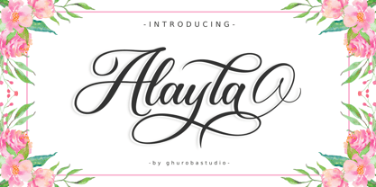 Alayla is modern calligraphy. It's feels both magical and elegant. It looks stunning for your design such as on wedding invitations, thank you cards, quotes, greeting cards, logos, business cards and every other design. This font is PUA encoded which means you can access all of the glyphs and swashes with ease! It features a varying baseline, smooth lines, gorgeous glyphs and stunning alternates.
 - Mojodelic by Mysterylab,
$21.00 Looking for a font with that certain... umm... special mojo? Mojodelic might just be the niche font that you need to create that unique statement — one that really pops off the page. While this typeface certainly grooves with the 1960s – 1970s vintage psychedelic and pop art look, it's also a perfect fit with retro 1990s party-way-too-hard youth culture graphics. With its ultra-bold reverse-contrast design and whimsical little curlies, this one's got equal parts silliness and swagger. Try it on skateboard graphics, retro message t-shirts, apparel logos, beverage labeling, candy packaging, teen/tweener marketing, greeting cards... you name it. Enjoy.
 - Gala72 by Dmitriy Shchetinskiy,
$25.00 Gala72 font consist of 72 calligraphic greetings letterings for different event. These letterings are original and handwritten. This font makes it possible to use high quality calligraphy in your projects - greeting cards, certificates, invitation cards, letters of commendation etc.
 - Congratulatory 2.0 by Dmitriy Shchetinskiy,
$19.00 Congratulatory 2.0 font consist of 36 calligraphic greetings letterings for different event. Letterings are original and handwritten. This font makes it possible to use high quality calligraphy in your projects - greeting cards, certificates, invitation cards, letters of commendation etc.
 - Congratulatory New Year And Christmas by Dmitriy Shchetinskiy,
$19.00 Congratulatory New Year and Christmas font consist of 36 calligraphic greetings letterings. Letterings are original and handwritten. This font makes it possible to use high quality calligraphy in your projects - greeting cards, certificates, invitation cards, letters of commendation etc.
 - Sealt by Michael Rafailyk,
$9.00 Sealt Typeface is inspired by the oldest saltworks in Eastern Europe, founded in 1390 in Drohobych. Sealt means salt in Old English, so most letters are rough and sharp like salt crystals and seem to be carved out of the rock. View PDF Specimen: https://michaelrafailyk.com/typeface/specimen/Sealt.pdf Variable font: Sealt VF has weight axis and includes hundreds of weights ranging from Light (300) to Bold (700), so feel free to choose the most accurate weight that you need, using a slider. Localized Forms: 47 character substitutions for Azeri, Bulgarian, Catalan, Dutch, German, Kazakh, Moldavian, Polish, Romanian, Tatar, Turkish. Glyph Composition/Decomposition (Diacritics): Full Latin and based Vietnamese set of diacritics (561 characters). Precomposed. Ordinals: adehnorst. Superscript, Subscript, Numerator, Denominator: 0123456789. Fractions: ¼½¾⅐⅑⅒⅓⅔⅕⅖⅗⅘⅙⅚⅛⅜⅝⅞⅟ (precomposed). Any other fractions (even those typed through a slash) will also be displayed correctly, with the automatic replacement to Numerator + fraction + Denominator. Slashed Zero: All 0 figures, including Lining, Superscript, Subscript, Numerator, Denominator, and Fractions. Contextual Alternates: ΆΈΉΊΌΎΏ. Greek uppercase accented characters lose their tonos accent and retain only dieresis in All Caps mode. Turned on by default. If you need tonos accents in All Caps then turn off Contextual Alternates (calt) feature. Standard Ligatures: OO TT tt fi. Turned on by default. Language count: 480+. Kerning Class pairs: 4295. The promo images used photos of Albin Berlin, Hervé Piglowski, Karolina Grabowska, Scott Webb from Pexels and Dollar Gill from Unsplash.
 - Villager by Sign Studio,
$12.00 Villager font created with a simulated ballpoint will give it a natural handwritten shape. It's perfect for a signature, diary, business card, greeting card or printed product with a casual theme. With the discretionary ligature and alternate characters, it will make you a good choice of writing variations.