7,528 search results
(0.019 seconds)
- Nami by Linotype,
$29.99Nami, the Japanese word for wave," is the latest collaboration between Adrian Frutiger and Linotype's Type Director, Akira Kobayashi. This typeface family is the most humanistic sans serif design ever to come from Adrian Frutiger, and it has an interesting twist: lapidar alternates that may be surfed through with the help of OpenType-savy applications. Adrian Frutiger began the design that would blossom into Nami during the 1980s. Although it would not be produced during the 20th century, it was quite forward thinking. The typeface included several seemingly avant garde alternates; these were "lapidary" versions of common letterforms. Revisiting the project in 2006, Akira Kobayashi reworked the concept into a working family of three typefaces. Each font contains 483 glyphs, including 11 alternates-two extra forms of the lowercase g, as well as new forms for a, e, h, l, m, n, r, t, and u." - Niedermann Grotesk by steve mehallo,
$19.14 With the printing of the Futurist poem “Zang Tumb Tuuum” in 1914, modern art had taken a typographic twist: “words in freedom” (parole in libertà) were now a major part of the art world. The avant garde followed suit. Niedermann Grotesk is based on the everyday type that appeared in early modernist collages, journals and manifestos. It is a peculiar style of lettering—which was originally inspired by the Sachplakat (object poster) work of Lucian Bernhard—and adapted for hot metal in 1908 by Heinz Hoffmann. 100 years ago, the style became a workhorse of the German printing industry. Niedermann Grotesk is an updated variant, referencing the original poster art, each letter carefully drawn with an old brush. Bumpy, bold and blunt—with a suite of alternate characters and a few dingbats—Niedermann Grotesk is perfect for advertising, packaging, poetry, art, protests and retro homage.
 - Core Sans C by S-Core,
$20.00 Core Sans C family is a part of the Core Sans Series, such as N, M, E, A, D, G, R and B. Core Sans C is inspired by classic geometric sans (Futura, Avenir, Avant Garde etc.). It is based on geometric shapes, like near-perfect circle and square. It has a much higher x-height (height of lowercase letters), an effect which promotes readability especially at small print sizes. The Core Sans C Family consists of 9 weights (Thin, Extra Light, Light, Regular, Medium, Bold, Extra Bold, Heavy, Black) and Italics for each format. Core Sans C supports complete Basic Latin, Cyrillic, Greek, Central European, Turkish, Baltic character sets. Each font includes proportional figures, tabular figures, oldstyle figures, numerators, denominators, superscript, scientific inferiors, subscript, fractions and case features. Core Sans C is an ideal font family for use in magazines, web pages, screens, displays, and so on.
 - Wonderglast by IKIIKOWRK,
$19.00 Proudly present Wonderglast - Stylist Sans, created by ikiiko. Wonderglast is a chic sans serif typeface with a seductively avant-garde vibe. This typeface effortlessly captures the spirit of elegance and sophistication thanks to its simple lines and contemporary design. Its modern, minimalist design lends an air of refinement to any project, making fashion-related projects the ideal fit for it. Wonderglast's letters have a sense of fluidity that makes them flow across the page and produce a pleasing visual effect. Its lack of serifs gives it a modern appearance, and its carefully constructed curves and proportionate design add to its allure. This typeface is perfect for an elegant logo, branding, fashion brand, luxury brand, layout magazine, beauty product, packaging product, quotes, or simply as a stylish text overlay to any background image. What's Included? Uppercase & Lowercase Numbers & Punctuation Ligature & Alternates Multilingual Support Works on PC & Mac
 - Brawner by IKIIKOWRK,
$25.00 Proudly present Brawner - Y2K Liquid Font, created by ikiiko. Brawner is the ultimate Y2K font with a liquid edge, developed for the fashion-forward and streetwear trendsetters. Brawner's flowing shapes encourage movement and vitality, resulting in a visual experience as bold and edgy as the streetwear culture it embodies. The font's liquid features offer a touch of avant-garde flair, making it an ideal match for firms looking to radiate cutting-edge style and stay ahead of the fashion curve. Brawner, the Y2K font that embodies the essence of hypebeast style and current streetwear, ushers you into the future of fashion. Elevate your brand's visual identity with a typeface that speaks the language of the fashionable, pushing limits and establishing trends with each letter. This font is very suitable for making a streetwear brand, poster, magazine layout, fashion design, quotes, or simply as a stylish text overlay to any background image. What's Included? Uppercase & Lowercase Numbers & Punctuation Alternates Ligatures Multilingual Support Works on PC & Mac
 - Gianis by Obelisk Gestalt,
$34.00 OBL Gianis is a family of compact geometric sans-serif typefaces designed with a strong focus on headline utility while infusing a touch of subtle naivety. We drew inspiration from the rigid yet rhythmic construction principles found in late 20th-century geometric classics like Avant-Garde, Futura, and Kabel. OBL Gianis seeks to salvage and build upon the legacy of geometric typefaces as they continue to evolve in the 21st century. We've considered various real-world scenarios and use cases, adapting to the ever-changing visual culture. This evolution has given OBL Gianis its unique quirks, including a larger x-height to accommodate bold usage in tighter typesetting, a compact double contour to balance the larger x-height, and shorter descenders and ascenders in lowercase characters. With extensive Latin character support (over 1000 glyphs) and 18 different weights and accompanying italics, OBL Gianis is well-equipped to meet the ever-changing demands and trends in headline typesetting.
 - AW Conqueror Std Slab by Typofonderie,
$59.00 Slab serif with a 70’s aesthetic A version of AW Conqueror Sans, AW Conqueror Slab draws inspiration from geometrical slab serifs of the 1930s, of which Rockwell is a perfect example. Lubalin Graph, a reworking of the genre, came out in the wake of the Avant Garde wave of the early 70s. In recent years, ‘slabs’ have made a comeback in the graphic design world. AW Conqueror Slab advances the cause quite happily. AW Conqueror superfamily AW Conqueror Didot is part of a larger family, who include 4 others subfamilies with great potential: They’re but based on same structure, with some connection between them (width for example), to offer a great & easy titling toolbox to any designers, from skillful to beginner. Each of the members try their best to be different from the others because of their features. They should work harmoniously in contrast. Club des directeurs artistiques Prix 2010 European Design Awards 2011
 - Marthine Diamond by Timurtype,
$14.00 Introduced by Timurtype Studio! Marthine Diamond is a Modern Handbrushed Script Font This font unlocks the appeal of contemporary design with a modern handwritten font, a symphony of sophistication and spontaneity. This font effortlessly combines the precision of digital craftsmanship with the organic flow of hand-drawn elegance. Each letter is a brushstroke of innovation, adding a dynamic and bespoke touch to your project. The sleek curves and smooth lines of modern hand script fonts create visual harmony, infusing your designs with a sense of stylish authenticity. Enhance your creative expression, as these fonts integrate seamlessly into a modern aesthetic, offering the perfect balance between avant-garde pieces and timeless works of art. Let your words take on a new dimension, where art blends technology and tradition, giving life to a contemporary narrative that is visually striking and uniquely yours Marthine Diamond Font also supports multilingualism. Enhance your designs with our original fonts, feel free to comment or provide feedback, Enjoy the fonts 😊 Thank You
 - Jeanne Moderno by steve mehallo,
$32.00Jeanne Moderno is a revisionary type family. A synthesis of Bodoni Italic and 19th Century Ultra-Bold "Fat Faces"—distilled with personality taken from early 20th Century Modernists; the Futurists, Dadaists, Suprematists, Constructivists. Historically, Jeanne Moderno could have appeared on the scene around 1918—after the First World War—when new cultural movements, manifestos, theories and countertheories shaped art, industry and society. Spatter in a few later influences—from De Stijl, the Bauhaus, the types of Herbert Bayer, Josef Albers, Paul Renner—plus a twist of Art Deco and High Fashion—Jeanne Moderno is a remanifestation of 19th + 20th Century Modernist thinking; traditional + revisionist, raw and elegant! Jeanne Moderno can best be used for magazines, advertising, posters, flyers, fashion reports, letterpress experiments, silkscreen endeavors, exhibitions, DMV signage, paper money, revolutionary political statements as well as formal declarations of peace or war. Jeanne Moderno is about the future, the past. The Avant-Garde. Humanist geometry + vintage footwear. Form, function, style, art and life. - Galano Classic by René Bieder,
$30.00 Galano Classic is the display companion of the Galano Grotesque family. Like the Grotesque family, it also pays tribute to the geometric shapes of Futura, Avant Garde, Avenir and the like. However, instead of that family’s modern interpretation of the geometric genre, Galano Classic prefers to stay in the past, a tendency characterized by a moderate x-height and details like the long stretched leg of uppercase “R”, as well as the traditional shaped lowercase “g”, to mention only a few details. Galano Classic, compared to Galano Grotesque, includes lots of redesigned glyphs and consequently adjusted kerning pairs, an extended number of alternative characters, ligatures and opentype features to match a great many design applications. It comes in 10 different weights with matching italics containing 555 glpyhs per font. Although Galano Classic was planned to be the display version of Galano Grotesque, it feels great in small sizes and long text passages, too.
 - Alright, let's talk about Cocaine Sans by Chris Hansen. Imagine a font that not only captures your attention but also holds it hostage with its bold, unapologetic style. That's Cocaine Sans for you. ...
- Decade by Grype,
$16.00 Straying outside of our usual logo driven typestyles, but remaining within typographic styles that have a strong brandable vibe to them comes our Decade font. Spawned from the 1938 book "Letters and Lettering" by Paul Carlyle and Guy Oring, this display style has been fleshed out into a full blown typeface, rich with a personality that evokes Art Deco and Jazz sensibility yet rooted in Russian Avant Garde Constructivism. Decade has a constructivist feel, yet contains letterforms that take take its appeal to album covers, holiday cards, minimalist corporate branding, and beyond. It adopts a sturdy yet approachable style with its geometric forms and curves, creating a straightforward, powerful presence that creates a solid foundation for designers and design trends. Here's what's included with the Decade typeface: - 368 glyphs per style - including All Capitals, Numerals, Punctuation and an extensive character set that covers multilingual support of latin based languages. (see the 5th graphic for a preview of the characters included) Here's why Decade is right for you: - You're in need of geometric typestyle evocative of the Jazz Era - You love that Constructivist look, but are seeking something "different" - You're looking for an Art Deco Showcard style typeface. - You're looking for a typeface with letter minimalist styled geometry. - You just like to collect quality fonts to add to your design arsenal
 - Korrupt by Typodermic,
$11.95 Introducing Korrupt, the typeface that shatters traditional letterforms and transports you to a bizarre, malevolent post-singularity metadystopia. With its antihumanist design and conflicting angles, this alien font is straight from the future. It’s a psychedelic apparatus that conjures up images of a twisted, eerie world. Korrupt is not for the faint of heart—it’s for those who want to push the boundaries of design and explore the strange and unconventional. If you’re into nanopunk, post-cyberpunk, biopunk or any other twisted science fiction theme, Korrupt is the font for you. Its optimal design will transport you to a world that’s both familiar and yet utterly alien. So don’t settle for the same old boring fonts—embrace the bizarre and choose Korrupt. It’s a typeface that will leave a lasting impression and make your message stand out. Get ready to take your design to the next level with this avant-garde, out-of-this-world typeface. Most Latin-based European writing systems are supported, including the following languages. Afaan Oromo, Afar, Afrikaans, Albanian, Alsatian, Aromanian, Aymara, Azerbaijani, Bashkir (Latin), Basque, Belarusian (Latin), Bemba, Bikol, Bosnian, Breton, Cape Verdean, Creole, Catalan, Cebuano, Chamorro, Chavacano, Chichewa, Crimean Tatar (Latin), Croatian, Czech, Danish, Dawan, Dholuo, Dutch, English, Estonian, Faroese, Fijian, Filipino, Finnish, French, Frisian, Friulian, Gagauz (Latin), Galician, Ganda, Genoese, German, Gikuyu, Greenlandic, Guadeloupean Creole, Haitian Creole, Hawaiian, Hiligaynon, Hungarian, Icelandic, Igbo, Ilocano, Indonesian, Irish, Italian, Jamaican, Kaingang, Kanuri, Kaqchikel, Karakalpak (Latin), Kashubian, Kikongo, Kinyarwanda, Kirundi, Kurdish (Latin), Latvian, Lithuanian, Lombard, Low Saxon, Luxembourgish, Maasai, Makhuwa, Malay, Maltese, Māori, Moldovan, Montenegrin, Nahuatl, Ndebele, Neapolitan, Norwegian, Novial, Occitan, Ossetian (Latin), Papiamento, Piedmontese, Polish, Portuguese, Quechua, Rarotongan, Romanian, Romansh, Sami, Sango, Saramaccan, Sardinian, Scottish Gaelic, Serbian (Latin), Shona, Sicilian, Silesian, Slovak, Slovenian, Somali, Sorbian, Sotho, Spanish, Swahili, Swazi, Swedish, Tagalog, Tahitian, Tetum, Tongan, Tshiluba, Tsonga, Tswana, Tumbuka, Turkish, Turkmen (Latin), Tuvaluan, Uzbek (Latin), Venda, Venetian, Vepsian, Võro, Walloon, Waray-Waray, Wayuu, Welsh, Wolof, Xavante, Xhosa, Yapese, Zapotec, Zarma, Zazaki, Zulu and Zuni.
 - Alagereas by IbraCreative,
$17.00 Alagereas – A Scifi Display Serif Font Alagereas, a captivating Sci-Fi Display Serif font, seamlessly blends futuristic aesthetics with timeless sophistication. Designed for maximum impact, its sleek and angular letterforms exude a sense of technological advancement and avant-garde elegance. Alagereas strikes a harmonious balance between readability and artistic expression, making it ideal for immersive digital interfaces, space-themed designs, and cutting-edge editorial layouts. The font’s meticulous detailing and precision convey a sense of otherworldly precision, while its serif elements evoke a classic charm, resulting in a typeface that transcends the boundaries of conventional sci-fi typography. Alagereas is a bold and versatile choice that transports typography into the realms of the future, embodying the essence of innovation in every character. Alagereas is perfect for branding projects, logo, wedding designs, social media posts, advertisements, product packaging, product designs, label, photography, watermark, invitation, stationery, game, fashion and any projects. Fonts include multilingual support for; Afrikaans, Albanian, Czech, Danish, Dutch, English, Estonian, Finnish, French, German, Hungarian, Italian, Latvian, Lithuanian, Norwegian, Polish, Portuguese, Slovak, Slovenian, Spanish, Swedish.
 - Beldaron by Konstantine Studio,
$12.00 Are you ready to transform your projects into visual masterpieces? Say hello to Beldaron, the experimental serif font that draws its inspiration from the dynamic world of modern music visuals and album design. It's your key to unlocking creativity like never before! Beldaron captures the essence of avant-garde music visuals and modern album aesthetics, infusing your designs with a futuristic aura. Watch your projects evolve into visually stunning, captivating masterpieces! Enhanced with a plethora of exquisite Ligatures and captivating Stylistic Alternates, this exquisite font is meticulously crafted to elevate your design journey to unparalleled heights. Just as music evolves, Beldaron seamlessly adapts to your design needs. From posters to websites and branding, it's your dynamic partner, harmonizing effortlessly with your creative vision. Break free from the ordinary and unleash your brand's uniqueness with this cutting-edge typeface. Whether you're a graphic designer, artist, or a creative visionary, Beldaron will ignite your imagination and empower you to bring your vision to life with the aesthetics of futuristic music visuals and modern album design. Beldaron - Where Design Meets Visual Symphony!
 - Fenomen Sans by Signature Type Foundry,
$38.00 Geometrical drawing of Fenomen Sans typeface goes back to the roots of the Bauhaus aesthetics and the entire architectural and design avant-garde of the 20th century. It is still a symbol of functional rationality, clean aesthetics in relation to shape, and of progressive thinking. Its popularity is timeless and permanent. The set contains eight basic alphabets of a square pattern, eight semicondensed, eight condensed and eight extremely condensed alphabets, all in Latin and Cyrillic alphabets. Every font of the family has four types of numerals, small caps and variant letters. The typesetting can fluently use all fonts simultaneously. The typeface originated between the years 2011–2014 and was subjected to a series of tests for the fluent legibility of narrow fonts even in extreme conditions. Narrow fonts provide this set with the maximum use also for newspaper typesetting. The typeface has an elegant, delicate design in thin fonts and sufficient legibility in bold. Mutual contrast produces creative tension. Font name acronyms described: SCN = SemiCondensed CN = Condensed XCN = ExtraCondensed
 - ITC Kabel by ITC,
$40.99 The first cuts of Kabel appeared in 1927, released by the German foundry Gebr. Klingspor. Like many of the typefaces that Rudolf Koch designed for printing use, Kabel is a carefully constructed and drawn. The basic forms were influenced by the Ancient Roman stone-carved letters, which consisted of just a few pure and clear geometric forms, such as circles, squares, and triangles. Koch also infused Kabel with some elements of Art Deco, making it appear quite different from other geometric modernist typefaces from the 1920s, like Futura. Linotype has two versions of Kabel in its library. Kabel has a shorter x-height, with longer ascenders and descenders, making it a bit truer to Koch's original design than the second version, ITC Kabel, which was designed by Victor Caruso. This version, also known in the United States as Cable, has a larger x-height, shorter ascenders and descenders, more weights ,and a diamond shaped i-dot. Typefaces in the same oeuvre include Avenir Next, ITC Avant Garde Gothic, Metrolite, Metromedium, Metroblack, and Erbar, just to name just a few."
 - Basurero Humano by Woodcutter,
$49.00 "Basurero Humano" is a bold and avant-garde typeface that defies conventions. Its irregular and captivating letters are framed within rectangles, creating a unique and eye-catching visual effect. With influences from the poster Punk style, this typeface stands out for its rebellious energy and its ability to break boundaries. "Basurero Humano" is ideal for projects that aim to convey a sense of rebellion, challenge, and originality. Whether it's in posters, fashion designs, album covers, or urban art projects, this typeface becomes the focal point, capturing the viewer's attention and leaving a lasting impression. With its striking style and deconstructed shapes, "Basurero Humano" becomes a versatile tool to communicate provocative messages and break away from conventional aesthetics. This typeface is perfect for those who want to push boundaries and make a bold statement in their designs. Discover the power of "Basurero Humano" and elevate your projects to a new level of originality and expression. Let this unique typeface be your ally in creating designs that stand out and leave a lasting impression in the minds of your audience.
 - Core Sans CR by S-Core,
$20.00 Core Sans CR family is a rounded version of Core Sans C; a part of the Core Sans Series, such as Core Sans N, Core Sans M, Core Sans E, Core Sans A, Core Sans D, Core Sans G, Core Sans R and Core Sans B. Core Sans CR is inspired by classic geometric sans (Futura, Avenir, Avant Garde etc.). It is based on geometric shapes, like near-perfect circle and square. It has a much higher x-height (height of lowercase letters), an effect which promotes readability especially at small print sizes. The Core Sans C Family consists of 9 weights (Thin, Extra Light, Light, Regular, Medium, Bold, Extra Bold, Heavy, Black) and Italics for each format. Core Sans C supports complete Basic Latin, Cyrillic, Central European, Turkish, Baltic character sets. Each font includes proportional figures, tabular figures, oldstyle figures, numerators, denominators, superscript, scientific inferiors, subscript, fractions and case features. Core Sans C is an ideal font family for use in magazines, web pages, screens, displays, and so on.
 - Shortblack by Adante Creative,
$23.00 Introducing by Adante Creative Proudly Present, Shortblack Shortblack is A Modern Calligraphy Font Shortblack is perfect for product packaging, branding project, magazine, social media, wedding, or just used to express words above the background. Shortblack also multilingual support. Enjoy the font, feel free to comment or feedback, send me PM or email.
 - Johnfoster by Adante Creative,
$23.00 Introducing by Adante Creative Proudly Present, Johnfoster Johnfoster is A Modern Sinature Font Johnfoster is perfect for product packaging, branding project, magazine, social media, wedding, or just used to express words above the background. Johnfoster also multilingual support. Enjoy the font, feel free to comment or feedback, send me PM or email.
 - Mothenary by Adante Creative,
$23.00 Introducing by Adante Creative Proudly Present, Mothenary Mothenary is A Beautiful Calligraphy Font Mothenary is perfect for product packaging, branding project, magazine, social media, wedding, or just used to express words above the background. Mothenary also multilingual support. Enjoy the font, feel free to comment or feedback, send me PM or email.
 - Mimolette by The Ampersand Forest,
$20.00 Every designer has a favorite geometric sans serif. For a century, they've been a staple for text that needs to be clear, strong, architectural, and objective. Mimolette offers a sans serif family that's great for text and display alike—the panache of Neutraface, the readability of Avenir, the sleekness of Avant Garde, the strength of Mark, the architecture of Gotham, and the classic lines of Futura—but she's entirely her own creature, and she's designed to offer maximum versatility and beauty at an affordable price. And she's got some nifty features, too! Her italic is a true italic, not just an oblique. Are the uberpointy diagonals (AMVW) not working in a particular context? Activate Stylistic Set 01, and they become flat-topped! Want more playful cursive alternatives in the italic? Activate Stylistic Set 02, and you've got them in the A, E, K, Q, R, and k. She's got true small caps in all styles! She's got true fractions in all styles, as well as oldstyle (small cap) and lining numerals, in both tabular and proportional widths. Best of all, perhaps, Mimolette was made with love, as always, by yer pals in the Ampersand Forest.
 - Halcyon by Studio Buchanan,
$12.00 Halcyon is a post-geometric typeface made up of 16 fonts across 8 weights. Each weight contains an upright with a corresponding true italic. Halcyon's design builds on the foundations of classic typefaces such as Futura, Gill Sans and ITC Avant Garde Gothic, by mixing their geometric structure with more modern humanist qualities and attributes. The result is a friendly and approachable personality with a sophisticated and serious edge. Halcyon feels familiar, but unique, playful but not asinine. The versatility of its character makes Halcyon a reliable choice for any design decision. With a large variety of weights, and a whole host of Open Type features, Halcyon can adapt to fit the tone of your communications. The lighter weights present a more refined and formal voice, while the heavier, oversized weights grow more exuberant. It's large x-height and open apertures increase it's legibility, making it perfect for setting large display headlines or small sized, long form text. Halcyon is a multilingual family with hundreds of accented characters, and allows for customisable characters through diacritic combinations. All European languages are already covered, alongside many more within the Latin alphabet.
 - Fibra by Los Andes,
$26.00 The font is actually not a revival of ‘Avant Garde’—by Herb Lubalin—but it takes its spirit. Fibra is a geometric sans serif, yet without the typical structural strictness of these kind of fonts, that represents experimental type design. This can be seen in the contrast between curves and straight lines in some characters such as ’n’ and ‘h’ unlike rounded ones such as ‘a’ and ‘d’; details of some display characters (e.g. three upper terminals in ‘W’ and projection off the stem in ‘A’); and exaggerated terminal in ‘R’. All these features give Fibra a strong personality—a sans serif typeface that ‘gives you the chills’. Fibra was specially designed for display use. The font has a very generous x-height that allows for use in corporate text, thanks to its good readability. Fibra comes with 2 subfamilies—a more ’normal’ Basic family, with a smaller amount of stylistic features, for use in subheadings or any other type of text that requires formality, and an Alt family that shows off the true potential of the font, making it the perfect choice for magazine headlines, posters and logotypes.
 - Shiver Me Timbers NF by Nick's Fonts,
$10.00Avast, me hearties! Here be a serious pirate font, based loosely on several of Victor Hammer’s uncial typefaces, designed between 1925 and 1953, and liberally weathered and corroded for that authentic barnacle-encrusted look. The bullet character is suitable for marking where the treasure is buried, and the section mark is a Jolly Roger. Both versions of the font include 1252 Latin, 1250 CE (with localization for Romanian and Moldovan). - Twogether Rounded by Sudtipos,
$39.00 The new font family Twogether Rounded, designed by Raúl Plancarte and published by Sudtipos, is a Sans Serif style with a rounded appearance. The aim of its design is to establish connections with diverse audiences and create a positive "feel good" sensation. The rounded style of typography is currently appreciated for its friendly and fresh personality. It is in trend, and the internet and technology have welcomed it with open arms, giving it a new sense of purpose. The proof is in the way that brands such as Box, Cox, Gaia Online, Imgur, Instacart, Instagram, itv 4, Jio, Skype, Twitter, Viasat, Vimeo, and Zoom Video have incorporated it into their visual identities. In the case of Twogether Rounded, a technical design has been combined with avant-garde contrasts, while still maintaining an institutional feel. These modern and lively fonts allow for a personal touch to be the protagonist, making them perfect for a range of design applications. Twogether Rounded's design makes it the perfect font family for a variety of design applications, including UX/UI, apps, branding, editorial design, and more. Its versatility and modern style can adapt to different design needs, making it a valuable asset for any designer or creative professional.
 - Core Sans GS by S-Core,
$29.00 The Core Sans GS Family is a rounded version of Core Sans G and a part of the Core Sans Series such as Core Sans N, M, A, E, D. Core Sans GS is constructed of straight, circular or square shapes. These geometric shapes are inspired by classic geometric sans (Futura, Avenir, Avant Garde etc.). Every stem is a rectangle or a straight line and every letter, lowercase or uppercase, seems to be in perfect geometric form and even weighted. The small x-height makes readability clean and clear. Core Sans G can be used equally well in headings or in body copy. The Core Sans GS Family consists of 9 weights (Thin, Extra Light, Light, Regular, Medium, Bold, Extra Bold, Heavy, Black) with maching Italics. It also includes alternate characters (a,g,t) and a bunch of ligatures. The Core Sans GS provides a wide range of character sets to support (Cyrillic, Central and Eastern European characters) and advanced typographical support with features such as proportional Figures, tabular Figures, numerators, denominators, superscript, scientific Inferiors, subscript, fractions, standard ligatures, discretionary ligatures and stylistic alternates. Core Sans G is an ideal font family for use in magazines, web pages, screens, displays, and so on.
 - Meloriac by Typodermic,
$11.95 Introducing Meloriac, the unicase display typeface that combines a pseudo-retro feel with a minimalist design, creating a strong and modern-looking font that has become a reliable staple in the toolbox of today’s graphic designer. Inspired by the classic Futura Extra Bold and Avant Garde Gothic Bold, Meloriac is an extra-heavy tribute that is perfect for tight headlines and logos. Its minimalist design and strong strokes make it stand out and demand attention. The font is versatile, able to convey a variety of messages while maintaining its bold and modern aesthetic. Meloriac is more than just a pretty face; it’s also highly functional. For improved clarity, we recommend tracking it wider (adding more space) on subheadings. The result is a cleaner, more legible display that will make your message pop. Additionally, the font’s OpenType stylistic alternates feature allows access to filled letter variations and an alternative ampersand, giving you even more creative control over your designs. Whether you’re designing a poster, a book cover, or a website, Meloriac’s minimalist design and bold aesthetic make it the perfect font to convey your message with impact. Try it out today and see for yourself why it’s a favorite among today’s graphic designers. Most Latin-based European, Vietnamese, Greek, and most Cyrillic-based writing systems are supported, including the following languages. Afaan Oromo, Afar, Afrikaans, Albanian, Alsatian, Aromanian, Aymara, Azerbaijani, Bashkir, Bashkir (Latin), Basque, Belarusian, Belarusian (Latin), Bemba, Bikol, Bosnian, Breton, Bulgarian, Buryat, Cape Verdean, Creole, Catalan, Cebuano, Chamorro, Chavacano, Chichewa, Crimean Tatar (Latin), Croatian, Czech, Danish, Dawan, Dholuo, Dungan, Dutch, English, Estonian, Faroese, Fijian, Filipino, Finnish, French, Frisian, Friulian, Gagauz (Latin), Galician, Ganda, Genoese, German, Gikuyu, Greenlandic, Guadeloupean Creole, Haitian Creole, Hawaiian, Hiligaynon, Hungarian, Icelandic, Igbo, Ilocano, Indonesian, Irish, Italian, Jamaican, Kaingang, Khalkha, Kalmyk, Kanuri, Kaqchikel, Karakalpak (Latin), Kashubian, Kazakh, Kikongo, Kinyarwanda, Kirundi, Komi-Permyak, Kurdish, Kurdish (Latin), Kyrgyz, Latvian, Lithuanian, Lombard, Low Saxon, Luxembourgish, Maasai, Macedonian, Makhuwa, Malay, Maltese, Māori, Moldovan, Montenegrin, Nahuatl, Ndebele, Neapolitan, Norwegian, Novial, Occitan, Ossetian, Ossetian (Latin), Papiamento, Piedmontese, Polish, Portuguese, Quechua, Rarotongan, Romanian, Romansh, Russian, Rusyn, Sami, Sango, Saramaccan, Sardinian, Scottish Gaelic, Serbian, Serbian (Latin), Shona, Sicilian, Silesian, Slovak, Slovenian, Somali, Sorbian, Sotho, Spanish, Swahili, Swazi, Swedish, Tagalog, Tahitian, Tajik, Tatar, Tetum, Tongan, Tshiluba, Tsonga, Tswana, Tumbuka, Turkish, Turkmen (Latin), Tuvaluan, Ukrainian, Uzbek, Uzbek (Latin), Venda, Venetian, Vepsian, Vietnamese, Võro, Walloon, Waray-Waray, Wayuu, Welsh, Wolof, Xavante, Xhosa, Yapese, Zapotec, Zarma, Zazaki, Zulu and Zuni.
 - Ah, LT Chickenhawk! Such a name evokes images of brave, intrepid fowls, doesn't it? Crafted by the creative minds at Nymphont, this font strides into your design projects with the confidence of a chi...
- Galano Grotesque by René Bieder,
$30.00 Galano Grotesque is a geometric sans in the tradition of Futura, Avant Garde, Avenir and the like. It has a modern streak which is the result of a harmonization of width and height especially in the lowercase letters to support legibility. Galano Grotesque aims to be a universal weapon not only because it works great in headlines, short and long copies but also because of its subtle neutrality. It comes in 10 different weights with matching italics and is equipped with a set of powerful opentype features including alternative glyphs, fraction, arrows, ligatures and many more. An extended character set, supporting Central, Western and Eastern European languages, rounds up the family. During the design process of the alternative glyph shapes of Galano Grotesque, the interest of creating a standalone version emerged rapidly. This was the birth of Galano Grotesque Alt. Not only because of the legible and unique character created by the alternatives, but also because this could be the small copy embracing stylistic companion to Galano Grotesque. In addition to the alternative glyphs, the height of descender and ascender was increased, supporting structure and rhythm. When finishing Galano Grotesque Alt, it turned out to not only work great in small and long copies but also to be a great performer in headlines and short copies. I'm proud to introduce: Galano Grotesque and Galano Grotesque Alt.
 - Kukulkan by Sudtipos,
$149.00 Introducing "Kukulkan," a font designed by Raúl Plancarte, adorned with accolades, that unravels the structural possibilities nestled within the realms of ancient Roman letters and fantastical styles, infusing them with a contemporary essence. This typeface exudes a conspicuous plasticity and expressiveness, seamlessly harmonizing within its original intended context as a font for continuous text, bolstered by its robust and assured strokes. It stands as the triumphant culmination of a thorough exploration, meticulously considering legibility. Infused with nuanced elements that evoke a pre-Hispanic idealization of Mayan culture, this essence takes center stage in its darker iterations. However, it is adept at adapting to a myriad of ethnic and cultural nuances prevalent in our global village. Noteworthy is the fact that the "Kukulkan" font family is available as a variable font, offering a dynamic range of styles across its 18 fonts, endowing it with a lively, human, and refined demeanor. Additionally, it features a variant known as "Kukulkan Ornaments," a collection of 150 dingbats comprised of icons, symbols, and frames intricately inspired by the iconography of Mayan hieroglyphs. In its natural application, "Kukulkan" thrives in contexts of art, lifestyle, culture, seamlessly bridging tradition and avant-garde. This font excels in the realm of editorial design, evident in its adeptness at crafting robust headlines, and in select cases, it lends itself to creating striking brand identities.
 - Core Sans G by S-Core,
$40.00 The Core Sans G Family is a part of the Core Sans Series, such as Core Sans N SC, Core Sans N, Core Sans NR, and Core Sans M. Core Sans G is constructed of straight, circular or square shapes. These geometric shapes are inspired by classic geometric sans (Futura, Avenir, Avant Garde etc.). Every stem is a rectangle or a straight line and every letter, lowercase or uppercase, seems to be in perfect geometric form and even weighted. The small x-height makes readability clean and clear. Core Sans G can be used equally well in headings or in body copy. The Core Sans G Family consists of 9 weights (Thin, Extra Light, Light, Regular, Medium, Bold, Extra Bold, Heavy, Black), 3 for rounded (Medium, Bold, Extra Bold) with matching Italics. It also includes 4 effects fonts (Outline, Neon, Shadow, Dimensional), Alternate Characters (a,g,t) and a bunch of ligatures. The Core Sans G provides a wide range of character sets to support (Cyrillic, Central and Eastern European characters) and advanced typographical support with features such as proportional Figures, tabular Figures, numerators, denominators, superscript, scientific Inferiors, subscript, fractions, standard ligatures, discretionary ligatures and stylistic alternates. Core Sans G is an ideal font family for use in magazines, web pages, screens, displays, and so on.
 - Cyberend by Alit Design,
$19.00 Introducing "Cyberend" – a font that seamlessly marries the raw, edgy aesthetic of cyberpunk with the precision of square pixels and the sleek modernity of italic serifs. As the digital world converges with futuristic design, Cyberend emerges as the quintessential typeface for those seeking a cyberpunk-inspired typographic experience. Dystopian Elegance: Cyberend encapsulates the essence of cyberpunk, embodying a dystopian elegance that effortlessly blends chaos and sophistication. The font's italic serifs add a touch of rebellion and forward momentum to every character. Pixelated Precision: Immerse yourself in the pixelated precision of Cyberend, where each character is meticulously designed with square pixels. The result is a sharp, high-tech appearance that resonates with the digital landscapes of cyberpunk aesthetics. Versatile Impact: From gaming interfaces to film titles, Cyberend makes a bold statement in any digital or print medium. Its versatility allows you to infuse cyberpunk vibes into logos, posters, websites, and more, giving your projects a distinctive and immersive feel. Futuristic Legibility: Despite its cyberpunk flair, Cyberend prioritizes legibility. Each character is crafted to ensure readability, maintaining a perfect balance between avant-garde design and practical functionality. Unleash the power of Cyberend to transport your audience into a cyberpunk-inspired future. Whether you're designing for tech enthusiasts, gamers, or cyberpunk aficionados, this font is your gateway to a digital realm where style meets rebellion. Upgrade your typographic game with Cyberend and let your creations transcend the boundaries of conventional design.
 - Fibra One by Los Andes,
$26.00 Fibra One looks like a “soft” version of the Fibra font, but it is actually more than that—the second part of its name suggests that it is a reinterpretation of the original typeface. While this new version maintains the overall structure of Fibra and influence of the Avant Garde font, its shapes are different from those found in its predecessor—Fibra One features both soft corners and smooth transition between curved and straight sections. This gives the font a more dynamic and playful personality. Fibra One keeps the original contrast between curves and straight lines in glyphs such as ’n’ and ‘h’ (not found in rounded glyphs such as ‘a’ and ‘d’); details of display characters (e.g. three upper terminals in ‘W’ and projection off the stem in ‘A’); and exaggerated terminal in ‘R’. All these features give Fibra One a strong personality—a typeface that ‘gives you the chills’. Fibra One was specially designed for display use. The font has a very generous x-height that allows for use in corporate text, thanks to its good readability. Fibra One comes with 2 subfamilies—a more ’normal’ Basic family, with a smaller amount of stylistic features, for use in subheadings or any other type of text that requires formality, and an Alt family that shows off the true potential of the font, making it the perfect choice for magazine headlines, posters and logotypes.
 - Full Sans by Bülent Yüksel,
$19.00 Full Sans is a geometric sans in the tradition of Futura, Avant Garde and the like. It has a modern streak which is the result of a harmonization of width and height especially in the lowercase letters to support legibility. Full Sans is the younger brother of original Full Neue, Full Slab and Full Tools. Ideally suited for advertising and packaging, editorial and publishing, logo, branding and creative industries, poster and billboards, small text, wayfinding and signage as well as web and screen design. Full Sans provides advanced typographical support for Latin-based languages. An extended character set, supporting Central, Western and Eastern European languages, rounds up the family. The designation “Full Sans LC 50 Book” forms the central point. The first figure of the number describes the stroke thickness: 10 Thin to 90 Bold. Full Sans LC comes 5 weights and italics also Full Sans SC comes 5 weights and italics total 20 types. The family contains a set of 485 characters. Case-Sensitive Forms, Classes and Features, Small Caps from Letter Cases, Fractions, Superior, Inferior, Denominator, Numerator, Old Style Figures just one touch easy In all graphic programs. Full Sans is the perfect font for web use. You can enjoy using it. UPDATE: 08 March 2019 - Fixed extension of glyhps "y" and "g". - "LineGap" error has been fixed. - Fixed bug in "onum", "pnum", "tnum" and "tnum" software in OpenType feature.
 - Gustatory Delight by Ali Hamidi,
$12.00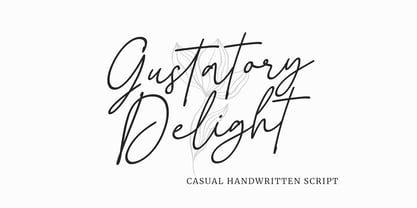 Gustatory Delight is a perfect handwritten script font that has a modern and authentic look, this font has a simple and unique character in both lowercase and uppercase, this font is perfect for branding, signature, logo, packaging, presentations, planners, resumes, business card, brochures, fashion, t-shirt, wedding invitations, yard signs and more.
 - First Love by Senekaligrafika,
$12.00 “First love” has hard strokes and signature style that speak to instant romance sensation. Take your creative projects to the highest level with this font. “First love” will help you to create special and touching typographical design for your loving and romantic projects, for every day or the happiest day in life, wedding party, wedding card,valentine day, greeting card, headings, flyer, product packaging, book cover, printed quotes, logos, and many more. It is really universal and modern font. The owner of endless possibilities!
 - Neospace Circuit is an avant-garde typeface designed for lovers of technology and science fiction. With its elegant extended proportion and geometric minimalism , Neospace Circuit redefines typogr...
- Huxley Vertical by Bitstream,
$29.99 The PARATYPE library is our latest major addition, consisting of more than 370 typefaces. In the spirit of the perestroika changes and following the collapse of the Soviet Union, a group of Russian type designers quit the state-owned Polygraphmash foundry to establish ParaType, the first, and now largest Russian digital type foundry. The ParaType team under the supervision of Vladimir Yefimov creates new typefaces and explores the Russian typographic heritage by making digital versions of existing Russian designs: these include the hits of Soviet typography such as Literaturnaya and Journal Sans. Most ParaType fonts are available in Western/Roman, Central European, Turkish and Cyrillic encodings. The Russian constructivist and avant garde movements of the early 20th century inspired many ParaType typefaces, including Rodchenko, Quadrat Grotesk, Ariergard, Unovis, Tauern, Dublon and Stroganov. The ParaType library also includes many excellent book and newspaper typefaces such as Octava, Lazurski, Bannikova, Neva or Petersburg. On the other hand, if you need a pretty face to knock your clients dead, meet the ParaType girls: Tatiana, Betina, Hortensia, Irina, Liana, Nataliscript, Nina, Olga and Vesna (also check Zhikharev who is not a girl but still very pretty). ParaType excels in adding Cyrillic characters to existing Latin typefaces — if your company is ever going to do business with Eastern Europe, we recommend you make them part of your corporate identity! ParaType created CE and Cyrillic versions of popular typefaces licensed from other foundries, including Bell Gothic, Caslon, English 157, Futura, Original Garamond, Gothic 725, Humanist 531, Kis, Raleigh, or Zapf Elliptical 711.