10,000 search results
(0.059 seconds)
- Wermut by Brownfox,
$45.00
- Okaytext by Okaycat,
$24.50 - DimeOtype by TypeArt Foundry,
$45.00
- Dirty Flamingo - Unknown license

- Bifurk - Unknown license

- New Cicle - Unknown license

- Trivial - Unknown license

- el Diablo - Unknown license

- Wanax Demo - Unknown license

- Dispute - Unknown license

- 486 - Unknown license

- Mailart Rubberstamp - Unknown license

- Subway Ticker - Unknown license

- PixL - Unknown license

- Arcade by Solotype,
$19.95 - Brown Now by Studio Fat Cat,
$15.00
- Bruce 1490 by Intellecta Design,
$26.90
- Editorial Comment JNL by Jeff Levine,
$29.00 - Cloverdale JNL by Jeff Levine,
$29.00 - Goodbees by ZetDesign,
$15.00
- Bresley by Blankids,
$27.00
- Crestwood by Ascender,
$29.99 - Avebury by Parkinson,
$25.00
- FF TradeOne by FontFont,
$30.99
- Dyane by Wiescher Design,
$39.50
- Salamander by Fenotype,
$35.00
- Europa Text by Solotype,
$19.95 - Westmore by Solotype,
$19.95 - Fashioniqa by Timurtype,
$14.00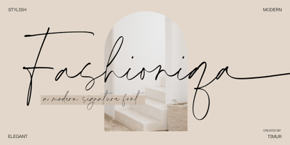
- Delightica by Timurtype,
$14.00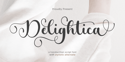
- Cinio Text by TeGeType,
$29.00
- FP Dancer Serif by Fontpartners,
$29.00
- Katydid JNL by Jeff Levine,
$29.00
- Fayte by That That Creative,
$15.00
- Glosa Display by DSType,
$55.00
- Kaufmann by URW Type Foundry,
$35.99
- PR Foxtail 01 by PR Fonts,
$5.00
- MPI Headline Modified by mpressInteractive,
$5.00
- Stencil Chamfer JNL by Jeff Levine,
$29.00
- Sunlight JNL by Jeff Levine,
$29.00


