10,000 search results
(0.03 seconds)
- Zeno by Device,
$39.00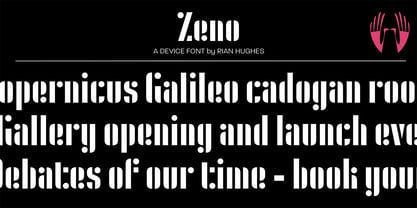 Bold, graphic and with a strong vertical emphasis. Built from simple geometric shapes, Zeno is similar to some of Joseph Albers’ Bauhaus experiments, though with attention paid to normalising the lettershapes to improve readability.
 - Black Wednesday by Lemon Studio Type,
$20.00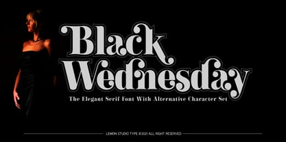 Black Wednesday is a bold serif typeface in modern and classy style. OpenType features include more Alternative character sets. Black Wednesday is ideal for headlines, headers, logos, labels, packaging, postcards, presentations, magazines, invitations, etc.
 - Family Deco JNL by Jeff Levine,
$29.00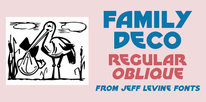 Family Deco JNL was inspired by the bold Art Deco hand lettering of the movie credits for the 1936 Laurel and Hardy comedy “Our Relations”, and is available in both regular and oblique versions.
 - Equalizer by Negara Studio,
$17.00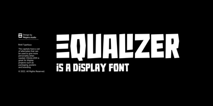 EQUALIZER is a bold font. The capitals have a set of alternates that can be used to give more personality when needed. EQUALIZER is great for display projects such as packaging, posters and branding.
 - Road Repair JNL by Jeff Levine,
$29.00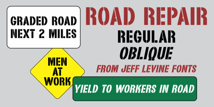 Road Repair JNL is a bold (hand lettered) sans serif stencil font based on the opening credits from the 1954 film “Drive a Crooked Road” – and is available in both regular and oblique versions.
 - Juicy Fruit by Seemly Fonts,
$14.00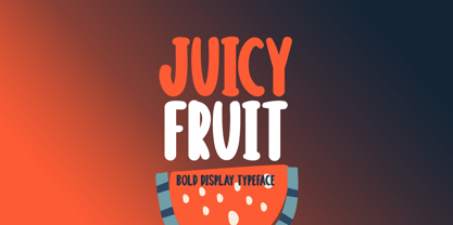 Juicy Fruit is a bold and paint-brushed display font. No matter the topic, this font will be an incredible asset to your fonts’ library, as it has the potential to elevate any creation.
 - Magemin by Sealoung,
$25.00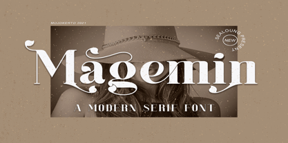 Magemin is an elegant and bold serif font. It is defined by smooth curves and is perfect for fashion branding or editorial designs. Add it confidently to your projects, and you won’t be disappointed.
 - Grimly Fiendish by Comicraft,
$19.00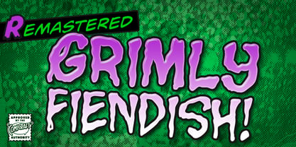 Twas brillig and the slithy toves did gyre and gimble in the wabe. All mimsy were the borogoves and the mome raths outgrabe. Nuff Said! Features: Two weights (Regular & Bold) with alternate uppercase characters.
 - Black Jacky by IbeyDesign,
$19.00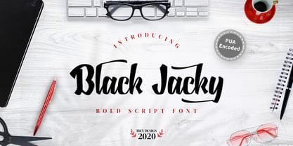 Black Jacky Bold Script Font is versatile script font that has a wide spectrum of applications ranging from greeting cards to headlines and is guaranteed to add a romantic feel to your next project.
 - Orange Melon by Motokiwo,
$15.00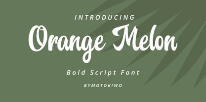 Orange Melon, a bold script font that is suitable for headline, logotype, apparel, invitation, branding, packaging, advertising etc. This typeface is comes in uppercase, lowercase, large range of punctuation, symbols & numerals, also support multilingual.
 - Contraform by Gleb Guralnyk,
$14.00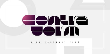 Hello! Introducing a high contrast font named Contraform. It's a geometric shape bold typeface with modern creative look. This font includes lots of multilingual characters (check out a screenshot with available letters and signs).
 - Triple Condensed Gothic by BA Graphics,
$45.00A triple condensed gothic based on the letter form of Franklin Gothic. Great for fitting a lot into a small space. With its condensed and extra bold appearance it makes a great headline face. - Boughies by Rochart,
$18.00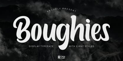 Boughies is modern bold display font. Boughies is great for branding, logo design, lettering, clothing, posters, magazine and other design project and also provides some Stylistic Alternates, Ligatures, Multilingual support and already PUA encoded.
 - Tralee by Tanincreate,
$12.00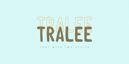 Tralee Font family consist of 2 styles, regular with outline and bold filled with background colour. Originally designed for packaging typography, also would be suitable for titles, headlines, greeting cards, adverts, books and more.
 - My Puma Oblique Outlined - Unknown license

- ascsys - Unknown license

- AIDino - Unknown license

- B5wingdings - Unknown license

- SF Junk Culture - Unknown license

- Flux Capacitor - Unknown license

- DayTrippin - Unknown license

- Flubber - Unknown license

- Leaves & Straw by Stone Type Foundry,
$49.00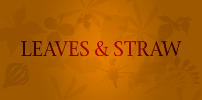 These ornaments are made from plants which grow on Alphabet Farm, the place where Stone Type Foundry is located.
 - Freska by ActiveSphere,
$30.00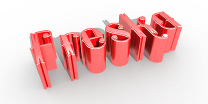 Freska is a custom font which is applicable for any type of graphic design - print, web, motion graphics etc.
 - TigerCat by ActiveSphere,
$30.00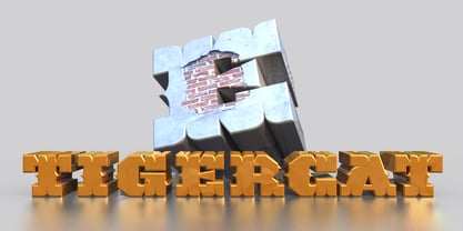 TigerCat is a custom font which is applicable for any type of graphic design - print, web, motion graphics etc.
 - Cinio by TeGeType,
$29.00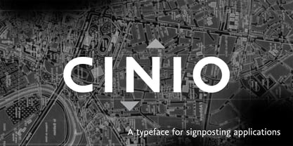 The Cinio family was specially designed for sign applications. This type family is used by several cities in France.
 - Xira by ActiveSphere,
$30.00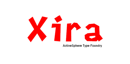 Xira is a custom font which is applicable for any type of graphic design - print, web, motion graphics etc.
 - Mecanic by Manolo Type,
$15.00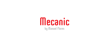 Their angular lines are strongly contrasted by sweeping curves, the result: one type with firm character and strong personality.
 - Cloister Black CT by CastleType,
$39.00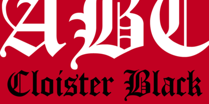 A clean-cut blackface type. As with all highly ornate typefaces, this should not be used in all caps.
 - Adelanto JNL by Jeff Levine,
$29.00Adelanto JNL is a wood type revival featuring a condensed sans serif face with chamfered [rather than rounded] corners. - Antique Five by Wooden Type Fonts,
$15.00A revival of one of the popular wooden type fonts of the 19th century, suitable for text or display. - Mercurio by Cubo Fonts,
$29.00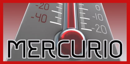 Mercurio is a sans serif type, inspired by scientific symbolism. It has a soft grey appearance suitable for text.
 - Engel by Intellecta Design,
$9.00Engel is a revival of a classic wood type font, in a large array of variations in the family. - Yoriko by URW Type Foundry,
$19.99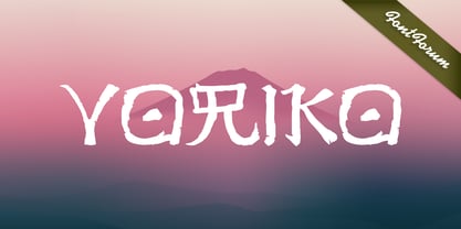 Yoriko is a Latin display type from Frank Lüdicke. Its design was heavily influenced by Japanese brush stroke glyphs.
 - Antique XX by Wooden Type Fonts,
$15.00A revival of one of the popular wooden type fonts of the 19th century, suitable for display, extra condensed. - Lockup JNL by Jeff Levine,
$29.00Lockup JNL is a more condensed version of Jeff Levine's Hoosegow JNL - based on a classic wood type design. - Limes by Piñata,
$9.90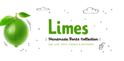 The idea of Limes emerged at the seashore last year in late summer. Getting ready in advance for a dark winter, we've decided to design a special fontfamily which would bring a bit of vitamins and summer sun into the rough everyday routine and help us survive the cold winter. Limes is both a dream of the sun while it’s gone and a refreshing breeze for the time when it finally gets warm! Limes is a completely handwritten fontfamily and consists of 23 typefaces. To create Limes Sans and Limes Slab families, we've used regular watercolor brushes, and to create monolinear Limes Script, as well as for Catchwords and Dingbats, we've used a felt-tip pen with circular section. Limes Sans and Limes Slabs fonts work perfectly together with Limes Script due to the general handwritten idea, as well as due to the widths contrast – despite its width, Limes Script mixes well with narrower opponents and adds a bit of human spontaneity into the general handwritten concept. The Limes collection includes: Limes Sans (Thin, Light, Regular, Bold, Black & italics), Limes Slab (Thin, Light, Regular, Bold, Black & italics), Limes Script, Catchwords and Dingbats. Limes Sans and Limes Slab widely support OT features: tnum, ordn, frac, case, numr, dnom, subs, sups, and Limes Script uses a large number of context alternatives.
 - Elido by Kontour Type,
$50.00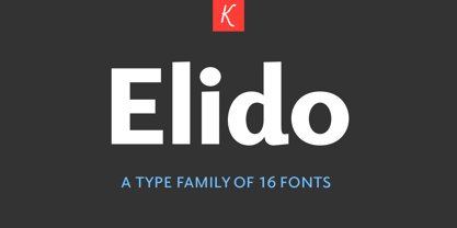 Elido (Odile in reverse) is the sans counterpart to the Odile type. Together they form a sans/serif superfamily with a wide range of variations for editorial use. Elido follows Odile’s proportions and matches the weight and typographic color of its serif twin. Elido is a sans with classical proportions. A slight geometric hint and open counters convey an airy feel. Elido’s family structure and relations within echo the conceptual approach of Odile. The arched stroke low off the stem reveals a script characteristic most pronounced in the Elido Upright Italic. This particular interpretation is gradually diminished in the Italic and becomes even less emphasized in the Regular. Six balanced weights, from an elegant Light to a pronounced Black, are in tune with three display solutions and a set of beautiful Ornaments. These variants allow for a diverse and multifaceted typography for the discerning type user. Sans serif initials amount to a rare finding. The charming monolinear Elido Initials come in two flavors, elaborate and rational, designed to hold their own in editorial and headline sizes. This type design boasts an extensive character set, many OpenType features including roman and italic Small Caps, five sets of numerals, beautiful ligatures, and many more. OT stylistic variants (with accents) offer a one-story “a” for the roman weights, alternate “g” and “s” designs for the italics, and a variant glyph “s” for the Upright Italic. These distinct qualities with its versatile and sincere traits make Elido an excellent choice for text and display use.
 - LFT Etica Sheriff by TypeTogether,
$35.00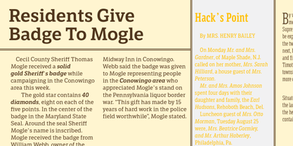 "LFT Etica, the moralist type family by Leftloft, began at the end of 2000, but its development is ongoing as it expands to fill the astute designer’s needs. The starting point was the common, cold grotesque sans typefaces — ubiquitous and often badly applied in their everyday visual environment. The challenge was to obtain the same force, versatility, and colour, but with a much warmer feel. LFT Etica resides aesthetically somewhere between a grotesque and a humanist sans serif, resulting from a design of soft strokes with open counters and terminals. LFT Etica successfully combines forcefulness and delicacy, wrapping both with sober charm. Milan-based Leftloft studio teamed up with Octavio Pardo to develop 24 additional styles for the very successful LFT Etica type family. This expansion is a direct response to type users’ requests who found in LFT Etica a de facto choice for web design. The new styles come in two series — 12 condensed widths and 12 compressed ones — and have proven versatile in applications where the ratio between information and space becomes an important challenge. Each letter was scrutinised to ensure durability throughout time and adaptability within circumstance, so LFT Etica meets the challenge of balance head-on. With its wide current range of 40 styles and many OpenType features (four sets of numerals, fractions, arrows, and dingbats, as well as stylistic alternates), LFT Etica is a versatile typeface suitable for corporate or casual use, for printed publications as well as web design. The complete LFT Etica family, along with our entire catalogue, has been optimised for today’s varied screen uses."
 - Binder by Grype,
$16.00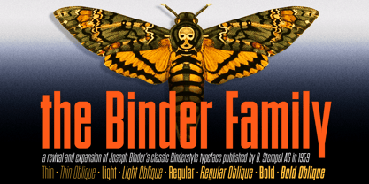 Our Binder Family is a revival and expansion of Binder-Style, a typeface designed by Joseph Binder and released by D. Stempel AG in 1959. It originally was a single weight. In later film type adaptations, a bold style, and an outline with drop shadow style were made available. However, this typeface never really had a true sense of family or larger language compatible character set. The original Binder-style typeface found revived popularity with its super condensed style when it appeared on the movie poster for "Silence of the Lambs". It was always a disappointment to me how this typestyle had never gained more traction in use. And so, many years later, we decided to revive the original typestyle, and expand it with a range of weights and obliques to pair with those weights. We've moved most of the unusual lowercase forms to a Stylistic Alternates feature, along with unicast alternates for the Capitals. The family includes a full standard character set with expansive international support of latin based languages, and 4 weights jumping from Thin to Bold, along with 4 accompanying obliques. This family is ready for you to eat it up with a nice glass of Chianti. Here's what's included with the Binder Family: 538 glyphs per style - including Capitals, Lowercase, Numerals, Punctuation and an extensive character set that covers multilingual support of latin based languages. 4 weights: Thin, Light, Regular, & Bold. Accompanying Obliques with each weight/width style. TTF formatted fonts have been hinted for optimal performance. Here's why the Binder Family is for you: You're in need of a stylish condensed font with a variety of weights and obliques for your designs You're a fan of the typographic works of Joseph Binder, but wish there was more to them You love the style of Agency and Bank Gothic, but want something uber-narrow You are desperate to recreate the movie poster from Silence of the Lambs You just like to collect quality fonts to add to your design arsenal


