7,106 search results
(0.03 seconds)
- Moreganic by Invasi Studio,
$19.00 Inspired by plants and healthy lifestyles. Introducing Moreganic Font, our new and fun font collection. Combining a hand-drawn style with a modern touch. Moreganic comes with Alternates that you can use to give more options to your projects. Moreganic Font is ideal for branding projects or packaging that need an organic and playful feel.
 - Rough Cut NF by Nick's Fonts,
$10.00An old Art Nouveau typeface named "Daphne" provided the inspiration for this decidely different font. This version is upright, but the linocut treatment employed visually suggests the slight rightward slant of the original typeface. Bold, unusual and distinctive. Both versions of the font include 1252 Latin, 1250 CE (with localization for Romanian and Moldovan). - Ulysses by ITC,
$29.99Ulysses was created by English designer Timothy Donaldson in 1991, an impulsive, dynamic alphabet in handwritten style. The sketchy strokes, the clear slant to the right and the light stroke contrast lend the font its flow and energy. Ulysses suggests randomness and individuality and is therefore perfect for invitations, greeting cards and other personal correspondence. - Calligraphy - Unknown license

- Commuter - Unknown license

- Eloquence by Monotype,
$31.99 Eloquence has a modern aesthetic with a strong classical influence – this is the “Renaissance Remixed”. While being inspired by the first printed texts of the Renaissance period, this typeface has contemporary features such as a high x-height, open bowls and counters, along with razor-sharp serifs and terminals. It has been designed specifically for creating a pleasant reading experience. With a comprehensive character set, Eloquence can comfortably handle printed documents such as novels, magazines, annual reports, along with their equivalent online/digital formats. This 14-font family also has a few tricks up its sleeve by means of some neat, complementing discretionary ligatures and alternates that will prove to be useful embellishments to your typography. Small Caps are included too, along with corresponding diacritics meeting the Latin Extended specification. You can view more details, design examples, and a specimen PDF at eloquence-font.com Key Features: • 14 font family – 7 weights in Roman and Italic • Small Caps, Alternates, Ligatures, with Proportional, Old Style, Small Cap, Fractions, Numerators, Denominators, Superior, and Inferior Figures • Full European character set (Latin Extended) • 900+ glyphs per font.
 - Wildly by Eurotypo,
$36.00 Wildly is a casual, modern and hand brushed font. I've designed Wildly carefully with the intention to preserve in its glyphs the original tell-tale dry brush imperfections and a bouncy baseline for a more personalized effect even more authentic. As an exclusively Open Type release, with 622 glyphs and 50 ornaments, it has several special alternatives for all letters with lots of possibility an an infinity of combinations. There are plenty of options to allow you to create something unique and special: standard and discretionary ligatures, swashes and stylistics alternates for each letter. These lovely fonts have already an extended character set to support Central and Eastern as well as Western European languages. This will help your creativity and make it easier to make the impressive and elegant typographic work. This font is a perfect choice for greeting cards, posters, labels, t-shirt design, logos, and more. Wildly was designed to make your project more beautiful and attractive! To activate the optional glyphs you may click on buttons in any OpenType savvy program or manually choose the characters from Glyph Palette.
 - Chancery Lane by K-Type,
$20.00 Chancery Lane is a condensed cursive with a breezy, flowing feel. Many of the lowercase characters join up, some uppercase ones too, and the two fonts are slantier than many other chancery-inspired faces, inclined at almost 20°. Each glyph has slightly rounded corners to bestow softness and warmth. The typeface emerged from a study of pen lettering, italic scripts and chancery hands – down a rabbit hole and along the Chancery Lane. The research ranged from early cancellaresca manuscripts to contemporary fonts, and also calligraphic work, most notably that of Indian artist Mayank Baranwal whose lowercase letters inspired many of the Chancery Lane glyphs. Uppercase characters have been designed to harmonise with the lowercase rather than providing overly ornamental openers, true to origins that were functional rather than fancy. Both the capitals and the uppercase alternates are unfussy and relatively simple, and the lowercase swash characters are similarly understated, only modestly flourished. Stylistic alternates and lowercase swash characters can be accessed using OpenType-aware applications or font management software.
 - Compita by Studio Buchanan,
$12.00 Compita is a Neo-Grotesk(ish) typeface that started life as a love-letter to Berthold's classic. But for every rigid, Neue-Haasism, there exists an equal and opposite amount of humanist attributes – along with a deliberate dose of creative license. It has some over-emphasised features and terminal endings which help to create its friendly personality, but sits them on a slightly condensed overall width. Together they help balance each other out, creating a face that feels both affable and professional. Aff-essional perhaps? The character set contains everything the modern day designer needs, including diacritic support for over 30 languages. And It’s packed full of the usual opentype features (that most will probably ignore) – Small caps, multiple number sets, and discretionary ligatures, to name just a few. Whether it’s deployed as a display face, or as the dependable choice for text, Compita is useable across multiple disciplines. Set in online, on screen or in print – it’s proof that not everything has to be Montserrat or Raleway...
 - South Rose by The Ocean Studio,
$15.00 South Rose is modern sweet Calligraphy South Rose is such the perfect typeface for any kind of your project, such as advertisements, branding, graphic design, quotes, wedding design, logo for online or offline business, photography, and others. Make your business more beautiful! Note : this helps you to use all of our font functions To get Special Characters like Our Preview Image · Adobe Photoshop go to Window - glyphs · Adobe Illustrator go to Type - glyphs You can get special characters by access Character Map for Windows user, and Font Book for MAC user. Download tutorial below : How to Access special characters, You can Download the link for Support you http://www.mediafire.com/file/o3sml68hxp6h6yd/Access_Spesial_Characters.pdf/file This is information and tutorial how to use ligatures in Adobe Illustrator, Adobe Photoshop, Microsoft Word (Windows and Mac). And Enable alternates characters in other apps. Download the guide here : http://www.mediafire.com/file/edm9sjjwx9g1vi2/How_to_Active_Ligature.pdf/file if you get a trouble on our font kerning : http://www.mediafire.com/file/9e0q5sjzx97e06m/how_to_slove_trouble_kerning.pdf/file Includes · Beginning and Ending Characters · Ligatures · Numbers + punctuation · International Languange
 - Diaria Pro by Mint Type,
$40.00 Diaria started as a project in Typeface Architecture for Master in Advanced Typograghy at EINA, Centre Universitari de Disseny i Art de Barcelona, a course tutored by Laura Meseguer and Íñigo Jerez Quintana. Later it has developed into Diaria Pro, an extensive typeface including Cyrillic script, small caps, and various OpenType features. Diaria Pro is a low-contrast serif typeface designed as a primary text face for the newspapers. Its large x-height and static exteriors allow comfortable reading in narrow columns, and calligrafic counters as well as dynamic serifs add humanist detail to overall perception and incline contrast axis without affecting interletter counterforms. Besides extensive language support, Diaria Pro includes various OpenType features: ligatures, discretionary ligatures, small caps, 6 sets of digits, superiors, inferiors, fractions, ordinals, upper-case punctuation, and some language-specific features. Diaria Pro also has a sans-serif companion - Diaria Sans Pro. Some of the styles of Diaria Pro can be found in Mint Type Editorial Bundle together with other fonts which make some great pairs. Check it out!
 - Ar Rayyan by LetterStock,
$20.00 Ar Rayyan Ar Rayyan is a decorative font that was inspired by middle east style design that i saw online, and it was crafted by hand to add a natural handmade feeling and i make it clean with pentool. If you looking for decorative font with middle east tyle for your title or even branding and logotype, Ar Rayyan is a great choice for that purpose. Opentype features: Ar Rayyan font is very good looking in logotype, labels, decorative lettering, playful design, product packaging, invitation titled, advertising and others. This decorative font works with folowing languages: Afrikaans, Albanian, Asu, Basque, Bemba, Bena, Chiga, Cornish, Danish, English, Estonian, Filipino, Finnish, French, Friulian, Galician, Gusii, Indonesian, Irish, Italian, Kabuverdianu, Kalenjin, Kinyarwanda, Low German, Luo, Luxembourgish, Luyia, Machame, Makhuwa-Meetto, Makonde, Malagasy, Malay, Manx, Morisyen, North Ndebele, Norwegian Bokmål, Norwegian Nynorsk, Nyankole, Oromo, Portuguese, Romansh, Rombo, Rundi, Rwa, Samburu, Sango, Sangu, Scottish Gaelic, Sena, Shambala, Shona, Soga, Somali, Spanish, Swahili, Swedish, Swiss German, Taita, Teso, Vunjo, Zulu. Thank you for using this font. LS
 - Tin Lizzie JNL by Jeff Levine,
$29.00 One of the most unusual sets of antique stencils spotted for sale online comprises a set of twenty-four classic logos of early 20th Century automobile companies. For whatever purpose that is now lost to time, these stencils represented the logos of many of America's finest auto manufacturers; most now just historical memories. The logos were painstakingly redrawn, maintaining the distinctive look of the hand made cutting, although it was an exacting process - some of the images were taken at an angle, and a bit of artistic license had to be used as a compensatory factor. It is to be noted that any and all of the logos presented in this font are the intellectual property of the companies, successors or assignees that may still hold the rights to these symbols. No endorsements by such corporate entities are either expressed or implied. Additionally, it is advised that any use of these logos be restricted to historical or hobby purposes, and they should not be used in a way that would construe any authorized reproduction of the logos in a commercial fashion.
 - Hello Honey by Krafted,
$10.00 Looking for a font that’ll make your branding sparkle? A versatile, modern, and happy font? Introducing Hello Honey - A Bold Script Font. This bold script font can be used for various different promotions or projects. Use it to create standout headings, promote your online sales, Instagram quotes, YouTube vlogs, and even printed materials like business cards, t-shirts, or invitations. Get ready to attract your audience and make your branding bold with Hello Honey. What you’ll get: Multilingual & Ligature Support Full sets of Punctuation and Numerals Compatible with: Adobe Suite Microsoft Office KeyNote Pages Software Requirements: The fonts that you’ll receive in the pack are widely supported by most software. In order to get the full functionality of the selection of standard ligatures (custom created letters) in the script font, any software that can read OpenType fonts will work. We hope you enjoy this font and that it makes your branding sparkle! Feel free to reach out to us if you’d like more information or if you have any concerns.
 - Pepone by Storm Type Foundry,
$43.00 This typeface is primarily optimized for the setting of belles-lettres. The regular styles are balanced to suit small text sizes and enable the reading of long portions of text. The development of the typeface was guided by the goal of creating a contemporary, discreet book serif, with modern expression and numerous functions. Letters feature reduced contrast, the lighter styles may evoke wired letters, while the heavier ones bear distinct slab serif references. The extremes thus work in harmony and fulfil the demanding requirements of advertising and magazine layout. The typeface is suitable for bottle labels, invitations, exhibition catalogs and posters, for printed and online presentations alike. The name Pepone was chosen as an homage to Josef Kroutvor. Of course, the typeface isn’t solely reserved for the setting of the works of Josef K. On the contrary – we’d like to present a universal typeface suited for literature, catalogs and magazines. It wouldn’t be the first and the last example of a typeface created with a specific purpose in mind, which later became used universally.
 - FS Sally by Fontsmith,
$80.00 Bookish A little bit bookish, but quietly elegant and well-proportioned, FS Sally is a graceful font family. It’s a refreshingly uncomplicated design that brings sophistication to text and display type, and a distinctive aplomb to both large and small volumes of text. Hidden talents There’s more to FS Sally than meets the eye. Choose Standard for the Latin alphabet or Pro if you work with Cyrillic and Greek typography. There’s a large range of special features, including elegant small caps and a set of discretionary ligatures to add a traditional flavour to figures and fraction sets. Rhythmic There’s a rhythm and flow to FS Sally – the result of the classic but asymmetric design of its serifed feet and shoulders. The inward curve of the serif at the shoulder and the outward curve at the foot subliminally guide the eye through each letterform, and the flicked feet of the “a”, “d” and “u” add an extra kick of energy to the rhythm. The italic forms have their own flow, too, with a pen-like fluency that retains the formal discipline required for a text type. Regular to heavy FS Sally’s five weights, all with italics, cover every kind of print application. The regular weight is elegant in display and an easy read in longer texts. A subtle step up from the regular is the medium, which was created to deliver a stronger colour and finish in poorer printing conditions. The semibold offers a strong alternative to the regular at smaller sizes, and its intermediate feel suits it to sub-headings, title pages and calmer designs. The bold works excellently in book and title headings, and FS Sally Heavy lends weight and punch to poster headlines and logotypes.
 - FS Sally Paneuropean by Fontsmith,
$90.00Bookish A little bit bookish, but quietly elegant and well-proportioned, FS Sally is a graceful font family. It’s a refreshingly uncomplicated design that brings sophistication to text and display type, and a distinctive aplomb to both large and small volumes of text. Hidden talents There’s more to FS Sally than meets the eye. Choose Standard for the Latin alphabet or Pro if you work with Cyrillic and Greek typography. There’s a large range of special features, including elegant small caps and a set of discretionary ligatures to add a traditional flavour to figures and fraction sets. Rhythmic There’s a rhythm and flow to FS Sally – the result of the classic but asymmetric design of its serifed feet and shoulders. The inward curve of the serif at the shoulder and the outward curve at the foot subliminally guide the eye through each letterform, and the flicked feet of the “a”, “d” and “u” add an extra kick of energy to the rhythm. The italic forms have their own flow, too, with a pen-like fluency that retains the formal discipline required for a text type. Regular to heavy FS Sally’s five weights, all with italics, cover every kind of print application. The regular weight is elegant in display and an easy read in longer texts. A subtle step up from the regular is the medium, which was created to deliver a stronger colour and finish in poorer printing conditions. The semibold offers a strong alternative to the regular at smaller sizes, and its intermediate feel suits it to sub-headings, title pages and calmer designs. The bold works excellently in book and title headings, and FS Sally Heavy lends weight and punch to poster headlines and logotypes. - Typist Slab Prop by VanderKeur,
$25.00 The Typist SlabSerif is part of a big family, the Typist Family. The family consists of a monospaced, a SlabSerif and a SansSerif version. The idea behind this family originated from the research into the design of typewriter typestyles, which is also the reason why the monospaced version was released first. Since it was decided from the start to make a SlabSerif and a SansSerif version of these monospaced fonts, it was also a logical consequence that the proportional variants also became available in these versions. The monospaced SansSerif fonts have been given the name 'Code' since they are designed to be used while writing code for a software program, for example. The proportional variants with each 6 weights of the Typist Slab Serif and Code (SansSerif) are now available. Although the name may seem a bit strange, it is a logical consequence from the monospaced variant. The SlabSerif variant therefore has Typist Slab Prop, written in full the Typist SlabSerif Proportional. After all, who wants to be bothered with long font names in their font menu. The entire Typist family is designed as a font for use in editorial and publishing publications. A lot of attention has been paid to the spacing and kerning of the fonts. Due to the many variants and weights, this font is versatile. Typist Font Family was designed by Nicolien van der Keur and published by vanderKeur design. Typist Slab Prop and Typist Code Prop contains each 6 styles (Thin, Light, Regular, Medium, SemiBold and Bold, each weight also designed as a true italic) and has family package options. The links to the monospaced version of The Typist are here: https://www.myfonts.com/collections/typist-slab-font-vanderkeur https://www.myfonts.com/collections/typist-code-font-vanderkeur
 - Typist Code Prop by VanderKeur,
$25.00 The Typist Code SansSerif is part of a big family, the Typist Family. The family consists of a monospaced, a Slab Serif and a SansSerif version. The idea behind this family originated from the research into the design of typewriter typestyles, which is also the reason why the monospaced version was released first. Since it was decided from the start to make a SlabSerif and a SansSerif version of these monospaced fonts, it was also a logical consequence that the proportional variants also became available in these versions. The monospaced SansSerif fonts have been given the name 'Code' since they are designed to be used while writing code for a software program, for example. The proportional variants with each 6 weights of the Typist Slab Serif and Code (SansSerif) are now available. Although the name may seem a bit strange, it is a logical consequence from the monospaced variant. The SansSerif variant therefore has Typist Code Prop, written in full the Typist Code Proportional. After all, who wants to be bothered with long font names in their font menu. The entire Typist family is designed as a font for use in editorial and publishing publications. A lot of attention has been paid to the spacing and kerning of the fonts. Due to the many variants and weights, this font is versatile. Typist Font Family was designed by Nicolien van der Keur and published by vanderKeur design. Typist Slab Prop and Typist Code Prop contains each 6 styles (Thin, Light, Regular, Medium, Semi-Bold and Bold, each weight also designed as a true italic) and has family package options. The links to the monospaced version of The Typist are here: https://www.myfonts.com/collections/typistslabfont-vanderkeur https://www.myfonts.com/collections/typist-code-font-vanderkeur
 - Sangli by insigne,
$- It started in 2007 with Chennai, the first of a three-part series of sans that I envisioned with slab serif counterparts. Each font would differ from the others in how the stem terminals were expressed. The initial font was extremely well received, and a revitalized and remastered Chennai made its appearance two years later, complete with new weights and new, novel OpenType features. Then came Madurai, a variation of Chennai based on the same core, only without the rounded stems. Chennai’s rounded stems made it distinctive and great for headlines but left it lacking appeal as copy--a problem that Madurai easily solved. And now comes Sangli, the final iteration of my original 2007 vision. Sangli is a happy medium. Like Chennai, it’s great for headlines--but not too distinct for copy. Sangli keeps the same core structure as the other two, but new less sharp forms give this latest font a friendlier look that’s more versatile than the original Chennai and less formal than Madurai. The font includes a whole range of six weights from light to black, along with condensed and extended options as well for a total of 54 fonts. There are plenty of OpenType features, including small caps. Alternates include normalized capitals and lowercase letters that include stems for when you want a more traditional look or when you’re writing copy. Sangli also supports over 70 languages that use the extended Latin script. Use Chennai, Madurai, and their slab serif variants interchangeably with Sangli, too, for even more options in your work. All three complement one another well. So when you need a balanced font that stands boldly on the page and commands your reader’s attention, look within and find your Sangli.
 - Yume by Thinkdust,
$10.00Yume is a fun loving font with a cruel streak that can sometimes turn laughter into daggers. This wicked personality can lead to some aggressive turns of phrase, but when it’s not being mean, Yume can use its strength and sense of humour to do a lot of good. Either way, Yume is sure to have a big impact on your audience, shocking them into paying attention through crisp, sharp lines and chunky, bold characters. - Gamilia by Craft Supply Co,
$15.00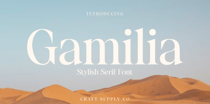 Presenting Gamilia: A stylish serif font that exudes elegance and sophistication. With its refined lines and contemporary charm, Gamilia adds a touch of class to your projects. Elevate your designs with Gamilia's timeless style, perfect for capturing attention with a dash of refinement. This typeface is ideal for greeting card, packaging, brand identity, poster, or any purpose to make your design project look eye catching and trendy. Feel free to play with this typeface!
 - Grotbox by Aah Yes,
$4.95Grotbox is an interesting, if not startling, distressed punk font. There are two varieties: one with upright characters; the other with the characters rotated out of whack for extra informality. Legibility is maintained, despite the wild industrial feel of the typeface, and it's designed to grab the attention. The zip package contains both OTF and TTF versions - install either OTF or TTF, not both versions of a font on the same machine. - Blonk by Zeptonn,
$- Looking for a big, bold, black typeface? Meet the fat solid curves of Blonk! This type is based on hand-drawn letterforms with basic curves and angles, so it still retains softness and has a handcrafted feel. Yet, its boldness suits poster design, packaging, and other uses that needs to draw attention, in an quirky yet distinctive way. All glyphs are handcrafted by illustrative designer Zeptonn. Prepare to make a Blonk statement!
 - Antique Vintage by Arendxstudio,
$15.00 Antique Vintage - Script font is a type of font that features thick and prominent strokes, giving it a bold and impactful appearance. The letters are usually interconnected, creating a flowing and handwritten look. The boldness of the font makes it stand out and grabs attention, making it a popular choice for headlines, titles, and logo designs. It exudes confidence, strength, and creativity, making it suitable for various design projects that require a strong visual impact.
 - Duck Duck by 066.FONT,
$9.99 Duck Duck is a display font in which each letter has been handwritten, giving it an authentic and original character. It exudes a varied and extravagant style, and with its daring and sophisticated letterforms, Duck Duck attracts attention and gives projects a touch of nonchalance. It is ideal for creative projects such as posters, invitations or branding materials, where a striking and distinctive text finish is sought that stands out. Remastered in 2022.
 - Tyrumate by Differentialtype,
$12.00 Tyrumate is an elegant serif font with a vintage touch and classic. Comes in two styles, regular and italic. Its clean lines and meticulous attention to detail embody the essence of classic typography, making it a chic serif font. Tyrumate is suitable for template design, brochures, videos, advertising branding, logos, invitations, layout designs, elegant crafts, beauty designs, and much more. It will add a splash of luxury to any design project you want to create!
 - Becham by Craft Supply Co,
$15.00 Introducing Becham: A bold sans-serif font that commands attention with its strong presence. With its impactful lines and modern appeal, Becham adds a bold touch to your projects. Elevate your designs with Becham's assertive style, making a striking statement that can't be ignored. This typeface is ideal for greeting card, packaging, brand identity, poster, or any purpose to make your design project look eye catching and trendy. Feel free to play with this typeface!
 - Sazzle by Craft Supply Co,
$20.00 Introducing Sazzle - Compressed Sans Serif: A sleek typeface that demands attention with its tightly compressed design and minimal white space. With its clean lines and modern appeal, Sazzle adds a touch of sophistication to your projects, making an unignorable, bold statement. This typeface is ideal for greeting card, packaging, brand identity, poster, or any purpose to make your design project look eye catching and trendy. Feel free to play with this typeface!
 - Vembazax Rm by HIRO.std,
$- VEMBAZAX RM is a Display font. This font describes about strong, taft, manly, hard, power, masculine, stiff, mighty, brave, gallant, rigid. FEATURES - Support Opentype Features - Support Ligatures - Uppercase - Numbering and Punctuations - PUA Encoded Characters - Multilingual Support - Works on PC or Mac USE VEMBAZAX RM works great in any branding, logotype, magazines, poster, social media posts, clothing, advertisements, product packaging, product designs, label, company profile, quotes and any projects that need STRONG taste.
 - VT Showcard by VarsityType,
$15.00 This condensed block is a true knockout. VT Showcard is a heavy-hitting headliner with presence. Inspired by the boxing showcards of the 60’s and 70’s, VT Showcard towers over body copy and demands attention. This tall and mighty athletic display typeface features chiseled corners and subtle embellishments that reinforce a steady rhythm across its dramatic letterforms. With 7 weights, VT Showcard provides a versatility for sports headlines and similar projects.
 - Morque by Craft Supply Co,
$20.00 Morque – Sans Serif Font: Bold and Expressive Boldness in Every Letter: Morque – Sans Serif Font stands out with its all caps design. It’s perfect for impactful titles and displays. This font commands attention in any visual space. Ideal for Titles and Displays: Morque’s bold structure makes it ideal for titles and visual displays. It enhances the readability of headlines. This font is a go-to for designers aiming for a strong statement.
 - Aestero by Craft Supply Co,
$20.00 Aestero Futuristic Typeface Cutting-Edge Inspiration Aestero Futuristic Typeface, drawing from Gundam and sci-fi aesthetics, embodies a cutting-edge design for a bold display impact. Sleek Sci-Fi Elegance Named Aestero, this font seamlessly blends Gundam inspiration with sci-fi elegance, presenting sleek characters with a futuristic charm. Dynamic and Bold Presence Aestero commands attention with dynamic and bold letterforms, making it an ideal choice for projects seeking a strong visual presence.
 - Sorren by Reserves,
$49.00 Sorren is a definitive bold condensed sans influenced by neo-grotesque designs. A relatively low stroke contrast complimented with sharp, horizontal stroke ends lend an unyielding appearance, while it’s rounded forms and refined curves juxtapose its inherent strength with grace. Stylistically, Sorren has a classic, timeless feel with a contemporary finish and attention to detail. It is characteristically more elegant and considerably sturdier than the typical condensed sans, lending to its singular disposition.
 - Modern Couture by Rochart,
$25.00 Modern Couture font is an elegant and artistic script font, designed with beautiful and soft handwriting style. Each letter has a unique stroke, with flowing and agile shapes, and an attention-grabbing signature. This font is ideal for graphic designs that require a personal and artistic touch, such as wedding invitations, greeting cards, posters, and more. Modern Couture font, you can add a touch of beauty and genuine hand impression to your design projects.
 - Hipnouma by Arterfak Project,
$19.00 Introducing Hipnouma, an experimental condensed font that draws inspiration from psychedelic and brutalist styles. This unique typeface is designed with a consistent wavy effect, creating an elegant and attention-grabbing aesthetic, making it perfect for your design projects. Hipnouma comes with special characters that enable you to create typography variations effortlessly, and it also supports multiple languages. It's the ideal choice for headlines, posters, logos, websites, social media, apparel, quotes, packaging, and more.
 - Regnante by BustanType,
$19.00 Regnante was created with all of my heart. It has a luxury style, is stylish and lovely, and has a strong personality, so it will catch your attention. This font is ideal for a wide range of tasks including branding, logos, packaging, and more. Regnante includes 12 fonts, including 4 weight variations and Italic style. Regular and Alternate are come separately. You can make your selection based on your personal preferences and requirements.
 - Manoer by Craft Supply Co,
$20.00 Manoer – Display Serif Font: Uniquely Eye-Catching Funky and Fresh Design: Manoer – Display Serif is a font that brings a funky twist to traditional serif. It’s perfect for unique, eye-catching displays. This font adds a playful charm to any project. Ideal for Creative Displays: With its unique flair, Manoer excels in creative display needs. It captures attention in advertising, posters, and more. This font is a top choice for making a bold statement.
 - Fabulous Sunday by Balpirick,
$15.00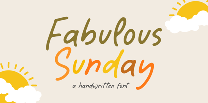 Fabulous Sunday is a Handwritten font that's perfect for adding a personal touch to your design projects! With its natural, organic feel and unique character. Crafted with care and attention to detail, this font is incredibly versatile and can be used for a range of design projects, including logos, branding, invitations, and more. Its modern, handwritten style gives it a unique character that's sure to make an impact. - also multilingual support Thank you!
 - Pokrak Nowy by 066.FONT,
$9.99 Pokrak Nowy is a display font in which each letter has been handwritten, giving it an authentic and original character. It exudes a varied and extravagant style, and with its daring and sophisticated letterforms, Pokrak Nowy attracts attention and gives projects a touch of nonchalance. It is ideal for creative projects such as posters, invitations or branding materials, where a striking and distinctive text finish is sought that stands out. Remastered in 2023.

