10,000 search results (0.08 seconds)
  1. Lane - Posh - Personal use only
  2. SixtySeven - Unknown license
  3. BN M@TAN - Unknown license
  4. Weehah - Unknown license
  5. Devroye - Unknown license
  6. GhoulyBooly - Unknown license
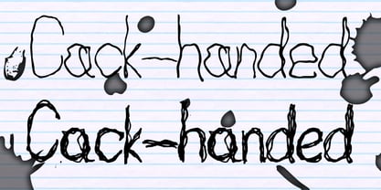
  7. Cack-handed by Kerry Colpus Designs, $25.00
    Cack-handed was created by writing with my left hand even though I am right handed.
  8. Bedaax - Personal use only
  9. roinert - Personal use only
  10. pixcoose - Personal use only
  11. wmxyo - Personal use only
  12. renvem - Personal use only
  13. The font named "Ash" brings to mind an elegant yet robust typeface that likely balances traditional design elements with modern flair. Without having a specific, widely-known font called "Ash" availa...
  14. TA Bankslab Art Nouveau by Tural Alisoy, $40.00
    TA Bankslab graphic presentation at Behance The building of the Northern Bank of St. Petersburg's Baku branch was built in 1903-1905. It was the first Art Nouveau-style building in Baku, Azerbaijan. Later the bank was transformed into the Russian-Asian Bank. After the oil boom in Baku in the 19th century, branches of many banks and new banks were opened in the city. The branch of the Northern Bank of St. Petersburg was among the first banks that was opened in Baku. N.Bayev was the architect of the building for the branch of the Northern Bank of St. Petersburg located at Gorchakovskaya 3 in 1903-1905. The building currently houses the Central Branch of the International Bank of Azerbaijan. My purpose in writing this is not to copy and paste the information from Wikipedia. What attracted me to the building was the word "Банкъ" (Bank) written in Cyrillic letters, which was also used in Azerbaijan during the Soviet era. The exact date of the writing is not known. Every time I pass by this building, I always thought of creating a font of this writing someday. I had taken a photo of the building and saved it on my phone. I did a lot of research on the font and asked a lot of people. However, some did not provide information at all and some said they did not have any information. I was interested in the history of this font but I do not know if this font really existed or it was created by the architect out of nowhere. If there was such a history of this font, I wanted to recreate this font and make it available. If not, I had to create it from scratch in the same way, using only existing letters on the building. Finally, I made up my mind and decided to develop the font with all letters I have got. It was difficult to create a font based on the word, Банкъ. Because in the appearance of the letters, the midline of the letters on A, H, K was very distinct, both in the form of inclination and in more precise degrees. The serif part of the letters, the height of the upper and lower sides, differed from each other. I don't know whether it was done this way when the building was constructed or it happened over time. I prepared and kept the initial version of the font. I took a break for a while. I started digging on the story of the font again. Meanwhile, I was researching and got inspired by similar fonts. Unfortunately, my research on the font's history did not yield any results. I decided to continue finishing up the font. After developing the demo, I created the font by keeping certain parts of these differences in the letters. In addition, I had to consider the development of letters in the Cyrillic, as well as the Latin alphabet, over the past period. Thus, I began to look at the appearance of slab-serif or serif fonts of that time. In general, as I gain more experience in developing fonts, I try to focus on the precision of the design for each font. In recent years, I specifically paid attention to this matter. YouTube channel and articles by Alexandra K.'s of ParaType, as well as, information and samples from TypeType and Fontfabric studios on the Cyrillic alphabet were quite useful. I gathered data regarding the Latin alphabet from various credible sources. I do not know if I could accomplish what I aimed at but I know one thing that I could develop the font. Maybe someday I'll have to revise this font. For now, I share it with you. I created the font in 10 styles. 7 weight from Thin to Extra Black, an Outline, Shadow, and Art Nouveau. The Art Nouveau style was inspired by the texture in the background used for the text on the building. The texture I applied to capital letters adds beauty to the font. If you like the font feel free to use it or simply let me know if your current alphabet doesn't support this font.
  15. Ah, Fleurs de Liane by Chloe - if fonts were a garden, this one would be the enchantingly mysterious path that leads you through a whimsical wonderland of floral elegance and handwritten charm. Conce...
  16. Interplanetary Crap, crafted by the renowned typeface designer Ray Larabie, stands as a notable entry in the modern archive of unique and thematic fonts. Known for his ability to infuse personality a...
  17. Signerica Fat - Personal use only
  18. Shit Happens - Personal use only
  19. Ornamental Versals - Personal use only
  20. Zekton - Unknown license
  21. Compostable - Personal use only
  22. Janda Everyday Casual - Personal use only
  23. Dem Bones - Personal use only
  24. The Hands of Deaf - Personal use only
  25. Battleforce 5 - Personal use only
  26. COWABUNGA - Personal use only
  27. btd Cart-O-Grapher (bitmap) - Unknown license
  28. Gizmo - Unknown license
  29. Lady Ice - Condensed - Unknown license
  30. Q-bo - Personal use only
  31. Lady Ice - Expanded - Unknown license
  32. Gizmo - Shade - Unknown license
  33. VTC NightOfTheWackedDead - Unknown license
  34. VTC NightOfTheDrippyLowCaps - Unknown license
  35. Covington SC Exp - Unknown license
  36. Zekton - Unknown license
Looking for more fonts? Check out our New, Sans, Script, Handwriting fonts or Categories
abstract fontscontact usprivacy policyweb font generator
Processing