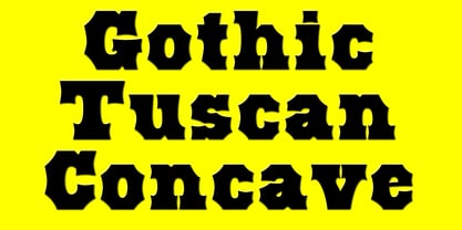
A revival of one of the popular wooden type fonts of the 19th century, a very useful design for display, lowercase missing, very narrow, unusual splayed serifs at top and bottom of strokes.
These are the letter forms from the famous monument in memory of the founders of the state of Israel.
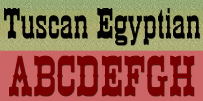
A revival of one of the popular wooden type fonts of the 19th century, suitable for text or display.
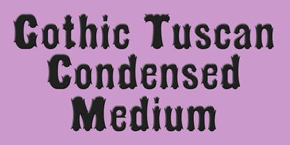
A revival of one of the popular wooden type fonts of the 19th century, suitable for display, extra condensed.

Many local variants of the Greek alphabet were employed in ancient Greece during the archaic and early classical periods, until around 400 BC, when they were replaced by the classical 24-letter alphabet that is the standard today. All forms of the Greek alphabet were originally based on the shared inventory of the 22 symbols of the Phoenician alphabet, with the exception of the letter Samekh, whose Greek counterpart Xi (Ξ) was used only in a sub-group of Greek alphabets, and with the common addition of Upsilon (Υ) for the vowel /u, ū/.[1][2] The local, so-called epichoric, alphabets differed in many ways: in the use of the consonant symbols Χ, Φ and Ψ; in the use of the innovative long vowel letters (Ω and Η), in the absence or presence of Η in its original consonant function (/h/); in the use or non-use of certain archaic letters (Ϝ = /w/, Ϙ = /k/, Ϻ = /s/); and in many details of the individual shapes of each letter. The system now familiar as the standard 24-letter Greek alphabet was originally the regional variant of the Ionian cities in Anatolia. It was officially adopted in Athens in 403 BC and in most of the rest of the Greek world by the middle of the 4th century BC.
MetroBots is a fun loving, non-traditional but very functional family of 6 fonts made of big city skies, the long tropical morning shadows of ancient ziggurats and entire pueblo villages, nestled into the steep cliff-sides of sage-topped mesas in south western deserts. This is a good solid, but kind of whacky looking display type family borrowing from the heft of good old-fashioned children�s wooden building blocks and the look and feel of both modern and ancient pueblo architecture. With a bit of the not-so-subtle expressiveness of a comical robot on a WD-40 high on the side.
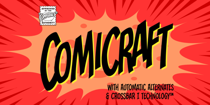
FIFTEEN YEARS! Hundreds of fonts of Unique Design, Thousands of pages of Fine Lettering, Millions of satisfied customers and Elephantmen served! Yes, this month marks Comicraft's fifteenth anniversary and we're celebrating with the relaunch of the COMICRAFT website and the launch of a brand new font... a font that's not just a bunch of letters arranged in alphabetical order... this one's Carefree, Original, Mirthful and Interesting, it's Clever, it's a little bit Raunchy, a little bit Adventurous, Friendly and Tenacious all at the same time -- and if that doesn't spell COMICRAFT, then we just didn't eat enough chocolate today. COMICRAFT: Stimulating the release of endorphins in your system preferences since 1992.
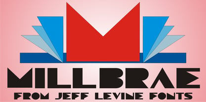
In the city of Millbrae (just South of San Francisco in San Mateo County, California) stands an office building which formerly housed the Millbrae Theater. California has the distinction of preserving artifacts of its past, unlike many other portions of the US, and the perpendicular "Millbrae" sign with its neon tubes and Art Deco lettering is still attached to the renovated structure. Gene Gable (a friend of type designer Jeff Levine) took a photo of the sign and sent it along as simply an image of great lettering of the past to enjoy, but it triggered the inspiration to create the namesake font Millbrae JNL.
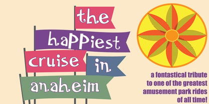
Inspired by the signage of one of the greatest theme park rides in the world (you know, the one with the song that you can't really get out of your head), The Happiest Cruise in Anaheim is sure to bring your small world of fonts closer. Whether a world of wonder or a world of cheer, the playful, quirky and childlike joy of the curves and lines will hopefully set your work on a journey through imagination!
At first glance, Else may seem to be similar to many of the Century typefaces, with its prominent figures and sturdy alphabet. But when Robert Norton, of Norton Photosetting Ltd., designed Else in 1982, he added a bit of flair to that basic model. Note the bowl of the g, the splayed legs of the M, the sharply curved G and J, as well as the leading strokes of v and w and both of the graceful ampersands.
Chift by Alexandra Korolkova, $20.00 Chift is a quite narrow serif font for both body text and headlines in periodicals, where economy of space is needed. The type family consists of ten faces: five styles of low contrast for body text sizes and five styles of high contrast, including Hairline and Black, for display purposes. One of the main features of the typeface is its professionally-designed Cyrillic, which won one of the special prizes at Modern Cyrillic 2009 competition in Text category.
This font consists of 26 design elements derived and adapated from various architectural works of Charles and Henry Greene who created hundreds of designs for houses, furniture and decorative arts in their own unique interpretation of the "Arts & Crafts" style in the early years of the 20th Century, mostly in Pasadena, California. Many of the picture elements are designed to form distinctive borders, and the variety of designs contained in this font encourages their use in many creative ways.
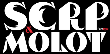
Designed for ParaType in 2003 by Tagir Safayev. The typeface was inspired by some of the Cyrillic letterforms of Sergey Chekhonin (1878-1936). Chekhonin belonged to the World of Art group, which is so closely associated with the flowering of Russian book and theater design at the beginning of the 20th century. For use in advertising and display typography. Serp & Molot has been adjugded Award of Excellence in Type Design of 'bukva:raz!' ATypI International Type Design Competition, 2001.
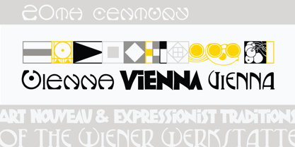
The Vienna Workshop (Wiener Werkstätte) produced a tremendous variety of art from the turn of the century until the beginning of World War II. This set, which includes three typefaces and a collection of graphic extras, draws on both the Art Nouveau and Expressionist traditions of the Workshop.
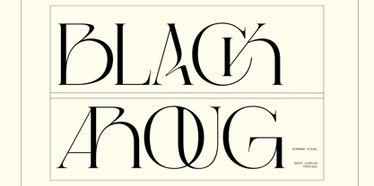
Introducing Black Aroug, crafted to capture the essence of design from the 1890s. Inspired by the ornate aesthetics and artistic intricacies of the period, this typeface combines the elegance of Victorian-era typography with a touch of modern refinement, creating a unique blend of old-world charm and contemporary
Discovered within the pages of a turn-of-the-Twentieth-Century specimen book of the Società Nebiolo of Turin, Italy, was this little gem, which shows both antique and Art Nouveau influences. Both versions of this font include the complete Latin 1252 and Central European 1250 character sets.
Canvas was inspired by the textural qualities of painting and drawing letters on, of course, rough canvas. Canvas will give your artwork a rough, painterly feel, yet Canvas is readable and clear. Canvas will add a bit of the texture of fabric to all of your paper arts.
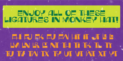
Monkey Hat is art deco with a fresh twist of graffiti, and on top of that a lot of funk! Comes with a good handful of ligatures to make the text even more playful!
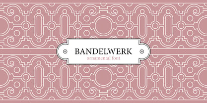
Collection of ribbon geometrical ornaments, that were popular in Europe in the 16th and 17th centuries in the age of Mannerism. The given ornaments can be attributed to the styles of strapwork of bandelwerk.
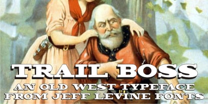
Trail Boss JNL emulates vintage wood type and was inspired by a few visual examples found online. The erratic widths of the letters are part of the intrinsic charm of this kind of lettering.
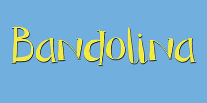
Bandolina is a fun, hand drawn typeface. Didone-ish, off-key, jumpy and full of happy glyphs. It comes with a bagful of quirkiness, a pinch of eccentricity and a full range of diacritics.
Worn and torn, dry and cracked, resistant to wind and rain... the skin of the elephant is a thing of dry beauty and ancient wisdom... During the gold rush, the phrase “Seeing the elephant” became synonymous with the high cost of each prospector’s dreams and hopes --- not only the prospect of wealth beyond the dreams of avarice in California but also the possibilities of encountering misfortune on the journey. Like the circus elephant, gold was an exotic sight, and seeking it was an unequalled experience, the adventure of a lifetime. Now we've created a font much like the skin of an Elephant and Adventure, Excitement and Really Wild Things are available in the pages of the comic book of the same name, Elephantmen.
Chekhovskoy, designed by the talented Marat Salychow, is a font that carries a distinct aura of refinement mixed with a touch of old-world charm. At first glance, it is immediately apparent that Chek...
Ah, the Armalite Rifle font, designed by the infamous Vic Fieger. If fonts had personalities, Armalite Rifle would be that one friend who thinks camouflage print is suitable for every occasion and be...
LC Bagira is an elegant and versatile typeface that captures attention through its blend of classic charm and contemporary flair. Named after Bagira, the wise black panther in Rudyard Kipling's "The ...
LemonCookieBold, created by Shara's Fonts, is a font that immediately evokes a sense of whimsy and sweetness, much like the delightful treat it is named after. This bold variant of the LemonCookie fo...
The font named "Kids" by Corel Corporation encapsulates the whimsy and creativity of childhood with its playful and cheerful design. Crafted to embody the essence of youthful handwriting, this font f...
Franklin Cascaes is a font that notably embodies a captivating blend of cultural heritage and artistic expression. Named after Franklin Cascaes (1908-1983), a celebrated Brazilian folklorist, artist,...
Steak, created by Last Soundtrack, is a distinctive font that immediately captures the attention of its audience. It is characterized by its bold, robust design which makes it stand out among various...
Ah, LT Anomaly, the typographic equivalent of that one friend who's both effortlessly stylish and a bit eccentric, brought to us by the whimsical digital pen of Nymphont. Picture this: each letter cr...
Picture it: a font that stalks the night, looming from the shadowy corners of design like the legendary vampire it's named after. "Nosferatu," conjured into being by the creative blood magicians at K...
Bebas, crafted in the bustling workshops of Flat-it, walks into the world of typography like it owns the place – and let's be honest, with its bold heart and towering stature, it nearly does. Picture...
SantaCruz is a font that evokes a laid-back, yet adventurous spirit reminiscent of the iconic coastal city it's named after. Its design carries the essence of surf culture, mingled with a vintage vib...
Based on a revival of one of the popular type fonts of the 19th century, suitable for display, or text.
A revival of one of the popular wooden type fonts of the 19th century, a very useful design for display.
A revival of one of the popular wooden type fonts of the 19th century. Suitable for posters and display applications.
A revival of one of the popular wooden type fonts of the 19th century; a very useful design for display.
The Ginga> font, created by the talented Billy Argel, is an embodiment of creativity and flair that effortlessly captures attention. Designed with a unique blend of street art influence and elegant c...
SlabRoundSerif-Light by Manfred Klein is a delightful and versatile font that bridges the gap between traditional serifs and the more modern, playful approach of rounded typefaces. This font is part ...
The Anderson Supercar font, crafted by the talented Steve Ferrera, is a font that exudes speed, strength, and the sleek elegance of a precision-engineered supercar. Typographically, it mirrors the es...
