10,000 search results
(0.038 seconds)
- Confas by Krntype Studio,
$16.00 A clean handwritten font. Confas come with stylish swashes, and ligature. This font also come with multilingual support. Confas is suitable for your creative design needs such as product packaging, merchandise, social media design, T-shirts, Logotype, and more.
 - Amethyst by Gatype,
$10.00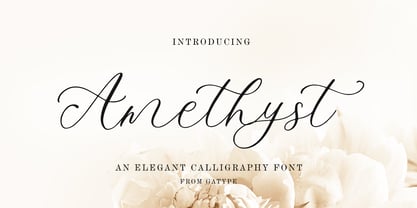 Amethyst is a modern calligraphy font. This font is casual and pretty with a stroke. Can be used for various purposes, such as logos, product packaging, wedding invitations, branding, headlines, signage, labels, signatures, book covers, posters, quotes, and more.
 - Nadall by Solotype,
$19.95This stylish lightface was designed by Bernd Nadall for Barnhart Bros. & Spindler as a caps-only font in 1895. The lowercase was added at Solotype a hundred years later, resulting in a font quite at home in modern advertising. - Race Sport by Namara Creative Studio,
$24.00 Race Sport is a modern techno display font, strong and unique style instantly add power and movement to your projects. It’s perfect font for sport or racing-themed projects, such as logo, poster, games, product design and much more.
 - Gastella Night by Fromletterel,
$12.00 Gastella Night is a handwritten font family consist of script, casual handwritten, and unique all caps font. In other words you can get four styles of fonts at once, all styles in this family is well matched to each other. Gastella Night Script font comes with few ligatures to make it looks more natural, also comes with slant style named Gastella Night Script Italic to make it looks more delicate when used as signature. Gastella Night Regular is a casual handwritten font, so it will be suitable to all kind of design, as tagline, quotes, etc Gastella Night All Caps consist the uppercase only, add this font to beautify your design with it's unique style.
 - ED Laurentsa by Emyself Design,
$9.00 Introducing - ED Laurentsa is a classic serif font family consisting of 9 Weights (Thin, ExtraLight, Light, Regular, Medium, Semibold, Bold, ExtraBold, and Black). Try DEMO Version : https://emyselfdesign.gumroad.com/l/pgtit ED Laurentsa has a classic minimalist look with a condensed style and has a wide variety from thin to black to suit your needs. This font is perfect for your design needs, such as logo design, branding, apparel, headings, web, etc. This font can also be easily combined with other fonts to create the perfect typography. Bold fonts are perfect for displays such as logos, or in-text headings. while the font with a thin style is suitable for covers, posters, or social media posts.
 - Mirkwood Chronicle - 100% free

- Middleton Brush by Canada Type,
$24.95 One of the earliest fonts published by Canada Type was Coffee Script, Phil Rutter's digitization of Robert Hunter Middleton's 1962 brush script, Wave. In 2010, when the font was revisited for an update, it was shown that it was too light for applications under 24 pt, and too irregular for applications over 64 pt. So the face was redigitized from scratch. This new digitization maintains a soft contour and a steadier stroke, as well as much better outlines for use at both extremes of scaling. Language support was also greatly expanded, and many alternates were added to the redigitized character set. The name was also changed to Middleton Brush, to better reflect the origins of the design, which was Middleton's response to Robert Smith's popular Brush Script Middleton Brush comes in all popular formats. Language support includes Western, Central and Eastern European character sets, as well as Baltic, Esperanto, Maltese, Turkish, and Celtic/Welsh languages.
 - Sonder by Fenotype,
$30.00 Sonder is a smooth brush Script and condensed Sans family of three weights on both. Both Script and Sans work as standalone fonts but they’re designed to go nicely together. Combine with Sonder Extras for smooth brush strokes for ambitious headlines, logos & posters. Sonder comes with a clean version and a “Print” version of each cut. Print versions have delicately rugged outlines and print texture inside. Sonder Script is packed with several OpenType features: Contextual Alternates and Standard Ligatures are automatically on to keep the text vibrant. If you need even more sparkly letters try Swash, Stylistic or Titling Alternates. The Scripts are PUA encoded and you can access extras from character map in most design softwares. For the best price Sonder can be purchased as “clean” Family - or as Print Family that has all cuts as printed versions. For the absolutely best price get the whole Complete Family pack that has all fourteen fonts and go wild with it!
 - Janna by Linotype,
$40.99 Janna is designed by Lebanese designer Nadine Chahine. It is based on the Kufi style but incorporates aspects of Ruqaa and Naskh in the letter form designs. This results in what could be labeled as a humanist Kufi, a Kufi style that refers to handwriting structures and slight modulation to achieve a more informal and friendly version of the otherwise highly structured and geometric Kufi styles. Janna, which means heaven" in Arabic was first designed in 2004 as a signage face for the American University of Beirut. So, the design is targeted towards signage applications but is also quite suited for various applications from low resolution display devices to advertising headlines to corporate identity and branding applications. The Latin companion to Janna is Adrian Frutiger's Avenir which is included also in the font. The font also includes support for Arabic, Persian, and Urdu as well as proportional and tabular numerals for the supported languages."
 - Intelo by Kastelov,
$25.00 Intelo was created with the single idea of redefining what makes a functional grotesque typeface nowadays. Its large x-height and letterforms with subtle elliptical finish create a distinctive look that can help brands cater to an increasingly design savvy audience. To top it off, Intelo comes in two versions - an attention-grabbing original cut and an additional version with flat endings for a more streamlined effect. The family weights range from thin to extrabold with matching italics making it a versatile choice and perfectly suited for digital applications including web and interaction design as well as printed media such as editorial and corporate materials. When it comes to Opentype features, Intelo is loaded with stylistic alternates, tabular figures, fractions, ligatures, and more. In addition, the font family has an extended language support featuring Western, Eastern and Central European languages. To sum it up, the friendly and inviting letterforms of Intelo came as a solution to the need for more human fonts in our technology-oriented environment.
 - 1885 Germinal by GLC,
$38.00 This script font was inspired by a lot of manuscripts, notes and drafts, written by the famous french novelist Émile Zola (1840-1902). Specially, letters and notes from the period he was writting "Germinal" one of his very famous novel (published in 1884-1885) depicting the french minor's life in the past middle of eighteens. It is an elegant pen written type, sometimes connected, sometimes disrupted, but always regular and legible, with many variants, ligatures and contextual alternate glyphs specialy numerous in the OTF version. It is used as variously as web-site titles, posters and fliers design or greeting cards, all various sorts of presentations, menus, certificates, letters. This font, in spite of its small size, supports very strong enlargements as well as small sizes ( the original size was about 22 to 30 pts ). When printed, it remain perfectly legible and elegant from 12/14 pts even if using an ordinary inkjet printer.
 - Opificium Sans by Unio Creative Solutions,
$5.00 Opificium is a visual contemporary sans serif typeface composed of three weights plus their matching obliques. The industrial design creates and develops concepts and specifications that optimize the function, value, and appearance of products. Indeed, this is reflected in the concept behind each glyph of our font family which geometry has required particular attention for the purpose to preserve optical exactness, along with proportions continuity. The whole design of this typeface is in fact ruled by versatility and legibility and makes it functional for any text in small and large sizes. "Opificium" typeface includes over 450 characters with coverage for several languages using the Latin alphabet as well as the Greek alphabet. The font family provides advanced typographical support such as a significant number of neat standard and discretionary ligatures and broad support of OpenType features (OTF). Recommended for headlines, logos, and any destination of use such as corporate identity, typography, posters, web design, and social feeds.
 - Palatino Sans Informal by Linotype,
$29.99 Palatino Sans Informal was designed as part of a group of three font families: Palatino nova, Palatino Sans, and Palatino Sans Informal. Together these three families act as the fulfilment of Herman Zapf’s original Palatino idea. Palatino, which was born as a metal typeface in 1950, proved to be one of the 20th Century’s most popular designs. Not only is Palatino Sans Informal a completely new typeface, it is also a completely new interpretation of the entire sans serif genre. Its letterforms are curved, rounded, and soft, not hard and industrial. In comparison with Palatino Sans, Palatino Sans Informal offers eccentricities that are somewhat artistic and more individual looking. The fonts in the Palatino Sans Informal family include several OpenType features, such as an extended character set covering all Latin-based European languages, old style figures, small caps, fractions, ordinals, ligatures, alternates, and ornaments. Palatino Sans Informal can be mixed well with Palatino and Palatino Sans.
 - Cardo - Personal use only

- Magistoe by Masinong Studio,
$15.00 Magistoe script a new fresh & modern script with a handmade calligraphy style, decorative characters and a dancing baseline! So beautiful on invitation like greeting cards, branding materials, business cards, quotes, posters, and more. Magistoe script come with 274+ glyphs. The alternative characters were divided into several Open Type features such as Swash, Alternates Set. The Open Type features can be accessed by using Open Type savvy programs such as Adobe Illustrator, Adobe InDesign, Adobe Photoshop Corel Draw X version, And Microsoft Word. And this Font has given PUA unicode (specially coded fonts). so that all the alternate characters can easily be accessed in full by a craftsman or designer. To enable the OpenType Stylistic alternates, you need a program that supports OpenType features such as Adobe Illustrator CS, Adobe Indesign & CorelDraw X6-X7. There are additional ways to access alternates, using Character Map (Windows), Nexus Font (Windows), Font Book (Mac) or a software program such as PopChar (for Windows and Mac). For use in office word, you all can read the following article to access alternate glyphs: http://www.magpiepaperworks.com/blog/using-opentype-fonts-in-microsoft-word/ If you have any question, don't hesitate to contact me by email masinong.studio@gmail.com Thanks and happy designing :-) Thank You for purchase!
 - World Discovery by Mans Greback,
$69.00 World Discovery is a stunning calligraphy font that exudes a sense of beauty, romance, and exploration. The artistic swirls and slanted serifs come together to create a distinctive, high-quality, and exclusive typeface that will bring an antique charm to your designs. World Discovery has its origin in 15th-century discovery maps. Designer Mans Greback procured maps from the state library, and the exquisite penmanship and intricate details on the map, showcasing the venture of exploration and the grandeur of the Age of Discovery, sparked the unique and evocative letterforms that now make up the World Discovery font. The font offers an impressive array of 19 styles, including six distinctive main styles, their italic versions, as well as light, regular, and bold weights, as well as a Swash style for added flair. Combining the fonts gives you infinite possibilities to create a truly customized typographical artwork. The font is built with advanced OpenType functionality and has a guaranteed top-notch quality, containing stylistic and contextual alternates, ligatures, and more features; all to give you full control and customizability. It has extensive lingual support, covering all Latin-based languages, from Northern Europe to South Africa, from America to South-East Asia. It contains all characters and symbols you'll ever need, including all punctuation and numbers.
 - Phiz by Shinntype,
$29.00 Phiz is a diverse suite of 28 decorative fonts based on Figgins Sans Extra Bold. Classic (10 fonts), Rounded (7 fonts), Rough (4 fonts) and Particles (7 fonts). The Rough and Particles styles emerge as a unique niche—neither imitating distressed printing (e.g. the “rusty” look), nor casual, hand-drawn styles. These type designs are conceived and executed as complex algorithmically-generated graphic procedures, in which repetitive elements have been artfully applied to the Sans capitals, and manually nuanced. As such they also differ substantially from textured glyph shapes that have been cut out from larger pattern fields, for the constituent particles are disposed in relation to the specific shape of each character they define. The caps-with-small-caps format was chosen for two reasons. Firstly, titling display usage is predominantly capitals, and secondly, rather like optical scaling, having the same resolution of texture available in two different “sizes” (upper and lower case) should prove useful in the hierarchy of page layout—not primarily for setting upper and lower case text as caps-with-small-capitals, although this is of course an option. All figures and major symbols (punctuation and currency) are provided in both cap and small cap height.
 - Averia Serif - 100% free

- News Cycle - 100% free

- nineveh - 100% free

- Averia Sans - Unknown license

- Averia - 100% free

- Rambat Campotype - Personal use only

- LT Stopwatch - 100% free

- LT Sonoma - 100% free

- LT Wave - 100% free

- LT Superior - 100% free

- LT Superior Serif - 100% free

- LT Makeup - 100% free

- LT Beverage - 100% free

- LT Renovate - 100% free

- PF Bague Slab Pro by Parachute,
$79.00 PF Bague Slab Pro draws its inspiration from early 20th century slabs and was designed as a companion to Bague Sans, a versatile monoline typeface with a distinct and eye-catching personality. Following its predecessor’s design guidelines, it overcomes the monotonous and mechanical rigidity of early geometrics by introducing subtle variations in stroke width and semi-wedge serifs rather than square slabs. These striking serifs, along with a mixture of attractive letterforms, exude a strong, modern and energetic personality at display sizes. On the other hand, at small sizes these distinct characteristics become subtle and the simplistic geometric personality of the typeface comes in place to offer a highly readable text. Bague Slab Pro is a very clean and legible typeface with a warm and well-balanced texture which is ideal for editorial design, branding and corporate identity. This superfamily includes 18 weights from Hairline to Ultra Black with a consistent and well-refined structure. The italics are slightly narrower than the romans with cursive characteristics. Each style consists of 718 glyphs with 13 opentype features and an extended set of characters which supports simultaneously Latin, Cyrillic and Greek. PDF Specimen Bague Slab Pro on Behance
 - The Grumpy Lime by SilverStag,
$9.00 Inspired by the new color of the season, The Grumpy Lime is my take on a super playful, 100% handwritten font! It has over 75 ligatures and alternate letters so you can play with it and get the look you need. And whether you have a client that needs a new quote design, or a social media post, it’s perfect for you. Check out the photos I have prepared for you to see what you can do with it and happy creating! This font pack also includes full language support, punctuation, numerals and detailed instructions how to use alternate letters most of the apps on your computer, as well as in Canva. And it also comes in three versions: vintage, solid & outline! I invite you to check out the preview images, and I hope you will be immersed in my vision for this creative typeface that, I am sure, will work for all kinds of interesting projects you might be working on this year. If you end up publishing your designs on Instagram, tag me - @silverstagco and I will make sure to showcase your design and work to my audience as well! Grumpy Lime - Playful Ligature Font: TheGrumpyLime - Solid Playful Handwritten Font with over 75 Ligatures & Alternates TheGrumpyLime-Vintage - Vintage Playful Handwritten Font with over 75 Ligatures & Alternates TheGrumpyLime-Outline - Outline Playful Handwritten Font with over 75 Ligatures & Alternates Over 75 Ligatures & Alternates Numerals & Punctuation Language Support Web Font Kit is included as well Detailed instructions on how to use alternates in most of the apps on your computer as well for Canva Happy creating everyone!
 - Valenzka by UICreative,
$23.00 Introducing our new product the name Valenzka Vintage Serif Fon. Modern Serif font that feels beautiful classy, elegant, and modern. This font is perfectly suited for a wide variety of projects, such as signature, stationery, logo, wedding, typography quotes, magazine or book covers, website headers, clothing, branding, packaging design, and more. Also for fashion-related branding or editorial design and displays both masculine and feminine qualities.
 - Streetcar JNL by Jeff Levine,
$29.00 An ebay purchase of a vintage Speedball lettering pen set yielded an extra bonus… numerous alphabets on paper rendered in both pen and ink and via pencil sketches. One such design in rough pencil layout is a classic serif typeface often found on many passenger and freight trains, trolley cars and busses. This “Railroad Roman” was scanned from the original sketches and then re-drawn digitally, all along retaining the charm and attractiveness often found in hand lettering. The end result is Streetcar JNL, which is available in both regular and oblique versions.
 - Hercílio by Sea Types,
$25.00 Hercílio is a typographic family without condensed serif, modern and geometric inspired by the architectural forms of the Hercílio Luz Bridge in Florianopolis | Brazi Comprising eleven (11), weights of which ten (10) business are: Five weights Romans: Light, Normal, Regular, Medium and Bold Five Italics weights: Light, Normal, Regular, Medium and Bold And a weight (FREE) Hercílio Decorative Comprising 430 glyphs in each source, brings support for 56 languages (Latin and West, Central and East European) still has features Open Type, ligatures and tabular figures. http://www.cort9.com/wp-content/uploads/2016/05/Specimen_Hercilio.pdf
 - AB Ticena by Andres Briganti,
$20.00 Elegant and idiosyncratic, AB Ticena is a display and extended typeface inspired by the ancient forms of Lombardic capitals. The sometimes quirky and capricious letterforms take their inspiration from medieval forms found in inscriptions and manuscripts where latin Roman capitals were taken to new stylistic and even extreme expressions. The ultra-wide horizontal proportions and its modulated, humanistic strokes gives it a more refined and contemporary edge. AB Ticena works best for logotypes, short and striking headlines, and editorial purposes. A set of ligatures and stylistic alternates is also available for selected characters and pairings.
 - ITC Mudville by ITC,
$29.99ITC Mudville was Christopher Wolff's entry in the 1998 U&lc Type Design Competition, for which he won an Honorable Mention (Display). Mudville evolved from variations on hand-lettering that Wolff had done on a variety of projects over the years. The underlying shapes of the letters are formal roman letterforms, but the actual strokes retain the look of letters sketched casually on a layout. Mudville straddles the line between inline and outline type designs. It recalls some of the styles of popular lettering used in display advertising in the '20s. - Zosimo Pro by Delicious Type,
$49.00 Zosimo is a neo-grotesque typeface created by designer Ron Gilad (Delicious Type) in cooperation with renowned typographer Oded Ezer based on his ubiquitous Alchemist typeface. Carefully drawn curves, robust shapes and a range of OpenType features make Zosimo a great choice for designing logotypes, signage, titling, texts and more. Zosimo now comes in three families: Standard (full Latin support), Cyrillic (basic Latin and Cyrillic) and Pro (all included). Totalling in 9 weights, roman and italic, Zosimo can accommodate all your type-related design needs in one big happy family.


