10,000 search results
(0.055 seconds)
- Mystica by Aestherica Studio,
$12.00 Introducing the new Fun Handwritten Font by Aestherica Studio. Proudly Present, Mystica Mystica is perfect for product packaging, branding project, megazine, social media, wedding, or just used to express words above the background. Mystica also multilingual support. Enjoy the font, feel free to comment or feedback, send me PM or email.
 - Circuito by Katherin Funez,
$10.00 Looking for a font that give you an electrifying feeling? Circuito is a fun display font that can be used in your projects to give some character and style to your design. Inspired by the visual representation of electrical circuits, Circuito is the font that is energetic, happy and daring.
 - Lindisfarne Nova BT by Bitstream,
$50.99 Lindisfarne Nova is an uncial-like design based on the script found in the Lindisfarne Gospels. Created by Harry Pears and Margaret Layson, it is available in two weights, regular and bold. Lindisfarne Nova is Harry’s first completed font. There are also two companion styles, Lindisfarne Nova Incised and Lindisfarne Runes.
 - Christmas Kringle by Mvmet,
$16.00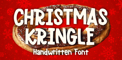 Christmas Kringle is a fun and festive Christmas display font. You can use it for anything ranging from t-shirts, book designs, and greeting cards to stickers and posters, or anything that needs a casual touch. Fall in love with its incredibly versatile style, and use it to create lovely designs!
 - Golden Opportunity JNL by Jeff Levine,
$29.00 The cover of vintage sheet music for "With Plenty of Money and You (The Gold Diggers' Lullaby)" from the Warner Brothers musical "Gold Diggers of 1937" had the movie title hand-lettered in a classic Art Deco style. Bold, brash and totally fun, this became the model for Golden Opportunity JNL.
 - Kendrick by Monotype,
$15.99 A heavy-set but lively font, Kendrick’s dense strokes were hand-painted using a thick wet brush. This all-caps set of letters is bold but brushy, textured and expressive; fun but very much meaning business. Kendrick is streetwise and no-nonsense, but with a big cheesy grin to boot.
 - Klose Slab by Studio Sun,
$20.00 Introductory Klose Slab Another Vintage Typeface from Studio Sun (SUN014) for your Fonts collection. Klose comes with 4 style (condensed, normal, semi expanded, and expanded) also available in Variable Font format (for customize widths). Perfect for logotype, head text, displayed text, and many more). Klose support more 75 language (Latin pro).
 - Merry Snowmen by Greater Albion Typefounders,
$5.00 Merry Snowmen is a piece of winter fun-is a set of hand-drawn snowwmen figures, ideal for Christmas or any other time when cold and snow are about. It complements our Merry Fleurons and Christmas Fleurons faces, and is ideal for all your cards, gift labels, invitations, posters and banners.
 - Monday Today by Sensatype Studio,
$15.00 Monday Today is a fun and playful cute typeface. It is perfect for logotype, flyer, greeting cards, packaging, book cover, printed quotes, headings, etc. What will you get: All Characters (from A to Z) Numbers and Punctuation Works on PC & Mac Simple installations PUA Encoded Thanks and have a wonderful day. :)
 - Sunday Snow by Sronstudio,
$15.00 Sunday Snow is a fun Handwritten Font, this font Is perfect for product packaging, product designs, label, photography, watermark, special events, or anything. Sunday Snow comes with uppercase and lowercase letters, multilingual symbols, numerals, punctuation. If you have any questions please don't hesitate to drop me a message :) Thank You, Sronstudio
 - Forsty Candy by Balpirick,
$15.00 Forsty Candy is a Fun Display Hand-brushed Font. Forsty Candy is perfect for product packaging, branding project, megazine, social media, wedding, or just used to express words above the background. Forsty Candy support multilingual. Enjoy the font, feel free to comment or feedback, send me PM or email. Thank you!
 - OC Blimp by OtherwhereCollective,
$99.00The inflatable font you never knew you always wanted! With its two axes you can literally blow this variable display font up and watch it float away… Uppercase display font built on OC Format Sans Print Bd Support for 84 languages 6 preset static Inflate styles gradually inflate and stay on the baseline. 6 preset static Float styles gradually inflate and rise from the baseline. Baseline punctuation and certain symbols don’t float to provide a grounded context. Various un-inflatable symbols carry over from Format Print Bd because they might come in handy as is. With a complete alternate set and double number ligatures years and zip codes don’t look repetitive (think 1991 – 10022 that sort of thing) Double letter ligatures prevent visual repetition in words like “balloon” and “coffee”. - Catchy Mager by Sensatype Studio,
$19.00 Catchy Mager is a unique and very elegant font for brand and logo design. Based on our experience as a graphic designer who works for a lot of companies, we often are requested to design a logo in a unique style but with an elegant shape. So, we try to brainstorming and create this font to make the idea is going out. This is perfect for BRANDING and LOGO DESIGN. You will get classy, elegant, and certainly unique logos with this font. To make it look more unique, here we prepared some ligatures: ab ah am an ar ap at cb ch cm cn cr eb eh em en ep er ub uh um un up ur fl fi ff ft ga gi it ai Include Fancy Style on Every Uppercase and Some Lowercase
 - Green Fairy by Maria Montes,
$39.00 Green Fairy is a chromatic font family highly ornamented for display purposes. Green Fairy’s characters have been specifically designed to accommodate its loops and ornaments following a modern typeface structure. Green Fairy has four chromatic weights: 1. Green Fairy Outline 2. Green Fairy Dots 3. Green Fairy Stencil 4. Green Fairy Full The outline weight has been created as the base or structure for the other weights. You can combine these weights as well as add colours to obtain multiple effects and type styles. Green Fairy has also three combined weights (combos) to simplify your work flow, for these occasions when you only want to use one single colour in your font: 5. Green Fairy Dots Combo 6. Green Fairy Stencil Combo 7. Green Fairy Full Combo GREEN FAIRY ORIGINS The origin of this typeface is the lettering I designed in October 2015 as part of my illustrated cocktail artwork called “Absinthe. La Fée Verte (The Green Fairy)”. Originally, this lettering only featured eight letters “AB·SINTHE” vector drawn in Illustrator. Right after creating the full-colour artwork, I designed a fountain-letterpress print version of it, in collaboration with Ladies of Letters, A.K.A. Carla Hackett and Amy Constable from Saint Gertrude Fine Printing. At the beginning of 2016 –and thanks to the project @36daysoftype– I found the motivation, and most importantly the deadline, to draw the rest of the twenty-six letters of the uppercase alphabet using Illustrator. I started 2017 having my first two calligraphy courses sold out, so I took this amazing opportunity to devote myself to Green Fairy for a few months. In February 2017, I purchased the font software Glyphs and I started to re-draw all twenty-six letters of the uppercase alphabet again. PRODUCTION PROCESS Green Fairy started being one weight, but quickly turned into a layered/chromatic font. Things were going more or less fine till I arrived to the Dots weight: 1) I started drawing squares following a grid; 2) Then, the squares turned into diamonds following the same grid; 3) Then, the grid wasn’t working so well on the round letters so I tried randomising the position of the diamonds but it didn’t work; 4) So I went back to the grid, and this time scaled down the size of the diamonds creating a visual half-tone effect. I spent over four weeks working on the Dots weight and I felt like I was in the middle of a very long tunnel and I couldn’t see the light at the end. I encountered many other problems along the way but by June 2017, I felt I was back on track again. I kept working, tweaking, re-drawing and re-adjusting, and then the diacritics came on board… And then more re-drawing, re-tweaking, re-adjusting and then numbers… And then spacing, symbols, and currencies… And then more spacing, kerning, contextual kerning for triplets… In September 2017 I told myself “that’s it, I’m going to finish it now!” But guess what? More re-tweaking, testing, hinting, testing, rendering, testing… For those of you not familiarized with typeface design, it is extremely time consuming and it requires a lot of hard work, focus and determination. This project could not have been possible without the help of these generous professionals: Jose Manuel Urós, typeface designer based in Barcelona and my teacher twice in the past; Jamie Clarke, freelance letterer and typeface designer who has released a couple of chromatic fonts recently; Troy Leinster, Australian full-time typeface designer living and working in New York City; Noe Blanco, full-time typeface designer and hinting specialist based in Catalonia; And Nicole Phillips, typographer currently relocating from Australia to New Zealand. To all of you: THANK YOU VERY MUCH!
 - Ollie by Eclectotype,
$40.00 Meet Ollie, a casual signage script whose friendly, bouncy exterior belies a heart of sophisticated OpenType programming. This font is designed to make the most of OpenType savvy applications, and as such is recommended for professional design use. Or to put it another way: Make sure that contextual alternates and ligatures are always turned on! Ollie includes about 900 glyphs, many of which are automagical substitutions to keep the text flowing smoothly, and to pseudo-randomly pick different glyphs to avoid repetition. With contextual alternates turned on (as they should be by default), most lowercase letters will alternate between at least two different forms. The powerful OpenType programming makes the font itself ‘look back’ (up to eight characters) on previously used letters; typing “banana” will give you three different a’s and two different n’s (the last a is a special ‘end form’ character). The calt feature controls many other ‘special effects’ which all add together to give a smooth-flowing, hand-lettered look. These effects include start and end forms (and indeed, ‘loner’ forms) of many letters, which are automatically substituted in at beginnings or ends of words, or when the previous or next letter doesn't connect. Another special feature tests to see if there is room for the crossbar of t (or tt ligature) to extend further over the previous or next letter, or both, as is often the case. The last main effect of the calt feature is to substitute certain letters typed before any ‘e’ character, to make for a more natural connection (see the pe combination in ‘Eclectotype’ in the first poster). Ligatures should be on by default, for a much nicer looking tt combination, and a few others besides. The swash feature should be used sparingly (one glyph at a time, really) to apply a more extravagant look to g,j and y in the lower case, and quite a few of the upper case too. Oldstyle figures are included, as well as the lining defaults. Now to delve into the stylistic alternates... These are all included in the salt feature, or for uses of applications that support them, separated into stylistic sets thus: ss01 - (with swash feature on) L and G swashes get even swashier. ss02 - standard s changes to a connected script s form. ss03 - r takes on a script form. ss04 - z also gets a scriptier look. [the previous three sets also change any versions of s, r or z with diacritics] ss05 - a useful underline function. When enabled, typing two or more underscores will extend a cool underline under the previous letters. More underscores = longer underline. ss06 - the Polish script lslash changes to its more standard form. ss07 - E, S and B change to a more top-heavy alternate form. ss08 - An alternate form for A characters. ss09 - Alterative rounder forms of M and N. ss10 - An alternate ampersand. That about wraps up the features. Now all that’s left is for you to license the font and get experimenting!
 - TT Ricordi Allegria by TypeType,
$29.00 Please note! If you need OTF versions of the fonts, just email us at commercial@typetype.org TT Ricordi Allegria useful links: Specimen | Graphic presentation | Customization options TT Ricordi Allegria is a sleek and intelligent contemporary Florentine grotesque inspired by the half-erased lettering in Basilica di Santa Croce, Florence. TT Ricordi Allegria was drawn by Antonina Zhulkova and reflects in its graphics the transitional stage between the classic serif with varying proportions, gravitating towards the Roman capital type, and the Florentine sans serif. The font is characterized by variability in the proportions of characters, contrast between strokes, wedge-shaped triangular characters, and the absence of traditional serifs. The main visual feature of the typeface is its diversity and the ability, using different stylistic sets, to completely change the character and perception of the typeface. The drawing of the characters from the main set is strict, thanks to which the font looks stern, as if the inscription in the font was really carved out of stone. And with the help of another set, we can add roundness, or even smoothness, to the font. This is due to the fact that the letters (E R K Q J Y in Latin, and Л К Ж Э in Cyrillic) from the second set have either very noticeable "curls" or smooth, rounded "legs". In addition, the typeface includes a set of beautiful ligatures for use in display inscriptions, such as large headlines. An interesting moment when working on the typeface was the creation of the Cyrillic typeset, since the Cyrillic alphabet does not so easily fit into the concept of the Florentine grotesque and stressed semi-serif. The most difficult thing in working on the Cyrillic alphabet was to create a system of spacing for characters, as it was done in the Latin alphabet, and to make sure that when typing in Cyrillic, the drawing of the text remained beautiful. That is why the letters Д Л У Ы appearing in the font family are somewhat unusual to the eye, and the proportions of other characters in Cyrillic are not quite “classic” either. In general, the Cyrillic set looks more display than its Latin prototype, but at the same time it lacks the sense of historicity or legacy of the Soviet past, which often comes to the foreground when working on the design of the Cyrillic alphabet in this type of serifs. TT Ricordi Allegria consists of two weights (Regular and Bold) and one variable font. Each style includes over 750 characters, as well as 19 OpenType features. Interesting features of the typeface include three stylistic sets that greatly change the perception of the font, a set of bright display ligatures, a few neat icons that are suitable for breaking text and will emphasize the visual language of the font. Please note! If you need OTF versions of the fonts, just email us at commercial@typetype.org FOLLOW US: Instagram | Facebook | Website
 - Prillwitz Pro by preussTYPE,
$49.00 Johann Carl Ludwig Prillwitz, the German punch cutter and type founder, cut the first classic Didot letters even earlier than Walbaum. The earliest proof of so-called Prillwitz letters is dated 12 April 1790. Inspired by the big discoveries of archaeology and through the translations of classical authors, the bourgeoisie was enthused about the Greek and Roman ideal of aesthetics. The enthusiasm for the Greek and Roman experienced a revival and was also shared by Goethe and contemporaries. »Seeking the country of Greece with one’s soul«. All Literates who are considered nowadays as German Classics of that time kept coming back to the Greek topics, thinking of Schiller and Wieland. The works of Wieland were published in Leipzig by Göschen. Göschen used typefaces which had been produced by until then unknown punch cutter. This punch cutter from Jena created with these typefaces master works of classicist German typography. They can stand without any exaggeration on the same level as that of Didot and Bodoni. This unknown gentleman was known as Johann Carl Ludwig Prillwitz. Prillwitz published his typefaces on 12th April 1790 for the first time. This date is significant because this happened ten years before Walbaum. Prillwitz was an owner of a very successful foundry. When the last of his 7 children died shortly before reaching adulthood his hope of his works was destroyed, Prillwitz lost his will to live. He died six months later. His wife followed him shortly after. The typeface Prillwitz as a digital font was created in three optical styles (Normal, Book and Display). The typeface Prillwitz Press was created especially for a printing in small sizes for newspapers. »Prillwitz Press« combines aesthetic and functional attributes which make written text highly readable. It was originally designed for a newspaper with medium contrast to withstand harsh printing conditions. Its structure is quite narrow which makes this typeface ideal for body text and headlines where space is at premium. For the Normal – even more for the Book – a soft and reader-friendly outline was created through a so-called »Schmitz« and optimized in numerous test prints. The arris character and the common maximal stroke width contrast of the known classicist typefaces (Didot/Bodoni) were edited by the study of the original prints. This was also done in order to reach a very good readability in small type sizes. This typeface is perfectly suited to scientific and belletristic works. Accordingly it has three styles: Regular, Bold and Italic as Highlighting (1). The typeface Prillwitz is a complete new interpretation and continuing development of the conservated originals from 1790. They have been kept in the German Library in Leipzig. It was always given the priority to keep the strong roughness and at the same time optimizing the readability of this striking font. The type family has all important characters for an efficient and typographic high quality work. ----------- (1) Accentuation of particular words or word orders (e.g. proper names, terms etc.). Typographic means for Highlighting could be Italic, SmallCaps or semi-bold.
 - KR Heartalicious - Unknown license

- Dot.com - Unknown license

- Gamegirl Classic - Unknown license

- BPchubby - Unknown license

- Shark Snack by Comicraft,
$19.00 Dumm DUM. Dumm DUM. Duh dum duh dum duh dum DUMMMM... Just when you thought it was safe to get back in the water, this font surfaces to take one last bite out of your summer vacation skinnydip! Scream and scream again — it won’t do you any good, SHARKSNACK is rough and ready to EAT YOU ALIVE! It’s too late to close the beaches, Chief Brody, this particular set of saw tooth letters has already consumed Dracula, the Werewolf, the Frankenstein Monster and any number of 70s comic book characters foolish enough to dip a toe in its maw!
 - Local Brewery Collection by Cultivated Mind,
$29.00 Local Brewery is back with a new vintage inspired font collection that includes a script, two sans serif fonts, icons and extras. The sans serif fonts and the script include regular, semi-bold and bold weights. The script is monoline with smooth edges. The sans serif fonts have a smooth edge with all caps letters. Local Brewery Script comes with caps and lowercase alternates. These alternates will give your designs an extra flair and uniqueness. The script and sans serif fonts work exceptionally well together. Use Local Brewery for packaging, products, websites, marketing and beer branding.
 - Aeonus by Harvester Type,
$20.00 AEONUS is a gothic font, an attempt to combine a wide-edged and pointed pen, while giving the font a readability that many gothic fonts lack. Angular shapes made strictly in 45 degrees and straight lines give the font a touch of futurism. A gothic, futuristic font that retains readability and makes a unique impression is the goal that was followed when creating the font. Aeonus also conveys the spirit of the occult and something dark. Aeonus is good for prints on clothes, posters, packaging, tattoo, merchandising, large headlines, logos, product design, and any other large font compositions.
 - Teenage Gonabe by Teenage Foundry,
$19.00 Teenage Gonabe – Groovy Display Font By Teenage Foundry Introducing our latest font creation – a groovy typeface that’s sure to transport you back to the funky, psychedelic era of the 60s and 70s! With its bold, playful style and unique character, this font is perfect for adding a retro feel to your design projects. This font is incredibly versatile and can be used for a range of design projects, including posters, album covers, branding, and more. Its groovy style gives it a unique character that’s sure to make an impact. Features: Uppercase, Lowercase, Numeral, Punctuation & Multilingual. For any questions please contact me 🙂 Thanks!
 - The Billates by Letterhend,
$14.00 Looking for a script font with a casual flair? Look no further than Billates! With its natural and free-flowing style, this font exudes a relaxed and informal look that is perfect for capturing a laid-back atmosphere. From handwritten notes to product packaging, Billates brings a touch of casual elegance to your design projects. Features : Uppercase & lowercase Numbers and punctuation Alternates & Ligatures Multilingual PUA encoded We highly recommend using a program that supports OpenType features and Glyphs panels like many of Adobe apps and Corel Draw, so you can see and access all Glyph variations.
 - Ersatz by Galapagos,
$39.00Ersatz has its vibrant roots in the Mediterranean climate of Spain. Tired of the functional monoline sanserif fonts used throughout Europe from road signage to corporate identity, Richard Dawson and Dave Farey, British type designers who crave color and sunlight, created a style that is refreshing and lively. The basic constructions are simple and attractive, mixing lower case shapes into the capitals - and unique letterforms into the lower case. There's a raunchy feel to Ersatz, soft curves and back kicks, if you listen very carefully you can hear the sharp guitars and the soft tambourine of the Flamenco. - Bloxic by Studio Buchanan,
$20.00 Bloxic is a chunky, counter-less display typeface, packed full extra characters and some bonus icons! Bloxic comes packed with over 320 glyphs, including stylistic alternate characters, circled numbers, and a whole bunch of useful symbols and stuff. It started life back in 2008, when pop/punk/emo bands were all the rage. Pulled from a hand lettered t-shirt design, adapted and systemised – it now exists for your typographic pleasure. It still carries some of the hand rendered feel of the original design, and has some slightly different takes on a zero counter typeface (which the world clearly need more of...).
 - Kaizena by MaxnorType,
$12.00 Kaizena is a modern script font with alternates, final form, stylistic sets, including front and back swashes. It can be used for various purposes, and suitable for logo design, branding, greeting cards, stationery, wedding invitations and much more. The design of Kaizena nuanced Japanese style, but it is very feasible to use in modern themed designs. Kaizena uses OpenType Features, so designers can access alternate glyphs easily with graphic design softwares. Besides that, these alternate glyphs are located in Private Use Area, so they can be accessed easily with Character Map, Babel Map, or font manager softwares.
 - NS Yorkest Poster by Novi Souldado,
$25.00 Experience the around-the-world traveling vibes from the past with Yorkest Poster. It was inspired by the vintage retro national travel arts and printings from the 60s and 70s eras back in the day. Comes along with 2 styles (Serif and Script) that would never go wrong to be paired. A pack of Stylistic Alternates features to give a personal touch to your design, and also Swashes to cover your visual needs to be stronger in every appearance. Perfectly fit for logo design, headliner, signage, poster, postcard, title, postage stamp, and a lot of other printing works and stuff.
 - Craft Roman by Baseline Fonts,
$24.00From scrapbooking to intensive graphic design applications, Craft Roman is a wonderful choice for charming and lighthearted communications. Craft Roman is based on Speedball and signpainter books from the 1920s and 30s, and reminiscient of the style of some of the lettering accompanying Mary Engelbreit artwork. Craft Roman is perfect for capturing the feel of vintage posters and retro stylings dating back to simpler times or handworked arts & crafts projects- even elementary school and childhood art. Extended character sets and intensive kerning provide foreign language support for many regions, plus bonus glyphs for quick stylistic flair. - Piccadilly Circus by Type Innovations,
$39.00 Piccadilly Circus is an original design by Alex Kaczun. Piccadilly Circus takes you back to Old London and is reminiscent of billboards and neon signs which made the area famous. It's a busy spot, and it is said that a person who stays long enough at Piccadilly Circus will eventually bump into everyone they know. So, take a stroll down the historic downtown shopping district and enjoy the shops, boutiques and pubs. This whimsical font is great for display posters, banners and carnival signs and is sure to captivate your audience. A decorative and cute alternative to any advertisement.
 - Bosento by Gatype,
$12.00 Hi everyone, come back from us The Bosento font is perfect for Your projects today are branding, poster design, t-shirts, invitations, designs for children, and editorial design. You will find a lot of glyphs, including ligatures, to look elegant in this bold serif. OpenType features include style sets, character variants, starting and ending forms, and multilingual support. Important information: To access the alternatives, you must have access to an older version of Photoshop to copy/paste the glyphs from the included PSD, OR the Glyphs Panel, which can be found in Photoshop CC or any Version of Adobe Illustrator. Cheer!
 - Authority by RetroSupply Co.,
$19.00 Inspired by public fonts in New York in the 1970s. Authority pays tribute to the almost unnoticed but powerful effect type have on our lives. From waiting on a cold morning to catch the 307 to Morton West High School, to the rain and snow worn stencil on a postal box. Public typography is a part of the little spaces in your lives where life actually happens. Government designed fonts were chosen to communicate authority and help grease the gears of the day-to-day grind. Authority beckons back to these days with it's mildly condensed feel, squared corners and weight presence.
 - Planetary Steam by PizzaDude.dk,
$15.00 Are you ready for the 1MB processing powerful performance? Step into the future with my wanna-be retro 8-bit powerful performance digital grafitti inspired computer font from the future...or rather...the past! I was inspired by old posters and commercials for old 8-bit computers from the late 70-ies and 80-ies. Despite the lack of powers (compared to computers and phones today) they seemed to be able to both rule the world and ease your everyday jobs. Well, the thought of all that, combined with my love for grafitti and comic text, inspired me to do this font!
 - The Amsterday by Jinan Studio,
$15.00 Introducing The Amsterday, a captivating and versatile Bold Retro Script Font that effortlessly transports your designs back in time while adding a touch of modern flair. This typeface exudes nostalgia and is perfectly suited for a wide range of creative projects, especially those with a vintage theme in mind. The Amsterday timeless elegance and a multitude of alternate characters make it a go-to choice for designers looking to infuse their work with a sense of yesteryear charm. Features A set of uppercase and lowercase glyphs Number, symbol, and punctuation Multilingual Support Alternates & Ligatures Extrude Version
 - Morning News by Wiescher Design,
$39.50 Morning News is the sister font of Evening News which I designed some years ago for use with my local newspaper Abendzeitung. Morning News is an adaption, a little bit rounder, which gives the font a much softer touch. The general design dates back to the pre-Hitler era, the time when Germany had already lost the first World War and was taking a short deadly breath to start the second big war. Lets hope there will be a day when there will never be another war in Europe (or elsewhere!). Another new peaceful font by your pacifistic designer, Gert Wiescher.
 - MyPimp by Type Associates,
$45.00 The concept of a bold connected script with a hand lettered feel has been on my bucket list for decades. I imagined a pretentious, ornate, swashy look, a variety of word-end embellishments, heaps of ligatures and underscores. It took a weekend workshop on Python Scripting at Type@Cooper in San Francisco reinforcing the smarts of Opentype to make it happen. Hand drawn on paper using broad pen strokes for reference, the design was the easy part. The real work was in the back-end and self-imposed rigorous testing. Download a comprehensive pdf User Guide at this link.
 - Nightclubber by Device,
$29.00 The late 70s and early 80s is sometimes considered to be the period when headline typography went off the rails. Growing up in that period, some designers may beg to differ. Many geometric designs were available in dry-transfer and for the typositor, and were used everywhere a youth-culture look was appropriate - annuals, comics, club flyers, high-street boutiques, TV-advertised compila tion albums. Nightclubber is a fond homage to the excesses of the period, and should be used back-lit in pink neon or at a rakish 45 degree slant across a blurred photograph of a glitter ball.
 - Cardillac by Hoftype,
$49.00 Cardillac, named after E.T.A. Hoffmann’s literary figure, refers back to classical Didonesque, yet presents unique details which set it apart from historic models by adding a new flavour. Its clarity, noble appearance and cool elegance predestine it for magazines and newspapers. The Cardillac Family consists of 14 styles, provides many features which allow its application for ambitious typography. It comes in OpenType format with extended language support. All weights contain small caps, ligatures, superior characters, proportional lining figures, tabular lining figures, proportional old style figures, lining old style figures, matching currency symbols, fraction- and scientific numerals, matching arrows and alternate characters.


