10,000 search results
(0.054 seconds)
- Blog Script by Sudtipos,
$39.00 Technology is making it so that we’re all connected without the need for the physical-presence kind of being connected. That is strange, fascinating, and has a certain magnetism that is very difficult to resist. What’s at stake is no less than the transformation of centuries of human behaviour, and that’s part of the fascination. But while our existence morphs and we rush headlong into our socially minimalist future, we use our present culture to helplessly signal our nostalgia about our past. We know what our future will be missing, and we’re already full of nostalgia about it, but we know that what little we can do about isn’t going to affect the outcome that much. So, almost in full hindsight now, the DIY implosion of the past few years must have really been a reaction to our technological dis/connection. In typography, the minimalist future is already here, with something as austere as the sans serif having become the preferred expression of progress and fortune, both part of the connected isolation we are undergoing. But when physical interaction must take place, like coffee shops and gin joints, our organic alphabets ride high and mighty. That sense of human heritage — elegance and exuberance in our writing, the use of flaws to charmingly brand our own individualism — keeps turning up in all kinds of places, most unexpected of which is the digital world. The overall message seems to be that we’re still creative, imaginative, and unique. In the digital world, on blogs where we write about our puny music and fashion preferences, we’re just articulating this individualism of ours, this third domain of existence our future seems eager to dismiss. These were the thoughts behind Blog Script, the second collaboration between Carolina Marando and Alejandro Paul, after their successful stint with the Distillery set of fonts. This typeface comes in two weights, alternates for most letters, and a strong aesthetic rooted in individuality and freedom of spirit. Use it to be alone together, to tell the world that we’re still human, for now.
 - Breamcatcher by Typodermic,
$11.95 Step into the 1920s with Breamcatcher, the typeface that’ll transport you to the Art Deco era. Inspired by the smooth notes of “With Every Breath I Take” from the Bing Crosby/Kitty Carlisle classic “Here is my Heart,” Breamcatcher is the epitome of class and style. Don’t be fooled by compact sans-serif typefaces that lack personality; Breamcatcher is a slow jam that’ll have you grooving in no time. With loose spacing and lazy strokes, your message will take on a breezy, reassuring voice that oozes romance. Get ready to feel like a true Gatsby with Breamcatcher’s OpenType fractions, numeric ordinals, and a wide range of currency symbols that are included. Available in Regular, Italic, and Bold-Italic styles, this typeface is perfect for any occasion. So whether you’re advertising the latest luxury goods or simply want to add a touch of class to your designs, Breamcatcher is the perfect choice. Most Latin-based European, Vietnamese, Greek, and most Cyrillic-based writing systems are supported, including the following languages. Afaan Oromo, Afar, Afrikaans, Albanian, Alsatian, Aromanian, Aymara, Azerbaijani, Bashkir, Bashkir (Latin), Basque, Belarusian, Belarusian (Latin), Bemba, Bikol, Bosnian, Breton, Bulgarian, Buryat, Cape Verdean, Creole, Catalan, Cebuano, Chamorro, Chavacano, Chichewa, Crimean Tatar (Latin), Croatian, Czech, Danish, Dawan, Dholuo, Dungan, Dutch, English, Estonian, Faroese, Fijian, Filipino, Finnish, French, Frisian, Friulian, Gagauz (Latin), Galician, Ganda, Genoese, German, Gikuyu, Greenlandic, Guadeloupean Creole, Haitian Creole, Hawaiian, Hiligaynon, Hungarian, Icelandic, Igbo, Ilocano, Indonesian, Irish, Italian, Jamaican, Kaingang, Khalkha, Kalmyk, Kanuri, Kaqchikel, Karakalpak (Latin), Kashubian, Kazakh, Kikongo, Kinyarwanda, Kirundi, Komi-Permyak, Kurdish, Kurdish (Latin), Kyrgyz, Latvian, Lithuanian, Lombard, Low Saxon, Luxembourgish, Maasai, Macedonian, Makhuwa, Malay, Maltese, Māori, Moldovan, Montenegrin, Nahuatl, Ndebele, Neapolitan, Norwegian, Novial, Occitan, Ossetian, Ossetian (Latin), Papiamento, Piedmontese, Polish, Portuguese, Quechua, Rarotongan, Romanian, Romansh, Russian, Rusyn, Sami, Sango, Saramaccan, Sardinian, Scottish Gaelic, Serbian, Serbian (Latin), Shona, Sicilian, Silesian, Slovak, Slovenian, Somali, Sorbian, Sotho, Spanish, Swahili, Swazi, Swedish, Tagalog, Tahitian, Tajik, Tatar, Tetum, Tongan, Tshiluba, Tsonga, Tswana, Tumbuka, Turkish, Turkmen (Latin), Tuvaluan, Ukrainian, Uzbek, Uzbek (Latin), Venda, Venetian, Vepsian, Vietnamese, Võro, Walloon, Waray-Waray, Wayuu, Welsh, Wolof, Xavante, Xhosa, Yapese, Zapotec, Zarma, Zazaki, Zulu and Zuni.
 - Dulcinea by Re-Type,
$79.00 Dulcinea is the title of Ramiro Espinoza’s in-depth look at Spanish Baroque calligraphy’s most extreme tendencies, and especially at some of those produced by the writing masters Pedro Díaz Morante and Juan Claudio Aznar de Polanco. These 17th and 18th centuries alphabets with their plentiful calligraphic flourishes represented a marked break with the harmonic and angular Renaissance Cancellaresca style. It was Morante who first introduced and popularized the use of the pointed quill in Spain, and although his famous text entitled “Arte Nueva de escribir” – first volume published in 1616 – contains alphabets that have much in common with traditional broad nib Cancellaresca calligraphy, most of the examples therein are outgrowths of the new models put forward by the Italian master Gianfrancesco Cresci. The writing’s swashes are complex and intricate, but at the same time they feature a profusion of defects. Many of them sometimes come close to ugliness. However, these pages contain an artistic essence that bears a relationship to the ironic and sometimes somber character of Spanish Baroque. That’s why the name of the font pays homage to “Dulcinea del Toboso”, the fictional beauty from Miguel de Cervantes’s ‘Don Quixote’, a work that reveals many of the period’s conflicts, such as the contrast between utopian ideals and reality, uncertainty and madness. But Dulcinea is far from being just a revival. Its forms are not careful tracings of the outlines of Morante and Polanco’s letters, nor are they attempts to reproduce them digitally. In fact, the author of the letters says that had the font been created that way it would have been too archaic to serve as acceptable contemporary typography. However, he believes that there are myriad interesting details that can be rescued and preserved, along with the playful spirit of the original. The work of designing Dulcinea consisted of combining original historical elements with the creativity and calligraphy of the font’s author in order to produce a modern typography that isn’t based on the same traditional sources as many recently created scripts fonts. Dulcinea offers attractive options for the setting of texts and headlines: abundant ligatures and swashes along with intricate alternate characters. It sophisticated forms make it an ideal option for women’s magazines, recipe books, lingerie products or perfume packaging.
 - SK Eliz by Shriftovik,
$10.00 SK Eliz is an eight-bit old-school geometric font based on pixels. Despite the old school, the font looks modern and simple. The font is built on a clear geometric grid, verified to the last pixel. It is ideal for design works in the old style, illustrations and for game design. This font also contains a set of pixel icons for more convenient operation. There are also paired styles of numbers. The font comes in one weight but it has 850 glyphs which supports classical Latin, Cyrillic and most European languages.
 - Trackpad by ITC,
$29.00Trackpad is the work of British designer Timothy Donaldson, an easy, free-spirited typeface. Don't let the undisciplined style fool you. Despite its casual appearance, it has been carefully worked to ensure legibility even in small sizes and retain its handwritten appearance. The jagged features of Trackpad give text a pleasing texture and produce an informal yet striking appearance. - Aberana by Attype Studio,
$13.00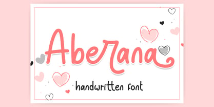 Aberana is lovely display font, including stylistic alternates that perfect for any combination for your design. Aberana perfectly macth for desgign with valentine theme, any product like book cover, t-shirt, branding, promotion, social media post, quotes, wedding, photography and more. What's included: - Multilingual Support - Support Opentype features --- Hope you enjoy with our font! Attype Studio
 - Magoat by Fikryal,
$25.00 Magoat – Modern Clean Bold Font is the perfect choice to infuse a contemporary and bold touch into your graphic design projects. With its distinctive All Caps style, Magoat has the ability to capture attention with clarity and courage. Each character is designed with precision, showcasing the cleanliness and modernity that define this font. With its bold shapes, Magoat is well-suited for titles, logos, and other design elements that require a strong and clear presence. Despite its bold appearance, the clarity of each letter is maintained, ensuring that your message is conveyed with precision and readability. With Magoat, your design projects will gain a fresh, contemporary, and professional touch, bringing a clean and bold look to various visual platforms. If you have any questions please don’t hesitate to contact me Follow my Instagram: @fkryall Thank you
 - Auchentaller by HiH,
$12.00 Auchentaller was inspired by a travel poster by Josef Maria Auchentaller in 1906. To our knowledge, it was never cast in type. Grado lies on the northern Adriatic, between Venice and Trieste. At one time the port for the important Roman town of Aquileia. With the decline of the Roman Empire, the upper Adriatic region came under the rule of the Visigoths, the Ostrogoths, the Byzantines, the Lombards, the Franks, the Germans, the Venetians and finally, in 1796, the Austrian Hapsburgs. So it remained until the dissolution of the Austro-Hungarian Monarchy in 1919, following World War I, when the seaport of Trieste was awarded to Italy. With Trieste came Montefalcone, Aquileia and Grado. The area was marked by years of political tension between Italy and Yugoslavia, exemplified by the d'Annunzio expedition to capture Fiume (Rijeka) in September, 1919. Some basic discussion of the period from 1919 to 1939 may be found in Seton-Watson’s Eastern Europe Between The Wars (Cambridge 1945) and Rothschild’s East Central Europe Between The Two World Wars (Seattle 1974). In 1965 I was traveling by train from Venice to Vienna. Crossing the Alps, the train stopped for customs inspection at the rural Italian-Austrian border, just above Slovenia. We were warned not to get off the train because there were still shooting skirmishes in the area. Through all this, Grado remained literally an island of tranquility, connected to the mainland by a only causeway and lines on a map. Auchentaller not only painted the beach scene at Grado, he moved there, living out the rest of his life in this comfortable little island town. His travel illustration contains the text from which the design of our font Auchentaller is drawn. The text translates: "Seaside resort : Grado / Austrian coastal land". Please see our gallery images to see a map locating Grado, as well as Auchentaller’s painting of the resort. Auchentaller is a monoline all-cap font, light and open in design , with a lot of typically art nouveau letter forms. Included in our font are a number of ligatures. As is frequently seen in designs by German speakers, the umlaut is embedded in the O & U below the tops of the letters. This approach led to two whimsies: a happy umlauted O and a sad umlauted U. This font has a clean, crisp look that is very appealing and very distinctive. Auchentaller ML represents a major extension of the original release, with the following changes: 1. Added glyphs for the 1250 Central Europe, the 1252 Turkish and the 1257 Baltic Code Pages. Add glyphs to complete standard 1252 Western Europe Code Page. Special glyphs relocated and assigned Unicode codepoints, some in Private Use area. Total of 336 glyphs. 2. Added OpenType GSUB layout features: pnum, liga, salt & ornm. 3. Added 116 kerning pairs. 4. Revised vertical metrics for improved cross-platform line spacing. 5. Revised ‘J’. 6. Minor refinements to various glyph outlines. 7. Inclusion of both tabular & proportional numbers. 8. Inclusion of both standard acute and Polish kreska with choice of alternate accented glyphs for c,n,r,s & z. Please note that some older applications may only be able to access the Western Europe character set (approximately 221 glyphs). The zip package includes two versions of the font at no extra charge. There is an OTF version which is in Open PS (Post Script Type 1) format and a TTF version which is in Open TT (True Type)format. Use whichever works best for your applications.
 - Le Havre Rounded by insigne,
$24.99 The Le Havre series is a series of geometric sans serifs inspired by the dignified era of the passenger ship, when getting to your destination was a delight in and of itself. Le Havre Rounded is a fun and new interpretation of geometric sans serifs. Le Havre Rounded features its sister family's compressed capitals, low x-height and geometric construction, and its rounded forms lend it to be used in contemporary and technology settings. Le Havre OpenType features include twenty five alternate characters, ligatures and old style figures. The Le Havre family includes a spectrum of weights for many design options.
 - Gridlock by I Can Be Your Type,
$10.00A condensed font using constructivism history to convey the cold hearted steel of machinery and progress. Gridlock tries it's best to fit as much info as possible in a small space neatly in line and with the subtle curves and smoothness of bent steel. The inspiration for Gridlock actually came accidentally after designing some lettering for a self-promo project and it needed something that just was condensed with visual appear. So imagining about how condensed fonts feel, I imagined them being squished together just like cars in traffic are forced to work together to make it to their end destination. - Tomato by Canada Type,
$22.95Tomato is the digitization and quite elaborate expansion of an early 1970s Franklin Photolettering film type called Viola Flare. This typeface is an obvious child of funk, the audio-visual revolution that swept America and put an end to the art nouveau period we now associate with the hippy era. Funk is of course little more than jazz with a chorus and an emphatic beat. Nevertheless, it became the definition of cool in the 1970s, thanks to blaxploitation movies with excellent soundtracks like Shaft and Superfly. Funk began as a commercial audio experience, then later expanded its signature to cover everything, from design to fashion to the later birth of disco, which is really a further simplification of funk. Funk had very strong and unique typographical elements, particularly a kind of titling with an essentially western, wooden core that suddenly changed and flared in unexpected areas until a very individual brand was achieved. Everything that can be tacked on to the alphabet was used towards that individuality. Things like curls, swirls, swashes, ligatures were always plentiful in funk, sometimes giving the titling a specific gender, sometimes bulging, sometimes speeding, sometimes fading in the distance, sometimes doing nothing but crazily aligning with other design elements, but the result was always a fascinating creature that seemed to invariably want to dance and have fun. Tomato was built in exactly that spirit. The original film type certainly had enough swashes and curls to be an unmistakable funk font in itself, but our further expansion of it cements it and makes it the definite font for the genre. With as many as 12 different possibilities for some letters, the designer's choices for a titling set in Tomato are virtually limitless. The Postscript and True Type versions of Tomato come in five fonts, including two fonts for alternates, one font for ligatures, and one font for swashes. These are split into two affordable packages. The entire family package is also available at an even more affordable price, and includes complimentary Cyrillic, Greek, Turkish, and Central European versions of Tomato. A Tomato Pro OpenType version is also available. It is a single font that includes over 650 characters, glued together with extensive programming for convenience of use in OpenType-friendly applications, where you can watch the letters morph and dance as you push the buttons and change the options of your OT palette. Now you know which font will come to mind when someone says the word "funky". - Destiny_Light - Unknown license

- Robot Teacher - Unknown license

- Ultra System by Set Sail Studios,
$14.00 Introducing Ultra System; A modern exploration of 8 fonts, each carefully designed to naturally compliment one another. With 6 clean sans fonts and 2 textured script fonts, Ultra System gives you a variety of ways to combine and arrange each font, allowing you to create striking & modern typographic designs. This typeface collection consists of 8 fonts; Ultra System Script • A textured, bouncy & flowing marker script font containing upper & lowercase characters, numerals, and a large range of punctuation. Ultra System Script Alt • This is a second version of Ultra System Script, with a completely new set of both upper and lowercase characters. If you wanted to avoid letters looking the same each time to recreate a custom-made style, or try a different word shape, simply switch to this font for an additional layout option. Ultra System Sans • A wide, bold sans font containing uppercase only characters, numerals, and a large range of punctuation. Ultra System Sans Line One • A thick outlined version of Ultra System Sans, pair this with other Ultra System Sans fonts to add emphasis to words or phrases. Ultra System Sans Line Two • A thin outlined version of Ultra System Sans, pair this with other Ultra System Sans fonts to add emphasis to words or phrases. Ultra System Sans Italic • Italic variations are included for all 3 Ultra System Sans fonts. FAQs; Accessing Ligatures • Ligatures are supported by most desktop graphics & text software (not just the fancy ones!), including Photoshop, Illustrator, InDesign, Word, Pages & Keynote. Many programs will automatically have this feature switched on for you, but if you need any help accessing then please feel free to drop me a message. Language Support • All Ultra System fonts support the following languages; English, French, Italian, Spanish, Portuguese, German, Swedish, Norwegian, Danish, Dutch, Finnish, Indonesian, Malay, Hungarian, Polish, Croatian, Turkish, Romanian, Czech, Latvian, Lithuanian, Slovak, Slovenian
 - Harmonique by Monotype,
$31.99 Harmonique is an incised serif typeface designed for both text and display purposes. It’s a type family of two styles that work in harmony together to add distinction and personality to your own typographic compositions. Harmonique’s low contrast forms have the appeal of a humanist sans serif typeface. Its subtly flared terminals evoke the craft and skill of a signwriter’s steady hand, creating an authentic and pleasing aesthetic. Harmonique Display is more calligraphic in its structure – as if drawn by a wide-nibbed pen. This style is accentuated by aggressively barbed serifs and chiselled arcs in its counters and bowls. These strong characteristics help to define a flamboyant, confident style that will provide impact and flair to your headlines, titles and identity designs. Practical features include 48 ligatures that will enhance titling possibilities with their all-capital pairings – these are accesssed by turning on Discretionary Ligatures and then selecting either Sylistic Set 1 or 2. There are also a number of alternate caps that will subtly enhance your titles and headlines – access these via Stylistc Sets 3 and 4. Small Caps are included too (along with their matching diacritics) – adding another layer of versatility to this typeface. Proportional Lining figures are available as an option if you prefer them to the default Old Style figures. There are 32 fonts altogether, with 8 weights in roman and italic from Light to Ultra in both text (low contrast) and display (high contrast) styles. Harmonique has an extensive character set (650+ glyphs) that covers every Latin European language. Key features: 8 weights across two styles in both roman and italic 48 Ligatures 11 Alternates Small Caps Full European character set (Latin only) 650+ glyphs per font.
 - Bonobo by Typodermic,
$11.95 Hey there, font fanatics! Have you met Bonobo? This casual-style transitional serif typeface is the perfect addition to your font collection. With its robust uprights adorned with blunt serifs and curls, Bonobo exudes a friendly yet sophisticated vibe. But that’s not all—the italics are flared and laid back, adding a touch of playfulness to your designs. And the best part? Bonobo comes in a variety of weights to suit your every need—Regular, Semibold, Bold, and Italic. So whether you’re crafting a brochure, designing a logo, or just jazzing up your social media posts, Bonobo has got you covered. Why settle for boring fonts when you can add a little personality to your work with Bonobo? Try it out today and see the difference it makes! Most Latin-based European writing systems are supported, including the following languages. Afaan Oromo, Afar, Afrikaans, Albanian, Alsatian, Aromanian, Aymara, Bashkir (Latin), Basque, Belarusian (Latin), Bemba, Bikol, Bosnian, Breton, Cape Verdean, Creole, Catalan, Cebuano, Chamorro, Chavacano, Chichewa, Crimean Tatar (Latin), Croatian, Czech, Danish, Dawan, Dholuo, Dutch, English, Estonian, Faroese, Fijian, Filipino, Finnish, French, Frisian, Friulian, Gagauz (Latin), Galician, Ganda, Genoese, German, Greenlandic, Guadeloupean Creole, Haitian Creole, Hawaiian, Hiligaynon, Hungarian, Icelandic, Ilocano, Indonesian, Irish, Italian, Jamaican, Kaqchikel, Karakalpak (Latin), Kashubian, Kikongo, Kinyarwanda, Kirundi, Kurdish (Latin), Latvian, Lithuanian, Lombard, Low Saxon, Luxembourgish, Maasai, Makhuwa, Malay, Maltese, Māori, Moldovan, Montenegrin, Ndebele, Neapolitan, Norwegian, Novial, Occitan, Ossetian (Latin), Papiamento, Piedmontese, Polish, Portuguese, Quechua, Rarotongan, Romanian, Romansh, Sami, Sango, Saramaccan, Sardinian, Scottish Gaelic, Serbian (Latin), Shona, Sicilian, Silesian, Slovak, Slovenian, Somali, Sorbian, Sotho, Spanish, Swahili, Swazi, Swedish, Tagalog, Tahitian, Tetum, Tongan, Tshiluba, Tsonga, Tswana, Tumbuka, Turkish, Turkmen (Latin), Tuvaluan, Uzbek (Latin), Venetian, Vepsian, Võro, Walloon, Waray-Waray, Wayuu, Welsh, Wolof, Xhosa, Yapese, Zapotec Zulu and Zuni.
 - Neutraface Slab Text by House Industries,
$33.00 From fine print and red ink in corporate annual reports to huge three dimensional signage, Neutraface has become the definitive designers’ workhorse. Now this geometric juggernaut boasts even more font firepower with the addition of the Neutraface Slab family. Neutraface Slab features five display weights, four text weights with italics plus a unique stencil style that work together like a typographic symphony or can stand alone like accomplished soloists. Just like its sans-serif counterparts, Neutra Slab Text includes small caps, seven figure styles and a host of other sophisticated OpenType features that have been integrated in a single seamless package. The complementary display weights afford an uncompromising statement that can range from thin and delicate to bold and bombastic. FEATURES: MORE ALTS: Neutraface Slab comes with several alternate characters, accessed through either OpenType stylistic sets or through the Stylistic Alternates feature. TITLING ALTERNATES: The distinctive lower crossbars of the original Neutraface are included in Neutraface Slab as the Titling Alternates OpenType feature. TEXT FIGURES: All variations of Neutraface Slab Text feature seven figure styles. Included are text figures for use in running text, lining figures for use with uppercase forms and small caps figures. Each of these styles is supplemented with tabular figures for use in columnar settings. Plus, superscript and subscript figures are included for use in fractions, footnotes, etc. NEUTRAFACE SLAB CREDITS: Typeface Design: Christian Schwartz, Kai Bernau, Susana Carvalho Typeface Production: Ben Kiel, Hannes Famira Typeface Direction: Christian Schwartz, Andy Cruz, Ken Barber Like all good subversives, House Industries hides in plain sight while amplifying the look, feel and style of the world’s most interesting brands, products and people. Based in Delaware, visually influencing the world.
 - Turquoise by Resistenza,
$59.00 Many calligraphers agree that Roman Capitals is one of the most beautiful yet difficult hands to master. Its beauty lies in its simplicity of form and structure, yet understanding and applying these skillfully can take years of mindful practice. My goal was to design Roman Capitals that were smoothly designed with a brush, not carved. The main concept was based on the fundamental strokes that are commonly studied when you practice Roman letters. That’s why many Serifs have these unfinished terminal serifs. I created the Turquoise typeface based on my Capitalis Romana practice with a flexible broad edged brush and gouache. During the lowercase process I was still following Foundational calligraphy with a flat brush. My Turquoise Capitals were then adjusted and redesigned at the Tipobrda calligraphy workshop in Slovenia. Turquoise contains small caps, many discretionary ligatures, ornaments, swashes as well as several brushy nature-inspired ornaments, accessible via OpenType. Ideally suited for headlines or body text in advertising, packaging and visual identities, its delicate shapes, curves and endings give projects a harmonious elegance and stylistic feel in unique Turquoise style. My inspiration for this font showcase is one of the richest islands in the Mediterranean, the place where my parents are from, Sicily. This southern Italian region has so many unique spots: Stromboli, part of the Aeolian Islands, and the Pelagie Islands is one of my favorite places in Sicily. The pictures I used were taken there this year. So enjoy the sun, the serifs, the water and its Turquoise colors. The brush is mightier than the sword. Opentype Features: https://www.rsztype.com/article/how-to-use-opentype-features-adobe-microsoft-pages Turquoise works very well with Nautica Check also Turquoise Inline
 - Harri Text by Blancoletters,
$39.00 Harri Text is more than an extension of Harri. It shares its origin, a certain flavour and a great deal of its idiosyncrasies, but while Harri is an uppercase-only typeface intended for display uses, Harri Text is conceived as a text type family, including a new extra-light weight, italics, small caps and other additions that make it suitable for editorial purposes. As its predecessor Harri Text addresses several concerns regarding the dualism neutrality vs. idiosyncrasy, or in other words, how local features meet global design in the context of a modern society (as is the case in the Basque Country in recent times). The origin of Harri Text —vernacular Basque lettering for the most part— is full of idiosyncrasies and peculiarities that, while giving them its special character, may hinder readability in some cases. The default set in Harri Text tones its essence down a little bit. It is still present, although less obstrusive. Stylistic sets 1, 2 and 3 are a chance to recover gradually this essence modifying some characters —specially the characteristic design of letter A– for those who seek a more local flavour. Stylistic set 4, on the other hand, does the opposite job, this is, removes asymmetrical serifs and other small details in order to create a more neutral atmosphere. Any traces to its origin are this way diluted resulting in a crisp and clean incise variant. Stylistic set 6 is available in the italic styles. It provides a more fluid and cursive flavour to some letters in case a calligraphic mood is desired. Harri Text comes with 1054 glyphs in its character set (1078 in the italics) with support for more than 220 languages.
 - Rafaella by Lián Types,
$37.00 To Rafaella, a menina dos cachos. We, designers, have grown accustomed to seeing that lowercase letters—not only in calligraphy but also in typography (1)—may be very playful and decorative. Almost every part of them can become a potential swash, ligature or decorative accolade (2) if the designer has some expertise regarding this matter. However, since we are living in an era that elevates the status of handcrafts, lettering has gained a lot of ground in different kinds of mediums, and with it there’s a sort of overuse of capitals. This may be due to the reason that lettering pieces need a high impact to convey their messages and many times why big capitals are the only solution. With this in mind, I started Rafaella: A font consisting entirely of capitals which go from unadorned to very decorative. Rafaella has ductus and forms vaguely based on the 1970s Bookman-like styled fonts. The presence and behaviour of serifs and ball terminals in this style were the perfect excuse to make really attractive aternates which the user can choose from the glyphs panel. The result is a font full of life. Able to be both very playful and formal due to its roman style which can be combined with (and between) a wide range of other styles of expressive scripts or geometric fonts with nice results (3). Also try Rafaella Shade Solo combined with Rafaella or Rafaella Bold for a layer effect to emphasize any given word or phrase. NOTES (1) See my fonts Erotica from 2013 or Dream from 2014. (2) Accolades is a wonderful word that refers to the ornaments made around the words in the spencerian style of calligraphy (3) Combinations often seen in different pieces of lettering were usually a contrast of style is wanted.
 - Turbinado by Aerotype,
$48.00 The ten font Turbinado™ Set was designed to be clear and easy to read with a friendly personality, ideal for advertising and packaging in both text and display settings. Included are three weights of brushed casual script, each with a dry version, two condensed all caps faces, another hand printed caps face and an Elements package with 100 brushed elements that include swashes, botanicals, shells, arrows, repeatable patterns and a few other doodads that play well with the fonts. Like our most recent release Fave, all of the fonts use the OpenType standard ligature feature to automatically differentiate consecutive lowercase letters and numbers, using separate glyphs rather than a single ligature so they can be set on a curve or colored separately, etc. They also automatically differentiate like characters that are separated by another letter when standard ligatures is enabled. The script fonts have alternate characters like swash glyphs for ends of words and a few ligatures too; single crossbar to unite the At and Att letter combinations etc. The two condensed faces also have a third set of less uniform glyphs that can be used to create a more quirky, fun and bouncy effect (see the ‘she sells seashells’ graphic above) when the discretionary ligature feature is on. The script fonts have 10+ lowercase t (and double t) crossbar alternates that can be selected from the OpenType glyph table manually, or you can enable the contextual alternates feature to automatically insert a bigger crossbar as the surrounding letters allow throughout a text box or document. Hello? Are you still there? :) And for those intrepid typographers who would rather fashion their own lowercase t to custom fit a specific design, all of the lowercase t ascenders and crossbars are also available separately in the glyph table, and can be combined manually.
 - Neutraface Slab Display by House Industries,
$33.00 From fine print and red ink in corporate annual reports to huge three dimensional signage, Neutraface has become the definitive designers’ workhorse. Now this geometric juggernaut boasts even more font firepower with the addition of the Neutraface Slab family. Neutraface Slab features five display weights, four text weights with italics plus a unique stencil style that work together like a typographic symphony or can stand alone like accomplished soloists. Just like its sans-serif counterparts, Neutra Slab Text includes small caps, seven figure styles and a host of other sophisticated OpenType features that have been integrated in a single seamless package. The complementary display weights afford an uncompromising statement that can range from thin and delicate to bold and bombastic. FEATURES: MORE ALTS: Neutraface Slab comes with several alternate characters, accessed through either OpenType stylistic sets or through the Stylistic Alternates feature. TITLING ALTERNATES: The distinctive lower crossbars of the original Neutraface are included in Neutraface Slab as the Titling Alternates OpenType feature. TEXT FIGURES: All variations of Neutraface Slab Text feature seven figure styles. Included are text figures for use in running text, lining figures for use with uppercase forms and small caps figures. Each of these styles is supplemented with tabular figures for use in columnar settings. Plus, superscript and subscript figures are included for use in fractions, footnotes, etc. NEUTRAFACE SLAB CREDITS: Typeface Design: Christian Schwartz, Kai Bernau, Susana Carvalho Typeface Production: Ben Kiel, Hannes Famira Typeface Direction: Christian Schwartz, Andy Cruz, Ken Barber Like all good subversives, House Industries hides in plain sight while amplifying the look, feel and style of the world’s most interesting brands, products and people. Based in Delaware, visually influencing the world.
 - SF Old South Arabian by Sultan Fonts,
$9.99Historical Background Old South Arabian Script (OSA) was used before the Islamic era not only in the southwest corner of the Arabian Peninsula, but actually in the entire Peninsula. In addition, samples of OSA have been found as far as Uruk in Mesopotamia, Delos in Greece, and Giza in Egypt. Archaeological finds show that as far back as the 8th century BCE, OSA was used in trade, religious writing, and in civil records. Following the spread of Islam in Yemen, the decline of OSA began in the 7th century CE as it was gradually supplanted by Arabic script. OSA was typically known by the name of the then-dominant peoples in the Southern Peninsula. At various times, it was known as Sabaean, Qatabani, or Hadramite, among others. Although it was used for a variety of languages, OSA is most strongly associated with Sabaean. Many Peninsular languages borrowed OSA before introducing further changes of their own. Prime examples are the Thamudic, Safaitic, and Lihyanite scripts which eventually developed into independent scripts. The westward migration of the Sabaean people into the Horn of Africa introduced the South Arabian consonantal alphabet into the region. The transplanted script formed the roots of the Geez script of Ethiopia, which, in time and under presumably external influences, developed into a rich syllabary unlike any other Semitic script in history. Even a cursory examination of the letter forms of Modern Ethiopic writing reveal a striking similarity to South Arabian Script. OSA inscriptions typically reveal a dominant right-to-left directionality, although there are also many cases of alternating directions, known as boustrophedon writing. Figure 1 is a fine example of this style of writing. OSA inscriptions were discovered early in the 19th century. Soon thereafter, two orientalists, Gesenius and Rödiger, made great strides towards deciphering the script. Styles of Writing Old South Arabian inscriptions have survived primarily on stone, ceramic, and metallic surfaces. Hundreds of artifacts have been found and, to this day, continue to be discovered. Some of the best examples number of inscriptions on softer materials, such as wood and leather, have also been discovered. Although there is a significant difference between the styles of letters on the hard surfaces and those on the soft. Old South Arabian (Musnad) is composed of 29 letters , that is one letter more than the Arabic alphabet, which is between “S” and “Sh”, and names “Samekh”. Aspects of difference between Musnad and the present Arabic writing is that Musnad is written in separate letters, and the shape of the letters do not change according to its place in the word. However, some letters change according to the beginning of the writing. Musnad is either prominent, or deep. Prominent writings are for important writings and deep writings are for ordinary. The material on which the Musnad was written were stones, rocks, wood, and metal. In the course of its development the Musnad use appeared in the “Lehyanite’, “Thamudic”, “Safaitic”, pen to which many changes and amendments were made. And from it “Habashi’ writing was born. As regards his place among the Arabs of the Peninsula , when we look at the internet and its role in cultural dialogue , the Arabs of the Peninsula considered Musnad inscription which was indisputably their national writing until the dawn of Islam. It was used by people in all parts of Arabia in their homeland and abroad . It was their means of chronology and record of their glories and history.2- Features of Musnad Script: 1. It is written from right to left and vice versa. 2. Its letters are not joined. 3. Shape of letters are uniform despite their positions in the word. 4. Words are separated by vertical lines. 5. A letter is doubled in case of assertion. 6. No points and punctuations. 7. Easy to be learned by beginners. My OSA Musnad Font My design and technical work is only a treatment of the OSA Musnad as a symbol of writing. And it is possible to use in computer.. My design is not aimed at demonstrating the linguistic and intellectual structure of the Old South Arabian (Musnad). It is so simple that it could be easy to learn by learners and those who are interested in the OSA Musnad letters in computer. The basis of such importance is that it spares a lot of time and effort for researchers and students in this field. Formerly they used to write the Musnad texts either by handwriting or scan them , But now they can easily write its texts in OSA Musnad by using keyboard directly, so that they can change , amend and fulfill easily and accurately . So, we made use of speed, easiness and accuracy. And anyone interested in the South Arabian history in any part of the world can due to this design read and write OSA Musnad letters most easily. This design will also be used by historians and archeologists. , as well as specialist linguistics . The design also demonstrates the aesthetics of the Himyarit writing. About this font family Old South Arabian is An Arabic, Old South Arabian and Latin typeface for desktop applications ,for websites, and for digital ads. Old South Arabian font family contains two types: Old South Arabian and Old South Arabian serif. The font includes a design that supports Arabic, Old South Arabian and Latin languages. Old South Arabian typeface comes with many opentype features. - Centennial Script by Canada Type,
$24.95 Centennial Script was designed and cut by Hermann Ihlenburg in 1876 (the centennial of American independence, hence the typeface's name) for the MacKellar, Smiths & Jordan foundry in Philadelphia. Ihlenburg was then only 33 years old, and these beautiful forms put him on his way to become the most prolific and innovative deco, ornamental and script typeface designer and punch cutter of the nineteenth century. In trying to be a true homage to the history of the new world, Centennial Script transcends its then-contemporary deco fashion to embrace script elements historically similar to lettering found on maps or political documents of the 18th century. Letters like the p and s extend themselves high and mighty to accentuate words and lines of text in a fancy hand-drawn manner. The dots on the i and j are those of a careful scribe who acknowledges the importance of the document being lettered. The lowercase letters connect with two slight angular motions of the hand, also very carefully and elegantly. Even the ligatures and ending swashes Ihlenburg made for this face were reminiscent of a mapmaker's patient hand, though Ihlenburg's elegant touch in them cannot be mistaken. Although Centennial Script was one of the few Ihlenburg faces to make it to film type technology, the transition was neither credited nor faultless. The film type version was a bit sloppy in the way the connectors were made, so the lowercase needed a lot of manual work to typeset properly. To alleviate such waste of time for the user of this digital version, the connectors were redrawn according to the original metal ones made by Ihlenburg himself, and tested thoroughly in print to ensure the quality of the typeface's flowing cursive nature. This wasn't an easy task, and very time-consuming, since the changing angles on both ends of the connection made it impossible to escape from having to build every lowercase letter with both left and right connectors that would fit with the rest of the letters. This is one typeface that couldn't be revived in any other manner than the way it was originally made, regardless of more than 130 years of technological advances since the face was designed. Centennial Script comes in all popular font formats, and supports most Latin-based languages. Also included is an Alts fonts that contains alternates, ligatures, snap-on swash endings, some ornaments, as well as a complete set of the lowercase without left side connectors, for a more natural combination when following a majuscule, or just in case the user finds it fit to set the copy in a non-connecting script instead of the face's original connected flow. Centennial Script Pro, the OpenType version, combines the main font with the Alts font in a feature-packed single font. Use the ligature feature to set wordmarks like Mr, Ms, Mrs, Dr, and &Co, the stylistic alternates feature to replace some letters with their alternative forms, the contextual alternates feature for better uppercase-lowercase sequences, and the titling feature to set your text in a disconnected script. Centennial Script is the only script we currently know of that can be set connected or disconnected simultaneously, either using the titling feature in the OpenType Pro version, or manually in the other formats.
 - flatline - Unknown license

- Cryptocurrency by Bülent Yüksel,
$14.00 "Crypto Currency - Block Chain" quickly entered our lives and its use is increasing day by day. Blockchain became more popular in web, TV and printed works. It is necessary to use their logos when defining "Crypto Currencies". But it is not easy to access these logos fast. "Cryptocurrency Font Family" which I prepared for you, is a resource that you can reach without searching for too many logos. Cryptocurrency Font Family contains 200+ logos. These are the most popular "Block Chain" logos in recent years. The popularity rankings changed over time and you can contact me if you need new logos and changing logos. I can create the "Block Chain" logo you need or apply the changes. You can send your new logo and logo change requests to me at "buyuksel@hotmail.com". Subsequent corrections and additions will be completely free. After the first purchase, there is no additional payment for updates. When using Cryptocurrency Font Family, "Cryptocurrency No.00 Guide Map" is absolutely free to download and use. This will help you a lot to define coins. "Guide Map" contains the letter and the Unicode numbers. --- Contents --- Ardor ARDR, Bitcoin BTC, Bitcoin Cash BCH, Bitcoin SV BSV, Bitcoin Gold BTG, Bitcoin Diamond BCD, Bitcoin Private BTCP, Bitcoin Plus ZBC, Bitcoin Z BTCZ, Etherium ETH, Etherium Classic ETC, Xrp Ripple XRP, Ripple, Teher USDT, Litecoin LTC, Litecoin Cash LCC, Eos EOS, Binance Coin BNC, Monero XMR, Cardano ADA, Steller XLM, Tron TRX, Tezos XTZ, Unus Sed Leo LEO, Chain Link LINK, Cosmos Atom ATOM, Huobi Token HT, Neo NEO, Hedge Trade HEDG, Crypto.com CRO, Iota MIOTA, Dash DASH, Maker MKR, Usd Coin USDC, Ontology ONT, Nem XEM, Ve Chain VET, Dogecoin DOGE, Basic Attention BAT, Z Cash ZEC, Paxos Standard PAX, Ftx Token FTT, Decred DCR, Qtum QTUM, Syntehetix Network SNX, True Usd TUSD , Raven Coin RVN, Ox ZRX, Okex OKB, Algorad ALGO, Holo HOT, Centrality CENZ, Augur REB, ZB Token ZB, Seele SEELE, Omisego OMG, Swipe SXP, Waves WAVES, Horizen ZEN, Kucoin Shares KCS, Theta THETA, Nano NANO, Nervos Network CKB, Byton BTM, Lisk LSK, Molekular Futures MOF, Digibayt DGB, Bittorent BTT, Icon ICX, V Systems VSYS, Iost IOST, Abbc Coin ABBC, Komodo KMD, Nexo NEXO, Siacom SC, Monacoin MONA, Luna LUNA, Enjin ENJ, DxChain Token DX, Hyper Cash HC, Verge XVG, Bytecoin BCN, Steem STEEM, Zilliqa ZIL, Maidsafe Coin MAID, Energi NRG, Bitshares BTS, Digixdo DGD, Rif Taoken RIF, Aeternity AE, Block Stamp BST, Zcoin XSC, Matic Network MATIC, Quart QNT, Silverway SLV, Kyber Network KNC, Iexec Rlc RLC, Electironeum ETN, Ren REN, Status SNT, Status Euro EURS, Single Colleteral SAI, Nash Exchange NEX, Grin GRIN, Decentraland Mana MANA, Stratis STRAT, Solve SOLVE, Kick Token KICK, Aelf ELF, Golem GLT, Pumdi X NPXS, Enigma ENG, Metaversa Etp ETP, Digitex Futures DGTX, Elastos ELA, Gxchain GXC, Chiliz CHZ, Ripio Credit RCN, Aion AION, Fetch Ai FET, Loopring LRC, Dragon Coin DRG, Wayki Chain WICC, Thunder Token TT, Iotex IOTX, Nebulas NAS, Hedera Hashgraph HBAR, Bread BRD, Hyperion HYN, Ignis IGNIS, True Chain TRUE, Wax WAX, Tierion TNT, Wanchain WAN, Reddcoin RDD, Wink WIN, Gatechain Token GT, Diamond Platform DPT, Nuls NULS, Yap Stone YAP, Vertcoin VTC, Project Pai PAI, Denta Coin DCN, Ark ARK, Fun Fair FUN, Loom Network XMX, Edu Care EKT, Aragon ANT, Factom FCT, Populous PPT, Revain R, Harmony ONE, Qash QASH, Groestl Coin GRS, Civic CVC, Fantom FTM, Swiss Borg CHSB, Santiment Network SAN, Moeda Loyalty MDA, GoChain GO, Dent DENT, Edc Blockchain EDC, Storj STORJ, Divi DIVI, Pivx PIVX, Bancor BNT, Metal MTL, Loki LOKI, Wirex Token WXT, Bitkan KAN, Gnosis GNO, Network NEW, Thorchain RUNE, Odem ODE, Bibox Token BIX, Bosagora BOA, Oceon Protocol OCEON, Celer Network CELR, Chimpion BNANA, Mixin XIN, Veritasium VERI, Mine Bee MB, Bankera BNK, Bitcoin2 BTC2, Casino Coin CSC, Bitforex Token BF, Dynamic Trading DTR, Poseidon Network QQQ, Obyte GBYTE, Cloak Coin CLOAK
 - Glofters by Martype co,
$15.00 Introducing Glofters a display blackletter comes with 4 styles to make it more useable in every design taste, this fonts include alternates and ligature to complete the mix and match your design. Perfect for Poster Headline, Music Label, Logotype, Logo, Merch Design and etc. Support for 66 languages Afrikaans, Albanian, ,Basque, Bemba, Bena, Breton, Catalan, Chiga, Cornish, Danish, Dutch, English, Estonian, Faroese, Filipino, Finnish, French, Friulian, Galician, German, Gusii, Indonesian, Irish, Italian, Kabuverdianu, Kalenjin, Kinyarwanda, Luo, Luxembourgish, Luyia, Machame, Makhuwa, Meetto, Makonde, Malagasy, Manx, Morisyen, North, Ndebele, Norwegian, Bokmål, Norwegian, Nynorsk, Nyankole, Oromo, Portuguese, Quechua, Romansh, Rombo, Rundi, Rwa, Samburu, Sango, Sangu, Scottish, Gaelic, Sena, Shambala, Shona, Soga, Somali, Spanish, Swahili, Swedish, Swiss, ,German, Taita, Teso, Uzbek (Latin), Volapük, VunjoZulu. Thanks! Happy Desigining :) Umar
 - Stevens Titling by Linotype,
$29.99 Stevens Titling refers to the classic Roman alphabet as it appears on the Trajan column and numerous other monuments. With its realistic brush strokes, it shows the letterforms as they might have been sketched on the marble before the stonecutter reached for his hammer and chisel. The four fonts that constitute the Stevens Titling suite are named after animals — badger, boar, sable and wolf –, each known for the specific character of its hairs when used to make painting brushes. Sable Brush is the most formal and elegant, with solid forms which show no obvious trace of the handdrawn brush stroke; it comes with a set of small capitals for those classical titles preferred by Hollywood. In fact, each of these fonts would do a great job as a film title and poster font. The Badger Brush variant is compact and firm; Boar Brush is dramatic, and in Wolf Brush each part of the letter is made up of realistic, dry strokes.
 - Coral Blush by Set Sail Studios,
$16.00 Explore a stunning typography pairing with Coral Blush; a carefully crafted and perfectly balanced set of elegant serif and realistic script typefaces. Here’s what’s included; Coral Blush Serif • An all-caps Serif font containing uppercase, all punctuation & numerals. Coral Blush Script • A thin and realistic textured handwriting font, hand-drawn with a real fine-tip pen. Contains, lowercase, uppercase, all punctuation & numerals. Also includes 88 built-in ligatures. Coral Blush Script Alt • This is a second version of Montrose Script, with a completely new set of upper & lowercase characters. 88 Script Ligatures • Coral Blush Script fonts contain 88 ligatures (double letter glyphs) to help your text flow more naturally and recreate authentic, handwritten text. Many programs will automatically have this feature switched on for you, but if you need any help accessing them, please feel free to drop me a message. Language Support; English, French, Italian, Spanish, Portuguese, German, Swedish, Norwegian, Danish, Dutch, Finnish, Indonesian, Malay, Hungarian, Polish, Turkish, Slovenian
 - Core Sans B by S-Core,
$20.00 The Core Sans B Family is a part of the Core Sans Series, such as N, NR, N SC, M, E, A, D, G, R and BR. The family has very small x-heights and large ascenders(descenders) which give an elegant feeling in body text. It is a sans-serif family but it’s structure is similar to serif fonts, so you can make paragraphs beautiful with this font family. It is very legible and readable even in small size because of its open counters and distinctive shapes. This font family consists of 7 weights (Thin, Light, Regular, Medium, Bold, Heavy, Black) and Italics for each format. Core Sans B supports complete Basic Latin, Cyrillic, Central European, Turkish, Baltic character sets. Each font includes proportional figures, tabular figures, oldstyle figures, numerators, denominators, superscript, scientific inferiors, subscript, fractions and case features. We highly recommend it for use in books, web pages, screen displays, and so on.
 - Beardstown by Swell Type,
$15.00 Beardstown is solid, hardworking & no-nonsense. It may be a little gritty & rough around the edges, but it can also be open, warm and welcoming. Beardstown is a little Midwestern town on a river with a town square where you can buy comic books from a spinner rack at the front of the drugstore and read 'em with a root beer float from the soda counter in the back. The Beardstown font is perfect for t-shirts, sports graphics, beer cans, trading cards, carnival posters and record albums. But that’s it. I mean, you could use it on foofy hipster stuff like organic produce, vegan meat substitutes, electric car accessories or mountain bike parts, but you risk Beardstown coming over there to kick your butt. Features: three versions of each letter and two versions of each number automatically rotate for authentic print texture thirteen catchwords (like "and" "of" "for" & "the") accessible in Discretionary Ligatures support for 223 languages including Western & Central Europe, Vietnamese & Cyrillic
 - Ongunkan Lydian by Runic World Tamgacı,
$50.00 Lydia (Lydian: 𐤮𐤱𐤠𐤭𐤣𐤠, Śfarda; Aramaic: Lydia; Greek: Λυδία, Lȳdíā; Turkish: Lidya) was an Iron Age kingdom of western Asia Minor located generally east of ancient Ionia in the modern western Turkish provinces of Uşak, Manisa and inland Izmir. The ethnic group inhabiting this kingdom are known as the Lydians, and their language, known as Lydian, was a member of the Anatolian branch of the Indo-European language family. The capital of Lydia was Sardis. The Kingdom of Lydia existed from about 1200 BC to 546 BC. At its greatest extent, during the 7th century BC, it covered all of western Anatolia. In 546 BC, it became a province of the Achaemenid Persian Empire, known as the satrapy of Lydia or Sparda in Old Persian. In 133 BC, it became part of the Roman province of Asia. Lydian coins, made of silver, are among the oldest coins in existence, dated to around the 7th century BC.
 - Framealot by Ingrimayne Type,
$14.95 Framealot is a frame or border or page divider construction kit. By choosing and mixing various elements, a wide variety of different geometric borders or frames or dividers are possible. The largest set is on the upper-case keys. There are two other sets on the lower case keys (plus the comma and period.) The characters above the number keys (the whole top row with shift, plus {}| keys are another set. And there are a couple of other small sets. Not all the sets allow vertical dividers. Outlined versions are available on the outline style, and the filled style either inverts the pattern or removes white interior sections for the outline version (and has some other differences compared to the other two versions). Use a character map to find all the parts of a set, type them out on your document, and then copy and paste to construct your border or frame. Have fun with it!
 - Remsen Script by Three Islands Press,
$39.00 The 1765 Stamp Act ignited in American colonists a simmering distrust of the distant British Parliament, whose oppressive trade duties they deemed unfair assaults on their rights as English subjects. Before long, of course, this little dustup spawned The Boston Tea Party, the American Revolution, and the birth of the U. S. of A. But before the Battles of Lexington and Concord, a group of Philadelphia merchants made one last-ditch call for commercial cooperation across the Atlantic. This futile appeal survives to this day on a three-page broadside, finely engrossed by a penman of the period and passed down through the generations of a family named Remsen. Remsen Script is an interpretation of that penman’s neat, formal cursive—from its broad antique flourishes to its subtle unevenness and gently ragged strokes. Perfect for event announcements, fine product packaging, recreations of historical documents, or anywhere you wish to offer a whiff of a bygone era.
 - Charpentier Classicistique Pro by Ingo,
$41.00 An unconventional classicistic Roman typeface This Roman typeface has a livelier effect than is typical of the epoch of classicistic style. In the lower case letters, an echo of the smoother forms of historically early scripts is identifiable. Typical of a classicistic Roman typeface are the emphasized and clear contrast in the weight of the strokes, the fine serifs and the accentuation of the vertical bold stem. Charpentier Classicistique is pleasantly legible. Its effect is much less harsh than other classicistic fonts. The pointed forms of M and N are uncommon. At 30°, the italic version of Charpentier Classicistique is unusually strongly slanted. The italic lower case letters refer, in part, to English handwriting, which also falls under classicism. Especially the curves show forms influenced by writing. Charpentier Classicistique supports all European languages including Turkish, Greek and Russian. It includes lots of ligatures, also discretional ones, as well as tabular figures and cap-height figures.
 - Core Sans ES by S-Core,
$29.00 The Core Sans ES Family is a rounded version of Core Sans E and a part of the Core Sans Series such as Core Sans N, M, A, G, D. This is a modernized grotesque font family with horizontal terminals, low stroke contrast, enclosed apertures and little line width variation. Its tall x-height makes the text legible and the spaces between individual letter forms are precisely adjusted to create the perfect typesetting. The Core Sans ES Family consists of 9 Weights (Thin, ExtraLight, Light, Regular, Medium, Bold, ExtraBold, Heavy, Black) and Italics for each format. It supports WGL4, which provides a wide range of character sets (CE, Greek, Cyrillic and Eastern European characters). Each font includes support for Superiors and Inferiors, Fractions, Tabular numbers, Arrows, Mathematical operators and Opentype Features such as Proportional Figures, Tabular Figures, Numerators, Denominators, Superscript, Scientific Inferiors, Subscript, Fractions, Case Features and Standard Ligatures. We highly recommend it for use in books, web pages, screen displays, and so on.
 - Selectric Century by Indian Summer Studio,
$45.00 Also known as Schoolbook. 900+ glyphs. After Linn Boyd Benton's and Morris Fuller Benton's 1894 lower contrast version of Scotch Modern, Didone. The part of the large project on revival and further development (by drawing many additional glyphs) of the 20th century’s typewriters’ fonts. And especially the most famous, versatile and beautiful typewriter: IBM Selectric’s golfball fonts, lost for the civilization for many decades after ‘80s, not being created since then in digital vector form. This new sub-project started in July 2018 for the restoration of the most beautiful classical typefaces, used during the 20th century on the extremely rare now IBM Selectric Composer typewriters / desktop publishing systems. Together with Nick Hamze and the Right Reverend Theodore Munk, the collectors of old typewriters. IBM showed the perfect taste by developing these best historical book typefaces of the human civilization for typewriters. So people could type then using both the real book faces, and the famous classical ones.
 - Scala Sans Pro by Martin Majoor,
$49.00 The award-winning Scala family (1990-1993) is a worldwide bestseller and has established itself as a ‘classic’ among digital fonts. It was one of the first serious digital text fonts to support small caps, ligatures and different set of numbers. In fact Scala and Scala Sans (1990-1993) are two workhorse-like typefaces sharing a common form principle: the skeletons of both Scala and Scala Sans are identical, therefore they can be combined perfectly. Where many of the modern sans serifs (like Helvetica and Univers) have rather ‘closed’ letter shapes, the same elements in Scala Sans are much more ‘open’. This greatly improves legibility, especially in the smaller point sizes. The italic of Scala Sans is not a slanted version of the roman, but rather a ‘real’ italic. Another part of Scala is very popular among its users: Scala Hands, containing more than one hundred decorative hands and pointers, is included in the Scala fonts and is a free bonus.
 - SL Borges by Sudtipos,
$29.00A man purposes himself the task of drawing the world. Among the years, he populates a space with images of provinces, reigns, mountains, bays, ships, islands, fishes, rooms, instruments, heavenly bodies, horses and people. A while before he died, he discovers that patient labyrinth of lines traces the image of his own face. J. L. Borges. SL Borges is a homage to the genial Jorge Luis Borges, illustrious Argentinean writer who lived between 1899 and 1986. Sharply depicted by Augusto Costhanzo, SL Borges synthesizes to icons the big themes that obsessed him: the infinite, labyrinths, libraries, identity. But it although traces lines over the more human side of the writer, who loved cats, fervent politics and the taste of Tango. SL Borges abridges a sum of original iconographic illustrations in True Type format, which masterly synthesizes the most important themes of the grand genius of the literature. SL Borges takes part of the "Icons of Icons" Gallery, developed by SinergiaLab for Sudtipos - Ico Phone by Setup,
$19.95 Ico Phone is a set of 115 symbols depicting anything that happens on the screen of a regular mobile phone. To name a few, there are Bluetooth and sync icons, signal bars, battery statuses, media playback icons, USB symbol, lock icon as well as a wifi signal strength indicator. The style of Ico is inspired by the look of symbols used on the classic monochrome LCD displays. The symbols are monolinear with rounded corners, composed of a smallest possible number of elements. In addition, the rounded style is accompanied by a second style with sharp corners and more detailed drawing. All symbols of Ico share the same width, making the font compatible with the LCD typeface ION. Together, they are the perfect sollution for LCD style typography. Ico Phone is a part of a larger set. Have a look at the other available Ico fonts and don't forget to check back soon for even more additions.


