10,000 search results
(0.035 seconds)
- Capellina by Outras Fontes,
$35.00Capellina is a responsive type family comprised of four styles – two script fonts and two small caps romans – built to work together in typographic compositions intended to catch the eye. The fonts will work in your app as you can see in the presentation above. They can be seen as some kind of lettering machines programed to take advantage of swashes (specially at the beginning and and at the end of text lines) and to avoid stroke collisions. Because of the Contextual Alternates feature, the letters will change while you’re writing. Just use any OpenType-compatible software, keep this feature activated and the font’s algorithm will do the rest. In Capellina Script and Capellina Rough you can also use the stylistic alternates / stylistic sets feature if you want to explore some extra letterforms. - Galactic Core by Thomas Käding,
$9.00A clean and easy-to-read Aurebesh font, inspired by writing in the Star Wars (TM) movies and at Disney's Hollywood Studios (TM). Includes special characters for CH, AE, EO, KH, NG, OO, SH, and TH. If your software supports this feature, then these replacements are automatically made while you type. If you do not want to use them, and you are unable to disable the feature in your software, then please use the GalacticCore_NoSubs file. That file has automatic replacements disabled. It has a different font name, so both files can be installed at the same time. Also includes both styles of numerals, Sabacc dice faces, and card suits. We created this font to be used for typesetting books and stories. But feel free to use it for t-shirts, artwork, or whatever. - Keway by Twinletter,
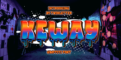
$15.00Keway is a graffiti font that prioritizes neatness and harmony while maintaining a distinct personality. There is an option to use capital or lowercase letters, which will make it much easier for you to develop projects that stand out to others. Your project will seem different, elegant, charming, and passionate if you use this font, and everyone who sees it will think it’s a professional, quality, high-quality, and high-class project. This graffiti font is great for product logos, poster titles, headlines, packaging, film titles, logotypes, gorgeous writing, and trendy graffiti designs, among other things. Of course, if you utilize this font in your numerous creative projects, they will be perfect and outstanding. Use this typeface right away for your one-of-a-kind and remarkable projects. - Benda by Suitcase Type Foundry,
$45.00Benda is a modern geometric script font with roots in the calligraphy and lettering of legendary artist Jaroslav Benda. With bold, predominantly low joins, the robust monolinear character strokes shine in one-word and short inscriptions as well as in longer headlines. The practical letterforms do not clutter the space with loops and curlicues, while the emphasised baseline helps to underline the importance of the message. What’s more – Benda is a smart font, automatically replacing conflicting characters with suitable alternatives as you write so that the final text flows seamlessly. Because Benda is the sequel to Jaroslav, it derives the slant, colour, and geometric characteristics from the sans typeface, forming the perfect companion to the font. So much so, it can serve as a second italic emphasis in long texts. - The Bouquet List by Nasir Udin,
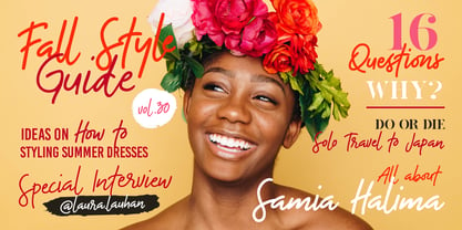
$16.00Introducing the Bouquet List - an ultimate handwriting script font. Inspired by the beauty of flower bouquets and the aesthetic of handwriting when you write some bucket list or itinerary on your journal while you travel. The Bouquet List is a handwritten font featuring 70+ ligatures that gives you beautiful typographic in organic, authentic, and natural handwriting style. Perfect for magazines, social media posts, travel blog, travel vlog, signatures, sticky notes, journal, quotes, restaurant menus, websites, women products, calendar marks, book covers, advertisements, wedding designs, even for a logo and branding! Its OpenType Features provides you an easy swash and magic underline (please see the instruction in the last two preview images). • How to add swash easily: type space three times after the word. • How to add underline: type underscore 2 or 3 or 4 times. - Allstar - Unknown license
- Jotting - Unknown license
- Artlookin - Unknown license
- PALMSPRINGS PERSONAL USE - Personal use only
- BACK TO SCHOOL - Personal use only
- LT Energy - 100% free
- Nawin Arabic by Letterjuice,
$43.00Nawin is an informal Arabic typeface inspired by handwriting. The idea behind this design is to create a type family attractive and ownable for children but at the same time a design that keeps excellent letter recognition for reading. Handwriting has been a great source of inspiration in this particular typeface. By emulating the movements of the pen, we have obtained letter shapes that express spontaneity. A bright group of letters create a lively and beautiful paragraph of text. To get closer to handwriting and the variety of letter shapes that we draw while writing, this typeface offers a large number of alternative characters, which differ slightly from the default ones. Because we have programed the «Contextual Alternate» feature in the fonts, these alternate characters appear automatically as you set a text on your computer. The proportions and letter shapes are flexible, escaping from tradition to increase expressivity and personality in the design. For instance, variability on vertical proportions between letters Alef and initial Lam, create movement in text and avoid the cold mechanical feel of repetition. Nawin is quirky and elegant at the same time. Letter recognition is relevant when reading continuous text. For this reason, we have added another contextual alternate feature with alternate characters that help to avoid confusion when letters with similar or the same shape repeat inside one word. For instance, this is the case of medial «beh and Yeh» repeated three times continuously in the same word. The alternate characters change in shape and length, facilitating distinction to the reader. Since this typeface is inspired by handwriting and the free movement of the hand while writing, we considered ligatures a good asset for this design. The typeface has a wide range of ligatures that enhance movement and fluidity in text making look text alive. - Nugetto by ZetDesign,
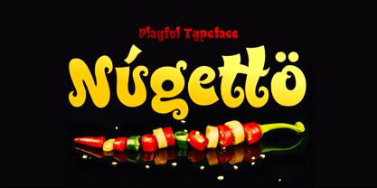
$15.00 - ITC Tapioca by ITC,
$40.99ITC Tapioca was designed by Eric Stevens. He developed the typeface for a nightclub, yet its simple forms are reminiscent of childhood writing exercises. This effect is enhanced by rough edges, which in large sizes make the characters look as though they were composed of strings of dots...or tapioca. The basic style is printed handwriting, although some forms take cursive handwritten forms. The varying slants and irregular forms of the characters give ITC Tapioca a sense of energy and playfulness. - Giriton by Hazztype,
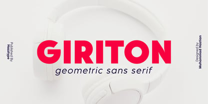
$18.00Giritron is a modern geometric sans-serif typeface that effortlessly blends elegance with a contemporary aesthetic. With its precise, angular forms and minimalist design, Giritron offers a perfect balance between readability and visual impact. Giritron is the perfect choice for contemporary branding, editorial layouts, websites, and any design project where a sophisticated, modern look is desired. Its geometric sans-serif nature ensures a timeless quality, while its attention to detail sets it apart as a distinctive and visually pleasing typeface. - Kakadu by Ludwig Type,
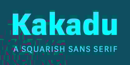
$55.00Kakadu is a squarish sans serif, designed to work equally well on paper and on screen. The angular curves in this typeface create a firm and dependable appearance. The square-like forms also provide an inward openness and allow large and open letterforms, adapting perfectly to the orthogonal pixel grid of the monitor. Kakadu works well in small sizes while, it appears strong and distinguished in larger ones. Play the classic snake game and see the Kakadu fonts in action here. - Grafton Titling by Tetradtype,
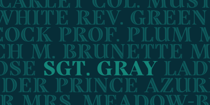
$35.00Grafton Titling was designed for dramatic impact. It contemporizes old style proportions, bracketed serifs and a left-leaning stress angle with striking contrast and modern angular joins. The solid style has a timeless feel, while a flared through-line variation provides textural interest. Small caps, a complement of OpenType features, and support for diacritics and accented characters make it a robust and distinctive choice for headlines that demand attention. Through-line characters are accessible using the Stylistic Set or Stylistic Alternate OpenType feature. - Posh by Lián Types,
$49.00I've always been in love with fat didones. That’s the reason of Posh. In search of something unique, I started this family back in 2013 with the aim of creating the fattest yet readable bodonian typeface in the market: It was a challenge, because roman fonts need generous counters (or what some call white spaces) and taking them to the extreme of inexistence attempted against the construction of many glyphs. Ears, dots, terminals and serifs always need some extra space so I had to find the exact point of boldness to make characters which have those attributes work well in the middle of those which haven't. (1) After a while, I felt I was again ‘in my element’: Big contrasted letters, sexy and elegant curves, and that Lubalinesque feeling that characterise my fonts. (2) Words written with Posh are a explosion of elegance and sensuality due to the fact that its didone attributes were exaggerated. Since it’s full of alternate glyphs, one can change and choose them until a nice block of ‘‘black’’ is achieved. (3) To accompany the regular style, I designed Posh Inline, a font with the same quantity of glyphs than the regular one; an all caps style called Posh Capitals, and also a really playful Italic version. I hope you find this one delicious like I do! This font is dedicated to all who understand letters are not just meant to be read, but also to be appreciated in group and individually. Enjoy it. NOTES (1) In example, it can be easy to design a fat letter ‘n’ with almost no counter, but really tough to make a satisfactory letter ‘s’ with serifs to match that ‘n’. (2) Also, it wasn't my first attempt in fat didones. Take a look at my font Reina, made in 2012. (3) Posters above show many words with ball terminals that seem to dance above and below the words in order to fill those “undesired” blank spaces. - Janagrace by Jonahfonts,
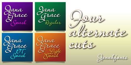
$40.00Janagrace is designed for birthday, holiday cards and can be used effectively in other applications for that calligraphy appearance. Regular: Contain ONLY Regular-Caps. Swash: Swash-Caps with NO Regular Caps. OT Swash: Contain BOTH Regular and Swash-Caps. Swash LIGHT: Swash-Caps with NO Regular Caps. Janagrace, Agile, Charming and Lovely. - Runes - Unknown license
- Die Lara by Ingo,
$27.00A girl’s handwriting written on the iPad Writing changes – throughout history over centuries, but also from generation to generation. Each new generation of students learns to write the basic forms of the letters a little differently than their predecessors. The role model is also changing. The cursive handwriting taught in school is getting closer and closer to printed type. The children no longer learn the forms of cursive handwriting required for connected writing, but first the “block letters”, only later should they develop their own individual handwriting from this, which many of them no longer do. And the writing tool is also changing. Of course, script looks different when children no longer learn to write on paper with a fountain pen, but on a tablet computer with the “pencil”. The writing experience is completely different, and the “material properties” are different too. There is practically no writing resistance that would make it difficult to move against the direction of writing. "Die Lara" was created based on the template by Lara Mörwald from the winter of 2023. The font version "Black" corresponds to the handwritten original, all thinner variants up to the wafer-thin "Hairline" are derived from it. In the variable font, the intermediate forms can be selected steplessly. In order to preserve the handwritten character of the font, "Die Lara" contains several alternates to most letters and numerals, so that different character forms alternate in the typeface. If the "ligatures" function is activated in the app (which is the default in most programs), these alternates appear automatically as you type. There is also an alternative "swashed" variant of some letters. So you can set somewhat livelier accents at the beginning or end of a word. "Die Lara" also contains fractions and tabular figures. - Pinocchio by TrueBlue,
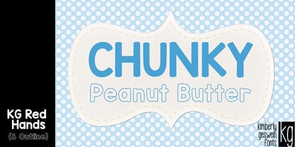
$20.00This font is a classic scholastic handwriting font designed to help students learn to write. - KG Red Hands by Kimberly Geswein,
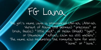
$5.00 - FG Lana by YOFF,
$13.95 - Casual Script by Jesse Tilley,
$19.95My own hand writing, which is surprisingly messy for a font artist. Hope you enjoy! - Sigmund Freud Typeface by Harald Geisler,
$29.00“For those who regret what keyboards and touch screens have done to their penmanship, typographer Harald Geisler has an answer: Sigmund Freud.” — The Wall Street Journal Sigmund Freud was a neurologist who lived from 1856 to 1939. His research and studies led to the foundation of ‘Psychoanalysis’. When I first saw Freud’s century old letters, I was fascinated by the beauty of these historic manuscripts. It made me smile to imagine a person writing his or her shrink a letter set in Freud’s handwriting. I started to plan creating a font based on his manuscripts. I contacted the Sigmund Freud Museum Vienna and Freud Museum London. To start the creation I selected eight handwritten documents from the archive in Vienna – This selection of specimen was my orientation during the design process. The Samples were created between 1883 to 1938 and are of various character such as handwritten scientific papers, personal letters, notes and a telegram. A successful Kickstarter Campaign "The Sigmund Freud Typeface - A Letter to your Shrink" with over 1400 Backers enabled me to visit the archive in Vienna and study the original manuscripts of Sigmund Freud. After a year of preparation and design work, I finished four alphabets based on Freud’s handwriting. What are the different Versions PRO, Kurrent, #1, #2, #3 and #4 about? “This project gives people the convenience afforded by the computer while maintaining the romantic nostalgia, beauty, and character of letter writing with real handwriting.” — Daniel Vahab, The Huffington Post When you write with your hand, every letter looks a little different. When you write a text on your computer every letter looks exactly the same. In order to make type look like handwriting, I chose four different variations of each letter from Freud’s manuscripts, drew and stored them in the font. The font is then programmed to exchange letters while you are typing. This makes the rendered result on your screen or print look like unique handwriting. PRO While you are typing… the PRO Version actively combines all four alphabets and exchanges them automatically. Through this mechanism never the same two o’s will stand next to each other. With every touch a unique look is generated. This works in certain applications i.e. Word 2010(or newer), Pages, TextEdit, Editor(Pre-installed on Windows 7 or newer), InDesign, Illustrator… →Here you can see an animation of what this effect looks like in action. (Please Note: some applications like LibreOffice, OpenOffice do currently not support this feature. Date: December 2013) #1 #2 #3 and #4 The Sigmund Freud Typeface #1, #2, #3 and #4 each hold one individual lowercase alphabet based on Freud’s handwriting. Kurrent Most of Freud’s correspondence was written in German. Until the 1950′s a different handwriting was taught throughout German speaking countries (Switzerland, Austria, Germany). This style is called Kurrent. The name Kurrent and Cursive derive from the Latin word currere - to run, hurry - both styles were designed to write fast. As you can see in the samples above, Freud practiced both Kurrent and when writing english Cursive (Latin script or Joined-up). Kurrent has three significantly different letters (s,h,e). Use Kurrent to render the authentic look of an historic Sigmund Freud letter in German. Bundle On the Top of this page you can get all six fonts of the Sigmund Freud Typeface Family in a bundle. International Typeface All styles of the Sigmund Freud Typeface feature a wide range of accented letters so you can write to all your friends in Sweden (Bjørn) France (Chloé & Zoë), Ireland (Dáirine), Poland (Łucja), Germany (Jörg) and almost everywhere around the globe (Find a complete list in the tech specs). Usage recommendations I hope that this design will be valuable to you and most of all that you have fun with this typeface! 1. Point Size — To reproduce the size of Sigmund Freud’s handwriting adjust the type size between 18-24 point in your word processor. If you are using an imaging software like Photoshop set the resolution to 300dpi and adjust the point size between 18-24. 2. Line Spacing — Narrow the line hight until swashes of capital letters touch the baseline above. This also happens when you write a letter and gives the document a unique handwritten look. 3. Right Aligned — Freud had the habit to write towards the right edge of the page and start loosely on the left. Set your text alignment to ‘right’ to incorporate this dramatic expression also to your documents. What do other People say about the Sigmund Freud Typeface? “Wouldn’t you love to write a letter to your shrink using the Sigmund Freud typeface?” — Dorothy Tan, Design TAXI ''“JUST DON’T WRITE A LETTER TO YOUR MOTHER WITH IT… …until the reader looks a bit closer, and they see 70+ years of modern science weighing in on turn-of-the-century pop psychology."'' — Mark Willson, Fast Company “Doctor, what does it mean if you dream of creating a font of Freud’s handwriting?” — Ayun Halliday, Open Culture “…geekily romantic, at once artistic and scientific” — Edie Jarolim, Freud’s Butcher “…sympathisch” — Jürgen Siebert, Fontblog !WOW! Thank you for reading the complete font description! You are awesome! If you still have a question please contact me through MyFonts or my website haraldgeisler.com. Credits This project was made possible by the help of 1481 Backers on Kickstarter and the kind support of the Sigmund Freud Museum Vienna and the Freud Museum London. Thank you. All of Freud’s Manuscripts shown are © Sigmund Freud Museum Vienna. Poster Image: IN17 - Sigmund Freud, Germany 1932. © Freud Museum London. Flag Image: IN19 - Sigmund Freud 1930’s. © Freud Museum London. - BudHand - Unknown license
- Porspican Serif - 100% free
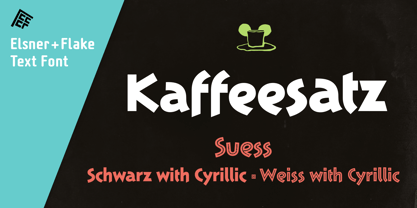
- EF Kaffeesatz by Elsner+Flake,
$35.00The Kaffeesatz EF typeface was designed in 1993 by Ralf Borowiak in three weights: “Schwarz”, “Weiß” and „Süß“ (“Black“, “White” and “Sweet”). Since it is experiencing ever increasing popularity, the Elsner+Flake Designstudios augmented the “Schwarz“ and “Weiß“ versions with a complement of Cyrillic characters. - Empyrean by Greater Albion Typefounders,
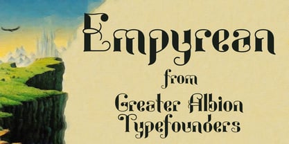
$16.00 - Cast Iron - Unknown license
- Pure evil 2 - Personal use only
- Major Snafu - Unknown license
- Skeksis - Unknown license
- Flying Peace PERSONAL USE - Personal use only
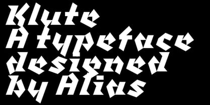
- Klute by Alias Collection,
$60.00Klute references stylised forms of writing; historic Germanic, blackletter letterforms and graffiti and tagging. Its references are based on a personal idea of lettering - the action of writing is more personal and human than the craft of calligraphy or the mechanics of typing. These references suggest the idea of saying something particular and personal. - Gartisans by Sign Studio,
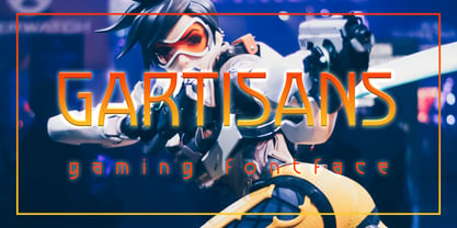
$10.00Gartisans are inspired by the appearance of games produced by Japan. Has a distinctive curves on the character (writing with Katakana). By using this font you will be able to feel the feel of the Katakana writing style (simple, clear, characterized). It is suitable for book cover design, poster, game UI, and logo making. - FS Kim by Fontsmith,
$80.00Unconventional beauty FS Kim is bold and intriguing – exuberant and unmissable, but playing a supporting role when needed. This typeface shines brightest as a display font, and is perfect for applications across fashion, theatre, cultural projects and pretty much any brand that wants to make a statement. While FS Kim is dramatic, it’s incredibly versatile, too, and works to showcase content in a stylish, striking way. This font makes you look, and makes you curious – perfect for brands and publishers that relish unconventional beauty. A playful text version While FS Kim’s text version is more constrained than the display, the strength and playfulness remain. Modifications for the text version include larger x-heights, longer ascenders and descenders, wider proportions and spacing, longer and more defined serifs and a lower contrast. “The overall idea is that it’s not an optical size,” Radoeva explains. Text and display maintain a strong connection that mean they can be used together. A display with a twist The calligraphic starting point helped to create familiar forms, while a contemporary display feel is achieved through short wedge serifs, with bold touches added through the font’s exaggerated forms and details. FS Kim’s narrow proportions, short ascenders and descenders, and tighter spacing make the font suitably compact for display use. The overall aesthetic feels bold and sharp, but closer inspection reveals that all the corners are softened. Decorative inlines In an unusual twist, FS Kim’s display version was first drawn using a broad-nib pen to create familiar forms and elegance while still breaking from serif traditions and making it all about standout character. There are also two additional styles, based on the Regular and Black with inlines – in uppercase, figures and symbols. The inline brings an extra option for an even stronger, more decorative display use. - FS Kim Variable by Fontsmith,
$349.99Unconventional beauty FS Kim is bold and intriguing – exuberant and unmissable, but playing a supporting role when needed. This typeface shines brightest as a display font, and is perfect for applications across fashion, theatre, cultural projects and pretty much any brand that wants to make a statement. While FS Kim is dramatic, it’s incredibly versatile, too, and works to showcase content in a stylish, striking way. This font makes you look, and makes you curious – perfect for brands and publishers that relish unconventional beauty. A playful text version While FS Kim’s text version is more constrained than the display, the strength and playfulness remain. Modifications for the text version include larger x-heights, longer ascenders and descenders, wider proportions and spacing, longer and more defined serifs and a lower contrast. “The overall idea is that it’s not an optical size,” Radoeva explains. Text and display maintain a strong connection that mean they can be used together. A display with a twist The calligraphic starting point helped to create familiar forms, while a contemporary display feel is achieved through short wedge serifs, with bold touches added through the font’s exaggerated forms and details. FS Kim’s narrow proportions, short ascenders and descenders, and tighter spacing make the font suitably compact for display use. The overall aesthetic feels bold and sharp, but closer inspection reveals that all the corners are softened. Decorative inlines In an unusual twist, FS Kim’s display version was first drawn using a broad-nib pen to create familiar forms and elegance while still breaking from serif traditions and making it all about standout character. There are also two additional styles, based on the Regular and Black with inlines – in uppercase, figures and symbols. The inline brings an extra option for an even stronger, more decorative display use. - KG What A Time - Personal use only


