7,109 search results
(0.03 seconds)
- P22 Zaner Basic by IHOF,
$24.95 P22 Zaner is based on ornamental penmanship from the turn of the 20th century. The Zaner font set includes four unique fonts that complement the other fonts in the set. Each font is available in PostScript and TrueType formats as well as OpenType which offers even more characters, options and overall functionality. Set options include PostScript and TrueType with a bonus set of extras and a “super” pro set containing over 3,000 characters. Zaner is perfect for wedding invitations and documents that require a touch of elegance.
 - Osande TXT by XdCreative,
$29.00 About Osande-TXT Neo-Grotesques Sans Osande TXT was created and inspired by Osande Pro (by. faldykudo), which carries a modern sans style with a touch of neo-grotesques / neo-gothic These include a large x-height, simpler forms and more static, low contrast, and often a condensed width. Osande TXT comes with enhancements characters and more complete language support, so you will be more flexible to use this font family for your various design, both for body text or displays. Thank you in advance _xdCreative
 - Aphrodite Slim by Typesenses,
$57.00 Aphrodite Slim Pro is not just a lighter version of its sister Aphrodite Pro. Aphrodite Slim Pro has duplicated the quantity of characters of its partner, and that means more than 500 new glyphs, reaching a total of more than 1000. More delicate and meticulous, Aphrodite Slim Pro is once more a new typography with deep calligraphic ideals: We immersed ourselves into the world of each calligraphy ductus and each calligraphy masters by studying from decoration to lettering books. This was the key for the logic of Aphrodite Slim’s behavior. The new concept of Aphrodite Slim Pro was to join diverse styles of calligraphy in one in order to achieve an autonomous expressiveness, in fact, this is what calligraphy aims to, and we agreed to bring those ideals to the world of typography: It is justifiable to be inspired in hundred-year-old calligraphies, but it is even better if the results you obtain have a plus. A personal plus. During the creation process we were wondering whether it was possible to mix certain strokes of such rigid styles as uncial, (Li·n’s favourite style), with strokes of the copperplate, (Sav’s favourite style), and also to take and mix cualities of cancelleresca cursiva, formata and moderna; finally giving our creation a roman-transition italic look. So Aphrodite Slim takes ideals and aspects from those formal styles, following its own logic though, and emphasizing the fact of being a decorative typography. Calligraphy masters of our past are who we are in debt with. They are the cause we have lovely letters now. They have been spontaneous at the moment of creation, what differs from the type-designers of nowadays, whose spontaneity is more limited. Digital faces that we are used to see these days are a result of long hours of optical adjustments, grids, macros and inspirations of other existing typography, but without personal contributions. Aphrodite Slim wants to refute this. Its mission is to rescue de spontaneity of the artesanal lettering in order to obtain unique words; those which only calligraphy masters of our past or lettering artists of our present could give us. We have worked hard to achieve this, making Aphrodite the most universal font we could: It was necessary to study the most common words, focalizing more in the ones referring to “sensitivity”, of four of the most spoken languages in the world. Aphrodite Slim has an enormous quantity of decorative characters and special ligatures for phrases and words in English, French, Spanish and German. (See English, Français, Español, Deutsch PDF in the gallery section). We promise there is no existing type that decorates/ligates glyphs and words like Aphrodite Slim does: It is the first time a font like this really considers its purpose. -The way glyphs are ligated is insane- : Aphrodite Slim rescues some ideals of persons like Jan van den Velde (Italian cancilleresca writing of XVI Century) who understands ascenders and descenders as possibilities to beautify the lines of writing with curved strokes that seem to be dancing above and below of the words. This master also creates ascenders and descenders even where they are not necessary, on letters that do not actually need them: Aphrodite Slim takes this ideal. The font counts with a wide range of glyphs that seem not to be satisfied with its more primitive form and prefer to extreme their parts to be decorative. It also existed masters of calligraphy like José de Casanova of XVII Century, who, with a magnificant skill and a really personal mark, had the particularity of ligating words that were actually separated with spaces. This is another innovative feature in Aphrodite Slim. An investigation of the most common beginnings and endings words of the English language was done. Having that feature activated (discretionary ligatures), common words will start to ligate or to be decorated even when they are separated by spaces. Impossible to forget Francesco Periccioli of XVII Century and our experience us designers to face with works of him: His letters, that today are included in the group of cancellerescas modernas, have been a direct inspiration to the oldstyle figures and historical forms variables in Aphrodite Slim. Giovanni Antonio Tagliente (XVI Century) and his particular way of making tails and diagonals longer than usual, qualities that our creation reflects too. Finally, our adventures in Biblioteca Nacional and Barrio San Telmo, Buenos Aires, were essential for us to make Aphrodite Slim more complete and interesting: Sav did an excellent work when studying how the decorative miscellanea and swirls of early XX century were. She also investigated what particularities made those roman titling characters look antique so she could rescue some ideals for the oldstyle figures and historical forms variables. This also leaded her to create the ornaments variable in Aphrodite Slim. We are really proud of presenting Aphrodite Slim Pro, a typography that was the result of days and nights of working hard, because we do love what we do; and we are glad we are living in a present that gives us the possibility to spread this kind of art, because that is the way we consider our job: Aphrodite Slim Pro is Art. Hope you can appreciate the enormous work this type has. Features. Aphrodite Slim Pro is the most complete variable. It includes more than 1000 glyphs. Thanks to the Open-Type programming, it counts with a easy way to change/alternate glyphs if the application in which the font is used supports this. The variables contained in Aphrodite Slim Pro are also offered separately. Aphrodite Slim Text: It is the variable for lines and paragraphs. Thus it is the least ornamental and the most accurate to achieve a satisfying legibility. It has the Standard Ligatures feature in order to improve the possible conflicts some glyphs could have by others. Aphrodite Slim Contextual: It is the one that makes emphasis in decorating. It has the particularity of ligating/decorating words of common use in English, French, Spanish and German. It also has the quality of ligating common beginnings and endings of the common words in English. Aphrodite Slim Stylistic: With similar features of Slim Contextual. It includes a set of decorative numbers for a display use. Aphrodite Slim Swash: This one has special beginnings and endings to decorate words. Aphrodite Slim Endings: It makes words look as a signature. Aphrodite Slim Historical: It adds an antique look to the written word. It also has the special historical ligature function. Aphrodite Slim Titling: This one is the most decorative. Its copperplate inspired ornaments give words a special color, in order to handle the quantity of decoration, it comes with the standard ligature feature, which has the most common ligatures plus others that make decorative swirls not to be conflictive. Aphrodite Slim Ornaments: A set of 52 ornaments. Aphrodite Slim Pro includes all this features plus the Stylistic Set 1; Stylistic Set 2 and the possibility of Slashed Zero. We recommend you to check out the gallery in order to see all these features in action.
 - Datura - Unknown license

- Bunken Tech Sans by Buntype,
$49.00 The Bunken Tech Sans superfamily: A reminiscence of constructed fonts of the modern age designed with considerably cleaner forms. Bunken Tech Sans follows in the best tradition of the straight-lined and somewhat angular structures of its predecessors while offering a much more open and mild design. The shapes of the letters are therefore reduced to the most essential elements: The spurs on a, b, n and other lower case letters occur just as little as decorative or style details, the lightly rounded inside edges are more pleasing to the eye than certain historic role models and make for a harmonic, flowing style. Use In particular Bunken Tech Sans stands out as an easy, distinctive headline font with its straight-lined, technical design. Open counters and large x-height make it equally suited for use in shorter texts. It is also perfectly complemented by Bunken Sans or Bunken Slab in longer texts (available soon). Features Available in 10 styles with widths ranging from Light to ExtraBold with associated Italics. All of the styles are very extensive: Support for at least 58 languages, Small Capitals, 9 number sets (e.g. Lining, Oldstyle, Tabular and Small Cap Figures), ligatures, alternate characters, numerous Opentype functions, and lots of other small features that make it more pleasant to work with the font on a daily basis as well as fulfilling typographic desires. Each style contains more than 870 characters! Each style is available in a professional (Pro) and standard (Std) edition with a reduced range of functions. (Language support, OpenType features and number of glyphs). Details can be found on the respective pages. Bunken Tech Sans is part of the Bunken Tech superfamily and is available in Condensed, Normal and Wide. Also of interest: The slab serif variation Bunken Tech Slab Features in Detail: 12 Weights: -Light -Book -Medium -SemiBold -Bold -ExtraBold and corresponding Italics 3 Widths: -Condensed -Normal -Wide Alternate Characters: A, E, F, L, S, e, f, t, s, y, etc. Small Capitals 5 Sets of Figures: -Lining Figures -Old Style Figures -Tabfigures -Old Style Tabfigures -Small Cap Figures Automatic Ordinals Automatic Fractions Extended Language Support and more...
 - Bison by EllenLuff,
$38.00 Bison is a sophisticated and strong family of sans serif fonts. Its sturdy uncompromising style is felt through controlled letterforms and modern touches. A balance of hard lines and smooth curves, each font in the family can stand on its own — dynamic and authoritative in its own right. FEATURES Bison includes ten all-caps fonts: Four weights / Italics / Outlines / Numbers & Punctuation / Extensive Language Support Bison Bold - bold and commanding Bison Demibold - the persuasive middleweight Bison Regular - a sturdy midground between light and bolds Bison Light - quiet but confident Bison Outline (Thick and Thin) - edgy and engaging USE Bison works great in any branding, logos, magazines, films. The different weights give you full range to explore a whole host of applications, while the outlined fonts give a real modern feel to any project.
 - Rothwood by Type-Ø-Tones,
$60.00 In 2011, while tutoring an exercise on Slab Serifs, Josema discovered Robert Thorne’s work for Thorowgood. Specifically, he was fascinated by the extraordinary density of the 6-line Egyptian Pica from 1820-21. As a simple exercise, he wanted to test the limits of readability within the context of a contemporary alphabet. Rothwood Ultra is the result of this experiment. As a way of developing the series, he found it interesting to go to the opposite end of the spectrum and discover how to evolve the extra-black Ultra’s DNA into a super lightweight model. The Hairline and Thin styles are her slim sisters. The third challenge has been the creation of the text version. Light, Book, DemiBold and Bold, including italics and Small Caps close the Rothwood cycle for editorial use.
 - Zenzai Itacha - Personal use only

- Holitter Titan - 100% free

- URAL 3d - Unknown license

- Mexican Knappett - Personal use only

- Carolingia - Unknown license

- Female and Male Symbols - Unknown license

- Aureola by OneSevenPointFive,
$20.00 Condensed Sans-Serif font family 7 widths with corresponding italics 2 free fonts (Aureola regular & italic) OpenType features
 - Scoto Koberger Fraktur N9 by Intellecta Design,
$9.00a free digitization of ancient types of Ottaviano Scotus, from incunabula times, printed in Germany by Anton Koberger - Rhomus by Typotheticals,
$4.00A Blocky face with a slight hint of angularity. The Omnilots are a free addition to the set. - Champina by Forberas Club,
$16.00 Champina is handwritten font, Recommended uses for simple write, wall type, decoration, and poster. Free for personal use.
 - Type Master by VP Creative Shop,
$39.00 NOTE : If you want any specific ligature included, just write me a message and I will add it with next update :) Type Master is a sophisticated and delicate serif font that exudes elegance in every aspect. With its extensive collection of over 100 ligatures and alternate glyphs, this font offers endless possibilities for creative expression. Additionally, its support for 87 languages ensures that it is versatile enough to meet the needs of any project. Whether you are designing a logo, creating marketing materials, or crafting an editorial layout, Type Master is the perfect choice for adding a touch of refinement to your work. Language Support : Afrikaans, Albanian, Asu, Basque, Bemba, Bena, Breton, Chiga, Colognian, Cornish, Czech, Danish, Dutch, Embu, English, Estonian, Faroese, Filipino, Finnish, French, Friulian, Galician, Ganda, German, Gusi,i Hungarian, Indonesian, Irish, Italian, Jola-Fonyi, Kabuverdianu, Kalenjin, Kamba, Kikuyu, Kinyarwanda, Latvian, Lithuanian, Lower Sorbian, Luo, Luxembourgish, Luyia, Machame, Makhuwa-Meetto, Makonde, Malagasy, Maltese, Manx, Meru, Morisyen, North Ndebele, Norwegian, Bokmål, Norwegian, Nynorsk, Nyankole, Oromo, Polish, Portuguese, Quechua, Romanian, Romansh, Rombo, Rundi, Rwa, Samburu, Sango, Sangu, Scottish, Gaelic, Sena, Shambala, Shona, Slovak, Soga, Somali, Spanish, Swahili, Swedish, Swiss, German, Taita, Teso, Turkish, Upper, Sorbian, Uzbek (Latin), Volapük, Vunjo, Walser, Welsh, Western Frisian, Zulu Ligatures : IS, FO, OD, FA, TY, EX, NN, PI, EY, AY, SS, LL, FU, US, UT, AS, AN, AM, CI, LO, ES, RO, ET, TE, CK, OH, OO, OE, OC, KO, KE, KC, CH, SE, EA, UR, RS, KS, TH, TU, TT, TK, TL, HE, RG, EP, ER, RE, RC, LE, ND, ED, OF, HA, EN, CT, ST, NT, ON, ME, MO, NG, NC, UG, UC, OU, GH, OR, OP, EE, YO, VE, IT, WE, TI, FAS, FAST, CKS, OOD, FOOD, FOO, THEY, HEY, HYP, TYP, OUT, UST, URS, WAS, THE, WES, EST, WEST, ERS, EAST, EAS, LES, ENT, FOR, OUG, OUGH, ERE, TER, YOU, VER, HER, THER, THA, AND, ITH, THI, MENT, WERE, WER, ROM, THE How to access alternate glyphs? To access alternate glyphs in Adobe InDesign or Illustrator, choose Window Type & Tables Glyphs In Photoshop, choose Window Glyphs. In the panel that opens, click the Show menu and choose Alternates for Selection. Double-click an alternate's thumbnail to swap them out. UPDATES : COMING SOON Mock ups and backgrounds used are not included. Thank you! Enjoy!
 - Pea Breathe Easy - Unknown license

- Hexanova by Jetsmax Studio,
$15.00 Hexanova is a handmade display font that is text friendly but will give an elegant touch in its alternative characters. With its free style, this font specifically design to elevate your project and make it stand out even more. Hexanova Font best uses for poster, logotype, branding, cover, events, advertisements, animation, social media post, advertisements, and many more. Let your imagination run free!
 - Sweet Steeffie - Personal use only

- Hollgates by Mozatype,
$17.00 Proudly present our new font. It is named Hollgates - Elegant Signature Font. Hollgates is script handwritten style with a natural charm. This font which is a modern signature and unique style handmade comes with very beautiful character changes. To keep the maximum real hand-lettered effect, there were created 240 ligatures (you can see them among the presentation pictures). When creating the font, we should take into consideration that each letter should be able to be connected with other letters. For example, the letter "a" should be well connected as well as with "l" and "n" and with any other letters. This limits us: we have to start letter from exact one point and finish at exact second point. So here come ligatures. Hollgates font contains following ligatures: ab ad af ah ai ak al am an ao ap as at az az bh bl bk bt bx br cb cl ch ck cc cr cs ct co cx cz dd db dh dl dk dt dr ds dx dz eb ef eh ek el et ett er em en es ex ez ff fh fl fk fi fo fs ft fr fz fx gg gh gr gb gf gl gk gt go gs gz hf ho hs ht hz ib if ih ik il it itt ii in im ip is ir iz ix jo kl kk kh ko ks kr kt kx kz lo li ls lu lr lx ly lz mm mf mi mh ml mk mo mp ms mt mz mx nb ni nf nh nl nk no ns nr np nt nx nz ob of oh oi oj ok ol om on op os ot ott ou ox oz ph ppl pp ps pt pu pi pr po px pz rs rr st sh sl sk sb si sm sn so sp su sx sy sz oll all ell ill ull th tl tk ti ts tr to tu tx tz ty ub ul uh uk ul ut utt un um up us ux uz vh vl wh wl wo zz ee ll ff oo rr ss tt dd ff It’s the perfect fit for all luxury projects, such as wedding invitation, signatures, luxury logos, printed quotes, grettings cards, social media headers, product packaging and many more! It includes a full set of uppercase and lowercase letters, multilingual symbols, numerals, punctuation and ligatures. It is PUA encoded which means you can access all of the glyphs and swashes with ease! Fall in love with its incredibly versatile style and use it to create spectacular designs! Use this font for any crafting project that requires a personalized look! What’s Included : – Works on PC & Mac – Easy to use ( Installations ) – Easy Convert to webfont – Compabilty Windows, Apple, Linux, Cricut, Silhouette and Other cutting machines Thanks for downloading, and I hope you enjoy it!
 - SpiroFace - 100% free

- Chicago Eskimo - Personal use only

- Fetch - Unknown license

- Chatter by Jonahfonts,
$25.00 A free style specifically designed for Packaging but still works well for Greeting cards, Magazines, Posters and Advertising Ads.
 - Maus - Personal use only

- Paternoster AH - Unknown license

- SchulVokalDotless - 100% free

- Pixelzim - Unknown license

- LEMON MILK - Personal use only

- Oliva by Viktor Nübel Type Design,
$25.00 Oliva & Oliva Italic are two strong and funky display fonts. Influences came from typefaces like Futura Black by Paul Renner and Motter Ombra by Othmar Motter, but also Stilla by François Boltana and Allegro by Hans Bohn lay on the desk. All these ingredients were mixed to a new and contemporary type experience and packed in proper OpenType files Oliva & Oliva Italic are OpenType Pro, featuring full Western, Central European, Baltic, Turkish and also Cyrillic language support. They contain ligatures, superior numerals, and a stylish set of decorative ornaments and arrows.
 - Chunkie by Hackberry Font Foundry,
$24.95 Chunkie is a simple serif experiment going for minimal width and maximum height. I made it into my display version of OpenType Pro, but mainly it was a vehicle for me to try out some more extreme serif ideas and glyph shapes. The solutions for the lowercase a and e are unique, for example. The double g ligature is a fun solution. I like the solution for the @, but I’m not sure how it will be received. That being said, it turned into a useful dark display face with a small x-height.
 - 1545 Faucheur by GLC,
$42.00 This family was inspired by the set of fonts used in Paris by Ponce Rosset, aka “Faucheur” to print the account of the second voyage to Canada by Jacques Cartier, first edition, in 1545. It is a Garalde set, the punchcutter is unknown, certainly it was not Garamond himself. In our two styles (normal and italic), fontfaces, kernings and spaces are scrupulously the same as in the original. This Pro font covers Western, Eastern and Central European languages (including Celtic) Baltic and Turkish, with standard and long-s ligatures in each of the two styles.
 - 1522 Vicentino by GLC,
$60.00 This font is mainly inspired from the engraved characters of the small book known as “Operina”, or “The method and rules for writing cursive letters or chancery script” from the famous calligrapher Ludovico Vicentino Arrighi, published in Roma in 1522 and signed with simplicity “Ludovico Vicentino”. The font contains a large set of standard ligatures and alternative characters: two lower cases, four sets of standard capitals, long s and variants, titlings, each feature easy to use with OTF managing software. It is a pro font, containing Baltic, Eastern, Central, Western European and Turkish diacritics.
 - 1350 Primitive Russian by GLC,
$44.00 This rough font was inspired by a Russian Cyrillic hand of the 1350s “Russkaja Pravda” (a Russian text of common Laws). As a Pro font, it supports Western and Northern European, Icelandic, Baltic, Eastern, Central European and Turkish specific characters, as well as Old Russian glyphs, including many which fell out of use in the 1700s, except in religious texts — in all over 136 Russian glyphs. The upper and lower case have the same form and almost same size, like in the original texts, which had only one size and style.
 - Alathena by Studio Sun,
$20.00 Alathena was inspired by the French art decade between art nouveau to art deco, comes with 2 style, Alternative swash and Modern deco, with some modified ligatures. Available with 6 Weights, Thin, Extra Light, Light, Regular, Bold, Extra Bold with support 75+ language (Latin Pro), and contains OpenType features. - Matching small caps for all weights. - Old Style Figure. - Full "f" Ligature set. - 20+ Optional (discretionary) ligatures. - Over 400+ Swash Characters. - Automatic Fractions. - Automatic Ordinals. - Extended language support for most Latin-based Western and Central European languages, including all the swash and alternate characters.
 - Militia Sans by Canada Type,
$24.95Militia Sans is the sans-serif version of Militia. A heavy sans serif with very distinct stenciling, Militia Sans is ideal for strong designs that settle for nothing less than total obedience. A few alternates are sprinkled throughout the character set. Militia Sans comes in all popular font formats, and offers a full range of Latin support, including Western, Eastern and Central European languages, as well as Baltic, Celtic/Welsh, Cyrillic, Esperanto, Greek, Maltese, Turkish, and Vietnamese. The Open Type font is entitled Militia Sans Pro, and contains class-based kerning. - CamingoDos SemiCondensed by Jan Fromm,
$65.00 CamingoDos SemiCondensed fills the gap between CamingoDos and CamingoDos Condensed and combines them to a homogeneous and versatile type family. The flexibility of the semi-condensed version makes it a typographic all-rounder. On the one hand CamingoDos SemiCondensed is perfectly suited for compact headline settings. On the other hand, it works well as an ergonomic, space-saving typeface for large texts. CamingoDos SemiCondensed comes with a Pro version that offers a rich set of expert typographic features like small caps, ligatures, stylistic alternates, different figure sets, arrows, fractions and ordinals.
 - Zosimo Cyrillic by Delicious Type,
$39.00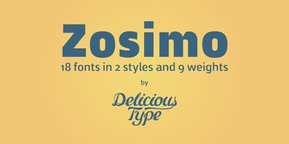 Zosimo is a neo-grotesque typeface created by designer Ron Gilad (Delicious Type) in cooperation with renowned typographer Oded Ezer based on his ubiquitous Alchemist typeface. Carefully drawn curves, robust shapes and a range of OpenType features make Zosimo a great choice for designing logotypes, signage, titling, texts and more. Zosimo now comes in three families: Standard (full Latin support), Cyrillic (basic Latin and Cyrillic) and Pro (all included). Totalling in 9 weights, roman and italic, Zosimo can accommodate all your type-related design needs in one big happy family.


