5,439 search results
(0.23 seconds)
- DIN Next Shapes by Monotype,
$29.99 Sabina Chipară's DIN Next Shapes typeface is a twist on the original German industrial classic, taking its skeleton and re-clothing it in dots, hearts, snowflakes and stars. The design offers a more approachable and whimsical tone of voice than the original, while maintaining all the legibility and clarity of form that makes DIN Next such a reliable and versatile design. It works in harmony with DIN Next, and is particularly suited for designers looking to be a little more expressive. DIN Next Shapes includes four fonts: Dots, Flakes, Hearts and Stars, and has pan European language support including Greek and Cyrillic. It also has OpenType features including stylistic alternatives, ligatures and fractions.
 - Ambigane by IbraCreative,
$17.00 Ambigane is a modern and elegant serif font that seamlessly blends sophistication with contemporary design. Its refined, timeless aesthetic is characterized by the subtle curves and clean lines of its letterforms, exuding a sense of luxury and professionalism. Ambigane strikes a harmonious balance between traditional serif elements and a fresh, modern twist, making it versatile for a range of design applications. With its well-crafted serifs and balanced proportions, Ambigane communicates a sense of refinement and style, making it an ideal choice for projects that require a touch of sophistication and a contemporary edge. Whether used in print or digital media, Ambigane conveys a sense of timeless elegance that elevates any visual composition.
 - Goose Creek JNL by Jeff Levine,
$29.00 The hand lettered credits from the 1942 British film comedy “The Goose Steps Out” became the model for Goose Creek JNL, a simple sans serif design available in both regular and oblique versions. According to the Internet Movie Database (imdb), “A bumbling teacher turns out to be the double of a German general. He is flown into Germany to impersonate the general and cause chaos and hilarity in a Hitler Youth college.” The title is a parody of the “goosestep” style of marching by German soldiers during World War II. As a variant on the movie’s title, the font was named for Goose Creek, South Carolina – a charming community just northeast of historic Charleston.
 - Bonyad by Naghi Naghachian,
$98.00 The Bonyad font family, designed by Naghi Naghashian, was developed considering specific research and analysis on Arabic characters and definition of their structure. Bonyad is a modern Sans Serif font family.The Bonyad innovation is a contribution to modernisation of Arabic typography; gives the Arabic font letters real typographic arrangement and provides for more typographic flexibility. Bonyad supports Arabic, Persian, and Urdu and includes proportional and tabular numerals for the supported languages. The Bonyad Font family is available in six weights; Thin, Light, Regular, Demi Bold, Bold and Heavy. Its intuitive design arrangement fulfills the following needs: It is precisely crafted for use in electronic and print media. Bonyad is not based on any pre-digital typefaces and it is not a revival. Rather, its forms were created with today’s ever-changing technology in mind. Bonyad is suitable for multiple applications, and gives the widest potential for acceptability. It is extremely legible not only in its small sizes, but also when the type is filtered or skewed, e.g., in Photoshop or Illustrator. Bonyad's simplified forms may be artificially oblique with InDesign or Illustrator, without any degradation of its quality for the effected text. Bonyad is an eye-catching and classy typographic image that developed for multiple languages and writing conventions. Bonyad uses the very highest degree of geometric clarity along with the necessary amount of calligraphic references. The Bonyad typeface is of a high vibration that is finely balance between calligraphic tradition and the contemporary sans serif aesthetic commonly seen in Latin typography.
 - Floral Decay by Mircea Boboc,
$22.00 This is Floral Decay, your seasonal autumn font with jaded, weathered, and earthy contours of rustic lettering. As they blend into words, the characters evoke floral arrangements of a decaying beauty. It is versatile, playful, and perfect for Graphic Design decorations! This font is unique because, in order to create it, I had to answer some tricky questions: What makes autumn… autumn? Capturing the essence of the other seasons into your letters comes easier. For instance, in order to suggest summer, you only need to draw a few flowers. How about autumn? You could garnish your letters with a few grapes, you might think, but it would only result in a grape-themed font. The notion that is more directly associated with autumn is the image of falling and withering leaves, which brought me to the second question. How exactly are you going to create something beautiful out of a somewhat morbid premise, like wilted leaves? Well, I soon realized that by creating a handwritten font and preserving the right imperfections, you can actually portray collateral beauty. In this context, asymmetry is important because it suggests decay. Further on, the design concept required the letters to come very close together, so that every typed word can be regarded as a floral arrangement. How close together, though? As much as possible without confusing one with the other, risking a lack of legibility. Therefore, in contrast with the demo version of this font, this actual version provides the ideal kerning.
 - Daily Routines by Fikryal,
$23.00 The “Daily Routines” Handwritten Display Font is a delightful and charismatic typeface that effortlessly captures the essence of casual elegance. With its carefully crafted strokes and artful imperfections, this font exudes a sense of handmade authenticity that is both inviting and versatile. Designed with meticulous attention to detail, “Daily Routines” showcases a harmonious blend of playful curves and well-balanced letterforms, making it a perfect choice for projects that seek to strike a harmonious balance between approachability and sophistication. Its smooth and flowing lines lend a sense of fluidity and ease, evoking a feeling of effortlessness and natural rhythm. The irregularities in each letter lend a unique charm, reminiscent of handwritten notes penned with care. The “Daily Routines” Handwritten Display Font is specifically tailored for projects that demand a warm and friendly touch, such as invitations, greeting cards, product packaging, and branding materials. It easily conveys a sense of personal connection, making it ideal for conveying heartfelt messages or highlighting the human element in design. Whether utilized for digital or print media, this font ensures legibility and readability, even in smaller sizes. Its captivating appearance adds a touch of personality to any text, making it stand out while retaining a sense of tasteful subtlety. Embrace the captivating allure of the “Daily Routines” Handwritten Display Font to infuse your designs with a genuine and endearing character, elevating them to new levels of aesthetic appeal and resonating with your audience on a profound level. If you have any questions please don’t hesitate to contact me follow my Instagram: fkryall Thank you
 - FF Speak by FontFont,
$62.99 Danish type designer Jan Maack created this sans-serif FontFont in 2007. The family has 8 weights, ranging from Light to Heavy (including italics) and is ideally suited for advertising and packaging, editorial and publishing, logo, branding and creative industries as well as web and screen design. FF Speak provides advanced typographical support with features such as ligatures, case-sensitive forms, fractions, super- and subscript characters, and stylistic alternates. It comes with tabular lining and proportional lining figures.
 - Adelphi PE by Rosetta,
$70.00 Adelphi is a geometric sans, redefined for the northern side of the English Channel. Typographic modernism was a late arrival in Britain — due partly to the Second World War and to the strong local type tradition. This delay provided for fruitful divergence, thus modernism was not adored in quite the same way as it had been in Germany and central Europe. It was instead rethought and repurposed against the backdrop of the bleak British weather and postwar social reform – a continental fashion statement reshaped into a more humanist variant. Likewise, when crafting Adelphi, Nick Job reimagined the constraints that defined the geometric sans as a genre. Whereas other typefaces seem overly bound by the rules, Adelphi feels relaxed and approachable. Elementary square and circular shapes are merely implied. A keen observer may notice that the uncomplicated letterforms occasionally reveal a subtle naïveté associated with early Grotesques. Brunel’s bridges and Harry Beck’s tube map spring to mind alongside the Bauhaus and Futura. But Adelphi is by no means nostalgic! It is a contemporary, comprehensive, and durable system with a pragmatic set of features. These include a wide array of weights, ‘uniwidth italics’, and variable extenders that go from tall and flat in Adelphi Text to short and sharp in Adelphi Display, with default Adelphi standing midway between these two extremes. You can set the extenders to your preference in the all-inclusive variable font or use one of the three static fonts that come packed together, priced as a single font. The pan-European support for Latin, Cyrillic and Greek scripts already makes for a vast character set, but Adelphi takes things a step further by including alternate glyphs to satisfy the DIN1450 legibility norm, a range of ordinals that can be used to create specialist compositions in all three scripts and two kinds of fractions and arrows. Play with the alternates or use it as-is. Either way, this understated beauty will carry you through.
 - Fruitygreen by Linotype,
$29.99 Fruitygreen is Indonesian designer Andi AW. Masry's second typeface following Coomeec™. Idiosyncratic but appealing forms are the signature feature of Fruitygreen™ and provide this new typeface with its truly distinctive character that you can utilize for your projects - and not just in headlines. The unique forms of fruits are not only individually fascinating, but are just as captivating when they are brought together, for example as decoration on a dining table. For Masry, these can be compared with an alphabet whose letters spell out in combination different words and with this as his inspiration, he based his designs for Fruitygreen on the versatile forms of fruits. However, it was not the whole fruits as such but rather small sections of their curves and ends that he decided to use. It is not only because of the characteristic line terminals that the rounded characters of Fruitygreen seem at first glance reminiscent of a brush-written calligraphic typeface; these are traces of the creation process, in which Masry used a digital brush. At the same time, Fruitygreen is by no means simply a brush font. Its dynamic characters reference biological forms and there is definitely something amoeba-like about them, particularly in the bolder variants, and they exude the same serenity and harmony that is inherent to organic structures. The many unconventionally shaped characters also provide for optical contrast. There is, for example, the very scaled down g", the open "q" and the lowercase "r", which has the form of the capital letter. Other letters, such as the sinuous "k" and the rounded uppercase "F" impart an exotic touch to Fruitygreen. Similarly remarkable is the "@", that has only a semi-circle. Available to the designer are other characters that can be used to accentuate a design, such as swash capitals and numerous ligatures. And, last but not least, there are also various numeral sets with oldstyle and lining figures for setting proportional text and table columns together with a selection of symbols, such as arrows and, appropriately, fruits. "
 - Biome by Monotype,
$29.99 In the sketches that formed the basis for his typeface Biome, Crossgrove experimented with inner and outer shapes in different styles, adapted letters to the form of the super-ellipse, and added curves only to remove these again. His challenge was to find a harmonious and coherent approach that provided sufficient contrast with existing fonts. Biome is essentially in the sans serif tradition and the letters exhibit only minor variations in terms of line thickness. There is still a suggestion of the super-ellipse at many points, but this never becomes the predominant design factor. While most of the terminals of the vertical strokes are only slightly rounded, the horizontals and diagonals have pronounced arches and it is these that basically determine the round and soft character of the typeface. The more unconventionally shaped letters, such as the lowercase 'g' with its two semi-open counters and the 'k' and 'x' with their crossbars, provide Biome with an individual personality. And this effect is emphasized by the generously rounded links in the 'v' and 'w' and the uppercase 'M' and 'N'. Biome has been designed as a typeface super-family. From the near hairline Extra Light to the amply proportioned Ultra, there are seven clearly differentiated weights and three tracking widths. There are oblique italic versions of all variants. The range includes small caps and numeral sets containing lowercase and uppercase digits. With its available range of characters, Biome can be used to set texts in all Eastern European languages. Although the remarkable individuality of Biome is most clearly apparent in the larger point sizes, this typeface is not just suitable for producing headlines and logos. Biome's elegant visual effects mean that it is equally comfortable in short texts while its large x-height and generous counters make it readily legible even in the small font sizes. Biome is a contemporary typeface that employs mid-20th century futurist elements which ironically give it a retro feel.
 - TT Frantz by TypeTrends,
$24.00 Useful links: Using the variable font in Illustrator Working with a variable font in Photoshop TT Frantz is an experimental variable font, distinguished by its slimness and lightness. The variation in the font affects the change in the height of the mean line - by moving the axis adjustment slider you can easily raise or lower the mean line of the font. In TT Frantz, you can find small references to the art deco aesthetics, which are expressed in significantly lowered or, conversely, heightened waist of the letters. In addition, depending on the position of the axis adjustment slider, the closedness of the aperture changes for some letters. In order to preserve the main feature of the font—the change in the height of the main line—we made lowercase characters as tall as uppercase ones, but at the same time we kept small kerns. An interesting fact is that in Cyrillic letters з с а е, the variability of the aperture follows a different scenario in comparison with their Latin sisters. When working on TT Frantz, we tried to make it so that when changing the variability, the width of the characters would not change, and the font would remain monospaced. And in order to avoid holes in the set, we made contextual alternates and several ligatures. Frantz consists of 470 glyphs, and in addition to broad language support (Latin and Cyrillic) it can offer standard and old-style figures, including their tubular versions, as well as ligatures. Important clarification regarding variable fonts. At the moment, not all graphic editors, programs and browsers support variable fonts. You can check the status of support for the variability of your software here: v-fonts.com/support/ But do not despair—even if you do not have access to the necessary software, you still have the opportunity to use TT Frantz in your projects. Especially for you, we have prepared three separate non-variable styles (Frantz A, Frantz B, Frantz C), each of which is responsible for a certain location of the mean line of the font and where this line is already fixed in a certain position (high, medium and low).
 - Given my artistic inclination and optimistic outlook, it's delightful to delve into describing a font named "Tangled". The name itself conjures images of whimsy and adventure, perhaps inspired by fai...
- Le Monde Courrier Std by Typofonderie,
$59.00 A rounded slab in 4 styles In our age, since the arrival of microcomputing, the majority of professional letters have been composed in quality typefaces. Typewriters & the typestyles they used have become antiques. A letter set in Times or Helvetica & printed with a laser printer at 600 dpi or more are of such quality that one can no longer distinguish it with a document produced by offset printing. But letters composed in this way appear overly institutional when a bit of informality is needed. Le Monde Courrier, designed by Jean François Porchez, attempts to re-establish a style halfway between writing and printing. Informal neo-tech style This rounded slab serif returns the informal character of “typewritten” fonts to letters and suit well all bad conditions, from inkjet printed memos to webfonts use. With a unique typographic colour, it integrate itself with the rest of the Le Monde family with effective contrast. The verticals metrics and proportions of Le Monde Courrier are calibrated to match perfectly others Typofonderie families. Bukva:raz 2001 Type Directors Club .44 1998 European Design Awards 1998
 - Hatmaker by ITC,
$29.99Jean Evans' interest in type design dates back to her third-grade fascination with fancy script writing. Years later, work at a sign-painting school she found in the Yellow Pages® cemented her relationship with letterforms. Evans went on to study with master calligraphers and type designers, including the likes of Donald Jackson, Hermann Zapf and Matthew Carter. Evans' designs have been exhibited and collected around the globe, and her distinctive calligraphic style has been lauded by leading trade organizations, annuals and publications. Hatmaker, one of Evans' more popular typefaces, was originally developed for the Boston-based broadcast design firm of the same name. Inspiration for the design came from Ben Shahn's famous hand-constructed alphabet. Shahn's alphabet, however, was limited to capital letters. Daunted by the idea of designing a lowercase that would measure up to Shahn's capitals, I developed a second set of caps-simple, quirky, yet almost classic-to work as 'lowercase' with the Shahn-like caps," explains Evans. Mixing the two in Hatmaker, creates a lively interplay of light and dark." - Maris by insigne,
$25.00 Maris is a rich, elegant script, subtly characterized by a whimsical handwritten calligraphy. The family is composed of six different weights, each one bolder than the last but all equally as filling. The lighter weights move delicately through each line, showing a gentle strength in their smaller frame. The six weights from these lighter forms to the bold include some textured versions such as jean, wood, print, rough and halftones. The Maris family performs superbly in custom headlines and logotypes. Turn on Swash, Stylistic or Contextual Alternates for even greater emphasis. Opentype lets you "auto-magically" swap out letter sets with alternate versions and creates the visual diversity that gives you the one-of-a-kind look of custom lettering. It also uses OpenType features to assist with letter flow. When you choose to make use of its open-type decorative glyphs, your headlines will dazzle. For the greatest benefit, grab the entire Maris family. Thanks to its variety of styles, Maris makes it easier for you to design. With this large font family, solve your design problem with just one typeface.
 - FF Cube by FontFont,
$62.99 Danish type designer Jan Maack created this display and sans FontFont in 2008. The family has 18 weights, ranging from Light to Bold in Condensed, Normal, Expanded, and Extra Expanded (including italics) and is ideally suited for advertising and packaging, logo, branding and creative industries, poster and billboards as well as sports. FF Cube provides advanced typographical support with features such as ligatures, alternate characters, case-sensitive forms, and stylistic alternates. It comes with tabular oldstyle and tabular lining figures.
 - Foundry Sans by The Foundry,
$90.00 This humanistic sans serif design was inspired by a conversation that David Quay had with renowned type designer Hans Meyer, during ATypI in Paris, 1989. Meyer revealed that Sabon, designed by Jan Tschichold, was the inspiration behind his Syntax font. This approach formed the basis for the design development of The Foundry's very first sans serif typeface family; the inspiration for Foundry Sans comes from Stempel Garamond. Foundry Sans was the second typeface to be released for The Foundry typeface library in 1990.
 - Architype Tschichold by The Foundry,
$99.00 Architype Universal is a collection of avant-garde typefaces deriving mainly from the work of artists/designers of the inter-war years, whose ideals underpin the design philosophies of the modernist movement in Europe. Their ‘universal’, ‘single alphabet’ theory limits the character sets. Architype Tschichold is a faithful rendering of Jan Tschichold’s 1929 experimental alphabet which was influenced by Bayer’s single-alphabet. His design was never put into production. This re-creates his original geometrically constructed design, including some phonetic characters.
 - PiS LIETZ Lindham by PiS,
$38.00 LIETZ Lindham is based on letters taken from an old type specimen folder from 1936 featuring handdrawn sans-serif ABC's. It's kinda bauhausy and straight but also shows the wonderful lively unevenness of hand-drawn letters. Being made for the use in large-scale advertisements and posters, LIETZ Lindham fits perfectly for pro-communist propaganda posters, but also features legibility in smaller sizes, so you can use it for your Neue Typographie manifesto too, Jan. Go grotesk! Go bold! Go neu!
 - Jannson Map by RM&WD,
$35.00 For best results, use of OpenType features is strongly recommend. This font is inspired by Johannes Janssonius, well know as Jan Janszoon o Jan Janssonius (Arnhem, 1588 – Amsterdam, 1664), was a Dutch cartographer, publisher and engraver. Married to Hondius's daughter. He was the author of many masterpieces of cartography of the 1700s like Willem Blaeu and Hondius, famous maps with heavy use of decorations in the letterig to fill the spaces of oceans, seas, lakes and scrolls. Now you can easily recreate not just ancient maps without effort, but you can use this font creatively, to make unique, modern logos, product names, fresh packaging, hip fashion outfits, refined labels, signs, coordinated images ... Hundreds of alternatives to choose from and maybe to combine with other fonts in an original way. One extra font with 27 castles in Janszoon style are also usefull for map, of course, but also for many different creative artworks. Warning: Jannson Map having oversized swashes compared to the normal standards cannot be used with Windows Word because Word does not give the possibility to manage the line spacing professionally. Jannson Map works great with applications like Illustrator, In Design, quark Xpress, mac Text etc ...
 - Besans by NJ Studio,
$19.00 Hi...Thank for your visit :) Besans Handmade sans font. It features tall characters that will take your projects to the next level! This font is PUA code which means you can easily access all the glyphs that are full of sans! It also features many special features including glyphs. font designs that are made for various vector designs, printing such as digital wedding blogs, online shops, social media, while printing can be used in the field of product clothing, accessories, bags, pins, logos, business cards, watermarks and many others ... so it can make your product look sans and attractive, and also Multilingual support!!! Happy design ...
 - Dash Wisher by PizzaDude.dk,
$15.00 The name Dash Wisher is a wordplay. The letters of the font are also quite playful - you never know what comes next, when typing. There is no exact x-heigh, the baseline is jumpy, the descender and ascender are messed up...there are no real rules for Dash Wisher! But with all that in mind, it comes out surprisingly legible, which means it does have a wide range of use. Let your fantasy and imagination break the boundaries and Dash Wisher do the rest - or maybe the other way around! :) I've added both ligatures to substitute double letters and a set of alternate letters as well.
 - Linotype Salamander by Linotype,
$29.99Linotype Salamander is a part of the Take Type Library, selected from the contestants of Linotype’s International Digital Type Design Contests of 1994 and 1997. Designed by German artist Michael Struller, the font seems to be composed of strokes and curves jointed together to form characters. Yet Salamander also looks like a handwriting font, in part because of its slight lean to the right. The font contains four basic weights, from regular to demibold, and two particularly heavy double-weights. Linotype Salamander is a light and lively font, particularly good for short texts of point size 10 and up or, in its heavier weights, for headlines and displays. - Creative Vibes by NJ Studio,
$19.00 Hi...Thank for your visit :) Creative Vibes a modern script font. It features ligatures characters that will take your projects to the next level! This font is PUA code which means you can easily access all the glyphs that are full of natural! It also features many special features including glyphs. font designs that are made for various vector designs, printing such as digital wedding blogs, online shops, social media, while printing can be used in the field of product clothing, accessories, bags, pins, logos, business cards, watermarks and many others ... so it can make your product look natural and attractive, and also Multilingual support!!! Happy design ...
 - Hello France by NJ Studio,
$19.00 Hi...Thank for your visit :) Hello France a modern handwritten font. It features ligatures characters that will take your projects to the next level! This font is PUA code which means you can easily access all the glyphs that are full of authentic! It also features many special features including glyphs. font designs that are made for various vector designs, printing such as digital wedding blogs, online shops, social media, while printing can be used in the field of product clothing, accessories, bags, pins, logos, business cards, watermarks and many others ... so it can make your product look beautyful and attractive, and also Multilingual support!!! Happy design ...
 - Colophon by Roy Cole,
$34.00 During development of Colophon 30, the base font of the typeface family, two requirements emerged; namely that it should demonstrate good legibility and robustness when used for text composition, and where individual characters become more apparent, as in much larger sizes, these should appear well formed. Colophon 60 and 90 progressively increase in x-height to allow the counters to retain openness. The italics lean towards informality, this being apparent in the descender tails. On account of its neutrality there are few instances where the use of Colophon would be inappropriate; a quality that can also be attributed to Roy Cole's other typeface families: Lina, Zeta and Coleface.
 - Didonesque Ghost by Monotype,
$25.99 Didonesque Ghost is a family of 10 fashionable fonts that will enhance any project that requires a touch of class. These fonts turn the contrast right up to 11 – giving each weight a ghost-like appearance by means of their hairline stems and serifs. This extreme contrast gives Didonesque Ghost a very stylish appearance which is intended for use in display purposes at very large sizes – posters, signage, branding, corporate identities, headlines, advertising, wedding invitations and the like. See more detailed examples here . Key features: • 5 Weights in Roman and Italic • Small Caps, Petite Caps, Contextual Alternates, Ligatures and Discretionary Ligatures • European Character Set – Latin Only • 750 glyphs per font.
 - Zenit by Cuchi, qué tipo,
$9.95 As "Zenith" means, in an astronomical context, the highest point reached by a celestial body, my new typeface raises its drawing for carry it to the highest expression. In an effort to design a singular graphic and visual letters system, the contrasts and proportions of “Zenit” boosts up and are squeezed as much as possible, resulting in a very particular aesthetic, while still maintaining a certain grotesque reminiscence. Given its dynamic, postmodern, daring and futuristic style, “Zenit” is an ideal typeface for use in designs that want to discover new space worlds full of color and speed, still unexplored. “Zenit, the typeface that rockets you!.”
 - Miracle Boy by NJ Studio,
$9.00 Hi...Thank for your visit :) Miracle Boy a display font. It features fun characters that will take your projects to the next level! This font is PUA code which means you can easily access all the glyphs that are full of sans! It also features many special features including glyphs. font designs that are made for various vector designs, printing such as digital wedding blogs, online shops, social media, while printing can be used in the field of product clothing, accessories, bags, pins, logos, business cards, watermarks and many others ... so it can make your product look fun and attractive, and also Multilingual support!!! Happy design ...
 - Assakita by Alifinart Studio,
$15.00 Assakita simplifies elegance into one truly outstanding handwritten font. It maintains its classy calligraphic influences while feeling contemporary and fresh. This versatility will appeal to a wide range of crafty ideas, from letterheads and titles, to stationery. This font is PUA encoded which means you can access all of the glyphs and swashes with ease. The Assakita font features beautiful and stunning Stylistic Alternates. You can access this feature through software that supports the OpenType Feature or can be accessed via the Character Map on Windows or Font Book on a Mac. Please note that the Stylistic Alternate features are also available on Multilingual Accents. Thank you. Alifinart Studio alifinart@gmail.com
 - Replay Pro by MAC Rhino Fonts,
$59.00 Replay is a pure hymn to the classic typeface Caslon originally made by William Caslon (1692–1766). The typeface that bears his name, was made between 1720 and 1726. In 1739 he founded the Caslon Foundry which later become a property of Stephenson, Blake & Co., but remained an independent foundry until 1937. The typeface have been popular ever since it was made and still stand proud as a classic text face. MRF made detailed research, including versions from Adobe and Justin Howes. The end result is leaning more towards the original. Some minor »imperfections« are also incorporated in order to make the typeface more lively and old fashioned.
 - Sylfaen by Microsoft Corporation,
$49.00Sylfaen was designed for Microsoft in 1998 by John Hudson and W. Ross Mills of Tiro Typeworks, and Geraldine Wade of Monotype Typography. Sylfaen is a Welsh word meaning foundation"; an apt name since the font stemmed from research into the typographic requirements of many different scripts and languages. This version of Sylfaen supports the WGL4.0 character set, for Pan-European language coverage. In addition to Latin, Greek and Cyrillic letterforms, the font contains the characters necessary for support of the Armenian and Georgian languages. Font Designer: John Hudson, W. Ross Mills, Geraldine Wade. The Sylfaen font contains 729 glyphs including Latin 1, WGL Pan-European, Armenian and Georgian." - BMX Radical by Eclectotype,
$15.00 BMX Radical is inspired by the titles of the cult 1980s BMX movie "Rad". The characters R, A and D were designed after this, with the rest of the character set being completely made up. The font is uppercase only, but with two different alphabets. In OpenType-capable applications, engaging contextual alternates will make the alphabets automatically switch between each other, meaning double letter combinations always contain two different glyphs to give the text a much more handmade feel. It is a very versatile brush font. It can look cheesy and retro in bright colors with outlines or gritty and modern in more muted palettes.
 - South Signature by NJ Studio,
$19.00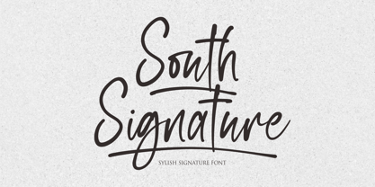 Hi...Thank for your visit :) South Signature a stylish signature font. It features ligatures characters that will take your projects to the next level! This font is PUA code which means you can easily access all the glyphs that are full of natural! It also features many special features including glyphs. font designs that are made for various vector designs, printing such as digital wedding blogs, online shops, social media, while printing can be used in the field of product clothing, accessories, bags, pins, logos, business cards, watermarks and many others ... so it can make your product look natural and attractive, and also Multilingual support!!! Happy design ...
 - Ghadys by ErlosDesign,
$15.00 Ghadys is a sweet, romantic and timeless handwritten font. It looks stunning on wedding invitations, thank you cards, quotes, greeting cards, logos, business cards and every other design which needs a handwritten touch. This font is PUA encoded which means you can access all of the glyphs and swashes with ease! It features a varying baseline, smooth lines, gorgeous glyphs and stunning alternates. The file you will get is: • Works on PC & Mac • Simple installation • Can be accessed in Adobe Illustrator, Adobe Photoshop, Adobe InDesign, and even works in Microsoft Word. • Encoded PUA Character - Can be accessed completely without additional design software. Happy Crafting!
 - South Australia by NJ Studio,
$19.00 South Australia a handwritten font is a font with ligatures. It features authentic characters that will take your projects to the next level! This font is PUA code which means you can easily access all the glyphs and ligatures that are full of authentic! It also features many special features including glyphs and alternate ligatures. font designs that are made for various vector designs, printing such as digital wedding blogs, online shops, social media, while printing can be used in the field of product clothing, accessories, bags, pins, logos, business cards, watermarks and many others ... so it can make your product look cute and attractive, and also Multilingual support!!! Happy design ...
 - Savanna by NJ Studio,
$9.00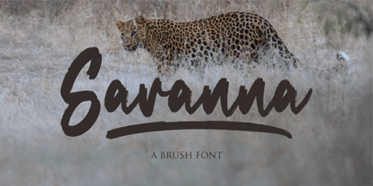 Hi...Thank for your visit :) Savanna a brush font. It features ligatures characters that will take your projects to the next level! This font is PUA code which means you can easily access all the glyphs that are full of brush! It also features many special features including glyphs. font designs that are made for various vector designs, printing such as digital wedding blogs, online shops, social media, while printing can be used in the field of product clothing, accessories, bags, pins, logos, business cards, watermarks and many others ... so it can make your product look brush and attractive, and also Multilingual support!!! Happy design ...
 - Latey Once by skillyas studio,
$20.00 LateyOnce feels playfully nostalgic and delivers an incredible vintage aesthetic. Use this handwritten font to add that special retro touch to any design idea you can think of! LateyOnce comes with 308 glyphs. Alternative characters are divided into several Open Type features such as Swash, Stylistic Alternate and Stylistic Sets. The Open Type feature can be accessed using savvy programs such as Adobe Illustrator, Adobe InDesign, Adobe Photoshop, Corel Draw, and Microsoft Word. This font is PUA encoded (custom coded font) which means you can access all of the glyphs and swashes with ease! FEATURES: • Additional Accents • Multilingual Support • Kerning • Alternates • Ligatures COMPATIBLE OS: • Mac OS • Windows
 - Samarinda by NJ Studio,
$19.00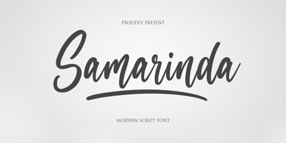 Hi...Thank for your visit :) Samarinda a modern script font with swash. It features ligatures characters that will take your projects to the next level! This font is PUA code which means you can easily access all the glyphs that are full of natural! It also features many special features including glyphs. font designs that are made for various vector designs, printing such as digital wedding blogs, online shops, social media, while printing can be used in the field of product clothing, accessories, bags, pins, logos, business cards, watermarks and many others ... so it can make your product look natural and attractive, and also Multilingual support!!! Happy design ...
 - Mg Dalenaf by NJ Studio,
$19.00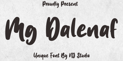 Hi...Thank for your visit :) Mg Dalenaf a unique font. It features unique characters that will take your projects to the next level! This font is PUA code which means you can easily access all the glyphs and swashes that are full of love! It also features many special features including glyphs. font designs that are made for various vector designs, printing such as digital wedding blogs, online shops, social media, while printing can be used in the field of product clothing, accessories, bags, pins, logos, business cards, watermarks and many others ... so it can make your product look cute and attractive, and also Multilingual support!!! Happy design ...