10,000 search results
(0.026 seconds)
- Afrobeat by Resistenza,
$39.00 Inspiration The pounding tribal rhythms of Afrobeat music is expressed through this psychedelic brand new font, Afrobeat. Every letter becomes art as every letter is elegantly placed side by side, like music notes, creating music for the eyes. Afrobeat is a musical style performed by many African artists such as Fela Kuti, Femi Kuti, Antibalas and many more, which is a fusion of jazz,funk, and psychedelic rock, originating from the 60s and was based on the political movements of Nigeria. The Font This font is perfect for when you want to use eye-catching big texts for anything from posters and flyers for concerts, events, parties, to CD covers, advertisements, and art, but it’s especially striking for printed projects. Check out also ‘Afrobeat light’
 - La Taqueria by Sudtipos,
$39.00 Mexico’s storied culture is one of the most recognizable today. Its amazing vibrant art and delicious foods have made the leap to influence many parts of the world in recent years. This proud, intense and diverse identity was the inspiration behind La Taqueria, a set of four fonts that express different characteristics of Mexican pop culture. The heavy and spicy, the light and gentle, the constant dynamism, all come together with one rhythm to produce an explosion of personality. Just like its predecessors Distillery and Scrapbooker, the La Taqueria set contains down-to-earth alphabets perfect for chalkboard art and handmade design. All the fonts include alternates and ligatures, providing plenty of variation for that spontaneous appearance everyone is looking for these days.
 - Enchanter by Cloveron Media,
$49.00 Cloveron Media unveils its first serif font that goes beyond the formal nature of typography. It celebrates the artistic expressions of graphic designers within themselves. The Name Mary Anne Remulla is the Master Designer behind the Enchanter Font. She aims to make graphic designers filled with delight and enjoy typography with its extensively artistic alternates and multilingual characters. The Font Style The serif style, known for its formal touch to typographic design, infuses the font with its professionalism as its regular. Using its middle alternate adds a hint of unique touch without losing the serif style's essence. The Enchanter font's start and end alternates are the designer's illustrations of design balance, which elevates its charm and enticing nature that adds to its overall artistic power. "I am fascinated by art and so by design. A font with alternates was my great revelation that I can do typography artistically, enthusiastically, and with freedom. I later found myself fascinated and lost in paper space, which then ended up that I completed my first font creation with extensive alternates for each letter." - Mary Anne Remulla
 - P22 Schneeberger by IHOF,
$29.95 In this font from graphic arts veteran Tracy Sabin, his trademark whimsy and playfulness are exhibited in spades. Sabin takes a multitude of influences, from mid-century art nouveau to today’s pleasant dream-pop doodles, and mixes them up into a sweet and animated alphabet that oozes energy, enthusiasm and honest innocence. Alongside the chromatic and colour-play possibilities that come with two layerable fonts, the jumpy, rough and curly elements that make up Schneeberger’s construct make this face a unique and essential tool for display and packaging aimed at catching the eyes of kids and teens. Use it for fantasy flicks, sugar-fix wrapping, and the elaborate backyard birthday party invite where the program is just as appealing for the adults as it is for the children. P22 Schneeberger comes in solid (Black) and outline (Regular) variants, each of which containing more than 400 characters, some very cool built-in stylistic alternates, a bunch of ligatures, and support for the majority of Latin languages.
 - Romanesque Monogram by MonogramBros,
$10.00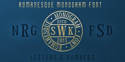 The perfect font for monogramming and personalization.
 - KG She Persisted by Kimberly Geswein,
$5.00 A chunky, playful, feminine font with personality.
 - Lhont Down by Alit Design,
$15.00 Introducing Lhont Down Typeface The Lhont Down font is designed with a serif font concept that has a decorative display style. Irregular dynamic shapes but impressively bold and unique make the font "Lhont Down" different and steal attention. The "Lhont Down" font has 2 font styles, namely decorative ones with irregular shapes with standard or normal font styles. Can be combined so that the designed design has a different rhythm. The lhon Down font is perfect for serious or non-serious design concepts, also suitable for classic retro designs, fashion, pop designs and so on. Serif typefaces such as "Lhont Down" are very easy to apply to any design, especially those with an retro and classic concept, besides that this font is very easy to use both in design and non-design programs because everything changes and glyphs are supported by Unicode (PUA). The "Lhont Down"contains 692 glyphs with many unique and interesting alternative options.
 - Archemy by Sonic Savior,
$90.00Archemy is a restricted and obscure branch of Alchemy that deals specifically with the life, generation and transmutation of Metals. The Archemy font is primarily a magical and alchemical alphabet. It was created on initiative of Senior Zadith, in order to properly quote older alchemical manuscripts, without the need to insert handwritten symbols. The font combines a unique and elegant Roman alphabet with a set of the most frequently used planetary and alchemical symbols that are common in the Western Mystery Tradition, and as used by those involved in the Royal Art. The Archemy font contains a selection of symbols that are still used by practitioners of the Art today, and for the sake of completeness, a selection of less used and more arcane symbols that can be found in older alchemical texts. In addition a Hebrew Alphabet is included, which will supply practitioners of the Art with the glyphs related to Cabalistic studies. The Hebrew Alphabet in this font does not include vowel points, since they have no place in ancient Hebrew, nor in the Western Mystery Tradition. A selection of the most distinct glyphs as used in the Antediluvian font family - the Alphabet of the Ancients - is included for those that wish to include the archetypal and arcane quality of these glyphs from the dawn of history. By our knowledge there exists at this time no font that includes a selection of Alchemical symbols, let alone combines all of the above mentioned archetypal symbols of occult language in a single package. In that respect Archemy can be considered to be an “Arch” font. - Nagi Tanka by Design23,
$18.00 Nagi Tanka is a Lakota word meaning Great Spirit. This font is a combination of Arts & Crafts, modern grunge and Native designs. When the cap lock is on arrows appear in your letters. The lowercase provides the more plain Nagi Tanka font. Glyphs are included in the font that are great for labels and logos!
 - Luckywish by Jafar07,
$12.00 Welcome to the world of Luckywish Sans-Serif Handmade Font, a special offering born from hands full of creativity and love. Combining the art of handwriting with the simplicity of a sans-serif, Luckywish font offers a magical script that fulfills all your wishes. Luckywish is a symbol of hope that shines through every stroke found in each character. Crafted with heartfelt dedication, this font showcases the natural beauty of handwriting, bringing warmth and joy to every design composition. Armed with a pen and imagination, Luckywish exudes a unique charm. Its relaxed and delicately intertwined style brings a friendly and inviting ambiance to every formed sentence. When used, this font will infuse happiness and a fresh spirit into every project you undertake. Luckywish is more than just a font; it's a loyal partner to designers, writers, and creators alike. With its sans-serif characteristics, this font is easy to use and suitable for a variety of creative projects, from logo designs to posters, from wedding invitations to company branding. In the palm of your hand, Luckywish offers a perfect balance between boldness and delightful gentleness. Each character is meticulously crafted to provide unparalleled harmony in every usage. It's time to let your hopes and imagination flourish with Luckywish. Let this font bring joy and inspiration into your design world. Get ready to witness your words and messages transform into mesmerizing works of art that capture hearts. Be part of this magical journey with Luckywish. Get the font now and enjoy limitless creativity with an unmatched personal touch.
 - Olivine by URW Type Foundry,
$35.00 In an era of typographic neutrality, Pria Ravichandran adds spirit and flavour to the humanist sans, a genre that is known for legibility. Introducing Olivine. Olivine is a versatile type family that performs admirably across sizes. It is designed with maximum care ensuring legibility across various sizes, angles and distances. The sturdy shapes and the exaggerated ink traps fade to produce an even typographic colour and a lively texture in smaller text sizes. In larger display settings, the details become self-conscious and highlight the spectacular quality of the design. Olivine is neither experimental nor minimal, striking a balance between formality and friendliness. Olivine is clean as well as organic at the same time. Consisting of seven weights in roman and italics, the type-family address typographic hierarchy for texts of all kinds and sizes. Distinctive, yet neutral letterforms add personality to the type family. The counter-forms are large and open giving the design plenty of internal space which is balanced against the generous spacing of the characters. These features of Olivine make the reading process enjoyable in digital as well as the print medium. No squinting to read this type-family! If you are looking to add some flavour into your design, try Olivine. It is a trend-setting typeface that we predict is going that extra mile. Try before you buy, Olivine Medium and Medium Italic are available free for unlimited commercial usage.
 - Orgon by Hoftype,
$49.00 Orgon, a new linear typeface family, fresh and easy but with a warm touch. It appears uncomplicated, unpretentious, but still distinctive. Its quiet text flow allows smooth reading even for longer texts. The Orgon family comprises 16 styles and is well suited for ambitious typography. It comes in OpenType format with extended language support. All weights contain ligatures, small caps, superior characters, proportional lining figures, tabular lining figures, proportional old style figures, lining old style figures, matching currency symbols, fraction- and scientific numerals and matching arrows.
 - Arcas by Austin Stahl,
$13.00 Arcas is a display sans with no curves — straight lines only. Unlike many other typefaces with this characteristic, however, it’s built with some asymmetry, which helps it expand beyond the “sports” or “tech” feel that many of those fonts have. Instead, it’s a surprisingly warm and friendly family, ready to lend a unique personality to headlines, posters, and packaging. Supports a wide array of Latin-script languages. OpenType features include ordinals, arbitrary fractions, and case-sensitive punctuation. A set of catchwords is also included.
 - Collateral Damage by Chank,
$59.00Collateral Damage is a classic splatter font from the earlier days of the internet. A consistent fan favorite since its initial release in 1999, this ink-dripping font was inspired by the gonzo art of Ralph Steadman. It looks hand-painted, like graffiti. Or crazy scary, like splattered blood. It was made by designer Chris Hunt who lives in the Canadian North with the polar bears. After years as a Chank.com exclusive, it is now available at MyFonts for your personal or commercial use. - Gloomie Saturday by Timurtype,
$14.00 Introduced by Timurtype Studio! Gloomie Saturday is a Bubbly Handwritten Font this font captures the charm of handcrafted elegance with our cheerful handwritten font collection – where every word dances with personality. Enhance your designs and captivate your audience with custom lettering art. Let your words sparkle with the magic of authenticity. Explore our cheerful fonts and make your message stand out! Gloomie Saturday Font also supports multilingualism. Enhance your designs with our original fonts, feel free to comment or provide feedback, Enjoy the fonts 😊 Thank You
 - Transat Text by Typetanic Fonts,
$29.00 Transat Text is a geometric sans serif typeface, and is the more rational sibling to the unabashedly Art Deco "Transat". Transat Text has a slightly taller x-height than its counterpart, making it easier to read at small sizes, but also performs admirably in larger display settings. Transat Text includes many OpenType features, such as ligatures, small capitals, case sensitive forms, stylistic alternates, arbitrary fractions, and a full complement of proportional, tabular, and oldstyle figures. The Transat Text family includes 5 weights plus optically-corrected obliques.
 - No Manners by Bráulio Amado,
$22.00 Out of step with the world. What was the inspiration for designing the font? Brasilian street art Pixacao. What are its main characteristics and features? strange M and N. Usage recommendations: headlines, caps, hate letters
 - Devendra by Wooden Type Fonts,
$20.00 A very distinctive style of font, in a kind of art deco style form the '30s. This font is unique in that there are no open, negative spaces in glyphs such as upper and lower case o, or p, or others which would usually have them. Instead the glyphs are solid. The only letters or glyphs which have triangular sides are A and V, X, and Y. This is unusual.
 - Paris by kapitza,
$99.00 Walking around Paris looking for inspiration for our latest people font, we encountered chic Parisians, yummy food markets, and bakeries on virtually every street corner with delicious baguettes and pastries. We were surprised how many people were cycling, motorcycling and rollerblading along the vast boulevards and side streets of Paris. We spotted classic French cars like the 2CV and Citroën CX and watched the world go by in one of the many sidewalk cafes whilst enjoying a 1664 or a café crème. With our latest people font, Paris, we tried to capture this unique Parisian atmosphere and hope we succeeded. All 64 illustrations are based on photographs taken on location over a period of time. The photographs are then hand traced to create high quality, detailed silhouettes.
 - Basco Std by Typofonderie,
$59.00 A mix of Renaissance & tropical atmosphere Basco is an exploration of the Renaissance style, a period in which letterforms were informed primarily by hand writing. It is clearly a contemporary interpretation of calligraphic shapes forms. The serifs are subtly asymmetrical. Slightly curved arches on the n, m and u are noticeable, creating an interesting tension in the text. Bruno Mello’s distinctive style is most obvious in his mastery of super fluid curves. It is a result of his extensive exploration of calligraphic forms, their tensions and dynamics, mixing angularities with curves. The roman weights include alternate swashes, as well as initial and terminal glyphs. The italics, based on chancellery script, feature simple stroke endings, most visible on the s and c. ➼ Basco minisite
 - Skiltmaler by Imagi Type,
$15.00 Skiltmaler is the typeface that refers to the style of decorative arts during the Victorian era 1837 to 1901, the Victorian era was the period in which fly poster typography emerged. The large amount of colour in combination with large font sizes were created from movable metal type. As well as being made from wood, this was used to create the two-coloured typefaces. You would imagine this would be specific to the '3D' styled type seen on the poster to create the drop shadow. Skiltmaler works well with normal size text, but it works even better for large displays, short words, or even just to incorporate a few or single characters in a design.
 - Jeanne Moderno by steve mehallo,
$32.00Jeanne Moderno is a revisionary type family. A synthesis of Bodoni Italic and 19th Century Ultra-Bold "Fat Faces"—distilled with personality taken from early 20th Century Modernists; the Futurists, Dadaists, Suprematists, Constructivists. Historically, Jeanne Moderno could have appeared on the scene around 1918—after the First World War—when new cultural movements, manifestos, theories and countertheories shaped art, industry and society. Spatter in a few later influences—from De Stijl, the Bauhaus, the types of Herbert Bayer, Josef Albers, Paul Renner—plus a twist of Art Deco and High Fashion—Jeanne Moderno is a remanifestation of 19th + 20th Century Modernist thinking; traditional + revisionist, raw and elegant! Jeanne Moderno can best be used for magazines, advertising, posters, flyers, fashion reports, letterpress experiments, silkscreen endeavors, exhibitions, DMV signage, paper money, revolutionary political statements as well as formal declarations of peace or war. Jeanne Moderno is about the future, the past. The Avant-Garde. Humanist geometry + vintage footwear. Form, function, style, art and life. - Sucker Font - Personal use only

- DBE-Beryllium - Personal use only

- Schindler’s Font - Personal use only

- Furia & Venganza - Personal use only

- Neue Goth - Personal use only

- ITC Typados by ITC,
$29.99ITC Typados is the joint effort of Roselyne and Michel Besnard and is composed of characters in two different senses of the word. First, it is of course made of letters and symbols, clean and legible with generous widths and x-heights. There is a hint of Art Nouveau style in the tapering, brush-like strokes. But the figures of ITC Typados are also made of characters in the theatrical sense: little tear-drop heads on tapering bodies that bend themselves into the shapes of an alphabet while maintaining a life of their own. The typeface is based on a recurring character in Michel's sculpture and painting, Ado. Ado is the first character who sings and repeats itself in all my creations," says Michel. "This adventure brings new forms for my painting and my sculpture: coiffed heads, bodies in the form of a cone, arms in the form of spread wings, etc." "Type" plus a number of "Ados" equals ITC Typados." - Charleston Caps by Type Associates,
$21.95 Based on hand-lettered poster styles of the twenties and thirties, Charleston evokes a mood of flapper-era nostalgia. Ideal font to suggest the period of fashionable bobbed hairstyles, short(ish) hemlines and baggy pants.
 - Tasci Kufi by Abdullah Tasci,
$50.00Tasci Kufi is the today’s commentary of the minimalist comprehension of the geometric balance in the epigraphs of the Seljuk period. The typeface offers innumerable alternatives for the balance component needed for headlines and logotypes. - Holiday Dish by PizzaDude.dk,
$15.00 Holiday Dish has a simple and stylish art deco look. Freshen up your design using Holiday Dish, and you are guaranteed to get the eye-catching look your design deserves. Comes in both Regular and Bold.
 - Deco Slaughter by Woodcutter,
$45.00 Deco Slaughter is a unique typeface that blends the elegant Art Deco style with the visceral and broken aesthetic of horror typography. Each letter is meticulously crafted to evoke a sense of intrigue and mystery. The sophisticated and geometric lines of Art Deco intertwine with shattered and bleeding details, creating a striking contrast. This typeface is perfect for projects that aim to break conventions and stand out with a provocative aesthetic. Deco Slaughter captures the essence of classic style with a dark and disturbing twist, providing your designs with a distinctive and memorable character.
 - Corporaet by Characters Font Foundry,
$25.00 CFF Corporaet is a corporate brand typeface that comes in 5 sans serif weights; Light, Regular, SemiBold, Bold & Black. Its character is warm, friendly, humane, clear and soft. The humanistic design style is rooted in the cursive style of handwriting, clearly visible in letters such as the e, f, g and y. The spurless letters round it off. Striking characters, such as the z, and small quirky details make it both a corporate and a friendly typeface. The proportions of each character are carefully constructed in such a way that they're balanced and create an even colour in text. That’s why it works extremely well with long body copy. Making it a hero for magazines and editorial design challenges. The Corporaet fonts can be applied in large sizes for print or web, bringing out the refined details that give the fonts its distinctive personality.
 - Egovu by Twinletter,
$17.00 "Welcome to the distinctive world of typography! A genuinely distinctive sans-serif display typeface is Egovu. Egovu is the ideal option if you want a bold and distinctive style for your many different visual design tasks. What is so unique about Egovu? has incredible characteristics. Egovu allows you to be as creative as you like with its selection of ligatures and alternatives. Every project may simply be given a distinctive, personalized touch by using different letter combinations. Since we understand how crucial it is to communicate with a worldwide audience, Egovu supports numerous languages. Your message will be efficiently and clearly heard by individuals all across the world. Are you prepared to advance your design, then? Egovu is prepared to advance your initiatives. Egovu is ready to take your projects to the next level. Get this font now and see how Egovu turns every design into an unforgettable work of art.
 - Gancio by Funk King,
$39.00 Gancio is my first fully realized hand-drawn font and has a robust character set. Its simple lines and sophisticated curves are contemporary, but recall vintage and retro cool. The font is very adaptable and flexible and can be used effectively in a number of themes. Also included are the dingbats used in the poster art.
 - Fluid Drive NF by Nick's Fonts,
$10.00 A playful Art Deco face from master penman Samuel Welo is combined with design elements used in 1930s signage to create this architectural face. End caps are created with {brackets} and spaces with the design elements are _underscores. Both versions of this font support the Latin 1252, Central European 1250, Turkish 1254 and Baltic 1257 codepages.
 - ArTarumianIshkhan by Tarumian,
$40.00 Font ArTarumianIshkhan (Ishkhan from Arm. “Prince” was created as a modern stylization of Armenian medieval lapidary letters.
 - Por Siempre Gótica - Personal use only

- Withyou by Haksen,
$10.00 Withyou so warm and beautiful handwriting Introducing the warm handwriting "Withyou" Script Font! If you are needing a touch of casual modern calligraphy for your designs, this font was created for you! What's Included: Uppercase and Lowercase Ligatures Number and Punctuation Support Language This font works best in a program that supports OpenType features such as Adobe Indesign, Adobe Illustrator CC and CS, or Adobe Photoshop CC and CS also CorelDraw More Questions? Here are some (potential) answers! Do not to resell this font in any way. Multilingual Support is included for Western European Languages Cheers!
 - CAL Bodoni Terracina by California Type Foundry,
$47.00 Bodoni Terracina is a legible, fun-formal script face, with lots of curls. Sometimes script faces are hard to read. Sometimes being formal means that there’s no personality and there’s no fun. Enter Terracina: one of the masterpieces of font design. Some of the most personable italics ever carved. Includes powerful new features for: • Dates • Pricings • Addresses Not is only Terracina formal but fun, it’s also fun to use! In a program like Adobe Indesign or Illustrator, just highlight a word and see lots of fun options. Bodoni himself etched these symbols, and his fun-loving personality shines through. As a semi-script, it can go together with many script fonts, but it is more readable. When you need something equal parts elegant and whimsical, Terracina strikes a perfect balance to let the fun shine through, such as for holiday designs or fairytales. Terracina is a subheads font, but Bodoni also used it for paragraphs. So Terracina works well doing subhead paragraphs, especially when contrasting with the mood of the first font. And because of the swash variety, it works well for setting German and other European languages. CAL Bodoni Terracina is a member of our Origins Series. Origin Fonts are designed to be true to the original designer's intentions and fonts. Our Bodoni origin fonts ARE Bodoni fonts, not imitations or interpretations. They were drawn by Bodoni, our team just expanded it for modern use. For Terracina, Bodoni's original weight is the "Quasi-Lite" option, all other weights have been meticulously matched by the CAL Origins Team.


