10,000 search results
(0.028 seconds)
- Great Squater Graffiti by Sipanji21,
$10.00 "Great Squater" is a graffiti font with two layers: solid and shadow. By using both of these layers in your design, you can create a three-dimensional (3D) effect on your text. Fonts like this are often used in street art, posters, or other designs that aim to add depth and dimension to their typography. With "Great Squater," you have the flexibility to make your text appear more dynamic and three-dimensional by using different layers. This allows you to customize the text's appearance to fit your design concept.
 - Urban Maxim 3d Graffiti by Sipanji21,
$15.00 Urban Maxim" is a graffiti font that features three different layers: solid, shadow, and inner shadow. By using this combination of layers in your design, you can create a three-dimensional (3D) effect on your text. Fonts like this are often used in street art, posters, or other designs that aim to add depth and dimension to their typography. With "Urban Maxim," you have the flexibility to create text that looks distinct and more pronounced by using the various layers. This allows you to customize the appearance of your text to fit your design aesthetics.
 - Private Sans by ParaType,
$30.00 Private Sans is a three styles family of humanistic sans serif based on broad pen calligraphy. Its noticeable distinctions -- a vivid irregular nature which is not typical for usual Cyrillic text faces. Characters of the font have visible “inthasis”, soft terminals and slanted axis in internal ovals. The name of the font reflects an intention to design a typeface for personal messages. It can be used in blogs, e-mails, personal Web pages -- the places where author wants to show his personal attitude and invite visitors to enter his intimate space. It also usable for memoirs, autobiographies, interviews, and for those kind of literature that deals with feelings and emotional experience. The font family was designed by Olga Karpushina on the base of her graduate work of Type and Typography course in British Higher School of Art and Design. Released by ParaType in 2010.
 - Svolta by Stefano Giliberti,
$15.00 SVOLTA is a font family designed by Stefano Giliberti — each character handwritten on paper to form something truly unreplicable, a reinterpretation and celebration of blackletter Germanic typefaces. But its uniqueness goes beyond form: SVOLTA integrates in its styles PARTITA 1990, a pixel typeface aiming in the opposite direction of time, the present and future, resulting in a duo that adds personality and depth to your designs.
 - Signature Present by Fikryal,
$23.00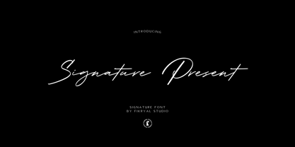 Signature Present – Signature Font is a meticulously crafted typeface that exudes elegance and sophistication. This font is designed to add a touch of personal flair and exclusivity to your projects, making it an ideal choice for various creative endeavors. With its exquisite strokes and graceful curves, Signature Present embodies the art of calligraphy, making it perfect for adding a luxurious and handwritten feel to your designs.
 - Astugia by Sesa Grafika,
$35.00 Astugia is a retro script font with a sense of funk, fun, and free-spiritedness. It is perfect for projects that seek a nostalgic or vintage feel, such as retro-themed designs, party invitations, music album covers, or any creative work aiming vibrant atmosphere. It adds a touch of whimsy and personality to any text, capturing the carefree and bold spirit of the era it represents.
 - Mesclo by DSType,
$40.00 Mesclo is our personal take on the geometric typefaces genre. With mono-linear appearance, humanistic elements and subtle hints of Art Deco, Mesclo is a timeless typeface with dramatic oblique terminals and a welcoming, friendly roundness. The outstanding dynamic rhythm and legibility of the text contrasts with the inflexible geometry of the unusual complementary caps-only typefaces, specially developed to fulfil and enrich this type family.
 - Catchfire by Alan Smithee Studio,
$10.00 Warm and human, yet reliable and precise. Catchfire blends humanist proportions and geometric features. The result is a sans serif typeface with strong personality traits, but that can fulfil everyday needs. It is very legible due to its open counters. It boasts a large character-set, OpenType features, circled numbers, wide range of weights, cursive italics : everything needed to become your new companion for years to come!
 - Celtic Monograms by Kaer,
$24.00 Here is my next Celtic Monograms font family. I used a lot of authentic knots and curves to imitate Insular art style. The term derives from insula, the Latin term for “island” in this period Britain and Ireland shared a largely common style different from that of the rest of Europe. I've drawn sketches set, manually vectorized it and assemble the font family. In an attempt to replicate the intricate patterns found in Celtic art, I endeavored to create a design that embodied the essence of true Celtic knot work. The interweaving lines, which were prominent motifs in Celtic art prior to the arrival of Christian influence around 450, served as the foundation for my creation. Over time, these designs seamlessly integrated into early Christian manuscripts and artwork, incorporating depictions of various elements from everyday life, including animals, plants, and even human figures. In the beginning, the patterns were intricate interwoven cords, called plaits. This particular style is often linked to the Celtic regions, but it was also widely embraced in England and spread throughout Europe through the efforts of Irish and Northumbrian monks. The utilization of the Celtic knot as a tattoo design gained popularity during the 1970s and 1980s in the United States. Consequently, it has proven to be a highly advantageous font choice for various applications such as posters, banners, and sportswear. You can also create a vintage color shift effect. Please note, you should use graphic applications such as Adobe Illustrator or Photoshop, but not Microsoft Word. All you need is put Two or Three lines style initial on the top of Back style. I’m happy to present you the Rough, Two lines, Three lines, and Back styles for your design. You’ll get uppercase and numbers set. Thank you!
 - MFC Bindi Monogram by Monogram Fonts Co.,
$19.95 The inspiration source for Bindi Monogram is a 1915 publication by Cartier-Bresson of Paris containing classic and modern monogram patterns for embroidery. This Art Deco style monogram has been redrawn, balanced, and brought forward into the digital age for your type-setting use and enjoyment. Like so many monograms from this period, it is only a two letter monogram format, but this particular monogram comes with an accent color block character to add pop! Download and view the MFC Bindi Monogram Guidebook if you would like to learn a little more.
 - Classike by Emtype Foundry,
$69.00 Classike is a high contrast squarish display typeface. Inspired by the Art Déco period from a modern perspective. Refined and elegant yet with a mechanical vibe, it is ideal for pairing with any functional font, it works especially well with Geogrotesque, from which it inherited its proportions and soul. Classike adds an exclusive touch and helps enrich your graphic voice. A Variable Font version is included with the family or as a separate style. Read some thoughts about the design process at the Emtype's blog. For more details see the PDF.
 - FHA Modernized Ideal Classic by Fontry West,
$25.00 Frank H. Atkinson's book Atkinson Sign Painting was published in 1909. For decades, this book served as the manual for sign painters - a handbook for hand lettering. Atkinson’s book described techniques, layouts and several sample alphabets. Modernized Ideal Classic was inspired by one of these demonstration alphabets. Although Classic has its beginnings in art deco, it is very comfortable in any period or style of design. It is most appropriate in headline and display text, poster copy and signs. We've included some nice stylistic alternates and an interesting array of ligatures.
 - Delaguerra by Scriptorium,
$18.00Delaguerra is based on a lettering style originating in the California Arts & Crafts period commonly associated with 'Mission Style'. It is still in common usage in signage at historical sites in California. This version is a sort of idealized hybrid of several different variations on the style from samples we were sent by a customer who wanted to use the font in a set of invitations. It features a basic character set on the lower case and then relief initial versions of the same characters for the upper case. - Binario by Tarallo Design,
$14.99 Binario is a simple and friendly font with three weights and matching obliques. The geometric and modular characteristics of this typeface subtly reference the Art Deco and early modernist periods. It is an ideal choice for achieving a clean, distinctive, and contemporary aesthetic, making it suitable for branding, posters, and screen-based designs. The light weight of Binario is good for body text. The regular weight exudes confidence, making it suitable for both body and heading text. For impactful headlines, the bold weight is superb. The clear weight distinction of this family make it easy to create organized text. Binario was designed in Siena, Italy taking some inspiration from train stations and shop signage. The name Binario means train platform in Italian. Other aspects that informed the design of this font are modularity and efficiency. The interior rounded forms of the letters (counterforms) are based on shape of the Roman arch. Binario has a sibling, Binario Soft. This version has gently rounded stroke ends, which make a softer impression on the page.
 - Malibu Punch by Rachel White Art,
$12.00 Malibu Punch. I am loving this sassy script font! There are two versions: rough, with tons of texture, and smooth! I made it with an itty bitty brush and pretty watercolors. It's got loads of texture - check out those edges! Wobbly, rough watercolor edges! The capital letters work together, so it's like two fonts in one! The lowercase script is so sassy and full of attitude. Great for branding, logos, and quote art.
 - XAirebesk by Ingrimayne Type,
$14.95 I am not sure exactly how to classify these geometrical ornaments. They resemble the arabesque ornamentation of medieval Islamic art, but also have similarities to Celtic knots and to some Chinese and Korean ornamentation. The bolder of the two only works well at very large point sizes, while the thinner is designed for use at smaller point sizes. There are usually similar ornaments on the same characters of the two, but not always.
 - Neuf by Velvele,
$9.99 Neuf family is an experimental search for new Art Deco letterforms, which are still easy to read and generate some unexpected attention.The distinguishes Neuf favoured by Art Deco and its predecessor Art Nouveau with a modern design touch. The style of Neuf is characterized by geometric shapes and craft motifs with Machine Age imagery and materials.
 - Blue Thunderbird by Cyberian Khatru,
$15.00 This font is meant evoke Native American art of the South-West US. The examples of this art that I've seen are very geometric, using rectangles and triangles to create all the images. This font isn't meant to be an authentic example of native American art, but is inspired by such. http://homepage.mac.com/baronvoncruzer/cyberiankhatru/bluethunderbird.htm
 - LTC Winchell by Lanston Type Co.,
$24.95 Winchell is the only identified typeface designed in Buffalo, NY prior to the formation of P22 type foundry. It was created by Edward Winchell of the Matthews-Northrup Printing Works and released by the Inland Type Foundry in 1903. The Winchell typeface was also made in Wood by the Hamilton Manufacturing company in the mid 20th Century. The Winchell typeface is a Clarendon styled slab serif that clearly has the look of a pre-modernist design. E.E. Winchell’s Arts & Crafts tendencies show through in this design
 - Cross Stitch Noble by Gerald Gallo,
$20.00 Cross Stitch Noble is based on upper case characters 43 stitches tall and contains the characters A-Z and period.
 - Merilee by SummitType,
$25.00 Fonts with handwritten characteristics are always an attractive option when creating projects that call for a personal touch. Merilee helps deliver a natural pattern to computer generated text, helping readers feel a more personal attachment to the words in front of them. Merilee includes a full character set (UPPER and lower case), all punctuation, all special characters, Euro symbol, and all Latin Extended-A characters, making this font a perfect match for a variety of creative projects including holiday and kids projects, signs, logo designs, banners and advertisements.
 - Zig Zag ML - Personal use only

- Alardo by MysticalType,
$12.00 Alardo is intended for branding that is synonymous with sports. The initial character was built in bold with a bold personality, but thin strokes and flowing italics provide a flexible and unique family series. Glyphs are made in low contrast strokes, short ascenders and descenders, and low caps.
 - Cargi by Studio Principle Type,
$12.00 A condensed neo-grotesque typeface with a quirky personality. Cargi contains 9 weights, obliques and a variable version. Low contrast and clean forms create legibility at small sizes, but display uses are where the real character of Cargi comes out to play. 319 glyphs to support 100+ languages.
 - Hondo by Fontasmic,
$16.99 The Hondo fonts are a collection of ultrabold slab serif typefaces with a dynamic look. Accented with decorative and functional inktraps and complete with Slant and Backslant styles, this heavyweight has a high performance racey feel to it. Ideal for titling, poster work, logos, and small bits of copy.
 - Tonus by Hurufatfont,
$29.00 Tonus Super Family; It is a family of five character styles built on the same skeleton. The entire Tonus Family is built on the skeleton of the "sans" family, it is the only family where five different styles are presented together. All families have an equal number of characters. It has rich opentype features. It inspires designers for different and creative applications such as brand building, periodicals, packaging, and social cultural event designs.
 - Wesna by Type Salon,
$41.90 Typeface Wesna was created as a reflection of the current state of design whose starting point is rooted in the letterings from the Slovenian posters from the interwar period. Bold strokes, condensed letterforms, sharp stroke joints and unique features are combined in the typeface. Wesna preserves the Slovenian typography heritage and establishes the connection between the past and the present through new digital formation. Available in 3 weights, italics in Latin & Cyrillic.
 - Mont Rose by Eurotypo,
$24.00 Rose fonts are based on examples published in the book "Script Lettering" written by M. Meijer in 1957. These kind of handmade lettering were served as a point of departure or inspiration for many other designers along the time. These writings had flowing lines, elegant curves and flourishes, which gave him a lot of rhythm and unique personality. Mont Rose is thin, feminine, friendly and sexy, each font contain 637 glyphs with many stylistic variations, swashes and ligatures in all its letters, and a set of interesting catchwords that you can mix and match to achieve a more interesting effect in your design project. They support also, Central, Eastern and Western European languages. Mont Rose are very versatile fonts, ideal for high-end logos, magazines and book covers, fashion, headlines, cards, posters, websites, packaging. Using these fonts you will achieve a very elegant and warm work.
 - Pluto Sans by HVD Fonts,
$40.00 Pluto Sans - the straight companion of the Pluto Family - was designed by Hannes von Döhren in 2012. This clear Sans Serif family is based on the Pluto architecture and it still has a hint of the friendly feeling the quirky Pluto conveys. With its geometric forms and its large x-height it is perfect for long texts in small sizes and usage in print & on screens. Both Pluto Sans and Pluto have the same range of weights and styles and can perfectly be used together. Pluto Sans is equipped for complex, professional typography. The OpenType fonts have an extended character set to support Central and Eastern European as well as Western European languages. Each font includes alternate letters, fractions, lining-, tabular numbers, scientific superior/inferior figures and a set of arrows. The fonts are manually hinted to deliver the best performance on all screens.
 - Eloquence by Monotype,
$31.99 Eloquence has a modern aesthetic with a strong classical influence – this is the “Renaissance Remixed”. While being inspired by the first printed texts of the Renaissance period, this typeface has contemporary features such as a high x-height, open bowls and counters, along with razor-sharp serifs and terminals. It has been designed specifically for creating a pleasant reading experience. With a comprehensive character set, Eloquence can comfortably handle printed documents such as novels, magazines, annual reports, along with their equivalent online/digital formats. This 14-font family also has a few tricks up its sleeve by means of some neat, complementing discretionary ligatures and alternates that will prove to be useful embellishments to your typography. Small Caps are included too, along with corresponding diacritics meeting the Latin Extended specification. You can view more details, design examples, and a specimen PDF at eloquence-font.com Key Features: • 14 font family – 7 weights in Roman and Italic • Small Caps, Alternates, Ligatures, with Proportional, Old Style, Small Cap, Fractions, Numerators, Denominators, Superior, and Inferior Figures • Full European character set (Latin Extended) • 900+ glyphs per font.
 - Last Ninja - Unknown license

- Sour Crunch by DM Studio,
$15.00 Introducing Sour Crunch! It's a 'crunchy' comical Display Font, inspired by pop art style comic fonts. It's a good choice for both personal and commercial project purpose, for creating logos, packaging, posters, headers, wall arts, cafe banners, t-shirt designs, advertisements, kids stuff, social media posts and much more! Sour Crunch feature : - All in CAPS with standard character set, including numeric and symbols. - Multilingual Supports ( Afrikaans, Albanian, Catalan, Danish, Dutch, English, Estonian, Finnish, French, German, Italian, Norwegian, Portugese, Spanish, Swedish, Zulu ) If you have any question please kindly send us a message. Hope you enjoy this font. Thanks and Stay Creative!
 - Pacaembu by Naipe Foundry,
$60.00 Pacaembu is a sans serif typeface that finds its roots in Brazilian football. This seven weight family began as a study of the stone lettering found in the Paulo Machado de Carvalho Municipal Stadium, affectionately known as the Estádio Pacaembu, a real gem of the Art-Deco style inaugurated in 1940. These art-deco letters, like football itself, were brought to Brazil by Europeans and out there in the tropics found a totally unique personality. Pacaembu is a celebration of Brazilian Football, it’s unique flavours, moves, sights and colors which have been delighting fans for generations.
 - Brootahh by Alit Design,
$16.00 Presenting the 🗯️💬The Brootahh Comic Typeface💬🗯️ by alitdesign. The Brootahh Comics typeface is inspired by the style of letters in comics that have less serious and fun characters. The lettering of the Brootahh font is a sans serif with distorted characters which gives a fun and design impression for children. The Brootahh font has 2 families, namely the Brootahh Blup font which has more bubble characters that can support comic characters to be cooler. The Brootahh font is perfect for creating designs with non-serious concepts, designs for children, book headers, and of course for text on comics. The Brootahh Comics typeface also gets a bonus character of 230 Comic-themed illustrations that make creating designs even easier. Simply by downloading The Brootahh Comics typeface creating a Comic and non formal themed design is very quick and easy. The Brootahh Comics typeface is perfect for magazine cover designs, brochures, flyers. Instagram ads, Canva Design and so on with comic, non-serious, pop art, game mobile and fun design. Besides that this font is very easy to use both in design and non-design programs because everything changes and glyphs are supported by Unicode (PUA). The Brootahh Comics typeface contains 618 and Brootahh Blup 498 + 230 bonus glyphs with many unique and interesting alternative options.
 - Kairos by Monotype,
$50.99 The Kairos™ family from Terrance Weinzierl is that rare form of typeface that successfully melds design distinction and ease of use. While based on 19th century Grecian wood type forms, it performs admirably in a variety of applications, both in print and on screen. Kairos Variables are font files which are featuring two axis and have a preset instance from Thin to Black and Condensed to Extended
 - Newsletter by Die Typonauten,
$19.00 Monospaced but no mono space. Created from 2002 to 2007 this font family is influenced by fonts like OCR-B, DIN and the work of Erik Spiekermann. Newsletter is not a real monospaced font but has the ease of recognition these fonts have - even though these fonts are often criticized for their aesthetic qualities. Newsletter has a computer-related impression but is more legible and aesthetic than real monospaced fonts are. Since 2006 Newsletter is the corporate font of the design agency "die Typonauten". It is eminently suitable for correspondence use. After a testing period and fine tuning it is now published.
 - Orbi by ParaType,
$30.00 The Orbi type system is a low contrast antiqua of elegant design with a well developed set of members. It consists of 10 roman and italic faces of different proportions and weights and 3 decorative calligraphic fonts. It also contains 3 additional fonts with various decorated initials. The roman includes small capitals. Thanks to its variety of styles the font is suitable for a wide range of applications - the basic styles are good for books and periodicals; the narrow styles work well in the columns and tables of business papers; the decorative styles are ideal for ceremonial typography where swashes, calligraphy and initials are usual. The fonts were designed by Natalia Vasilyeva. Released by ParaType in 2010.
 - Kumala Script by Rillatype,
$17.00 Introducing "Kumala Handwritten Script," a font crafted with artistic finesse and a touch of personal charm. Embracing the beauty of imperfection, this script font captures the essence of hand-drawn strokes, bringing a unique character to your projects. Whether used for invitations, quotes, or branding, "Kumala" adds a distinctively human touch. Its fluid lines and versatile nature make it a perfect choice for those seeking a blend of elegance and informality. With a range of characters and a warm, inviting vibe, "Kumala Handwritten Script" is designed to elevate your creative expressions. Unlock the potential of personalized typography with "Kumala Handwritten Script" and infuse your designs with a handwritten authenticity that resonates with every stroke.
 - Bodoni Classic Ad by Wiescher Design,
$55.00 I became interested in designing Bodoni Classic because of a lazy graphic designer at Jacques Damase publishing house. He had to change a single letter on a bookcover about J. B. BODONI. The French call him Jean Baptiste instead of Giambattista! And that unknown graphic designer just took any old “J” from some newly cut Bodoni. All the new Bodoni cuts have square serifs, whereas the originals had rounded serifs and slightly concave feet. The single letter “J” with the squared off serif was for me like a road sign to start redesigning the entire Bodoni family. That’s exactly what I started in 1993 and a dozen years later I am finished. Okay, I am still adding new Bodoni Classics, but those are my personal additions. Yours very retro, Gert Wiescher
 - Bodoni Classic Initials by Wiescher Design,
$55.00 I became interested in designing Bodoni Classic because of a lazy graphic designer at Jacques Damase publishing house. He had to change a single letter on a bookcover about J. B. BODONI. The French call him Jean Baptiste instead of Giambattista! And that unknown graphic designer just took any old “J” from some newly cut Bodoni. All the new Bodoni cuts have square serifs, whereas the originals had rounded serifs and slightly concave feet. The single letter “J” with the squared off serif was for me like a road sign to start redesigning the entire Bodoni family. That’s exactly what I started in 1993 and a dozen years later I am finished. Okay, I am still adding new Bodoni Classics, but those are my personal additions. Yours very retro, Gert Wiescher

