2,380 search results
(0.047 seconds)
- Dutch Mediaeval Book ST by Canada Type,
$39.95 Dutch Mediaeval Book ST is a special version of the popular Dutch Mediaeval Book text fonts, engineered specifically for science writing. It is equipped with SciType, a combination of additional characters and OpenType programming included in the fonts to help in typesetting science text. For more information about SciType, please consult the SciType FAQ available in the Gallery section of this page. The Dutch Mediæval design is the historically renowned one made in 1912 by S. H. de Roos. It stands out as one of the most classic Dutch text faces. This Book version comes in two weights and an italic, optimized for body copy use between 8 and 12 pt. Aside from the SciType additions, all the fonts contain OpenType features for ligatures, ordinals, automatic fractions, eight kinds of figures, and a few ornaments. For details about the functionality of Dutch Mediaeval Book ST, please consult its Access Chart PDF available in the Gallery section of this page.
 - Rennie Mackintosh Scotland St by CRMFontCo,
$20.00Derived from the world famous Rennie Mackintosh Font, the Scotland St. version gives an outline form of the genius of Charles Rennie Mackintosh. The "Scotland St." name comes from one of Mackintosh's most famous architectural works - the Scotland St. School in Glasgow, Scotland. This wonderful legacy of Mackintosh's genius can be visited daily FREE OF CHARGE, as it has been classed as a museum by Glasgow City Council. - Dutch Mediaeval Pro ST by Canada Type,
$49.95 Dutch Mediaeval Pro ST is a special version of the popular Dutch Mediaeval Pro family, engineered specifically for science writing. It is equipped with SciType, a combination of additional characters and OpenType programming included in the fonts to help in typesetting science text. For more information about SciType, please consult the SciType FAQ available in the Gallery section of this page. The Dutch Mediaeval design is the historically renown one made in 1912 by S. H. de Roos. It stands out as one of the most classic Dutch text faces. This digital version comes in two weights and their italic counterparts. Aside from the SciType additions, all the fonts contain OpenType features for small caps and caps-to-small-caps, ligatures, ordinals, automatic fractions, seven kinds of figures, and a few ornaments. For details about the functionality of Dutch Mediaeval Pro ST, please consult its Access Chart PDF available in the Gallery section of this page.
 - P22 St G Schrift by IHOF,
$39.95 P22 ST.G Shrift is a font series based on the type designs of Stefan George with an italic version designed by Colin Kahn. Stefan George (1868-1933) was a German poet who led the revolt against realism in German literature. All of his works were privately published and the typefaces that were used reflected his neo-classic and anti-industrial (progessive) aesthetics; oftentimes consisting of his own hand lettering designs. The original font was cast in 1907 by a small foundry in Germany and was used primarily for the works of George as well as other books including a monumental edition of Dante's Divine Comedy. The ST.G Shrift Fonts contained in this set are derived from 3 known variations of the original roman typeface, St.G., found in various books published in Berlin in the early 20th century. ST.G Shrift One contains the most idiosyncratic characters, while ST.G Shrift Two uses more familiar characters as well as a redesign of characters including the t and the k to be more in keeping with modern san-serif designs. The OpenType version of the roman contains both one and two and expands on them by including central European characters, small caps, and small caps titling figures. The Small Caps titling figures are derived from the first version of the typeface. Below is a features list (accessible through the type palette in Adobe programs) and their functions: ST.G Shrift Opentype Features: Small Caps: Changes Lowercase to Small Caps Titling Figures: Changes Uppercase to Titling Caps, and Small Caps to Small Caps Titling Figures Contextual Alternates: Changes Character Set to match ST.G One and changes Small Caps to Titling Small Caps Ornaments: Changes < > and ? (greater, less and bullet) to ornaments ST.G Shrift Italic is an art nouveau version of the roman. The OpenType version includes central European characters, small caps, titling caps, titling small caps and ornaments.
 - FreeSet by ParaType,
$30.00 The type family in four basic styles was designed in ParaType (ParaGraph) in 1992 by Tagir Safayev. Based on Frutiger, of Mergenthaler Linotype, 1976 by Adrian Frutiger. Frutiger font was originally designed for use on signs at the new Charles de Gaulle Airport at Roissy. The straightforward sans serif shapes are suited well for both text and display setting. Six additional styles were added in 1998-2000. Multilingual versions of 6 styles (Light, Demi and Extrabold) include Armenian alphabet designed by Manvel Shmavonyan in 1997. Two condensed Cyrillic styles (Demi Condensed and Bold Condensed) designed by Manvel Shmavonyan in 2005.
 - Stylish Classy by Azetype,
$11.00 Have you ever used a handwritten font on your design project? Have you ever felt bored or dissatisfied with its glyphs style that looks stiff and doesn't flow even doesn't really characterize the peculiarities of a handwritten font? Or fonts that don't have alternative glyphs so they look monotonous in a word or even sentence. And in the end, it makes your projects so far from your expectations, even your clients. It's so frustrating, isn't it? Just wake up from your dissatisfaction and this is your time to make a good choice for your design project. So, we have a solution to fix it. We introduce 'Stylish Classy' just for you. This is a font that really characterizes from the handwritten style. This font is crafted carefully in every its single scratch, created to look as close to a natural handwritten script so that it can create the perfect combination on each glyph. When we make this font, we really want to create a touch that is so free-flowing that it gives a natural impression on its use later. For example, if you want letter 's' that has a flow sketch with letter 't', you can find it in 'st' ligature glyph. So if you really want a so natural and flowing touch in your project, Stylish Classy Font gives you 210 Natural Ligatures ( combining of two or more letters in a glyph ), Two Alternates, and Slant Version. Stylish Classy is a fashionable handwritten script font and obviously it's so Stylish and Classy :) Stylish Classy Font offers beautiful typographic harmony for your design projects diversity e.g. logos & branding, wedding designs, social media posts, advertisements, product designs, quotes, watermark, photography, poster design, magazine, stationery, or simply as a stylish text overlay to any background image. - Included Languages support: Afrikaans, Albanian, Catalan, Danish, Dutch, English, Estonian, Finnish, German, Icelandic, Indonesian, Italian, Norwegian, Malay, Portuguese, Spanish, Swedish, Zulu. - All Natural Ligatures (210 Glyphs): Bh Cl Cr Cs Ct Cy Hy Jh Ji Kh Kl Lo My Mrs Mr Mt Si Sl Sp Sp St St1 St2 St3 Ul1 Un1 Ut1 Ul Un Ut Wh Yo aa ab ab1 ab2 ak1 all ant app arr art ask ast at at2 at3 at4 att af ah aj ak ak1 al al1 an ap ap ar av bb1 bb cc ch ck co ct dd ever ee1 ee2 ent er1 err ett ee ek el en er es et ff1 ff2 ful ff fi gg1 gh gh2 ght gn1 gf gg gh gi gl gn hh ight ill1 ill2 it's itt1 if1 ill ion ism it1 it2 ith itt ity if ii il it jj1 jj kk ll1 ll2 la lh ll most nt oll on2 on1 op1 ops or1 orr oth ous of oh ok ol om on oo op or ot ow ox oz ph pp pt rk1 rta rk rr rt sl1 sl2 sl3 ss1 ss2 st1 st2 st3 st4 st5 st sh si sl sp ss st the tt1 tt2 th to tt tv ty ull ure ut1 ut2 ut3 us ut ve vs wh wt yl1 yl2 yl3 you yr yr2 yl yn yr mm1 mm2 mm3 mm ms nn1 nn -Swash on pictures are not included
 - Japanese Brush - Unknown license

- Ongunkan Bactrian Script by Runic World Tamgacı,
$150.00 Bactrian (Bactrian: Αριαο, ariao, [arjaː], meaning "Iranian") is an extinct Eastern Iranian language formerly spoken in the Central Asian region of Bactria (present day Afghanistan) and used as the official language of the Kushan and the Hephthalite empires.Bactrian, which was written predominantly in an alphabet based on the Greek script, was known natively as αριαο [arjaː] ("Arya"; an endonym common amongst Indo-Iranian peoples). It has also been known by names such as Greco-Bactrian, Kushan or Kushano-Bactrian.
 - KR St Patricks Day Dings - Unknown license

- Sans Serif Shaded - Unknown license

- Half Cut - Unknown license

- Shoguns Clan - Unknown license

- Pluot by Bunny Dojo,
$23.00 Designed for an age of increased nuance and inclusivity, Pluot defies conventional classification. With an upper half inspired by sans-serif tendencies and a serif-influenced lower half, Pluot is a geometric semi-serif (or semi-sans). It is, at once, fresh and exciting, while also completely at home in any setting. Pluot is your elegant workhorse for a new era.
 - spanky 20 second version - Unknown license

- Mellifluos - Unknown license

- Nagarawa by Beewest Studio,
$50.00 Nagarawa is an Asian style font, very suitable for various logotypes for Asian nuanced products, such as Asian food, martial arts clubs, music, novel and comic titles, apharel clothing and others.
 - Italienne by Linotype,
$29.99Inspired by the large American wood type of the Wild West, Richard Yeend created Italienne Std in 2002. Italienne Std is both very condensed and very decorative. It sports heavy, band like serifs, reminiscent of other italienne-style fonts, like Westside. Italienne-style fonts rose in popularity during the early 19th Century, when designers were first beginning to experiment with extreme contrast within letterforms, and across lines of text. Interestingly enough, letterforms with similar designs were just as common during the 1970s as during the 1870s, so you may use Italienne Std for applications ranging from country music concerts to disco parties. Italienne Std is part of the Take Type 5 collection from Liinotype GmbH." - Choujun - Unknown license

- DIN Schablonierschrift - Unknown license

- Mordred - Unknown license

- Mordred - Unknown license

- Albany by Monotype,
$29.99Albany, from Monotype Imaging, is a typeface family whose fonts have the same metrics as Arial. However, in contrast to Arial or Helvetica, Albany's letterforms are more open, with more generous apertures and counters. Also, punctuation is not square, as in Arial, but round - Rebellion Knight Personal Use O - Personal use only

- Ned by Linotype,
$29.99Ned Std. is part of a series of typographic experiments from the young Swiss designer Michael Parson. Using a wide, horizontal hexagonal grid, Parson created the system of letters that make up this font. Text set in Ned Regular takes on a modular, honeycomb-like appearance. For an interesting effect, try overlapping individual letters, or use a few letters together as elements in a logo. A great companion face to Ned Std. is Linotype's Hexatype Bold. Both Ned Std. and Hexatype Bold have been included in the Take Type 5 collection, along with eight further constructions from Parson." - Mandarin by Linotype,
$29.99Mandarin font first appeared with the Type Founders of Chicago and is an interpretation of artistically drawn Asian brush calligraphy. The stylized Asian atmosphere is not created only by the forms of the figures but also by the very name of the typeface. A mandarin was a high official of the ancient Chinese empire. Alphabets like Mandarin font are often used for the menus, signs and advertisements of Asian restaurants as well as for businesses with Asian products. - PaddingtonSC - Unknown license

- NewerSymbolFont4 - Unknown license

- NewerSymbolFont5 - Unknown license

- NewSymbolFont5 - Unknown license

- BetterthanBefore NewSymbolFont5 - Unknown license

- Senator by Emigre,
$39.00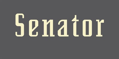 Greek version by Dimitris Arvanitis.
 - Enfonix by limitype,
$12.00 Enfonix is a modern sans display font suitable for the needs of logos, magazines, posters, etc. with dynamic shapes, Enfonix is equipped with 3 alternative width sizes and 2 typeface shapes (Std and Pro). Enfonix is also available in a monospaced style Enfonix Std: Standard form 3 alternative width variations ( Strecth Font ) uppercase and lowercase symbols & numbers multilingual Enfonix Pro: More unique and proportional typeface 3 alternative width variations ( Strecth Font ) uppercase and lowercase symbols & numbers multilingual Enfonix Mono Std: Standard form only one width variation Monospaced uppercase and lowercase symbols & numbers multilingual Enfonix Mono Pro: More unique and proportional typeface only one width variation Monospaced uppercase and lowercase symbols & numbers multilingual
 - CartoGothic Std, created by FontSite, is a prominent typeface that embodies a blend of modernity and functionality. At its core, CartoGothic Std is a sans-serif font, known for its clean lines and un...
- Feelin Sweet - Unknown license

- Ginko by Monotype,
$29.99Ginko is a capitals only display font with an obvious Asian influence. The characters are formed with short tapered strokes, reminiscent of those produced by a broad pen. An ideal face for signage, menus, advertising, wherever an Asian feel is required. - Toolbox by Adobe,
$29.00Brian Strysko, a graphic design student at California Polytechnic State University, came up with an idea for a typeface crafted from everyday gadgets and tools. After much poking around in do-it-yourself" books and friends' garages, Brian created Toolbox." - Ming - Unknown license

- Ongunkan Sidetic by Runic World Tamgacı,
$49.99 The Sidetic language is a member of the extinct Anatolian branch of the Indo-European language family known from legends of coins dating to the period of approximately the 5th to 3rd centuries BCE found in Side at the Pamphylian coast, and two Greek–Sidetic bilingual inscriptions from the 3rd and 2nd centuries BCE respectively. The Greek historian Arrian in his Anabasis Alexandri (mid-2nd century CE) mentions the existence of a peculiar indigenous language in the city of Side. Sidetic was probably closely related to Lydian, Carian and Lycian. The Sidetic script is an alphabet of the Anatolian group. It has about 25 letters, only a few of which are clearly derived from Greek. Consensus is growing that the script has essentially been deciphered.
 - Avenir Next Thai by Linotype,
$79.00 Avenir Next Pro is a new take on a classic face—it’s the result of a project whose goal was to take a beautifully designed sans and update it so that its technical standards surpass the status quo, leaving us with a truly superior sans family. This family is not only an update though; in fact it is the expansion of the original concept that takes the Avenir Next design to the next level. In addition to the standard styles ranging from ultralight to heavy, this 32-font collection offers condensed faces that rival any other sans on the market in on and off—screen readability at any size alongside heavy weights that would make excellent display faces in their own right and have the ability to pair well with so many contemporary serif body types. Overall, the family’s design is clean, straightforward and works brilliantly for blocks of copy and headlines alike. Akira Kobayashi worked alongside Avenir’s esteemed creator Adrian Frutiger to bring Avenir Next Pro to life. It was Akira’s ability to bring his own finesse and ideas for expansion into the project while remaining true to Frutiger’s original intent, that makes this not just a modern typeface, but one ahead of its time. Avenir Next Variables are font files which are featuring two axis, weight and width. They have a preset instance from UltraLight to Heavy and Condensed to Roman width. The preset instances are: Condensed UltraLight, Condensed UltraLight Italic, Condensed Thin, Condensed Thin Italic, Condensed Light, Condensed Light Italic, Condensed, Condensed Italic, Condensed Demi, Condensed Demi Italic, Condensed Medium, Condensed Medium Italic, Condensed Bold, Condensed Bold Italic, Condensed Heavy, Condensed Heavy Italic, UltraLight, UltraLight Italic, Thin, Thin Italic, Light, Light Italic, Regular, Italic, Demi, Demi Italic, Medium, Medium Italic, Bold, Bold Italic, Heavy, Heavy Italic.
 - Avenir Next Rounded by Linotype,
$42.99Avenir Next Pro is a new take on a classic face—it’s the result of a project whose goal was to take a beautifully designed sans and update it so that its technical standards surpass the status quo, leaving us with a truly superior sans family. This family is not only an update though; in fact it is the expansion of the original concept that takes the Avenir Next design to the next level. In addition to the standard styles ranging from ultralight to heavy, this 32-font collection offers condensed faces that rival any other sans on the market in on and off—screen readability at any size alongside heavy weights that would make excellent display faces in their own right and have the ability to pair well with so many contemporary serif body types. Overall, the family’s design is clean, straightforward and works brilliantly for blocks of copy and headlines alike. Akira Kobayashi worked alongside Avenir’s esteemed creator Adrian Frutiger to bring Avenir Next Pro to life. It was Akira’s ability to bring his own finesse and ideas for expansion into the project while remaining true to Frutiger’s original intent, that makes this not just a modern typeface, but one ahead of its time. Avenir Next Variables are font files which are featuring two axis, weight and width. They have a preset instance from UltraLight to Heavy and Condensed to Roman width. The preset instances are: Condensed UltraLight, Condensed UltraLight Italic, Condensed Thin, Condensed Thin Italic, Condensed Light, Condensed Light Italic, Condensed, Condensed Italic, Condensed Demi, Condensed Demi Italic, Condensed Medium, Condensed Medium Italic, Condensed Bold, Condensed Bold Italic, Condensed Heavy, Condensed Heavy Italic, UltraLight, UltraLight Italic, Thin, Thin Italic, Light, Light Italic, Regular, Italic, Demi, Demi Italic, Medium, Medium Italic, Bold, Bold Italic, Heavy, Heavy Italic.


