5,161 search results
(0.144 seconds)
- Headhunter Two by Barlov,
$25.00 The original Headhunter shareware font was created in ©1992 by the famous D. Rakowski. It consisted of 63 unique skeletal Glyphs, including Capital A-Z, and a few bone symbols, but lacked lowercase and numerals. He has since abandoned his fonts to pursue other things. (You can download it from FontSquirrel for free.) I've always enjoyed this limited Halloween font, but its incompleteness had to be rectified; thus I took it upon myself to delve slightly into the world of typography, resulting in the birth of HeadhunterTwo. I've slightly reworked his original contribution and "fleshed out" more of the font than necessary. As of this writing, it consists of 777+ Glyphs and passes Underware's compatibility test for Latin Plus (Supporting 219 Latin based languages, which are spoken in 212 countries.)
 - Branding by Latinotype,
$39.00 Branding, a modern typeface for modern needs! Branding, especially designed for meeting contemporary aesthetic and functional needs, is the interpretation of a modern typeface from the designer’s own perspective. This typeface encapsulates a wide range of nuances and combines, seemingly, opposite elements such as technology and friendly rounded shapes. In addition, alternative characters make Branding an ideal tool for both graphics designers and art directors. Branding is a sans-serif spurless typeface with a medium-large x-height, slightly wider horizontal proportions, straight curves and convex terminals. This font is well-suited for logotypes, isotypes, short text, etc. Branding comes in 7 weights—ranging from Thin to Black—with matching italics and includes a set of 544 characters that supports 128 different languages. European accents, old style numbers and multiple alternates are also included.
 - Forjada by Latinotype,
$26.00 Forjada—designed by Raúl Israel—is a monolinear, rounded and condensed typeface, belonging to the slab serif classification, inspired by wrought iron window and door grills on facades of historic buildings in America and Europe. Forjada is a rigid yet softly curved font with exquisite ornaments and optimized for great legibility. Forjada Family comes in 3 weights—Light, Regular and Bold—with matching italics and includes alternate swash caps and ligatures plus Ornaments and Catchwords sets that provide a wide range of choices for creating the most beautiful designs. The font character set supports 212 languages. Forjada is well-suited for branding, packaging, food & drinks menus, wedding invitations, party invitations, guidebooks to old cities or any glamorous design you want to add a fresh and modern touch to!
 - Cunaeus by George Tulloch,
$21.00 Cunaeus is intended primarily for use in running text. It brings together the types of two renowned sixteenth-century punchcutters: the roman is an interpretation of a pica font cut by Ameet Tavernier (c.1522–1570), and the italic that of a pica font of Robert Granjon (1513–1589/90). Granjon’s italics have inspired a number of revivals in the past, but usually of his more slanted styles; the present digitization features the lesser slant of his so-called ‘droit’ style typical of the mid 1560s. Cunaeus provides wide support for west, central, and east European languages that use the roman alphabet. Among its OpenType features are ligatures, small caps, several sets of numerals, contextual alternates, intelligent implementation of long ‘s’, and fractions. For more detail, please see the pdf available in the Gallery.
 - Soka by Alit Design,
$12.00 Introducing Soka Typeface Soka font is inspired by a sans serif font that is retro style but still modern and unique. With a preview with a Japanese concept, the Soka font looks unique among other retro fonts. Sans Serif typefaces such as “Soka typeface” are very easy to apply to any design, especially those with an elegant and smooth concept, besides that this font is very easy to use both in design and non-design programs because everything changes and glyphs are supported by Unicode (PUA). The Soka typeface contains 522 glyphs with many unique and interesting alternative options. Plus, there's a cool sans serif font family for header and description text from thin to heavy and thin condensed to heavy condensed. In the poster preview all the letters are in the Soka typeface.
 - Museum Tertia Cursive by T4 Foundry,
$21.00Museum Tertia Cursive is inspired by a beautiful set of 126 matrices in the Swedish Norstedts type collection. These types were probably manufactured in Germany before 1750. The matrices are part of a set imported to Sweden by J.P. Lindh from Breitkopf & Härtel 1818. Now this exquisite design is available again, thanks to type designer Torbjörn Olsson. Please note modern additions like the ?-mark, @-sign and €-sign. Museum Tertia Cursive is an OpenType creation, for both PC and Mac. Swedish type foundry T4 premiere new fonts every month. Museum Tertia Cursive is our eighth introduction. Museum Tertia Cursive is part of the growing Museum type family. Museum also includes three different border fonts, an ornament font with some of Granjon's arabesques and a flowery Fournier font with Rococo capitals. - Jiho Soft by cretype,
$20.00 Jiho Soft Family is a modern & soft sans-serif typeface that is clean, simple and highly readable. It is the rounded version of Jiho Family. Letters in this type family are designed with minimal & modern shapes without any decorative distractions. The spaces between individual letter forms are precisely adjusted to create the perfect typesetting. Jiho Soft is versatile type family of 18 fonts. Jiho Soft family consists of 9 weights (Thin, ExtraLight, Light, Regular, Medium, Bold, ExtraBold, Heavy & Black) with their corresponding italics. The Open Type fonts contain complete Latin 1252, Cyrillic, Central European 1250, Turkish 1254 character sets. Each font includes proportional figures, tabular figures, numerators, denominators, superscript, scientific inferiors, subscript, fractions, old style-figures and case features. We highly recommend it for use in signage, books, web pages, screen displays, and so on.
 - Madison Ave. by Funk King,
$10.00 The Madison Ave. family started from Madison Ave. at Fontstruct.com. As my most downloaded font, this was an easy, although not necessarily logical choice to make – regarding taking an existing free font and attempting to offer it for purchase. The font is very basic and simple in its layout, but has achieved popularity over at Dafont with almost 80,000 downloads with its cool, understated nature and inherent sophistication. The original Madison Ave. is now 95 Madison Ave. A couple of glyphs have changed from the original, but mostly the set is the same. The big news here is the availability of multiple variations on the original. Ninety-five refers to the filter settings used to achieve the faint cross lines in the font. The sequence 95-100 provides a gradual fade to solid effect when used together. The other versions use variations on the filter settings that allow each its own distinctive flavor, while at the same time maintaining inherent characteristics of the original. Ninety-five is now joined by 55, 75, 97, 99, 100, 102, 105, 155, 175, 201, 202, and 275. 100 is the solid version which doesn’t contain the trademark lines found in 95. In 95-99, the line width varies to achieve subtle effects. 50 and 85 are distorted by reducing the filter settings in a somewhat minimizing fashion. In 102-205, these are distorted by increasing the filter settings above the normal which is what 100 represents. While some of the effects are extreme and challenge the legibility of text, these can be fun or edgy. They offer a cohesion that can be used to advantage for different projects that require the use of a modern font family.
 - Sanchez by Latinotype,
$- CHECK OUT Sánchez Niu (new, nova, neue, next) Sánchez, designed by Daniel Hernández, is a serif typeface belonging to the classification slab serif, or Egyptian, that bears a strong resemblance to the iconic Rockwell, but with rounded edges— offering contrast and balance to the square structure. Sánchez & Sánchez Condensed comprises 12 variants, ranging from extra light to black, each of the same x-height. Regular and Italic variants are available for free. Download specimen pdf
 - ITC Arid by ITC,
$29.99ITC Arid was designed by Rob Leuschke in 1997 as a lively calligraphy typeface which looks as though it was put to paper with a piece of charcoal. Generous capitals mix harmoniously with the more reserved lower case characters and the forward slant of both create a dynamic impression. Arid should be used in point sizes of 12 and larger and is well-suited for headlines and short to middle-length texts. - Linotype Boundaround by Linotype,
$29.99Linotype Boundaround is part of the Take Type Library, selected from the contestants of Linotype’s International Digital Type Design Contests from 1994 and 1997. German artist Christina Sachse gave her font a mystical feel. The vertical strokes meet the base line at a point and the strokes vary in their width. The lively Linotype Boundaround is suitable for shorter texts in point sizes 12 or larger and for headlines in larger point sizes. - Regnante by BustanType,
$19.00 Regnante was created with all of my heart. It has a luxury style, is stylish and lovely, and has a strong personality, so it will catch your attention. This font is ideal for a wide range of tasks including branding, logos, packaging, and more. Regnante includes 12 fonts, including 4 weight variations and Italic style. Regular and Alternate are come separately. You can make your selection based on your personal preferences and requirements.
 - Mestiza by Antonio Lechuga,
$30.00 Mestiza is a type family with a living past, which combines its ancient roots with the handmade and the contemporary in a spirited mix that evokes elegance and strength. Thanks to its sharp terminals and high contrast, Mestiza acquires a unique personality. It is ideal for headlines and branding projects. Mestiza has 12 variants, six Roman plus Italics including Small Caps, Old-Style numbers, Superiors, Inferiors, Contextual and Discretionary ligatures, Symbols, and some Alternates.
 - Estricta by Graviton,
$24.00 Estricta font family has been designed for Graviton Font Foundry by Pablo Balcells in 2017. It is a sans serif typeface with a geometrical and mechanic appearence, its sharp, angular edges provide a strong and solid design. It has been conceived to be most suitable for short and middle length text blocks, as well as on all sized headlines. Estricta consists of 12 styles. Each containing small caps and glyph coverage for several languages.
 - Woodstock by Linotype,
$29.99Woodstock is a round, heavy, lovable serif display typeface. Just as music brought many together in the spirit of love during the 1960s and the Woodstock music festival, this face brings a smile to the eye of the beholder. Many traces of the hand can be seen in the curves and the joins of Woodstock's forms. Try using Woodstock in headlines, logos, or greeting cards, in point sizes from 12 on upward. - Wedding Text by Monotype,
$40.99Wedding Text was designed by Morris Fuller Benton in 1901 for American Type Founders (ATF). The face was so popular that its forms soon began appearing with other font foundries under different names, Elite Kanzlei with D. Stempel AG, Comtesse with C.F. Rühl, Linotext with Linotype, etc. Its ornamental forms are not considered very legible by today's standards; therefore it should be used for headlines and short texts in point sizes 12 or larger. - Binaria by Graviton,
$24.00 Binaria font family has been designed for Graviton Font Foundry by Pablo Balcells in 2018. It is a sans serif typeface with a mechanic appearence. Its squared, angular shapes provide a futuristic and robust design. It has been conceived to be most suitable for logos, headlines and display design pieces as well as short length text blocks. Binaria consists of 12 styles, each containing small caps and glyph coverage for several languages.
 - Grand by North Type,
$- Inspired by old school sign painting techniques, Grand is a display condensed sans serif that isn't shy to put its foot down. Its verticality and bulky curves combined with its sharp angular connections between the bowls and stems give Grand a distinctive look and feel. It comes in 12 styles (6 weights and accompanying italics), and supports over 200 languages. Grand Regular and Grand Italic are both available for free (personal and commercial use).
 - Slabic by Tour De Force,
$30.00 Slabic is modern slab serif font family available in 12 styles. It’s main characteristics are gently rounded edges, unique serifs and ink traps. Looks and feels compact, harmonized and visually balanced, so readers flow don’t get interrupted during reading. Slabic recommends itself for editorial use or main body webfont, for logos, package design and posters. Slabic contains Small Caps, Fractions, Tabular and Old Style Numerals as Open Type features. Supports extended Latin character map.
 - EXPATRIATE by UICreative,
$23.00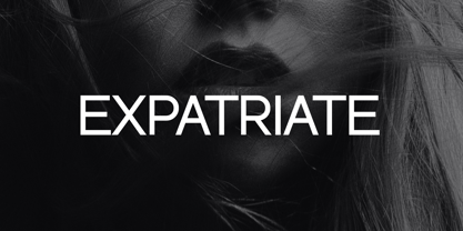 Introducing our new product the name Expatriate Sans Serif Font Family comes with 12 different weights. Modern Sans Serif font that beautiful classy, elegant, and modern. This font is perfectly suited for a wide variety of projects, such as signature, stationery, logo, wedding, typography quotes, magazine or book covers, website headers, clothing, branding, packaging design, and more. Also for fashion-related branding or editorial design and displays both masculine and feminine qualities.
 - ITC Bailey Quad by ITC,
$29.99 ITC Bailey Quad Bold was designed by Kevin Bailey in 1994. It is a semiserif typeface in the style of slab serif faces. The unusual placement of some serifs and unconventional forms of some characters give the font a modern feel. The overall look of Baily Quad Bold is robust and strong and the font is best used in headlines and short to middle length texts in point sizes of 12 and larger.
 - Praho Pro Stencil by Picador,
$29.00 Praho Pro is a part of Warsaw Types – a project based on Warsaw’s local typographic heritage. The project, presented at the Museum of Praga, is a collaboration of 12 young Polish typographers. Praho Pro Stencil is a multilingual family inspired by the unique, historical character of Praga district of Poland's capital - Warsaw. High contrast, thin serifs, sharp terminals and large x-height are key features for distinctive headlines. Now available as a stencil version!
 - Castle by Linotype,
$29.99This family, which includes faces in light, book, bold, and ultra weights, more stroke contrast than is typical of sans serifs, making it very legible in text. Because of its large x-height, it is recommended for used in point sizes ranging from 12 point upward. Of course, it functions well in display sizes, too. The contrast between the four weights makes this family optimal for use in hierarchical advertising systems, and corporate identity uses. - ITC Static by ITC,
$29.99Static looks almost like it was stamped on paper: the black color is not evenly distributed and the background comes through the letters and consciously irregular forms reinforce the effect. The characters do not all have the same height, nor do they stand straight and regularly on the base line. Static is a robust font with bold, rounded serifs and is best used for headlines and short texts in point sizes of 12 and larger. - Afterglow by Vintage Voyage Design Supply,
$18.00 Elegant and so stylish serif typeface full of contrast lines, a lot of Stylistic Alternates with thin swashes. Some letters has up to 12 of them. Use only capitals for headers or quotes, it looks strong and refined, or use Caps with lowercase for block texts, or subheaders. Design your art- or beauty blogs, t-shirts or websites, posters, magazines or cards, and logo's of course. You will return to this font again and again.
 - Playful Runway by UICreative,
$23.00 Introducing our new product the name Playful Runway Sans Serif Font Family comes with 12 different weights. Modern Sans Serif font that beautiful classy, elegant, and modern. This font is perfectly suited for a wide variety of projects, such as signature, stationery, logo, wedding, typography quotes, magazine or book covers, website headers, clothing, branding, packaging design, and more. Also for fashion-related branding or editorial design and displays both masculine and feminine qualities.
 - Arabolical, designed by BenTagain, is a striking font that stands out for its unique blend of traditional Arabic calligraphic art and modern design elements. This font is a visual feast, merging the ...
- Calligraphy - Unknown license

- Clocko by upirTYPO,
$7.00 Clocko automatically turns the time stamp text into an analog clocks using the OpenType ligatures. Even when the ligatures are turned off, the time is still visible and readable, and it does not change or ruin the layout. Perfect for web usage and even for small sizes. For a crisp look, please use sizes divisible by 30, for example 30pt or 60pt. To make a custom analog clock, type any uppercase or lowercase letter to have a border (see previews for examples), and then type the time in 12 hour or 24 hour format with or without seconds. Use colon, comma, semicolon, hyphen, period or plus as a separator. Few examples: 12:45 9:25:46 10.50 13:30.10 The borders can be mixed together for more interesting look, please see the screenshots above. An additional background shape can be added to the clocks by typing a symbol (! # $ % & ( ) < = > ) as a first character, for example %A12:40:55. Please note that in order to keep the clocks visible, the background shape and the clocks need to have a different colors.
 - Tomato by Canada Type,
$22.95Tomato is the digitization and quite elaborate expansion of an early 1970s Franklin Photolettering film type called Viola Flare. This typeface is an obvious child of funk, the audio-visual revolution that swept America and put an end to the art nouveau period we now associate with the hippy era. Funk is of course little more than jazz with a chorus and an emphatic beat. Nevertheless, it became the definition of cool in the 1970s, thanks to blaxploitation movies with excellent soundtracks like Shaft and Superfly. Funk began as a commercial audio experience, then later expanded its signature to cover everything, from design to fashion to the later birth of disco, which is really a further simplification of funk. Funk had very strong and unique typographical elements, particularly a kind of titling with an essentially western, wooden core that suddenly changed and flared in unexpected areas until a very individual brand was achieved. Everything that can be tacked on to the alphabet was used towards that individuality. Things like curls, swirls, swashes, ligatures were always plentiful in funk, sometimes giving the titling a specific gender, sometimes bulging, sometimes speeding, sometimes fading in the distance, sometimes doing nothing but crazily aligning with other design elements, but the result was always a fascinating creature that seemed to invariably want to dance and have fun. Tomato was built in exactly that spirit. The original film type certainly had enough swashes and curls to be an unmistakable funk font in itself, but our further expansion of it cements it and makes it the definite font for the genre. With as many as 12 different possibilities for some letters, the designer's choices for a titling set in Tomato are virtually limitless. The Postscript and True Type versions of Tomato come in five fonts, including two fonts for alternates, one font for ligatures, and one font for swashes. These are split into two affordable packages. The entire family package is also available at an even more affordable price, and includes complimentary Cyrillic, Greek, Turkish, and Central European versions of Tomato. A Tomato Pro OpenType version is also available. It is a single font that includes over 650 characters, glued together with extensive programming for convenience of use in OpenType-friendly applications, where you can watch the letters morph and dance as you push the buttons and change the options of your OT palette. Now you know which font will come to mind when someone says the word "funky". - Trapper by Typeco,
$29.00Trapper is so named because it exploits a typographic design mechanism known as ink traps purely for graphic effect. Ink traps are a device used by type designers to create significantly higher legibility under adverse printing conditions, especially when the intended use of the type is to be printed at small sizes on mediocre substrate. For Trapper the ink trap is overused for exaggerated visual effect. This gives the Round version a playful twisted balloons look while the Sharp has a stern mechanical default effect. Trapper is a versatile font family of 8 fonts -- Sharp and Round variations in regular and bold weights each with an accompanying oblique. - Ballon Midair by Nathatype,
$29.00 Wanna make your branding radiate elegance? Something that’s versatile, original, stylish, and eternal? Get ready to explore to a world of magic, laughter, and butterflies. Your branding will make everyone happy! Balloon Midair-A Handwritten Font A beautifully handcrafted font that’ll make your guests sing and elevate your projects! Every stroke and curve was created to spread happiness and elegance. Use it to create standout headings, promote your online sales, Instagram quotes, and even printed materials like business cards, t-shirts, or invitations. Balloon Midair includes Multilingual Options to make your branding globally acceptable. Features: Ligatures Stylistic Set PUA Encoded Numerals and Punctuation Thank you for downloading premium fonts from Nathatype
 - JF Cotswold Leaves, a creation of Jester Font Studio, stands as a captivating and distinctive font that draws inspiration from the natural elegance and intricate beauty of leaves found in the Cotswol...
- Ciutadella Slab by Emtype Foundry,
$69.00 The family keeps growing, Ciutadella Slab is the ‘serif’ counterpart of the popular Ciutadella font. The former alternate characters like 'a', 't' and '&' are now the default ones (and the former default characters are now the alternates), giving way for a typeface more suitable for texts. Thus, the new Ciutadella Slab is not only a great headline family, it will also work in texts of intermediate length and size. Especially appropriate for magazines, brochures or branding. This new addition provides even more versatility to the family started with Ciutadella and Ciutadella Rounded. It is available in Open Type format and includes Alternate Characters, Ligatures, Tabular Figures, Fractions, Numerators, Denominators, Superiors and Inferiors. It supports Central and Eastern European languages. As the sans version, the type family consists of 10 styles, 5 weights (Light, Regular, Medium, SemiBold and Bold) plus italics. For more details see the PDF.
 - Verdana by Microsoft Corporation,
$49.00The Verdana™ Family of fonts was created specifically to address the challenges of on-screen display. Designed by world renowned type designer Matthew Carter, and hand-hinted by leading hinting expert, Tom Rickner, these sans serif fonts are unique examples of type design for the computer screen. The generous width and spacing of Verdana's characters is key to the legibility of these fonts on the screen. Despite the quality of the Verdana font family at small sizes it is at higher resolutions that the fonts are best appreciated. In the words of Tom Rickner, ‘My hope now is that these faces will be enjoyed beyond just the computer screen. Although the screen size bitmaps were the most crucial in the production of these fonts [their] uses should not be limited to on screen typography. Character Set: Latin-1, WGL Pan-European (Eastern Europe, Cyrillic, Greek and Turkish). - FF Nort Headline by FontFont,
$50.99 The FF Nort™Headline is the ideal companion to the already released FF Nort typeface family. It is open, inviting, highly legible, strikingly handsome and a comfortable performer on screen and in print. As a powerful display type tool, it is perfect for headlines, navigational links and banners. OpenType® Pro fonts of FF Nort Headline, have extended character sets that support most Central European and several Eastern European languages – including Greek and Cyrillic. Graphic communicators will also benefit from the additional ligatures, and suite of symbols and signs. FF Nort’s designer Jörg Hemker has a background in corporate and governmental design and has received a variety of awards for his work – including the prestigious German Red Dot Design Award. He works as a freelance graphic and branding designer and is a lecturer in type and typography at the University of Applied Science in Hamburg
 - Freco by Canada Type,
$24.95Freco is a celebration of the short but very productive life of Dutch designer and illustrator Fré Cohen (1903-1943). This font is mostly an assembled compilation of letters Fré created for a variety of print designs over the years, showcasing her consistent talent for the architectural moderne, art deco, and Wendingen styles of her era. Freco is a prime example of how seemingly minute details can visually be most relevant and consequential in typography. Fré Cohen's subtle variations on the familiar art deco forms and contrast have made her typographical work so stunning it continues to be taught and celebrated as some of the finest 20th century Dutch design. Freco comes in an expanded character set that includes support for Central and Eastern European languages, as well as Turkish, Baltic, Celtic, Maltese and Esperanto. It also includes complementary alternate forms and letter combinations for added flexibility in usage. - ST Gaidar by ShimanovTypes,
$9.00 The font "Gaidar" named in the honour of Arkady Gaidar. He was a Soviet writer, whose stories were very popular among Soviet children, and a Red Army commander. He died in combat fighting with German nazis in 1941. Few generations of Soviet kids are raised on his books and a number of films were made based on his stories. This font inspired by posters, movie titles and book covers of this writer. The letterforms are bold and gnarly and comes in 2 styles: uppercase and small caps. It has LATIN and Extended Eastern Europe CYRILLIC letters. "ST-Gaidar" created for titles, poster design, web design, branding and packaging works, illustrations, badges and other typography works. Pls, don't use it for for typing large arrays of text. ST Gaidar supports 15+ languages: Belarusian, Bosnian, Bulgarian, Croatian, Dutch, English, German, Macedonian, Norwegian, Russian, Serbian, Swedish, Spanish, Slovenian, Ukrainian and probably others
 - Verdana Ref by Microsoft Corporation,
$29.00The Verdana™ Family of fonts was created specifically to address the challenges of on-screen display. Designed by world renowned type designer Matthew Carter, and hand-hinted by leading hinting expert, Tom Rickner, these sans serif fonts are unique examples of type design for the computer screen. The generous width and spacing of Verdana's characters is key to the legibility of these fonts on the screen. Despite the quality of the Verdana font family at small sizes it is at higher resolutions that the fonts are best appreciated. In the words of Tom Rickner, ‘My hope now is that these faces will be enjoyed beyond just the computer screen. Although the screen size bitmaps were the most crucial in the production of these fonts [their] uses should not be limited to on screen typography. Character Set: Latin-1, WGL Pan-European (Eastern Europe, Cyrillic, Greek and Turkish). - Plectrum CP by CounterPoint Type Studio,
$29.95 As the first multi-font family designed for the CounterPoint font library, Plectrum offers designers and font lovers an alternative to the usual display style fonts of CounterPoint with a low key yet elegant sans serif family that can serve a variety of functions. Designed as a humanist style sans serif, the letters have variation in stroke weight. The italic faces have some variation in the letter design making them more of a true italic rather than simple oblique faces. The complete family consist of four weights: Regular, Italic, Bold and Bold Italic which can be purchased separately or as a complete package. The typeface has some unique features which add warmth to the design such as a slanted cross bar on the lowercase e and a large x-height. This is a solid, versatile family. Available in OpenType and contains support for Latin based and Eastern European languages.
