10,000 search results
(0.07 seconds)
- Mellow Morning by Set Sail Studios,
$18.00 Inject some irresistible fun into your designs with the Mellow Morning Font Duo! This playful font duo consists of a fast flowing signature script, and a charming small caps font as the perfect companion. But that's not all - also included is a bonus doodle font containing 45 hand-drawn doodles - designed to add an eye catching, hand-made appeal to your Mellow Morning fonts. The Mellow Morning Family includes; Mellow Morning Script • A clean, free-flowing handwritten signature font containing upper & lowercase characters, numerals, and a large range of punctuation. Mellow Morning Script Alt • This is a second version of Mellow Morning Script, with a completely new set of both upper and lowercase characters. If you wanted to avoid letters looking the same each time to recreate a custom-made style, or try a different word shape, simply switch to this font for an additional layout option. Mellow Morning Small Caps • A clean, charming handwritten all-caps font. Contains 2 sets of a-z letters, simply switch between upper and lowercase to toggle between both sets. Also includes 8 stylised letters for extra flair, accessible via a Glyphs panel or by switching on Stylistic Alternates. Mellow Morning Small Caps Italic • An italicised version of Mellow Morning Small Caps, which can be used for a more fast-hand flow to your text. Mellow Morning Doodles • A set of 45 doodles designed to pair with the Script & Small Caps fonts. Simply install this as it's own font, and type any A-Z or a-s character to generate each doodle. Language Support • All Mellow Morning fonts support the following languages; English, French, Italian, Spanish, Portuguese, German, Swedish, Norwegian, Danish, Dutch, Finnish, Indonesian, Malay, Hungarian, Polish, Croatian, Turkish, Romanian, Czech, Latvian, Lithuanian, Slovak, Slovenian
 - LiquidCrystal is a distinct and visually engaging font that emulates the appearance of characters displayed on LCD (Liquid Crystal Display) panels. This type of font is characterized by its digital, ...
- Once upon a time, in the bustling metropolis of Typography Town, there lived a unique and rather intriguing font named EU-Sym. This font wasn't your typical character in the neighborhood, like the bo...
- Veronica by Miller Type Foundry,
$29.00 Veronica is a fun and playful script font with matching caps. Perfect for headlines, logos or display purposes; Veronica is sure to put a smile on the face of everyone who sees it. Veronica comes with opentype features like oldstyle figures, ligatures and stylistic alternates.
 - Mommy Lemon by Motokiwo,
$15.00 Mommy Lemon - a smooth handcrafted font with delightful characters. It's great for headline, logo, poster, spa or hotel projects, food projects, and many more. Mommy Lemon features Uppercase and Lowercase, Numeral & Punctuation, Ligature, Special Characters (Multi-lingual), is PUA Encoded and easy to use.
 - Hi TV by Yebhu,
$15.00 Hi TV is an good-humored and energetic display font. Although being an all caps alphabet, it counts two versions for a letter, easily accessed choose uppercase or lowercase. These slightly different letterforms will bring spontaneity and vitality to your designs. Crunching noises guaranteed!
 - Aliefba Script by Sulthan Studio,
$14.00 Aliefba Script is a charming font with beautiful curves This font has 430 glyphs, includes alternative characters and also has language support, and all characters can be accessed via the Character Map, Font Book, or your preferred font management program. For help in either program,
 - Dramatisk by Bogstav,
$17.00 Dramatisk is my attempt on making a square-is sans font, suitable for headlines, shoutouts and even massive amounts of text! Choose between the 5 different versions of each letter, or use the contextual alternates and see how the magic magically and automatically just happens!
 - Artane Elongated BT by Bitstream,
$50.99Artane, Tony Fahy's first typeface for Bitstream Inc., has a specific philosophy at the core of it's creation. He decided he would try to create a Roman sans that would have the elegance of a serifed italic, such as Stempel Garamond, Bembo, or Baskerville. - SK Mutka by Shriftovik,
$32.00 SK Mutka is a geometric sans serif made in the style of Art Deco. Its graceful forms are emphasized by the arched structure typical for the style and spirit of Art Deco. The typeface is suitable both for decorative work and for typing because it includes uppercase and lowercase. Moreover, it supports a wide language range. SK Mutka typeface supports extended Cyrillic, Latin, as well as an extensive character set. SK Mutka is perfect for bold and classic designs, for print and web works.
 - Austin Antique by HiH,
$10.00 “More is better” may have been the motto of Richard Austin of Austin and Son’s Imperial Letter-Foundry on Worship Street at Finsbury Square in London when he designed and cut his Antique typeface. The year it was created is uncertain, but it is known to have appeared in a specimen book produced in 1827. At first glance, the upper case letters of Austin Antique look very much like Figgins Antique. But, upon examination, one will note that the Austin face is much darker. In general, the letters designed and cut by Richard Austin have fatter strokes, larger serifs and smaller counters -- more metal and less daylight. The premise was that the darker the letter, the more attention an ad using the typeface would receive. In old pictures of London and Paris one may see walls crowded with posters and “bills” -- competing for the attention of the passerby. Morris and Updike aside, the early nineteenth century marked the beginning of a commercial as well as industrial revolution. Patterns of commerce were changing. With new methods of marketing came the need for new typefaces to support the new methods. Foundries found the display types were very profitable and competed most energetically and creatively for the trade. There was a lot of trial-and-error. Some ideas faded away. Others, like the Antiques or Egyptians, were refined and developed. From them came the Clarendons that were to prove both popular and long lasting -- because they worked. Their job was to sell goods, not please the aesthetic sensibilities of the critics. They did their job well. Austin Antique has a full Western European character set, plus the following ligatures: ct, st, fi, fl, ff, ffi and ffl. Tabular numbers. Surprisingly readable.
 - Minor by Glen Jan,
$25.00 Minor is contemporary simple equable text grotesk in 6 weights with italics. It combines the best features of neo- and humanist sans types for legibility and easy reading. Clean design and balanced white spaces enables using Minor for long texts. Or in any other work as secondary invisible type in pair with display face. Using as primary type in large sizes it, static and non-emotional, will focus attention to text content. Minor family supports Latin Extended-A (Western, Central Europe, Baltic, Turkish) and Cyrillic Extended encoding languages. All styles contain basic OT-features and numeric forms for text typography.
 - Roses Bolero TP by Authentype,
$12.00 Roses Bolero TP Elegant Sans Serif is a sans serif font with full set of uppercase and lowercase letters, multilingual symbols, numerals, punctuation and ligatures. Roses Bolero elegant sans serif font classic and elegant style for poster design, magazines, beauty branding with a flower-shaped asterisk glyph suitable for your beautiful and elegant design concept. Features Standard glyphs uppercase and lowercase letters Numerals, a large range of punctuation and ligatures. Lowercase letters include ending swashes. Works on PC & Mac. Simple installations, accessible in the Adobe Illustrator, Adobe Photoshop, Adobe InDesign, even work on Microsoft Word. PUA Encoded Characters – Fully accessible without additional design software. Fonts include multilingual support for; ä ö ü Ä Ö Ü ß ¿ ¡ ________________________________________________________________________________________________________________________________________________ Image used : All photographs/pictures/logo/vector used in the preview are not included, they are intended for illustration purpose only. Thank you for your purchase! Hope you enjoy with our font! Designers: Ekayasa.
 - Glance Slab by Identity Letters,
$29.00 Dynamic and sportive. A well-balanced experiment for sparkling headlines. Glance Slab is an experimental design that plays on the tension between connection and detachment. In this typeface, serifs may be detached and some strokes may not connect to their stems. This creates a dynamic impression of balance and movement. The elegance of an ice skater and the determination of a quarterback: Glance Sans has it all. Where a curve meets a stem and where serifs seem to “hover” near their respective letters, the nonjoining elements create an impression similar to a stencil typeface. But here, the function of the gaps differs from strictly stencil designs: while the gaps provide a “sparkling” effect in Glance Slab that’s clearly visible in large sizes, they take on the role of ink traps when set smaller, making for surprisingly legible body copy. With its strong visual character, this font family is quickly recognizable, making it perfectly suitable for branding and any large-scale application, such as posters, billboards, and event signage. Glance Slab consists of seven weights from Thin to Black. Each style has a character set of about 570 glyphs, which includes circled numbers and arrows (positive and negative versions), ligatures, extended language support, and many other features.
 - Jabogram by Baqoos,
$19.00 Jabogram is a quixotic fortuitous san serif typeface apt for headline, editorial, branding, packaging, printed materials and typographic applications. 250+ glyphs including punctuation and numerical.
 - TOMO Ernest by TOMO Fonts,
$10.00 Ernest is a handmade typeface with an unique yet strong personality. Say it bold with this font. Punk & Wave styles. Ideal for type based designs.
 - DaDi Arm by inknagir,
$15.00 New Font for Armenian Designers. This is an Armenian handwritten font. The font is comprised of Armenian letters only All Caps, numbers, and minimal punctuation.
 - Jr High by BA Graphics,
$45.00A heavy contoured all cap font, great for poster, school and sports, will also work in many other applications where a strong statement is needed. - Maim by The Type Fetish,
$25.00 Maim is one messed up sans serif typeface. Designed to be used as a family by intermixing the letters for more random looking destroyed text.
 - Hearts And Swirls Too by Outside the Line,
$19.00 48 whimsical hearts and swirls, some solid, some line but lots of little graphics for your Valentine needs. Many ways to say "I Love You".
 - Fig Bun by PizzaDude.dk,
$20.00Fig Bun is a slightly curly font with a cute attitude. When used in CAPS only, Fig Bun is is suitable for text in comics! - Golnama by Naghi Naghachian,
$159.00 Golnama is a modern Sans Serif headline font. Golnama supports Arabic, Persian, Urdu and Latin. It includes proportional and tabular numerals for the supported languages.
 - Phi by Cas van de Goor,
$19.00 Phi is a simple geometric sans, inspired by the Golden Ratio. It is rock solid, versatile, legible and excellent for both text and display usage.
 - JH Hala by JH Fonts,
$30.00 JH Hala is a modern style typeface; it is designed based on Koufi style & latin humanist sans serif classification, typical for corporate identity, branding & signage...
 - Quinger by Almarkha Type,
$33.00 Introducing Quinger - Unique Sans Display inspired by the famous minimalist logo perfect for the purposes of designing templates, brochures, videos, advertising branding, logos and more.
 - Agenor by Graphite,
$17.00 Agenor is an all caps display typeface family. It comes in five weights and is suitable for headlines, headings, branding, posters, packaging, titles and logos.
 - Wadezix by Allouse Studio,
$16.00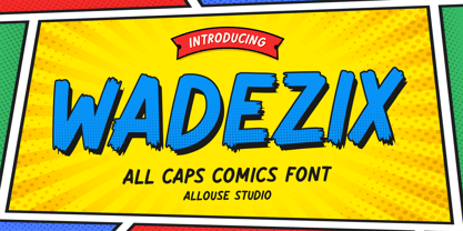 Proudly Presenting, Wadezix A All Caps Comics Font. Wadezix is perfect for any titles, logo, product packaging, branding project, megazine, social media, wedding, or just used to express words above the background. Wadezix also come with Multi-Lingual Support. Enjoy the font, feel free to comment or feedback, send me PM or email. Thank You!
 - Marlrock by Allouse Studio,
$16.00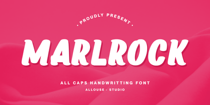 Proudly Presenting, Marlrock A All Caps Handwritting Font. Marlrock is perfect for any titles, logo, product packaging, branding project, megazine, social media, wedding, or just used to express words above the background. Marlrock also come with Multi-Lingual Support. Enjoy the font, feel free to comment or feedback, send me PM or email. Thank You!
 - August Rush by Callie Sharp,
$13.00 August Rush is a delicate handwritten script font. The font comes in 2 weight options: regular and semi-bold. It's best used as a main headlines or as a secondary headline combed with other simple serif or sans-serif fonts. It can be used for various designs such as packaging, wedding stationery or branding.
 - Fachristar by Allouse Studio,
$16.00 Proudly Presenting, Fachristar A Fun All - Caps Font. Fachristar is perfect for any titles, logo, product packaging, branding project, megazine, social media, wedding, or just used to express words above the background. Fachristar also come with Multi-Lingual Support. Enjoy the font, feel free to comment or feedback, send me PM or email. Thank You!
 - Right Swipe by Din Studio,
$25.00 Right Swipe is a fantastic sans serif brush font duo. The sans serif font, in the Right Swipe, is the epitome of simplicity and elegance. Designed in uppercase, it boasts clean lines and a minimalist aesthetic, making a versatile look. This sans serif typeface is all about timeless sophistication and modern appeal. In contrast to its sans serif, the brush font adds a touch of creativity and spontaneity to the duo. The brush font's characters are made in round shapes and consistent proportions, creating a harmonious appearance. Each letter is meticulously crafted with fluid strokes, evoking a sense of warmth and approachability. Together, this duo offers a harmonious balance of elegance and creativity. This combination of a simple and refined sans serif font with a warm and inviting brush font allows you to strike the perfect tone for your design projects. In addition, enjoy the features here. Features: Multilingual Supports PUA Encoded Numerals and Punctuations Right Swipe fits in headlines, logos, posters, flyers, branding materials, print media, editorial layouts, and many more vintage-inspired designs. Find out more ways to use this font by taking a look at the font preview. Thanks for purchasing our fonts. Hopefully, you have a great time using our font. Feel free to contact us anytime for further information or when you have trouble with the font. Thanks a lot and happy designing.
 - The Chaffy by XdCreative,
$25.00 About The Chaffy The creation of the chaffy is inspired by classic and vintage fonts, with a touch of Slightly calligraphic, with variable stress angle and high contrast. The Chaffy is a display font type, so it is perfectly suited for graphic design and any display use ( for the logos, t-shirts, the web as well as for print, and also great for headings), The Chaffy is perfect pairing for Giane Gothic sans or Giane Serif Thank You _xdCreative
 - Times New Roman PS Cyrillic by Monotype,
$67.99In 1931, The Times of London commissioned a new text type design from Stanley Morison and the Monotype Corporation, after Morison had written an article criticizing The Times for being badly printed and typographically behind the times. The new design was supervised by Stanley Morison and drawn by Victor Lardent, an artist from the advertising department of The Times. Morison used an older typeface, Plantin, as the basis for his design, but made revisions for legibility and economy of space (always important concerns for newspapers). As the old type used by the newspaper had been called Times Old Roman," Morison's revision became "Times New Roman." The Times of London debuted the new typeface in October 1932, and after one year the design was released for commercial sale. The Linotype version, called simply "Times," was optimized for line-casting technology, though the differences in the basic design are subtle. The typeface was very successful for the Times of London, which used a higher grade of newsprint than most newspapers. The better, whiter paper enhanced the new typeface's high degree of contrast and sharp serifs, and created a sparkling, modern look. In 1972, Walter Tracy designed Times Europa for The Times of London. This was a sturdier version, and it was needed to hold up to the newest demands of newspaper printing: faster presses and cheaper paper. In the United States, the Times font family has enjoyed popularity as a magazine and book type since the 1940s. Times continues to be very popular around the world because of its versatility and readability. And because it is a standard font on most computers and digital printers, it has become universally familiar as the office workhorse. Times?, Times? Europa, and Times New Roman? are sure bets for proposals, annual reports, office correspondence, magazines, and newspapers. Linotype offers many versions of this font: Times? is the universal version of Times, used formerly as the matrices for the Linotype hot metal line-casting machines. The basic four weights of roman, italic, bold and bold italic are standard fonts on most printers. There are also small caps, Old style Figures, phonetic characters, and Central European characters. Times? Ten is the version specially designed for smaller text (12 point and below); its characters are wider and the hairlines are a little stronger. Times Ten has many weights for Latin typography, as well as several weights for Central European, Cyrillic, and Greek typesetting. Times? Eighteen is the headline version, ideal for point sizes of 18 and larger. The characters are subtly condensed and the hairlines are finer." - Times New Roman Seven by Monotype,
$67.99In 1931, The Times of London commissioned a new text type design from Stanley Morison and the Monotype Corporation, after Morison had written an article criticizing The Times for being badly printed and typographically behind the times. The new design was supervised by Stanley Morison and drawn by Victor Lardent, an artist from the advertising department of The Times. Morison used an older typeface, Plantin, as the basis for his design, but made revisions for legibility and economy of space (always important concerns for newspapers). As the old type used by the newspaper had been called Times Old Roman," Morison's revision became "Times New Roman." The Times of London debuted the new typeface in October 1932, and after one year the design was released for commercial sale. The Linotype version, called simply "Times," was optimized for line-casting technology, though the differences in the basic design are subtle. The typeface was very successful for the Times of London, which used a higher grade of newsprint than most newspapers. The better, whiter paper enhanced the new typeface's high degree of contrast and sharp serifs, and created a sparkling, modern look. In 1972, Walter Tracy designed Times Europa for The Times of London. This was a sturdier version, and it was needed to hold up to the newest demands of newspaper printing: faster presses and cheaper paper. In the United States, the Times font family has enjoyed popularity as a magazine and book type since the 1940s. Times continues to be very popular around the world because of its versatility and readability. And because it is a standard font on most computers and digital printers, it has become universally familiar as the office workhorse. Times?, Times? Europa, and Times New Roman? are sure bets for proposals, annual reports, office correspondence, magazines, and newspapers. Linotype offers many versions of this font: Times? is the universal version of Times, used formerly as the matrices for the Linotype hot metal line-casting machines. The basic four weights of roman, italic, bold and bold italic are standard fonts on most printers. There are also small caps, Old style Figures, phonetic characters, and Central European characters. Times? Ten is the version specially designed for smaller text (12 point and below); its characters are wider and the hairlines are a little stronger. Times Ten has many weights for Latin typography, as well as several weights for Central European, Cyrillic, and Greek typesetting. Times? Eighteen is the headline version, ideal for point sizes of 18 and larger. The characters are subtly condensed and the hairlines are finer." - Times New Roman WGL by Monotype,
$67.99 In 1931, The Times of London commissioned a new text type design from Stanley Morison and the Monotype Corporation, after Morison had written an article criticizing The Times for being badly printed and typographically behind the times. The new design was supervised by Stanley Morison and drawn by Victor Lardent, an artist from the advertising department of The Times. Morison used an older typeface, Plantin, as the basis for his design, but made revisions for legibility and economy of space (always important concerns for newspapers). As the old type used by the newspaper had been called Times Old Roman," Morison's revision became "Times New Roman." The Times of London debuted the new typeface in October 1932, and after one year the design was released for commercial sale. The Linotype version, called simply "Times," was optimized for line-casting technology, though the differences in the basic design are subtle. The typeface was very successful for the Times of London, which used a higher grade of newsprint than most newspapers. The better, whiter paper enhanced the new typeface's high degree of contrast and sharp serifs, and created a sparkling, modern look. In 1972, Walter Tracy designed Times Europa for The Times of London. This was a sturdier version, and it was needed to hold up to the newest demands of newspaper printing: faster presses and cheaper paper. In the United States, the Times font family has enjoyed popularity as a magazine and book type since the 1940s. Times continues to be very popular around the world because of its versatility and readability. And because it is a standard font on most computers and digital printers, it has become universally familiar as the office workhorse. Times?, Times? Europa, and Times New Roman? are sure bets for proposals, annual reports, office correspondence, magazines, and newspapers. Linotype offers many versions of this font: Times? is the universal version of Times, used formerly as the matrices for the Linotype hot metal line-casting machines. The basic four weights of roman, italic, bold and bold italic are standard fonts on most printers. There are also small caps, Old style Figures, phonetic characters, and Central European characters. Times? Ten is the version specially designed for smaller text (12 point and below); its characters are wider and the hairlines are a little stronger. Times Ten has many weights for Latin typography, as well as several weights for Central European, Cyrillic, and Greek typesetting. Times? Eighteen is the headline version, ideal for point sizes of 18 and larger. The characters are subtly condensed and the hairlines are finer."
 - Times New Roman by Monotype,
$67.99 In 1931, The Times of London commissioned a new text type design from Stanley Morison and the Monotype Corporation, after Morison had written an article criticizing The Times for being badly printed and typographically behind the times. The new design was supervised by Stanley Morison and drawn by Victor Lardent, an artist from the advertising department of The Times. Morison used an older typeface, Plantin, as the basis for his design, but made revisions for legibility and economy of space (always important concerns for newspapers). As the old type used by the newspaper had been called Times Old Roman," Morison's revision became "Times New Roman." The Times of London debuted the new typeface in October 1932, and after one year the design was released for commercial sale. The Linotype version, called simply "Times," was optimized for line-casting technology, though the differences in the basic design are subtle. The typeface was very successful for the Times of London, which used a higher grade of newsprint than most newspapers. The better, whiter paper enhanced the new typeface's high degree of contrast and sharp serifs, and created a sparkling, modern look. In 1972, Walter Tracy designed Times Europa for The Times of London. This was a sturdier version, and it was needed to hold up to the newest demands of newspaper printing: faster presses and cheaper paper. In the United States, the Times font family has enjoyed popularity as a magazine and book type since the 1940s. Times continues to be very popular around the world because of its versatility and readability. And because it is a standard font on most computers and digital printers, it has become universally familiar as the office workhorse. Times?, Times? Europa, and Times New Roman? are sure bets for proposals, annual reports, office correspondence, magazines, and newspapers. Linotype offers many versions of this font: Times? is the universal version of Times, used formerly as the matrices for the Linotype hot metal line-casting machines. The basic four weights of roman, italic, bold and bold italic are standard fonts on most printers. There are also small caps, Old style Figures, phonetic characters, and Central European characters. Times? Ten is the version specially designed for smaller text (12 point and below); its characters are wider and the hairlines are a little stronger. Times Ten has many weights for Latin typography, as well as several weights for Central European, Cyrillic, and Greek typesetting. Times? Eighteen is the headline version, ideal for point sizes of 18 and larger. The characters are subtly condensed and the hairlines are finer."
 - Times New Roman Small Text by Monotype,
$67.99In 1931, The Times of London commissioned a new text type design from Stanley Morison and the Monotype Corporation, after Morison had written an article criticizing The Times for being badly printed and typographically behind the times. The new design was supervised by Stanley Morison and drawn by Victor Lardent, an artist from the advertising department of The Times. Morison used an older typeface, Plantin, as the basis for his design, but made revisions for legibility and economy of space (always important concerns for newspapers). As the old type used by the newspaper had been called Times Old Roman," Morison's revision became "Times New Roman." The Times of London debuted the new typeface in October 1932, and after one year the design was released for commercial sale. The Linotype version, called simply "Times," was optimized for line-casting technology, though the differences in the basic design are subtle. The typeface was very successful for the Times of London, which used a higher grade of newsprint than most newspapers. The better, whiter paper enhanced the new typeface's high degree of contrast and sharp serifs, and created a sparkling, modern look. In 1972, Walter Tracy designed Times Europa for The Times of London. This was a sturdier version, and it was needed to hold up to the newest demands of newspaper printing: faster presses and cheaper paper. In the United States, the Times font family has enjoyed popularity as a magazine and book type since the 1940s. Times continues to be very popular around the world because of its versatility and readability. And because it is a standard font on most computers and digital printers, it has become universally familiar as the office workhorse. Times?, Times? Europa, and Times New Roman? are sure bets for proposals, annual reports, office correspondence, magazines, and newspapers. Linotype offers many versions of this font: Times? is the universal version of Times, used formerly as the matrices for the Linotype hot metal line-casting machines. The basic four weights of roman, italic, bold and bold italic are standard fonts on most printers. There are also small caps, Old style Figures, phonetic characters, and Central European characters. Times? Ten is the version specially designed for smaller text (12 point and below); its characters are wider and the hairlines are a little stronger. Times Ten has many weights for Latin typography, as well as several weights for Central European, Cyrillic, and Greek typesetting. Times? Eighteen is the headline version, ideal for point sizes of 18 and larger. The characters are subtly condensed and the hairlines are finer." - Times New Roman PS Greek by Monotype,
$67.99In 1931, The Times of London commissioned a new text type design from Stanley Morison and the Monotype Corporation, after Morison had written an article criticizing The Times for being badly printed and typographically behind the times. The new design was supervised by Stanley Morison and drawn by Victor Lardent, an artist from the advertising department of The Times. Morison used an older typeface, Plantin, as the basis for his design, but made revisions for legibility and economy of space (always important concerns for newspapers). As the old type used by the newspaper had been called Times Old Roman," Morison's revision became "Times New Roman." The Times of London debuted the new typeface in October 1932, and after one year the design was released for commercial sale. The Linotype version, called simply "Times," was optimized for line-casting technology, though the differences in the basic design are subtle. The typeface was very successful for the Times of London, which used a higher grade of newsprint than most newspapers. The better, whiter paper enhanced the new typeface's high degree of contrast and sharp serifs, and created a sparkling, modern look. In 1972, Walter Tracy designed Times Europa for The Times of London. This was a sturdier version, and it was needed to hold up to the newest demands of newspaper printing: faster presses and cheaper paper. In the United States, the Times font family has enjoyed popularity as a magazine and book type since the 1940s. Times continues to be very popular around the world because of its versatility and readability. And because it is a standard font on most computers and digital printers, it has become universally familiar as the office workhorse. Times?, Times? Europa, and Times New Roman? are sure bets for proposals, annual reports, office correspondence, magazines, and newspapers. Linotype offers many versions of this font: Times? is the universal version of Times, used formerly as the matrices for the Linotype hot metal line-casting machines. The basic four weights of roman, italic, bold and bold italic are standard fonts on most printers. There are also small caps, Old style Figures, phonetic characters, and Central European characters. Times? Ten is the version specially designed for smaller text (12 point and below); its characters are wider and the hairlines are a little stronger. Times Ten has many weights for Latin typography, as well as several weights for Central European, Cyrillic, and Greek typesetting. Times? Eighteen is the headline version, ideal for point sizes of 18 and larger. The characters are subtly condensed and the hairlines are finer." - Times New Roman PS by Monotype,
$67.99In 1931, The Times of London commissioned a new text type design from Stanley Morison and the Monotype Corporation, after Morison had written an article criticizing The Times for being badly printed and typographically behind the times. The new design was supervised by Stanley Morison and drawn by Victor Lardent, an artist from the advertising department of The Times. Morison used an older typeface, Plantin, as the basis for his design, but made revisions for legibility and economy of space (always important concerns for newspapers). As the old type used by the newspaper had been called Times Old Roman," Morison's revision became "Times New Roman." The Times of London debuted the new typeface in October 1932, and after one year the design was released for commercial sale. The Linotype version, called simply "Times," was optimized for line-casting technology, though the differences in the basic design are subtle. The typeface was very successful for the Times of London, which used a higher grade of newsprint than most newspapers. The better, whiter paper enhanced the new typeface's high degree of contrast and sharp serifs, and created a sparkling, modern look. In 1972, Walter Tracy designed Times Europa for The Times of London. This was a sturdier version, and it was needed to hold up to the newest demands of newspaper printing: faster presses and cheaper paper. In the United States, the Times font family has enjoyed popularity as a magazine and book type since the 1940s. Times continues to be very popular around the world because of its versatility and readability. And because it is a standard font on most computers and digital printers, it has become universally familiar as the office workhorse. Times?, Times? Europa, and Times New Roman? are sure bets for proposals, annual reports, office correspondence, magazines, and newspapers. Linotype offers many versions of this font: Times? is the universal version of Times, used formerly as the matrices for the Linotype hot metal line-casting machines. The basic four weights of roman, italic, bold and bold italic are standard fonts on most printers. There are also small caps, Old style Figures, phonetic characters, and Central European characters. Times? Ten is the version specially designed for smaller text (12 point and below); its characters are wider and the hairlines are a little stronger. Times Ten has many weights for Latin typography, as well as several weights for Central European, Cyrillic, and Greek typesetting. Times? Eighteen is the headline version, ideal for point sizes of 18 and larger. The characters are subtly condensed and the hairlines are finer." - Besans by NJ Studio,
$19.00 Hi...Thank for your visit :) Besans Handmade sans font. It features tall characters that will take your projects to the next level! This font is PUA code which means you can easily access all the glyphs that are full of sans! It also features many special features including glyphs. font designs that are made for various vector designs, printing such as digital wedding blogs, online shops, social media, while printing can be used in the field of product clothing, accessories, bags, pins, logos, business cards, watermarks and many others ... so it can make your product look sans and attractive, and also Multilingual support!!! Happy design ...