10,000 search results
(0.041 seconds)
- Myla by Creative Toucan,
$12.00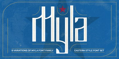 Myla makes it easier to convey the message in your designs. Use its eastern, old soviet inspired style for awesome display, labeling, clothing, movie screen, posters, movie titles, gigs, album covers, logos, and much more. It comes in 3 styles: Regular, Bold and Black, in 2 variations of regular and italic. Inspired by eastern and soviet traditions, hardworking people and 1960s, Myla is ideal for retro and vintage projects, from clear to rough looking designs. Myla features: Stylistic alternatives Ligatures International characters (Multi-lingual) Punctuation symbols OpenType Features Multilanguage Support: English, Albanian, Danish, Dutch, Estonian, Croatian, Bosnian, Slovenian, Finnish, French, German, Icelandic, Italian, Norwegian, Portugese, Spanish, Swedish with a lot of other languages; see the Full Character List. Note: To access the extra alternate letters, you will need to use the glyphs panel. Many design programs offer this ability, including Adobe Photoshop CC 2015 , Adobe Illustrator, Adobe Indesign.
 - Niedermann Grotesk by steve mehallo,
$19.14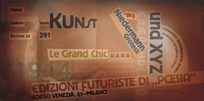 With the printing of the Futurist poem “Zang Tumb Tuuum” in 1914, modern art had taken a typographic twist: “words in freedom” (parole in libertà) were now a major part of the art world. The avant garde followed suit. Niedermann Grotesk is based on the everyday type that appeared in early modernist collages, journals and manifestos. It is a peculiar style of lettering—which was originally inspired by the Sachplakat (object poster) work of Lucian Bernhard—and adapted for hot metal in 1908 by Heinz Hoffmann. 100 years ago, the style became a workhorse of the German printing industry. Niedermann Grotesk is an updated variant, referencing the original poster art, each letter carefully drawn with an old brush. Bumpy, bold and blunt—with a suite of alternate characters and a few dingbats—Niedermann Grotesk is perfect for advertising, packaging, poetry, art, protests and retro homage.
 - Freundschafts-Antiqua AR by ARTypes,
$35.00Freundschafts-Antiqua AR is based on a 20th-century German type design. Freundschafts-Antiqua (which was also called Chinesische Antiqua) was designed by the Chinese calligrapher Yü Bing-nan when he was a student at the Hochschule für Grafik und Buchkunst at Leipzig in 1960. It was cast in 1964 by VEB Typoart, Dresden, in 9-pt and 28-pt (Didot). The design combines the best German traditions with the Chinese bamboo pen. It is a unique, wholly modern, yet quiet and dignified typeface which is well suited for text-setting in many sizes. The original design was carefully crafted with all non-kerning letters (none of the letters overhangs its side-bearings); the lower-case f was designed so that no ligatures were needed. The AR fonts include the type's ch and ck logotypes, monetary signs and all the standard accents. The letterfit of the original design is retained and, as can be seen in the attached printable .pdf, text composed at normal sizes is very agreeable indeed. Freundschafts-Kursiv AR A features old-style (non-lining) figures and 'kerning' letters; Freundschafts-Kursiv AR B contains lining (cap-height) figures and all non-kerning letters following the original design of the face. - Schorel by insigne,
$29.00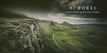 Schorel commands the room and sets the audience at ease. This new Scotch Roman typeface from insigne is a confident personality with a tasteful amount of contrast. Cool, sharp, balanced, and contemporary, Schorel not only delivers well in longer texts, but can use its mass to meet the needs of subheadlines, callouts, and other similar projects. Scotch typefaces initially come from Scottish foundries, popular in the United States in the late 18th century. This beautiful genre of type grew in popularity through the Victorian era and most of the 20th century to make regular appearance in books, magazines, newspapers, and advertisements. Schorel itself, with its moderate contrast and organic design, features short ascenders and descenders and calligraphic italics. The design features a few ball terminals, but mostly touts its bracket serifs, which come to a sharp point. The typeface, ideal for medium to large sizes, is useful for both headlines and text, carefully created for both print and screen. This OpenType font supports most Latin-based languages. Schorel has nine weights and a true italic, and many special features such as small caps, fractions, old-style figures, and numerous extras complete each font. It’s every bit a delight to your reader’s eye.
 - Arkaim by Dima Pole,
$22.00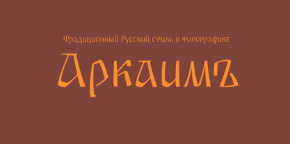 Arkaim is a modern typeface in traditional East-Slavic and GreatRussian style in typography. This style is not like any other style in the world. It combines elegance and brevity, depth and modernity, originality and convenience. This unique font is certainly eye-catching. Arkaim font is named after the ancient Slavic-Aryan city located in the South of Russia, which is a symbol of antiquity, wisdom, as well as the unexplored ancient world. Arkaim is not only a historical place, but also a place of Spiritual power. The font Arkaim has many Opentype features that will help to create interesting and unique compositions. An interesting and non-trivial solution is a kind of mixture of all caps and upper/lowercase characters. Arkaim contains symbols of all Slavic and European languages. There are fractions, superscripts and subscripts, and many others. There is a standard number and the old-style number, also Slavic numbers. There are all the historical characters Of the ancient Slavic script called Bukvitsa, today mistakenly called Cyrillic. In addition, here is a free demo font (only with Russian, Belarusian, Ukrainian, Bulgarian, Macedonian and Serbian characters) without Opentype features and other symbols. You can try it.. and love it.
 - Gessetto by Resistenza,
$39.00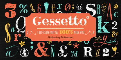 Gessetto is an extensive chalk font family, containing script, sans, roman, figures and ornaments. One of the things most charming about chalkboard lettering is the variation; in both texture and style. Our goal was to achieve a real chalk effect using the varied typographic genres in a digital format. With flexibility and control for the designer in mind, we built a digital chalk toolkit. The script is a fusion of Italic Roman and cursive, it contains swashy alternates for each capital letters with some long and extended flair on some ascendent and descendent letters. An all caps high contrast sans is in 5 complimentary styles. The Roman is precisely proportioned and maintains elegance while being bold. There is a set of Figures and ornaments. Gessetto is perfect to grab attention on signage, print advertising and editorial applications like book covers, but suits branding applications too. The diverse styles and subtle handcrafted textures in this display type family will well serve any designer looking for the authentic chalkboard aesthetic. We recommend to combine Timberline with: Turquoise
 - Syncopate Pro by Stiggy & Sands,
$29.00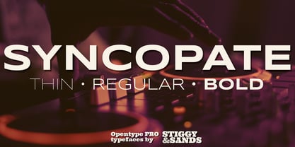 The Syncopate Pro Family is a unicase design where the traditional lowercase x-height has been abandoned and a single uppercase height rules the design of all of the alpha and numeric glyphs. Some uppercase glyphs are copied to their lowercase slots, where other lowercase glyphs such as the a, e, and r, are scaled up to uppercase heights. This motif allows for a vast array of typesetting possibilities. A modern and stylish sans inspired by the many trendy sans serif typefaces that are prevalent today, the Syncopate Pro Family, primarily intended for display and headline use, also works well for limited text runs. The thin and regular weights and wide body impart a certain level of elegance, while the unicase approach keeps the look lively and fresh. The bold weight imparts a powerful substantiality, lending a strong corporate presence to any design. Opentype features include: - Stylistic Alternates for a collection of alternate Small Caps - Full set of Inferiors and Superiors for limitless fractions - Lining and Proportional figure sets
 - Edelgotisch by HiH,
$10.00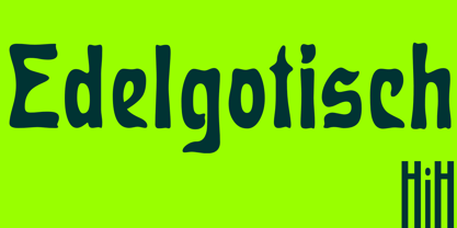 Edelgotisch is a bold Jugendstil design that shows its strong blackletter roots. This typeface, along with a set of initial letters, was released by Schelter & Giesecke of Leipzig, Germany about 1898 and is very similar to Eckmann-Schrift released by Rudhard'schen Giesserie (later Klingspor) during the same period. One suspects they may have been in direct competition. The decorative devises of the initial letters for Edelgotisch have a simpler, bolder line than for Eckmann. In the initial letter set, the ligatures aesc (AE) and ethel (OE) were generated by embedding the ‘A’ and ‘O’ respectively inside the upper left corner of the ‘E.’ The accented caps were given similar treatment, with the exception of the cedilla. Regarding the I-diaeresis, we considered rotating the accent ninety degrees to avoid and possible misconstruction. On further reflection however, we realized it was silly and unnecessary. No one would look at the accented letterform and see anything but what it is. We have also included four decorative ornaments and a frame with each font.
 - Eurostile LT by Linotype,
$40.99Eurostile® is one of the most important designs from the Italian font designer Aldo Novarese. It was originally produced in 1962 by the Nebiolo foundry as a more complete version of the earlier Microgramma, a caps-only font designed by Novarese and A. Butti. Eurostile reflects the flavor and spirit of the 1950s and 1960s. It has big, squarish shapes with rounded corners that look like television sets from that era. Eurostile has sustained the ability to give text a dynamic, technological aura. It works well for headlines and small bodies of text. The Eurostile font family has 11 weights, from roman to bold and condensed to extended. In 2009 Linotype released a revised version in the Platinum Collection under the name , with three weights in all three different styles. And additionaly there are now new weights for the Eurostile family as , and ." - Bunaero by Buntype,
$24.50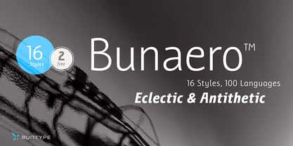 Buntypes Bunaero™ combines classical and contemporary characteristics to a unique and distinctive font family with extravagant but also harmonious appearance. The characters are clear, open and sometimes bellied. Especially the caps have a very high waistline. The font was manually hinted and contains extensive handcrafted kerning tables to ensure flawless appearance in all media. It supports at least 99 languages incl. Vietnamese and provides ligatures, alternative glyphs, special localized forms and even more enjoyable OpenType® features. Feature Summary*: - 9 weights, 18 styles: Hair, Light, Thin, SemiLight, Regular, SemiBold, Bold, ExtraBold and Heavy and corresponding italics - Supports at least 99 Languages incl. eastern european and vietnamese languages - Overall width: Narrow or Space-Saving - Advanced f- ligature set including fb - Discretionary s- and c- ligatures - Alternative Characters: a, e, f, g, i, k, l, t, v, w, y, J, K, Q, R, and more - Capital German Eszett - Extra characters with Polish Kreska - Catalan Punt Volat - Extra characters with alternate minimalistic Cedille * Some features may only be available in OpenType®-savvy applications
 - Wien Pro by Wannatype,
$36.00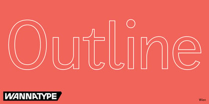 Wien Pro, the sans serif by Ekke Wolf. Typeface lovers looking for a modern, well-developed sans serif font with a touch of retro and warm, individual lettering will get excited about a new addition to the font market. The more than complete Wien Pro front comes in three styles and four different weights. In addition to the upright Wien Pro there is the Wien Pro Oblique with a moderate 6° slant and the Wien Pro Superoblique with an 18° slant. Available weights are light, regular, medium, bold and black. These fonts are equipped with extended Latin alphabet for Central and Eastern Europe and also Cyrillic and Greek alphabet. The set of characters includes nine different sets of numbers, plus its own set for the small caps, as well as alternative characters and groovy ligatures. In addition, all Wien Pro styles are also available as unicase with upper case and lower case x-height alignment. The style, metrics and proportions of Wien Pro combine perfectly with the Liebelei Pro and the script fonts of the Calafati Pro.
 - Mono To Go by buero bauer,
$20.00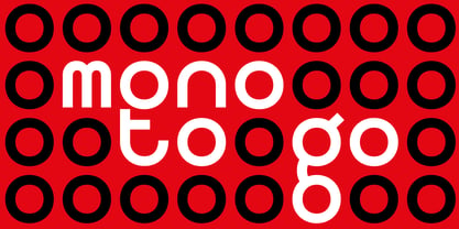 Mono To Go is a monospace typeface with a constructed, grid-based body and a playful and quirky spirit. Built from circles and other simple geometric shapes, it sees itself as a contemporary interpretation of the early, consistently reduced typefaces of modernism. With its modular concept, the typeface invites you to "build" individually combined word pictures. Depending on your preference for the type of composition, stylistic alternatives and open typeface features offer you a wide range of possibilities. The rhythm of the glyphs and their distinctive ascenders and descenders give the typeface a confident character for bold designs. The typeface works best in larger sizes, e.g. for brands, poster and cover designs, film titles, exhibition displays or generally for striking headlines. The character set contains 600 glyphs, including full language support for Western, Central and Eastern Europe, digits and oldstyle figures, punctuation, currency and mathematical symbols, and the entire set as small caps. mono to go was designed by buero bauer (2019–2021). Special thanks to Franziska Weitgruber for her support.
 - Octin Spraypaint by Typodermic,
$11.95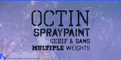 As a designer, it’s crucial to choose a typeface that not only complements the overall design, but also conveys the intended message. Octin Spraypaint, a typeface that exudes streetwise grit and toughness, is a perfect choice for projects that demand a bold and fearless statement. Octin Spraypaint boasts two distinct styles—sans and serif—each offering three weight options: regular, bold, and black. The sans style offers a sleek, modern aesthetic with sharp, angular lines, while the serif style offers a more classic and sophisticated feel with its clean and sharp serifs. Together, these styles and weights provide designers with the flexibility to create striking headlines that command attention. This typeface is the perfect choice for design projects that demand an edgy and daring look. From police and military themes to sports, prison, construction, and school, Octin Spraypaint is versatile enough to lend its tough appeal to various themes and contexts. Octin Spraypaint is a typeface that offers a distinctive look that’s hard to ignore. It’s ideal for projects that need to convey strength, power, and authority, and its bold, spray-painted style is sure to capture the attention of viewers. With its unique blend of streetwise design and raw power, Octin Spraypaint is a must-have tool for any designer looking to make a bold statement. Check out the rest of the Octin families: Octin Sports, Octin College, Octin Prison, Octin Stencil & Octin Vintage. Most Latin-based European writing systems are supported, including the following languages. Afaan Oromo, Afar, Afrikaans, Albanian, Alsatian, Aromanian, Aymara, Bashkir (Latin), Basque, Belarusian (Latin), Bemba, Bikol, Bosnian, Breton, Cape Verdean, Creole, Catalan, Cebuano, Chamorro, Chavacano, Chichewa, Crimean Tatar (Latin), Croatian, Czech, Danish, Dawan, Dholuo, Dutch, English, Estonian, Faroese, Fijian, Filipino, Finnish, French, Frisian, Friulian, Gagauz (Latin), Galician, Ganda, Genoese, German, Greenlandic, Guadeloupean Creole, Haitian Creole, Hawaiian, Hiligaynon, Hungarian, Icelandic, Ilocano, Indonesian, Irish, Italian, Jamaican, Kaqchikel, Karakalpak (Latin), Kashubian, Kikongo, Kinyarwanda, Kirundi, Kurdish (Latin), Latvian, Lithuanian, Lombard, Low Saxon, Luxembourgish, Maasai, Makhuwa, Malay, Maltese, Māori, Moldovan, Montenegrin, Ndebele, Neapolitan, Norwegian, Novial, Occitan, Ossetian (Latin), Papiamento, Piedmontese, Polish, Portuguese, Quechua, Rarotongan, Romanian, Romansh, Sami, Sango, Saramaccan, Sardinian, Scottish Gaelic, Serbian (Latin), Shona, Sicilian, Silesian, Slovak, Slovenian, Somali, Sorbian, Sotho, Spanish, Swahili, Swazi, Swedish, Tagalog, Tahitian, Tetum, Tongan, Tshiluba, Tsonga, Tswana, Tumbuka, Turkish, Turkmen (Latin), Tuvaluan, Uzbek (Latin), Venetian, Vepsian, Võro, Walloon, Waray-Waray, Wayuu, Welsh, Wolof, Xhosa, Yapese, Zapotec Zulu and Zuni.
 - Meloriac by Typodermic,
$11.95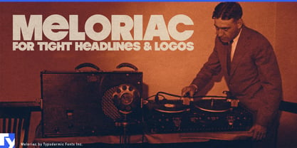 Introducing Meloriac, the unicase display typeface that combines a pseudo-retro feel with a minimalist design, creating a strong and modern-looking font that has become a reliable staple in the toolbox of today’s graphic designer. Inspired by the classic Futura Extra Bold and Avant Garde Gothic Bold, Meloriac is an extra-heavy tribute that is perfect for tight headlines and logos. Its minimalist design and strong strokes make it stand out and demand attention. The font is versatile, able to convey a variety of messages while maintaining its bold and modern aesthetic. Meloriac is more than just a pretty face; it’s also highly functional. For improved clarity, we recommend tracking it wider (adding more space) on subheadings. The result is a cleaner, more legible display that will make your message pop. Additionally, the font’s OpenType stylistic alternates feature allows access to filled letter variations and an alternative ampersand, giving you even more creative control over your designs. Whether you’re designing a poster, a book cover, or a website, Meloriac’s minimalist design and bold aesthetic make it the perfect font to convey your message with impact. Try it out today and see for yourself why it’s a favorite among today’s graphic designers. Most Latin-based European, Vietnamese, Greek, and most Cyrillic-based writing systems are supported, including the following languages. Afaan Oromo, Afar, Afrikaans, Albanian, Alsatian, Aromanian, Aymara, Azerbaijani, Bashkir, Bashkir (Latin), Basque, Belarusian, Belarusian (Latin), Bemba, Bikol, Bosnian, Breton, Bulgarian, Buryat, Cape Verdean, Creole, Catalan, Cebuano, Chamorro, Chavacano, Chichewa, Crimean Tatar (Latin), Croatian, Czech, Danish, Dawan, Dholuo, Dungan, Dutch, English, Estonian, Faroese, Fijian, Filipino, Finnish, French, Frisian, Friulian, Gagauz (Latin), Galician, Ganda, Genoese, German, Gikuyu, Greenlandic, Guadeloupean Creole, Haitian Creole, Hawaiian, Hiligaynon, Hungarian, Icelandic, Igbo, Ilocano, Indonesian, Irish, Italian, Jamaican, Kaingang, Khalkha, Kalmyk, Kanuri, Kaqchikel, Karakalpak (Latin), Kashubian, Kazakh, Kikongo, Kinyarwanda, Kirundi, Komi-Permyak, Kurdish, Kurdish (Latin), Kyrgyz, Latvian, Lithuanian, Lombard, Low Saxon, Luxembourgish, Maasai, Macedonian, Makhuwa, Malay, Maltese, Māori, Moldovan, Montenegrin, Nahuatl, Ndebele, Neapolitan, Norwegian, Novial, Occitan, Ossetian, Ossetian (Latin), Papiamento, Piedmontese, Polish, Portuguese, Quechua, Rarotongan, Romanian, Romansh, Russian, Rusyn, Sami, Sango, Saramaccan, Sardinian, Scottish Gaelic, Serbian, Serbian (Latin), Shona, Sicilian, Silesian, Slovak, Slovenian, Somali, Sorbian, Sotho, Spanish, Swahili, Swazi, Swedish, Tagalog, Tahitian, Tajik, Tatar, Tetum, Tongan, Tshiluba, Tsonga, Tswana, Tumbuka, Turkish, Turkmen (Latin), Tuvaluan, Ukrainian, Uzbek, Uzbek (Latin), Venda, Venetian, Vepsian, Vietnamese, Võro, Walloon, Waray-Waray, Wayuu, Welsh, Wolof, Xavante, Xhosa, Yapese, Zapotec, Zarma, Zazaki, Zulu and Zuni.
 - Maiers Nr. 8 Pro by Ingo,
$27.00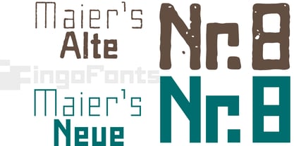 A handwritten ”font for technicians“ from ca. 1900. Very geometrical, rigid forms borrowed from the typical characteristics of Jugendstil / Art Nouveau. This script is found in an old magazine which was issued sometime in the years shortly before WWI. The original copy, produced by means of a galvanized plate, is just 7 centimeters wide. It served as the model for technical professions in which, at that time, the captions of drawings were still done by hand. ingoFonts has not only digitized this beautiful typeface, we have also extended it to a whole family. In »Maier’s Alte Nr. 8« special attention was given to ensure the ”uneven“ edges, typical of handwritten script, remained effectively noticeable even in the digitized form. As a result, this ”technical“ font retains a handmade touch, while »Maier’s Neue Nr. 8« is the clean version with exact contours. The Art Nouveau forms, which are characteristic for the period of origin around the turn of the century around 1900, look especially pretty. The high degree of abstraction also seems strange in Maier's No. 8, especially when the age of the original is known. It is generally assumed that it was not until the Bauhaus in the late 1920s that such "modern" typefaces were created. Maier's No. 8 is a generation older! So many of today's supposedly "ultramodern" typefaces look quite old in comparison. In addition to the original two weights, Light and Bold, the Maiers Neue Nr. 8 got a regular and a extra-bold weight. Furthermore, the Neue is also available in italics. Although this is only a slanted version, unlike common practice, it is inclined to the left. Maier’s Nr. 8 Pro is suitable for all European languages. It includes ”Latin Extended-A,“ for Central and Eastern Europe incl. Turkish, and even Cyrillic and Greek, too. The font includes several stylistic alternates as well as a number of ligatures.
 - PaddingtonSC - Unknown license

- Zaleski - Unknown license

- FG April by YOFF,
$14.95FG April works great with all caps as well emphasized by the double lines. It doesn't connect but feels like a script. - Lipsia Pro by RMU,
$40.00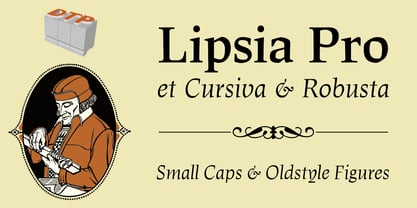 An RMU redesigned font family of Kapr’s Leipziger Antiqua which was extended for multilingual use, and added small caps and oldstyle figures.
 - Leitura Sans by DSType,
$26.00Leitura Sans is part of Leitura Type System and was specially designed for editorial purposes. Includes small caps, ligatures, alternates and swashes. - curlyJoe by JOEBOB graphics,
$19.00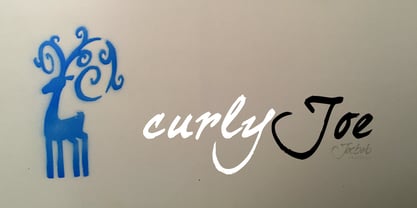 CurlyJoe is a fast, informal handwritten font. A bit in the line of the dearJoe series, with a different style of caps.
 - Leitura Display by DSType,
$26.00Leitura Display is part of Leitura Type System and was specially designed for editorial purposes. Includes small caps, ligatures, alternates and swashes. - Lineatura by ABSTRKT,
$20.00Lineatura is a simplistic sans serif caps only typeface with dynamic character width. All its styles are based around the same skeleton. - Korpus Sans Pro by RMU,
$50.00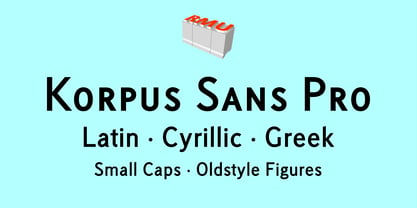 Korpus Sans Pro - a modern, versatile and multilingual sans serif font family with oldstyle numbers and small caps throughout all font styles.
 - Leitura Headline by DSType,
$26.00Leitura Headline is part of Leitura Type System and was specially designed for editorial purposes. Includes small caps, ligatures, alternates and swashes. - Francesco Decorative by Intellecta Design,
$14.95In accordance with Roman use, please note that the cap 'U' in this font has been made to look like a 'V'. - Quilotoa by Rachel Kick,
$8.00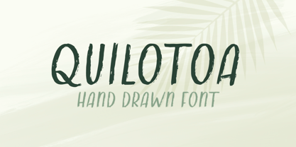 This font was originally hand drawn to include authentic brush texture. Works in all caps style and lowercase! The perfect casual font.
 - Leitura News by DSType,
$26.00Leitura News is part of Leitura Type System and was specially designed for editorial purposes. Includes small caps, ligatures, alternates and swashes. - Industrial Gothic by Monotype,
$29.99Industrial Gothic recalls the Industrial Revolution of the 19th century. There are four styles: Single-Line, Double-Line, Banner, and Small Caps. - Hellfire BB by Blambot,
$20.00An unconventional Gothic typeface with decorative caps and a whiff of fire and brimstone! Comes with a devilish compliment of European characters. - Priva Pro by DSType,
$26.00PrivaPro is available in four styles with italics. It includes Greek and Cyrillic characters, along with small caps, ligatures, alternates and swashes. - Husk by Stiggy & Sands,
$24.00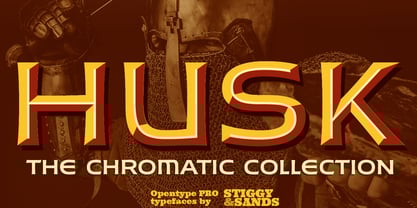 A Flare Serif Family to Rule Them All The Husk Family began as a digitization of a film typeface called Maile by LetterGraphics. From there, it has evolved to a much more robust character set than its original reference. With multiple numerals sets, creative discretionary ligatures, as well as Swash Capitals and a few final forms, this gladiator of the type arena cuts through to let your designs shine. See the 5th graphic for a comprehensive character map preview. The Husk Family is loaded with features to give you plenty of customisation options: - Regular, Chiseled, and Inline styles that can be used alone or chromatically layered - A mix of specialized Capital letterforms for Caps & Lowercase standard - A Swash feature for Swash Capitals as E & R final forms. - Stylistic Alternates feature for Lining Numerals, an alternate & and M. - Discretionary Ligatures for a collection of unique ligature arrangements. - A Full set of Inferiors and Superiors for Limitless Fractions - An Oldstyle (default), Tabular, Proportional, and Lining figure sets Approx. 482 Character Glyph Set per font: The Husk Family comes with a glyphset that includes standard & punctuation, international language support, discretionary ligatures, alternate numeral styles, subscript and superscript.
 - Blacker Pro by Zetafonts,
$39.00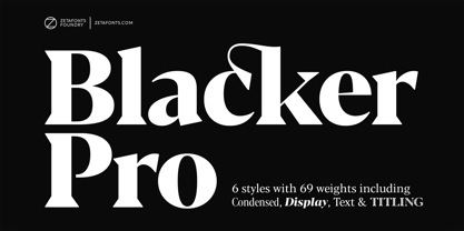 Blacker Pro is the revised and extended version of the original wedge serif type family designed by Cosimo Lorenzo Pancini and Andrea Tartarelli in 2017. Blacker was developed as a take on the style that Jeremiah Shoaf has defined as the "evil serif" genre: typefaces with high contrast, oldstyle or modern serif proportions and sharp, blade-like triangular serifs. Due to the high contrast in the design - slightly reminescent of didone typefaces - Blacker has been developed in two optical subfamilies. The display version offers tighter tracking, higher contrast and sharper corners for maximum effect at big sizes, while the text variant offers better readability and screen rendering at smaller sizes, with lower contrast and looser spacing. In the pro version, two additional condensed variant families have been added (condensed display and condensed text) allowing for more freedom and versatility in typesetting where space constraints are present. Also, three titling uppercase-only variants have been added, with a slightly extended feel, and two decorative subfamilies (inline and diamond). Each of these seven variants has been developed in six weights from light to heavy, with matching italics, for a total of 69 styles covering a wide range of editorial and advertising uses. All Blacker Pro feature a revised and extended character set covering over two hundred languages using the latin, cyrillic and greek alphabets. Open type features include small caps, positional numerals, fractions, superior & inferior figures, alternate forms, and an extended set of standard and discretionary ligatures. With its bold personality, Blacker aims to be a modern classic used for bold statements and self-conscious brands, making your text look great both on paper and on the screens.
 - Takeaway by Fenotype,
$35.00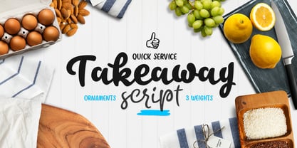 Takeaway is a hand drawn script family of three weights and ornament set. Takeaway is sketchy but due to its clean features it retains legibility even in small sizes - especially the Light version. Takeaway is packed with OpenType features: Keep Contextual Alternates and Standard ligatures on for smooth flow and for more expressive character try Swash or Titling Alternates in any OpenType savvy program. Takeaway caps work as ALL CAPS - yet there’s also Swash and Titling caps that are more expressive initials. Takeaway is a great organic display type for any project from branding to packaging and from websites to greeting cards. Combine Takeaway Script with Takeaway Extras which is a set of sketchy ornaments, icons and swashes.
 - Nautical Fabulous by Letterhend,
$14.00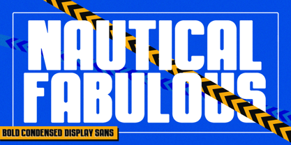 The Nautical Fabulous font features a perfect blend of boldness and condensed letterforms. Its clean lines and sharp edges give it a catchy look that is ideal for modern branding, striking headlines, and impactful displays. With its commanding presence, this font effortlessly stands out in any design composition. This font perfectly made to be applied especially in logo, and the other various formal forms such as invitations, labels, logos, magazines, books, greeting / wedding cards, packaging, fashion, make up, stationery, novels, labels or any type of advertising purpose. Features : Uppercase & lowercase Numbers and punctuation Alternates & Ligatures Multilingual PUA encoded We highly recommend using a program that supports OpenType features and Glyphs panels like many of Adobe apps and Corel Draw, so you can see and access all Glyph variations.
 - Kigo by Prominent and Affluent,
$30.00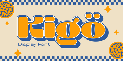 Artistic, bold and creatively designed - Kigo Font is the perfect choice for graphic designers who want to add an element of fun to their designs. Inspired by retro sans serif and the beloved shape of a cat, Kigo Font combines classic design with whimsy. With 4 styles including Regular, Round, Regular Italic and Round Italic, this font family offers versatility in every project you undertake. The multilingual support of Kigo allows you to seamlessly incorporate your message in any language without compromising on style or clarity. Perfectly suited for professional use, Kigo Font adds that touch of personality without sacrificing professionalism. Whether it's for branding projects or marketing collateral, let Kigo Font be your go-to choice when looking to create something truly unique. Upgrade your designs today with this playful yet sophisticated font!
 - Good Slient Night by Scoothtype,
$10.00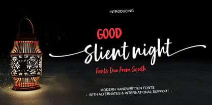 Good Slient Night is handmade fresh typeface, created with brush and ink. contemporary approach to design hand-painted natural and also a combination of delicate script with an irregular baseline. Suitable for use in watercolor design or as a hand brushed bold letters. Such as Novel tittle, Apparel, Invitations, Quotes, Books tittle, Stationery Design, Branding, Logos, Greeting Card, T-shirt, Packaging design, Poster and more. Good Slient Night includes a complete set of uppercase and lowercase letters, as well as multi-language support, numbers, punctuation, ligatures and alternative character. How to access all alternative characters, using Windows Character Map with Photoshop: https://www.youtube.com/watch?v=Go9vacoYmBw How to access all alternative characters using Adobe Illustrator: https://www.youtube.com/watch?v=XzwjMkbB-wQ If you need help or advice, please contact me by e-mail. Thank you.!
 - Klapt Arabic by SevenType,
$29.99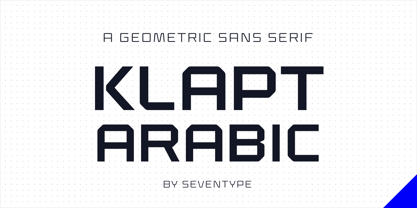 Klapt Arabic is a geometric sans serif family that is soft on the outside and sharp on the inside. It is based in the Arabic Kufic style. Klapt Arabic can be bold or very elegant and is well suited for designs ranging from branding and corporate identity to editorial design or web design. It has a timeless style and is great for display purposes, especially for headlines, posters, magazines, book covers, logos... you name it! This font family of four weights includes an extended character set supporting most Latin languages and extended Arabic, including Persian and Urdu. Feel free to share your designs using Klapt Arabic or just get in touch via email to hi@seventype.com. Klapt Arabic is the extension of Klapt https://www.myfonts.com/fonts/seventype/klapt/.
 - Reality Goals by Fikryal,
$22.00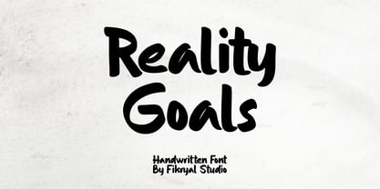 Reality Goals is a beautiful and stylish handwritten display font that exudes creativity and inspiration. This font is perfect for a variety of projects, including branding, marketing materials, social media graphics, quotes, invitations, and more. The font features unique and eye-catching letterforms that are carefully crafted to convey a sense of playfulness and sophistication. The characters are designed to appear as if they were hand-drawn, with irregular lines and strokes that add a personal touch to any design. With a bold and modern look, “Reality Goals” is sure to catch the attention of your audience and make a lasting impression. It is versatile and easy to use, and can be paired with a variety of other fonts to create a unique and cohesive look. Reality Goals Multilingual Support Thank you
 - Gemsea by Product Type,
$17.00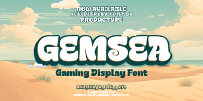 With Gemsea Fonts, you open the door to a world of limitless creativity. A display theme that celebrates the power of the ocean, bringing a strong, bold, and fun touch to any of your projects. Gemsea is the perfect solution for projects that require a unique theme. From epic films to stunning games and unforgettable streaming events, this font offers durability and appeal in various languages. Stunning Features: Five different family styles: Regular, Blur, Engrave, Outline, and 3D. This gives you the flexibility to create a variety of nuances in your designs. It supports multilingual so that you can connect with a global audience without restrictions. Gemsea creates not just projects, but unforgettable works of art. Get the Gemsea Font now and bring the magic of the ocean into your designs!


PreviousPage 250 of 250