10,000 search results
(0.033 seconds)
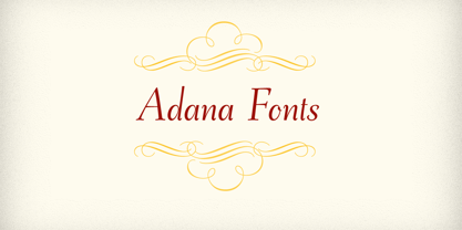
- Adana by astype,
$19.00 - Linotype Dinosaures by Linotype,
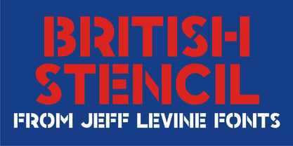
$29.99This font is a must for dinosaur lovers, as it brings back to life a variety of these huge reptiles. Besides figures of complete dinosaurs there are also a number of 'portraits' and poses. A creative combination of dinosaur figures allows the depiction of various situations, fighting, eating, etc. Have fun! - British Stencil JNL by Jeff Levine,
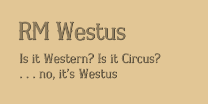
$29.00 - RM Westus by Ray Meadows,
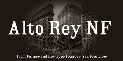
$19.00 - Alto Rey NF by Nick's Fonts,
$10.00 - Faceless by Gassstype,
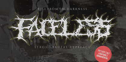
$29.00Hello Everyone, introduce our new product Font Faceless it is lack metal Typeface, Rooted, but still readable.This is a Textured Natural Style and classy style with a clear style and dramatic movement. This font Faceless is great for your next creative project such as logos, printed quotes, invitations, cards, product . - Rockland by Monotype,
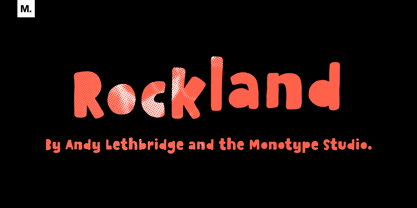
$15.99This is an original, confident and cheeky little font; characterised by its boldness and dense letterforms, which boast a solid texture and distinctive lack of counters. Drawn with a marker pen, the bounciness of Rockland counteracts its solidity to make for a friendly aesthetic that’s as confident as it is playful. - Allust Italic by Halfmoon Type,
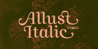
$20.00Allust Italic is an Upright italic font that is inspired by italic version some old-style serif typefaces specimen and an from my own flawed italic letterforms back in 2016. Download the cheat sheet for Allust Italic Ornament here: https://www.dropbox.com/s/yz1rvdopxm6mwva/Allust%20Italic%20Ornament%20Cheat%20Sheet.pdf?dl=0 - Connectica by Tour De Force,
$25.00 - Signs Of Yesterday JNL by Jeff Levine,
$29.00Signs of Yesterday JNL brings another twenty-six vintage signs inspired by a series of decals once made by the Duro Decal Company (now Duro Art Industries) of Chicago. This font complements the original twenty-six designs found in Too Much Information JNL. There are two blank sign panels on the parenthesis keys for use in creating custom retro signage. - Volume by Cubo Fonts,
$29.00Volume is a 3D font, with interlocked characters, inspired by vintage wooden block capitals! Superimposed weights bring light and shadow on the structure and allows many coloured combinations. Cubo est une fonte en volume dont les lettres s'imbriquent, inspirée d'anciens caractère d'imprimerie en bois. Les diiférentes graisses se superposent, créant des effets d'ombre et de lumière, et facilitant la colorisation des caractères. - Stamped Metal JNL by Jeff Levine,
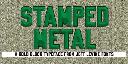
$29.00Online auctions offer a myriad of unique, vintage and novel lettering devices – all which are fertile ground for typographic inspiration. In this instance, a set of stamped metal letters for outdoor signage was the basis for Stamped Metal JNL. Some of the non-traditional letter weights makes these simple block letters a wonderful change of pace for bold, attention-getting headlines. - Rocksolid by Aah Yes,
$9.95Rocksolid's appearance is somewhere between a font resembling large, carved blocks of stone and a negative outline grunge font, and it is surprisingly responsive to simple effects in graphics programs. Mostly it is intended for titles, display and headlines. There's an extensive set of accented characters and punctuation. The zip contains both OTF and TTF versions - install either OTF or TTF, not both. - Lyric Stencil NF by Nick's Fonts,
$10.00This elegant stencil face is based on an alphabet found in one of the innumerable Dover Books volumes edited by Dan X. Solo. Intended for headline use, it can also be employed effectively for short blocks of body copy. This font contains the complete Latin language character set (Unicode 1252) plus support for Central European (Unicode 1250) languages as well. - Occidental by Ryan Corey,
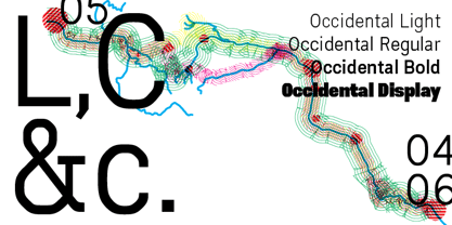
$35.00The Occidental family is a geometric, sans-serif text face marked by its angular construction. Occidental is suitable and economical enough to set large blocks of copy, but at display sizes Occidental's inherent character takes over making it useful for headline setting as well. The family includes four weights, each with corresponding italics (excepting Display) for a total of seven fonts. - Industrialist JNL by Jeff Levine,
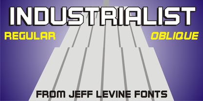
$29.00The chamfered block style of lettering has been a workhorse for years. From the early signage of the 1800s to military markings to the techno fonts of the 1980s and beyond, its clean and simple look gets the message across easily and boldly. Industrialist JNL and its oblique partner were modeled from the title on a piece of sheet music from the 1940s. - NewLibrary by Ingrimayne Type,
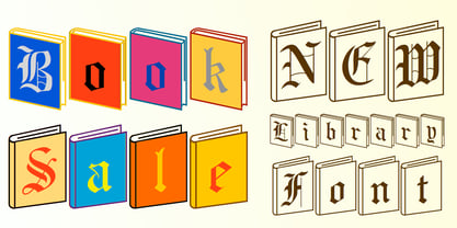
$9.95In NewLibrary the letters are on books, not in them. (The letters are from the typeface BeneScriptine). The NewLibrary fonts have characters with blank books, both solid and outlined, that can increase coloring possibilities. Instructions on how to form the layers or alternatively to get the effects with a string of characters, some with zero width, are given in this pdf file. - Toddler JNL by Jeff Levine,
$29.00The fun, lighthearted appeal of Toddler JNL will bring out the inner child in you. Perfect for any layout or project that has to do with newborns, toddlers, preschool, playtime or anything related to little ones. There's a fairly complete character set - and two different width blank boxes on the brace keys - which can be used as spaces between words. - Local Druggist JNL by Jeff Levine,
$29.00Inspired by an image of the chamfered block lettering of a semi-faded “ghost sign” for the Thomas Drug Co. in Thomas, Oklahoma, Local Druggist JNL is available in both regular and oblique versions. “Ghost Signs” are the visible remnants of hand-painted signs on buildings where the original business had long closed or moved, yet the lettering had survived the passing years. - Chancy JNL by Jeff Levine,
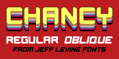
$29.00A short-lived TV game show from 1977 called “Second Chance” has its logo lettered in a bold, block type style with slightly chamfered corners. This inspired Chancy JNL, which is available in both regular and oblique versions. While “Second Chance” only lasted one season, the show was re-tooled - and debuted in 1983 as “Press Your Luck” – which ran until 1986. - Impact by URW Type Foundry,
$35.99Impact As its name suggests, Impact, a bold sans serif, is designed to make an impression on the reader. Obviously a display font, Impact makes use of its thick strokes and blocked style, to catch and hold the eye. Because Impact is so striking, it is best placed in plenty of white space so that it does not overwhelm any accompanying text. - Jane Plain NF by Nick's Fonts,
$10.00Here's a clean, simple architectural-blueprint style, eminently suitable for subheads and text blocks. Inspired by and named for a gentlewoman who gave up a career as an architect in Bolivia to care for the elderly in the United States. All versions of this font include the Unicode 1250 Central European character set in addition to the standard Unicode 1252 Latin set. - II Balfron by Increments,
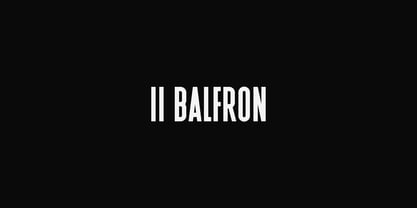
$19.00Inspired by Ernö Goldfinger's east London tower block of the same name, II Balfron is an imposing, all caps, one-weight typeface. Brutalist in form, the characters embody the principles of the distinctive 27-storey concrete profile with unexpected angles set within a rigid, structural grid. Much like Goldfinger's humanist, utopian housing ideals, the font is best viewed at large scale. - Blandit by Webhance,
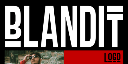
$18.00Blandit - Display & Logo Font family Blandit is a Display font family for design of minimalistic logos. The fonts are very much suitable for creating wordmarks, titles, taglines,Film Posters, headlines, Block letter, Subheading, Logo Designs, Big Banners. Classic & Decorative Typography Web Designs. Upper / lowercase glyphs Multilingual Support Webfonts included Free updates and feature additions Font Designed and Crafted by Webhance Studio. - Upstanding Pro by Multiformis,
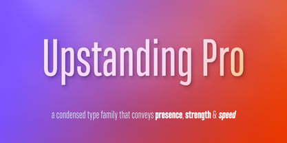
$10.99Upstanding Pro is suited for use as a display typeface, but legible enough to be used in small blocks of text (lighter weights), thus providing a lot of flexibility for all kinds of projects. Upstanding Pro conveys presence, strength and speed with the italics, yet conserving certain traces of sobriety and elegance. Want to make a statement? Use Upstanding Pro! - Raeling by Volcano Type,
$19.00Raeling is a display font inspired by a visit to Luxembourg, capturing shadows falling intricately from park railings appearing as broken-script lettering. A mixture of manmade / natural, traditional / new, ugly / beautiful reflecting the paradox and contradictions of the city. A single curve and stroke developed into a grid block from which characters emerged and broke free of their barriers and conformity. - Marins Perdus by Biroakakarati,
$9.00This font is inspired by graffiti calligraphy, it's only block letters in a modern style and more readable. The name "Marins Perdus" is from a novel by Jean-Claude Izzo "Les Marins Perdus", set in Marseille. The letters of "Marins Perdus" have a light inclination to the left, slim letters in a cool style, perfect for a title or a street event. - Precious Serif by G-Type,
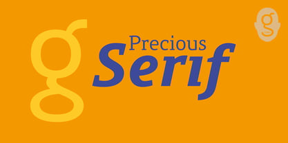
$60.00Precious Serif is a distinctive, modern slab serif typeface, first released in 2003 and now refreshed in 2017. This contemporary, chunky gem is the sister typeface to our Precious Sans family, both sets designed with similar metrics and characteristics to ensure they pair together seamlessly in print & digital applications. Mix Precious Sans & Serif together in a block of text to wonderful effect! - Town And Country JNL by Jeff Levine,
$29.00Town and Country JNL features a mix of block-style characters along with rounded ones found so often in the Art Deco fonts of the 1940s. Modeled from the hand-lettered title on a piece of sheet music from that era, this unusual coupling of two distinct design styles works despite it breaking all of the obvious rules of typography. - Fattern - 100% free
- Oldbrothers - Personal Use - Personal use only
- Megalito Slab ExtCond - Personal use only
- LT Soul - 100% free
- Champagne & Limousines - Personal use only
- FellFel - Personal use only
- Calico Cyrillic - Unknown license
- La Babaca - Personal use only
- LT Afficher Neue - 100% free
- Babylon Font - Unknown license
- Droid Serif - 100% free
