10,000 search results
(0.059 seconds)
- M Lady HK by Monotype HK,
$523.99 M Lady is a design inspired by Agfa Waddy’s rather elegant design comes with narrow proportion. M Lady is a rare condensed design in world of Chinese typefaces. Entry and finial points of strokes are squarish, with a sharp but small symmetric serif. It has a medium contrast to improve character recognition. Its thin stems (豎) make it suitable for fine print with minimal conglutination. Dots (點) are straight, reversely curved or round. Downstrokes (撇、捺), ticks (剔) and hooks (勾) are highly regular and consistent. Dots (點), downstrokes (撇、捺) and ticks (剔) are long, smooth, monolinear and curved with small symmetric serif and sometimes angled entry and finial points of strokes to create subtle sharpness in the midst of its softness and elegance, which is better for larger text print. Its features and construction create subtle sharpness in the midst of softness and slim elegance. It is best suited for casual subheading or display, set upright (non-slanted), non-condensed (naturally condensed).
 - Cybernaut by Studio K,
$45.00 Cybernaut is a bold, distinctive display font with a futuristic feel. It is ideal for all branding, advertising and publishing projects, and particularly well suited to science and science-fiction based applications. It boldly goes where no font has gone before!
 - Hendrix Bubble by Letterena Studios,
$17.00 Hendrix bubble is a modern and classic display font with its own unique style and modern looks. This typeface is perfect for an elegant & bold logo, book or movie title design, fashion brand, magazine, clothes, lettering, quotes, and so much more.
 - Racing Foner by Multype Studio,
$24.00 Racing Foner is a racing sport display font. A strong, bold and unique style instantly gives your design power and uniqueness. This font perfect font for sport or racing themed projects, such as logo, poster, games, product design and much more.
 - Toma Sunny by Letterena Studios,
$17.00 Toma Sunny is a modern and classic serif font with a unique style and bold look. This typeface is perfect for an elegant & luxury logo, book or movie title design, fashion brand, magazine, clothes, lettering, quotes, and so much more.
 - Broadletter JNL by Jeff Levine,
$29.00Modern digital typography pushes many designers to try and achieve visual perfection with their lettering. In the days of wooden type, the premise was more in creating a font that "sold" the message (possibly, in part due to the lack of advanced tooling to achieve uniformity). In many styles of wood type (such as the one used as a model for Broadletter JNL), there are vast differences within the character design, weight and symmetry from letter to letter. This is now looked upon as "old fashioned" and "charming" - part of the appeal of this typeface. - Molhim by Ethar Elaagib,
$79.00 About Molhim: I first designed Molhim in 2016 as a personal project to digitalize my handwriting. Molhim 2016 was a static typeface, including two weights, and supported basic Arabic only. Since it was my first typeface to design, it had several issues regarding letterform design and aesthetics, good curve drawing, proportions, font programming, and correct OpenType features. So, in 2019 I started redesigning my handwriting font from the beginning to produce a neat Multi-lingual typeface suitable for diverse purposes. Arabic letterforms are redrawn with a focus on proportions and unity. Molhim Variable characteristics: Supports basic Arabic, and Arabic script-based languages, such as Persian and Urdu. Supports Basic and extended Latin characters. Includes 200+ ligatures and alternate styles for a natural flow of letters. Latin small letters have both separated and connected script forms. The variable font comes in two axes, Weight (wght) and Softness (SOFT): The Weight axis ranges from thin to bold, while Softness changes the stroke's cap from a round cap to a sharp projecting cap. Although I see the new Molhim Variable as a different typeface, I decided to keep the name 'Molhim' for the new typeface with the addition of 'Variable'. Molhim is an Arabic word that means 'inspiring'; this is how I hope people would perceive my handwriting.
 - Hua by YXType,
$14.99 Hua type family is a sans-serif with very humanist details to represent the essence of nature. It features 14 weights from the very thin to the very bold, generously covering a wide range of the natural spectrum. Aiming to represent the soft and elegant side of nature, Hua features very unique italics that have their own take on the identity. The letterforms of the italic fonts are inspired by the lineage of both traditional calligraphic approaches for serifs and much simpler forms for sans-serifs. Hua provides very crisp performances on screens and its large x-height combined with fine-tuned proportions help it retain legibility very well on smaller sizes. Features: • Support for 200+ Latin languages • Double & single storie “a” & “g” • Unique italic letterforms • Low contrast with unique details • Small caps with symbols • Arbitrary and defined fractions • Support for superscript & subscript in normal & scientific alignments • Proportional lining, proportional old-style, tabular lining, tabular old-style
 - Ecatherina by BlessedPrint,
$23.00 Hi! It took me almost a year to design Ecatherina script. Finally it is available to purchase! Ecatherina script is an opentype font-family (15 fonts: 5 styles for 3 line thickness) with a bonus (editable wedding invitations, menu, quotes, letters, and more) HOW TO GET ACCESS TO ALTERNATES? Absolutely easy, just type a number after any letter: a1, a2, a3 etc Capital letters have 3-4 options and more. So just type E1, E2, E3 etc and find your favourite one! I found this method the most useful when you need to experiment with design very fast. All characters are available through Glyph panel as well, even more each of the alternate letter has it’s own unicode (PUA) so you can copy/paste from Apple Font Book or Windows Character Map. Total amount of glyphs 1436. Compatible with SILHOUETTE & CRICUT DESIGN SPACE WHAT IS INCLUDED BP-Ecatherina OTF & TTF It goes with 5 weights: Thin, Medium, Regular, Bold, UltraBold BP-Ecatherina-Ex1 The only difference between previous font is that thin line is a bit thicker. BP-Ecatherina-Ex2 Even more thicker line. Help.pdf Help file with most common questions. Bonus - Ecatherina.fig with editable wedding invitations (10+ designs 5x7 inches), menu, quotes, letters. Important! You need to install Figma application (it is free) to access files. With Figma application you can import bonus files and edit the text, export as png, pdf, svg and print it. Bonus - help.pdf file with general information how to work with Figma if you are new. It is very easy application and I recommend it to you! It works with MS Word, I included example.docx file so you can understand how to work.
 - Acid Bath by Bogusky 2,
$12.00Bold corroded font - Egyptienne75 Black by Wooden Type Fonts,
$15.00 Bold Serif style
 - Verdana - Unknown license

- DS Diploma - Unknown license

- Michaels - Unknown license

- Slenderz by CozyFonts,
$25.00 Slenderz is a handwritten font designed by Tom Nikosey, an American Graphic Designer specializing in Typographic Design and Illustration. Slenderz is available in Light, Medium & Bold weights. CozyFonts Foundry is Tom's intro into the world of font design. Slenderz is a casual, handwritten font that gives a reserved yet firm and legible personality to any headline or copy. Each of the 3 weights has it’s own personality yet like 3 brothers they represent the and belong to the same family. Intermixing Light & Bold or Medium & Bold won’t ruin the flow but will enhance it. Slenderz is the 9th font family from CozyFonts Foundry.
 - Praitor by Scriptorium,
$18.00Praitor is based on a devotional inscription to the goddess Diana found a short distance from Rome in 1887. It is an early style from before 100 BC and has some characteristics of Etruscan lettering. It's a rough, strong font which works very well for distinctive titles. - Pomponianus by Scriptorium,
$18.00Pomponianus comes from a 4th century inscription found in North Africa. It is an attractive example of early uncial lettering. Uncial inscriptions are quite uncommon, because although the style was well suited for writing on vellum, the curved letters made it more difficult to carve in stone. - Pigalle Swing by Autographis,
$39.50 Pigalle Swing is a very elegant script from the 1950s which I found some time ago in a similar but not so elegant version on Place Pigalle in Paris. I designed lots of alternate capitals and lowercase letters to make the font more usable and interesting. Enjoy!
 - Love Bug by PizzaDude.dk,
$20.00Yet another one of those romantic looking fonts. The lowercase looks pretty ordinary, while the uppercase swings around with a mixture of tagging / grunge / comicscript and casual handwriting. It works out extremely well with letters and stuff!. For fun, try writing in uppercase only...looks swell!! - Hebrew Latino by Wiescher Design,
$39.50 Hebrew Latino was started out of frustration. I could not find a font that looked like Hebrew - actually I found one, but it had only capitals. So I decided to make my own. Strangely enough it looks a little bit Jugendstylish! Here it is. Shalom! Gert Wiescher
 - Assay by Solotype,
$19.95This is our name for Antique Tuscan, of which there were many variations. This font came from a large lot purchased around 1970 from an east coast newspaper shop. Subsequently, we acquired several more versions of the face, but this one had lowercase so we used it. - Favorite Stencil JNL by Jeff Levine,
$29.00 Favorite Stencil JNL is inspired by and modeled after the classic hot metal typeface "Ludlow Stencil"; a design that enjoyed popularity around the 1950s and is not to be confused with Ludlow's similarly-named "Stencil" which was released in 1937. Available in both regular and oblique versions.
 - Show Card Brush JNL by Jeff Levine,
$29.00 A movie poster for the 1952 Dean Martin & Jerry Lewis comedy “Sailor Beware” had the text rendered in a casual style of brush lettering similar to that found on store show cards. This inspired Show Card Brush JNL, which is available in both regular and oblique versions.
 - Postea by TypeTogether,
$47.00 The Postea font family is Veronika Burian and José Scaglione’s take on German geometric typefaces, reshaped with the right attributes for setting paragraphs and headings, and perfect for branding and text use. Some typefaces are a rough tool, like a pumice rock: abrasive to the senses, unforgiving, and unhelpful for most reading situations. Postea is an obsidian: smooth and classy, with attractive nuances in any light. The classic curves and purposeful details keep its individuality intact while allowing it to fit an incredible range of geometric font needs. Because of these qualities, Postea makes normal reading in paragraphs a cinch and your branding memorable. Compared to midcentury attributes of restraint and a sparse appearance, Postea’s deliberate play between character widths injects life and distinctiveness into its personality. The default ‘t, f’ have lyrical doses akin to a robust evening drink and are rounded out with a serpentine ‘s’ and rotund ‘o, g, b’. Another nice surprise awaits: spacing for the Hairline weight is tighter for optimal use in large headings and titles, while the regular weights have the expected, slightly looser spacing for text. Setting the test word ‘bogarts’ brings all this together nicely, invoking a balance between a constructed and human feel while brushing away the dust from a century of derivatives. Postea is opinionated and its modern stylistic sets allow it to be accommodating with softer, specially-designed alternative characters. SS01 replaces ‘b, f, M, m, t’, while SS02 changes only the lowercase ‘a’ to the round style, and SS03 swaps out the angled ‘y’ for a straight version. The fourth and sixth stylistic sets are packed with wallpaper-worthy geometric patterns, ornaments, arrows, and symbols aplenty. Postea’s 14 styles (seven upright and italic) and two variable fonts are accompanied by an all-new family of icons in three weights, which we developed a new, easy way to activate. Simply bookend the desired icon name with colons (:arrowUp: :chargingStation: :aid: :firstAid:), making sure to capitalise each word after the first word, then highlight and activate SS05. Icons include wayfinding, social interface, sanitary precautions like face masks, thermometers, and hand washing, and much more. Postea is resilient in the number of ways the family can be used, and its recognisable characters make it a prime selection for branding, signage, corporate typefaces, and magazines. Beginning with midcentury virtues, Postea is the rational response for text — a lyrical take on geometric sans serifs.
 - Linden by Journey's End,
$12.00I hope that you enjoy the "Linden" font. The basis for this new font is my Leaf font. As much as I love the Leaf font, however, I felt (and still feel) the desire to have a larger font, for three reasons: 1. I enjoy customizing my internet browser to show different fonts. The original "Leaf" font was a bit too small for that. The new "Linden" font is perfect for this function. 2. Some of the fonts that I use in writing e-mails look their best at sizes 24 or 36. That’s fine for me, but unless I want to go to the trouble each time of changing the size, then the recipients oft my e-mails get wolloped with an enormous-sized font. When I use "Linden" for my e-mails, it’s automatically a perfect size at 12 or 14, solving this problem. 3. I also enjoy customizing the font in which I read my e-mails. Unfortunately, there are only a few which are legible in the tiny size in which this is configured. Again, "Linden" is configured to be large enough automatically so that it can easily be read by anyone. I am pleased to offer a pleasant font for use in any or all of the scenarios; I love fun solutions and hope that you will enjoy the "Linden" font. (Just a tip: when printing out documents using the "Linden" font, I love it best in font size 11!) - Sassoon Felt by Sassoon-Williams,
$48.00 Sassoon Felt’s more casual letterforms can be used either as informal text or for the teaching of reading and handwriting; having the letterforms most taught in UK schools. These fonts are an educators alternative to Comic Sans (from Microsoft) and Chalkboard (from Apple), which are more appropriate for ‘Print’ style writing in United States Elementary schools and may also be appropriate for parts of Australia, which can be identified usually by crucifix t, diagonal y downstroke, short f, two-stroke and there may be more. Free to download resources: How to access Stylistic Sets of alternative letters in these fonts
 - Mantika Sans Paneuropean by Linotype,
$67.99With its well-defined characters that are readily legible even in the small font sizes, Mantika Sans by Jürgen Weltin is ideal for typesetting. The elaborately designed and highly individual set of italics enhances the attractiveness of the font.Jürgen Weltin developed the Mantika™ Sans sans serif font using older designs for an serif font as his inspiration. Nothing more than the merest suggestion of the original serifs has survived. Bevelled line endings and the slight variation in thickness of verticals, in particular, provide Mantika Sans with a very dynamic character that evokes manuscript. Short ascenders and descenders give the font a compact appearance that is also underscored by its condensed proportions. Weltin has achieved his aim of producing a typeface with excellent legibility even in small sizes not just by means of the x-height, which is tall in comparison with the capital letters, but also by using clearly defined and well differentiated designs for critical letters, such as i", "I" and "l". Lower case "i", for example, has a serif while the "l" has a curved base.In addition to uppercase numerals, Mantika Sans also has lowercase or old style numerals that have been designed so that they can be used in both tabular and proportional settings. The uppercase numerals are slightly shorter than the uppercase letters, ensuring that the latter can be sympathetically incorporated within continuous text.The Mantika Sans italics are very unusual. They are inclined at only 4.5° (the usual angle for italics is 10 - 12°) and so appear to be almost upright. In addition, they also have quite distinctive forms. The overall effect calls attention to their curvilinear, manuscript character, enhances contrasts and further emphasizes the terminals. Weltin explains: "Within the variety of forms of the italics there are many contrasting terminal elements that create dynamism. The result is a diversity of interaction between the rounded and angular forms". Mantika Sans Italic thus has all the features of a display typeface, but can also be happily used on its own to set longer text passages. Mantika Sans is available in two weights; Regular and Bold, both of which have corresponding italics sets. Mantika Sans has been designed so that the widths of the four related cuts are identical, meaning that a change of font within a single layout will have no effect on justification. In addition, the members of the Mantika Informal font family, designed by Jürgen Weltin in 2010, also have the same thickness. Other font families having weights with equal thickness can be found in the "Linotype Office Alliance series".The Mantika Sans character sets are paneuropean. There are characters for setting texts in Eastern European languages, Greek and Cyrillic. There is also a range of special symbols, including right-angled brackets, subscript and superscript lower case letters, together with numerals, arrows and many different bullet points.As a vibrant and highly legible text font, Mantika Sans has a broad spectrum of potential applications. Its unusual italics are not just perfect for use in display text. The fact that it has only four cuts means that Mantika Sans is particularly suitable for office use or for the setting of business reports. Its excellent legibility even in the small font sizes also makes it ideal as a text for electronic reading devices; this also applies to Mantika Informal.At the 3rd International Eastern Type Design Competition Granshan 2010, Mantika Sans was awarded in the category Greek text typefaces." - Mantika Sans by Linotype,
$50.99 With its well-defined characters that are readily legible even in the small font sizes, Mantika Sans by Jürgen Weltin is ideal for typesetting. The elaborately designed and highly individual set of italics enhances the attractiveness of the font.Jürgen Weltin developed the Mantika™ Sans sans serif font using older designs for an serif font as his inspiration. Nothing more than the merest suggestion of the original serifs has survived. Bevelled line endings and the slight variation in thickness of verticals, in particular, provide Mantika Sans with a very dynamic character that evokes manuscript. Short ascenders and descenders give the font a compact appearance that is also underscored by its condensed proportions. Weltin has achieved his aim of producing a typeface with excellent legibility even in small sizes not just by means of the x-height, which is tall in comparison with the capital letters, but also by using clearly defined and well differentiated designs for critical letters, such as i", "I" and "l". Lower case "i", for example, has a serif while the "l" has a curved base.In addition to uppercase numerals, Mantika Sans also has lowercase or old style numerals that have been designed so that they can be used in both tabular and proportional settings. The uppercase numerals are slightly shorter than the uppercase letters, ensuring that the latter can be sympathetically incorporated within continuous text.The Mantika Sans italics are very unusual. They are inclined at only 4.5° (the usual angle for italics is 10 - 12°) and so appear to be almost upright. In addition, they also have quite distinctive forms. The overall effect calls attention to their curvilinear, manuscript character, enhances contrasts and further emphasizes the terminals. Weltin explains: "Within the variety of forms of the italics there are many contrasting terminal elements that create dynamism. The result is a diversity of interaction between the rounded and angular forms". Mantika Sans Italic thus has all the features of a display typeface, but can also be happily used on its own to set longer text passages. Mantika Sans is available in two weights; Regular and Bold, both of which have corresponding italics sets. Mantika Sans has been designed so that the widths of the four related cuts are identical, meaning that a change of font within a single layout will have no effect on justification. In addition, the members of the Mantika Informal font family, designed by Jürgen Weltin in 2010, also have the same thickness. Other font families having weights with equal thickness can be found in the "Linotype Office Alliance series".The Mantika Sans character sets are paneuropean. There are characters for setting texts in Eastern European languages, Greek and Cyrillic. There is also a range of special symbols, including right-angled brackets, subscript and superscript lower case letters, together with numerals, arrows and many different bullet points.As a vibrant and highly legible text font, Mantika Sans has a broad spectrum of potential applications. Its unusual italics are not just perfect for use in display text. The fact that it has only four cuts means that Mantika Sans is particularly suitable for office use or for the setting of business reports. Its excellent legibility even in the small font sizes also makes it ideal as a text for electronic reading devices; this also applies to Mantika Informal.At the 3rd International Eastern Type Design Competition Granshan 2010, Mantika Sans was awarded in the category Greek text typefaces."
 - Maudhia by BBA Key,
$12.00Hello, all. I Want To Introduce New Fonts Maudhia Script Maudhia Script New fresh & modern style with handmade calligraphy, decorative characters and dancing lineage! So wonderful are invitations like greeting cards, branding material, business cards, quotes, posters, and more !! Maudhia Script The comes with 331 glyphs. Alternate characters are divided into several Open Type features such as Swash, Stylistic Sets, Stylistic Alternate, Contextual Alternate. Open Type features are accessible by using Open Type savvy programs such as Adobe Illustrator, Adobe InDesign, Adobe Photoshop Corel Draw X versions, and Microsoft Word. And this font has code PUA unicode (font with special code). So that all alternative characters can be easily accessed by craftsmen or designers. Maudhia Script Uppercase & lowercase International signature & symbol Punctuation Support & PUA number Unicode Style Style Alternative Style Style Range 1-6 Contextual Character Variations. If you do not have programs that support OpenType features like Adobe Illustrator and CorelDraw X Versions, you can access all alternative flying machines using Font Book (Mac) or Character Map (Windows). Thanks and good luck :-) Thank you for buying! - Icebold by Balpirick,
$15.00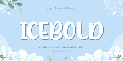 ICEBOLD is a Fun and Bold Hand brushed Font. ICEBOLD is perfect for product packaging, branding project, magazine, social media, wedding, or just used to express words above the background. It support multilingual. Enjoy the font, feel free to comment or feedback, send me PM or email. Thank you!
 - Adinkra Symbols by SymbolMinded,
$39.99 The Adinkra name, by legend, comes from the King who was conquered by the Ashante people of Ghana. The king, Adinkra, wore wonderful patterned fabrics. Adinkra means “goodbye,” and the symbols were reserved for funeral garments. Today the symbols are part of the Ghana popular culture and around the world. You will find the symbols on everything from housing, clothing, to tattoos. These 100 symbols are accompanied by the Ghana name, a loose translation and what the symbol has come to represent. The meanings and symbols are by no means the complete list and some people do not use the exact same translations and meaning as you will find here. These are for casual use and not historical or anthropologically completely accurate.
 - KR Wiccan Symbols by Kat Rakos is like the mystic cousin in the font family who turned the attic into a spell-casting room. Imagine if your keyboard was imbued with magic, and each keypress invoked a...
- Kugelhopf JF by Jukebox Collection,
$32.99 Kugelhopf is a calligraphic style font with an old-world Blackletter feel to it. Full of charm and flair, this friendly script font will lend a sense of childlike magic to any design. Perfect for themes relating to holidays, fairy tales, storybooks and even Renaissance designs, Kugelhopf was inspired by a hand-lettered sample in an old book about sign painting. It can also be used for cards, invitations and scrapbooking as well! ‘Kugelhopf’ is a German & Austrian holiday yeast cake from which our modern western Bundt cake was derived. It has a particular shape that is said to be inspired by Turkish turbans. Jukebox fonts are available in OpenType format and downloadable packages contain both .otf and .ttf versions of the font. They are compatible on both Mac and Windows. All fonts contain basic OpenType features as well as support for Latin-based and most Eastern European languages.
 - Bethlehem Star by HiH,
$10.00 For much of the world, the last half of December encompasses the beginning of winter and the a season of gift-giving, marked by Hanukkah and Christmas. It is generally accepted that the tradition of giving of gifts at this time was begun by The Three Wisemen. As described in The Gospel According to Matthew, the wisemen, led by a star from a distant land to the east, found the baby Jesus. First, they worshipped him and then, "they presented him with gifts: gold, frankincense and myrrh." (Matthew 2:11). Thus began the tradition of celebrating the birth of Christ with the giving of gifts. There is a parallel tradition in the Jewish faith of the giving of gelt or gold at Hanakkuh to help support poor students, in keeping with the rich history of scholarship that is fundamental to the rabbinic system. Inevitably, in our secular culture, there has been a blending and a secularization of these traditions. The reasons have gotton lost in the “gimme.” What is often overlooked is what Paul realized when he told Timothy, “Neglect not the gift that is in thee.” The most importent gift is the gift inside of us, the gift of sacrificial love for others. When we let that gift be diminished in our minds amid the clutter of modern day material seeking, we can recall the prophesy of Micah over 2800 years ago, But thou, Bethlehem Ephratah, though thou be little among the thousands of Judah, yet out of thee shall he come forth unto me that is to be ruler in Israel: whose goings forth have been from of old, from everlasting." (Micah 5:2 KJV) Never underestimate the impact you have on others. Words of kindness can change people’s lives. The Talmud says that the highest form of wisdom is kindness. Be wise this holiday season. The font BETHLEHEM STAR was originally designed for the church to which I belong, The Star Bethlehem Church of Ansonia, Connecticut, USA and is based on the typeface Accent with the permission of URW++ of Hamburg, Germany. You might choose BETHLEHEM STAR for your personal greetings as well as for flyers and programs at your church this holiday season. Like most display fonts, it is most effective at 18 points and larger. Like most script fonts, it is most effective when set with both upper and lower case. All caps with this font is like eating two pieces of pecan pie — too much of a good thing.
 - Graffiti Bomerang by Nirmana Visual,
$22.00 Graffiti Bomerang is a bold display font that captures the rebellious spirit of street art. Its thick, uppercase letters feature jagged edges and unique embellishments that evoke the look of spray-painted graffiti. This font is perfect for creating eye-catching titles and headlines for urban-inspired designs, music posters, and other projects that require an edgy and daring style. The font’s bold and unapologetic personality is sure to make a statement.
 - Antique Vintage by Arendxstudio,
$15.00 Antique Vintage - Script font is a type of font that features thick and prominent strokes, giving it a bold and impactful appearance. The letters are usually interconnected, creating a flowing and handwritten look. The boldness of the font makes it stand out and grabs attention, making it a popular choice for headlines, titles, and logo designs. It exudes confidence, strength, and creativity, making it suitable for various design projects that require a strong visual impact.
 - Panderman by theulum studio,
$10.00 panderman is a simple modern san serif font with 4 font styles. Simplicity and modernity are the basis for making this font. Perfect for branding, logos, invitations, mastheads, and more. The panderman also includes the full set: Uppercase and Lowercase Multilingual Symbol Number Punctuation Alternative multilingual 4 font styles (Regular, Italic, Bold, & Bold Italic) Hope you enjoy our fonts and if you have any questions feel free to message & I'm happy to help. Thank you.
 - Drexel JNL by Jeff Levine,
$29.00 The bold hand lettered title on the 1940 sheet music for the band piece "Drexel Marching Song" was the inspiration for Drexel JNL; available in both regular and oblique versions.
 - Noonvlix by ArashiGames,
$30.00 A font designed in the style of vintage stencil show-cards. Uses bold chunky geometric shapes to form characters. This font is great for creating titles for books and products.
 - Gwyner by Typomancer,
$24.00 Gwyner, a strengthened didone with sharp and clean characteristics, comes with thin to bold weights and is suitable in italic for various uses. A condensed family for space-saving design.


