297 search results
(0.017 seconds)
- FF Spoken Trial - Personal use only

- Axial Caps Med - Personal use only

- FF PQR Trial - Personal use only

- FF Comma Trial - Personal use only

- Calligraphia Latina Dense by Intellecta Design,
$20.90 - Calligraphia Latina 2 by Intellecta Design,
$24.90
- Calligraphia Latina Mixed by Intellecta Design,
$22.90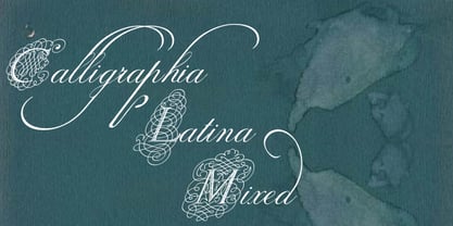
- Calligraphia Latina Versals by Intellecta Design,
$23.90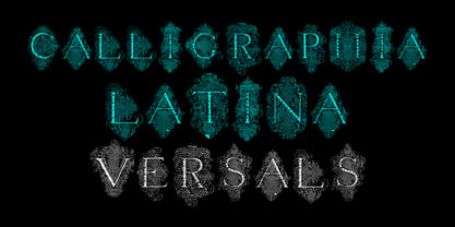
- Calligraphia Latina Soft by Intellecta Design,
$26.90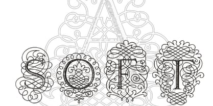
- Child's Play Trial Version - Unknown license

- Killer Ants Trial Version - Unknown license

- Varial Two Super Rounded by Paavola Type Studio,
$21.00
- Faqro Extended Wide Trial - Personal use only

- Faqro Extended Expand Trial - Personal use only

- Fear Logo Fires Trial - Personal use only

- Calligraphia Latina Soft 2 by Intellecta Design,
$24.90
- Calligraphia Latina Soft 5 by Intellecta Design,
$20.90
- Calligraphia Latina Versals Two by Intellecta Design,
$21.90 - Calligraphia Latina Soft 3 by Intellecta Design,
$22.90 - Calligraphia Latina Soft 4 by Intellecta Design,
$25.90
- Albany by Monotype,
$29.99 - Ongunkan Latin Runic by Runic World Tamgacı,
$45.00
- ZRex - Unknown license

- Angel Tears - Personal use only

- Yaroslav - Unknown license

- Valuxe by Gholib Tammami,
$14.00
- Inlove by Sudtipos,
$29.00
- KiddieGrinder - Unknown license

- Santino by Sudtipos,
$39.00
- BN-Old Fashion - Unknown license

- BN-Outer Line - Unknown license

- BN-Blurry Day - Unknown license

- Boqueta by BRtype,
$18.00
- Nowie Vremena by ABSTRKT,
$30.00 - Easter Parade - Unknown license

- airbrush - Unknown license

- Eddie - Unknown license

- Xero by Megami Studios,
$12.50
- Alien Marksman - Unknown license

- Paris ND by Neufville Digital,
$29.60


