4,551 search results
(0.019 seconds)
- Zentenar Fraktur by RMU,
$25.00 The name of this blackletter font was chosen due to the centennial of the Bauer Foundry, Frankfurt am Mai, in 1937. Ernst Schneidler probably created then the most beautiful of all fraktur fonts. They are the fruit of countless calligraphic drawings and of many years of professional experiences. Zentenar Fraktur became in its time the workhorse among German blackletter fonts. To access all ligatures in both styles, it is recommended to activate Standard and Discretionary Ligatures. The round s can be reached by typing the # key, and the combination N-o-period plus the OT feature Ordinals gives you the Numero sign.
 - Sweet Darkness by Gassstype,
$23.00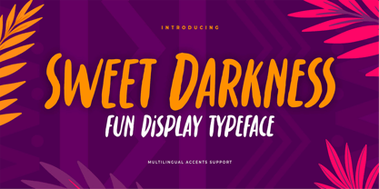 Hello Everyone, introduce our new product Font Sweet Darkness is a Fun Display Typeface .This is a Textured Natural Style and classy style with a clear style and dramatic movement. This font Sweet Darkness is great for your next creative project such as logos, printed quotes, invitations, cards, product packaging, headers, Logotype, Letterhead, Poster, Design this font is great for your creative projects such as watermark on photography, and perfect for logos & branding, invitation,advertisements,product designs, stationery, wedding designs,label ,product packaging, special events or anything that need handwritting taste. You can activate Ligatures glyphs and Alternates glyphs OpenType panel.
 - Ristella by Mans Greback,
$59.00 Ristella - a logotype script font. This high-quality typeface is created by Måns Grebäck. Its style is bold and has large, attention-grabbing uppercase letters. Ristella contains alternate and stylistic alternates, as well as multiple ligatures. With its hundreds of glyphs it also has support for a wide range of languages. How do you make a swash? Combine an ending and a tail to make a swash. Endings are found in the following symbols: [ ] { } Tails are found in the following symbols: < > § _ ¤ Example: Ristella}> With ligatures activated, write multiple tail symbols to make a longer swash. Example: Tailextender]¤¤¤
 - Bailamore by 38-lineart,
$19.00 Bailamore is a retro boldscript font. We're pouring the lettering styles into fonts. As much as possible we make this font well integrated with spacing and balance of space. We made 159 ligatures. Activate the ligature mode and you are like being a lettering artist, plus 85 alternates to enrich the feel of lettering. This font consists of 3 fonts, namely regular, outline and shadow. Regular stands alone, while outline and shadow are complementary if you want a 3D extrude impression. Please see the video torial here: https://youtu.be/H71JEgEOows Please try and enjoy the retro bold Bailamore script
 - Knockoff by Gassstype,
$23.00 Hello Everyone, introduce our new product Font Knockoff is a Fun Display Font.This is a Textured Natural Style and classy style with a clear style and dramatic movement. This font Knockoff is great for your next creative project such as logos, printed quotes, invitations, cards, product packaging, headers, Logotype, Letterhead, Poster, Design this font is great for your creative projects such as watermark on photography, and perfect for logos & branding. That is has charming, authentic and relaxed characteristic more natural look to your text You can activate 6 Alternates glyphs and 14 Ligatures glyphs OpenType panel.
 - SK Parnik by Shriftovik,
$32.00 SK Parnik is a modern display font inspired by the culture of vegetarianism. This font is based on the shape of a bean pod, which gives the symbols a unique playful character, perfect for working with the branding of companies that are aimed at a children's audience, as well as engaged in restaurant activities. The character composition consists of uppercase and lowercase letters and supports extended Cyrillic and Latin letters. This allows you to expand the scope of this font. Despite the pronounced decorative component, thanks to its tools, the font will fit perfectly into the collection of any designer.
 - Another Story by Gassstype,
$23.00 Introducing Another Story is All Caps Display Font Authentic that is written casually and quickly. Then scanned and carefully drawn into vector format. This handmade font will make your design has a beautiful natural touch for each details. It is perfect for any design project as Invitation,logo, book cover, craft or any design purposes. That is why Another Story has charming, authentic and relaxed characteristic more natural look to your text with a more natural look to your text. You can activate Ligature OpenType panel design more interesting. Another Story is perfect for homeware designs,branding projects, Logo design, Quotes product packaging.
 - Kanote by Letterhend,
$15.00 Introducing, Kanote. A Whimsical display font. This typeface is have a playful and casual look, very suitable to use for headline, title, logo or anything especially related with fun themed design project. Features : uppercase & lowercase (alternates) numbers and punctuation multilingual PUA encoded We highly recommend using a program that supports OpenType features and Glyphs panels like many of Adobe apps and Corel Draw, so you can see and access all Glyph variations. How to activate opentype feature : https://letterhend.com/tutorials/using-opentype-feature-in-any-software/ Email us to letterhend@gmail.com if you need something! Happy Designing!
 - Miklos by George Tulloch,
$21.00 The gifted Hungarian punch-cutter and printer Miklós Kis was active in Amsterdam in the 1680s. Among the many fonts that he cut during those years were a ‘mediaen’ (pica-sized) roman and italic, and the digital Miklós fonts are an interpretation of these ‘mediaen’ types. The character set has been extended to cover all the European languages that use the Latin alphabet, and the fonts offer OpenType features such as small capitals; old-style and lining figures, both proportional and tabular; fractions; superior and inferior numbers; superior alphabet; contextual and stylistic alternates; and intelligent application of long ‘s’.
 - Artka by Gassstype,
$23.00 Hello Everyone, introduce our new product Font Artka is a Fun Display Font.This is a Textured Natural Style and classy style with a clear style and dramatic movement. This font Artka is great for your next creative project such as logos, printed quotes, invitations, cards, product packaging, headers, Logotype, Letterhead, Poster, Design this font is great for your creative projects such as watermark on photography, and perfect for logos & branding, invitation,advertisements,product designs, stationery, wedding designs,label ,product packaging, special events or anything that need handwritting taste. You can activate 14 Alternates glyphs OpenType panel.
 - Nice Postman by Gassstype,
$23.00 Hello Everyone, introduce our new product Font Nice Postman is a Fun Brush Font .This is a Textured Natural Style and classy style with a clear style and dramatic movement. This font Nice Postman is great for your next creative project such as logos, printed quotes, invitations, cards, product packaging, headers, Logotype, Letterhead, Poster, Design this font is great for your creative projects such as watermark on photography, and perfect for logos & branding, invitation,advertisements,product designs, stationery, wedding designs,label ,product packaging, special events or anything that need handwritting taste. You can activate 19 Ligatures glyphs and Alternates glyphs OpenType panel.
 - Denominary by Balibilly Design,
$19.00 Denominary typeface is about precision, beauty, and refinement. It's crafted with care and attention to detail for professional creative people who value quality and distinction. The Denominary typeface has an advanced feature that sets it apart from others: auto-active contextual alternates. Our font engineer writes this feature to minimize kerning between characters automatically, making it very convenient and easy to use, especially for web purposes where minimal kerning means a smaller font size. The feature adjusts the kerning based on the specific characters being used, ensuring optimal spacing between letters. Contextual alternates will push your typography project to a balanced form. We designed the letterform by considering the white space and contrast to get a natural voice and fluid, and of course, this will happen in a legible and stylish. Denominary typeface offers extensive language support and stylistic variations, thanks to its 482 glyphs. It also has discretionary ligatures, case-sensitive forms, and slashed zeroes for added typographic options. The condensed style saves space, and seven weights will provide more options. Denominary typeface brings refinement, exclusivity, and sophistication to any design project. It's a typeface that tells a story of precision, beauty, and distinction. Go ahead with the game in terms of its advanced auto-active contextual alternates feature, giving you a competitive edge in the design field.
 - Marian Churchland by Comicraft,
$39.00 Tall, thin and elegant, Marian Churchland’s fonts are very much like her.. and now available from those awfully nice chaps at Comicraft to allow you to pretend that you are too! Marian Churchland was born in Canada in 1982, and was raised on a strict diet of fine literature and epic fantasy video games. She has a BA in Interdisciplinary Studies (English Literature and Visual Arts) from the University of British Columbia, and has been doing professional illustration work, including book covers and magazine articles, since she was 17. Last year, she became the first woman to solo-illustrate a CONAN story, and this year she’s illustrating three issues of ELEPHANTMEN for Image Comics. See the families related to Marian Churchland: Marian Churchland Journal.
 - Hello Margarine by Prioritype,
$23.00 Groovy fonts are here again. Yes, "Hello Margarine" is a hand drawn typeface with a bold, funny and fun feel. Comes in 3 styles, namely Regular, Outline and Extrude. When combined, it will be a great visual and practical in use. Features: Uppercase, Lowercase, Numeral, Punctuation & Multilingual. Multilingual contained: Afrikaans, Albanian, Asu, Basque, Bemba, Bena, Breton, Catalan, Chiga, Cornish, Danish, Dutch, English, Estonian, Filipino, Finnish, French, Friulian, Galician, German, Gusii, Indonesian, Irish, Italian, Kabuverdianu, Kalenjin, Kinyarwanda, Luo, Luxembourgish, Luyia, Machame, Makhuwa-Meetto, Makonde, Malagasy, Manx, Morisyen, North Ndebele, Norwegian Bokmål, Norwegian Nynorsk, Nyankole, Oromo, Portuguese, Quechua, Romansh, Rombo, Rundi, Rwa, Samburu, Sango, Sangu, Scottish Gaelic, Sena, Shambala, Shona, Soga, Somali, Spanish, Swahili, Swedish, Swiss German, Taita, Teso, Uzbek (Latin), Volapük, Vunjo, Zulu. Thanks!
 - Echelon by Barnbrook Fonts,
$50.00 Echelon is based upon 1970s Eastern European ‘pipe-style’ typefaces. This style of Communist consumer typography came from what, at the time, seemed like a bizarre mirror universe: Existing alongside the West, similar-but-different, essentially unknowable. Even though the letterforms had the same historical origins as their Western equivalents, they also had their own bizarre fashionable/unfashionable aesthetic. The parallels between the surveillance practices of the Soviet Union and those of today’s Western governments informed the naming of this typeface. Echelon is the codename for a massive international surveillance system that collects and processes data from communications satellites. It can eavesdrop on telecoms and computer systems, it can track bank accounts. It can record and store information on millions of individuals.
 - SomaSlab by ArtyType,
$29.00 The 'Somatype' range has expanded further with this latest addition to the collection, titled SomaSlab. Although the basic letterforms are the same as in the generic Somatype family, the introduction of slab-serifs to appropriate characters has transformed the typeface into something new, creating a completely different styling in the process and striking a pleasing balance between classic & contemporary styles. The fishtail and curved serifs on certain characters also introduces a unique quirkiness, making SomaSlab stand out alongside most classic slab serif fonts. Some alternative characters are available too, together with an extended Latin glyph set, allowing users a variable choice and great versatility for text settings. SomaSlab comes in both Regular & Slanted styles, each in 4 practical weights, providing plenty of flexibility on any creative project.
 - Carlin Script by Linotype,
$40.99The Carlin Script family, inspired by the Carolingian minuscule alphabet (ca 800 A.D.), is one of the great new families available through Linotype's Library's Take Type 5 collection. Take a closer look at these beautiful characters; with them, one can create a different, more personal feeling than commonly comes from more available script and chancery fonts. Like a monk with his writing table, German designer Hans-Jürgen Ellenberger created this new design, which includes 10 different weights, bringing scribal excellence directly to your keyboard. The Carlin Script family includes an additional Initial set-allowing the creation of medieval-flavored drop or initial caps in snap. And the critics are raving: Carlin Script was a winner in the New York-based Type Directors Club's 2003 Type Design Contest!" - Artifex CF by Connary Fagen,
$35.00 Designed for easy reading of long passages, Artifex CF's smoothed-off serifs help the flow of text without unnecessary visual noise. Artifex's even rhythm and mellow tone make it an excellent option for books, magazines, articles, blogs, captions, and longform texts. A near-upright italic adds emphasis and urgency with elegance. Artifex also doubles as a handsome display typeface, scaling gracefully with charming details revealing themselves at large sizes. Artifex CF pairs nicely with bold, clean sans-serifs, such as Greycliff CF and Visby CF. Artifex also has a sibling typeface, Artifex Hand CF, cut from the same cloth, but with subtle flares in place of the serifs. All typefaces from Connary Fagen include free updates, including new features, and free technical support.
 - Apocalypso by Barnbrook Fonts,
$30.00 Apocalypso is a pictogram font for the end of the world. The name Apocalypso is a portmanteau of the words apocalypse (end of the world) and calypso (joyful improvised music), with a meaning analogous to the idiom ‘fiddling while Rome burns’. The Apocalypso family is more of an art project than a practical font and contains a series of crosses and pictograms. The crosses add decorative detailing to typographic layouts, whilst the pictograms can be deployed to express the forthcoming apocalypse. Apocalypso was originally published in 1997, a few years before the turn of the millennium. It is both a document of the ideas of the time and a scarily prophetic vision of a possible world that has now largely come to pass.
 - Ongunkan Kensington Runestone by Runic World Tamgacı,
$70.00 The Kensington Runestone is a rune-covered slab of brownstone that was claimed to have been discovered in central Minnesota in the United States in 1898. Olof Öhman, a Swedish immigrant, reported that he dug it out of a field in the largely rural town of Solem in Douglas County. It was then named after the nearest settlement, Kensington. The inscription claims to be a record left behind by Scandinavian explorers in the 14th century (internally dated to 1362). There has been a long-standing debate as to the stone's authenticity, but since the first scientific review in 1910, scientific consensus has classified it as a 19th-century hoax, and some critics have directly accused Öhman of fabricating it. there is community.
 - Heather Flourish by Krntype Studio,
$18.00 Introducing Heather Flourish font Heather Flourish is a signature font created to impress an elegant and luxurious look Heather Flourish is perfect font for branding & logo projects, such a photography studio, clothing/fashion studio, also suitable for Product Packaging, Title on your article or book cover, Stationary, and many more. this font has a ligature and swash which you can access by typing the letters a-g You can try it first by typing the name you want below, I hope you can create amazing custom personal signature or logo with this font you can buy this font at https://www.myfonts.com/foundry/krntype-studio/ Enjoy the font, feel free to comment or feedback, send me PM or email at krntype@gmail.com. Thank you!
 - Le Monde Livre Std by Typofonderie,
$59.00 A text face in 4 styles Before the arrival of Phototypesetting, each font size had a specific design. Le Monde Livre, designed by Jean François Porchez, along with Le Monde Journal re-establishes this practice. When Le Monde Journal was developed specifically for use at small point sizes (below 10 points.) Le Monde Livre works beautifully for book typography, magazine settings. In comparison to the italics in Le Monde Journal, Le Monde Livre’s italics are of a totally different design, closer to the models of the Renaissance. The families match well together on the same page, Le Monde Journal for small sizes settings, Le Monde Livre for large settings. The verticals metrics and proportions of Le Monde Livre are calibrated to match perfectly others Typofonderie families.
 - School Age by Jeff Levine,
$29.00 The “Trixy Toy Educator” was a 1930s-era set of letters and numbers (along with a few animal shapes) for teaching children, and was manufactured by the Durrel Company of Gardner, Massachusetts. Die cut from thick cardboard, the 40 piece set also included a rack to display the characters, presumably for little ones to practice the correct order of the alphabet and basic numerals or to spell simple words like ‘dog’ or ‘cat’. Whomever came up with the idea, they used the most rudimentary and unusual ‘type design’ shapes in the A-Z and 0-9, but they were just odd enough to inspire a digital type version of them. School Age JNL is available in both regular and oblique versions.
 - Adelbrook by Vibrant Types,
$36.00 Adelbrook is a dynamic serif typeface that keeps calm. It enriches text with the archaic structure of humanist type, because its characters arrange in a harmonious rhythm with a dynamic stroke, asymmetric serifs and stems that lean in the direction of reading. These characters have gravity and are firmly on the baseline. The tapered stems define a heaviness that end in emphasized foot serifs. Actually all the details are heftier the lower they are. This is particularly evident in a subtle vertical hairline variation, light or unapplied head serifs, and clipped upper dots. The clearness of the semi-serif italics with a brushy nature integrates perfectly in a subtle way. All these details result in a sophisticated text typeface with a sharp contemporary design.
 - Parliament by Hoefler & Co.,
$49.99 The Parliament typeface was designed by Jonathan Hoefler beginning in 1995. A burlesque typeface in the Regency Blackletter style, Parliament was inspired by the ‘Four-line Pica Black No. 1’ typeface of William Caslon Jr (1821), whose enigmatic design for the letters E, G, I, N, V and Y hinted at a broader ambition to modernize the arcane shapes of the gothic alphabet’s capital letters. Parliament completes this project for the first time by including two sets of alphabets, one archaic and one modern, along with a third set of ‘small caps’ that restores to the blackletter the versatility of Roman type. Parliament was first used for the 1998 ATypI Conference in Lyon, and was published by Hoefler&Co in 2022.
 - Clarinette by Océane Moutot,
$32.90 Clarinette is a sophisticated 32-style typeface designed to strike a harmonious balance between softness and sharpness. Carefully crafted with triangular serifs, it exudes visual strength and carries a distinctive personality. Meanwhile, its gentle and dynamic lines add a touch of elegance. With a wide range of weights, Clarinette offers exceptional versatility. Its display and book versions enable seamless multitasking, making it suitable for various applications. From magazine titles to newspapers and logotypes, its high contrast version demands attention. Similarly, the low contrast variant provides a practical choice for text and editing purposes. Embrace the artistry of Clarinette, where the fusion of softness and precision creates an enchanting visual presence. Let your designs transcend boundaries and captivate with refined elegance.
 - Big Welly by Inclusive Fonts,
$19.95 Big Welly …in the United Kingdom we have a very British phrase which is ‘Give it some Welly (Wellie)’ this is often shouted to a person as encouragement or criticism, it asks for more effort to be put into whatever he or she is doing. The saying comes from an informal name for Wellington Boots; Wellies - named after The Duke of Wellington. Hence, ‘Big Welly’ the font, this font is bold and big on the one hand and handwritten on the other. These two attributes make this font ideal as a poster font or t-shirt font for instance to make your message really stand out. So, if you need a bit of added oomph in your design – look no further than ‘Big Welly’.
 - Latex by Canada Type,
$29.95 Latex was initially a single multi-script all-cap font commissioned in 2012 by a company we can't name, to market a billion-dollar superhero movie we also can't name. A year later the commission grew to include a shaded variant and a set of DIY-like fonts, with different layering possibilities for dimensional manipulation. Each of the five Latex fonts come with a character set of over 600 glyphs, supporting the vast majority of Latin languages, as well as Cyrillic and Greek alphabets. Lots of stylistic alternates are also included, including some for Cyrillic and Greek. Superheroes are cool, though their costumes need more pockets, for credibility's sake. Maybe some superheroines should find something more practical than stilettos. Or maybe not. But definitely more pockets.
 - Bourgeois Rounded by Barnbrook Fonts,
$75.00 Bourgeois Rounded is built upon the framework of Bourgeois, our popular geometric type family. As with the sans-serif Bourgeois Rounded letterforms are contemporary in look and feel. Echoing late 20th century modernism in style, Rounded’s overall look is clean and sleek, more ephemeral and dynamic than Bourgeois’s pared-down asceticism. The Rounded’s place in the history of font is a complex one. Being lauded for their legible characteristics and also at the same time their fashionable qualities, looking ultramodern and nostalgic, readable and highly stylised, authoritative and playful. Bourgeois Rounded and Rounded Condensed when combined, offer 24 styles suited for text of all kinds and sizes. Both are particularly good for short pieces of text requiring a sense of urgency or playfulness.
 - Elizabeth by ParaType,
$30.00 The hand composition typeface was developed at the Ossip Lehmann type foundry (St. Petersburg) in 1904-07 (after designs by Alexander Leo?). It was redeveloped at Polygraphmash in 1960s for slugcasting composition. Named after Russian Empress Elizabeth I (1709-61). Based on typefaces of George Revillon type foundry of 1840s, though some characters’ shapes were redrawn similar to Russian Academy of Sciences typefaces (mid-18th century). Sharp contrast, strong weight Modern Serif with archaic flavor. The typeface is useful in text and display composition, in fiction, historical, and art books, especially connected to the 18th or 19th centuries. It looks great in Russian classical literature such as Pushkin and Gogol works. The revised, improved and completed digital version was designed at ParaType in 2001 by Lyubov Kuznetsova.
 - Donchenko Serif by Donchenko,
$15.00 Donchenko Serif is a leisurely, elegant, minimalist serif typeface that combines references to medieval half-uncials with Art Nouveau motifs. Its styles are well readable and at the same time have individual features, which makes this typeface stand out from the rest. Donchenko Serif is a "universal soldier". It's great for any challenge. It is also good for typing books or articles, designing corporate identity and promotional materials, or creating display cases. A wide range of Latin, Greek, Cyrillic and special characters provides extensive language support for all European languages. Font Donchenko Serif Regular was developed by designer Oleksandr Donchenko in Lviv (Ukraine) in the first half of 2022. His daughter - Sofia Donchenko - took part in the development some letters. Donchenko Serif - Good font for good people!
 - HWT Showcard Script by Hamilton Wood Type Collection,
$29.95 Described as “An extended script type that lends itself well to fine fashion, ready-to-wear and all quality merchandise” in a marketing blurb pitching Beaufont by the Morgan Sign Machine Company of Chicago for their Line-O-Scribe sign printing system. This advertising script font was originally manufactured exclusively for Morgan Sign under license by the Hamilton Wood Type Manufacturing Company. The source patterns and original artwork for this typeface exist in the archives of the Hamilton Wood Type & Printing Museum, and were used for this fresh digitization of this font. This digital take includes alternate letters as originally designed in the mid-century wood type version, and now includes a full extended latin character set with over 350 characters.
 - Capital Love by Harald Geisler,
$68.34 Capital Love just contains capital letters decorated with hearts. By pressing a lowercase button a alternative to the uppercase letter will appear. All shapes are drawn individually and do not oblige a geometrical system. The lighthearted vivid ductus remind me of a quality that can be found in the dynamics of Keith Haring drawings. Capital Love is a part of the Light Hearted Font Collection that is inspired by a recording of Jean Baudrillard with the title, "Die Macht der Verführung" (The Power of Seduction) from 2006. Further inspiration came from the article, "The shape of the heart: I'm all yours". The heart represents sacred and secular love: a bloodless sacrifice. by British writer Louisa Young printed in EYE magazine (#43) London, 2002.
 - HWT Lustig Elements by Hamilton Wood Type Collection,
$24.95 'Euclid. A New Type,' originally designed in the 1930s by modern American designer Alvin Lustig (1915-1955), has been revived as 'Lustig Elements' through a collaboration of designers Craig Welsh and Elaine Lustig Cohen. Only twelve letterforms from the original font design had been retained in archive material in the many decades since its initial development. Lustig Elements combines four simple, geometric shapes aligned to an underlying grid with letterform designs that hold true to the spirit of the original font. Lustig Elements initially came to life in 2015 as wood type cut at Hamilton Wood Type & Printing Museum. The digital version expands on the basic character set with a pro expanded latin character set, small caps and even an Inline variation.
 - Scriptuale by Linotype,
$29.00The Scriptuale family, which contains eight styles, is a contemporary upright calligraphic face. Designed by German designer Renate Weise in 2003, this family of typefaces speaks to the present, while at the same time reflecting on a lyrical past. The letterforms of the Scriptuale family are romanticized, they reference German calligraphic styles from the 19th and early 20th Centuries. For instance the design of Scriptuale's uppercase strays from the canon of classical proportion into romantic idealism. While the C and O are drawn according to the ancient quadratic proportions - almost twice as wide, optically, as the E or the L - the letter A is wider than would be expected, and the D narrower. These subtle differences introduce a different rhythm into text set in Scriptuale than Italic styles of calligraphy may offer. Scriptuale's Gs merit special notice: both the upper and lower case G lunge slightly forward, further enhancing the dynamic quality of the text. Also unique in Scriptuale's design is the lowercase width: the letterforms appear slightly condensed; they have large x-heights to compensate for this. In a delightful twist, the number 2's beak has been closed by drawing it full-circle, back into the stem: this references a style of letter design that was practiced, among other places, by artists from the old Klingspor foundry in Offenbach Germany. Typefaces constructed there easily captured the zeitgeist of the romantic period, but are less calligraphic than Scriptuale (e.g., Rudolf Koch's Koch Antiqua). A semi-serif face (like Prof. Hermann Zapf's Optima or Otl Aicher's Rotis Semi), some of Scriptuale's letters have serifs (D), and some do not (A). And although both the B and the E normally have the same "structure" on their left side, Weise has drawn them differently in Scriptuale. These strengthen the calligraphic-like quality of the family. Traces of the pen are easy to see in Scriptuale's design; it is a thoroughly calligraphic face. The eight typefaces in the Scriptuale family include Light, Regular, Semi Bold, and Bold weights. Each weight has a companion italic. Scriptuale is similar to one other contemporary calligraphic family in the Linotype portfolio, Anasdair , from British designer - Conspired Lovers by Harald Geisler,
$39.00 Conspired Lovers is based on five years of love-letter writing. A font to capture the intentions of love letters more than any other font. How did the Project start? In the last five years I wrote love letters with two persons. I became used to the joy of handwriting with ink and nib on fine paper. Through practice a experimentation my style continuously refined. As life moves on, suddenly I found myself with no one to write love letters to. It's a luxury to have someone to write letters to. Missing the joy of writing and listening to Gregory Porter’s “Be Good”, the decision was made to take this 5 years of writing and make this dance on paper a font. A handwritten typeface for everyone to use. This font was created in July, 2012 and named Conspired Lovers. A font to capture and convey your message in a special way to the beloved one close to your heart. With a long practice of writing crafted into the unique design I hope that you and the recipient of your writing will soon enjoy this design. The Open-type version features 350+ glyphs including alternates and ligatures. All lowercase and most uppercase letters are connected, to create a realistic hand-writing-calligraphy on your creations. Conspired Lovers is international and supports a wide range of eastern european languages with accented letters to reach everyone in Sweden, France, Hungary and almost everywhere around the globe. A trailer for Conspired Lovers can be seen here: http://vimeo.com/haraldgeisler/conspired-lovers If you're looking for more heart related fonts also check out my other fonts.
 - A Cuchillada - Personal use only

- Huge by Omotu,
$16.00 Huge is a handwritten font with a personal charm. Huge is perfect for branding projects, homeware designs, flyers, posters, product packaging - or simply as a stylish text overlay to any background image. Whats Include? 1. Uppercase and lowercase characters 2. Supports international languages 3. Numerals & punctuations, stylistic alternates, and ligatures 4. Accessible in the Adobe Illustrator Glyphs panel, or under Stylistic Alternates in the Adobe Photoshop OpenType menu, Adobe InDesign, Corel Draw, even work on Microsoft Word. 5. TTF and OTF files 6. Bonus 59 vectors (swashes, catchphrases, and doodles) Fonts include multilingual support. Please message me if you're unsure of any language support. Thanks for looking, and I hope you enjoy it! Please don't hesitate to drop me a message if you have any issues or queries. Omotu Studio ibnu.blawong2@gmail.com
 - Telder HT Pro by Huerta Tipográfica,
$45.00 Telder HT Pro is a humanist sans serif family with 10 weights, conceived as a web font with nice legibility at normal text sizes. Originally based on grid fitting shapes it became a multi-purpose typeface with low contrast, open counter forms, wide proportions and a touch of freshness. It is ideal for paragraph text on websites as blogs and news sites and works great for printed text. Its extreme weights are suitable for display sizes. This PRO version contains 10 weights and 2 styles. All the fonts contain small caps, alternate glyphs in stylistic sets (such as B, P, R, a, f, g, w, x, y & z), four number sets (lining and old style, proportional and tabular), ordinals, superiors, inferiors, fractions, disctretionary ligatures, arrows and more. Each font contains +1000 glyphs.
 - Athens by EllenLuff,
$38.00 Athens is an elegant typeface of contrast. Designed for branding, headlines and titles. The family offers class and clarity at larger and smaller sizes. Its a modern take of the old didone genre, confidently playing with extremes of thick strokes and whisper-thin curves, but removing the serifs, planting it firmly in modern day design. Its a careful collaboration between beauty and function. FEATURES 10 Fonts (4 weights + inline + matching italics) Supports ALL Latin based languages. (657 Glyphs per font) 2 options of numbers (Basic and stylistic) Athens features upper and lower cases, USE Each font offers something different and are all crafted to work harmoniously together. Athens Light, Regular, Bold and inline is designed specifically for headlines, titles and branding. Athens Book is optically designed for use in smaller sizes, making great body copy.
