7,896 search results
(0.023 seconds)
- Geometry Soft Pro Bold N - 100% free
- Pabellona (B) Dúplex - Personal use only
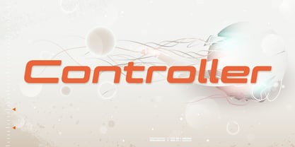
- Controller by Dharma Type,
$19.99Controller is a geometric rounded sans serif including 5 weights and corresponding obliques and their extended style are ready. Originally, the designer was inspired by a mixture of techno and organic design in the end of 20th century around the West Coast. The letterforms of this font are designed geometric but are also slightly rounded to make a natural, warm and organic impression. Uppercase N has its alternative glyph that can be accessed by using OpenType stylistic feature. Controller is a versatile and useful family for a wide range of projects. We released 4 big Sci-Fi families in 2013. Check it out! Clonoid Controller Geom Graphic Space Colony - Ekorre PERSONAL USE ONLY Black - Personal use only
- BaileysCar - Unknown license
- CONFORMITY PERSONAL USE - Personal use only
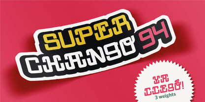
- Super Chango 94 by Nomaszebras,
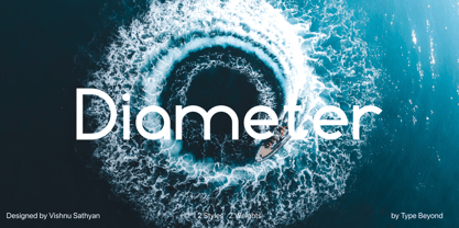
$10.00 - Diameter by Vishnu Sathyan,
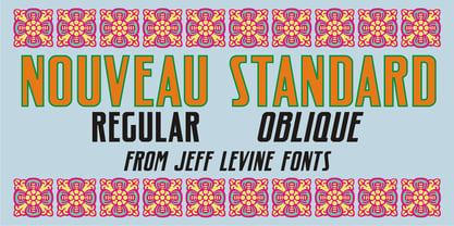
$8.00The idea of symmetry came to me when I was lookig for a geometric sans font. None of the things that I found did have the mathematically perfect symmetry. So, I went ahead and created one. I have used complex mathematical equations to get the perfect angle in every letter. Diameter comes with two styles square corner and rounded corner, each with regular and bold weights. - Nouveau Standard JNL by Jeff Levine,
$29.00The hand lettering found on the cover of the 1912 sheet music for "Somebody Else is Getting It" featured a blockish Art Nouveau style with rounded corners and a very lurid title [although it likely had a more innocent meaning in those days than the casual observer might interpret today]. Now available as Nouveau Standard JNL, it is available in both regular and oblique versions. - Monoska by ATK Studio,
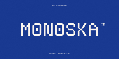
$15.00Monoska is a display monospaced font designed with classic industrial taste and rounded font style by Radinal Riki. Inspired by retro vhs font. created for electronic displays found in our modern techie world such as postal packing slips, airline tickets, informational video displays, ads, logos and more. Come in only one weight, this entire font is capitalized and with a character set that covers over 100 languages. - Proto Mono by ATK Studio,
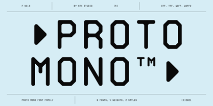
$15.00Proto Mono™ is a modular monospaced font built with rounded shapes, designed with tech industrial taste by Radinal Riki. Created for electronic displays found in our modern techie world such as postal packing slips, airline tickets, informational video displays, ads, and more. Come with 2 styles with 4 weights each. This entire font is capitalized and with a character set that covers over 100 languages. - Nobodi by Wilton Foundry,
$29.00This Bodoni-like font sets out to slightly square off rounded shapes, adding a very slight curve to the join from the square serif and stem, and minimizing and softening the pronounced bulbs found in Bodoni. There are hints of Walbaum and Melior but the overall effect is a more subtle, and interesting letterform that is friendly, fresh and contemporary. Ideal for corporate communications, ads and magazines. - Bernhard Blackletter by RMU,
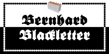
$25.00Bernhard Blackletter can be compared to a tuba, adding its deep bass sound to the orchestra of blackletter fonts. This font contains a bunch of useful ligatures, and to access all, it is recommended to activate both Standard and Discretionary Ligatures. You find the round s on the # key, and typing the combination N-o-period and activating the OT feature Ordinals gets you the numero sign. - Anglaise by Ladyfingers,
$39.00Anglaise was designed for display and it likes to be big and present, filling the width of a whole spread. The repetition of vertical black and white space holds the typeface together and the contrasting straight and round shapes add the personality... for even more... use the OpenType features, and Anglaise will start merging and building new characters for you to play around with... Enjoy! - FS Matthew by Fontsmith,
$80.00Developed for screen For not the first time, Fontsmith was commissioned to develop a font for one of the UK’s terrestrial TV channels. The product was a clearly-defined three-weight family. When italics were added, it became FS Matthew, a clean, stylish, structured sans serif with swooping, open curves and a bright, lively personality. Southbank Inspiration for many of the forms of FS Matthew came from details found within the modernist buildings and architecture of London’s Southbank, such as the Royal Festival Hall. During the font’s gestation, Jason had found himself at London Studios, a TV studio on Southbank, and a wander around the neighbouring arts buildings proved thought-provoking. The result was a font with a very British character: solid forms that provide the platform for innovation and distinctiveness. Feelgood efficiency FS Matthew’s trademark is efficiency with a feelgood factor: disciplined enough for corporate identities, websites and signing systems, and colourful enough for logotypes and advertising. Its versatility and excellent legibility are achieved via some unexpected details: the reaching curves of the “g” and “y”; the simple shape of the “u”; an off-kilter “k”; generous counters; and a slightly condensed aspect that makes FS Matthew a space-saver in text or title sizes. - Oaxaca by Just My Type,
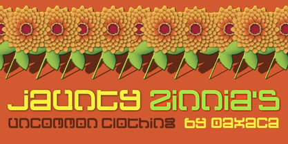
$25.00Traveling through the central and southern parts of Mexico a number of years ago, I couldn’t help but be impressed with the amazing architecture of the indigenous peoples. From the giant pyramids of Teotihuacan to the extensive and impressive layout of Chichén Itzá to the smaller-but-spectacular Monte Alban ruins in Oaxaca, creativity abounds. One of the things I most enjoyed were the carved stone friezes that ran around many of the more complete buildings. Oaxaca calls to mind those beautiful carvings and, strangely, Chinese writing. - BDRmono 2021 by Typedifferent,
$15.00Büro Destruct’s «BDR mono» typeface has a long tradition in the font library of typedifferent. Initially designed by Lopetz as a single weight, monospaced Mac PostScript Type 1 font way back in 1999, it got a first update as a little family with light, regular and bold weights, plus an extended glyphs set in Opentype format during 2006. With this 2021 update the typeface received a second rounded family and a complete glyphs set with all needed characters used in the north, east, south and west of Europe. The «BDR mono 2021» serves great in signage, routing people, architecture, technical plans, manuals, or even science and fiction related communications. - LOLO City by Okaycat,
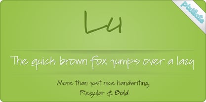
$24.50Ready to release your inner urban planner? Next time you need to lay out some buildings for an illustration, use LOLO City. The concept for LOLO City originates partly from my childhood, spending many hours playing a city simulation game, and also from my schooling -- which included architectural drafting and civil engineering studies. The building designs themselves are largely from my imagination -- but much inspired by architecture seen in my travels around Canada, America, Thailand, and Japan. The zoning of LOLO City is easy to remember, so you won't get lost in its streets: Small Letters (a-z): Light Residential(a-m), Light Commercial(n-t), Light Industrial(u-z) Capital Letters (A-Z): Dense Residential(A-M), Dense Commercial(N-T), Dense Industrial(U-Z) Digits, Shift Digits & Punctuation: random extras, small utilities (cars, trucks, traffic signals, park bench, etc.) Whenever you need a prefabricated city design --- think LOLO City! - Lu Px by Letradora,
$15.00 - Dunkelbunt by PintassilgoPrints,
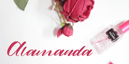
$20.00 - Alamanda by Goodigital13,
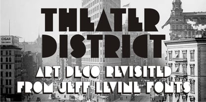
$20.00Alamanda will be great for any projects including : branding, logo, stationery, business card, signage, flyer, brochure, and more. Almost all industries will be fall for this typeface: wedding, events, real estate, architect, law firm, florist, gardening, makeup artist, travel, hotel, musician, and many more . - Theater District JNL by Jeff Levine,
$29.00 - As of my last knowledge update in April 2023, Architect by Altsys Metamorphosis is not widely recognized as one of the mainstream fonts, and detailed information specifically referencing a font named...
- Old Softy NF by Nick's Fonts,
$10.00The pattern for this friendly face was found within the Keystone Type Foundry's 1884 specimen book, under the rather prosaic name of Round Gothic. This version retains all of the original's warmth and charm, while updating it to twenty-first century standards. Both versions of this font include the complete Latin 1252, Central European 1250 and Turkish 1254 character sets, along with localization for Lithuanian, Moldovan, Romanian and Turkish. - Scriber by The Northern Block,
$12.80 - Architectuur NF by Nick's Fonts,
$10.00Letterpress type, crafted by H. Th. Wijdeveld, founding editor and chief designer of the legendary Dutch art and architecture magazine Wendingen, provided the inspiration for this typeface. The original design graced a 1925 issue examining the work of Frank Lloyd Wright, and Wijdeveld created his typeface by assembling bits of standard brass rules. This version features several of the meanders typical of Wijdeveld’s graphic design in the dagger, double dagger, ASCII tilde and ASCII circumflex positions. Both versions of the font include 1252 Latin, 1250 CE (with localization for Romanian and Moldovan). - Biscayne by JVB Fonts,
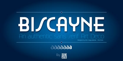
$39.00Biscayne is inspired by the old and classic Art Deco art and architecture found in some building ads from the 1930's in the Art Deco District of Miami. The name of the font family is one of the most emblematic and representative places in Miami City. Biscayne can be used mainly in titles, display and short texts. This typeface family supports East Europe languages. It also includes standard and discretionary ligatures, alternative style of uppercase, fractions, numerators and denominators, end and/or terminal forms and other OpenType features. - Quarzo by Corradine Fonts,
$39.95This script font is inspired by the flexible nib strokes to create a concatenation of refinement with character mixing the contrast with pronounced but rounded angles. This angles along with the inktraps give the font a better performance when printing. Texts will have a very even rhythm due to its consistency on the stroke’s angle and spacing. The words can receive a dramatic touch by using the wide range of glyphs with curly and refined ornamentation. There are lots of caps and number variants dressed up with a variety of swashes. Also, two sets of versatile ornaments will be found: a first set of ending flourishes that match with any lowercase letter and a second set of independent flourishes to be placed around the words. Quarzo will give a great sophistication level to invitations, cards, tags, menus, advertising and packaging. Its character map covers Western and Central European characters. - Chelsea Studio by Scriptorium,
$18.00Chelsea Studio is based on hand lettering from architectural sketches by Charles Rennie Mackintosh. - Behrensschrift iF Plus by Ingo,
$29.00Peter Behrens’ renowned art nouveau type from 1902 – with ornaments. Newly revised and neatly digitalized by Ingo Zimmermann In 1902, Peter Behrens (1869–1940), architect, designer and typographer, created a new ”German“ type which became very successful very quickly for the Rudhard’sche Gießerei (foundry which later became Gebr. Klingspor AG) in Offenbach am Main. It served, for example, as the official German type for the world expositions in 1904 and 1910. Behrens himself writes about the development of this type ”...For the actual form of my type, I took the technical principle of the Gothic script, the stroke of the quill feather. The proportions of height and width and the boldness of the strokes of the Gothic letters were also decisive for me in producing a German character. A cohesive character could be hoped for by avoiding all non-necessities and by strictly carrying out the design principle of holding the quill at an angle…“ By the way, when “long s” is activated, the typographically correct “round s” is automatically placed at the end of the word so that you need only pay attention to the correct s on syllable endings within words. When using “long s,” you must ensure the correct use of the rules for the Fraktur font: “round s” is always at the end of the word, also in compound words. For those of you who want to be even more correct, read the corresponding article in >> Wikipedia. Peter Behrens also drew matching ornaments for his typeface – we have likewise carefully revised these decorative touches and arranged them into a font. The "Behrens-Schrift" fits best on all topics that have something to do with art history or the time around 1900. - Soli Px by Letradora,
$15.00 - Hargloves by Heypentype,
$17.99Hargloves is a modern sans serif font family. The overall design shapes taken from advance engineering technology themes in various industries like motorsports, biotech, games, architecture, robotics, and aerospace tech. A distinct visual characteristic of this font family can be found on 'G','O','P','Q', and 'R' letter. Each glyph design combined a geometric shapes and stylished ink-traps with parabolic curves. The design of the glyph curves taken from fast corner often found on motorsports circuit, when diagonal glyph shapes taken from aerodynamic in machine engineering and kinetic movement on sports. Hargloves consist of 12 font with 6 weight: From thin to Bold with each matching italics.It also contains extras 4 Icons designed specifically for sports entertainment. Hargloves support for most western languages and several opentype features. - PTF NORDIC Rnd - Unknown license
- General Merchandise JNL by Jeff Levine,
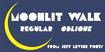
$29.00 - Moonlit Walk JNL by Jeff Levine,
$29.00Another variant to the ever-popular Art Deco sans lettering with solid centers (no counters) was found in the hand-lettered title on the cover of the 1933 song "There's A Ring around the Moon". This became the basis for the digital typeface Moonlit Walk JNL, available in both regular and oblique versions. - AB FatChic - 100% free
- Amor Sans Neo by Storm Type Foundry,
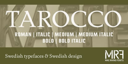
$55.00The peculiarity of this alphabet is already its origin: the basic drawing was created by narrowing Roman capitals with corresponding lowercase letters. The goal was to create a monumental font for architecture and book covers. Surprisingly, however, Amor Sans has found its way into corporate identity, offices, magazines and packaging design. Its slightly narrowed, economical design predestines it for quick reading of shorter texts, which is why it is also excellent for theater posters and programs. Its moderate width proportions and rich selection of arrows and pointers are excellently used in public spaces. Amor Sans has a neutral expression that works harmoniously in any architectural style. It will serve as an orientation system in a medieval monastery as well as in a modern building, while remaining distinctive even in the dark. The family consists of ten cuts with many functions, such as small capitals, Cyrillic, several types of numerals, a number of ligatures and stylistic alternatives. - Tarocco by MAC Rhino Fonts,
$18.00Tarocco is a typical book face with good readability and rather tall x-height. The origin for this typeface is found in Nordisk Antikva. A typeface especially constructed with attention for the Swedish language. Waldemar Zachrisson was determined to realize his ideas and in 1906 he began to cooperate with the foundry Genzsch & Heyse, based in Hamburg. Some influences of Jugendt can be found and the typeface were released in 1910. It became rather popular until around 1930. The MRF version includes 7 weights all together. - Bombelli Light Hand by Wiescher Design,
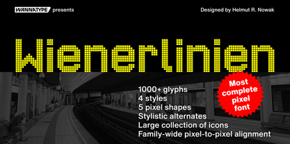
$39.50Bombelli is a font that looks like it has been handwritten by a meticulous architect in one of those hand-drawn blueprints of the old days. I chose the name to honor one of my ex-bosses -- a graphic designer-architect who taught me a lot of things when I was young and needed the money. One of the things he taught me – and probably the most important one – was to always be on time in the morning. He never said a word about me being late, but it worked. He taught me about being meticulous in detail and many other things I only appreciated much later. This clear and straightforward font deserves bearing his name. Your grateful type designer Gert Wiescher - Wienerlinien by Wannatype,
$26.00Versatile pixel fonts inspired by underground LEDs in Vienna. 4 styles (Pro, Poster, Caption, Mosaique) with different shapes and proportions are bound to one pixel grid to be combined perfectly in 5 pixel shapes: Square, Rounded, Dots, Hatch, Polaris. Pro: strong emphasis, wide proportions, best for legible text. 400+ symbols, greek alphabet. Poster: strong + compressed for large text use. Caption: legibilty for small text use. Mosaique: monospaced tiles with letters and pattern.


