10,000 search results
(0.018 seconds)
- P22 Late November by IHOF,
$39.95 P22 Late November is a transitional Antiqua-inspired type design great for text and display uses. The name is derived from the dark, November night in which the design of the font began. The Pro version features fractions, ligatures and full Central European support.
 - Bravura Pro by RMU,
$40.00 Inspired by Karl-Heinz Lange’s Publica, Bravura Pro is a versatile humanist sans font family with a slight calligraphic touch which makes it ideal for private correspondence as well as for body texts in magazines and books. All styles contain small caps and oldstyle figures.
 - My Dear Watson NF by Nick's Fonts,
$10.00This simple, charming script is based on the handlettering of Carl Holmes, from Walter T. Foster art book entitled ABC of Lettering. Elementary! Both versions of this font include the complete Latin 1252 and CE 1250 character sets, with localization for Romanian and Moldovan. - Morgothick by Morganismi,
$10.00 Morgothick is an ugly not-so-decorative blackletter font, hand-drawn like straight from the dark Middle Ages of drunk monks and dim chambers. Most readable, suits for multiple purposes. Morgothick supports West and Central European languages as well as Baltic, Turkish and Romanian.
 - Aniara by Gustav & Brun,
$18.00 Aniara is a playful, happy and intergalactic font. Arriving in three different weights, Light, Regular and Bold. + the antagonist; the dark version without the space/counter. Aniara comes with laser shrinked upper case letters. It attacks with a alternative upper and lower case glyph. PoFF!!
 - Pinback by FaceType,
$20.00 Pinback was inspired by the science fiction movies of the 60s and 70s. The name is taken from one of the protagonists of John Carpenter’s Dark Star.
 - Yemeyi by AukimVisuel,
$9.00 Yemeyi family is a modern and daring display font. No matter the topic, this font will be an incredibly asset to your fonts’ library, as it has the potential to elevate any creation. Yemeyi is a simple and neat lettered sans serif font. Add this font to your creative ideas and notice how it will make them stand out!
 - Dead Elder Metal by Studio Hello Good,
$45.00 Dead Elder is a font that embodies the raw, visceral essence of death metal in every stroke and curve. With an astonishing array of 952 meticulously crafted glyphs, this font unleashes a dark, otherworldly energy that is perfect for conveying the macabre and relentless intensity of the death metal genre.
 - Newcomen by insigne,
$24.99 Newcomen is a highly versatile titling face that includes 87 OpenType alternates and 38 ligatures. Newcomen titling, in its default form, evokes the Victorian era and is named for the British inventor of a steam engine for pumping water. Newcomen's flexibility is remarkable; the family includes four weights, and OpenType style sets are included that can alter the appearance of the face to either appear more dark and gothic, classical, include dots in the counters, and swash and "boxy" sets. Individual characters can also be selected and mixed and matched in OpenType capable applications for distinctive custom designs. A few design ideas are to use the gothic alternates for Halloween, the dots for a steampunk appearance, or the traditional alternates for a unique classical look.
 - Rogelio Script by Joelmaker,
$15.00 Rogelio Script is a stylish modern calligraphy font with casual chic flair. It is perfect for branding, wedding invites and cards, signature and maybe for red wine label. Rogelio Script includes full set of gorgeous uppercase and lowercase letters, numerals, a large range of punctuation and variation ligatures. All lowercase letters include beginning and ending swashes, giving realistic hand-lettered style. What you get, darling? In order to use the beautiful swashes, you need a program that supports OpenType features such as Adobe Illustrator CS, Adobe Photoshop CC, Adobe Indesign and Corel Draw.
 - Southland Letter by Hanzel Space,
$25.00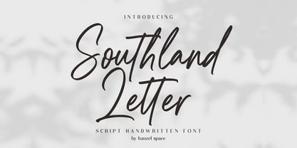 Southland Script Handwritten Font with contemporary, sophisticated accents. It is perfect for branding, wedding invites, tagline, cards, maybe for label and logo. Southland includes full set of gorgeous uppercase and lowercase letters, numerals, a large range of punctuation and ligatures. It expresses beauty of handwriting. What you get, darling? In order to use the beautiful ligatures, you need a program that supports OpenType features such as Adobe Illustrator CS, Adobe Photoshop CC, Adobe Indesign and Corel Draw. Feel free to give me a message if you have a problem or question.
 - Scary Sign by Java Pep,
$9.00 Scary Sign is inspired by scary novels and is styled as a rough font. It's perfect to place in your project which has horror, scary, dark, or spooky themes. But this font also perfects for other themes according to your creativity. You will get a free 12 swash bonus to complement the Scary Sign font.
 - Quality Times by Gilar Studio,
$16.00 Quality Times is a stylish modern calligraphy font with casual chic flair. It is perfect for branding, wedding invites and cards, and maybe for red wine label. Quality Times includes full set of gorgeous uppercase and lowercase letters, numerals, a large range of punctuation and ligatures. All lowercase letters include beginning and ending swashes, giving realistic hand-lettered style. What you get, darling? In order to use the beautiful swashes, you need a program that supports OpenType features such as Adobe Illustrator CS, Adobe Photoshop CC, Adobe Indesign and Corel Draw. Check my other Font here : https://gilarstudio.com/
 - Sagrantino by Monotype,
$50.99 Sagrantino™ shines at large sizes – and in vibrant colors. Think big posters, commanding headlines, massive banners and oversized packaging. Set headlines in the Highlight or Shadow designs and running copy in the Regular – all on the same page! Sagrantino could be called the Lava Lamp of fonts. It’s slick, glossy, retro and futuristic. Somehow, it’s fresh and quirky-classic at the same time. This is a design that challenges you to think outside the text box. In fact, Sagrantino is so lively, it took three Monotype typeface designers, Karl Leuthold, Juan Villanueva and Carl Crossgrove, to draw it. Because it’s a script, Sagrantino pairs perfectly with just about any other design – except another script. Maintain the futuristic retro vibe by combining Sagrantino with a typeface like Biome™ or Neo™ Tech. Looking for a counterpoint? Try a cool sans like Avenir® Next or Univers® Next. OpenType® Pro fonts of Sagrantino enable automatic insertions from a crowd of fancy ligatures and delightful alternate characters – in addition to offering an extended character set supporting most Central European and many Eastern European languages.
 - Thunder Inferno by Mans Greback,
$79.00 Thunder Inferno is a gothic black metal typeface with sharp serifs. Rooted in the aesthetics of heavy metal and the occult, this typeface is a harbinger of darkness and intensity. Evocative of Halloween and gothic grandeur, Thunder Inferno also captures a march toward darkness. It serves as a rebellious voice for skate culture and alternative lifestyles. Crafted exclusively in uppercase, this font is a growl in typographic form, a visual cacophony that grabs your attention and refuses to let go. Capitalize the first and last letters of any word for symmetrical heavy metal style. Example: Heavy metaL Enclose any word in < > ( ) [ ] { } to give it wings. Example: [HawkstylE]
 - Ponderosa by Adobe,
$29.00Ponderosa font is a joint work of the typeface designers K.B. Chansler, C. Crossgrove and C. Twombly, who also created Rosewood, Zebrawood and Pepperwood together. As the name suggests, it is so-called wood type. The origins of this kind of typeface can be found in the early 19th century. Called Italian or Italienne, these typefaces quickly became very popular. They are distinguished by square serifs whose width is larger than the stroke width of the characters. When the letters are set together, the heavy serifs build dark horizontal bands. The distinguishing characteristic of Ponderosa lies in its extremely fine figures between heavy serifs. The designers approached the boundaries of the impossible with this contrast. The typeface is reminiscent of the Wild West with its shootouts and heroes as well as of the 1970s with their platform shoes and wild hair-dos. When used carefully in headlines, Ponderosa font will surely attract attention. - Murs Gothic by Kobuzan,
$- Murs Gothic is a bold sans serif with sharp dynamic forms. It is a collective image of American Gothics from the 19th and early 20th centuries. It is quite massive, has tight letter spacing and increased contrast. Somewhere elongated, as well as asymmetric details give it a characteristic emotionality and playfulness. Especially against the backdrop of neutral geometric sans-serifs. The set comes with 694 glyphs. Among which are Latin and Cyrillic characters, a couple of ligatures, alternatives, geometric symbols, arrows and much more! Murs Gothic consists of 56 styles that are adjustable in weight and width + italics. Or one variable font with 3 axes. This allows it to be very flexible and adapt to many different designs. All styles include an extended set of Latin characters and a basic Cyrillic. A font style Murs Gothic Wide Dark is free for unlimited use. Murs Gothic was designed by Maksym Kobuzan in 2023.
 - Scala Pro by Martin Majoor,
$49.00 The award-winning Scala family (1990-1993) is a worldwide bestseller and has established itself as a ‘classic’ among digital fonts. It was one of the first serious digital text fonts to support small caps, ligatures and different set of numbers. In fact Scala and Scala Sans (1990-1993) are two different typefaces sharing a common form principle: the skeletons of both Scala and Scala Sans are identical. Scala’s dark colour and low contrast works to prevent the thin parts from breaking up. The generous length of Scala italic’s serifs gives it a strong rhythm. The bold weight has the same character widths as the normal weight, so changing a text from normal into bold does not affect the set width. Another part of Scala is very popular among its users: Scala Hands, containing more than one hundred decorative hands and pointers, is a free bonus. Scala Jewels is a set of four highly decorative typefaces, based on the bold capitals of Scala.
 - Chisel by Linotype,
$29.99An inline version of the Latin bold condensed, and designed on the suggestion of Robert Harling. There is a double white line, which was originally engraved in Latin type. - Hearst Italic by Solotype,
$19.95Carl Schraubstadter of the Inland Type Foundry probably had more to do with the design of this italic than he did with the roman. Great for Craftsman Era projects. - Romance Fatal Sans - Personal use only

- AddamsRegular - Unknown license

- Agathodaimon - Personal use only

- La Rosa Muerta - Unknown license

- Douglas by Monotype,
$15.99 An upstanding, dark horse of a font, Douglas comes in two sets of all capitals and is authoritarian while flying the flag for idiosyncrasies. The font was created using a loose brush and rough paper, and the authentic textures of the lettering indicates these rough and ready roots. Perfect for rustic signage.
 - ViabellaT H Pro by Elsner+Flake,
$40.00 The script version of the typeface Viabella introduces us to the calligraphic side of the Berlin type designer and typographer Karl-Heinz Lange. The sketches for this script typeface, which resulted from the close cooperation with Veronika Elsner and Günther Flake, found their roots in sketch drawings which Karl-Heinz Lange had already drawn in the 1980’s. For the Viabella design, Karl-Heinz Lange drew the basic letterforms of the Black and Regular cuts with a brush. He then re-worked the drawings and transferred them on to tracing paper. The design studio Elsner+Flake in Hamburg cut these typeface extensions and later digitized them manually with the help of the IKARUS Sustem. With the Regular cut as a basis, Elsner+Flake extended the family with the Light version and interpolated and re-worked the Medium weight. The completion of the family was taken over by the type designer Björn Gogalla who had done the same kind of work on Rotola, a design which Karl-Heinz Lange had also created for Elsner+Flake. While Viabella was originally conceived as a headline typeface, its lighter weights can certainly be used for shorter text applications. The Black version creates powerful headlines with highly effective accents. With the help of swashes, which are available for all weights, the user can lighten up longer texts and add special character to titles. In contrast to pure headline fonts, Viabella has been enriched by an extensive complement of special characters. In addition to the Europa-Plus character set which allows setting type in over 70 latin-based languages, the user will find multiple versions of numerals as well as oldstyle figures, tabular and proportional lining figures, diagonal fractions, and a complete set of superior and inferior figures and fractions (60%). With such a rich character set, Viabella is not only ideal for many different uses in the areas of newspaper, magazine and advertising but it will surely be chosen for the design of greeting cards, invitations and other design projects within the privat sphere.
 - Mordova by Holis.Mjd,
$14.00 The font is done with a minimalist touch of gothic and blackletter, inspired by several music and bands that I was currently enjoying and often listened to throughout the day, where the music depicts a little visually in the form of font characters like this Mordova font, feels loud, vibrant , dark but simple and easy to read.
 - Sunrise Till Sunset by Comicraft,
$19.00 Between twilight and daybreak it is said that the dark side of the human psyche eclipses the sun that shines from the depths of our souls. Certainty turns to doubt, clarity becomes confusion, man turns into wolf, the dead wake, vampires seduce the young are restless and milk boils over on the stove. Those that seek only to bathe in the light of a romantic new moon often end their tragic lives soaked in nothing other than their own blood, and the milk spilt on the stovetop has no one left to cry over it. There are fifty shades of grey during those hours after sunset and I think just as many in my porridge this morning. Yes, okay, I admit it, I spoiled the milk! This porridge tastes like it was left in a graveyard overnight. Death warmed over. Gothic and lumpy. Just like the Buried weights of this font.
 - Bellfort Draw by GRIN3 (Nowak),
$19.00 Bellfort Draw family is a hand-drawn version of the Bellfort family. It features 5 different sub-families: Regular, Rough, Hollow, Dark, Script. Each of these sub-families contains up to three font weights. When the font is used in OpenType-savvy applications, the 3 variants of glyphs are automatically alternated to achieve a random-like effect. When not using the Contextual Alternates feature, you can still pick the alternates in the Glyphs palette or use the alternates available from the keyboard upper and lower case. Bellfort Draw Script is a handwritten, fully connected script with ligatures and contextual alternates to help with flow and readability. Language support includes Western, Central and Eastern European character sets, as well as Baltic and Turkish languages.
 - Negro by Storm Type Foundry,
$32.00 Dark, spicy & distinctive display typefaces from the nineteenth century I had in mind when creating this font family. Extreme contrasts and sharp endings may remotely remind some blackletters, especially in narrowed styles. The range of interpolated widths is useful for designing a provoking poster, magazine, music or book cover.
 - Bloody Night by LfarStudio,
$17.00 Halo! thank for your visit :) Bloody Night is a dark metal handwritten font with a horror feel and creepy impression. it looks stunning on movie title, book covers, photography, greeting cards, creepy quotes, and much more. This font is PUA encoded which means you can access all of the glyphs and swashes with ease!
 - Linotype Fluxus by Linotype,
$29.99Linotype Fluxus is part of the Take Type Library, chosen from the contestants of Linotype’s International Digital Type Design Contests of 1994 and 1997. This fun font was designed by German artist Andreas Karl. Its wavy contours give the font a restless, choppy feel. Its relatively strong strokes make Linotype Fluxus particularly good for headlines. - Alternate Gothic by Linotype,
$20.99 Alternate Gothic was designed by Morris Fuller Benton for American Typefounders Company in 1903. All three weights of Alternate Gothic are bold and narrow. In fact, this face is essentially a condensed version of Benton’s other well-known sans serif types, Franklin Gothic and News Gothic. In the early twentieth century, the modern concept of type “families” had not yet been formed — and though Benton designed these sans serifs to harmonize with each other, the foundry gave them different names. Robust, dark, and coolly competent, Alternate Gothic is a good choice when strong typographic statements must fit into tight spaces. As a modern usage, it is currently the font of YouTube’s homepage logo.
 - VLNL Wood Burger by VetteLetters,
$35.00 We all love a good burger here at Vette Letters. We also love to prepare them ourselves. Grilling the patties, cutting the tomatoes and cucumber, nothing beats a home made hamburger. And the best and tastiest way to grill a burger is on a wood charcoal grill. So all in all we can safely say that burgers and wood are a pretty darn good combination. This made Donald Roos decide to design VLNL Woodburger, obviously based on 19th century American wood type alphabets. Donald decided to add cyrillic characters, as he strongly believed that Russians would be equally partial to home made burgers. VLNL Woodburger is not really polished font, it will give any design a rough sturdy edge.
 - Cavole Slab by insigne,
$22.00 Cavole Slab is a new slab serif, designed in early 2011, that has a strong influence from Dutch typography. The name is an altered form of the Portuguese word for feather, emphasizing the typefaceís soft and friendly character. Slab serifs give this face plenty of impact and make it an excellent choice for contemporary designers. The font family includes a very dark and powerful black all the way down to a hairline thin weight, giving a tremendous versatility. The family also features dynamic italics that add plenty of emphasis and momentum. Cavole Slab is suitable for both headline and text settings and should easily find its place in a number of different settings, from corporate identity to magazine body copy. There are six weights that come with complementary italics, and each font includes over 450 characters and extended Latin-based language support. The typeface family comes in OpenType format, and OpenType alternates are easily accessible through OpenType enabled applications such as the Adobe suite or Quark. Please see the informative .pdf brochure to see what OpenType features are available and to see them in action.
 - Vocaloid - Personal use only

- Vocaloid Oblique - Personal use only

- Grogoth by Anomali Creative,
$19.00 Broken letters[1] (German: gebrochene Schrift literally "broken writing"; English: blackletter) or Gothic letters, also known as German letters, are the typeface used in Europe West from the 12th century to the 17th century. Meanwhile, Danish spoke it until 1875 and German, Estonian and Latvian spoke it well into the 20th century. Fracture is one of the broken typefaces that is often considered to represent the entire broken typeface. Broken letters are sometimes also called Old English, but not in the Old English or Anglo-Saxon sense that was born centuries earlier. This group of letters is so named because it contains Latin letters that have breaks in the curvature of the letters, either in part or in whole designs. The fracture arises from a sudden dip when writing certain parts of the letter. In contrast, letters with perfect, unbroken curves, such as Antikua, are created from smooth, flowing writing movements. Grogoth is a font inspired by the Blackletter typeface, made with a modern impression but still looks strong and unique. In addition, Young Best font is also supported with multilingual characters that can be used in several international languages. Grogoth font is very suitable for use in making music album cover designs, tattoo logos, wishkey labels, packaging pomades and so on which are made with dark and strong concepts. Thank you, and don't forget to check out our other products.
 - Terghosting by Tiny Hand Letter,
$14.00 ENGLISH: By installing or using this font, you are agreeing to the Product Usage Agreement: 1. This font is ONLY for PERSONAL USE || PROMOTIONAL & COMMERCIAL USE NOT ALLOWED! 2. FOR COMMERCIAL USE : https://creativefabrica.com/designer/tinyhandletter/ref/438703/ 3. Please contact us before using for any Promotional or Commercial Use! (Email: nasrunifajarita.project@gmail.com) 4. Follow our soscial media for update more great fonts and informations : Instagram: @tinyhandletter Please, let me know if you have any questions! :) Thank you :) ................................................................................................................... INDONESIA: Mengunduh dan menggunakan font ini berarti andan dianggap mengerti dan menyetujui semua syarat dan ketentuan penggunaan font dibawah ini: 1. Font ini hanya dapat digunakan untuk keperluan pribadi "Personal Use", yang berarti keperluannya tidak untuk "promosi" maupun "komersil" . Menghasilkan profit atau keuntungan baik dalam materi maupun efek promosi TIDAK DI IJINKAN! || Berlaku untuk Individu, Agensi Desain Grafis, Percetakan, atau Perusahaan/Korporasi. 2. TIDAK DIPERBOLEHKAN dalam menggunakan dan/atau memanfaatkan font ini untuk kepeluan Komersial, baik itu untuk Iklan, Buku, Promosi (social media), TV, Film, Video, Motion Graphics, Youtube, atau untuk Kemasan Produk (baik Fisik ataupun Digital) atau Media apapun dengan tujuan menghasilkan efek promosi maupun profit/keuntungan. 3. Menggunakan font ini untuk kepentingan Promosi dan/atau Komersial apapun bentuknya TANPA IZIN dari saya, akan dikenakan biaya EXTENDED LICENSE atau MINIMAL 100 kali lipat dari Lisensi Standard (biaya lebih besar berlaku untuk anda yang tidak kooperatif). 4. Hubungi kami untuk mendapatkan Informasi tentang Lisensi apa yang akan anda perlukan (Email: nasrunifajarita.project@gmail.com) Terima kasih.
 - Brown Amsonia by Nathatype,
$29.00 Brown Amsonia is a lovely script font of which letters are in handwriting to express unique, personal nuances in your designs. Such a handwriting font is available in high contrasts having noticeable differences between the bright and the dark letter parts to produce clear, firm displays making the designs look professional and modern. Besides, Brown Amsonia can express personal, artistic displays to create more interesting, noticeable designs. The letters are interconnected and their details show sharp, curvy scratches on the edges. Due to the complex font style details, this font is better to apply for big text sizes. In addition, you may enjoy the available features here. Features: Ligatures Stylistic Sets Multilingual Supports PUA Encoded Numerals and Punctuations Brown Amsonia fits best for various design projects, such as brandings, invitations, greeting cards, name cards, quotes, printed products, merchandise, social media, etc. Find out more ways to use this font by taking a look at the font preview. Thanks for purchasing our fonts. Hopefully, you have a great time using our font. Feel free to contact us anytime for further information or when you have trouble with the font. Thanks a lot and happy designing.


