10,000 search results
(0.066 seconds)
- Myna by Milatype,
$15.00 Myna is a modern geometric sans font family, primarily designed to be a lightweight web font. But is also suitable for any other purpose, such as brand design or editorial design, or any other use case that require clean and elegant geometric sans font. It contains 54 styles, divided into Condensed, Regular and Expanded weight, with 18 styles in each (9 upright, and 9 italic styles), ranging from Thin to Black styles, and are all available in one variable font. All styles are manually TrueType hinted to produce sharp glyph outlines for easier reading at small text sizes. And all contain OpenType features: Fractions, Kerning, Ordinals, Scientific Inferiors, Subscript, Superscript.
 - Bonitto by Omotu,
$18.00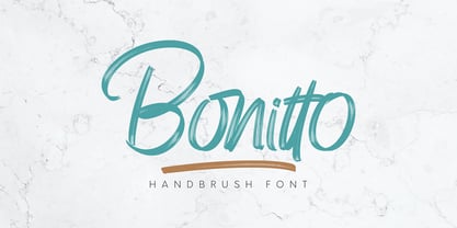 Bonitto is a handwritten script font with 2 styles, Regular and Slant. Bonitto is suitable for branding, logotype, apparel, t-shirts, hoodies, product packaging, quotes, flyers, posters, advertising and more. What's Included? 1. Uppercase and lowercase characters 2. Multilingual support. 3. Numerals, punctuations, and ligatures 4. Accessible in the Adobe Illustrator Glyphs panel, or under Stylistic Alternates in the Adobe Photoshop OpenType menu, Adobe InDesign, Corel Draw, even work on Microsoft Word. Please message me if you're unsure of any language support. Thanks for looking, and I hope you enjoy it! Please don't hesitate to drop me a message if you have any issues or queries. Omotu Studio
 - Street Punks by Wing's Art Studio,
$10.00 Street Punks: Graffiti Inspired Marker Pen and Paint Brush Font A hand-drawn font inspired by graffiti and skate culture that comes in two pen and paint styles. Plus a shed-load of alternatives for designs that come straight off the pen (or brush). What happens when you combine graffiti, skate culture and 80s movies? You get Street Punks; a gritty, no-nonsense design that's equally at home on a ripped t-shirt or opening a horror movie (with ninjas!) Choose the slick look of marker pens or the textured roughness of paint brushes. Mix them up, play around and have fun. It's up to you! Street Punks comes with a complete set of alternatives and underlines with each style, so you’ll never have to repeat an E or an I; the tale-tell signs that give away other hand-made fonts. It also features all-caps uppercase and lowercase characters, along with numerals, punctuation and language support. It's a font that gives you tools to create some truly unique designs with just a little bit of work. The perfect choice for t-shirts, posters, stickers, movie titles, YouTubers and more! Street Punks: Marker and Paint Marker Regular Marker Alternative Marker Underlines* Paint Regular Paint Alternative Paint Underlines* *Underlines are assigned to keys: ABCDEFGHIJKLMNOP Find more from The Video Store Collection at Wingsart Studio
 - Cospiog by ryan creative,
$15.00 Creative greetings... Introducing Cospiog which has an elegant looking design. This font has additional ligatures to give it a varied appearance. You can use Cospiog in modern and contemporary designs, and is suitable for use in various fashion media, posters, modeling magazines, typography, promotions and other digital media. FEATURES; Uppercase. Foreign Support, Numbers and Punctuation. Ligatures. Regular & Italic. Works on PC and Mobile. Simple installation. Accessible in Adobe Illustrator, Adobe Photoshop. Adobe InDesign, even works in Microsoft Word. Fully accessible without additional design software. Cospiog is encoded with Unicode PUA, which allows full access to all additional characters without having to design any special software. Mac users can use the Font book, and Windows users can use the Character map to view and copy any additional characters to paste into your favorite text editor/app. Thank you for visiting, have a nice day ;)
 - FF Sale by FontFont,
$41.99 British type designer Tony Booth created this script FontFont in 1996. The family contains 4 weights: Light Italic, Regular, Medium Italic, and Bold Italic and is ideally suited for advertising and packaging and poster and billboards. FF Sale provides advanced typographical support with features such as ligatures, alternate characters, and case-sensitive forms. It comes with proportional lining and tabular lining figures.
 - Rashela by Agny Hasya Studio,
$9.00 Rashela is a Decorative Serif Display Font, Modern, Luxury, and Elegant Come with 2 (two) styles (regular & italic) and is created with glyph variations like alternates and ligatures. Perfect for your design projects like logos, branding, advertising, product designs, stationery, photography, art quotes, wedding designs, fashion designs, and more. Featured with Uppercase and Lowercase, Numeral and Punctuation, Multilingual Support, and Opentype Features.
 - Gevenda by Agny Hasya Studio,
$12.00 Gevenda is a Modern Classic Display Serif Font, Luxury, Elegant, and versatile. Come in 2 (two) styles (regular & italic) and is created with glyph variations like alternates and ligatures. Perfect for your design projects like logos, branding, advertising, product designs, stationery, photography, art quotes, wedding designs, fashion designs, and more. Featured with Uppercase and Lowercase, Numeral and Punctuation, Multilingual Support, and Opentype Features.
 - Monstera Jam by Heinzel Std,
$14.00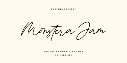 Monstera Jam is a Signature Script Font, described by an elegant touch, perfect for your favorite projects. It looks stunning on wedding invitations, thank you cards, quotes, greeting cards, logos, business cards, social media, magazines, marketing materials, and every other design which needs a handwritten touch. Fall in love with its incredibly distinct and timeless style and use it to create spectacular designs! Monstera Jam Features: Regular and Bold Version Uppercase and Lowercase Numerical and Punctuation Ligatures PUA Encoded Multilingual Language Easy To Use
 - Paulette by Rosario Nocera,
$22.99 Paulette is a script typeface, the capital letters are completely unpublished, some of them have a smile-similar ornament (A,F,O,H,Q,B,C,P,G), whereas minuscule letters are inspired to Edwardian font script. The font is very versatile and is very suitable for typographic compositions with large letters and for medium and small ones. It includes a complete series of internationals letters, 342 glyphs and 6 new ligatures. Paulette is an elegant letter and it's available in two versions, regular and eroded.
 - Nouveau Hippie JNL by Jeff Levine,
$29.00 The cover of the 1907 sheet music for "I'd Rather Twostep Than Waltz, Bill" was hand lettered in an Art Nouveau sans serif alphabet. During the hippie counter-culture movement of the 1960s, rock posters, album covers and other printed ephemera of the time embraced the styles of lettering and art made popular during the early 1900s. It seemed only fitting to name this type design Nouveau Hippie JNL as an homage to both eras. The font is available in both regular and oblique versions.
 - Lite On Condensed by Factory738,
$15.00 LiteOn Condensed is the perfect font family for designers who want to achieve a sleek and refined look. This sans serif font is both lightweight and elegant, with a smooth and contemporary feel that is sure to make any project stand out. With a variety of weights to choose from, LiteOn Condensed provides ample options to suit any design need. Choose LiteOn Condensed for your next project and take your design to the next level! 6 Weights 2 Styles (Regular and Italic) Basic Latin A-Z and a-z Numerals & Punctuation Stylistic Ligatures and Alternate glyps Multilingual Support for ä ö ü Ä Ö Ü … Thanks for looking, and I hope you enjoy it.
 - Norman Variable by Resistenza,
$110.00 Norman Variable contains all the weights in between Norman Regular and Norman Fat. Get to know Norman, elegant and fashion forward. This new condensed and high contrast serif font is based on expansion giving a sense of self confidence. The oblique ax was specially added to get a contemporary and innovative sense. Norman is young and idealist, he has a distinctive sense of style. A complete set of ligatures and stylistic alternates is included, this will help the designer to customize and give a special look to any layout. We recommend to use it for big title, magazine, editorial purposes and display.
 - RePublic by Suitcase Type Foundry,
$75.00In 1955 the Czech State Department of Culture, which was then in charge of all the publishing houses, organised a competition amongst printing houses and generally all book businesses for the design of a newspaper typeface. The motivation for this contest was obvious: the situation in the printing presses was appalling, with very little quality fonts existing and financial resources being too scarce to permit the purchase of type abroad. The conditions to be met by the typeface were strictly defined, and far more constrained than the ones applied to regular typefaces designed for books. A number of parameters needed to be considered, including the pressure of the printing presses and the quality of the thin newspaper ink that would have smothered any delicate strokes. Rough drafts of type designs for the competition were submitted by Vratislav Hejzl, Stanislav Marso, Frantisek Novak, Frantisek Panek, Jiri Petr, Jindrich Posekany, and the team of Stanislav Duda, Karel Misek and Josef Tyfa. The committee published its comments and corrections of the designs, and asked the designers to draw the final drafts. The winner was unambiguous — the members of the committee unanimously agreed to award Stanislav Marso’s design the first prize. His typeface was cast by Grafotechna (a state-owned enterprise) for setting with line-composing machines and also in larger sizes for hand-setting. Regular, bold, and bold condensed cuts were produced, and the face was named Public. In 2003 we decided to digitise the typeface. Drawings of the regular and italic cuts at the size of approximatively 3,5 cicero (43 pt) were used as templates for scanning. Those originals covered the complete set of caps except for the U, the lowercase, numerals, and sloped ampersand. The bold and condensed bold cuts were found in an original specimen book of the Rude Pravo newspaper printing press. These specimens included a dot, acute, colon, semicolon, hyphens, exclamation and question marks, asterisk, parentheses, square brackets, cross, section sign, and ampersand. After the regular cut was drafted, we began to modify it. All the uppercase letters were fine-tuned, the crossbar of the A was raised, E, F, and H were narrowed, L and R were significantly broadened, and the angle of the leg and arm of the K were adjusted. The vertex of the M now rests on the baseline, making the glyph broader. The apex of the N is narrower, resulting in a more regular glyph. The tail of Q was made more decorative; the uppercase S lost its implied serifs. The lowercase ascenders and descenders were slightly extended. Corrections on the lower case a were more significant, its waist being lowered in order to improve its colour and light. The top of the f was redrawn, the loop of lowercase g now has a squarer character. The diagonals of the lowercase k were harmonised with the uppercase K. The t has a more open and longer terminal, and the tail of the y matches its overall construction. Numerals are generally better proportioned. Italics have been thoroughly redrawn, and in general their slope is lessened by approximatively 2–3 degrees. The italic upper case is more consistent with the regular cut. Unlike the original, the tail of the K is not curved, and the Z is not calligraphic. The italic lower case is even further removed from the original. This concerns specifically the bottom finials of the c and e, the top of the f, the descender of the j, the serif of the k, a heavier ear on the r, a more open t, a broader v and w, a different x, and, again, a non-calligraphic z. Originally the bold cut conformed even more to the superellipse shape than the regular one, since all the glyphs had to be fitted to the same width. We have redrawn the bold cut to provide a better match with the regular. This means its shapes have become generally broader, also noticeably darker. Medium and Semibold weights were also interpolated, with a colour similar to the original bold cut. The condensed variants’ width is 85 percent of the original. The design of the Bold Condensed weights was optimised for the setting of headlines, while the lighter ones are suited for normal condensed settings. All the OpenType fonts include small caps, numerals, fractions, ligatures, and expert glyphs, conforming to the Suitcase Standard set. Over half a century of consistent quality ensures perfect legibility even in adverse printing conditions and on poor quality paper. RePublic is an exquisite newspaper and magazine type, which is equally well suited as a contemporary book face. - Lemon Press by Attype Studio,
$7.00 Lemon Press is display font of fresh lemon, come up with two font regular and display. It is suitable for any summer event! Lemon Press is perfect for branding, logo, invitation, stationery, social media post, product packaging, merchandise, blog design, game titles, cute style designs, Book/Cover Titles and more. Multilingual Support included for Afrikaans, Albanian, Catalan, Danish, Dutch, English, Estonian, Finnish, French, German, Icelandic, Italian, Norwegian, Portuguese, Spanish, Swedish, Zulu. Hope you enjoy with our font! Attype Studio
 - Reffort by Locomotype,
$16.66 Reffort is a new sans serif with a slightly different look as its signature. Customization in certain parts of the letters allows visual changes to look more captivating. This font comes in regular style and its matching italic as well as two variable version. Each version has 7 different weights. Perfect for graphic design and any display use, Reffort can easily work for packaging design, web, signage, advertising, logotypes, even for long paragraphs like editorial design.
 - Aremic by Graptail,
$15.00 Aremic is a bold display font created to be used for bold headings coming in 2 shapes Regular and Rounded including Oblique. This font is inspired by the shape of the letters on sports posters. This type of font perfectly made to be applied especially in logo, headline, signage and the other various formal forms such as invitations, labels, logos, magazines, books, greeting / wedding cards, packaging, fashion, make up, stationery, novels, labels or any type of advertising purpose.
 - Chatter Pro by Jonahfonts,
$35.00 Chatter Pro is a handwritten unconnected script face in four styles: Light, Regular, Semibold and Bold with Small-Caps. Chatter Pro is a Pro-version of my previous font 'Chatter'. A free style specifically designed for Packaging but still works well for Greeting cards, Magazines, Posters and Advertising Ads. Invoking the OpenType CONTEXTUAL ALTERNATIVE variant. A space after any lower-case glyph will produce the word terminal. (Opentype variants may only be accessible via Opentype-Aware applications.)
 - Mouvere by Fikryal,
$18.00 Mouvere – Old Style Serif Family, comes with four types of typefaces, Regular, Italic, Bold, and Bold Italic. This font is very suitable to be applied in various aspects of design, and your branding. It’s perfect for logos, branding, title, social media posts, advertisements, product packaging, product designs, label, photography, watermark, special event, magazine, web designs, etc. Features : Multilingual Support If you have any questions please don’t hesitate to contact me follow my Instagram: @fkryall Thank you
 - Java Heritages by Heybing Supply Co,
$25.00 Java Heritages Typeface is a multi-layered type family with opentype features, inspired by vintage signage that have unique decorative shapes. Comes with 4 font system that can be layered to create different effect (Regular, Drop Shadow, Inner Shadow & Inline). Java Heritages Typeface includes a full set of character A-Z, as well as multi-lingual support, currency figures, numerals, and punctuation. Java Heritages Typeface family is perfect for logotype, gig poster, letterhead, dropcap, titles, and any artworks.
 - Deco Spring by Ingrimayne Type,
$10.00 DecoSpring is a decorative art-deco family that was inspired by one word in an advertisement in a 1978 edition of my local newspaper. I could not find a typeface that matched it so decided to create one, which became DecoSpring-Regular. It is caps only, with an alternative set of capitals on the lower-case keys. Characters with very thick stems invite interior decoration and I opted for floral decorations. DecoSpring-Flowers can be used alone or it can be layered on top of the regular style to create colored flowers. Changing the width of the bolder stem resulted in two more style, the light and thing styles. Another set of four styles, the Simple set, was formed by eliminating the split in the stems by merging the two parts. All the DecoSpring faces are display faces to be used in small doses, and especially the bolder ones, at large point sizes.
 - LT Wave - 100% free

- LT Superior Serif - 100% free

- Pirouette by Linotype,
$40.99Pirouette is based on a logo that Japanese designer Ryuichi Tateno created for a packaging design project in 1999 (a shampoo container!). Tateno's logo experimented with complex, overlapped swash letterforms. He continued to develop these outside of the initial packaging project, until they took on a life of their own. Eventually, Tateno designed a full typeface out of the logo, Pirouette, which was the first place display face in Linotype's 2003 International Type Design Contest. The Pirouette typeface contains six different fonts. The basic font is Pirouette Regular. This is an engraver's italic lowercase paired with elaborate swash capitals. The swash capitals have two visual elements in their forms: thick strokes and thin strokes. Pirouette Text includes the same lowercase as Pirouette Regular, but the uppercase letters are much shorter and simpler. This "text" font can be used to set longer amounts of copy. Pirouette Alternate contains different lowercase glyphs and additional ligatures, which can be used as substitutes for the lowercase forms in the Pirouette Regular and Pirouette Text fonts. Pirouette Ornaments contains swashes and other knick-knacks that can either be added onto the end of a letter, or used as separate decorative elements or swooshes (accolades) on a page. Pirouette Separate 1 and Pirouette Separate 2 are two fonts that can be layered over top of one another in software applications that support layering (e.g., most Adobe and Macromedia applications, as well as QuarkXPress). Pirouette Separate 1 contains the thick stroke elements from Pirouette Regular's uppercase letters, as well as the same lowercase glyphs that can be found in Pirouette Regular and Pirouette Text. Pirouette Separate 2 contains only the thin stroke elements from Pirouette Regular's uppercase letters. By layering Pirouette Separate 1 and Pirouette Separate 2 over one another, you can give the uppercase letter's thick and thin stroke elements different colors and create unique, more calligraphic designs. The Pirouette family, Tanteno's first commercial typeface, was greatly influenced by the calligraphic and typographic work of the master German designer, Prof. Hermann Zapf, especially his Zapfino typeface. - Bodrum Sans by Bülent Yüksel,
$19.00 You can download usiful link: Bodrum Sans PDF Type Specimen Bodrum Sans is a sans serif type family. Designed by Bülent Yüksel in 2018/19. The font, influenced by style serifs, popular in the 1920s and 30s, is based on optically corrected geometric forms for better readability. Bodrum Sans is not purely geometric; it has vertical strokes that are thicker than the horizontals, an “o” that is not a perfect circle, and shortened ascenders. These nuances aid in legibility and give Bodrum Sans a harmonious and sensible appearance for both texts and headlines. Bodrum Sans provides advanced typographical support for Latin-based languages. An extended character set, supporting Central, Western and Eastern European languages, rounds up the family. The designation “Bodrum Sans 14 Regular” forms the central point. "Bodrum Sans" is available in 10 weights (Hair, Thin, Extra-Light, Light, Regular, Meduim, Bold, Extra-Bold, Heavy and Black) and 10 matching italics. The family contains a set of 650+ characters. Case-Sensitive Forms, Classes and Features, Small Caps from Letter Cases, Fractions, Superior, Inferior, Denominator, Numerator, Old Style Figures just one touch easy in all graphic programs. Bodrum Sans is the perfect font for web use.
 - Bodrum Slab by Bülent Yüksel,
$19.00 “Bodrum Slab” is a slab serif type family. Designed by Bülent Yüksel in 20018/19. The font, influenced by style serifs, popular in the 1920s and 30s, is based on optically corrected geometric forms for better readability. “Bodrum Slab” is not purely geometric; it has vertical strokes that are thicker than the horizontals, an “o” that is not a perfect circle, and shortened ascenders. These nuances aid in legibility and give “Bodrum Slab” a harmonious and sensible appearance for both texts and headlines. Bodrum Slab provides advanced typographical support for Latin-based languages. An extended character set, supporting Central, Western and Eastern European languages, rounds up the family. The designation “Bodrum Slab 14 Regular” forms the central point. “Bodrum Slab” is available in 10 weights (Hair, Thin, Extra-Light, Light, Regular, Meduim, Bold, Extra-Bold, Heavy and Black) and 10 matching italics. The family contains a set of 650+ characters. Case-Sensitive Forms, Classes and Features, Small Caps from Letter Cases, Fractions, Superior, Inferior, Denominator, Numerator, Old Style Figures just one touch easy In all graphic programs. Bodrum Slab is the perfect font for web use.
 - Natura by Resistenza,
$39.00 Inspired by old nature field notebooks, Natura was born out of the passion for new modern hand-calligraphy, designed first with a flexible fountain pen and then digitalized glyph by glyph to get the natural feeling of the dry ink on smooth paper. This family includes five different fonts. Natura regular is an upright script with lots of swashes and ligatures and offers a wide range of flexibility with its many Opentype features. You will also find that its initial and terminal letters can enhance your designs in new and creative ways. Natura Slanted font offers the same functionality than Natura Regular but we changed the angle 16 degrees, creating an elegant feeling. Natura Notebook, is a narrow serif font with a stylised grunge effect with strong, legible vertical height. Natura Icons and Natura Stamps complete the whole family with incredible flourished elements and capital letters inspired by nature. Hand-drawn leaves, plants, flowers, as well as large and small animals add original detail while complementing the font perfectly. Natura is ideal to use for event invitations, special purpose cards, signatures, labels and packages. Check out also ‘Modern Love Slanted’ Turquoise Nautica
 - Tuffy - 100% free

- Tuffy - 100% free

- Arlequin by TipografiaRamis,
$29.00 Arlequin is a high-contrast sans serif decorative font. The most distinguished characteristic of this typeface is its lowercase letters. Their shapes, a high-contrast clash of bold angular fragments with arched thin counterparts, make for a dramatic impact on entire font visual impression. Arlequin is recommended for use as a headline or short-text font.
 - Reboot by Typelove Fontworks,
$7.00 Born in the lab as a research experiment, Reboot is great for that certain 70’s sci-fi need. It’s filled with the angular curves of the technology of yore, with full diacriticals for Eastern European Cold War era galactic display copy. It’s the first font of a series of research experiments, varying from rectilinear to ovoid.
 - Divided Highway JNL by Jeff Levine,
$29.00 The Narsinh Series (from the 1940 Gujarati Type Foundry of Bombay, India) is a modular metal font comprised of 32 basic shape pieces which would be assembled into any configuration to form various letters and numbers. Examples of the alphabet and numerals were set in an Art Deco, condensed sans serif and were the basis for this type revival. Strongly resembling a stencil design, the typeface was named after the revered 15th-century poet-saint of Gujarat, India Narsinh Mehta, and the foundry itself gets its name from the language and script of Gujarati [spoken by the Indo-Aryan residents of the Indian state of Gujarat]. Divided Highway JNL is the digital version of this design, and is available in both regular and oblique versions.
 - Hermitage by Larin Type Co,
$15.00 Hermitage is a modern, elegant serif font that includes six typefaces regular, outline, oblique, outline oblique, rough and rough oblique. This font has a light weight and looks amazing in logos, branding, arranging wedding invitations, business cards, packaging, cosmetics, also works perfectly with text, it is very readable and recognizable, book cover, magazine headers, or simply as a stylish text overlay to any background image. This font includes alternates for Uppercase and Lowercase, with them you can make your project more elegant and unique and the slanted style will add dynamics to your design. Use a rough style on the craft paper, it will look great on it and create an atmosphere of handwriting. This font is easy to use has OpenType features.
 - Auldroon by Ingrimayne Type,
$12.00 Auldroon was inspired by the pseudo-medieval fonts that were fairly popular in the late 19th century. Auldroon comes in two variants. Auldroon-Eld was designed first and is a bit more compact than the regular version. Both are decorative and distinctive and neither was created with a specific use in mind.
 - General Merchandise JNL by Jeff Levine,
$29.00 Antique X Condensed is a condensed slab serif font found with the pages of a Rob Roy Kelly book of wood type designs. It was introduced around 1840 by Wells and Webb, and the example served as the model for General Merchandise JNL, which is available in both regular and oblique versions.
 - Guadalupe by Latinotype,
$45.00 Guadalupe –from the family of classic Didots– is a high performance font with a great set of alternates & swashes and carefully refined details. Especially suited for fashion magazines, logotypes and luxury contexts with a range of two different terminal versions; “Regular” –a classic roman typeface– and “Gota”, much more expressive for word setting.
 - Brush Off JNL by Jeff Levine,
$29.00 Brush Off JNL is based on the hand-lettered title from the cover of the 1955 sheet music of "Love is A Many Splendored Thing". The unique, artistic and somewhat eccentric letter shapes are both reminiscent of show card lettering and calligraphy. The design is available in both regular and oblique versions.
 - Softrock by Doehantz Studio,
$18.00 SOFTROCK, a bold sans serif font with 3 styles Regular, Rounded, and Textured Effect. SOFTROCK is made as neatly as possible with great attention to detail. softrock is very suitable to be used in making quotes, headlines, logos, labels, lettering, and packaging. What's Included? Uppercase & Lowercase, Numbers, Punctuation, and Multilingual Support. Thank You
 - Greature by Uncurve,
$18.00 Greature Typeface Come with more 400 glyphs, 2 style ( Regular and Shine ) including Stylistic sets, Ligatures, Contextual Alternates and some extras font for helping your design. Greature is inspired by Tattoo art, Typografi design, Sign Painters, Lettering, Vintage art and Ephemera Perfect looking for Label, Poster, Logotype, Letterhead, Titles, Branding, Packaging, Typography etc.
 - Cheeky Moghster by Salamahtype,
$19.00 Cheeky Moghster is a fun slab serif font mixed with vintage style. Cheeky Moghster are ready to be used to make your design projects more interesting. Its special stamp style gives your design a unique and classic touch. Features : – Uppercase and lowercase – Punctuation and symbols – Multilingual support – Style: Regular, Stamp, Expanded, Slant
 - Deco Holiday JNL by Jeff Levine,
$29.00 A hand lettered Art Deco ‘stencil’ design used in various ads for “Holiday” and other Pathé films was found in the July 22, 1930 issue of “The Film Daily”. Similar in style to Futura Black and other like designs, it is now available as Deco Holiday JNL in both regular and oblique versions.


