10,000 search results
(0.071 seconds)
- Glister PS by pentagonistudio,
$19.00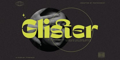 Glister Is An Stylish Display Character Inspired By Cheek Style. SOFTWARE REQUIREMENTS : Fonts and alternate : No special software required they may be used in any basic program /website apps that allows standard fonts That's it folks! You can go ahead and get cracking :) Follow My Shop For Upcoming Updates Including Additional Glyphs And Language Support. And Please Message Me If You Want Your Language Included or If There Are Any Features or Glyph Requests, Feel Free to Send me A Message. Have a Good Day !
 - Borgeny by pentagonistudio,
$19.00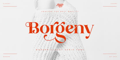 Borgeny Is An Modern Classy Serif Font Inspired By Modern Serif Typeface SOFTWARE REQUIREMENTS : Fonts and alternate : No special software required they may be used in any basic program /website apps that allows standard fonts That's it folks! You can go ahead and get cracking :) Follow My Shop For Upcoming Updates Including Additional Glyphs And Language Support. And Please Message Me If You Want Your Language Included or If There Are Any Features or Glyph Requests, Feel Free to Send me A Message. Have a Good Day !
 - Moglan by pentagonistudio,
$19.00 Moglan Is An Modern Ligature Serif Font Inspired By Modern Serif Typeface. SOFTWARE REQUIREMENTS : Fonts and alternate : No special software required they may be used in any basic program /website apps that allows standard fonts That's it folks! You can go ahead and get cracking :) Follow My Shop For Upcoming Updates Including Additional Glyphs And Language Support. And Please Message Me If You Want Your Language Included or If There Are Any Features or Glyph Requests, Feel Free to Send me A Message. Have a Good Day !
 - Evoria by pentagonistudio,
$19.00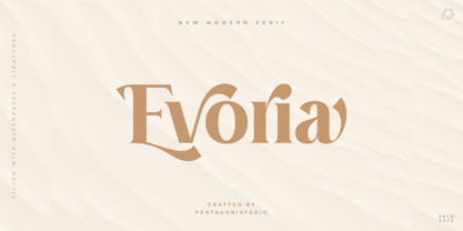 Evoria Is An Modern Stylish Font Inspired By Elegant Modern Stylish Serif. SOFTWARE REQUIREMENTS : Fonts and alternate : No special software required they may be used in any basic program /website apps that allows standard fonts That's it folks! You can go ahead and get cracking :) Follow My Shop For Upcoming Updates Including Additional Glyphs And Language Support. And Please Message Me If You Want Your Language Included or If There Are Any Features or Glyph Requests, Feel Free to Send me A Message. Have a Good Day !
 - Astrena by pentagonistudio,
$19.00 Astrena Is An Victorian Vintage Display Typeface Inspired By Nostalgic Characters. SOFTWARE REQUIREMENTS : Fonts and alternate : No special software required they may be used in any basic program /website apps that allows standard fonts That's it folks! You can go ahead and get cracking :) Follow My Shop For Upcoming Updates Including Additional Glyphs And Language Support. And Please Message Me If You Want Your Language Included or If There Are Any Features or Glyph Requests, Feel Free to Send me A Message. Have a Good Day !
 - Masterson by Arterfak Project,
$10.00 Introducing Masterson, the strong slab serif that inspired from cowboy and western style. Masterson has three styles : Regular, Spurs and College that you can combine as a unite in your design project. Masterson is all-caps font, the good choice for your logo, logotype, badges, store front, headline, sub headline, even body text because the shapes already set to keep the readability when it's use in small size. This font is recommended for western style, vintage, retro, pop art or minimalist. 300+ Glyphs included with 27 accents : Afrikaans, Albanian, Catalan, Croatian, Czech, Danish, Dutch, English, Estonian, Finnish, French, German, Hungarian, Italian, Latvian, Lithuanian, Maltese, Norwegian, Polish, Portuguese, Romanian, Slovak, Slovenian, Spanish, Swedish, Turkish, Zulu. Masterson has catchwords to give you more variants in your design.
 - Lunar Pop by Prioritype,
$19.00 Lunar Pop - Display Font. Bold and fun fonts are here to accompany your design projects. Consists of 2 styles, namely Regular & Outline which further adds to the creative value of this font. Perfect for poster design, branding, crafting, merchandise and more. Features: Uppercase, Lowercase, Numeral, Punctuation & Multilingual. Multilingual contained: Afrikaans, Albanian, Asu, Basque, Bemba, Bena, Breton, Catalan, Chiga, Cornish, Danish, Dutch, English, Estonian, Filipino, Finnish, French, Friulian, Galician, German, Gusii, Indonesian, Irish, Italian, Kabuverdianu, Kalenjin, Kinyarwanda, Luo, Luxembourgish, Luyia, Machame, Makhuwa-Meetto, Makonde, Malagasy, Manx, Morisyen, North Ndebele, Norwegian Bokmål, Norwegian Nynorsk, Nyankole, Oromo, Portuguese, Quechua, Romansh, Rombo, Rundi, Rwa, Samburu, Sango, Sangu, Scottish Gaelic, Sena, Shambala, Shona, Soga, Somali, Spanish, Swahili, Swedish, Swiss German, Taita, Teso, Uzbek (Latin), Volapük, Vunjo, Zulu. Thanks!
 - School Hand by Scrowleyfonts,
$15.00 School Hand is a font designed for use with young children. There is the Dotted version, which is designed to be traced over with a larger dot to show where to start and automatic lines. Then there is the Regular version which can be used for reading or can be printed light grey for tracing. School Hand Cursive is a cursive font which is designed using contextual alternates. Contextual alternates cannot be activated in the Myfonts preview window so please see the gallery images which show how the smooth flow of letters is achieved. Contextual alternates are available in Adobe applications and MS Word 2010 or later. If you want to see how particular text will be rendered please contact me.
 - Bodebeck by Linotype,
$29.99 The Swedish designer/typographer Anders Bodebeck designed the Bodebeck type family in 2002. The family, which includes five different styles, is primarily intended for use as a titling, or display face, and belongs to the neo-transitional style of typefaces. Transitional style type first appeared in England during the late 1750s, when John Baskerville released his first sets of type. Bodeck bears similarities to another, later transitional style typeface as well - Eric Gill's Perpetua (originally released by the British Monotype Corporation in 1928). Like these two previous English stonecutters turned masters of typography, Anders Bodebeck has given us a modern re-interpretation of classic letterforms. Bodebeck, which is fitted with old style figures, is available in the following styles: Regular, Italic, Bold, Bold Italic, and Extra Bold."
 - Native Stories by Prioritype,
$19.00 Native Stories - Classic Serif Font. A serif font with a stylish, classic feel is ready to work with your design projects. There are two styles, namely Regular and Italic. Perfect for applying to poster designs, branding, magazines, merchandise, logos and more. Features: Uppercase, Lowercase, Numeral, Punctuation & Multilingual. Multilingual contained: Afrikaans, Albanian, Asu, Basque, Bemba, Bena, Breton, Catalan, Chiga, Cornish, Danish, Dutch, English, Estonian, Filipino, Finnish, French, Friulian, Galician, German, Gusii, Indonesian, Irish, Italian, Kabuverdianu, Kalenjin, Kinyarwanda, Luo, Luxembourgish, Luyia, Machame, Makhuwa-Meetto, Makonde, Malagasy, Manx, Morisyen, North Ndebele, Norwegian Bokmål, Norwegian Nynorsk, Nyankole, Oromo, Portuguese, Quechua, Romansh, Rombo, Rundi, Rwa, Samburu, Sango, Sangu, Scottish Gaelic, Sena, Shambala, Shona, Soga, Somali, Spanish, Swahili, Swedish, Swiss German, Taita, Teso, Uzbek (Latin), Volapük, Vunjo, Zulu. Thanks!
 - The Green Eggs and Spam font is a serif typeface that is both decorative and playful, clearly inspired by the cartoon aesthetic of Dr. Seuss. The characters are characterized by their smooth, somewha...
- Preto Serif OT Std by DizajnDesign,
$50.00 Preto is an extensive type family, which explores the function of serifs on readability and legibility. Preto consist of three subfamilies: Sans, Semi and Serif. Preto is designed for multilingual typesetting. All of the subfamilies have equal gray value but different texture which can be use to differentiate languages. Preto sub-families have two text weights and two bold styles (Regular -> Bold, Medium -> Black). Every weight has a companion Italic style as well. The serif version has been designed to work best at small point sizes (around 8, 9 points). You will not achieve calm, boring or invisible look of your text with Preto Serif. Its long, spiky and sharp serifs contribute to give the typeface a distinct and energetic character. It is very suitable for magazines, corporate identity, brochures or other print materials where a typeface for continuous reading is required. The ligatures in Preto Serif are very special. You can set them in different tracking values and spacing will increase/decrease consistently in the ligatures as well. Alternative characters in the font files allow you to change the feeling of the text from typical to more special (J, Q, g , &). Each font contains a full set of small caps and many alternative characters for complex typesetting.
 - Preto Serif by DizajnDesign,
$24.00 Preto is an extensive type family, which explores the function of serifs on readability and legibility. Preto consist of three subfamilies: Sans, Semi and Serif. Preto is designed for multilingual typesetting. All of the subfamilies have equal gray value but different texture which can be use to differentiate languages. Preto sub-families have two text weights and two bold styles (Regular -> Bold, Medium -> Black). Every weight has a companion Italic style as well. The serif version has been designed to work best at small point sizes (around 8, 9 points). You will not achieve calm, boring or invisible look of your text with Preto Serif. Its long, spiky and sharp serifs contribute to give the typeface a distinct and energetic character. It is very suitable for magazines, corporate identity, brochures or other print materials where a typeface for continuous reading is required. The ligatures in Preto Serif are very special. You can set them in different tracking values and spacing will increase/decrease consistently in the ligatures as well. Alternative characters in the font files allow you to change the feeling of the text from typical to more special (J, Q, g , &). Each font contains a full set of small caps and many alternative characters for complex typesetting.
 - Austral Slab by Antipixel,
$15.00 Austral Slab is a hand-drawn layered font designed by Antipixel, with unique textures & styles that combine giving your work a distinctive impression. This font comes in three weights, Regular, Light & Thin, with irregular outlines and uneven/crooked strokes, giving your work more personality and making it exclusive and powerful. For this same reason it can be used in a vast variety of projects, such as logos & branding, stationery, book covers, magazine design, clothing prints & tags, packaging, animated videos, and many more! Austral Slab has three sets of alphabets in uppercase and lowercase to avoid repeating the same character pattern, and giving the font a more natural handwritten feel. This is included in the Open-Type Contextual Alternates, which applies an automatic substitution of glyphs as long as the Open-Type features are activated. Also, Austral Slab offers other Open-Type features such as Stylistic Alternates, Ligatures, Discretionary Ligatures, Fractions, Superscript, Subscript, Denominator, Numerator, Scientific Inferiors & Kerning. This font has a very large glyph coverage and can be used in a wide range of languages, including English, Spanish, Italian, French, German, Polish, Czech, Vietnamese, Finnish, Icelandic, among many others. The style Maplines Thin is offered Free for commercial & personal use!
 - Mantika Informal Paneuropean by Linotype,
$67.99Jürgen Weltin's Mantika Informal is pretty difficult to categorize, but very easy to like. This particularly reader-friendly typeface in regular and bold weights, brings to the table the informal fluidity of a script, the consistency of an inclined italic, and the open and airy forms and contrast of a humanist sans. The result is a warm, approachable, and very legible typeface that is never static and staid, but rather invites an attentive, reading eye. The original idea behind Mantika Informal lay in the challenge to create a typeface for setting children's books. German designer Jürgen Weltin aimed to create a reading typeface for those just starting to learn how to read. On the one hand, it should help create clear word-images; on the other, its letterforms should remain uncomplicated but resist mechanical and industrial sterility. Mantika?s subtle cursive lines stress the printed word's connection with handwriting, in addition to making the transition from school writing exercises to printed texts seamless and effortless. The resulting slightly organic and cursive forms that developed during the design process are so captivating that Mantika Informal may be used for a multitude of unintended applications - anywhere a friendly and informal yet sophisticated character could lend a helping hand, Mantika is there, giving a fresh accent to anything from packaging design to food products. With a broad character set encompassing support for Cyrillic and Green, Mantika Informal's two fonts make for a versatile and dynamic typeface that surely will find its place in a broad range of applications. - Juxta Sans Mono by NaumType,
$19.00 Juxta Sans Mono is an experimental monospace sans, an extension of the Juxta superfamily. During the creation of the Juxta script, I felt that the aesthetics and the main idea of the font had promising potential and I started thinking about a pair for it. So the idea of Juxta Sans Mono was formulated. Juxta has several style-forming elements: 45° beveled or cross out bowls, squared m and w arcs and other unobvious letter structures. Despite its unusual and sometimes odd (f, g, m) letterforms, Juxta Sans is fairly easy to read due to its monospace font nature and wide spacing. Juxta Sans Mono offers great customization potential. It has two sets of stylistic alternates — [salt] makes a letter underscored, but keep it in line, [ss01] replaces some of the glyphs with different letterforms. The [case] function automatically adjusts the height of the punctuation marks to the neighbor letter and [onum] is a set of old style numbers. Juxta Sans Mono also has subscript and superscript features, but they are utilized a bit unconventionally — if you want to customize your logo or headline, you can make a glyph superscript and the one next to it subscript and they automatically kern into one letter width. You can see examples of using these features in the presentation. Juxta Sans Mono is available in 8 weights, including Thin, Light, Regular, Medium, SemiBold, Bold, ExtraBold and Black. It extends multilingual support to Basic Latin, Western European, Euro, Catalan, Baltic, Turkish, Central European, Pan African Latin, Afrikaans, and Basic Cyrillic.
 - Mantika Informal by Linotype,
$50.99 Jürgen Weltin's Mantika Informal is pretty difficult to categorize, but very easy to like. This particularly reader-friendly typeface in regular and bold weights, brings to the table the informal fluidity of a script, the consistency of an inclined italic, and the open and airy forms and contrast of a humanist sans. The result is a warm, approachable, and very legible typeface that is never static and staid, but rather invites an attentive, reading eye. The original idea behind Mantika Informal lay in the challenge to create a typeface for setting children's books. German designer Jürgen Weltin aimed to create a reading typeface for those just starting to learn how to read. On the one hand, it should help create clear word-images; on the other, its letterforms should remain uncomplicated but resist mechanical and industrial sterility. Mantika?s subtle cursive lines stress the printed word's connection with handwriting, in addition to making the transition from school writing exercises to printed texts seamless and effortless. The resulting slightly organic and cursive forms that developed during the design process are so captivating that Mantika Informal may be used for a multitude of unintended applications - anywhere a friendly and informal yet sophisticated character could lend a helping hand, Mantika is there, giving a fresh accent to anything from packaging design to food products. With a broad character set encompassing support for Cyrillic and Green, Mantika Informal's two fonts make for a versatile and dynamic typeface that surely will find its place in a broad range of applications.
 - Woodford Bourne PRO by Monotype,
$25.99 Woodford Bourne PRO is the evolution of my original Woodford Bourne typeface that was inspired by the iconic stone cast letters on the façades of the 19th century Woodford, Bourne & Co. buildings in Cork City, Ireland. Woodford Bourne PRO has matured with numerous improvements to make it an even more versatile font family. The fonts have been completely redrawn and spaced, there are now an additional 500 glyphs for you to use across 9 stylistic sets. The additions include underlined caps, small caps, petite caps, catchwords, discretionary ligatures and more. Please view the specification sheet before you purchase to see all the glyphs and features. Key features: • Woodford Bourne PRO is a vintage geometric sans, optically adjusted for improved aesthetics and legibility 2 FONTS IN 1 – Use the default contemporary character set, or switch to vintage style with stylistic sets 9 Weights in Roman and Italic Thin | ExtraLight | Light | Regular | Medium | SemiBold | Bold | Black | Ultra Underlined Caps, Small Caps, Petite Caps, Catchwords, Discretionary Ligatures Full European character set 1000+ glyphs per font UPDATED JULY 2021 (v.3) Woodford Bourne PRO v.3 update includes numerous improvements including rebalanced /S/s/ glyphs to make them less ‘top heavy’. Italics have been redrawn to smoothe out irregularities. Improvements have been made to diacritics and glyph coverage now supports all Latin European languages.
 - LT Oksana - Personal use only

- Spooky Zombie by Ahmad Jamaludin,
$11.00 Just in time for your Halloween projects hopefully :) Introducing SPOOKY ZOMBIE! A font that's ready to cast a spooky spell on your designs. This eerie display font is the perfect choice for all your Halloween-related projects and crafty ideas. Plus, we've included an Outline version of the font as a little bonus. When you get Spooky Zombie, you'll also receive 26 spook-tacular Halloween doodles that perfectly complement your hair-raising projects! What's Included? Spooky Zombie Main File 26 free doodles with a Halloween theme Regular and Outline version Instructions (Access special characters, even in Cricut Design) Unique Letterforms Works on PC & Mac Simple Installations Accessible in Adobe Illustrator, Adobe Photoshop, Microsoft Word even Canva! PUA Encoded Characters. Fully accessible without additional design software. Multilingual Supports: (Afrikaans, Albanian, Catalan, Croatian, Czech, Danish, Dutch, English, Estonian, Finnish, French, German, Hungarian, Icelandic, Italian, Lithuanian, Maltese, Norwegian, Polish, Portuguese, Slovenian, Spanish, Swedish, Turkish, Zulu) Thank you, Dharmas Studio
 - FS Pimlico by Fontsmith,
$80.00 Born in the 70s Personal influences are unavoidable in type design and usually find their way through into finished fonts. At Fontsmith, one period in particular provides inspiration, according to FS Pimlico designer, Fernando Mello. “Jason and Phil have always known that I’m very into the visual language of the 70s. I know that Jason shares my love of the 70s and Phil will sometimes admit to being a fan, too. I think that’s the reason they were both so supportive in the development of this font. “And, of course, we all share an interest in good-humoured and intelligent design. We like to think it’s a Fontsmith characteristic.” Back from black FS Pimlico started in an unusual place: with a tubby, penguin-like lowercase “a” that Fernando Mello had been sketching. From “a” grew the rest of the alphabet – a bubbly, fat, friendly family with a brush-written quality that became FS Pimlico Black. The black weight certainly isn’t the normal starting point for creating a regular and bold weight, but Fernando pressed on, driven by a glut of influences: brush-writing; Letraset and early digital systems catalogues; the type of Herb Lubalin and Tony di Spigna; 70s clothes and vinyl; and 70s revival disco nights in London’s Pimlico and Vauxhall. Natural or flourished Not often do fonts come along that seem to span the ages. FS Pimlico is at home in an office environment providing a fresh clear identity in communications or providing text that’s clear and easy to read. But it likes to party, too, 70s style. With the OpenType features switched on, a designer can totally change the look of their work, and create point-of-sale, headlines and titles that stand out and get noticed.
 - FS Pimlico Variable by Fontsmith,
$249.99Born in the 70s Personal influences are unavoidable in type design and usually find their way through into finished fonts. At Fontsmith, one period in particular provides inspiration, according to FS Pimlico designer, Fernando Mello. “Jason and Phil have always known that I’m very into the visual language of the 70s. I know that Jason shares my love of the 70s and Phil will sometimes admit to being a fan, too. I think that’s the reason they were both so supportive in the development of this font. “And, of course, we all share an interest in good-humoured and intelligent design. We like to think it’s a Fontsmith characteristic.” Back from black FS Pimlico started in an unusual place: with a tubby, penguin-like lowercase “a” that Fernando Mello had been sketching. From “a” grew the rest of the alphabet – a bubbly, fat, friendly family with a brush-written quality that became FS Pimlico Black. The black weight certainly isn’t the normal starting point for creating a regular and bold weight, but Fernando pressed on, driven by a glut of influences: brush-writing; Letraset and early digital systems catalogues; the type of Herb Lubalin and Tony di Spigna; 70s clothes and vinyl; and 70s revival disco nights in London’s Pimlico and Vauxhall. Natural or flourished Not often do fonts come along that seem to span the ages. FS Pimlico is at home in an office environment providing a fresh clear identity in communications or providing text that’s clear and easy to read. But it likes to party, too, 70s style. With the OpenType features switched on, a designer can totally change the look of their work, and create point-of-sale, headlines and titles that stand out and get noticed. - Sada by Arabetics,
$45.00 Sada is a text font designed with hand held devices and ebooks in mind. Glyphs are designed to be larger than usual and very clear with soft visual characteristics and many traditional Arabic calligraphic transitional features incorporated to improve legibility. The word “sada” means “echo” in Arabic. Even though Sada is a cursive style font it offers clearly distinguished and visually unified letter shapes in every position of a word. Sada supports all Arabetic scripts covered by Unicode 6.1, and the latest Arabic Supplement and Extended-A Unicode blocks, including support for Quranic texts. It comes with three weights, regular, bold, and ultra-light. Each weight has normal and left-slanted “italic” styles. The script design of this font family follows the Arabetics Mutamathil Taqlidi style and utilizes varying x-heights. The Mutamathil Taqlidi type style uses one glyph per every basic Arabic Unicode character or letter, as defined by the Unicode Standards, and one additional final form glyph, for each freely-connecting letter in an Arabic text. Sada includes the required Lam-Alif ligatures in addition to all vowel diacritic ligatures. Sada’s soft-vowel diacritic marks (harakat) are only selectively positioned with most of them appearing on similar lower or upper positions to emphasize they are not part of letters. Kashida is zero width glyph.
 - Linex Sans by Monotype,
$29.99Linex Sweet was designed by Albert Boton in the late 1990s. It's a smallish family of three weights; the middle weight has an italic companion face. With its soft corners and slightly quirky head-serifs, Linex Sweet is a friendly design that sees much use. Several years later, Boton began sketching a new design, based on the original Linex Sweet but with a little more authority and grace. Linex Sans is the result. A mix of crisp angles and soft shapes, this new addition to the extended Linex family is both inviting and elegant. The subtle calligraphic overtones distinguish the design from more traditional sans serif designs. A three-weight family with a complementary italic for the Regular weight, Linex Sans is a versatile communications tool in both text and display sizes. It offers that mix of sophistication and joie de vivre that characterizes the designs of Albert Boton. Boton began his professional career as a carpenter. Fortunately for designers and typographers, he quickly turned from pounding nails to hammering out graphic design and constructing great letterforms as a profession. In his long career, he has created hundreds of distinctive, highly useful and award-winning designs. And even though he is now retired from active business, Boton continues to create fresh, new typeface designs. Add Linex Sans to the list. - Etelka by Storm Type Foundry,
$49.00 Etelka was designed for purposes of corporate identities, branding, product package design and outside lettering. It works anywhere an extremely legible typeface is needed. Package and label design often requires a wide choice of weights and widths: light and narrowed fonts to fit huge amount of mandatory informations onto a small box, or to squeeze text lines around a bottle, fat and wide styles to emphasize information on a poster or vehicle. The regular styles will serve well for business card, small texts and for your website. Etelka’s design idea is wide, open rounded square. Some details are extremely minimized: lower-case “a, n” or “u” lack their typical spur. The typeface has a distinctive industrial expression with all diagonals slightly softened, and her overall strict mono-linear principle is exceptionally broken only for fine optical adjustments in joints. Cyrillic and Greek scripts are present for international business, as well as rich latin diacritics. Etelka is actually very well suited for all kinds of visual communication, especially orientation systems in modern architecture. The first drawing of the font, which was later named “Etelka”, was submitted in 2004 for the Czech Television identity competition and was rejected by the jury. We later concluded that the design was worth extending to the current superfamily of 42 fonts. It is a reliable typeface for corporate identities and websites.
 - Promenades - Personal use only

- Weigela by Colllab Studio,
$15.00 Presenting Weigela! A Beauty Script Font 6 alternates and extra. This font made with the perfect combination of each character. You can combine with Alternates and Extra to get a unique combination. It looks original and can be used for all your project needs. Each glyph has its own uniqueness and when meeting with others will provide dynamic and pleasing proximity. This font can be used at any time and in any project. You can see in the presentation picture above, Weigela looks beautiful and versatile on design projects. So, Weigela Font can't wait to give its touch to all your design projects such as quotes, wedding invitations, wedding theme designs, poster design, personal branding, promotional materials, website, logotype, product packaging, etc. WHAT'S INCLUDED? Weigela Regular • It comes with uppercase, lowercase, ligatures, numeral, punctuation, symbols, Many Ligatures, Alternates, and Standard Latin Multilingual Support (Afrikaans, Albanian, Catalan, Danish, Dutch, English, French, German, Icelandic, Indonesian, Italian, Malay, Norwegian, Portuguese, Spanisch, Swedish, Zulu, and More). Weigela Stylish Alternate • It comes with the lowercase of ending swash. Weigela Alternate One • It comes with the lowercase of beginning swash. Weigela Alternate Two • It comes with the lowercase of ending swash Weigela Alternate Three • It comes with the lowercase of love connecting swash. Weigela Alternate Four • It comes with the lowercase of love connecting swash. Weigela Alternate Five • It comes with the lowercase of love connecting swash. Weigela Alternate Six • It comes with some lowercase; b, d, f, k, and l. Extra Swashes • Included 15 Underline Swashes. You can feature all with typing c_1 until c_15 (Opentype Feature) or using Characters Map Tool. A Million Thanks Colllab Studio
 - Nathaniel by Mevstory Studio,
$25.00 Nathaniel The "Nathaniel " font family epitomizes beauty and elegance in every character. With two distinct styles, Regular and Italic, this font is the perfect choice to infuse sophistication into your design projects. Key Features: Elegance and Beauty: Nathaniel has been meticulously crafted to ensure each letter is visually captivating. It's an ideal choice for creating stunning quotes and long paragraphs in your designs. Feminine Appeal: This font is perfectly suited for designs with a feminine touch, such as fashion, magazines, and logos with a simple yet enchanting design. Artistic Pairings: Nathaniel seamlessly complements script fonts, enhancing the artistic appeal of your projects. Combine these two font styles to create unique and attention-grabbing designs. Recommended Uses: Inspirational Quote Designs: Use Nathaniel to create motivational and inspirational quotes for social media, posters, or merchandise. Fashion and Magazine Design: Nathaniel is the perfect choice to create a luxurious and feminine look in magazine layouts and fashion promotions. Simple and Classy Logos: Craft simple yet character-filled logos using Nathaniel to represent your brand with unmatched style. Nathaniel is the perfect fusion of beauty and functionality, elevating your design projects to the next level. With this font, you'll be able to create impressive and captivating works. Get Nathaniel today and start making your design projects stand out. Don't miss out on this opportunity! Get Nathaniel now and start inspiring the world with your captivating designs.
 - Turntable Stencil JNL by Jeff Levine,
$29.00 A disc jockey-only promotional sleeve for a 1964 [45 rpm] release of “Close to Me” and “Let Them Talk” by Dan Penn featured the song titles printed in a stencil typeface on the record sleeve. Closely resembling a stencil version of Franklin Gothic but with its own unique characteristics, this design has been reinterpreted as Turntable Stencil JNL and is available in both regular and oblique versions. For trivia buffs, Dan Penn is a singer-songwriter-record producer, often collaborating with Dewey Lindon “Spooner” Oldham; both closely associated with the late Rick Hall’s Fame recording studios in Muscle Shoals, Alabama. In 1964, Hall started the Fame record label, and for a time it was distributed by Vee-Jay Records of Chicago, the first major Black-owned record label in the United States. Penn’s release was only the second for the new label; Fame 6402.
 - Plinc Kerpow by House Industries,
$33.00 Inspired by the hand-lettered sound effects found in comic books, Dave West takes a three-dimensional deep dive into the genre with his extensive onomatopoeic alphabet originally designed for Photo-Lettering, Inc. The sonorous voice of Kerpow’s caps captures “cartoon” brilliantly, while the accompanying lowercase provides options for broader applications. Turn to Kerpow for eye-catching children’s book covers, fast casual restaurant marketing, or family fun centers, and…BAM!…all eyes will be on your design. Originally drawn in the late 1960s, Kerpow was digitized by Allen Mercer in 2011. Please note that the shaded version of the typeface is composed by layering the Regular font and a separate Drop Shadow font. Some assembly required. Like all good subversives, House Industries hides in plain sight while amplifying the look, feel and style of the world’s most interesting brands, products and people. Based in Delaware, visually influencing the world.
 - Walkway by Sabrcreative,
$25.00 Discover the elegance of Walkway Font, a stunning handwritten signature script with a natural flow. Whether you're a photographer, brand designer, or simply looking to add a touch of sophistication to your projects, Walkway Font is the perfect choice. It is versatile and can be used for various purposes such as watermarks, social media posts, advertisements, logos and branding, invitations, product designs, labels, stationery, wedding designs, and product packaging. With its full set of alternate characters, Walkway Regular offers endless creative possibilities. As a bonus, you'll also receive the Walkway Bonus, which includes ornamental vector graphics to enhance your designs further. This font provides multilingual support, catering to a wide range of languages including Afrikaans, Albanian, Catalan, Danish, Dutch, English, Icelandic, Italian, Spanish, Portuguese, German, Swedish, Norwegian, Polish, Indonesian, Zulu, and more. Its extensive language support ensures that you can communicate your message effectively to diverse audiences.
 - The Roletta by Almarkha Type,
$29.00 Introducing The Rolleta – Handbrush Signature is a brush script that is written casually and quickly. Letters are made with brushes on paper. Then scanned and carefully drawn into vector format. That is why The Rolleta has charming, authentic and relaxed characteristic,has 4 styles of regular, slant, Alternate , and Alternate Slant variations with a more natural look to your text with a more natural look to your text. The Rolleta is perfect for homeware designs, branding projects, Logo, design, Quotes, Product packaging, Photography, Watermark What’s Included : + Standard glyphs + Ligatures + Web Font + Works on PC & Mac + Simple installations Accessible in the Adobe Illustrator, Adobe Photoshop, Adobe InDesign, even work on Microsoft Word. PUA Encoded Characters – Fully accessible without additional design software. Fonts include multilingual support Image used : All photographs/pictures/vector used in the preview are not included, they are intended for illustration purpose only. Cheers! Thank You
 - Shàngó Gothic by CastleType,
$59.00 Shàngó is CastleType’s beautifully-rendered interpretation of Professor F.H.E. Schneidler's elegant titling typeface released in 1936 with the name 'Schneidler-Mediaeval mit Initialen'. This latter design is usually referred to as Schneidler Initials. Although early on Medium and Bold weights were added to the somewhat delicate design of Shàngó, it seemed there were other possibilities that might be useful for display use. So, for the last couple of years I have been working on and off on a monoline version of Shàngó. This new design maintains the classic letterforms of the original, but its relatively even strokes gives it a more solid appearance, making it useful where a more modern, masculine look is needed. This new family is called Shango Gothic and is available in four weights: Regular, Medium, Bold, and Extra Bold. Shàngó Gothic is a member of the extended Shàngó family (Classic, Chiseled, Sans, Gothic).
 - Hansplatz Grotesk by Heypentype,
$20.00 Hansplatz Grotesk is a sans serif type family of nine weight. Influenced by Akzidens Grotesk, Hansplatz typeface bring a new approach to this utilitarian style of grotesk. With more square proportions rather than geometric style, Hansplatz grotesk aimed to ease typesetting job when arranging a words or paragraph easily. A wide range of weight gives flexibility to every design project, hansplatz fit nicely to grid-system because of proportions. Furthermore Hansplatz Grotesk supplied with smart Opentype scripting to assist typesetter and designer very easily to Hansplatz feature. Hansplatz Grotesk truly a utilitarian, workhorse, neutral, and of course faceless. But, it makes the work done quickly. For display use, Hansplatz Grotesk Black to Semi-Bold is recommended, for paragraph heavy design, use regular and light weight. To spice up, adding Hairline or extra-light weight will make a design execution looks great and catchy but not intimidating.
 - Widy by Pasternak,
$12.00 Wide font family is a geometric sans serif font, which features 9 styles. It’s based on the Futura developed by Paul Renner and neo sans-serif fonts. At the same time, it has significant stylistic differences. Massive lengthy letters are among the unique features of this font. They will help you come up with the perfect composition. The letters have optical compensation, while a circle is the main figure of the fonts. Due to wide fonts, your project will have modern and fresh design. The composition will keep its contrast regardless of a background you’ve chosen. The Widy family includes 9 styles: Thin, Extra Light, Light, Semi Light, Regular, Medium, Semi Bold, Bold and Extra Bold. Each of them also has Italic variation. The fonts are perfect for both graphic design projects (posters, brand identities, logotypes) and simple interface design, which needs the necessary style.
 - Bebas Neue - 100% free

- FS Truman by Fontsmith,
$80.00 Beyond broadcast Like Truman Burbank, the star of The Truman Show, FS Truman was born for TV. You’ll know it from Sky One’s on-screen trails and announcements, but it’s just as at home in other media. Its starting point was the skeleton of a highly legible, space-saving, corporate font with some of FS Dillon’s geometric discipline built in. Its distinctive tone of voice and “ownability” are in its boxy but friendly shapes, and characters with hybrid features. FS Truman’s weights and widths were honed to work at TV screen resolutions. A face for TV it may have been, but this is a font that works on every level, on screen, in print, in headlines, in listings, in longer text, in tight corners and open spaces. The space-saver Compact, condensed but crystal clear, FS Truman comes into its own where a lot needs to be said in not a lot of space. Its letter spacing allows the type room to breathe, even at small sizes, while its fulsome x-height and diminutive descenders pave the way for tighter leading. A natural for headlines and titles over three or four lines. “Hybrid” features With every font, Fontsmith look for crafty new ways to imbue letterforms with a consistent character. The idea with FS Truman was to introduce “hybrid” features. In open letters such as “c” and “s”, for example, the top terminals have straight, vertical cuts while their lower terminals have a more angular, cursive finish. Boxy, spacious forms with unusual curves and angles create not just highly legible and efficient letters but strongly distinctive ones, too.
 - HS Alfaris by Hiba Studio,
$59.00 The idea of this font started while designing a logotype for a company named (Mazarat), consisting of 3D geometric looking shapes and overall structure. After designing several words, I thought of using the design concept of this logo to develop a geometric Kufi font for headline category. All letters of this typeface family were conceived with suitable coordinates and dimensions to create the first weight, bold, before finishing the rest of the letters to support Arabic, Persian, Urdu and Kurdish languages. Another weight was conceived, regular, which was designed closer to light to support applications that require variations in thickness. With a 3D look, this font is a simple and creative addition which can be useful for book titles in addition to a variety of other geometrical constructions projects. It brings new design concept for ends of Jeem, Ayn, Reh and Waw to enhance beauty and harmony and to enrich our previous geometrical font contributions which started with the release of HS Alhandasi and HS Almohandis from HibaStuido.
 - CoolKids by SevenType,
$29.99 CoolKids was inspired by the song “Signs of Life” by Arcade Fire. Since the lyrics talk about some cool kids we wondered what a typeface with the name cool kids would look like. We immediately knew it had to be laid back yet bold and to stand out from the crowd. After designing the bold script we decided to include a light, regular and medium weight to offer you more options for your designs. It comes with initial and final alternates, that show up automatically, to make it feel more natural and similar to handwriting. Every character was carefully drawn and connections are real smooth. This casual font-family speaks most Latin languages, both in their basic and alternate forms. CoolKids is great for creating logos, packaging, posters and much more. More important than to create a font is to use it… so now it’s up to you to create something awesome with it. Feel free to share your designs with us via email to hi@seventype.com We would love to see and share them with the world!
 - Thunderboss by Haksen,
$16.00 Thunderboss is a strong modern sans style with upper and lowercase feel nice balanced. Its wide range of uppercase with alternates and ligatures allow versatile design options and works perfectly for headlines, logos, posters, packaging, T-shirts and much more. Font Features : Regular and Italic version Character set A-Z Ligatures in Uppercase Alternates in Uppercase Numerals & Punctuation Accented Characters Multiple Languages Supported Format File: OTF Recommended to use in Adobe Illustrator or Adobe Photoshop with opentype feature. Ligatures feature is default setting in Adobe Illustrator or Adobe Photoshop in Uppercase character. So when you want not to use the ligatures. Open glyphs panel : In Adobe Photoshop choose tool Window Character and then please klick fi symbol In Adobe Illustrator choose tool Window Type Open Type and then please klick fi symbol How to access Alternate Characters? Open glyphs panel : In Adobe Photoshop choose tool Window glyphs In Adobe Illustrator choose tool Type glyphs If you have questions, just send me a message and I’m glad to help. Have a great day, Haksen Std


