9,402 search results
(0.023 seconds)
- Regatta Condensed by ITC,
$29.00Regatta is a bold, narrow sans serif designed by Alan Meeks in 1987. Its strong, robust figures makes it a particularly good font for headlines in larger point sizes. Regatta is distinguished by its diamond shaped dots on i and j as well as the slanted strokes of several figures. These characteristics relax the closed, static image of Regatta and let the font seem cheerful and friendly. - Aerosol - Unknown license

- MCF bad manners ww - 100% free

- ITC Tapioca by ITC,
$40.99ITC Tapioca was designed by Eric Stevens. He developed the typeface for a nightclub, yet its simple forms are reminiscent of childhood writing exercises. This effect is enhanced by rough edges, which in large sizes make the characters look as though they were composed of strings of dots...or tapioca. The basic style is printed handwriting, although some forms take cursive handwritten forms. The varying slants and irregular forms of the characters give ITC Tapioca a sense of energy and playfulness. - Crimstone by Locomotype,
$14.00 Crimstone is a bold and strong geometric typeface. Rectangular shape with rigid and sharp edges is the first impression that makes this font look powerful and hit. Its continued development created other variations including rounded styles, inline and handmade styles. Not only the clean version, Crimstone is also available in a printed version with a rough and textured appearance. Each has an upright and slanted version. Available in 16 fonts, the Crimstone family is perfect for poster designs, movie titles, logotypes, packaging etc.
 - FRIESKA by Unitype Studio,
$19.00 FRIESKA is a modern serif typeface. It is consist two styles : Regular and Slant. This gorgeous font will engage your audience and make your promotions and projects stand out. Bring your branding to life and add a touch of modernity and style with this font. It’s the perfect fit for all luxury projects, such as wedding invitation, signatures, luxury logos, printed quotes, grettings cards, social media headers, product packaging and many more! Thanks for downloading, and I hope you enjoy it!
 - Heidth Variable by Arkitype,
$40.00 Heidth Variable has 2 styles, regular and slanted with varying extremes in width and height. It is designed as a display font for fun typographic use. Heidth is perfect for use in branding, posters, print campaigns packaging or what ever you need to have fun expressive typography. Wide or high, Heidth Variable is extremely versatile and works for any artwork layout and orientation. Please note: Being a Variable font, you will need software that supports variable fonts.i.e Adobe Illustrator, Photoshop etc.
 - Hoax by More Etc,
$18.00 Introducing Hoax – a pre-worn sans serif with spirit, personality and distinction. This bold and semi-condensed sans serif is inspired by old copy machines and vintage prints. It is lively and eye-catching, ideal for where and when you want to make a lasting impression. Hoax is a celebration of character, a tribute to curiosity. Use this typeface and let everyone know that you mean business. OPENTYPE FEATURES: This font includes over 40 discretionary ligatures of prepositions and common words in English. These OpenType features can be accessed using OpenType friendly applications that allow the use of discretionary ligatures and stylistic sets. MULTILINGUAL SUPPORT: With over 700 glyphs, it has support for more than 150 languages, including Cyrillic script. List of discretionary ligatures: AND, ARE, AT, BY, FOR, EST, FEAT., FROM, IN, IS, OF, ON, OR, OUR, THAN, THAT, THE, TO, WITH, YOUR, CO. Each word is available in both upright and slanted versions. How to use: Activate the discretionary ligatures as you normally do in your OpenType friendly application. When activated, the words are in upright versions. To access the slanted versions, activate the first stylistic set (“Slanted Ligatures”). Happy typing!
 - Boott Stitch by Aboutype,
$24.99Pen drawn in line, outline typeface originally designed for embroidery application. Boott was designed for print media in a wide point size range. Boott requires subjective display kerning and compensation. - Thicker by Zetafonts,
$39.00 Thicker is a type-family designed for Zetafonts by Francesco Canovaro with Andrea Tartarelli. A geometric sans typeface on steroids, it was first designed in the muscular Extrablack weight with the aesthetics of high-power dynamic typefaces used in sports communication, and then developed in the lighter weights where the shapes show some vintage-inspired proportions and the slightly squared look that nods to Novarese famous Eurostile, eponymous with retro-futurism. With these diverse influences the typeface allows for both impressive display use and effective logo design as well as more fine-tuned editorial use in body text - with a natural inclination for effective and powerful advertising. Sports typography usually uses italics to add dynamism and impact, and Thicker complies with this by offering a choice of three alternate italic forms with different slant, made even more customizable by the inclusion of variable font technology that allows fine tuning of the weight range as well as precise choice of typeface slant. In each of the 44 weights of the typeface family (as well as in the all-in-one variable type solution) Thicker offers a extended charset of over 900 latin, Cyrillic and Greek glyphs, covering over two hundred languages and including useful Open Type features (Alternate forms, Positional Numerals, Small Caps and Case Sensitive Forms) for flawless typesetting.
 - Linotype Projekt by Linotype,
$29.99Linotype Projekt was created by German type designer Andreas Koch with both a well-defined inspiration and goal. It occurred to me that typefaces like Helvetica and Univers seemed to have a higher quality in hot-metal composition as with modern digital typesetting. They are stronger and livelier. This is in part due to the printing process, which presses the characters onto paper, and in part to the forms of the letters, which differ from the PostScript version of the same typeface. An important aspect of printing is the slight increase in character width resulting from the pressure which also serves as an optical correction to the forms. (True exact squares appear slightly barrel-formed to the eye.) I wanted to revive this peculiarity, not because of a nostalgic feeling, rather just because it is more attractive." The result is Linotype Projekt, a text font which is harmonious, clear and extremely legible. Koch lives in Bielefeld, Germany, and is a freelance book and type designer." - Octane MF by Masterfont,
$59.00 Perfect for high contrast, slanted stylistic headlines, signage and logos.
 - Linotype Rory by Linotype,
$29.99Linotype Rory oblique is part of the Take Type Library, selected from contestants of Linotype’s International Digital Type Design Contests of 1994 and 1997. The font was designed by Canadian Tad Biernot with strictly constructed forms. The similarly formed figures seem mechanically created and their light slant gives the impression of strenght and dynamism. Linotype Rory oblique should only be used in the shorter texts of headlines in larger point sizes. - Dalcora by Linotype,
$29.99Dalcora was designed by Erwin Koch in 1989 in a single weight. The most distinguishing characteristic of this font is its unusual proportions. Text fonts are usually designed with more delicate horizontal strokes as the verticals, but Dalcora is exactly the opposite. Its slight slant to the right and the round forms of the letters make the font dynamic and cheerful. Dalcora is intended exclusively for headlines in larger point sizes. - AnimalTracks - Unknown license

- Broft by Baqoos,
$25.00 Broft is a pointed substantial linear sans apt for headline, editorial, branding, packaging, printed materials and typographic applications. 200+ glyphs with ligatures and fractions provided in opentype .otf and .woff format.
 - Back And Forth by A New Machine,
$10.00 This all cap, bold, sans serif font features one face that slants backward ("Back") and one that slants forward ("Forth"). Use in combination to create headlines and designs that call for a sense of speed, motion and power. Uppercase and lowercase letters are the same.
 - 914-SOLID - Personal use only

- Agathodaimon - Personal use only

- Bona Nova by Borutta Group,
$- ☞ Bona Nova is a collective revival project of Bona typeface designed in 1971 by the author of polish banknotes Andrzej Heidrich. Besides giving the project a digital font form the aim was to expand the base character set: preparation of small caps, designing the alternative glyphs and multiple opentype features. Working together with the author we designed two new text versions: regular and bold – to give the family a form of a classic script triad. ☞ It is accompanied by three title versions and three contour styles under the name of Bona Sforza. All styles contains over 1200 glyphs. ☞ Bona Nova is an unprecedented typographic adventure for our team. We hope that our work will allow the cultural heritage of Bona and the work of Andrzeja Heidricha to gain new followers and fans. This project connected three generations of graphic designers who graduated the same school – the Academy of Fine Arts in Warsaw. ☞ Bona Nova isn’t only a typeface. We have also prepared a book about the project (including an interview with Andrzej Heidrich, my text about the digitalisation and a font specimen). The Bona Nova release party was a big exhibition (over 1000 guests). I’ve invited 26 graphic designers to prepare their own initials of Bona Nova – they were presented as posters on exhibition too. LINKS Bona Nova WEB Bona Nova FP Bona-Nova-(FREE-FONT) Bona Nova Book BONA NOVA IN THE MEDIA Typeroom Typography Guru Slanted Designalley Stgu Typografie Info Wikipedia Bona Nova is a non-profit project, all founds that we raise we reinvest to develop the Bona Nova project (new styles, Cyrillic & Greek, extend character set).
 - Astoylist by Maulana Creative,
$14.00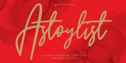 Astoylist Slanted Signature Script Font Give your designs an authentic handcrafted feel. Astoylist Slanted Signature Script Font is perfectly suited to logo, stationery, branding, typography quotes, magazine or book cover, website header, clothing, branding, packaging design, restaurant and more. Thanks for use this font. Maulana Creative
 - Film Title JNL by Jeff Levine,
$29.00 A World War II training film had its opening title card “First Aid” hand lettered in a casual, Art Deco sans serif design. This is now available digitally as Film Title JNL, in both regular and oblique versions.
 - 1920 French Script Pro by GLC,
$42.00 This font was inspired by one of a standard French manual styles in use from the beginning of 1900s to the end of World War II, when people were writing most often with pen holders and metal nibs. This typeface is easily legible as it was used for the lithographic printing of university textbooks. All lower cases from a to z and numerals from 0 to 9 are doubled by a slightly different one to allow a varying manual aspect in texts. We have added a lot of diacritic characters, covering West (including Celtic) and North European, Icelandic, Baltic, Eastern European and Turkish language. A few special glyphs allows to make final loops or underlining.
 - Deltoid - Unknown license

- Moon And Stars by Ana's Fonts,
$15.00 Moon and Stars is a handwritten script font and illustrations collection, perfect to create cute handmade designs, such as logos, packaging, prints and postcards, patterns, and social media posts. Moon and Stars includes: A handwritten script font with tons of ligatures for a smoother text. A dingbat font with 52 handmade line drawings, including food, fruits, vintage objects and plants, with a bonus blackout version.
 - Seasick by Ingrimayne Type,
$8.95Seasick and Seasick-Mirror features wobbly, wavy, distorted letters. They were derived from the almost monoline font Kwersity. The letters of Seasick have a slight backward slant and the letters of SeasickMirror have a slight forward slant. Each of them comes in four weights: Light, Regular, Bold, and ExtraBold. - Dropsomaniacal by Proportional Lime,
$9.99 Drop Caps happen. They started off life as decorated initials way back when in the days of illuminated manuscripts. Then printing came and they became the work of the rubricators and then somewhere soon after printing began, at least by the 1490’s, they were printed directly into the text. This then is a collection of over a hundred glyphs from that closing decade of the Incunabula period. All of them are based on examples found in the works printed by Michael Wenssler in Basel. This font also contains a few useful pointing hands and a set of spacing characters.
 - ITC Belter by ITC,
$29.99ITC Belter was designed by Andreu Balius in 1996. Out of a purposely limited form repertoire Balius created a constructed typeface with a cool and technical character. A distinguishing characteristic of this font is the cross at the ends of many strokes. The figures seem to be products of mass production, which heightens the mechanical feel of the font. Belter is meant for point sizes of 10 and larger in headlines and shorter texts and must be set with generous spacing. - FebDrei by Ingrimayne Type,
$9.95 FebDei is neat, meticulous hand printing in two weights, plain and bold, each with italics. It has little contrast and appears as if it was written with a pencil or ball-point pen. Unlike many other hand-printing fonts, it has tiny serifs. FebDrei was created in the process of making the fonts AllSmiles and BringInTheFrowns and can be used with them.
 - ITC Arid by ITC,
$29.99ITC Arid was designed by Rob Leuschke in 1997 as a lively calligraphy typeface which looks as though it was put to paper with a piece of charcoal. Generous capitals mix harmoniously with the more reserved lower case characters and the forward slant of both create a dynamic impression. Arid should be used in point sizes of 12 and larger and is well-suited for headlines and short to middle-length texts. - Blackletter - Unknown license

- Clear Prairie Dawn by Quadrat,
$25.00Clear Prairie Dawn is an original humanist sans serif family based on the designer's own printing. Designed for use as a text face, as a humanist sans it shares some of the characteristics you might notice in other such faces as Optima, Gill Sans or Stone Sans. The italic is a designed italic, rather than merely a slanted roman, and incorporates many of the ideas that the designer found too lively for the roman fonts. The complete CPD package consists of three weights with italics, and a set of original ornaments. - Crackers Brusher by MlkWsn,
$18.00 Crackers Brusher is a carefully crafted brush script and full of imagination and rough textures that are typical of this font. It includes two regular and slant styles and OpenType and 28 ligature features (in uppercase) as well as a swash weight. This font is perfect for challenging jobs, titles, t-shirts, websites, hoodies, and various print and digital media with energy. With extra attention to quick strokes and sharp details, Crackers Brusher is ideal for logos, apparel, quotes, product packaging, or anything which needs a typographic turbo-boost.
 - Richfont BT by Bitstream,
$50.99Based on Mr. Hubbard's own hand printing, Richfont Medium is an extremely casual design. Actually light in weight, it renders best at 14 point and above. Richfont Light and Bold are available from the designer. - DEAD SECRETARY - Personal use only

- Bad Hair Day - Unknown license

- WW2 BlackltrAlt - Unknown license

- Klein by Zetafonts,
$39.00 Klein PDF Specimen Klein is Zetafonts love letter to the grandmother of all geometric sans typefaces, Futura. Starting from a dialogue with Paul Renner’s iconic letterforms and proportions, Francesco Canovaro and Andrea Tartarelli decided to depart from its distinctive modernist shapes with slight humanist touches and grotesque solutions - with some design choices evoking the softness of humanist sans serifs like Gill Sans. The end result is a workhorse superfamily of 54 fonts with full multilingual capabilities and coverage of over two hundred languages using latin, cyrillic and greek alphabets. The original display-oriented family, developed in nine weights with matching italics (from the hairline thin to the sturdy black), has been paired with a text version (with slightly higher x-height, better readability and maximum legibility at small point size) and with a condensed version, to be used for space-saving display solutions in editorial and advertising formats. With a name that is both a nod to its humble functionality and an homage to french nouveau realiste artist Yves Klein, this typeface aims to become your next trusted companion in all your adventures in print, digital and motion design.
 - Smudger by ITC,
$39.00 Smudger, from designer Andrew Smith, is oriented toward a young generation who does not want to mind the rules. The font invites unconventional and playful use. The figures seem to be almost coincidentally shaped. Letters alternate between thin and thick strokes alternate and give the font the smudged look that inspired its name and gives the font its unmistakable character. Smudger is a font that just cannot settle down. It is best used for headlines and short texts in point sizes of 12 or larger.
 - Sweetheart Script - Personal use only


