10,000 search results
(0.033 seconds)
- Bouncy Color by Mans Greback,
$59.00 Bouncy Color is a funny cartoon font with pre-set coloring, outline and shine effects! Drawn and created by Mans Greback in 2021, this comic-style lettering has a happy, quirky personality and optimistic humour. It has a colorful graffiti and street art look, while being a childish and cute sans-serif – a typeface for boys and girls alike. Bouncy Color is provided in five styles: White, Blue, Pink, Highlight and Outlined. Use it in Photoshop, Illustrator, InDesign or any other modern software that supports color fonts, and you'll give any project a fun and happy appearance.
 - Ambient by IHOF,
$24.95 “When you push the stage props of the life aside, there will remain the truth ...” Ambient is a deconstructed sans-serif font, which captures the essence of basic Roman letterforms... with a few twists. Gabor Kothay was born July 19th, 1962. He works as a graphic designer and teaches second-form art students. Typeface design was a hobby for many years but it has become an everyday routine with Fontmunkasok and Fontana Type Foundry. He lives with his wife and two daughters in a suburb of Szeged, a sunny southern Hungary town that lies on the banks of the Tisza river.
 - POLIGRA by Borutta Group,
$39.00 POLIGRA is an experimental typefamily and a homage to traditional printing of the pre-war era in Poland. Most of the typefaces based on traditional printing are either clean, geometric typefaces or completely distressed lettering. The POLIGRA project explored everything in between. The letters, cleaned up, redesigned where necessary, and defined in their entirety, have a friendly and warm character, as if taken out of the press. The selection of typefaces was based on theater and sports posters. All of them have blocky and geometric character, each of them is an all-caps typeface. The POLIGRA family includes 13 typefaces.
 - Dot To Dot by A New Machine,
$9.00 This font is for parents and educators that want to easily be able to print out the alphabet in order to have their child or student then trace them. This eliminates the need for creating the dotted lines by hand and lets the user type out exactly what letters they need instead of relying on pre-made charts. The font is upper and lowercase letters and numbers only - no punctuation. Comes in Regular and Guides (get both for the same price as one) which draws guidelines with the letters. Best when used at a large point size.
 - Grotesk Polski FA by Fontarte,
$39.00 Grotesk Polski FA developed in 1998-2006, was inspired by the Polish eminent pre-WWII text typeface - Antykwa Półtawskiego. Adam Półtawski designing his antiqua had took into consideration the special qualities of Polish language. He designed unique letters: k, w, y, z and R, K, Y. Another unique element of his typeface was polygonal dot. Grotesk Polski keeps all that shapes and goes further. It is a contemporary sans serif in four cuts: Regular, Italic, Bold and Stencil. The proportions of the typeface were rebalanced to give it a neo-grotesque form with a Polish twist.
 - Conthey Inline by ROHH,
$29.00 Conthey Inline™ is your new retro-display best friend! The one and only, unique IN-AND-OUT typeface with strong personality and outstanding flexibility. This display sans features amazing variable fonts letting you adjust not only width of the letters, but also let you fluently transition from thin inline styles to thin outline ones. This mechanics opens a world full of layering possibilities as well as a great fine-tuning ability. The family consists of 39 OpenType fonts - 18 pure inline/outline styles in 3 widths (Narrow, Condensed, Normal) and 21 styles carefully prepared and tuned for layering. For even greater flexibility 3 variable fonts are included in the set. In addition to flexible width and inline-outline transitioning, this playful typeface features 4 different inline styles to spice up things even more! All styles were meticulously crafted with the highest attention to detail in the letterforms as well as spacing. Conthey Inline is a sibling of Conthey, a display unicase family as well as Lutschine, a versatile modern narrow display typeface. Conthey Inline composes perfectly with its family members, covering a very broad range of design scenarios. All these typefaces are a part of big type system containing also a workhorse sans serifs such as Rothorn and Montreux Grotesk. You will have a lot of success using Conthey Inline for any kind of playful, vintage/retro, organic, friendly and stylized designs. Especially, industries such as food & beverage, travel, hospitality, fashion, healthcare, sports, lifestyle, music, art, entertainment and products for youth are perfect areas to make Conthey Inline shine with all its charm.
 - Paneuropa 1931 by ROHH,
$19.00 Paneuropa 1931™ is a faithful recreation of XX-century Polish classic, made by Idzikowski foundry in Warsaw, 1931. Original Paneuropa was a renowned and highly popular typeface in XX-century Poland, and was widely used in all kinds of design, editorial use and printed materials for decades. Paneuropa is a geometric, clean and versatile font family inspired by Paul Renner's famous Futura - it is a bit narrower, with different proportions and details in drawing, completely different figures and punctuation shapes than Futura. It is an interesting and refreshing alternative to Futura with its own distinct personality and a subtle authentic vintage flavour. Paneuropa 1931 contains separate styles for display and large sizes as well as styles for small text sizes - differing in spacing and the softness of letterforms. The family features an original Paneuropa Double font - a beautiful inline style for headlines and display use. The whole family is completed with added missing inbetween styles as well as italics. The original subfamily set is available for purchase and it contains solely the original Paneuropa styles (Thin, Regular, Bold, Text Regular, Text Italic, Double). Paneuropa 1931 characteristics: letter shapes and proportions are very faithful to the original, keeping its idiosycrasies and inconsistencies spacing and kerning are carefully adjusted in order to achieve the colour of the original fonts, keeping maximum possible consistency - a compromise between authentic vintage feel and legible consistent text colour (for hardcore users: just turn off the kerning) weights precisely matching the original (Thin, Regular, Bold, Text Regular, Text Italic, Double), inbetween weights were added (Light, Demi Bold, as well as missing italic styles) italic angle faithful to the original (8 degrees) softened corners help achieving the character of old imprecise printed display styles for big sizes are sharper and have tight spacing, text styles have softer shapes (recreating small print imperfect print) and broader spacing for use in paragraph text (spacing in both display and text styles matches the original as well) original style names in Polish for devices with Polish set as their primary language The family is very versatile. The Inline style as well as bold and thin weights are perfect for headlines and display use, other styles works wonderfully as paragraph text. Paneuropa 1931 consists of 18 fonts - 5 display weights with corresponding italics + 3 text weights with corresponding italics + 2 inline styles (for big and small print sizes). It has extended support for latin languages, as well as broad number of OpenType features, such as case sensitive forms, fractions, superscript and subscript, ordinals, currencies and symbols.
 - Crakos - Personal use only

- SpideRaY - Personal use only

- Palatino Arabic by Linotype,
$187.99 Palatino Arabic is a collaboration between Lebanese designer Nadine Chahine and Prof. Hermann Zapf. The design is based on the Al-Ahram typeface designed by Zapf in 1956 but reworked and modified to fit the Palatino nova family. The design is Naskh in style but with a strong influence of the Thuluth style as well. This is evident in the swash-like finials and the wide proportions of the letterforms. It is designed for use in print in both large and small sizes. The counters are wide open to allow for better readability in small sizes as well as to maintain an open and friendly appearance. The font has 1091 glyphs and includes a large number of extra ligatures and stylistic alternates as well as the basic Latin part of Palatino nova and support for Arabic, Persian, and Urdu. It also includes proportional and tabular numerals for the supported languages. Palatino Arabic wins Type Directors Club award. Each year, the New York-based Type Directors Club judges typeface designs from all over the world in their TDC2 contest. Linotype is pleased to announce that a very new typeface of its own is among 2008’s winners: Palatino Arabic. A collaboration between Nadine Chahine and Prof. Hermann Zapf, this face is an extension of Zapf’s Al-Ahram Arabic type from 1956 recreated to join the Palatino nova family.
 - FF Infra by FontFont,
$50.99 FF Infra™ is a fresh take on the robust sans serif typefaces of the early 20th century. Drawn by Gabriel Richter, it’s a friendly, inviting – and multi-talented family. Whether long blocks of editorial text, or snackable copy in web pages and blog posts, FF Infra’s 20 typefaces are easy on the eyes in both print and digital environments. The design also performs as well at petite sizes, as it does at supersized display settings. Pair FF Infra with an old style or Didone serif design and you’ll have powerful and distinctive typographic pages! FF Infra is available in 10 weights, ranging from a delicate light to a commanding black, each with an italic companion. OpenType® Pro fonts of FF infra have an extended character set supporting most Central European and many Eastern European languages, in addition to providing for the automatic insertion of ligatures and fractions. Each font also contains four sets of figures and a bevy of arrows that are ideal for wayfinding and similar info-graphic projects. A generous lowercase x-height, open counters and subtle graduations between family weights, make for a family that is at home in a wide range of sizes, and comfortable in everything from large signage, content for mobile apps, product manuals and full-scale branding projects. In addition, to provide design diversity, Richter drew alternate designs for the a, G and ß. Richter first became interested in fonts and the art of creating typefaces while studying communication design at Düsseldorf University of Applied Sciences. His first designs were experimental, but these lead a position at FontShop International in 2013, where he developed his typeface design skills. A strong background in font production, hinting and font marketing were also part of his FontShop experience. Richter worked as freelance graphic and type designer until he founded übertype in 2017. He also invests back into the type community through the type design courses he teaches at his alma mater. FF Infra is Richter’s first commercial design for Monotype. We’re sure that you’ll find it as versatile and powerful as we do.
 - Lust by Positype,
$49.00 Lust’s original masters were completely redrawn, expanded, with a new optical size added based on customer requests. Lust now sports 6 fonts, instead of the original 4: Standard, Display, Fine, and complementing Italics. The character set has been expanded as well to include more OpenType features and more swashes. The Lust Collection is the culmination of 5 years of exploration and development, and I am very excited to share it with everyone. When the original Lust was first conceived in 2010 and released a year and half later, I had planned for a Script and a Sans to accompany it. The Script was released about a year later, but I paused the Sans. The primary reason was the amount of feedback and requests I was receiving for alternate versions, expansions, and ‘hey, have you considered making?’ and so on. I listen to my customers and what they are needing… and besides, I was stalling with the Sans. Like Optima and other earlier high-contrast sans, they are difficult to deliver responsibly without suffering from ill-conceived excess or timidity. The new Lust Collection aggregates all of that past customer feedback and distills it into 6 separate families, each adhering to the original Lust precept of exercises in indulgence and each based in large part on the original 2010 exemplars produced for Lust. I just hate that it took so long to deliver, but better right, than rushed, I imagine.
 - Rodeo Roundup by FontMesa,
$30.00 Four years in the making Rodeo Roundup is a very ornate script font where the letters look like a flowing rope with connecting lowercase letters. Due to the high amount of detail in this and other FontMesa fonts some applications may have difficulty displaying the letters larger than 100 point size.
 - Dissert by Skiiller Studio,
$20.00 Dissert is a playful and unique display font with a charming feel. Get inspired by its unique authentic charm! What's include: Ligature PUA Encoded Characters - Fully accessible without additional design software. Basic Latin Language Support (AÀÁÂÃÄÅCÇDÐEÈÉÊËIÌÍÎÏÑOØÒÓÔÕÖUÙÜÚÛWYÝŸÆß ) How to access alternate glyphs? you can see it on this link ( http://goo.gl/1vy2fv )
 - Break Age Graffiti by Sipanji21,
$17.00 Break Age is an awesome display font with a graffiti style and break characters with bandages to make your design look awesome! It will elevate a wide range of design projects to the highest levels, be it branding, headings, wedding designs, invitations, signatures, logotypes, wall art illustrations, apparel, labels, and more!
 - Noyr by Sign Studio,
$20.00 Noyr is a font for display that requires a modern/futuristic appearance. Uppercase and Lowercase are available equipped with standard symbols and multilingual characters. This font is designed to be dynamic with today's style. All have been PUA Encoded. You can easily access each character in the software in general.
 - Meaglez by Rvandtype,
$15.00 Meaglez Display font. Its elegant and cool look makes it the perfect choice for logos, branding, invitations, stationery, wedding designs, social media posts, and so much more. Meaglez font is PUA encoded which means you can access all of the glyphs. Features: Ligature Alternate Characters Numbers and punctuation Multilingual PUA encoded
 - Trade Stencil by Jeff Levine,
$29.00 Spotted in an online auction was a set of brass stencils (possibly handmade) of which some of the characters were individually displayed. The interesting placement of where the letters were broken into stencil parts inspired the creation of Trade Stencil JNL, which is available in both regular and oblique versions.
 - Fux by Rodrigo Fuenzalida,
$25.00 Fux is a condensed, neutral looking font, that features and extended ligature set, small caps, old style numbers and stylistic alternates, that should help to fulfill all your type setting needs. Is perfect to be used as big display and title font, and works very good in small sizes and paragraphs.
 - The Kallman by Sabrcreative,
$25.00 Introducing The Kallman Font, a captivating display brush typeface that effortlessly commands attention. With its bold and dynamic strokes, this font adds a striking impact to your design projects. Perfect for eye-catching headlines, posters, logos, and more, The Kallman Font infuses your creations with a powerful and contemporary vibe.
 - Bulluck by Patria Ari,
$12.00 Bulluck is a serif display typeface with strong characters to support your brand/project. Perfect for projects with subjects related to automobiles or outdoor activities. Bulluck can also be used for logos and branding, headlines, posters, signage, advertisements, printed quotes, product packaging, product designs, labels, photography, watermark, special events and more.
 - Gledek by Differentialtype,
$10.00 Gledek is a lightning display font that comes in two styles. The regular and outline styles complement each other perfectly for any purpose such as logos, sports, games, club branding, posters, labels, comic books and more. Add this font to every project you create to make it brighter and stand out.
 - Archequare by Midtype,
$26.00 Archequare is a square font made with geometric shapes by adding a slight curve to the font to make it more varied and specifically designed for text content, long sentences such as mechanical instructions. However, Also useful for display, titling, captions by their sophisticated glyph shapes and their eye-catching geometry
 - Blackleather by Clint English,
$25.00 Blackleather is a gothic display typeface best for dark and moody vibes. Included are full sets of upper and lowercase letters, numbers, symbols and bonus alternate characters for select letters. Blackleather is designed in a classic blackletter style with sharp, clean 90º/45º lines for the highest quality output possible.
 - Gratezon by Rvandtype,
$15.00 Gratezon is a display font. It has a cool and playful look that can be used for logos, branding, invitations, stationery, social media posts, and so much more. Featuring the perfect amount of trendiness, this font will make your designs come to life. Features : Numbers and punctuation Multilingual Support Ligature
 - Noma by Spinturnix,
$15.00 Noma is a new wide-set display font with a minimal geometric style. I designed Noma because I wanted a tech-inspired font that has plenty of character while remaining legible. Noma is a great choice for high-impact headings and logotypes. I hope you enjoy, thanks for checking it out!
 - Fox Bowling by Fox7,
$12.00 Fox Bowling is a bold and playful display font that adds a captivating and energetic touch to your designs. Its main feature is its vibrant and expressive design, allowing you to create attention-grabbing headlines, t-shirt typography, banners, product labels, and more. With its versatility and eye-catching presence.
 - Spinach by Larin Type Co,
$12.00 Spinach - a new fun display font. This is a fun font that is perfect for creating your project, it can be used to create a beautiful inscription for t-shirts, children's books, branding, small business, book covers, stationery, marketing, blog, magazines and more. All characters of this font support PUA encoded.
 - Kong Script by Talbot Type,
$19.50 Kong Script is a contemporary, geometric, script typeface, a modern interpretation of a traditional style. The upper and lower case character sets link seamlessly, in the manner of a traditional script, to create an easy, flowing look. It's full of character and works well as a stylish, memorable display font.
 - Maggies Luck by Gleb Guralnyk,
$15.00 Hello! Introducing a layered display font — Maggie's Luck. It's a vintage style bold typeface with layered feature. Maggie's Luck Font has five "fonts-layers" for more convenient recoloring. This font has a multilingual support (check out a screenshot with available letters and signs). Thank you and wish you a peaceful sky!
 - Kanban by ITC,
$29.99Kanban is the work of British designer Ed Bugg, an all capital, oriental style typeface. Kanban was the word used for shop signs in old Japan and the letter forms mimic the square look of Japanese and Chinese calligraphy. Kanban is the ideal display solution wherever an oriental appearance is needed. - Cute Easter by Yoga Letter,
$16.00 "Cute Easter" is a unique and playful display font. The letters in this font are so cute because they have been specially designed. This font is equipped with uppercase, lowercase letters, numerals and punctuations, and multilingual support. Can be used for Easter moments, greeting cards, cartoons, comics, movie titles, and more.
 - Plz Print by Outside the Line,
$19.00 A happy, friendly hand printed font for many uses. Works as a display or body copy font. Great for that letter home to Mom or when you need a casual look. It can also be found in the book "Indie Fonts 3, a Compendium of Digital Type from Independent Foundries".
 - Misologist by Sronstudio,
$23.00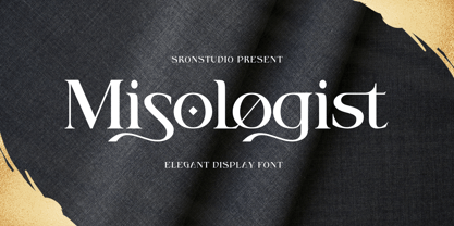 Misologist – Display Font comes with an elegant and modern touch this font is perfect for branding, invitation, stationery, wedding designs, social media posts, advertisements, product packaging, product designs, label, photography, watermark, special events, and more. Features: Uppercase and lowercase letters Lowercase Swashes Alternates Ligatures -Multilingual, numerals, and punctuation Thank You!
 - Dotum by Microsoft Corporation,
$129.00Dotum™ features plain strokes similar to sans serif designs with proportional Latin characters, and works well for on-screen display such as user interfaces. This Dotum font file is 5.2 MB in size. Dotum is a trademark of Microsoft Corporation. Dotum font Character Set: Latin 1, Korean code page 949 - Halvert by Din Studio,
$22.00 Halvert is an amazing display font. The font is suitable for any project like branding , lettering , tshirt print and many others. Included Files : Halvert Solid (OTF) Halvert Shadow (OTF) Havert Layered (OTF) Features: Accents (Multilingual characters) PUA encoded Numerals and Punctuation (OpenType Standard) Thanks for visiting and purchasing my font!
 - Barbaros by MoodyType,
$49.00 An Art Deco condensed display sans font with 8 styles, +800 glyphs, +100 ligatures, +30 languages and many opentype features. It is perfect for poster designs, magazines, book covers, logotypes, headlines, newspapers and press. It's bold, daring, modern, geometric and covers a good range of weights from light to block.
 - Valgan by Patria Ari,
$15.00 Valgan is a bold, slanted, all-capital display font designed to energize sport-themed apparel and related content. Its dynamic style exudes power and motion, making it perfect for team logos, jerseys, posters, and event branding. Versatile and contemporary, Valgan ensures your designs command attention and convey the spirit of competition.
 - Hasan Aya by Hiba Studio,
$59.00 Hasan Aya is an Arabic display typeface. It is useful for titles and graphic projects The font is based on the simple lines of Kufi calligraphy. This font was created based on the Latin font "Bedrock" which was designed by Corel Corporation in 1992. It supports Arabic, Persian and Urdu.
 - Texas Moliqu by Evo Studio,
$15.00 Texas Moliqu is a retro and western-looking display font. This bold, and vintage font can easily become your favorite. It can be used for books, magazine covers, social media posts, invitations, and so much more! So add this to your creations and take your designs to the next level!

