10,000 search results
(0.046 seconds)
- Maesha by DYSA Studio,
$18.00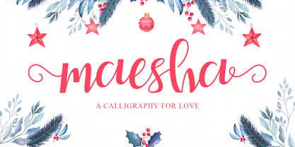 Maesha is handwritten signature font. This another collection of script is perfect for your next personal branding project, excellent for your business. Maesha have a smooth edges, so this font gives an authentic handcrafted feel style. Maesha is perfect choice for people looking for clean, modern, minimalist, elegant, beauty design styles. Suitable for almost any graphic designs such as logo, branding materials, business cards, gift cards, t-shirt, cover, thumbnail, print, poster, photography, quotes .etc
 - Bekof by Twinletter,
$15.00 Bhekof is typography with strong characteristics. Explore several other eras of art and combine them into a strong Bhekof characteristic. A great typeface for your next design project. Looking for a typestyle that has strong characteristics? Look no further than Bhekof! This awesome typeface has a vintage look that will make your designs stand out from the rest. With strong characteristics like this, it’s no wonder it makes your design very popular.
 - Somnium Amor by Salsabiyl Studios,
$15.00 Introducing Somnium Amor Modern Serif Font Somnium Amor is a modern and elegant serif font. This serif font is perfect for your next branding project. This serif font has plenty Characters and has Multilingual Support. Somnium Amor is perfect choice for people looking for clean, modern, minimalist, elegant, beauty design styles. Suitable for almost any graphic designs such as logo, branding materials, business cards, gift cards, t-shirt, cover, thumbnail, print, poster, photography, quotes .etc.
 - The Anglican font, an exquisite typeface that captures the sophisticated essence of traditional Anglicanism, amalgamates the venerability of classical letterforms with the finesse of modern typograph...
- Riff by estudioCrop,
$24.90Having spent all of my teenage years in the 90s, it's no surprise that this very particular decade resonates so deeply in me. As a graphic designer, I still think the strongest visual languages of the last 50 years or so come from that time. Bold aggressive attitude is what most people remember from those designs. What they seem to forget—or, rather, to have completely ignored—is that some incredibly elegant and subtle styles emerged from those years. It still amazes me how they reflected so well the period in which they were conceived, taking style construction to the next level. Riff is a natural development of some of my thoughts about the 90s. Mixed with a very contemporary feel, it embodies several idiosyncrasies I absorbed over years of exposure to favorite design pieces, fonts, music, films and other cultural products that share the same spirit. - Paranoid Android by Comicraft,
$29.00Fonts are Inhuman and Human Fonts are IN! Now, the Comicraft Cybernetics Corporation is proud to announce the first in a new line of fonts with GFP... Genuine Font Personalities. Paranoid Android is an outer alloy, inner void, solitary solenoid GFP prototype -- you can tell, can't you? Finally a font that knows its place as a digital servant to the human race. What will Comicraft think of next? No, don't bother to answer that, Comicraftsmen are fifty thousand times more intelligent than you and even they don't know the answer. Warning: Nothing left to be enjoyed, every diode rheumatoid*, terminally Paranoid Android is not so much a font, and more a kind of electronic sulking device. Share and Enjoy! *The moving parts on the left side of this font are in a solid state. It may sit in a corner and rust, or just fall apart where it's standing. - Valmera by Arterfak Project,
$13.00 Valmera is an elegant serif font, designed with modern-classy style. Valmera has a high contrast of the strokes that gives the minimalist looks, the serif crafted minimal to makes the letterform more classy. Also, the letter spacing is set wide that looks so clean. It is versatile and luxury! Available in 3 weights that you can use it for a headline, sub-headline, and body text. Valmera is a great choice for a minimalist design such as book cover, magazine, cards, packaging, quotes, editorial needs, advertising, traveling needs, logos & branding. Valmera is complete with alternates and swashes on the uppercase letter that possible you can make a typographic text. Font Features: Uppercase Lowercase Numbers Symbols Punctuation Stylistic alternates Swashes Accents (28 Languages) Thank you for visiting and watching, have a nice day!
 - FF Daxline by FontFont,
$83.99 German type designer Hans Reichel created this sans FontFont in 2005. The family has 14 weights, ranging from Thin to Black (including italics) and is ideally suited for advertising and packaging, book text, editorial and publishing, logo, branding and creative industries, poster and billboards, small text as well as web and screen design. FF Daxline provides advanced typographical support with features such as ligatures, small capitals, case-sensitive forms, fractions, super- and subscript characters, and stylistic alternates. It comes with a complete range of figure set options – oldstyle and lining figures, each in tabular and proportional widths. As well as Latin-based languages, the typeface family also supports the Cyrillic and Greek writing systems. This FontFont is a member of the FF Dax super family, which also includes FF Dax and FF Dax Compact.
 - Aquene by Craft Supply Co,
$20.00 Introducing Aquene – Display Serif Font Are you in search of a unique serif font with a captivating flow for your display requirements? Look no further than Aquene – Display Serif. This meticulously crafted font is designed to make your text stand out and captivate your audience. Unique Flow for Captivating Text Aquene – Display Serif font boasts a distinctive flow that sets it apart. Firstly, its elegant curves and graceful lines lend a touch of sophistication. Secondly, it’s perfect for eye-catching headlines and titles that leave a lasting impression. Versatile Usage for Various Design Needs Moreover, Aquene is remarkably versatile. It’s suitable for posters, banners, or website headers, making it ideal for different design contexts. Whether you’re working on a promotional campaign, crafting a logo, or designing social media graphics, Aquene’s adaptability shines.
 - Rufing by Twinletter,
$12.00 Introduce our newest font named Rufing. There are three alternatives in this font, thin, regular, and bold. which makes it easier for you to arrange a proportional and captivating design layout because the character of this font is suitable for use as logos and titles and of course it is also flexible in use in text and sentences. This handwritten font is perfect for children’s magazines, drink banners, games, posters, beverage, outdoor events, thumbnails, food banners, cheerful writing, film titles, quotes, titles, logos, and various kinds of projects you need, of course, your various design projects will be perfect and extraordinary if you use this font because this font is equipped with a complimentary font family, both for titles and subtitles and sentence text. start using our fonts for your amazing projects.
 - Symbojet by SIAS,
$56.00 Symbojet is the first professionally designed font equally covering alphabetic and pictographic characters on a large-scale scheme. It’s typographically based on Andreas Stötzner’s recent “Lapidaria” design and uses brandnew standard Unicode-6.0 codepoints for about 340 symbol characters. Use Symbojet for combined text/signage composing to design wayfinding, tourism and leisure, sports and transport matters, for media and communication, for birthday invitations or bistro menu cards … With Symbojet the combined usage of text and signage becomes as easy and elegant as it has never been before. Symbojet is available in a Regular and a Bold version. Both fonts contain about 340 alphabetic (full Latin and Greek) and 400 pictographic characters; in total they count about 1000 glyphs each. The pictographic content is the same in both fonts.
 - Adelle by TypeTogether,
$52.00 While Adelle is a slab serif typeface conceived by Veronika Burian and José Scaglione specifically for intensive editorial use, mainly in newspapers, magazines, and online, its personality and flexibility make it a true multipurpose typeface. Adelle’s superior screen rendering and cross-platform consistency has also made it one of our most popular webfonts. The intermediate weights deliver a neutral look when used in text sizes, providing the usual robustness expected in a newspaper font. The unobtrusive appearance, excellent texture, and slightly dark colour allow it to behave flawlessly in continuous text, even in the most unforgiving editorial applications. As it becomes larger in print, Adelle shows its personality through a series of measured particularities which make it easy to remember and identify. Its energetic character, so inherent to slab serif fonts, becomes evident when used for subheadings and headlines. A condensed series of seven weights with matching italics expand Adelle’s possibilities. This extension provides flexible solutions in situations where saving space is vital but losing legibility is not an option. The new condensed series shares the same personality, proportions, and skeleton of the Adelle family, creating an harmonious texture when combined. Be sure to check out the companion to Adelle, Adelle Sans, to complete the look of your design with the intended personality and flexibility. Awards – Third prize for Latin text typeface in the 2009 Granshan Type Design Competition – Won Gold for Original Typeface in the 2010 European Design Awards – Selected in the first Ukrainian typeface competition in 2010 – Exhibited at the Rutenia Calligraphy & Typography Festival (http://rutenia.org.ua/en/index_u.html) in Kyiv, 2010 – Selected in the 2011 Type Directors Club Tokyo Exhibition – Selected in Communication Arts 2011 Typography Annual – Selected in Yearbook of Type I, 2013 – Part of the exhibition «Call for Type» and subsequent book Neue Schriften (New Typefaces)
 - Lyra by Canada Type,
$39.95 Lyra is an Italian Renaissance script that might have developed if metal type had not broken the evolution of broad pen calligraphy. It lies in the area between the humanist bookhand and the chancery cursive, combining the fullness and articulation of the Roman letters with a moderate italic slant and condensation. A steep pen-angle allows use of a broader pen relative to the x-height, giving the letters more contrast with light verticals and heavy curves. Lyra embodies the Renaissance spirit of refining technical advances of the late middle ages with reintroduction of ancient classical principles. Based on the moving penstroke with constantly changing pen-angle, it brings the vitality of handwriting to the ordered legibility of type. Lyra is a formal italic, too slow for copying books. By eliminating the element of speed, digital technology opens up a new level of calligraphy, bringing it into the sphere of typography as would naturally have happened if metalworkers had not controlled the process. If classical Western traditions are respected, digital calligraphy has the potential to recapture the work of the past and restart its stalled evolution. There is of course no substitute for the charm of actual writing, with each letter made for its space; but the tradeoff is for the formal harmony of classical calligraphy as every curve resonates in tune with every other. This three-weight font family marks Philip Bouwsma's much-requested return from a three year hiatus. It also reminds us of his solid vision in regards to how calligraphy, typography and technology can interact to produce digital beauty and vesatility. Each of the three Lyra fonts contains almost three character sets in a single file. Aside from the usual wealth of alternates normally built into Bouwsma's work, Lyra offers two unique features for the user who appreciates the availability of handy solutions to subtle design space issues: At least three (and as many as six) length variations on ascending and descending forms, and 65 snap-on swashes which can be attached to either end of the majuscules or minuscules. The series also offers 24 dividers and ornaments built into each weight, and a stand-alone font containing 90 stars/snowflakes/flowers, symmetric contstructs for building frames or separators, masking, watermarking, or just good old psychedelia.
 - Scandilover by Katsia Jazwinska,
$19.00 Scandilover Family was inspired by monochrome Scandinavian style kid rooms full of handwritten graphics, black and white accessories and prints. Scandilover is a playful display font with its personal charisma. Each letter in the font perfectly combines with another and all in all creates a text that is an entire illustration itself. Scandilover Script is a thin delicate font which isn’t devoid of playfulness too. Together with contrasting Scandilover they make funny lively combinations. Just try!
 - Afterword JNL by Jeff Levine,
$29.00 At the end of the 1931 gangster film “The Public Enemy” a hand lettered card offers up an afterword on the demise of Tom Powers (James Cagney’s character in the film) and how a “public enemy” is neither a man nor a character but a problem society must deal with. The text is in an Art-Deco influenced sans serif, and has been digitally recreated as Afterword JNL, which is available in both regular and oblique versions.
 - Dastardly Deeds SRF by Stella Roberts Fonts,
$25.00 This design from Ray Larabie (and adapted by Jeff Levine) is so unusual. The lettering lends itself to messages of sinister intent or horror movie titles. The net profits from my font sales help defer medical expenses for my siblings, who both suffer with Cystic Fibrosis and diabetes. Thank you.
 - IMars by Artyway,
$14.00 Introducing the IMars Font - the future of typography is here! This sleek and modern font is the perfect addition to your design arsenal. Its clean lines and minimalist elegance make it ideal for contemporary, sci-fi, and space-themed designs. But that's not all - the versatility of the IMars Font also makes it the perfect choice for branding, adventure, and music projects. With its cutting-edge design, this font will bring your projects to the next level. Whether you're creating a stunning sci-fi movie poster or a sleek and stylish brand identity, the IMars font has you covered. So why wait? Get creative and try different styles and kerning combinations to find the perfect look for your project. Embrace the future of typography with the IMars font today! Try different styles and experiment with kerning for best results.
 - Theossaint by Keristyper Studio,
$14.00 Introducing Theossaint font, the epitome of modern beauty in typography! This font is the perfect mix of contemporary and classic elements, making it the ideal choice for your next design project. With its clean lines, sharp edges, and bold presence, Theossaint font will elevate any design and make it stand out. Whether you're designing for a modern brand, a fashion label, or an editorial publication, this font is sure to make a statement. Get ready to add a touch of modern beauty to your design with Theossaint font! Featured: Standard, Uppercase & Lowercase Numeral & Punctuation Multilingual : ä ö ü Ä Ö Ü ß ¿ ¡ Alternate & Ligature PUA encoded We recommend programs that support the OpenType feature and the Glyphs panel such as Adobe applications or Corel Draw, so you can use all the variations of the glyphs. Hope you enjoy our fonts!
 - Rockeby by My Creative Land,
$24.99 Please welcome the new grotesque family; slightly more geometric than Block Berthold but much softer than the industrial Din Next, Rockeby includes a lot of stylistic alternates and ligatures to help add character to any type of design. The slightly curved diagonal strokes give the sans serif fonts its unique personality and soft look. Even more - the family has two scripts (4 weights each) which will enhance the design even more. Combining italic with the script has never been easier - they both have the same italic angle. These scripts also benefit from contextual alternates, swashes and ligatures. And last but not least, the family also includes Extras fonts (which also have 4 weights) which can further enhance any design you are creating. There is an new addition to the family - Rockeby SemiSerif and Rockeby Brush families!
 - White Rainbow by Wyarecreatype,
$13.00 Please welcome, White Rainbow. Fun and casual vintage retro decorative font. The definition of real versatility and flexibility. You can rock on both vibes, retro and modern by using a single font. Yes, just like your favourite day-to-day sneakers. Wide variety of Stylistic Alternates and Ligatures in every single letter to elevate your design game to the next level. Cut the process more because it should be easy. Perfectly fit for the visual project such as logo, branding, poster, food and beverages, social media content, website, UI/UX design, youtube thumbnail, CV, mood board, wedding, you name it. FEATURES Uppercase and Lowercase letters ligature and alternates feature Numbering and Punctuations Multilingual Works on PC or Mac Simple Installation Support Adobe Illustrator, Adobe Photoshop, Adobe InDesign, also works on Microsoft Word Hope you Like it. Thanks. Helotype
 - ITC Seven Treasures Ornaments by ITC,
$29.99Akira Kobayashi's ITC Seven Treasures is a symbol font for use in patterns and textures. The interlocking patterns, usually circular or oval, are taken primarily from motifs used in Japanese textiles. Most of these designs are known as komon, or tiny patterns," and they are often applied to kimono and other textiles, although their use is not limited to fabrics. They also appear carved in wood in traditional architecture, and painted in pictures as background patterns. Each of the individual designs in ITC Seven Treasures Ornaments is carefully sized and spaced so that it will fit together into a continuous pattern. Most overlap slightly but precisely, so that when you type a row of them you can't tell where one leaves off and the next begins. They may be combined or alternated to vary the texture of a background pattern." - Maketa - Personal use only

- TT - Unknown license

- TonleSab - Unknown license

- Peach Lotus by Nathatype,
$29.00 It can be a tough challenge to present the best display for your projects, especially in limited options of fonts. For that reason, let us introduce you to our display serif font to amaze your audience with your projects. Peach Lotus is a display serif font we created by mixing the classical serif elements with big, bold-sized letters for you to impress and attract your audience. On top of that, it gives you more artistic, creative touches as a result of the display font combinations. A display font with thickly-lined and high contrast capital letters will produce a prominent display to strengthen the impressions delivered. In addition, you can apply this font for big-sized texts to be legible. Also, you can enjoy the available features here. Features: Multilingual support PUA encoded Numerals and punctuations Peach Lotus fits best for various design projects, such as brandings, posters, banners, headings, magazine covers, quotes, printed products, merchandise, social media, etc. Find out more ways to use this font by taking a look at the font preview. Thanks for purchasing our fonts. Hopefully, you have a great time using our font. Feel free to contact us anytime for further information or when you have trouble with the font. Thanks a lot and happy designing.
 - CA Texteron by Cape Arcona Type Foundry,
$40.00 CA Texteron is a modern text font family to cover the most common typographical needs with a minimum of weights. It is aiming for a serious but unconventional look, which is achieved by combining round and edgy forms in the same font, often in the same glyph, and by using Humanist and modern form-principles at the same time. It merges classical type-design with an experimental spirit. CA Texteron combines elements of the dynamic renaissance principle with the static neo-classic style, which makes it hard to classify. The result is a post-modern hybridization. The Regular weight works best in text size, and with more letter-space also for footnotes. The low contrast makes it robust and legible even in very small sizes. Bold, Italic and Small Caps are intended for emphasis. Bold, Bold Italic and Heavy make good headlines, that reveal the unconventional details. The Italic is not just a slanted version of the Regular weight but has individual forms and typical italic characteristics.
 - Semikolon by URW Type Foundry,
$35.00 SemikolonPlus: Optimal readability by reduced, distinct letter forms. Appropriate for early readers of any age in schools and other educational institutions. SemikolonPlus minimizes the risk of confusing similar characters and therefore is predestinated for the use in text blocks, work sheets, educational games et cetera. Furthermore, with its accented characters, currency signs, true fractions and other special characters, SemikolonPlus is suited for numerous typographic tasks and – thanks to its distinct letter forms - offers great readability, even in lower point sizes. SemikolonPlus is recommended by the German association of alphabetization and basic education, which uses it for adult education, reading magazines, teaching material and the own YouTube-channel. SemikolonClassic: Is the familiar font with alternative character forms. E.g. it contains the lower case double level a and g, as well as glyphs harmonically formed to the typeface. The SemikolonClassic is suitable for diverse uses in various sectors. Together or in combination SemikolonPlus and SemikolonClassic offer extensive possibilities for the layout of text material with their heavy font weights.
 - Core Narae Pro by S-Core,
$25.00 Core Narae Pro is an improved version of Core Narae released in 2012. This type family has improved a lot. First of all, we have rearranged a rhythmic text line to make it work well both as a headline and a text font. And this new version has more OpenType features, including Proportional Figures, Tabular Figures, Numerators, Denominators, Superscript, Scientific Inferiors, Subscript, Fractions and Standard Ligatures. We have also added one more weight and improved kerning for using this type family effieciently. Finally, we exclude MS Windows 949 Korean consisting of 11,172 Korean letters and Symbols except Chinese to reduce the file size and price but added more glyphs that support latin,cyrillic,greek. Now, Core Narae Pro Family consists of 2 weights (Regular & Bold) and it supports WGL4, which provides a wide range of character sets(CE, Greek, Cyrillic and Eastern European characters). Its bending strokes and rhythmic feeling of this typeface make your works more friendly.
 - Karme by PeachCreme,
$18.00 Say hello to our new classy font duo "Karme"- a combination of all-caps serif and stylish handwritten script! Karme Serif - Due to its extraordinary and eccentric characters, the serif can be more suitable for displays, headers, and short logos rather than body or long texts. Not all but some of the letters have alternatives in stunning lowercase forms. You can play with 92 different fascinating ligatures with the Karma Serif. While using the serif, we would recommend turning off the automatic ligatures and accessing them manually through the Glyphs panel (or copy/paste) so that from several options you can choose the one that fits your text best. Karme Script - a modern and realistic handwritten font with a natural flow. Featuring 112 playful and groovy ligatures, the font can be well paired with serif, sans serif, and display fonts. Works great for stationery, websites, packaging, and many other handwritten style designs.
 - Frigga by Sudtipos,
$49.00 Frigga is a typeface that settles its roots in the Baroque Dutch tradition of text typefaces and northern european type forms. Carefully crafted for an optimum balance between its solid historic structure and a refreshing repertoire of organic forms, where blossoms its contemporary spirit and natural beauty. In the page, spread on long text settings a feeling of comfort and closeness, while in headlines and display use, it reveals itself more exuberant and plentiful of details. Is beautiful, timeless, lush, elegant and smooth like nordic mead. Fully equipped to realize your wildest editorial dreams, Frigga came in 20 styles, with more than a 1000 glyphs per style, alternates, ornaments and borders, old style and tabular figures, small caps and plenty of OpenType features to fulfill any type of editorial need. Named after the nordic goddess Frigga (also called Frejya), taking as a reference the romantic mythos of its cultural representation, the solemn presence and her warm, gentle embrace.
 - Drop_it by Just in Type,
$18.00Drop_it is a redesign of fonts originally created to be recognized by computers using OCR (optical character recognition) softwares. Strangely, human beings fell in love for the stylistic inconsistencies of these fonts made for machines. In small sizes, Drop_it emulates the appearance of fonts in antique operational systems monitors. In large sizes, its structure is composed of capsules and pills allude the universe of medicines, drugs and rave culture. Drop_it Dingbats follow the the same grid of its alphabetic version, and can be used side by side in sign projects. Besides the traditional symbols, it present specific images from the rave culture like DJ (Disc-Jockey) and VJ (Visual-Jockey). Drop_it italic set adds velocity to text compositions using six angle variations. All the fun starts with a very unusual Break version. Fall version is a kind of "anti-italic". Slow version put your text in another rhythm. Swing have a little italic emphasis. Italic is, you know, italic. And Speed version run away. - Scala Pro by Martin Majoor,
$49.00 The award-winning Scala family (1990-1993) is a worldwide bestseller and has established itself as a ‘classic’ among digital fonts. It was one of the first serious digital text fonts to support small caps, ligatures and different set of numbers. In fact Scala and Scala Sans (1990-1993) are two different typefaces sharing a common form principle: the skeletons of both Scala and Scala Sans are identical. Scala’s dark colour and low contrast works to prevent the thin parts from breaking up. The generous length of Scala italic’s serifs gives it a strong rhythm. The bold weight has the same character widths as the normal weight, so changing a text from normal into bold does not affect the set width. Another part of Scala is very popular among its users: Scala Hands, containing more than one hundred decorative hands and pointers, is a free bonus. Scala Jewels is a set of four highly decorative typefaces, based on the bold capitals of Scala.
 - Cheria by Ahmad Jamaludin,
$15.00 Say hello to our new Retro font, Cheria! Cheria - A chunky serif texture with a bit of humanist touch. With its good readability, Cheria is perfect for both displays as well as body text. Inspired by all the retro aesthetics making a comeback, Cheria is perfectly suitable for creating thoughtful yet still contemporary designs such as logos, packaging, editorial, and more. Cheria - Has a unique shape, where all uppercase letters have alternates so you can combine them to make your text and header look more interesting! What you get : Regular and Bold family Alternate and Ligature Instructions ( Access special characters, even in circuit design ) Letters, numbers, symbols, and punctuation Use in many programs even in Canva Multilingual Support Language Support: Danish, English, Estonian, Filipino, Finnish, French, Friulian, Galician, German, Gusii, Indonesian, Irish, Italian, Luxembourgish, Norwegian Bokmål, Norwegian Nynorsk, Nyankole, Oromo, Portuguese, Romansh, Rombo, Spanish, Swedish, Swiss-German, Uzbek (Latin) Come and say hello over on Instagram! https://www.instagram.com/dharmas.studio/ Dharmas Studio
 - Dutch Mediaeval Pro ST by Canada Type,
$49.95 Dutch Mediaeval Pro ST is a special version of the popular Dutch Mediaeval Pro family, engineered specifically for science writing. It is equipped with SciType, a combination of additional characters and OpenType programming included in the fonts to help in typesetting science text. For more information about SciType, please consult the SciType FAQ available in the Gallery section of this page. The Dutch Mediaeval design is the historically renown one made in 1912 by S. H. de Roos. It stands out as one of the most classic Dutch text faces. This digital version comes in two weights and their italic counterparts. Aside from the SciType additions, all the fonts contain OpenType features for small caps and caps-to-small-caps, ligatures, ordinals, automatic fractions, seven kinds of figures, and a few ornaments. For details about the functionality of Dutch Mediaeval Pro ST, please consult its Access Chart PDF available in the Gallery section of this page.
 - M Banquet P PRC by Monotype HK,
$523.99 M Banquet is a humanistic script written by a Chinese restaurant owner, which the name ‘Banquet’ comes from. It is a calligraphic style that always being seen in traditional Chinese banquet menu. Incorporated a feeling of masculinity, fill with strength and energy and attracts eyeballs of customers. It was written with a thin ball pen in a unique, personal and expressive writing style, such that it is realistic, natural and masculine. Contrast of strokes is low and the text is visible and eye-catching. Its light to medium stems (豎) make it suitable for small text to subheading with little conglutination. All strokes are irregular, inconsistent, irregularly oriented and tightly coupled. Spatial distribution, positioning, size and relative proportion of radicals fully reflect a natural and personal style. It is one of the few proportional-width font in a full scale. It is best suited for casual lively atmosphere, illustrations, set upright (non-slanted), non-condensed.
 - M Banquet P HK by Monotype HK,
$523.99 M Banquet is a humanistic script written by a Chinese restaurant owner, which the name ‘Banquet’ comes from. It is a calligraphic style that always being seen in traditional Chinese banquet menu. Incorporated a feeling of masculinity, fill with strength and energy and attracts eyeballs of customers. It was written with a thin ball pen in a unique, personal and expressive writing style, such that it is realistic, natural and masculine. Contrast of strokes is low and the text is visible and eye-catching. Its light to medium stems (豎) make it suitable for small text to subheading with little conglutination. All strokes are irregular, inconsistent, irregularly oriented and tightly coupled. Spatial distribution, positioning, size and relative proportion of radicals fully reflect a natural and personal style. It is one of the few proportional-width font in a full scale. It is best suited for casual lively atmosphere, illustrations, set upright (non-slanted), non-condensed.
 - Secca by astype,
$42.00 Secca is a fresh and versatile typeface series. With its workhorse qualities, Secca is perfectly suited for a wide range of applications - especially where legibility and economy are important factors. Secca is rooted in the tradition of early German Grotesk typefaces, but is tailored for the needs of today, with a wide language support and many typographic features and extras. » pdf specimen « The core family comes in nine weights from Thin to Ultra Black plus another three Hairline weights - each with italics, small caps and italic small caps. While the weights from Light to Bold perform well in text sizes, the more extreme styles give extra freedom for Headlines & Signage. For setting tables and charts, Secca offers tabular figures, fractions, currency signs and mathematic operators which share the same fixed width throughout the entire range of weights. This special feature is called “weight duplexing” and is a time saver for designers of annual reports and other figure-heavy texts.
 - Enoway by Valentino Vergan,
$17.00 Enoway is a modern elegant typeface, which leans towards the Neue Nouveau style. The Enoway typeface was inspired by the early the Art Nouveau typographic designs, which was characterized by decorative designs and embellished stroke endings. The Enoway typeface has a high-contrast and a thin hairline, this gives the typeface a modern but nostalgic look. The Enoway typeface comes in two styles, Regular and Oblique. The Enoway typeface can be paired with a minimal sans serif or light script font, this combination will give your next project a modern and unique look. The Enoway typeface is very versatile and can cover a wide range of project such as: fashion branding, mastheads, magazines, feminine logos, facebook banners, wedding invitations, Instagram posts, websites, blog posts, pull quotes, editorials, product packaging, trendy social media posts, advertisements and much more. If you are looking for something modern and nostalgic for you next project, Enoway is the font for you. ENOWAY INCLUDES A FULL SET OF: Uppercase and lowercase letters. Numbers. Punctuation. Ligatures. Alternate characters. Multilingual symbols. We hope you enjoy using the Enoway typeface.
 - Misslena by Din Studio,
$29.00 Have you been looking for a serif font? Do you sometimes have an appetite for a bit more wholesome typography? Do you dream of creating headings that stand out and inspire creativity, imagination, and endless fun? Wait no more, we will give you the best choice. Misslena-A Serif Font One of the most elegant, exquisite yet strong fonts. Misslena is made to bring out a modern and stylish view of what you make. This font contains upper & lowercase characters, all punctuation, and numerals. Also features ligatures and alternates characters to help the text flow naturally and add a custom-made feel. Its lighter weights are well-suited for body text. The available stylistic alternates offer a number of different characters that give your logo or business card a unique look. Misslena includes Multilingual Support to make your branding reach a global audience. Inspire your audience, clients, or guests with this beautiful, statement font. Features: Ligatures Alternates PUA Encoded Numerals and Punctuation Thank you for downloading premium fonts from Din Studio
 - Gilam by Fontfabric,
$39.00 Gilam is a sans serif font with semi-condensed proportions. The typeface was based on the famous DIN but combines its popular neo-grotesque look with characteristics, such as the pointed edges in the “W” and “M” as well as the outward cut terminals, which gives a distinctive look to the modern geometric typeface. The complete set of 9 weights plus italics gives to designers the absolute freedom to create anything. Perfect layouts with blocks of text, headlines, motion graphics, logos, apps, and websites are just part of the intended usage of this versatile typeface. Features: • 765 glyphs in 18 styles; • Extended Latin, Cyrillic and Greek; • Geometric forms and low contrast; • Prominent x-height which makes it legible in a text; • Perfect for headlines and logos; • Suitable for web, print, motion graphics etc. • Semi-condensed proportion; • Advanced typographical support and OpenType features including case-sensitive forms, fractions, superscript and subscript characters, and stylistic alternates; • Complete set of figures - old style and lining figures, which come with proportional and tabular variation; Gilam means “joy of people” so that you can enjoy it!


