10,000 search results
(0.466 seconds)
- Poster Bodoni by Tilde,
$39.75 - Prumo Poster by DSType,
$40.00 Prumo is a new type system, based on a unique skeleton that flows, like a pendulum, from high contrast to low contrast fonts, is a sort of typographic journey, from the eighteen century typefaces to the nineteen century slab serif typefaces, gathering information from the scotch roman fonts on it's journey. Prumo is a type family with classic proportions, that takes advantage of the recent type production technology while looking carefully at the most important historical references.
 - Bill Poster by Smartfont,
$18.00 A powerful, energetic and exciting condensed typeface. It brings charming curves and satisfying patterns to traditional condensed fonts. It's designed for impact, without sacrificing style or legibility. It looks especially stunning in large scale, although it still carries a punch at smaller point sizes. It's born to be! Ideal for magazine, posters, headlines and pull quotes.
 - Poster Compressed by Arkitype,
$15.00 Poster compressed is a display font made specifically for editorial and posters. This font has a super compressed character set and super tight kerning to match! This gives you the ability to create large headlines and copy for bold typographic posters and editorial pieces. This font packs punch when it comes to large copy lines and you're going to want it in your font arsenal.
 - Posterizer KG by Posterizer KG,
$40.00 This slab serif font is inspired by European industrial, machine-made letters. It looks rational and geometric, but optically corrected and balanced. As the name says this font face is designed to be used by mostly for posters, headlines, visual identities and short texts. Font was created for Celebration of the 5 year anniversary of Design Studio Box from the city of Kragujevac (KG), the industrial city of Serbia. Posterizer KG contains all the Latin and Cyrillic glyphs.
 - Standard Poster by ParaType,
$25.00 Designed at Polygraphmash type design bureau in 1986. Based on "English" bold styles of the Ossip Lehmann type foundry (St.-Petersburg), of mid-19th century. The digital version was developed at ParaType in 1992 by Vladimir Yefimov. For use in advertising and display typography.
 - Bipolar Poster by VersusTwin,
$39.00 The Bipolar Poster family of fonts adds extra weight and width to the Bipolar family to fonts. A mechanical blackletter enhancing readability while retaining ornamentation elements of the historical blackletter form.
 - Circus Poster by Ascender,
$29.99 Circus Poster Shadow was created by Tom Rickner as a tribute to the classic Tuscan Egyptian forms used in many wood types of the 1890s. It captures the spirit of the wild west, amusement parks and ciruses. The details of Circus Poster Shadow are best reproduced at larger, display sizes.
 - Poster Sans by K-Type,
$20.00 The Poster Sans display fonts have the enduring functionality of vintage condensed grotesques. They are loosely based on Ludlow 6-EC, and perfect for signs and posters. The Basic Package includes the Regular and Bold weights, and also a useful Outline version. Poster Sans Extreme may hold the record for the slimmest usable font available. The latest versions of the Regular, Bold and Extreme weights offer improved outlines and now include a full compliment of Latin Extended-A European accented characters.
 - Girder Poster by GroupType,
$15.00 Girder Poster, also named Spurred Gothic, was inspired by showcard lettering samples featured in the book, Commercial Art Of Show Card Lettering, published in 1945. Although similar to Cooper Bold, Girder Poster's serifs are spurred and the design's inception came out of theatrical poster studios of the mid 1900's in New York.
 - Cooper Poster by GroupType,
$15.00 Cooper Poster was inspired by showcard lettering samples featured in the book, Commercial Art Of Show Card Lettering, published in 1945. Although named ""Western"", the design was modeled after Ozwald Cooper's 1921 original Cooper Black.
 - Binner Poster by Monotype,
$29.99Binner was designed by John F. Cumming in 1898 and is an alphabet with a strongly historic character. It takes the reader back to the early part of the 20th century, when typefaces of this kind could be found in advertisements on houses and posters. The robust figures display a marked stroke contrast. Particularly striking are the high middle strokes of the E and F as well as the wavy connecting stroke of the H. The curves of the R and P extend well into the lower third of the characters. With its robust figures, Binner is best used for headlines in middle and larger point sizes. - Poster Linear by Jehansyah,
$9.00 Poster Linear Natural sans serif font is simple but looks very futuristic and very stylish, it adds to your confidence to make your designs look bolder and modern. Perfect for stickers, media posts, social media statuses, magazines, books, covers, game covers, banners, wall magazines, sports shades, and more, plus a few families you can incorporate into your designs.
 - Poster Brush by Fenotype,
$18.00Poster Brush is a hand drawn font pair with lots of character. Poster Brush is packed with OpenType features - Contextual Alternates changes prevents identical double letters from being next to each other. With Stylistic Alternates you can manually change the letters. When you turn on Discretionary Ligatures you’ll get interlocking ligatures when typing with caps. Poster Brush Script is equipped with Standard Ligatures and Contextual Alternates to keep the flow smooth. It also has Swash alternates for certain letters. Poster Brush & Poster Brush Script work great together or as themselves. For the best price purchase the whole family. - Poster Monster by BW90,
$19.00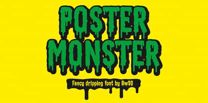 Dripping Spooky Font
 - Velino Poster by DSType,
$55.00 Velino is the most recent of our Premium Typefaces. The serif version comes in two packages with three widths: Velino, Velino Condensed and Velino Compressed. The Display package contains high contrast typefaces, with a modern flair, very feminine but with plenty of character, specially designed for fine print in big text sizes. The Text package was designed for any running text. It’s proportions and colors make it the ideal for text, even in very difficult conditions such as newspaper printing. We also designed the perfect companion to this enormous type system: Velino Poster, a Slab Serif typeface with only one weight and it’s respective italic, but with plenty of muscle, for every time some extra strength is needed, like setting very big text, magazine covers or newspaper’s special sections. Finally we designed Velino Sans and Velino Sans Condensed to perfectly match the weight and proportions of Velino, all with matching italics.
 - Film Poster by Fontsphere,
$12.00 Film Poster is an ultra condensed sans serif display typeface with geometric forms. It can be used in many creative ways, all kinds of graphics, posters, advertising materials, text composition. It fits perfectly for the film industry as well as many other fields. Font include multilingual support (Latin-1), uppercase and lowercase letters, numerals and a large range of punctuation.
 - Bodoni Poster by Linotype,
$29.99 Giambattista Bodoni (1740–1813) was called the King of Printers and the Bodoni font owes its creation in 1767 to his masterful cutting techniques. Predecessors in a similar style were the typefaces of Pierre Simon Fournier (1712–1768) and the Didot family (1689–1836). The Bodoni font distinguishes itself through the strength of its characters and embodies the rational thinking of the Enlightenment. The new typefaces displaced the Old Face and Transitional styles and was the most popular typeface until the mid-19th century. Bodoni’s influence on typography was dominant until the end of the 19th century and even today inspires new creations. Working with this font requires care, as the strong emphasis of the vertical strokes and the marked contrast between the fine and thick lines lessens Bodoni’s legibility, and the font is therefore better in larger print with generous spacing. Chauncey H. Griffith’s Poster Bodoni displays characteristics of the advertisement fonts of the first half of the 20th century. The font was most often used for posters and signs, eventually including neon signs.
 - Moderately by Alex Jacque,
$35.00 Introducing Moderately, a chunky and friendly typeface that makes a bold statement. This high-impact font is specifically crafted for designers seeking a display typeface with presence, perfect for applications where large, expressive type is a must. The defining features of Moderately include a generous x-height, soft curves, and tight spacing, ensuring a punchy and fresh aesthetic. Moderately is a deliberate departure from your contemporary sans with nary a straight line to see, embracing the organic and dynamic qualities reminiscent of blocky Art Nouveau typefaces, notably inspired by the works of Alfred Roller. While drawing influence from psychedelic / Art Nouveau revival typefaces of the 1960s, Moderately strikes a contemporary balance, delivering a design that is both impactful and approachable. Each glyph in Moderately attempts to maximize its space within the em square, incorporating slim carve outs for counters and apertures. The name "Moderately" adds a touch of irony, as this typeface is anything but plain – it exudes affable confidence and subtle flair. Created with versatility in mind, Moderately offers broad support for Latin-based languages, ensuring its adaptability for a wide range of creative projects.
 - Modern Vision - 100% free

- Advokat Modern - 100% free

- Odd Modern - Unknown license

- Zillah Modern - Unknown license

- Moderne Fraktur - Personal use only

- Eidetic Modern by PSY/OPS,
$36.00 Eidetic Modern is the sanserif counterpart to Eidetic Neo. Both families were developed in tandem, however the Modern was the first to be published by PSY/OPS [1997]. Eidetic Modern's features -- gently tapered stems, buffed corners and junctures, vertical stress, non-classical proportions -- combine to create a unique, contemporary humanist sans.
 - Craw Modern by GroupType,
$19.00 Craw Modern was designed by Freeman Craw in 1958 and first released by The American Typefounders Company, (ATF). In typography, 'Modern' is a style of typeface (classification) developed in the late 18th century that continued through much of the 19th century. Characterized by high contrast between thick and thin strokes and flat serifs. Bodoni is among the most popular of the Moderns. Moderns are also known as Didone and New Antiqua.
 - Modern Techno by Nirmana Visual,
$24.00 Introducing our cutting-edge techno font, designed to add a futuristic and sleek aesthetic to your designs. Inspired by the sleek designs of technology and the digital age, this font captures the essence of innovation and progress. Its clean and precise letterforms, along with its distinct futuristic style, make it an excellent choice for technology-based branding, gaming graphics, sci-fi posters, and digital interfaces.
 - TE Modern by Tharwat Emara,
$7.00 Its one of the modern Arabic fonts, a spontaneous free line characterized by beauty and speed of reading. To be used in advertisements, writing titles, magazines, cartoons, films, serials, comics and plays.
 - Whiteboard Modern by Albatross,
$19.95 Whiteboard Modern is a hand-drawn face resembling the flowing motion and freedom of writing in an open space, such as a dry-erase board.
 - Modern 735 by Bitstream,
$29.99 - Craw Modern by URW Type Foundry,
$35.99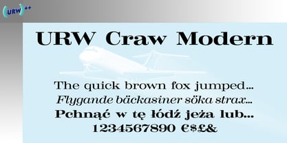
- Modern Blues by T-26,
$49.00 - RFX Modern by Xaver Design Studio,
$25.00 RFX Modern, published in 2024, is a contemporary typeface. The idea was to create a typeface that is immediately associated with topics such as AI, blockchain, digitalization and innovation. The 90° angles and horizontal emphasis give it both a technical and futuristic character. Although it has a strong character of its own, it is still compliant enough to be used as a continuous text font. Monospacing and a high X-height make it very striking and pleasing to the eye. Of course, it supports all common accents and special characters of the Latin alphabet.
 - Modern Negra by Sohel Studio,
$14.00 Modern Negra is a Modern elegant serif typeface with Unique alternative , multilingual support with perfect kerning. This typeface is perfect for an elegant & luxury logo , classy editorial design, women's magazine, fashion brand , cosmetic brand, fashion promotion , modern advertising design, invitation card, art quote, home decoration , book/cover titles, special events, Tote bag, T-shirt, Advertising and much more.
 - Modern Slim by Throndsen,
$19.00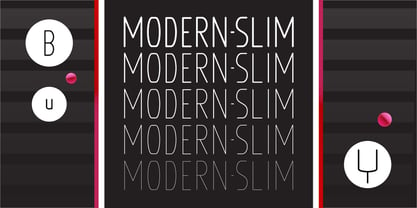
- Modern Aesthetic by Nirmana Visual,
$22.00 Modern Aesthetic Inspired by Renaissance Design Era. Modern Aesthetic offers beautiful typographic harmony for a diversity of design projects, including logos & branding, social media posts, advertisements & product designs.
 - Bernhard Modern by Bitstream,
$29.99Bernhard Modern was designed in 1937 by Lucian Bernhard for ATF. It is his personal version of the small x-height engravers’ old styles popular at the time. A perennial best-seller, Bernhard Modern remains popular in a wide variety of design and typesetting uses more that 60 years after its initial release. Bitstream’s version offers a wide array of typographer sets, including alternates, extensions, small caps and italic swashes. - Modern Extended by URW Type Foundry,
$35.99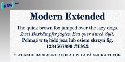
- Gatsby Modern by Nicky Laatz,
$15.00 Gatsby Modern Serif takes its cues from the "Roaring Twenties" , an era when breaking from the norm was the order of the day, when femininity took on a charming 'boyishness', and a time when anyone who’s anyone, needed to be bold and ever so slightly, or even not so slightly, eccentric. Perfect at any size - Gatsby Modern does well from large eye-catching headlines , to large paragraphs of small text. Great for modern branding, posters, logos, social media projects, headers, advertising and so much more. Gatsby Modern is available in two weights, regular and a heavier set bold to suit your project needs.
 - Modern Prestige by Letterhend,
$19.00 Modern Prestige is a unique serif which is combined with copperplate script letterform with all the swashes! This typeface has many alternates with swashes that can make your lettering / logotype become more interesting. The clean and neat of a serif combined with the swirl swashes makes this font one of a kind! This font perfectly made to be applied especially in logo, and the other various formal forms such as invitations, labels, logos, magazines, books, greeting / wedding cards, packaging, fashion, make up, stationery, novels, labels or any type of advertising purpose. Features : uppercase & lowercase numbers and punctuation multilingual ligatures alternates swashes PUA encoded We highly recommend using a program that supports OpenType features and Glyphs panels like many of Adobe apps and Corel Draw, so you can see and access all Glyph variations.


