10,000 search results
(0.186 seconds)
- By Starlight - Unknown license

- ATROX - Unknown license

- Sion - 100% free

- Boulder - Unknown license

- BON ViVER - Unknown license

- Uno Estado - Personal use only

- Hulkbusters 3D - Personal use only

- !Futurelic - Unknown license

- Talvez assim - Personal use only

- Present Bold - Unknown license

- Qurve Hollow Wide - Unknown license

- Nagel by ParaType,
$40.00 Nagel is a contemporary uniwidth display sans serif for headlines and short texts. It’s a closed low-contrast typeface with an emphasis on stroke joints. The length of the line set in Nagel remains the same in all weights. Nagel has all the advantages of monospaced typeface graphics, but none of their functional disadvantages. Characters in Nagel are made monospace-like wide, as opposed to traditionally narrow characters of proportional fonts, and often have slab serifs. Letters of monospaced fonts that have to be narrowed down considerably, have the usual width here. The scope of Nagel is branding and identity of IT companies, infographics, scientific and technical documentation — any areas where a technical, modern typeface with distinctive graphics may be required. The typeface includes three upright styles — Regular, Medium, Bold; two sets of 11 and 18 slanting degrees and a variable version with two axes: Weight and Slant. The character set includes extended Cyrillic and Latin alphabets, arrows, triangular bullets, index numbers and fractions. Designed by Alexander Lubovenko.
 - VLNL Kouseband by VetteLetters,
$30.00 The starting point for VLNL Kouseband was spotted by Donald DBXL Beekman on the Christian Reformed Church in the Dutch town of Naarden. The iron wire lettering contained a number of unusual characters and details, which eventually led to this five weight family. The Kouseband fonts mix elements of geometric sans serifs and upright unconnected scripts, with a hint of Dutch school writing. VLNL Kouseband is monolinear and has an very large cap height compared to the (lowercase) x-height, giving the capital letters an elongated condensed appearance. Kouseband is the Dutch word for ‘garter (belt)’ and also gave the name to a long tropical bean known as Yardlong bean. Kouseband beans are a common ingredient in Roti and other Surinamese dishes. As the Dutch Christian church is sometimes referred to as ‘Zwarte kousenkerk’ (Black stocking church), and stockings are held up by garter belts, we have come full circle and VLNL Kouseband has a name. VLNL Kouseband contains a set of oldstyle numbers matching the lowercase letters, and a couple of wider alternate capitals (HMNOQ) to enhance the liveliness of your designs.
 - Yanyont by Jipatype,
$27.00 Yanyont แบบอักษรซานเซอริฟอเนกประสงค์และแห่งอนาคตที่สมบูรณ์แบบสำหรับอุตสาหกรรมยานยนต์ ด้วยฐานและ x-height ที่แบนราบ Yanyont มีรูปลักษณ์แห่งเทคโนโลยีอันโฉบเฉี่ยวที่ช่วยดึงดูดสายตาได้อย่างแน่นอน แบบอักษรได้รับการออกแบบด้วยรูปลักษณ์แห่งอนาคตแบบไซไฟที่เพิ่มความไฮเทคให้กับทุกโปรเจ็คของคุณ Yanyont มีน้ำหนักให้เลือกถึง 9 น้ำหนัก ทั้งแบบตัวตรงและแบบตัวเอียง รวมเป็น 18 ลักษณะให้ได้เลือกใช้ ซึ่งการมีตัวเลือกที่หลากหลายช่วยสร้างความเป็นอันหนึ่งอันเดียวกันในการสื่อทั้งหมดของคุณ ตั้งแต่โบรชัวร์และโปสเตอร์ไปจนถึงเว็บไซต์และแคมเปญโฆษณา นอกจากนี้ Yanyont ยังรองรับหลายภาษาและมาพร้อมกับคุณสมบัติ opentype เช่น Small cap หรือ tabular แบบอักษรนี้เหมาะสำหรับบริษัทที่มีการเข้าถึงระหว่างประเทศ ให้แบรนด์ยานยนต์ของคุณดูล้ำสมัยกับ Yanyont Introducing Yanyont, a versatile and futuristic sans-serif typeface that is perfect for the automotive industry. With its flat baseline and x-height, Yanyont has a sleek and technical look that is sure to catch the eye. The typeface is designed with a sci-fi futuristic look that adds a high-tech edge to any project. Yanyont offers 9 weight options in both upright and italic styles, for a total of 18 unique styles to choose from. This provides a wide range of options for creating a cohesive look across all your branding materials, from brochures and posters to websites and advertising campaigns. Additionally, Yanyont supports multiple languages and come with opentype features such as small cap or tabular. This typeface is perfect for companies with international reach. Give your automotive brand a cutting-edge look with Yanyont.
 - Evita by ITC,
$29.99Gérard Mariscalchi is a self-made designer. Born in Southern France of a Spanish mother and an Italian father, he has worked as a mechanic, salesman, pilot, college teacher – even a poet (with poetry being the worst-paying of these professions, he reports.) “Throughout all this, the backbone of my career has always been design,” Mariscalchi says. “I’ve been drawing since I was five, but it wasn’t until I was twenty-four that I learned that my hobby could also help me earn a living.” It was about this same time that Mariscalchi fell in love with type. He studied the designs of masters like Excoffon, Usherwood and Frutiger, as well as the work of calligraphers and type designers such as Plantin, Cochin and Dürer. With such an eclectic background, it’s no surprise that Mariscalchi’s typeface designs are inspired by many sources. Baylac and Evita reflect the style of the art nouveau and art deco periods, while Marnie was created as an homage to the great Lithuanian calligrapher Villu Toots. However, the touch of French elegance and distinction Mariscalchi brings to his work is all his own. Baylac Who says thirteen is an unlucky number? Three capitals and ten lowercase letters from a poster by L. Baylac, a relatively obscure Art Nouveau designer, served as the foundation for this typeface. The finished design has lush curves that give the face drama without diminishing its versatility. On the practical side, Baylac’s condensed proportions make it perfect for those situations where there’s a lot to say and not much room in which to say it Evita Mariscalchi based the design of Evita on hand lettering he found in a restaurant menu, and considers this typeface one of his most difficult design challenges. “The main problem was to render the big weight difference between the thin and the thick strokes without creating printing problems at small point sizes,” he says. Unlike most scripts, Evita is upright, with the design characteristics of a serif typeface. Mariscalchi named the face for a close friend. The end result is a charming design that is light, airy, and slightly sassy. Marnie Based on Art Nouveau calligraphic lettering, Marnie is elegant, inviting, and absolutely charming. Mariscalchi paid special attention to letter shapes and proportions to guarantee high levels of character legibility. He also kept weight transition in character strokes to modest levels, enabling the face to be used at relatively small sizes – an unusual asset for a formal script. Marnie’s capital letters are expansive designs with flowing swash strokes that wrap affectionately around adjoining lowercase letters. The design easily captures the spontaneous qualities of hand-rendered brush lettering. - Baylac by ITC,
$29.99Gérard Mariscalchi is a self-made designer. Born in Southern France of a Spanish mother and an Italian father, he has worked as a mechanic, salesman, pilot, college teacher – even a poet (with poetry being the worst-paying of these professions, he reports.) “Throughout all this, the backbone of my career has always been design,” Mariscalchi says. “I’ve been drawing since I was five, but it wasn’t until I was twenty-four that I learned that my hobby could also help me earn a living.” It was about this same time that Mariscalchi fell in love with type. He studied the designs of masters like Excoffon, Usherwood and Frutiger, as well as the work of calligraphers and type designers such as Plantin, Cochin and Dürer. With such an eclectic background, it’s no surprise that Mariscalchi’s typeface designs are inspired by many sources. Baylac and Evita reflect the style of the art nouveau and art deco periods, while Marnie was created as an homage to the great Lithuanian calligrapher Villu Toots. However, the touch of French elegance and distinction Mariscalchi brings to his work is all his own. Baylac Who says thirteen is an unlucky number? Three capitals and ten lowercase letters from a poster by L. Baylac, a relatively obscure Art Nouveau designer, served as the foundation for this typeface. The finished design has lush curves that give the face drama without diminishing its versatility. On the practical side, Baylac’s condensed proportions make it perfect for those situations where there’s a lot to say and not much room in which to say it Evita Mariscalchi based the design of Evita on hand lettering he found in a restaurant menu, and considers this typeface one of his most difficult design challenges. “The main problem was to render the big weight difference between the thin and the thick strokes without creating printing problems at small point sizes,” he says. Unlike most scripts, Evita is upright, with the design characteristics of a serif typeface. Mariscalchi named the face for a close friend. The end result is a charming design that is light, airy, and slightly sassy. Marnie Based on Art Nouveau calligraphic lettering, Marnie is elegant, inviting, and absolutely charming. Mariscalchi paid special attention to letter shapes and proportions to guarantee high levels of character legibility. He also kept weight transition in character strokes to modest levels, enabling the face to be used at relatively small sizes – an unusual asset for a formal script. Marnie’s capital letters are expansive designs with flowing swash strokes that wrap affectionately around adjoining lowercase letters. The design easily captures the spontaneous qualities of hand-rendered brush lettering. - Marnie by ITC,
$29.99Gérard Mariscalchi is a self-made designer. Born in Southern France of a Spanish mother and an Italian father, he has worked as a mechanic, salesman, pilot, college teacher – even a poet (with poetry being the worst-paying of these professions, he reports.) “Throughout all this, the backbone of my career has always been design,” Mariscalchi says. “I’ve been drawing since I was five, but it wasn’t until I was twenty-four that I learned that my hobby could also help me earn a living.” It was about this same time that Mariscalchi fell in love with type. He studied the designs of masters like Excoffon, Usherwood and Frutiger, as well as the work of calligraphers and type designers such as Plantin, Cochin and Dürer. With such an eclectic background, it’s no surprise that Mariscalchi’s typeface designs are inspired by many sources. Baylac and Evita reflect the style of the art nouveau and art deco periods, while Marnie was created as an homage to the great Lithuanian calligrapher Villu Toots. However, the touch of French elegance and distinction Mariscalchi brings to his work is all his own. Baylac Who says thirteen is an unlucky number? Three capitals and ten lowercase letters from a poster by L. Baylac, a relatively obscure Art Nouveau designer, served as the foundation for this typeface. The finished design has lush curves that give the face drama without diminishing its versatility. On the practical side, Baylac’s condensed proportions make it perfect for those situations where there’s a lot to say and not much room in which to say it Evita Mariscalchi based the design of Evita on hand lettering he found in a restaurant menu, and considers this typeface one of his most difficult design challenges. “The main problem was to render the big weight difference between the thin and the thick strokes without creating printing problems at small point sizes,” he says. Unlike most scripts, Evita is upright, with the design characteristics of a serif typeface. Mariscalchi named the face for a close friend. The end result is a charming design that is light, airy, and slightly sassy. Marnie Based on Art Nouveau calligraphic lettering, Marnie is elegant, inviting, and absolutely charming. Mariscalchi paid special attention to letter shapes and proportions to guarantee high levels of character legibility. He also kept weight transition in character strokes to modest levels, enabling the face to be used at relatively small sizes – an unusual asset for a formal script. Marnie’s capital letters are expansive designs with flowing swash strokes that wrap affectionately around adjoining lowercase letters. The design easily captures the spontaneous qualities of hand-rendered brush lettering. - ITC Skylark by ITC,
$29.99ITC Skylark, from designer Patty King, is an alphabet with a strong handwritten character and calligraphic influences. The figures look as though they were written with a broad-tipped pen on rough paper. The result is a light stroke contrast, irregular outer contours, pointed stroke endings and a clear slant to the right. These characteristics lend the font its spontaneity and liveliness. ITC Skylark is best used for headlines and short texts in point sizes of 12 and larger. - KG Manhattan Script by Kimberly Geswein,
$5.00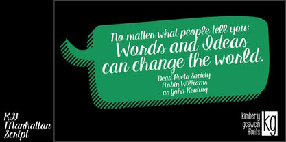 A connected, upright script font.
 - Decima Mono by TipografiaRamis,
$39.00 Decima Mono – condensed geometric monospaced Sans Serif typeface, released back in 2009 and quite successful ever since (MyFonts Rising Star, February 2009). This new edition is an upgraded version of Decima Mono and Decima Mono X, combining both into one edition. New version supports more Latin languages with an extension to glyph amounts. Also, six more alternate styles have been added to the original six styles.
 - Gosent by NamelaType,
$19.00 Gosent is a Modern Sans serif typeface that has larger x-height size, it will give great performance in small text sizes. Features moderate contrast and lots of special details like the unusual ink trap, giving a modern feel. Gosent is great your various design, both serious and fun projects. Consists of 9 Weight variants from Thin to Black and comes with Oblique version
 - Railroad Gothic Pro by Red Rooster Collection,
$60.00 Railroad Gothic Pro is a condensed, sans serif typeface, exclusively licensed from the Ludlow Collection. The original Railroad Gothic was produced by Ludlow in the early 1900’s, and Steve Jackaman (ITF) produced the digital version in 2017. The font provides support for Latin 1, Central, and Eastern European languages, and Cyrillic. Railroad Gothic Pro is reminiscent of typefaces used in 1900’s railyards, hence the name.
 - Kaybuts by sugargliderz,
$44.00 Kaybuts consists of three styles: sans-serif, serif, and semi-serif, each of which includes italic typefaces. Thinner and thicker weights look best when handled in relatively large font sizes, such as eye catchers and headlines. The middle weight is best suited for smaller text. Incidentally, this typeface was designed under the influence of, or with Mary Shelley's novel Frankenstein: or The Modern Prometheus in mind.
 - Mighty Rooster by Invasi Studio,
$13.00 Introducing a versatile Vintage Sans Serif. Mighty Rooster includes 2 font files with Regular and Rough style. Mighty Rooster is a great font for achieving an authentic vintage aesthetic as seen in the display images or Body text project, it is perfect for headings, flyers, greeting cards, product packaging, book cover, printed quotes, logotype, apparel design, album covers. Mighty Rooster Features: Ligatures Alternate Multi-language Punctuation
 - Bring Me The Horizon by Struggle Studio,
$20.00 BringMeTheHorizon is a modern handwritten display font. With Brush strokes, scribbled characters. To give you extra creative work. BringMeTheHorizon font supports multilingualism of more than 100+ languages. This font is great for logo designs, social media, Movie Titles, Book Titles, short text even long text letters and great for your secondary text font in sans or serif. Create stunning works with the BringMeTheHorizon font.
 - Rude ExtraWide by DSType,
$50.00 Rude was designed as a dichotomy between the Grotesque and Humanistic typographic shapes: a no-nonsense Sans and a very muscular Slab Serif companion. Showing the historically demanded consistency for such kind of typefaces, this is one of DSType's most wide-ranging and flexible type systems, introducing seven weights across seven widths, from Thin to Black and ExtraCondensed to ExtraWide, along with a wonderful set of Icons.
 - Lets get crazy by Pedro Teixeira,
$14.00 Let's get crazy is a font inspired by modern lettering and calligraphy with pronounced swashes, ascending / descending and crazy ear in "r" (btw you have more ordinary alternates) and so on, challenging the boundaries of reasonable. This font is good for titles or short sentences in combo with Let's get crazy sans serif majuscule letters, giving you a nice pairing of the modern lettering.
 - Diameter by Vishnu Sathyan,
$8.00 The idea of symmetry came to me when I was lookig for a geometric sans font. None of the things that I found did have the mathematically perfect symmetry. So, I went ahead and created one. I have used complex mathematical equations to get the perfect angle in every letter. Diameter comes with two styles square corner and rounded corner, each with regular and bold weights.
 - Trovas by Letteralle,
$23.00 Trovas is a modern sans font that takes a classic style. Designed to give the impression of elegance with a classic feel. Contains uppercase-only characters, all punctuation & numerals. There are also ligatures that will bring a unique style. Trovas is perfect for editorial projects, Logo design, Wedding, Clothing Branding, product packaging, magazine headers, or simply as a stylish text overlay to any background image.
 - Rude Condensed by DSType,
$50.00 Rude was designed as a dichotomy between the Grotesque and Humanistic typographic shapes: a no-nonsense Sans and a very muscular Slab Serif companion. Showing the historically demanded consistency for such kind of typefaces, this is one of DSType's most wide-ranging and flexible type systems, introducing seven weights across seven widths, from Thin to Black and ExtraCondensed to ExtraWide, along with a wonderful set of Icons.
 - Seductive Height by Wildan Type,
$15.00 Seductive Height has been realised Seductive Height is sans serif font. It is unic font. all Character have hight stem. That make this font look simple but elegant. Seductive Family has 10 font style with different wieght. you also will get lowercase, uppercase, number, function, multilingual, and some alternate. Suitable for many project (formal or informal). Features Lowercase/Uppercase/ Numbers & Punctuation / Extensive Language Support/Alternate
 - Displayer by Tour De Force,
$30.00 Displayer font family is modern, wide and sans serif family available in 7 weights and Variable type file. It’s strong, stable, compact, futuristic family with some specific letter design and generous ink-trap. With it’s display charm, Displayer fits perfectly into any branding project – use it in posters, package, website, logo, video games, magazines. Contains fractions and standard ligatures with Extended Latin character map.
 - Munichley by Maulana Creative,
$14.00 Munichley is an expressive casual signature script font. With mono-line consist stroke, fun character with a bit of ligatures and alternates. To give you an extra creative work. Portuis GingerMunichleylogo design, Social media, Movie Titles, Books Titles, a short text even a long text letter and good for your secondary text font with sans or serif. Make a stunning work with Munichley font. Cheers, Maulana Creative
 - Lamiran by RagamKata,
$14.00 Lamiran is a Distorted Wavy Font . You're not going to write a novel with this font, I will tell you that but... if you want something seriously psychedelic thats part art and part font, then this is the font for you. Using it sparingly to mix and match with a clean sans serif or go all out for a good time. Thanks, Have a wonderful Day. Ragamkata
 - Rahido by Twinletter,
$15.00 This relaxed and formal Rahido font with a san serif look is for you if you like fonts that look cute and pretty. Its lovely curves make it ideal for any type of visual design in your project, and when used, it has a lovely appearance. Your various design projects will, of course, be flawless and extraordinary. Start using our fonts in your amazing projects today.
 - Gimbo by Halbfett,
$30.00 Gimbo is bold. This heavy sans-serif design features thin counters. The interior spaces inside letterforms have been reduced as much as possible. Often, they seem abstract. There are three fonts in the Gimbo family: Black, Ultra, and Ultra Shadow. What do those terms mean? Well, Ultra is wider than Black. It takes up more pixels on-screen or brings more ink to the page.
 - Rude Slab by DSType,
$50.00 Rude was designed as a dichotomy between the Grotesque and Humanistic typographic shapes: a no-nonsense Sans and a very muscular Slab Serif companion. Showing the historically demanded consistency for such kind of typefaces, this is one of DSType's most wide-ranging and flexible type systems, introducing seven weights across seven widths, from Thin to Black and ExtraCondensed to ExtraWide, along with a wonderful set of Icons.
 - Marca by ArimaType,
$18.00 Marca is a futuristic sans serif font family with calculations to develop your designs and products. By utilizing geometric calculations, and remain logical, so as to maintain balance in each shape. So that you will get a clean, neat, and perfect shape. Marca comes in 9 weights and italics to match, making it 14 styles. It makes it perfect for all your creative projects. ArimaType@gmail.com #1266576
 - Sidemore by Ironbird Creative,
$15.00 Sidemore is a organic sans serif inspired by vintage type with handdrawn feel. This typefaces is perfect for people looking for vintage aesthetic and suitable for any graphic designs such as branding materials, t-shirt, print, logo, poster, quotes. Also support multilingual, number and symbol, and already PUA Encoded. We hope you enjoy the font. Thanks for purchasing and happy creating! Regards, Ironbird Creative
 - MRK Amentus by Marka Design,
$11.00 MRK Amentus is an elegant and modern sans serif font inspired by mixing humanistic and Grotesk styles. Horizontal oblique lines are the main visual style for this type. It gives an aesthetic dynamic look that is perfect for modern elegant brandings and for headlines. This font is suitable for various purposes such as movies, posters, logos, labels, packaging, branding, editorial design, and any modern purposes.


