1,195 search results
(0.016 seconds)
- Riccia by Hubert Jocham Type,
$39.00 Riccia actually started with the idea of a Rotunda a. Specifically the lower part of it. This element has a lot of character and I wanted to transfer it to a modern sans serif. The curly endings made it possible to spread that idea to the entire alphabet. Apart from those strong elements the proportions are inspired by classic grotesques. The weights are layed out in the usual way I create my families. 9 weights up to a strong Ultrabold, all with italics. Ideal for magazine and corporate usage.
 - Noyh Geometric Slim by Typesketchbook,
$55.00 Noyh Geometric Slim is altered modified from the form of the original “Noyh”(2015) typeface. We added sharp corners in apex, including the structure of typeface. Import to be more Corporate, the font family has flat terminals that harmonize with sharp corners. With all of these features , “Noyh Geometric Slim” is a prominent, eye-catching and unique typeface. It comes with 9 weights and italic type in order to suit for a multifunctional usage, especially for cooperative work, such as website, magazine, editorial, publishing , as well as packaging.
 - Maver by Ani Dimitrova,
$30.00 Maver is a 7 - style font family designed by Ani Dimitrova. Maver containing Regular, Italic, Round, Round Italic, Modify and Modify Italic weights. All weights contain standard ligatures, proportional figures, tabular figures, old-style figure, numerals, and arrows, matching currency symbols and fraction. The fonts are carefully hinted and its wide proportions make them a perfect choice for screen usage. This style palette offers a flexible range for display typography. The Maver type family is ideally suited for magazines, branding, posters, as well as web and screen design and more.
 - Gogosquat by Bogusky 2,
$34.50Usually, the condensed version of a face comes after the regular design. Not with gogo squat. After gogo big, I thought how strong a regular version would be. A nice clean gutsy face. A "today" Franklin Gothic Extra Bold. I find it ideal for contemporary headlines as well as for logo solutions. As with gogo big, in my terms and conditions, I permit the modification of up to ten of the letter forms for logos and monograms, but logos and monograms only, not the typeface in normal usage. - Mirador by René Bieder,
$30.00 Mirador is a powerful neoclassical font family designed for various usages — ranging from editorial and corporate design to web, interaction and product design. It is a contemporary take on high contrast typefaces that have never gone out of style — defined by elegance, tradition and timelessness. Although Mirador seems to be a display font at first glance, its proportions and design reveal a powerful and characteristic workhorse when set in smaller sizes. Mirador comes in 10 weights with matching italics. It is equipped with ligatures, a large set of alternative glyphs and many more opentype features.
 - Journal Sans Old School by ParaType,
$30.00 Journal Sans Old School is a new, modernized digital version of the widely popular Journal Sans. The new typeface preserves the character of the geometric sans from the famous “Science and Life” magazine of the 1960s. The weight of the basic styles corresponds to the Journal Sans regular and bold from the Soviet linotype catalogs. Also, the original vertical proportions and character forms match the original. Cyrillic Alternates, Greek language support expand the range of font’s usage. Journal Sans Old School was designed by Natalia Vasilyeva and released by Paratype in 2019.
 - Lilith by Dawnland,
$13.00 Hand drawn shadow entities from the dark corners of Dawnland. Lilith X is ideal for: Initial characters - give your text a unparalleled facelift! Headlines - create a unique look for your posters, event graphics, book covers & music/media/game packaging. Preamble - reanimate the introduction... The main focus and usage of Lilith X are initial characters or headlines for posters, event graphics and music/media/game packaging. The bread text on the gallery images is written in Aeterna . Lilith X contain uppercase and small caps letters A-Z + swedish characters Å Ä Ö.
 - Matrona by Hubert Jocham Type,
$39.00 When letterpress started with the Gutenberg Bible, the typeface was like a texture. Before humanism, type did not really need to be legible. The letters were rather drawn in an ornamental way. It filled a space. My idea for Matrona was to create a similar structure. I wanted it to be very bold and still as legible as possible. The result was a headline typeface that can fill spaces. You can even fill it with a picture. Or you create an ornament with contents. There are 3 weights to extend the usage to different sizes.
 - Globe Grotesk Display by Jan Charvát,
$26.50 Globe Grotesk is modern art deco inspired sans serif. Its root goes to beginning of last century into Czechslovakia. The design is inspired in Universal Grotesk – font made by unknown designer. There are some really unique details in the font, especially letters a, g, u, E, F, R, & and many more. It primary intended for display usage or rather shorter texts. The original is extended with full latin support, ligatures, small caps, alternates, inktraps, oldstyle figures and many more features necessary for contemporary type design. Also true italics are no doubt in this font.
 - Caligreto by FoxType,
$15.00 Introducing Caligreto Display new generation Typeface with 5 Weights. Caligreto Typeface created with the vision of to attract the audience to your brand . The finest details of this typeface are methodically and mathematically created. Caligreto is created with all the tasks of a corporate font and also for the usage in a variety of projects, including branding, logos, titles, headlines, servers, posters, screens, display, digital ads, and everything else. We are putting a lot of effort on this font as a long-term project. The Typeface includes Five Weights. Light, Regular, Medium, SemiBold and Bold.
 - Fisionada by Graviton,
$24.00 Fisionada font family has been designed for Graviton Font Foundry by Pablo Balcells in 2023. It is a condensed sans serif typeface with sharp edges and a very technical aesthetics. Its condensed design makes it very effective for space economizing and its geometric features make it a very attractive choice for display usages such as futuristics logos, video games and sci-fi content. It has been conceived to be most suitable for headlines and short length text blocks. Fisionada consists of 8 styles. Each containing small caps and glyph coverage for several languages.
 - Roanne by Tour De Force,
$25.00 Roanne is a sans serif family named after a town in France. This font family contains 2 width variations: Normal and Condensed, and all together counts 44 font styles. Equipped with OpenType features (Tabular Figures, Fractions, Stylistic Alternates, Localization for Serbia, Poland and the Netherlands, Case Sensitive brackets) for extended Latin and Cyrillic character set with a small charming set of Dingbats. For easier usage as webfont, Roanne font files contain numeric values for CSS weight attribute – 100, 150, 200, 300, 400, 500, 600, 700, 800, 850, 900.
 - Salda by Hurufatfont,
$19.00 Salda; It is a modern sans serif family that blends old and new generation sans serif fonts in the same body. It has a wide usage area with its light narrow structure, sharp and clean lines, humanist touches. It provides clean and smooth visuals in vertical screens, mobile applications and block texts. With two different x heights (xL-xS), the body offers richness in text and headings. It consists of a total of 40 styles. Ideal for all kinds of editorial design, packaging, corporate identity, brand, application, web and desktop.
 - Lenkay by MC Creative,
$10.00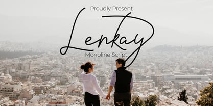 Lenkay is monoline script font which natural movement and elegant for signature style. is perfect for branding projects, logo, wedding designs, social media posts, advertisements, product packaging, product designs, label, photography, watermark, invitation, stationery and any projects that need handwriting taste. What’s Included : Standard glyphs Ligature Works on PC & Mac Accessible in the Adobe Illustrator, Adobe Photoshop, Adobe InDesign, even work on Microsoft Word. PUA Encoded Characters – Fully accessible without additional design software. Fonts include multilingual support for; ä ö ü Ä Ö Ü ß ¿ ¡ for questions and usage license please contact us Mohamadcandirah@gmail.com
 - Gogobig by Bogusky 2,
$25.00I have always been frustrated when looking for a bold condensed face. The choices were the usual? Helvetica Bold Condensed, Univers Bold Condensed or Alternate Gothic #2... all rather dated. I was looking for a really unique, clean, uncluttered sans serif face, so I decided to design one. I have since adapted it to many logo designs. So, in my terms and conditions, I decided to permit the modification of the letter forms for logos and monograms, but logos and monograms only, not the typeface in normal usage. - Krick by FoxType,
$30.00 Introducing Krick Display new generation Typeface with 4 Weights. Krick Typeface created with the vision of to attract the audience to your brand . The finest details of this typeface are methodically and mathematically created. Krick is created with all the tasks of a corporate font and also for the usage in a variety of projects, including branding, logos, titles, headlines, servers, posters, screens, display, digital ads, and everything else. We are putting a lot of effort on this font as a long-term project. The Typeface includes four Weights. Regular, Medium, SemiBold, and Bold.
 - Gelato Sans by Stolat Studio,
$29.00 Gelato is the Italian word for ice cream, commonly used in English for ice cream made in an Italian style. Gelato Sans designed by Ania Wieluńska is a humanistic typeface with geometric construction. It is characterised by a lot of details, which gives it a friendly and warm character. Scalable and large x height, sharp cuts makes Gelato good choice for many purposes from textes to display usage. All family consist 18 styles with italics from hairline to black. Ania was awarded a TDC Beatrice Warde Scholarship for this type family.
 - Delaguerra by Scriptorium,
$18.00Delaguerra is based on a lettering style originating in the California Arts & Crafts period commonly associated with 'Mission Style'. It is still in common usage in signage at historical sites in California. This version is a sort of idealized hybrid of several different variations on the style from samples we were sent by a customer who wanted to use the font in a set of invitations. It features a basic character set on the lower case and then relief initial versions of the same characters for the upper case. - Uchrony Cube - Personal use only

- Axeo Sans by Asritype,
$15.00 As mentioned on previous released font Axeo (freeform serif), now, the original sanserif font is released with similar name, Axeo Sans. Axeo was release first when Axeo sans is still in minimal glyphs and font weights. However, Axeo sans is released with more fonts, 7 font in roman and 7 in italic/oblique versions, instead of semi condensed. 7 fonts is in roman form of weight: Light, Regular, Medium, Semi Bold, Bold, Extra Bold and Black; and 7 fonts in italic/oblique versions of its weight, respectively. This font weight offers the user to use the best fit to the usage. Axeo sans is neutral typeface, designed for general use. This font has also more glyphs variations and OpenType features. More than 700 glyphs for each cut. While the OpenType is equipped with: Large unmarked Basic Latin caps (ss02-ss05); normal character variation for some letters (ss01); Small caps (c2sc and smcp); superscript for 1, 2, and 3; ordinals for a and o; 5 basic fractions; standard and discretionary ligature; kerning; case sensitive and ornaments. Large Caps is unique setting, additional letters for font variations lover/user, applicable for first letter of paragraph, sentences, for design mean, just for fun or other usage.
 - Fifth Reign by Mans Greback,
$59.00 Fifth Reign is a decorative medieval typeface. This wonderful typeface of brings us to the golden times of epic knight sagas. Fifth Reign is the typeface of a Royal House, of vikings, kings and queens. Use it for a Middle Ages game, a fantasy headline, or as a logotype for anything of historical theme. With usage in any modern software, the letters will automatically overlap and embrace in an elegant way. To make heraldic symbols, copy these icons: 🐉 🐎 👑 🗡 🦁 🦅 🦌 + ♖ × ✝ ⚓ * ⚔ † ‡ Alternatively write %A %B %C ... etc to create the heraldry. (Download required.) Dragon, Horse, Crown, Sword, Eagle, Deer, Cross, Anchor are some of the logos. The Fifth Reign family consists of three styles: The weights Thin, Bold and Medium, made to balance against each other and allow for usage in any scale. The font is built with advanced OpenType functionality and has a guaranteed top-notch quality, containing stylistic and contextual alternates, ligatures and more features; all to give you full control and customizability. It has extensive lingual support, covering Greek and Cyrillic, as well as all Latin-based languages, from North Europe to South Africa, from America to South-East Asia. It contains all characters and symbols you'll ever need, including all punctuation and numbers.
 - Isento by DSType,
$40.00 We always wanted to design a gothic typeface. Our most similar typefaces are Rude and Firme, but Rude has some very delicate curves especially visible in the vertical strokes and Firme introduces a type family with reasonably big ascenders and descenders. On the other hand, Isento has a much more straightforward approach to the particular genre. Loosely inspired by Times Gothic, introduced in the American Type Founders Specimen Book and Catalogue from 1923, soon followed its very own path. Is our first typeface that clearly shows a distinct weight difference between the uppercase and the lowercase and the spacing is very open to provide a much more mechanical feeling. Isento and Isento Slab ranges from Thin to ExtraBold with perfectly matching italics. Immediately seemed very clear that a slab serif companion would follow the sans, therefore Isento Slab is the perfect companion to Isento, with very strong rectangular serifs, ideal to set short passages of text or to become the key actor in a big headline.
 - Isento Slab by DSType,
$40.00 We always wanted to design a gothic typeface. Our most similar typefaces are Rude and Firme, but Rude has some very delicate curves especially visible in the vertical strokes and Firme introduces a type family with reasonably big ascenders and descenders. On the other hand, Isento has a much more straightforward approach to the particular genre. Loosely inspired by Times Gothic, introduced in the American Type Founders Specimen Book and Catalogue from 1923, soon followed its very own path. Is our first typeface that clearly shows a distinct weight difference between the uppercase and the lowercase and the spacing is very open to provide a much more mechanical feeling. Isento and Isento Slab ranges from Thin to ExtraBold with perfectly matching italics. Immediately seemed very clear that a slab serif companion would follow the sans, therefore Isento Slab is the perfect companion to Isento, with very strong rectangular serifs, ideal to set short passages of text or to become the key actor in a big headline.
 - Ongunkan Old Turkic by Runic World Tamgacı,
$50.00 Orkhon inscriptions (Orkhon inscriptions, Orkhon inscriptions, Khöshöö Tsaidam monuments (also known as Khoshoo Tsaidam, Koshu-Tsaidam or Höshöö Caidam) or Kul Tigin steles (simplified Chinese: 阙特勤碑; traditional Chinese: 闕特勤碑; pinyin: Què tèqín bēi )) They are two monumental installations written by the Göktürks in the Old Turkic alphabet in the Orkhon Valley in Mongolia at the beginning of the 8th century. They were erected in honor of two Turkish princes Kül Tigin and his brother Bilge Kagan. Both Chinese and Old Turkish inscriptions describe the legendary origins of the Turks, the golden age of their history, their subjugation by the Chinese and their liberation by İlteriş Kağan. According to one source, the inscriptions contain "rhythmic and parallel passages" similar to those of epics. In the Old Turkish Alphabet, 38 letters are accepted academically and this pattern is generally used in the books. But there are more than 38 letters in this alphabet, these special letters are included in this font.
 - Elementis by Linotype,
$29.99German designer Hans-Jürgen Ellenberger originally developed the concept behind Elementis in 1975. Wanting to create an alternative typewriter script that was more round and natural, Elementis' design was born. True to its typewriter roots, Linotype's Elementis exhibits more character than one expects from that genre. The letters display a delightfully quirky nature, which is sure to lighten up any document. Elementis may be used in a number of point sizes: although the letters function best in large display settings, short passages of text in sizes of 12 point or less may also be created. This family has received a number of awards in various contests: Elementis was awarded an Honorable Mention in the 2003 International Type Design Contest, sponsored by Linotype GmbH. Additionally, Ellenberger received a Certificate of Typographic Excellence from the Type Directors Club in 2005; during their annual TDC2 type design competition, Elementis was selected as a "judge's choice." - Klint by Linotype,
$40.99 Type designer Hannes von Döhren created Klint. A sans serif typeface with a technical appearance and humanistic streak. The family includes five weights; each weight ships in three widths: condensed, regular, and extended. All of the 15 Klint variants have a companion Italic, rounding out family at 30 fonts. Klint's large x-height makes the design especially legible at small point sizes. In today's day and age, appliance manufacturers and/or companies in the mobile phone, computer hardware and software or Internet sectors are becoming ever more important. Klint fills the rising need for superfamilies with a technical feeling that are also legible in both text and display settings. Through conspicuous letters like R, K, k, or g, as well as the independent nature of its Italic, Klint exudes an ethos that separates it from the competition. Longer text passages in brochures, catalogs, or magazines would be well served by Klint's Light, Regular, and Medium weights. The heavier cuts are optimized for poster settings and headlines."
 - Galano Classic by René Bieder,
$30.00 Galano Classic is the display companion of the Galano Grotesque family. Like the Grotesque family, it also pays tribute to the geometric shapes of Futura, Avant Garde, Avenir and the like. However, instead of that family’s modern interpretation of the geometric genre, Galano Classic prefers to stay in the past, a tendency characterized by a moderate x-height and details like the long stretched leg of uppercase “R”, as well as the traditional shaped lowercase “g”, to mention only a few details. Galano Classic, compared to Galano Grotesque, includes lots of redesigned glyphs and consequently adjusted kerning pairs, an extended number of alternative characters, ligatures and opentype features to match a great many design applications. It comes in 10 different weights with matching italics containing 555 glpyhs per font. Although Galano Classic was planned to be the display version of Galano Grotesque, it feels great in small sizes and long text passages, too.
 - Carrigallen Display by Tony Fahy Font Foundry,
$20.00 The Carrigallen family of fonts has roots in Megalithic and Celtic Ireland. It has six weights—Light, Regular and Bold and their corresponding italics. The distinctiveness of the Carrigallen family, is in it's sculpted, spiral nature, inspired by the graphics at the entrance stones and kerbstones at the Newgrange passage graves in Ireland. This is where it derives it’s decorative nature and suitability, as a very distinct Display font. Exceptionally suited for Logos and Headlines, it can increase the corporate presentation of a company as its main identifying feature—and with high memorability! The three separately designed letterforms—differing in line weight—are held in place by the white space within and without the character giving a distinctive twenty first century flavour! It is this dynamic that makes the font unique! Carrigallen Display is a modern font. It draws from its nomadic influences allowing it to be culturally representative of all languages.
 - Linotype Textra by Linotype,
$40.99Linotype Textra is a clever twist on the sans serif genre, designed by Jochen Schuss and Jörg Herz in 2002. Schuss says this about Linotype Textra: "Two in one! The same Linotype Textra, which is so neutral and practical for long text passages turns into an eye-catching headline type when used in larger point sizes. The trick? It's all in the details. The type's clear, robust forms give it a high degree of legibility when used in smaller point sizes for texts. When used in larger sizes, the angular, slightly irregular forms that give the type its strong character become apparent. Hence the name Linotype Textra: pure text with a little something extra!" With 15 weights, the Linotype Textra family provides graphic designers with a good basis for almost any type of work. The five regular weights have matching true italics and old style figures, and the five small cap weights include tabular figures. - Boule Plus by Ingo,
$33.00 CAPITALIZED, geometric, bold and round. If the typographer sees a font like that, it's enough to make his toes curl. But sometimes it just has to be that way. Geometrically constructed fonts do not necessarily have to be pointed and angular; It also works consistently around. And if I say it consistently, then in this case, that's done consistently. The basis for the BOULE is the circle. The letters are drawn with constant line width, the “corners“ and endings all have the same radius, the lines are all the same thickness. The BOULE consists only of capitals. There is only one difference in the use of uppercase and lowercase letters: in the uppercase letters, the round letters are circular, while the lowercase letters are narrow. The character set of the Boule contains all letters and accents to support the Western, Northern, Central and Eastern European languages with Latin alphabet. The BOULE is not only very fat, it also runs very tight; that is, the glyphs are very close to each other. To avoid "holes" due to unfortunate letter combinations, the BOULE contains ligatures for FT, ST, TT and TZ. There are also other versions of the font: BOULE Brillant on the one hand. In this version, simple highlights simulate a light incidence from the top right. These light edges give the font a decorative effect that makes it easy to think of wet sausages or balloons in some shapes. And finally the BOULE Contour. As the name implies, it is the outer contour of the letters, combined with a shadow at the bottom left. The name BOULE (French for ball) says it already: this font is globated. Therefore, it is also very suitable for all three-dimensional alienation effects. With simple light and shadow you can achieve a very convincing 3D effect with little effort.
 - GEOspeed - Personal use only

- Sargento Gorila - Personal use only

- Glotona Black - Personal use only

- Gaban - Personal use only

- Deslucida - Personal use only

- Arkitech Round - Personal use only

- Sucesion Slab - Personal use only

- Hartia by Tour De Force,
$25.00 Hartia is modern serif family designed to be tireless worker (aka workhorse) for all situations – from small size texts in different editorial situations to main webfont usage. Designed with asymmetric serifs in 5 weights and 5 true Italics, Hartia is gently different and enough recognisable to deserve attention for any serious project. With slightly taller x-height, Hartia comes with OpenType features (ligatures, tabular numbers, fractions, small caps and localisation for Poland, Netherlands and Serbia). It is fully packed for Latin language support and equipped with Russian Cyrillic as default Cyrillic set (with previously mentioned localisation for Serbia).
 - Le Grand by Calamar,
$10.00 Le Grand is an elegant & modern typeface that uses ligatures to smoothly link letters. It's perfect for logos, wedding monograms or pull quotes. Flip through the previews above to get some inspiration and to see what you can make with this font. Le Grand Typeface includes regular, italic and bold versions. Also for more easier usage I've created Ligature and Capital Serifs. All gorgeous ligatures in these versions turn on automatically and you don't need any special programs to use them. This font has 42 ligatures as well as alternate characters, numerals and punctuation making it super flexible.
 - HollaBear by Designova,
$9.00 A cute and funny kid-friendly typeface inspired from bears and handmade with passion and joy. Will you believe if we say, HollaBear is made by bear cubs. The typeface is essentially simple but very uniquely expressive when it comes to the design of posters, flyers, cartoons graphics, logotype, web and display usage. Please see the examples shown above to get an idea about the capability of this typeface. HollaBear comes with Extended Latin character sets including Western European, Central European and South Eastern European character sets. The typeface comes in 6 variants (Regular, Italic, Outline, Outline Italic, 3D and 3D Italic).


