10,000 search results
(0.037 seconds)
- StrangePhenomena [normal] - Unknown license

- Coliseo-Normal - Unknown license

- Slam Normal by Wiescher Design,
$12.00 »SLAM« is my new, very sturdy but elegant slab-serif font family. I designed this font family with body copy in mind and gave it all the glyphs necessary for use with all latin writing languages. I also gave the fonts all kinds of different numerals as well as a complete set of small caps and overall extensive kerning. It comes in eight normal weights with corresponding oblique cuts and it comes in a rounded version and corresponding obliques as well. Enjoy this original font, it is a real work horse!
 - Sagata Normal by Lemonthe,
$10.00 Sagata Normal Font Duo, perfect for product packaging, branding project, magazine, social media, and much more. Explore the best your side. FEATURES Sans Serif & Script Ligatures Uppercase and Lowercase letters Numbering and Punctuations Also Multilingual Support
 - Fabrikat Normal by HVD Fonts,
$40.00 Fabrikat Normal is a geometric typeface which is based on 20th century German engineers’ typefaces. It is optimised for small sizes and long texts, but due to its constructed architecture it also works in headlines or display use. You can combine Fabrikat Normal with the more straight and space saving Fabrikat Kompakt or the reduced to the max Fabrikat Mono.
 - CA Normal by Cape Arcona Type Foundry,
$40.00 CA Normal is a typeface aiming for beauty without ostensible effects, merely relying on clarity and well balanced proportions. True beauty is not to be found in perfect geometry, so slight irregularities and inconsequences are spread throughout the typographic image. That’s perfection through imperfection. CA Normal merges influences from European grotesques and American gothics, breeding an experimental mongrel. The underlying concept stays in the background, giving the design a great self-evidence. Although it is doubtful if there can be such thing as neutrality, CA Normal comes pretty close to what people mean when speaking of a neutral font. Nevertheless it’s not faceless, anonymous or confound able. It’s just that the charm comes from subtle details rather than obvious design features. As good text typefaces must not be too smooth nor too agitated, CA Normal is smuggling little uneven details into the typographic image, that keep the readers eye awake. The well crafted oblique follows the grotesque tradition which knows no individually drawn italics. A rather unexpected addition is the reverse oblique, a style mainly used for maps. Under the classic surface lies a modern well equipped font, featuring small caps, a Central European character set and numerals in all kinds of flavors. Numerous ligatures round up the overall impression. By default CA Normal will set numbers as proportional lining figures. But if you prefer oldstyle figures, or tabular figures, just use the OpenType functions of your layout program. These allow access to the small caps as well, which feature a complete central European character set, brackets, punctuation and lining figures in small caps height.
 - ADs Comics For All by Letters by Amal Desai,
$10.00 AD's Comics For All has everything you need from a professional comic book font but with a light, accessible price tag. The key to digitally lettering comics is mimicking the style and natural imperfections of hand lettering. This font was handmade and programmed (with nifty tricks) keeping exactly that in mind. The functionality of hand lettered comic book fonts definitely doesn't end at comic books. It can give an energetic and natural feel to just about any design. They can be especially handy when a bit of contrast is needed in a type-heavy layout. If you need an exceptional and affordable font to letter your indie comic book/manga/graphic novel, AD's Comics For All is an excellent choice. If you're a seasoned letterer, this versatile font is worth adding to your dialogue arsenal. If you're a designer and have never looked twice at a comic book, you'll find that comic book fonts are a category of their own and a useful tool in your utility belt.
 - Intellecta Pointers And Hands by Intellecta Design,
$14.90
- BONES - Unknown license

- Zone - 100% free

- Nine - Unknown license

- Fone by Volcano Type,
$19.00 - Zone by Aboutype,
$24.99Graphically drawn face with a somewhat mono weight thick to thin contrast. Zone was designed for all media and can be used in a wide range of point sizes. Similar to FreeZone but with small flared endings. Family includes common capitals and alternate lowercase characters. Zone requires subjective display kerning and compensation. - Sone by Soneri Type,
$50.00 Sone is designed to be bold with stripped off nonessential details making it uncomplicated, simple in expression, yet appealing and easy to decipher, even from a distance. Serene and gentle in quality by low contrast, slow ductus and large x-height reducing the up down motion, plus enhance the legibility. It works beautifully in both, display and body copy.
 - Bones by Gravual,
$39.00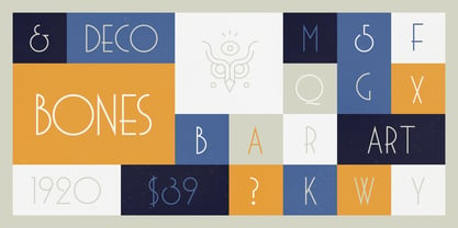
- Note by Little Fonts,
$15.00 Note is a fresh and dynamic hand writing font. Inspired by graffitti and street style writing, executed using a flat tip calligraphy pen. The typeface is hand drawn on paper, then the resulting alphabets and punctuation scanned in and rendered to create the font. The resulting characters are bold yet energetic with an obvious human touch creating an interesting and original hand drawn typeface.
 - Notes by Resistenza,
$39.00 Notes Is a handwritten-Italic font style, casual and fresh. Our recipe for this project is a perfect blend of typography and handwriting. Works well in small sizes and has several ligatures. Notes Family has many cuts, Pen, Pencil, Marker and Felt Tip. This font family can be used for many purposes like publishing, quick notes, adding captions, signage.
 - Nove by FSD,
$50.00 Designed for "Milano Kalibro Kobe" a Nike advertising campaign. A geometric font inspired by b-movie typography. The glyphs were designed using an unusual method: at a glance it seems a drafted design but if you look closely you will discover how much the geometry is complex.
 - Nono by Wiescher Design,
$39.50 Nono is the nickname of my oldest son, Konstantin. His little brother could not really speak yet, but he was always looking for him and said something to the tune of, "wea is a nono". From that time on I call Konstantin Nono. I designed a handwritten script with his real name, that i named Konstantin. Now I made this slick version of that script – hence – Nono! I made three basic sets of characters plus a smallcaps version. To top things off, I designed a set of endletters that I throw in for free. Everything can be mixed! I sell single cuts but the best deal would be the entire packet, it goes for a very fair price. Your generous typedesigner, Gert Wiescher
 - Balls to the Wall - Unknown license

- 1499 Alde Manuce Pro by GLC,
$42.00 This family was inspired by the beautiful roman font used by Aldus Manutius in Venice (1499) to print for the first time Hypnerotomachia Poliphili..., the well known book attributed to Francesco Colonna. Francesco Griffo was the punchcutter. The present font contains all of the specific latin abbreviations and other ligatures used in the original. The Italic style, carved by Francesco Colonna, the so called "Aldine" style, was inspired from various documents, all printed with this first Italic font. We offer the complete set of ligatures (about 60) we have been able to find, contained in the original font. In the two styles, we have made differences between I and J, V and U, to make easier a modern use. Added are the accented characters and a few others not in use in this early period of printing. The Italic style may be used as a complement to our 1470 Jenson Latin. The font contains all characters for West European (including Celtic), Baltic, East and Central European and Turkish language.
 - Ale and Wenches BB - Personal use only

- Ali - Unknown license

- BALL - Unknown license

- Elle by Device,
$39.00 Elle is a geometric sans in three weights with rounded stroke terminals and circular forms. Classy, elegant and modern, with just a hint of the future. Inspired by a single-weight Typositor headline typeface from the early 1970s called Pipeline.
 - Dalle by Stawix,
$40.00 Dalle was designed in 2012 by Stawix Ruecha, and has been continued to develop over the last two years in order to keep pace with the changing trends and to apply for different uses. Dalle comes with a large font family and is ideally suited for body texts and also display. This typeface has OpenType features including multi-ligatures support and tabular figures. Add Dalle (Sans) in your font menu and spice up your layouts with this new flavour!
 - Able by T-26,
$39.00The history of Able’s connection with the Harry Potter phenomenon is really up in the air. It’s a catch-22 in this business - you either promote your own work and negotiate expensive exclusive licenses, or you work with a promoter and sell your designs to anyone and everyone. It could have been an in-house designer at Rowling’s publisher, Scholastic, or a freelancer who proposed Able for the headings and such. The responsible party licensed it from T26, and JK Rowling’s storytelling made it a star. (I suppose it’s ironic that there’s a whole lot of unwritten history in the typography business.) Able’s rise to fame really is a classic love story between reading and type design. If the books weren’t so popular, Able might still be waiting for some Mexican fast food chain to pick it up for packaging design. The movie deal certainly made the font all the more recognizable, what with its merchandising campaign. Popularity can also cripple a great decorative face. It’s always being recognized as “The Harry Potter Font.” It might just have to wait a few decades for the Potter phenomenon to subside to be freed from the “Chamber of Pigeonholed Fonts.” In the meantime, I’m sure that a lot of fledgling graphic design apprentices are reading their new Potter books, being charmed by the idea of type design when they’re not turning the pages too fast to notice. - Vallely by Fontdation,
$15.00 Vallely is a classic art-deco-ish serif that are inspired by the old typography/letterings used in packaging labels and advertisements. This font is loaded with 350+ glyphs, packed with lots of alternate characters, gives you various letter combinations to play with. If you're a fan of classic and art-decoish typography, make sure you add this font to your design toolbox.
 - Alie by Lebbad Design,
$29.95 Alie is a casual textured script with sophisticated flair. The font contains several ligatures and alternates.
 - Galle by Typophobia,
$25.00 Galle is a very distinctive and specific typeface. It has 356 glyphs that are coherent in their own way. We have two versions to use: regular and italic. It is a display font with very characteristic letters, each of which has been developed separately, but in such a way as to match the rest of the typeface. The inspiration taken to design the cut is Sri Lankan typography - a lot of squiggles and sharp edges, hence the name of one of the prettiest and atmospheric cities in Sri Lanka - Galle.
 - Walls by Piñata,
$8.00 What do you use to write a price tag at a store or to design a wall menu in a cafe? What to choose – a marker or chalk? Now it makes no more sense to be torn apart by the choice – use both techniques for your design. Walls fontfamily allows to perfectly combine an eco-friendly style with contemporary motives. Walls fontfamily supports over 70 languages and consists of 10 typefaces in 5 popular weights (Thin, Light, Regular, Bold, Black). Initially we wanted to create a font that would imitate an inscription made by a square tip marker which is usually used to write price tags at supermarkets, shops and cafes. During the working process we've decided to extend the conceptual boundaries of the Walls fontfamily and added 5 rough typefaces that imitate the style of ecologic chalk writing
 - Aloe by ROHH,
$29.00 Aloe is a characterful and friendly display font family inspired by headlines from 1930’s newspapers and calligraphy. The family consists of 9 weights, ranging from Thin to Heavy, with matching ornament fonts. It features a variable font with weight axis. Each weight has over 900 glyphs including advanced typographic features, such as vast number of stylistic alternates, swashes, titling and terminal forms, case sensitive forms, ligatures, symbols, ornaments as well as lining and old style figures, fractions, subscripts and superscripts. This original mixture of display typeface with calligraphy gives a versatile family great for all sorts of uses - from advertising, packaging, branding, wedding invitations, menu cards and other editorial uses to screen and web projects.
 - Falling by Supersemarletter,
$12.00 Falling is an exquisite handwritten font, masterfully designed to become a true favorite. It maintains its classy calligraphic influences while feeling contemporary and fresh. Fall in love with it and bring your projects to the highest levels! Provide Ligatures and alternates with special character make the design letters looks incredible. Honestly it works perfectly for headlines, logos, posters, packaging, T-shirt and much more. Font Features : Regular Version Character set A-Z in Uppercase and Lowercase Ligatures in lowercase and special Alternate option Numerals and Punctuation Accented Characters Multiple Languange Supported Recomended to use in Adobe Illustrator or Adobe Photoshop with opentype feature. If you have any questions, just send me a message and I'm glad to help. Best Regards Supersemar Letter
 - Alkes by Fontfabric,
$35.00Features: Over 1200 gyphs in 14 styles; True form of italics; Humanist character and proportions; Extended Latin, Extended Cyrillic & Greek scripts; For more than 130 languages Moderate contrast; Perfect for text, headlines and web; Coverage of many OpenType features Ligatures, Small Caps, Case sensitive forms, OldStyle figures, Tabular figures, Fractions Named after a star and inspired by the cosmos, Alkes traveled a long way from a graduation project to a published multiscript serif type family. Designed with the intention of harmonising between three scripts - Latin, Cyrillic and Greek, the contemporary, yet well defined humanist serif combines the best out of the digital and analog worlds. Featuring a generous x-height, wide letter spacing, large open counters and angled stress contrast, Alkes is highly effective for editorials and publishing, where long texts and legibility are the key forces. Its attractive details, calligraphic structure and asymmetrical serifs shine through in the larger sizes and make Alkes suitable for headlines. Alkes has a pull with editorial designers, graphic designers and publishers who aim for a clear structure, hierarchy and coherent non-Latin scripts for both print and on-screen environments, in order to achieve otherworldly designs - Alys by Red Rooster Collection,
$45.00An original design. A memorial typeface by Pat for her mother, Alys, who was tragically killed. - Tallings by Grontype,
$14.00 TALLINGS is a bold modern, urban-condensed font, inspired by street urban poster that combines the classic and modern style. TALLINGS will be best suited for creating logotypes, branding, headlines, corporate identities, Invitation card, and other graphic design elements. TALLINGS Features: Bold condensed font Punctuation & Characters Ligatures and alternates Glyphs included superscript & Symbol Currencies Multilingual Thankyou for picking up this font. Happy creating! Regard, Grontype
 - Corvallis by ITC,
$29.99 - Cormac by Typedepot,
$19.00 Cormac is a humanist typeface characterized with it's large x-height and slightly flared stems. The word that best describes our ideas in the beginning of the project is "simple" - the idea behind it was to strip the letter forms of everything unnecessary, and yet keep the typeface interesting. The typeface is friendly without being too cheezy thanks to its humanistic character, flared ascenders and stems reminding of its calligraphic origin. The proportions are closer to the traditional old style typefaces. Cormac is open and readable typeface coming in 7 weights plus their matching 'true' italics - from Extra Thin to Bold. The family comes with Cyrillic support, great range of numerals, fractions, ligatures, alternates and a lot of special characters making Cormac a great solution for greate range of design work - branding, editorial, web, wayfinding, etc.
 - Norway by pentagonistudio,
$19.00 Norway Is Authentic Display Font Inspired By Classic Characters. SOFTWARE REQUIREMENTS : Fonts and alternate : No special software required they may be used in any basic program /website apps that allows standard fonts That's it folks! You can go ahead and get cracking :) Follow My Shop For Upcoming Updates Including Additional Glyphs And Language Support. And Please Message Me If You Want Your Language Included or If There Are Any Features or Glyph Requests, Feel Free to Send me A Message. Have a Good Day !
 - NORWALKE by Unitype Studio,
$19.00 Introducing NORWALK - Modern Serif Font. Our latest digital modern serif font - a sleek and sophisticated typeface perfect for any creative project. With clean lines and elegant curves, this font is sure to make your designs stand out. Get your hands on it today and elevate your designs to the next level! Ready to take your design game to the next level? Whether you're creating a logo, website, or printed materials, this font is the perfect choice for adding a touch of class and sophistication.


