1,504 search results (0.067 seconds)
  1. Belinsky by Tabular Type Foundry, $32.99
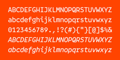
    Belinsky is a monospace sans serif typeface inspired by early 20th century geometric sans serifs, architectural letterings, and retro video games to some extent. Its exaggerated proportions and sharp details appear less harsh thanks to the corner rounding. It is comprised of a standard and text families, and the latter is especially suited for small text and programming, with wider spacing and more centralised gravity of certain letters like E. It still gives your codes a lot of personality. The typeface name is a reference to the designer�s favourite animated film, American Pop.
  2. Slugfest - 100% free
  3. BoogieNightsNF - 100% free
  4. Grasshopper - Unknown license
  5. TestarossaNF - 100% free
  6. NotMaryKate - 100% free
  7. StonyIslandNF - 100% free
  8. CampGranadaNF - 100% free
  9. GingerPeachy - Unknown license
  10. HamburgerHeaven - Unknown license
  11. PayzantPen - Unknown license
  12. MyGalSwoopyNF - 100% free
  13. CitySlicker - Unknown license
  14. BooMeringueNF - Unknown license
  15. EmporiumNF - Unknown license
  16. MetropolisNF - Unknown license
  17. ChippewaFallsNF - 100% free
  18. HighFive - Unknown license
  19. PhattPhreddy - 100% free
  20. HappyCampersNF - Unknown license
  21. SpacePatrol - Unknown license
  22. Rivanna - 100% free
  23. RunyTunesRevisited - Unknown license
  24. ModernTypography - Unknown license
  25. HeraldSquare - Unknown license
  26. DayPosterBlack - Unknown license
  27. ChromeYellow - 100% free
  28. BeckerBlackNF - 100% free
  29. GrandPrix - Unknown license
  30. Xpress Rounded by Wiescher Design, $12.00
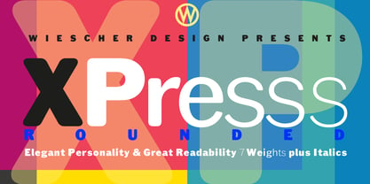
    »XPress-Rounded« is my new addition to »XPress«, my Sans-Serif that impresses – especially in small sizes – with its outstanding readability. »XPress-Rounded« looks very different, almost like a completely new font. But the rounded version has the same seven precisely calibrated weights from »Thin« to »Heavy« and its corresponding italics make this font-family universally usable. The »XPress« fonts got their bearings from the fabulous American »Gothic« fonts of the twenties of last century. Modern, present day elements, high lowercase letters and infinitesimal elegant slight curves in start- and end strokes make the font family not only great for body copy, but also very useful in advertising. Enjoy! »XPress-Rounded« ist meine neue Erweiterung zur »XPress« Familie, die durch aussergewöhnliche Lesbarkeit auffällt. »XPress-Rounded« sieht jedoch vollkommen anders aus als sein älterer Bruder. »XPress-Rounded« hat jedoch die selben sieben präzise aufeinander abgestimmten Schnitte von »Thin« bis »Heavy« und die dazu passenden Kursiven. Das macht die Schriftfamilie vielseitig einsatzfähig. Die »XPress« Schriften basieren auf der Formensprache der grossen amerikanischen Groteskschriften der zwanziger Jahre des letzten Jahrhunderts. Durch moderne Formelemente, große Mittellängen und unendlich leichte, elegante An- und Abstriche ist die Schrift jedoch nicht nur als Textschrift, sondern auch im gesamten Bereich der Werbung vielseitig einsetzbar. Viel Erfolg!
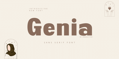
  31. Genia by Product Type, $15.00
    In every glyph, Genia is lovely and charming. It has a strong, uncompromising style with regulated letterforms and a contemporary edge. Each typeface in the family can stand alone, be lively, and forceful in its own right, and there’s a balance between harsh lines and gentle curves. This typeface also comes with 16 different families to help you create outstanding projects. of course, your various design projects will be perfect and extraordinary if you use this font because this font is equipped with a font family, both for titles and subtitles and sentence text, start using our fonts for your extraordinary projects.
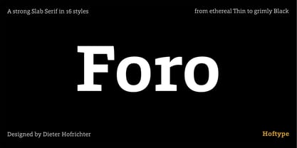
  32. Foro by Hoftype, $39.00
    Foro was designed in 2012 to be a slab serif with an appealing flow, warm, and less harsh than many slab serifs. It evinces an attachment to humanistic shapes, models and proportions. Foro’s demonstrated strength renders it excellent for texts, and its clear and distinct details are an advantage in display sizes. Foro comes in 16 styles and in OpenType format. All weights contain standard ligatures, proportional lining figures, tabular lining figures, proportional old style figures, lining old style figures, matching currency symbols, fraction- and scientific numerals and arrows. Foro supports Western European, Central and Eastern European languages.
  33. BoyzRGross - 100% free
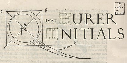
  34. 1525 Durer Initials by GLC, $28.00
    In 1525, Albrecht Dürer, the well known German great artist, was publishing the so-called “Underweysung der Messung mit dem Zirckel und Richtscheyt”, printed in Nuremberg. This handbook explained with numeral figures how to draw with a compass and ruler. A large part is devoted to the drawing of Roman characters, which can be used as decorative initials. We are offering two complete historical initial sets and also have entirely redrawn the missing letters: J, U and W, Eth, Lslash, Thorn and Oslash in the two forms, using the Dürer style. The font may be used with all our Humane and Garalde fonts, like 1543 Humane Jenson or 1592 GLC Garamond and others from the GLC foundry catalog.
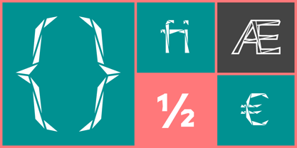
  35. Tri-Font by Greiner grafik, $54.24
    By the arrangement of single triangles Tri-Font gets a folded, handmade, geometric and modern effect. Tri-Font is perfectly suitable for use in anything from guidance systems to signage and was made for optimal readability both on screen and in print. The font family consists of a total of 350 glyphs and contains the font styles Triangle // Outline // Body. In Deutsch Die Tri-Font bekommt durch die Anordnung einzelner Dreiecke eine gefaltete, handwerkliche, geometrische und moderne Wirkung. Tri-Font eignet sich wunderbar für den Einsatz in Leit- und Orientierungssystemen. In der Displayanwendung wie auch im Printbereich ist sie angenehm zu lesen. Die Schriftfamilie besteht insgesamt aus 350 Glyphs und beinhaltet die Schriftschnitte Triangle // Outline // Body.
  36. Capita by Hoftype, $49.00
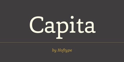
    Capita, a serif-dominated face in a new style. Strong in appearance, with controlled motion of the contour, vivid and warm, with gentle flow – it avoids any harshness of many slab serifs. Well-balanced proportions make it qualified as reading type, yet with its puissant qualities ideal for headlines and subheads. Capita is well equipped for ambitious typography. The Capita family consists of 12 styles, comes in OpenType format with extended language support for more than 40 languages. All weights contain small caps, proportional lining figures, tabular lining figures, proportional old style figures, lining old style figures, matching currency symbols, fractions and scientific numerals.
  37. RANXEROX - 100% free
  38. Carlsbad by RMU, $30.00
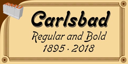
    The Carlsbad font family is a bringing together of Regina Cursiv and Hansa Cursiv which both had been released by H. Berthold Messinglinienfabrik und Schriftgiesserei around 1895. Both these beautiful Art Nouveau italic fonts come with the following swash alternatives: D, E, G, H, K, S, T, h, k, m, n, s, and z.
  39. Punch Label - Unknown license
  40. Imperial Symbols - Unknown license
Looking for more fonts? Check out our New, Sans, Script, Handwriting fonts or Categories
abstract fontscontact usprivacy policyweb font generator
Processing