3,391 search results
(0.109 seconds)
- F2F Whale Tree by Linotype,
$29.99Heavy techno music, a personal computer, a font creation program and some inspiration had been the sources to the Face 2 Face font series. Thomas Nagel and his friends had the demand to create new unusual faces that should be used in the leading german techno magazine Frontpage" Even typeset in 6 point to nearly unreadability it was a pleasure for the kids to read and decrypt the messages. WhaleTree is a hommage to Walbaum. The word is a gemanized translation where Wal means Whale and Baum means Tree. :-)" - 321 - Unknown license

- 321 - Unknown license

- Ballet Mechanique by Characters Font Foundry,
$25.00 Ballet Mechanique is a custom designed font for musician Jeroen Borrenbergs, aka Ballet Mechanique. For his upcoming record releases Jeroen asked me to create a special font for him. As co-founder and graphic designer at Stoere Binken Design he creates his own artwork and therefor had very specific wishes. The font should be warm, soft and have soul. He gave me some sketches for his logo that I should use as a starting point. The result is a very narrow, kind of techno, monocased font called "Ballet Mechanique" (what else). After having served his purpose, Jeroen Borrenbergs allowed his font to be sold publicly. Jeroen Borrenberg’s debut work, in 1996, received hugely praising reviews. Muzik Magazine made Evolutionary Entities techno single of the month, Laurent Garnier and Mister C constantly played it in their sets and Morgan Geist just said “I won’t do a review here - let me just encourage all of y’all to listen to and/or pick up the new Eevolute 12″. Beautiful stuff - complex, melodic, soaked in just enough reverb to take it to another room. Check or regret.”
 - P22 Preissig Calligraphic by P22 Type Foundry,
$29.95 P22 Preissig Calligraphic was originally designed by Czech typographer, artist, and designer Vojtěch Preissig (1873–1944). Preissig developed this type design in 1928 and has remained unpublished until recently. One can only speculate why this wonderful design was never produced into a commercially available typeface. His original designs feature an accompanying italic as well as small caps. Preissig had originally named the typeface design after his former employer in New York, Butterick Publishing Co. The ‘Butterick’ typeface retains the angularity of his previous typeface, Preissig Antiqua (AKA P22 Preissig Roman), but displays a more fluid calligraphic influence. P22 Preissig Calligraphic was started shortly after Richard Kegler saw the original drawings in an exhibit in Prague in 2004. A sympathetic security guard allowed a few photographs and the contraband images fueled a development of the typefaces. The design simmered for many years and is now ready to enter the world of contemporary design. P22 Preissig Calligraphic is a 2 font family that contains the originally designed small caps as an OpenType feature, as well as all the necessary diacritical to cover most European languages.
 - enen - Unknown license

- enen - Unknown license

- clover - Unknown license

- Classification JNL by Jeff Levine,
$29.00 Sometimes it's easy to find a name to fit a font design, other times it's a struggle because of the sheer number of digital fonts available and the number of names already taken. Classification JNL stretches a point to arrive at its name. The attractive sans design was found as a hand-lettered title on a piece of vintage sheet music called "My Hawaiian Souvenirs". During the 1940s, the popular mode of travel to other countries was by steamship. Steamship passengers were assigned their accommodations by the type of passage they booked (such as First Class and Tourist), thus they were in various levels of classification. This aside, Classification JNL is a nice alternative to "standard" condensed fonts for design projects.
 - Schooner Script by Three Islands Press,
$39.00 I happened to mention to the proprietor of an antique barn near here that I'd be interested in any old typewriters she happened to come across. A conversation ensued, the proprietor withdrew into a back room, and she re-emerged with an old handwritten letter, dated 18 Sept. 1825 and spanning nearly three pages. The letter, penned by Samuel Clarke, a Princeton, Mass., pastor, sought donations for the victims of an accident at sea. I thought his script unique, stylistic, and definitely something worth digitizing, so I bought the old letter and took it home. Had to come up with several uppercase characters to round out the set, but the results seem good and proper. Full release has complete character set.
 - Rhino by Canada Type,
$24.95This is Canada Type's second Helmut Matheis revival. Rhino is what Matheis did under the name Mobil for the Ludwig & Mayer foundry in 1960. It's an informal text face with some attractive irregularities relating to the traits of handwriting. The influence of the human hand can be clearly seen in letters like the A, J, Q, R, T and pretty much all of the lowercase. Though obviously inspired by and tooled after the human touch, Rhino's functionality extends to even a page or two of text setting. Aside from its functionality, Rhino gives short paragraphs what the classic immersive-reading fonts are not built for: immediate friendliness and natural humility. A few alternates and ligatures are included within the font. - VLNL Agitka by VetteLetters,
$30.00 As a font designer for films Henning Brehm delivers fonts with a whip-sharp eye for precision. His latest Vette Letters release, VLNL Agitka is a Cyrillic-inspired (and including) alphabet with both feet rooted in Soviet Union-era propaganda posters. Its design is constructivist (look Mom, no curves!) geometric and strong. Like Russian vodka. Aside from the Regular, Light, Bold and Black weights, Agitka comes in four Neon styles as well. For a dazzling design effect, layer those neons over a regular weight for a star struck embossed-letter effect. We would also like to point out the usage of VLNL Agitka in the Bourne Ultimatum movie, for which Brehm designed neon signage for a scene at a Russian supermarket. За здоровье – Za Zdarovje!
 - Cleveden by Greater Albion Typefounders,
$9.50 Cleveden was inspired by some lettering sighted on a neglected and somewhat tarnished brass plaque, affixed to an elderly office building. The elegance and character (somehow playful and formal at the same time) of the letterforms shone through the tarnished state of the plaque. As an aside the brass plaque in question was on the former business premises of a long established firm of accountants. We suspect the ethics of that profession would preclude us identifying which one. Our efforts to identify their engraver have proven unavailing. Cleveden is a family of four typefaces, Regular, Bold, Capitals and Capitals Bold. They are ideal for designs that call for distinctive formality and especially lend themselves to signage, certificates, and -dare it be said- engraved plaques!
 - Arboria by Type-Ø-Tones,
$60.00 Arboria has been a long-term project. Starting with the commission of a custom ‘architect’ font, this typeface has been changing over the years to its current form, which is its public debut. The source is named after the capital of planet Mongo, a futuristic city with art decó influences in their buildings. Arboria maintains that tension but is influenced by all elements of concern to his author. The result is a hybrid Grotesque with nods to the XXII century. Arboria family consists of six weights and matching italics, aside from many characters (it covers Latin and CE languages), the wide range OpenType features allows Arboria to perform great as a text and as a display typeface. Please check the ‘Read me’ file for more specifications.
 - Monni by Matt Chansky,
$29.00 Meet Monni, a clean and balanced sans-serif typeface family—fresh-faced and cosmopolitan with a high x-height. Monni sports finely crafted angles, complemented by confident squared punctuation. This sans-serif has a universal appeal accentuated by select modern angles. Perfect for campaign work with its memorable lines, clear consistency, and optimization for screens. Noteworthy for both headline and body copy needs. Monni is sure to aid in brand retention. Monni is generously multilingual, including Ukrainian and comes in 5 weights, from light to black. With nearly 800 total glyphs, Monni’s versatility will make an excellent addition to any professional font collection.
 - EmBauhaus by Emboss,
$25.00 EmBauhaus is a display typeface, geometric in style, inspired by the face named after the world changing Bauhaus School. To aid readability I rethought the original typeface and closed all of the voids cut out of the strokes. We also modified the upper case to make it a more traditional design. An example of this is the upper case L, where a 90 degree angle was added. This typeface was designed to be used judiciously in a layout, to draw focus to words and headlines, using stark angles, radii and geometry to create visual rhythm and gestalt.
 - Merel by Inhouse Type,
$33.78 Merel is a modern geometric typeface with humanist attributes. Geometry and logic are at the heart of this 6 weight font family. Humanist touches give it a number of distinctive characteristics, as well as aid legibility. Despite being rational and function driven in its nature, Merel has a soft and gentle touch. It was designed to tackle both print and onscreen challenges of the modern environment. Details include reduced x-height, mild stroke contrast and vertically sheared terminals with cushioned finish across the typeface. Merel features a number of alternative characters, manually edited kerning and Opentype features.
 - Botuna by Twinletter,
$15.00 Botuna San Serif is a typeface designed by Botuna San Serif. This is a high-end font family with 18 different styles. Designed to aid you in the creation of visually stunning projects of all types. This font is simple to use and integrates seamlessly with any standard software. Your project will stand out with this font! of course, your various design projects will be perfect and extraordinary if you use this font because this font is equipped with a font family, both for titles and subtitles and sentence text, start using our fonts for your extraordinary projects.
 - Harmonia Sans by Monotype,
$34.99 The Harmonia Sans™ typeface is a fine blend of contemporary geometric sans serif lettershapes and classic calligraphic proportions. Jim Wasco, who was aided by George Ryan in the production of the typeface family, began the design of Harmonia Sans with a single goal in mind. "I wanted to create a simple and legible typeface by pulling the best aspects of classic geometric sans designs, such as Futura and ITC Avant Garde Gothic," Wasco explained. The result is a design suitable for virtually all typographic applications, from text on low-resolution displays to high-resolution print and even architectural signage.
 - Acrom by Inhouse Type,
$33.78 Acrom is a geometric sans serif typeface with a minimal stroke contrast. It was designed with a modern, contemporary context in mind. Acrom is not merely mechanical, it can also be recognised as a natural typeface with subtle geometric aesthetics. The humanist quality of the font aids legibility across both text and display work. Acrom’s main characteristics lie in the injection of stylistic forms that enhance its individuality without overpowering the font’s functional purpose and integrity. The font can be tamed utilising the set of alternative characters available within the typeface. Details include 500 characters, manually edited kerning and Opentype features.
 - Rapor by Hurufatfont,
$22.00 Rapor is a powerful and elegant combination, built from a combination of sans serifs with strong gemometric foundations such as Futura, and grotesque fonts based on the equal-width system. Its slightly softened evenly converging diagonal corners add distinctiveness to it. It has 10 weights ranging from Thin to Black. It consists of twenty styles with matching italics. Rapor is equipped for professional typography with rich opentype features. Rapor OpenType features: aalt, locl (Romanian, Moldovian, Dutch, Catalan, Turkish, Azeri, Crimen Tatar, Kazakh), ordn, locl, case, frac, sinf, subs, sups, numr, dnom, tnum, onum, lnum, pnum, ss01 (Alternative a), ss02 (Alternative g), ss03 (Alternative r), ss04 (Alternative M), ss05 (Circled Figures), ss06 (Apostrophe), ss07 (Dingbats Ligature), dlig, liga, salt, cpsp, calt. Rapor Language Support: Afrikaans, Albanian, Alsatian Aragonese, Arapaho, Aromanian, Arrernte, Asturian, Aymara, Basque, Belarusian (Lacinka), Bislama, Bosnian, Breton, Catalan, Cebuano, Chamorro, Cheyenne, Chichewa (Nyanja), Cimbrian, Corsican, Croatian, Czech, Danish, Dutch, English, Esperanto, Estonian, Faroese, Fijian, Finnish, French, French Creole (Saint Lucia), Frisian, Friulian, Galician, Genoese, German, Gilbertese (Kiribati), Greenlandic, Haitian Creole, Hawaiian, HiligaynonHmong, Hopi, Hungarian, Ibanag, Icelandic, Iloko (Ilokano), Indonesian, Interglossa (Glosa), Interlingua, Irish (Gaelic), Istro-Romanian, Italian, Jèrriais, Kashubian, Kurdish (Latinized Kurmanji), Ladin, Latvian, Lithuanian, Lojban, Lombard, Low Saxon, Luxembourgian, Malagasy, Malay (Latinized), Maltese, Manx, Maori, Megleno-Romanian, Mohawk, Nahuatl, Norfolk/Pitcairnese, Northern Sotho (Pedi), Norwegian, Occitan, Oromo, Pangasinan, Papiamento, Piedmontese, Polish, Portuguese, Potawatomi, Quechua, Rhaeto-Romance, Romanian, Romansh (Rumantsch), Rotokas, Sami (Inari), Sami (Lule), Samoan, Sardinian (Sardu), Scots (Gaelic), Seychellois Creole (Seselwa), Shona, Sicilian, Slovak, Slovenian (Slovene), Somali, Southern Ndebele, Southern Sotho (Sesotho), Spanish, Swahili, Swati/Swazi, Swedish, Tagalog (Filipino/Pilipino), Tahitian, Tausug, Tetum (Tetun), Tok Pisin, Tongan (Faka-Tonga), Tswana, Turkish, Turkmen, Turkmen (Latinized), Tuvaluan, Uyghur (Latinized), Veps, Volapük, Votic (Latinized), Walloon, Warlpiri, Welsh, Xhosa, Yapese, Zulu
 - Teco Serif by Gaslight,
$20.00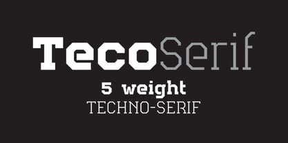 Serif version of TecoSans.
 - Crash Demons by Gian Studio,
$10.00 About Product Crash Demons, Display Typography is an elegant modern variable font. It's basically Sans with a touch of serif to each letter. A Simplicity yet very legible with various widths and weights that you can explore, combine, create and help you design things. Language Support: English, French, German, Indonesian, Irish, Italian, Low German, Norwegian, Portuguese, Swedish, Swiss German. Thank you.
 - Evanescent - Unknown license

- Excelsor Script by Storm Type Foundry,
$32.00Excelsor Script is inspired by lithographically produced scripts. It is softer and simpler than, for example, engraved Splendid Script, because its designer used pens and lithographic needles. The graver for steel is held in a quite different way and this has an influence on the shape of the letter. Similar type faces were in use from Neo-Classicism until the beginning of Art Nouveau, when they were pushed aside by a completely different view of festive typography. It has, in contradistinction to other scripts, slightly narrowed letters, which signifies a distinctive elegance without wasting space on the line. For practical reasons it was not possible to encircle the bottle with too long a label. It is, therefore, a suitable type face for labels. Its two optical grades cover a wide range of sizes. - Omnibus by Linotype,
$29.99Omnibus is one of my absolute favourites. My intention was to design a typeface as easy to read as Baskerville, without being a copy of it. It is easy to see that I was influenced by Baskerville, e.g. in the open lowercase g. I had in mind to design a Baskerville with the looks of the Baskervilles used in earlier typesetting. I put aside those plans for a while (but fulfilled them later on) and dedicated myself to Omnibus. In both cases my aim was to achieve a typeface with darker looks than the most used Baskerville. The name has nothing to do with buses, it is Latin with the meaning of for all". It is also in the name of Omnibus Typografi. Omnibus was released in 1993. - Schoolblock by Wiescher Design,
$39.50 Schoolblock is the typeface German schoolchildren learn to imitate when they are taught the printed letters. I just had to do this one for use in a German schoolbook. Your education-designer, Gert Wiescher
 - Power Grotesk by Power Type,
$15.00 Power Grotesk is a sans serif typeface with details that give typography that has its own characteristics from the thinnest to the thickest that is slightly widened. The goal is to create a typeface with legibility and good contrast between black and white so that it is suitable for different sizes. The typeface has a special feature that aids in reading and reproducing, trapping the right-sized ink for the text to work. The geometric shapes and structures reflect the inspiration and influence of medieval typography. Power Grotesk moves between the vast historical material that makes up modern typography, combining contemporary details with classic styles.
 - Trade Convention JNL by Jeff Levine,
$29.00 An ad for the annual Variety Club Convention appeared in the March 18, 1940 issue of "The Film Daily. The main headline was hand lettered in a classic Art Deco "solid" style of sans serif - ultra bold and with no counters - but had one additional feature: 'engraved' lines to the left of each character. This has now been expanded into the digital typeface Trade Convention JNL, which is available in both regular and oblique versions. Variety Clubs (now know as Variety - The Children's Charity) was founded in Pittsburgh, Pennsylvania in 1928 by entertainers specifically to aid children. Their history can be found at https://variety.org/who-we-are/history
 - Xcetera by Typogama,
$19.00 Work for the Xcetera typeface started with the desire to create a classical serif design but using the less contrasted stroke thickness found in a host of sans serif designs. My aim was to retain some of the clarity found in modern strokes yet use the serifs to aid in letter recognition and legibility. The result is a form of hybrid design that is surprising clear in small point sizes yet offer a lot of personality in larger formats. Suited for both display and text settings, Xcetera aims to be both functional and fun while looking to explore new possibilities for the classical typeface style.
 - Virna by FSD,
$60.00In September, 2003 I was contacted by MTV for the restyling of mtv.it I started from the beginning to work on a radical simplification of its visual elements, to achieve a better usability. It didn't take me so much to realize the basic design I attempted would have called for a notable reduction of the rich imagery distinguishing MTV's visual identity. As a visual aid to help me in this process I designed Virna, a headline "op-art" inspired face with the ability to create both vertical and horizontal ligatures between single words among two text lines, with the same ease of linking letters in handwriting or a linked script typeface. - Vtc-NueTattooScript - Personal use only

- Reika by Andrey Sharonov,
$20.00 Reika is a super soft and positive script inspired by the summer funny mood, simple street food and fresh drinks. It’s all about smiles, delicious, not too serious time spending with family or friends. Reika looking smooth thanks to 95 ligatures like an ak ch ck th in im ax ux and many others. Script includes Stylistic Alternates of some Uppercase and Lowercase and 12 lengths of End-Swashes (tales). You can use this font for example in logo and package design, in food business, kids and confectionery products. Reika support Western European characters and works with following languages: English, Danish, Dutch, Estonian, Faroese, Filipino, Finnish, French, German, Hungarian, Icelandic, Irish, Italian, Norwegian, Polish, Portuguese, Spanish, Swedish, Turkish. Quick combinations for Opentype features: Alternates - just add «2» End-letter - just add «underscore» End-swashes (tails) - just add -1, -2, -3…up to -12, where number is length of tail. This combinations works only with activated Standard Ligatures option in Opentype panel (Adobe Illustrator / Photoshop).
 - Pixochrome - Unknown license

- 1880 Kurrentshrift by GLC,
$38.00 This font was inspired by the old form of the so called "Kurrentschrift" German handwriting, based on late medieval cursive. It is also known as "Alte Deutsche schrift" ("Old German script"). It was taught in German schools until 1941, when Adolf Hitler decided to forbid it. As it is a little hard to read, we are proposing here two versions: the "pure" Kurrentschrift, and an adapted "Easy" one, with simplified difficult characters.
 - Mechanikschrift by Victory Type,
$12.00Mechanikschrift, roughly German for “mechanical writing”, is a typeface from Noah Rothschild and Victory Type. The aesthetic of this font is just what its name points towards: machine-like structure with a German flare. Minimalism is often associated with German design, and Mechanikschrift is a minimalist typeface. Furthermore, the designs of the characters, outside of the general theme of squared-off corners and angular appearance, are related to Herbert Bayer’s work at the Bauhaus. - Heckel by Hanoded,
$15.00 Erich Heckel (1883 - 1970) was a German painter and printmaker. He was a founding member of Die Brücke (The Bridge), a group of German expressionists. Heckel font somewhat resembles the loose (and messy) handwriting Erich Heckel used in some of his drafts.
 - US Bill Sans by Unidaas,
$39.00 US Bill™ Sans A Humanist typefaces sans serif. US Bill Sans has 12 weights, ranging from Light to Extrabold (including italics) and is ideally suited for advertising and packaging, book text, logo, branding and creative industries, small text, wayfinding and signage as well as web and screen design. Provides with features such as ligatures, small capitals, alternate characters, fractions, and super—and subscript characters. It comes with a complete range of figure set options as well as Latin-based languages. Designed and produced by Firman Suci Ananda, Fajar Wahyu Pribadi & Irfan Ulya. Published under Unidaas® Std — Formatika Aksa IDN, 2018.
 - Schneider Buch Deutsch by Intellecta Design,
$21.90a digitization of a classic blackletter by german typographer Schneidler - Dractura by Aerotype,
$29.00Dractura is based on a fifteenth century German fraktur typeface.


