10,000 search results
(0.026 seconds)
- Sweet Harmony by Balpirick,
$15.00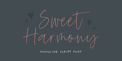 Sweet Harmony - a monoline script that's clean, elegant and perfect for a range of design projects! With its smooth, effortless lines and understated sophistication, this font is the perfect choice for those who want a modern look that's still timeless in its appeal. Crafted with precision and care, this font is incredibly versatile and can be used for a range of design projects, including logos, branding, invitations, packaging, and more. With its simple yet refined aesthetic, it's sure to make a lasting impression on anyone who sees it. - also multilingual support Enjoy the font! Feel free to comment or feedback! Thank you!
 - Harmony Embrace by Letterhend,
$14.00 Harmony Embrace is a font duo that seamlessly blends a signature script and chic serif font to create a modern and elegant look.The script font is perfect for creating a personal touch and adding a bit of flair to your designs, while the serif font adds a sense of professionalism and sophistication. Features : Uppercase & lowercase Numbers and punctuation Alternates & Ligatures Multilingual PUA encoded We highly recommend using a program that supports OpenType features and Glyphs panels like many of Adobe apps and Corel Draw, so you can see and access all Glyph variations.
 - Geometric Harmony by 2D Typo,
$24.00 Charming beauty of the laws of geometry. Easy and elegant decor for your design.
 - Tropical Harmony by Balpirick,
$15.00 Tropical Harmony is a Modern Calligraphy Font. Tropical Harmony Script is an enchanting handwritten font. This versatile script font has a wide spectrum of applications ranging from greeting cards to headlines and is guaranteed to add a romantic feel to your next project. Tropical Harmony also multilingual support. Enjoy the font, feel free to comment or feedback, send me PM or email. Thank you!
 - Silky Harmony by Prestige Artsy Studio,
$19.00 Introducing Silky Harmony Duo, a luxurious duo font an all caps font with a bewitching modern script font. The duo was specifically designed for modern projects, made to match perfectly together. Silky Harmony serif comes in with lots of elegant ligatures to embellish and compliment the handwriting font. Silky Harmony Duo works great in movie posters, stationery, digital assets, logos, quotes and much more... Supported Languages: Bosnian, Catalan, Czech, Danish, German, English, Spanish, Estonian, Finnish, French, Irish, Croatian, Hungarian, Icelandic, Italian, Lithuanian, Latvian, Maltese, Dutch, Norwegian, Polish, Portuguese, Romanian, Slovak, Slovenian, Albanian, Swedish, Turkish
 - Poem Harmony by Fromletterel,
$12.00 Introducing to a usable handwritten font family : Poem Harmony. Just like the name Poem Harmony, this fonts will beautify your design with its lovely look, you can also harmonize the font and create phenomenal works. This is a very easy usable family font, it is perfect to your signature, business card, branding, also will be very gorgeous to your quote for social media post and obviously will be very great to be applied to mug, tote bag or any kind of crafts.
 - Instant Harmony by Hanoded,
$15.00 Wouldn’t it be nice to have a pack of Instant Harmony in your cupboard? Just add water and *poof* - all strive and struggle have gone, having been replaced by peace and quiet. The grass seems greener, the sky bluer and the air smells like a fresh mowed lawn. Ahhhh! Zap! Back to reality. There is no instant harmony, don’t go looking for it in your local supermarket! If you want a taste of something resembling instant harmony, then add this super-duper font family to your collection and use it for your designs. You may find that your creativity levels are up, your morning coffee tastes better and your designs look exactly like you had in mind. Pinky promise!
 - Harmonis Style by Sensatype Studio,
$15.00 A Serif font that we created special for beauty branding needs, with extra ligatures in unique shape will be ready to add value of your brand. It so nice to leverage designer or product owner that need solutions to make their design look more beauty and modern. And specially for Harmonis font, We prepared any ligatures characters to help you create unlimited variations for your creative needs. Harmonis Serif font ready with: Any options to get creative variations (combination of Ligatures) Preview as a inspirations that you can do with Harmonis font Ready with Lowercase and Uppercase characters Wish you enjoy our font. :)
 - Charons Obol - Personal use only

- Sharon Apple - Unknown license

- Linotype Charon by Linotype,
$29.99Linotype Charon is the work of Renate Weise. Linotype Charon is a typeface with two sides to it: both objective and classic, it is neither neutral, nor an everyday typeface. Charon is modern and animated; its curving letters seek to touch the reader. Linotype Charon is named after the ferryman of Greek mythology who brought the souls of the dead across the River Acheron into the Underworld, connecting living and the dead. Linotype Charon, with its light swing and script character, can be used for either short texts or headlines. - Sharon Baker by Letterhend,
$13.00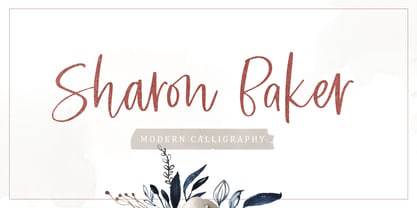 Sharon Baker a modern script that has a bright, lovely feeling. The natural hand written script is suitable for everyone who needs a typeface for headlines, logotype, apparel, invitations, branding, packaging, advertising, and more. This typeface is comes in uppercase, lowercase, punctuation, symbols, numbers, stylistic set alternate, ligatures, also contains multi-lingual support.
 - Charons Obol by Hanoded,
$20.00 Charon's Obol is a scary, brushed typeface. It was created using cheap paint and stiff brushes - hence the rough texture of the glyphs. Using this font will ensure you a safe passage across the river styx - just don't pay the ferryman until he gets you to the other side…
 - Medina by Hatftype,
$15.00 Medina - Cute Valentine Display Font is a font with distinctive handwritten characters perfect for branding projects, logos, wedding designs, media posts, advertisements, product packaging, product designs, labels, photography, watermarks, invitations, stationery, and any project who need handwritten dishes. Features : • Character Set A-Z • Numerals & Punctuations (OpenType Standard) • Accents (Multilingual characters) • Ligature. Multilingual Support : Afrikaans, Albanian, Asu, Basque, Bemba, Bena, Catalan, Chiga, Cornish, Danish, English, Estonian, Faroese, Filipino, Finnish, French, Friulian, Galician, German, Gusii, Icelandic, Indonesian, Irish, Italian, Kabuverdianu, Kalenjin, Kinyarwanda, Low German, Luo, Luxembourgish, Luyia, Machame, Makhuwa-Meetto, Makonde, Malagasy, Malay, Manx, Morisyen, North Ndebele, Norwegian Bokmål, Norwegian Nynorsk, Nyankole, Oromo, Portuguese, Romansh, Rombo, Rundi, Rwa, Samburu, Sango, Sangu, Scottish Gaelic, Sena, Shambala, Shona, Soga, Somali, Spanish, Swahili, Swedish, Swiss German, Taita, Teso, Vunjo, Zulu. There it is. I really hope you enjoy it. Comments & likes are always welcome and accepted.
 - Helium by Red Rooster Collection,
$45.00 Re-tooled from the QBF Collection.
 - Medika by MC Creative,
$15.00 Medika is a sweet and a natural script stylish script. Medika Modern Calligraphy is perfect for branding wedding designs, invitation, social media posts, advertisements, product packaging, product designs, label, projects, logo, photography, watermark,stationery and any projects that need handwriting taste. What’s Included : · Standard glyphs · Ligature · Works on PC & Mac · Simple installations · Accessible in the Adobe Illustrator, Adobe Photoshop, Adobe InDesign, even work on Microsoft Word. · PUA Encoded Characters – Fully accessible without additional design software. · Fonts include multilingual support for; ä ö ü Ä Ö Ü ß ¿ ¡ Thank you for your purchase! Hope you enjoy with our font!
 - Radium by Typespec,
$32.00 Radium is a futuristic display face with a robust attitude and sharp geometric ideals. Drawing inspiration from computer games, graffiti and nineties dance music, Radium is a versatile typeface for branding, posters, packaging and point of sale. Radium is available in three weights and comes in OpenType (.otf) format for Mac and Windows. Features: Radium supports the following OpenType features: Standard ligatures, discretionary ligatures, ordinals, custom fractions, numerators, denominators, superscript, scientific inferiors, proportional and tabular lining figures, and a slashed zero. Supported Languages: Each weight has a 528 glyph character set for use in the following Latin languages: Albanian, Afrikaans, Basque, Bosnian, Breton, Catalan, Croatian, Czech, Danish, Dutch, English, Esperanto, Estonian, Faroese, Finnish, French, Gaelic, German, Greenlandic, Hungarian, Icelandic, Indonesian, Irish, Italian, Latvian, Lithuanian, Luxembourgish, Maltese, Norwegian, Occitan, Polish, Portuguese, Romanian, Sami, Serbian (Latin), Slovak, Slovene, Sorbian, Spanish, Swedish, Swahili, Turkish, Walloon and Welsh.
 - Mediator by ParaType,
$30.00 Mediator is a balanced contemporary sans serif typeface that performs well both in display sizes and body text. The family contains 30 fonts in 3 widths: 8 romans with matching italics, of slightly extended proportions, from Thin to Black; 7 narrow and 7 condensed, from Thin to ExtraBold. The character set in normal upright faces was expanded to include small caps and all faces include old style figures. The typeface was designed by Manvel Shmavonyan with the participation of Alexander Lubovenko and released by ParaType in 2016.
 - Cesium by Hoefler & Co.,
$51.99 An inline adaptation of a distinctive slab serif, Cesium is an unusually responsive display face that maintains its high energy across a range of different moods. The Cesium typeface was designed by Jonathan Hoefler in 2020. An energetic inline adaptation of Hoefler’s broad-shouldered Vitesse Black typeface (2000), Cesium is named for the fifty-fifth member of the periodic table of the elements, a volatile liquid metal that presents as a scintillating quicksilver. From the desk of the designer, Jonathan Hoefler: I always felt that our Vitesse typeface, an unusual species of slab serif, would take well to an inline. Vitesse is based not on the circle or the ellipse, but on a less familiar shape that has no common name, a variation on the ‘stadium’ that has two opposing flat edges, and two gently rounded sides. In place of sharp corners, Vitesse uses a continuously flowing stroke to manage the transition between upright and diagonal lines, most apparent on letters like M and N. A year of making this gesture with my wrist, both when drawing letterforms and miming their intentions during design critiques, left me thinking about a reduced version of the typeface, in which letters would be defined not by inside and outside contours, but by a single, fluid raceway. Like most straightforward ideas, this one proved challenging to execute, but its puzzles were immensely satisfying to solve. Adding an inline to a typeface is the quickest way to reveal its secrets. All the furtive adjustments in weight and size that a type designer makes — relieving congestion by thinning the center arm of a bold E, or lightening the intersecting strokes of a W — are instantly exposed with the addition of a centerline. Adapting an existing alphabet to accommodate this inline called for renovating every single character (down to the capital I, the period, and even the space), in some cases making small adjustments to reallocate weight, at other times redesigning whole parts of the character set. The longer we worked on the typeface, the more we discovered opportunities to turn these constraints into advantages, solving stubbornly complex characters like € and § by redefining how an inline should behave, and using these new patterns to reshape the rest of the alphabet. The New Typeface The outcome is a typeface we’re calling Cesium. It shares many of Vitesse’s qualities, its heartbeat an energetic thrum of motorsports and industry, and it will doubtless be welcome in both hardware stores and Hollywood. But we’ve been surprised by Cesium’s more reflective moods, its ability to be alert and softspoken at the same time. Much in the way that vibrant colors can animate a typeface, we’ve found that Cesium’s sensitivity to spacing most effectively changes its voice. Tighter leading and tracking turns up the heat, heightening Cesium’s sporty, high-tech associations, but with the addition of letterspacing it achieves an almost literary repose. This range of voices recommends Cesium not only to logos, book covers, and title sequences, but to projects that regularly must adjust their volume, such as identities, packaging, and editorial design. Read more about how to use Cesium. About the Name Cesium is a chemical element, one of only five metals that’s liquid at room temperature. Resembling quicksilver, cesium is typically stored in a glass ampule, where the tension between a sturdy outer vessel and its volatile contents is scintillating. The Cesium typeface hopes to capture this quality, its bright and insistent inline restrained by a strong and sinuous container. Cesium is one of only three H&Co typefaces whose name comes from the periodic table, a distinction it shares with Mercury and Tungsten. At a time when I considered a more sci-fi name for the typeface, I learned that these three elements have an unusual connection: they’re used together in the propulsion system of nasa’s Deep Space 1, the first interplanetary spacecraft powered by an ion drive. I found the association compelling, and adopted the name at once, with the hope that designers might employ the typeface in the same spirit of discovery, optimism, and invention. —JH Featured in: Best Fonts for Logos
 - Reditum by Mans Greback,
$59.00
- Modicum by Elemeno,
$10.00 - Podium by Identikal Collection,
$23.00 - LT Festive Medium - 100% free

- Wiegel Latein Medium - 100% free

- Tt-Kp Medium - Unknown license

- COM4t Sans Medium - Unknown license

- SF Espionage Medium - Unknown license

- SF Arborcrest Medium - Unknown license

- Wiegel Kurrent Medium - 100% free

- SF Arborcrest Medium - Unknown license

- Abbey Medium Extended - Unknown license

- SF Espionage Medium - Unknown license

- Bill Corporate Medium by OGJ Type Design,
$35.00 Bill Corporate is a geometric typeface with generous capitals. A modern classic, based on Max Bill’s lettering work, its straightforward and uncompromising construction can be both edgy and sublime. With minimalist letterforms, pointy apexes instead of flat ones, and archetypal proportions, this font family doesn’t follow any trends but strives to achieve a timeless formal vocabulary. The skeleton of its letters is based heavily on the famous primary shapes of the Bauhaus: square, circle, and triangle. This makes for quite wide uppercase and much narrower lowercase letters. The contrast between uppercase and lowercase benefits inexperienced users, who will be able to get appealing results quickly. At the same time, it’s a powerful tool for seasoned designers, who can employ either case selectively to set the desired typographic course. Bill Corporate Medium’s 16 styles (including a set of eight lighter-than-light fonts from “Two” to “ExtraLight”) are an excellent choice for editorial design, branding, headlines, and even short to mid-length copy in a wide range of applications and industries. The uppercase letters in particular—with their varied widths and lavish dimensions—are suitable for cosmopolitan and stylish logotypes and wordmarks. Whenever a timeless, staid, and classy look is demanded, choose Bill Corporate.
 - Mementor Medium Regular by Wooden Type Fonts,
$15.00 Medium slab serif
 - Varial Rounded Medium by Cloud9 Type Dept,
$35.00
- Bernhard Gothic Medium by Wooden Type Fonts,
$15.00 A version of Bernhard Gothic Medium. Quite useful for advertising.
 - Martin Medium Regular by Wooden Type Fonts,
$15.00 Medium weight, sans serif.
 - Copperplate Classic Medium by Wiescher Design,
$49.50 Copperplate was the classic nineteenth century engravers typeface, consisting of capitals and small caps only. Among others (for example Deberny & Peignot) F. W. Goudy's cut for ATF around 1901 is probably the most widely known. Copperplate typefaces are traditionally used for business cards and all that "serious" stuff. My Copperplate Classic is a completely new design, based on some old samples. To make it look more up-to-date and elegant, I gave it some extra swings here and there. The old fonts were all designed with clogging corners or points that can break off in the minds of its designers. Today we do not have those problems any longer, so I could give my Copperplate Classic real sharp pointed serifs. To give you more choice I now added this medium cut in three variations, medium, sans and rounded! Enjoy! Gert Wiescher
 - LT Shortcake Medium - 100% free

- LT Bread Medium - 100% free


