10,000 search results
(0.023 seconds)
- Cyan Sans by Wilton Foundry,
$29.00The design of Cyan was inspired by features found in classic Roman and styles like Trajan and Bodebeck. The characters stay true to the same features as the capitals, resulting in an unusually distinctive style. The Capitals version contains Roman numerals. Cyan's weight is similar to Trajan's but the horizontal strokes are slightly bolder resulting in better legibility for small sizes, especially for lowercase characters. Cyan Sans evolved out of the hugely successful Cyan Serif family. Cyan Sans retains the same geometric Roman proportions with open centers in B,P,R b, d, p . This helps create a thick and thin stroke illusion since the actual strokes don't vary much. There are many subtle details in Cyan Sans that become more interesting in larger sizes. The beauty of Cyan Sans is that it has no features that "jar" the eye. The result is a very pleasing and distinctive sans that scales well. Cyan Sans is a robust font that will exceed expectations in areas never explored before. The name is inspired by the Greek word cyan, meaning "blue". Blue as a primary color that has many hues and uses. Cyan the font, we hope will be seen in a similar light. Obviously Cyan Sans is a perfect companion to the Cyan Serif family. - Clockmaker by Sudtipos,
$49.00 Sudtipos is proud to announce the release of Clockmaker, an 8-weight family that takes initial inspiration from typography around the turn of the twentieth century. Clockmaker takes aesthetic references from Victorian, Art Nouveau and Art Deco advertising and typography, taking special influence from John F. Cummings’ all-caps – and never digitized – type design Elandkay. Clockmaker is a robust multi-weight family that includes an array of ligatures as well as alternate characters and support for all latin languages. The design process began with developing and modernizing the uppercase letterforms, followed by designing the lowercase and additional weights. Creating a diverse and playful set of uppercase ligatures was an almost endlessly enjoyable task; they are one of Clockmaker’s most charming features. Clockmaker is an impeccable choice for designs requiring a vintage flair such as a luxury liquor labels, restaurant identities, lavish hotels and many other applications where elegance and grace are needed. In addition to its historical references, Clockmaker is an homage to my grandfather who was a master craftsman, repairing antique clocks and fine watches with great skill and mathematical precision. Watching him work was fascinating and it has been a joy to remember those quiet and curious moments from my childhood while designing this font.
 - Wayfinding Sans Symbols by FDI,
$29.00 Placing pictograms as single vector images makes designing signage a time-consuming task. But with Wayfinding Sans Symbols and its built-in OpenType intelligence using pictograms becomes as easy as typing words. With Wayfinding Sans Symbols you don’t need to scroll through endless glyph palettes to look for one symbol among hundreds of symbols. Just active ligatures and type in the mnemonic codes like #wheelchair, #parking, #toilet and so on. An overview of these codes can be found in the type specimen PDF. Each pictogram is available in 4 different versions and you can easily assign an additional background color or turn the symbol into a prohibition sign. Wayfinding Sans Symbols has a full coverage of the Unicode range “Transport & Map symbols” and a lot of additional signs that are missing in the typical wayfinding symbol sets. Beside the pictograms, Wayfinding Sans Symbols also has a huge set of arrows for every possible situation and you can easily switch between the different sets using OpenType feature controls. The enclosed letters and figures make it easy to set transport line numbers, room & storey numbers and much more. Wayfinding Sans Symbols is the perfect addition to Ralf Herrmann’s signage typeface Wayfinding Sans Pro, but it can also be used with any other typeface.
 - Nurnberg Schwabacher by Intellecta Design,
$29.95"I digitized and to revitalize NurnbergSchwabacher by the extinct Haas'sche Schriftgiesserei, a German/Swiss foundry established in 1790 and based in Basel/Münchenstein. Many of its shares were acquired by D. Stempel in 1927. On the Luc Devroye site this foundry is listed on the Extinct Foundries of the 18th century page. This design is very similar to another Intellecta best seller: Hostetler Fette Ultfraktur Ornamental, both drawn from the classical type specimen book from Hostetler. The ornamental frame that completes the font is a fantastic baroque ornament that I found in another old book, unfortunately lost now. Luc Devroye, whose book is the source for all of my fonts, writes this about Rudolf Hostettler: He was a Swiss type designer, author of “The Printer’s Terms” designed by Jan Tschichold, of "Technical Terms of the Printing Industry" (5th edition was printed in 1995), and of "Type: eine Auswahl guter Drucktypen; 80 Alphabete klassischer und moderner Schriften" (Teufen, Ausser-Rhoden: Niggli, 1958). He also wrote "Type: A Selection of Types" (1949, fgm books, R. Hostettler, E. Kopley, H. Strehler Publ., St. Gallen and London) in which he highlights type made by European houses such as Haas, Enschedé, Deberny and Nebiolo. Jost Hochuli wrote his biography. - Neue Plak by Monotype,
$57.99 Originally designed in 1928, Plak is something of a lost gem in the type world. Despite being drawn by Futura creator Paul Renner, it never achieved the same popularity and spent decades lacking a much-needed digital revival. Monotype designers Linda Hintz and Toshi Omagari have taken its existing three weights and, after extensive research into the original wood type, extended them into the vast Neue Plak family. The typeface is available in 60 weights that stay true to Renner’s intentions, and offer the same blend of “quirky” details and “German stiffness” – as Hintz describes it. The design is an unusual mixture, bringing together a defiant outer appearance that’s counteracted by more playful details found in the lowercase r, and the large dots of the lowercase i. Other distinctive details include open or strikethrough counters, and a set of hairline widths that reduce Renner’s original design to its bare bones. Neue Plak’s display weights are crying out to be used in editorial, on packaging or in logos, while its text weight works well in both print and digital environments. Neue Plak Text Variables are font files which are featuring one axis and have a preset instance from Thin to Black
 - Business Penmanship by Sudtipos,
$79.00 Business Penmanship is an ode to the business handwriting from the era penmanship was a highly-valued part of business education and practice. In the early 1800s, Platt Rogers Spencer (1800-1864) created what would become the most widely accepted and prized cursive writing method used in business. Before the American Civil War, Spencer was the undisputed king of handwriting. He was also an outspoken supporter of American business education. By the late 1800s business education included some focus on penmanship, and there were many colleges that specialized in it. One of the most influential penmanship schools was founded by Charles Paxton Zaner and his partner E. W. Bloser. Later on, in the early 1900s Austin Palmer introduced the Palmer Method of business penmanship, and it soon became the most popular handwriting system in the United States. Business Penmanship is a single feature-rich font that includes over 1100 characters, covering ligatures, alternates, a large set of beginning and ending extensions, as well as a wide range of Latin-based languages, including Turkish and the languages of Central and Eastern Europe and the Baltic region. To take advantage of all the OpenType features included in the font, please use within programs that support such advanced typography.
 - Change Serif by Borutta Group,
$39.00 Change Serif is a typeface family designed as a part of Mateusz Machalski's PhD project, carried out in 2015-2021. The main goal was to create a typeface allowing for the typesetting of complex humanistic texts, containing many historical letterforms. The starting point was the preparation of most of the glyphs provided in unicode for Latin, Cyrillic and Greek. From the formal point of view, the Change family is based on Renaissance proportions with contemporary details. Classic upright version is paired with expressive and calligraphic italics, inspired by the works of Robert Granjon. Each of the styles contains about 4,000 characters, allowing for a broad range of typesetting capabilities – multiscript publications, historical translations, and texts transcription. The crucial aspect was to treat all scripts equally. All OpenType features, such as swashes, final forms, decorative ligatures, can be found in Latin, Cyrillic and also Greek. The name of the typeface refers to the design process in which there are constant changes and corrections. On the other hand, it means to convey how this project influenced my perception of typography and allowed me to embrace it as a medium of artistic expression. Due to its similar proportions, Change works perfectly with the Gaultier typeface.
 - Happy Sans by Essqué Productions is a delightful and vibrant font that embodies a sense of joy and approachability. As its name suggests, this typeface exudes happiness through its design, making it ...
- MachaCow - Unknown license

- Maharlika - Unknown license

- Reklamefraktur by RMU,
$25.00 Reklamefraktur is a stout, eye-catching blackletter font for labels, product branding, posters, ads, the internet and much more.
 - Hata MF by Masterfont,
$59.00 As personal as a handwriting can be, the ink drops add much of genuine touch to this childish script.
 - Stereoflows by Maulana Creative,
$16.00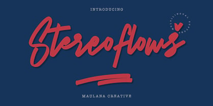 Give your designs an authentic handcrafted feel. � Stereoflows� is perfectly suited to stationery, logos and much more. Many Thanks!
 - The "Computer Is Personal" font is a distinctive typeface that embodies the essence of digital intimacy and personal computing. This font captures the ethos of the era when personal computers started...
- Lost Forever, as evocative as the name sounds, is a font that carries the weight of nostalgia, mystery, and perhaps a hint of melancholy. This typeface finds its roots deeply embedded in the world of...
- Austin Antique by HiH,
$10.00 “More is better” may have been the motto of Richard Austin of Austin and Son’s Imperial Letter-Foundry on Worship Street at Finsbury Square in London when he designed and cut his Antique typeface. The year it was created is uncertain, but it is known to have appeared in a specimen book produced in 1827. At first glance, the upper case letters of Austin Antique look very much like Figgins Antique. But, upon examination, one will note that the Austin face is much darker. In general, the letters designed and cut by Richard Austin have fatter strokes, larger serifs and smaller counters -- more metal and less daylight. The premise was that the darker the letter, the more attention an ad using the typeface would receive. In old pictures of London and Paris one may see walls crowded with posters and “bills” -- competing for the attention of the passerby. Morris and Updike aside, the early nineteenth century marked the beginning of a commercial as well as industrial revolution. Patterns of commerce were changing. With new methods of marketing came the need for new typefaces to support the new methods. Foundries found the display types were very profitable and competed most energetically and creatively for the trade. There was a lot of trial-and-error. Some ideas faded away. Others, like the Antiques or Egyptians, were refined and developed. From them came the Clarendons that were to prove both popular and long lasting -- because they worked. Their job was to sell goods, not please the aesthetic sensibilities of the critics. They did their job well. Austin Antique has a full Western European character set, plus the following ligatures: ct, st, fi, fl, ff, ffi and ffl. Tabular numbers. Surprisingly readable.
 - Micelina by Gatype,
$14.00 Micelina modern script style sweet calligraphy, decorative characters and dancing baseline! Very pretty on invitations such as greeting cards, branding materials, business cards, quotes, posters and more! Micelina comes with 338 glyphs. Alternate characters are divided into several Open Type features such as ,Stylistic Alternates. The Open Type feature can be accessed using Open Type savvy programs such as Adobe Illustrator, Adobe InDesign, Adobe Photoshop version of Corel Draw X, and Microsoft Word. And this Font has provided PUA unicode (custom coded font). so that all alternative characters can be easily accessed in full by a craftsman or designer. Thank you for your purchase!.
 - Laughing Kids by Putracetol,
$24.00 Junior Schoolboy - Bold Fun Display Font. Junior Schoolboy a bold, quirky display font with a fun and trendy cute characters. With a childish style, it will be very suitable for your project, which is related to children. Such as story books, illustrations, comic books, t-shirts, posters, greeting cards, logos, branding, stickers, svg, crafting. The alternative characters were divided into several Open Type features such as Swash, Stylistic Sets, Stylistic Alternates, Contextual Alternates, and Ligature. The Open Type features can be accessed by using Open Type savvy programs such as Adobe Illustrator, Adobe InDesign, Adobe Photoshop Corel Draw X version, And Microsoft Word. This font is also support multi language.
 - Celestial Script by Gatype,
$14.00 Celestial Script modern script style sweet calligraphy, decorative characters and dancing baseline! Very pretty on invitations such as greeting cards, branding materials, business cards, quotes, posters and more. Celestial Script comes with 427 glyphs. Alternate characters are divided into several Open Type features such as, Stylistic Alternates. The Open Type feature can be accessed using Open Type savvy programs such as Adobe Illustrator, Adobe InDesign, Adobe Photoshop version of Corel Draw X, and Microsoft Word. And this Font has provided PUA unicode (custom coded font). so that all alternative characters can be easily accessed in full by a craftsman or designer. Thank you for your purchase!.
 - Legator by Putracetol,
$25.00 Legator - Super Bold Display Font. Legator a super bold, quirky display font with a fun and trendy characters. With a sporty style, it will be very suitable for your project, which is related to sport display. Such as story books, illustrations, comic books, t-shirts, posters, greeting cards, logos, branding, stickers, svg, crafting. The alternative characters were divided into several Open Type features such as Swash, Stylistic Sets, Stylistic Alternates, Contextual Alternates, and Ligature. The Open Type features can be accessed by using Open Type savvy programs such as Adobe Illustrator, Adobe InDesign, Adobe Photoshop Corel Draw X version, And Microsoft Word. Legator is also support multi language.
 - Tailor Craft by Putracetol,
$24.00 Tailor Craft - Bold Quirky Display Font. Tailor Craft a bold, quirky display font with a fun and trendy cute characters. With a childish style, it will be very suitable for your project, which is related to children. Such as story books, illustrations, comic books, t-shirts, posters, greeting cards, logos, branding, stickers, svg, crafting. The alternative characters were divided into several Open Type features such as Swash, Stylistic Sets, Stylistic Alternates, Contextual Alternates, and Ligature. The Open Type features can be accessed by using Open Type savvy programs such as Adobe Illustrator, Adobe InDesign, Adobe Photoshop Corel Draw X version, And Microsoft Word. This font is also support multi language.
 - Chubby Chicks by Putracetol,
$22.00 Chubby Chicks - Funky Display Font. Chubby Chicks a bold, quirky display font with a fun and trendy cute characters. With a childish style, it will be very suitable for your project, which is related to children. Such as story books, illustrations, comic books, t-shirts, posters, greeting cards, logos, branding, stickers, svg, crafting. The alternative characters were divided into several Open Type features such as Swash, Stylistic Sets, Stylistic Alternates, Contextual Alternates, and Ligature. The Open Type features can be accessed by using Open Type savvy programs such as Adobe Illustrator, Adobe InDesign, Adobe Photoshop Corel Draw X version, And Microsoft Word. This font is also support multi language.
 - Junior Schoolboy by Putracetol,
$16.00 Junior Schoolboy - Bold Fun Display Font. Junior Schoolboy a bold, quirky display font with a fun and trendy cute characters. With a childish style, it will be very suitable for your project, which is related to children. Such as story books, illustrations, comic books, t-shirts, posters, greeting cards, logos, branding, stickers, svg, crafting. The alternative characters were divided into several Open Type features such as Swash, Stylistic Sets, Stylistic Alternates, Contextual Alternates, and Ligature. The Open Type features can be accessed by using Open Type savvy programs such as Adobe Illustrator, Adobe InDesign, Adobe Photoshop Corel Draw X version, And Microsoft Word. This font is also support multi language.
 - Gothan by IM Studio,
$19.00 Gothan Scripts Fresh & modern new scripts with handcrafted calligraphy style, decorative characters and dancing baselines! Very pretty on invitations such as greeting cards, branding materials, business cards, quotes, posters and more!! Gothan Script comes with 401 glyphs. Alternate characters are divided into several Open Type features such as Swash, Stylistic Sets, Stylistic Alternates, Contextual Alternates. The Open Type feature can be accessed using Open Type savvy programs such as Adobe Illustrator, Adobe InDesign, Adobe Photoshop version of Corel Draw X, and Microsoft Word. And this Font has provided PUA unicode (custom coded font). so that all alternative characters can be easily accessed in full by a craftsman or designer.
 - Lingstone by Gatype,
$12.00 Lingstone Script modern script style sweet calligraphy, decorative characters and dancing baseline! Very pretty on invitations such as greeting cards, branding materials, business cards, quotes, posters and more! Lingstone Script comes with 441 glyphs. Alternate characters are divided into several Open Type features such as , Stylistic Alternates. The Open Type feature can be accessed using Open Type savvy programs such as Adobe Illustrator, Adobe InDesign, Adobe Photoshop version of Corel Draw X, and Microsoft Word. And this Font has provided PUA unicode (custom coded font). so that all alternative characters can be easily accessed in full by a craftsman or designer. Thank you for your purchase.
 - Torcao by insigne,
$24.00 Torcao is one of the sporks of the font universe, a useful and functional outlier. Half square, half circle, this uncommon squircle of a family with its asymmetry of curved and angular shapes drives through headlines and body copy with forward velocity. The robust, technical appearance is light-hearted and inviting, and its organic nature plays off of its one-of-a-kind kinks and hybrid forms. Torcao is not merely an experimental font, though. The figures have been crafted and refined into a functional, hard-working typeface that lends itself to many sizes and environments. The font family features a tall x-height and light modulation, which give the typography its unique color highly effective in headlines but still quite legible in longer text. This family contains a comprehensive range of nine weights--slender to black--and features condensed and extender selections for a complete set of forty-eight fonts. The font has been decked out for experienced typographers, together with swash alternates and simplified titling. The typeface also contains a range of numeral sets, together with fractions and old-style figures. OpenType-capable programs including Quark or the Adobe suite allow quick changes to ligatures and alternates. Previews of these options can be found in the .pdf brochure. Torcao also features the glyphs to enable all Central, Eastern, and Western European languages. In all, the font supports around forty languages that utilize the prolonged Latin script, making it an excellent option for multi-lingual publications and packaging. Simple, technical, and open, the Torcao type family could just be the perfect choice for your web type or print project.
 - Beynkales by Scriptorium,
$18.00Now here's a font with an unusual backstory. You may recall that a while ago we discovered that Tim Burton was using an outdated version of one of our fonts for the interior titles in his The Corpse Bride. Well, our quest to get hold of him didn't bear any immediate fruit, but in a totally unrelated event we were contacted by the graphic arts company working with the overseas distributors for The Corpse Bride and it turned out that they needed a font based on the main title of the movie so they could keep the same style when they retitled it into other languages. The original title was either hand lettered or a heavily modified font, bearing some resemblance to our Ligeia and Tuscarora fonts, so we had to create a whole font more or less from scratch and extrapolate most of the letters from the very limited sample in the original title by identifying certain consistent characteristics and building new characters around them. It was a lot of work, but the good news is that they didn't want exclusivity, so we've got the font to add to our collection. We ended up calling it Beynkales which means 'Bone Bride' in Yiddish, which makes sense given the context of the movie. So here it is, in all its tattered glory, and bound to end up in our Halloween font selection later this year as well. Beynkales Alternate is a companion font that includes a full set of alternative upper and lower case characters which can be used on their own or in combination with the characters from Beynkales to create a more varied and handwritten look. - Conspired Lovers by Harald Geisler,
$39.00 Conspired Lovers is based on five years of love-letter writing. A font to capture the intentions of love letters more than any other font. How did the Project start? In the last five years I wrote love letters with two persons. I became used to the joy of handwriting with ink and nib on fine paper. Through practice a experimentation my style continuously refined. As life moves on, suddenly I found myself with no one to write love letters to. It's a luxury to have someone to write letters to. Missing the joy of writing and listening to Gregory Porter’s “Be Good”, the decision was made to take this 5 years of writing and make this dance on paper a font. A handwritten typeface for everyone to use. This font was created in July, 2012 and named Conspired Lovers. A font to capture and convey your message in a special way to the beloved one close to your heart. With a long practice of writing crafted into the unique design I hope that you and the recipient of your writing will soon enjoy this design. The Open-type version features 350+ glyphs including alternates and ligatures. All lowercase and most uppercase letters are connected, to create a realistic hand-writing-calligraphy on your creations. Conspired Lovers is international and supports a wide range of eastern european languages with accented letters to reach everyone in Sweden, France, Hungary and almost everywhere around the globe. A trailer for Conspired Lovers can be seen here: http://vimeo.com/haraldgeisler/conspired-lovers If you're looking for more heart related fonts also check out my other fonts.
 - Anca by DizajnDesign,
$49.00 Anca typeface started as a comission work for Fest Anca, an international animation festival. They needed something to complement the corporate identity of the festival. Inspiration came from a sketch made by my friend long time ago, which had a tremendous potential. As letters were digitized and the basic alphabet was completed, a very practical and universal typeface resulted. The whole type family has a playful and simple look with rounded stroke endings as well as long ascenders. The construction skeleton uses the minimum number of strokes and as a consequence, some original letter shapes (Q, w, j, &, A, §) were produced. Despite the fact that most letter shapes are based on geometry, some strokes are intentionally irregular, which creates a very natural feeling. Anca is appropriate for setting short paragraphs, headings and big inscriptions.
 - Caros Soft by cretype,
$20.00 Caros Soft is the rounded version of Caros. Caros Soft Family is a modern sans-serif typeface that is clean, simple and highly readable. Letters in this type family are designed with geometric shapes without any decorative distractions. The spaces between individual letter forms are precisely adjusted to create the perfect typesetting. Caros Soft is a versatile type family of 18 fonts. Caros Soft family consists of 9 weights (Thin, ExtraLight, Light, Regular, Medium, Bold, ExtraBold, Heavy & Black) with their corresponding italics. The Open Type fonts contain complete Latin 1252, Cyrillic, Central European 1250, Turkish 1254 character sets. Each font includes proportional figures, tabular figures, numerators, denominators, superscript, scientific inferiors, subscript, fractions and case features. We highly recommend it for use in books, web pages, screen displays, and so on.
 - SK Paragrapher by Shriftovik,
$10.00 SK Paragrapher™ is a monumental geometric typeface whose structure was inspired by the paragraph glyph. The entire typeface is built on a rhythmic composition and a black-to-white balance. Each character corresponds to a grid, and all its characters are monospaced, so the typeface looks harmonious and complete, despite the complexity of perception of its appearance. This typeface has both uppercase and lowercase letters, as well as a capital! The typeface supports a multilingual layout that includes: extended Latin and Cyrillic characters, additional characters, and Hebrew. This typeface also includes more than 10 currency symbols, as well as 4 fonts: Solid, Outline, Rounded, Sharp! As a result, SK Paragrapher is a multilingual, monospaced geometric monumental typeface that contains almost 1000 glyphs for your any design work, be it a poster or a website!
 - Artico Soft by cretype,
$20.00 Artico Soft is the rounded version of Artico. Artico Soft Family is a modern sans-serif typeface that is clean, simple and highly readable. Letters in this type family are designed with genuine neo-grotesque and neutral shapes without any decorative distractions. The spaces between individual letter forms are precisely adjusted to create the perfect typesetting. Artico Soft is versatile type family of 18 fonts. Artico family consists of 9 weights (Thin, ExtraLight, Light, Regular, Medium, Bold, ExtraBold, Heavy & Black) with their corresponding italics. The Open Type fonts contain complete Latin 1252, Cyrillic, Central European 1250, Turkish 1254 character sets. Each font includes proportional figures, tabular figures, numerators, denominators, superscript, scientific inferiors, subscript, fractions and case features. We highly recommend it for use in books, web pages, screen displays, and so on.
 - Thanksgiving Joy by Putracetol,
$16.00 Thanksgiving Joy - Various Fun Font is a whimsical and playful typeface designed to celebrate the spirit of Thanksgiving. With its rounded and friendly characters, this font adds an element of fun and warmth to your designs, making it a perfect choice for projects related to this special holiday. This font boasts nine delightful decorative variations, each inspired by different Thanksgiving motifs like turkey, pumpkins, pie, leaves, and hats. It's an ideal font for creating Thanksgiving-themed designs, including invitation cards, birthday invites with a Thanksgiving theme, party decorations, logos, stickers, clothing, packaging, children's books, magazines, and more. With its charming and playful style, Thanksgiving Joy captures the essence of gratitude, celebration, and the joy of Thanksgiving, making it an ideal choice for any project that aims to bring the warmth of this holiday to life
 - Axion SER by Type Innovations,
$39.00 Axion SER is an original design by Alex Kaczun. Axion SER is a serif style variation based on his original Axion typeface family of fonts. It is a display font not intended for text use. It was designed specifically for display headlines, logotype, branding and similar applications. The entire font has an original look which is strong, dynamic, machine generated and can be widely used in publications and advertising. Axion SER is a futuristic, techno-looking and expressive typeface with an appearance of machined parts with sharp and rounded edges. This attractive display comes in roman with lower case and lining figures.The font is also available with true small capitals and old style figures. The large Pro font character set supports most Central European and many Eastern European languages.
 - Wiblz Serif by The Ampersand Forest,
$19.00 Meet Wiblz (say “Vibbles!”). Wiblz is a Modern/Didone text family in the great tradition of squarish text families like Walbaum, Ibis, and Georgia. He has a high x-height and a great balance of legibility and readability. Plus, he supports the Latin alphabet, basic Cyrillic, Monotonic and Polytonic Greek, and the International Phonetic Alphabet. That makes him superlative in his usefulness and versatility! When searching for a didone typeface, it's often a struggle between blackness/legibility and stylishness/contrast. this is especially true of squarish didones, which number less than their round counterparts. Wiblz is an excellent balance between the two — clean and striking, good for uses from text to heading, and at home in print and on screen. Give him a try! He's a smart, adaptable, useful guy!
 - Galey by Prestigetype Studio,
$23.00 Galey is a modern and clean sans serif with a geometric and rounded style. Each style comes in 18 weights with italics + variable fonts, from thin to black, includes 592 glyphs in each weight. Each style has its unique characters include OpenType features and extended language support (+Cyrillic) to suit a different purpose. Designed with a modern minimalist in mind, Perfectly use for branding, display, logo, text, headline, web design, and many editorial design purposes. We highly recommend using a program that supports OpenType features and Glyphs panels like many Adobe apps and Corel Draw so you can see and access all Glyph variations. We hope you enjoy our font - please do let us know by emailing us at info@prestigetype.com or prestigetypestudio@gmail.com if you need something!
 - Hnm by Krown Creative Factory,
$5.00 Hnm is a Geometric Sans Typeface with some bold and round glyphs to give a sense of confidence but also not rigid or strictly its a jovial Happy Typeface It can be used to create a range of design projects like posters, advertising and marketing flyers and even to printed items. It just requires you to use your imaginative strength and your design projects will look more native and even better pass your message. With this typeface you can create a party poster, movie flyer, advertising and marketing posters, it can also be used on branding items, Craft design, book covers, music cover arts, or any purpose of your choice to make your designs have that bold and confident look without looking too serious, feel free to play with this typeface.
 - Strokes by Favorite Fonts,
$17.00 The "Strokes" font family presented here has several styles: regular, italic, bold and bold italic. The font supports the alphabet consisting of Latin letters and symbols, Cyrillic, Tatar. The composition of the font "Strokes" includes graphemes from uppercase and lowercase letters, numbers, standard characters. The originality of the font lies in its name. The "Strokes" font is made up of many intersecting lines, forming rounded sans-serif letters, but at the same time smooth and easy to read, which will fit perfectly into your composition. The unusualness and attractiveness of the font makes it noticeable among the texts that surround us everywhere. This property is convenient to use on signs, logos, corporate identity, product packaging. The decorativeness of the font is eye-catching and will add important accents to your work.
 - Verse Sans by Hubert Jocham Type,
$39.00 In 2006 the art director of Emotion, a women’s psychology magazine, asked me to design a copy typeface for them. Before I actually got the job I started to work on a serif. I wanted it to be feminine but still clear and modern. On one hand there are the floral round elements and on the other hand the angular serifs. In the composition I wanted the two extremes to work together. All the other elements had to be harmonized. The proportions needed to match the magazine’s requirements. The ascenders and descenders are short enough to work in narrow columns but long enough to work in small sizes. As you can imagine, the emotion-job never happened. In copy you should not get heavier than Heavy. Extrabold and Ultrabold work best in display.
 - WBP Emperio by Studio Jasper Nijssen,
$20.00 A classic serif font with a twist. WBP Emperio has an interesting shape. She has rounded corners and a slightly 'curvy' look. The little indent makes her stand out above the rest. A sensation in the making. Emperio has two styles. The Regular: Great for designing friendly corporate identities. And there's the Hand Drawn style: Great for design posters of prints with a handmade feel. Combine the two and you can go infinite. WBP Emperio was a sketch I designed when I started my company. So you can say it's been five years in the making XD. When I was invited to add two pages to the Typodarium 2022, I speeded up the process and added the hand-drawn style. The end result is awesome. A classic serif font, with a crazy extra style.

