10,000 search results
(0.052 seconds)
- Guhly by Ingo,
$35.00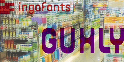 A modern Sans Serif — prosaic, designed geometrically, beautiful in large sizes All the dimensions of the font are based on Factor 10. The general principle of construction leads to slim forms and nearly equally wide characters. So the font appears very solid but is actually difficult to decipher in longer texts. Along with the ”normal“ Guhly Regular there are also the two versions Guhly Light and Guhly Bold, whereas in each only the vertical strokes [Guhly Light] or horizontal [Guhly Bold] have been changed in strength. The result is a very individual decorative effect which slightly reflects old circus and western scripts. The lower case characters in the version Guhly Book are, therefore, optimized to be suitable for longer texts in smaller font sizes — because after all, sometimes you should read a bit more than just the headline… The design of a shampoo bottle stands behind the creation of this sans serif display font. Prominent, clearly constructed forms with circular arcs define its appearance. This is a font primarily designed for use with capital letters — for all sorts of advertising purposes, headlines and titles. But lower case letters also belong to a good functional font; so, of course, Guhly includes them and ligatures for the more ”critical“ letter combinations as well as stylistic alternates for the letters K (or k), V (v) and o. As a decorative “encore”, the Guhly family also contains the “normal” weight in two variants: on the one hand the Guhly Cutout – these are letters without counter, as if the letters were cut out and the internal surfaces fell out; and on the other hand the Guhly stencil – as the name suggests, a stencil font with the typical bars that give a stencil the necessary cohesion.
 - Vangba by Alit Design,
$12.00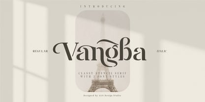 Introducing Vangba Typeface The Vangba font is designed with a serif font concept that has a elegant stencil style. Irregular dynamic shapes but impressively regular and unique make the font "Vangba" different and steal attention. Serif typefaces such as "Vangba" are very easy to apply to any design, especially those with an retro, elegant and classic, besides that this font is very easy to use both in design and non-design programs because everything changes and glyphs are supported by Unicode (PUA). The "Vangba"contains 656 glyphs with many unique and interesting alternative options. In addition to the regular font, there is also an italic version of the Vangba font.
 - Blue Rays - Personal use only

- Everest Pro by NicolassFonts,
$25.00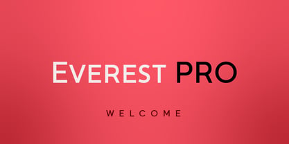 The complete family contains 24 weights, 1568 glyphs in each font, and supports OpenType features. RAlt sub-family has rounded corners. Everest Pro family is ideally suited for advertising, packaging, brand identity, books, magazines, logotype, software, sports as well as web and screen design. Everest Pro OpenType features list: zero, ordn, case, locl, c2sc, smcp, frac, subs, sinf, tnum, sups, numr, dnom, dnom, onum, lnum, pnum, ss01, ss02, ss03, ss04, ss05, ss06, ss07, ss08, ss09, dlig, liga, salt, hist
 - BR Firma by Brink,
$30.00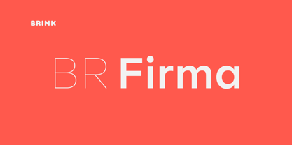 BR Firma is a geometric sans serif consisting of 8 weights ranging from Thin to Black with matching italics. It supports an ‘Extended Latin’ character set that covers over 200 latin based languages. BR Firma provides advanced typographic support with features such as case sensitive forms, fractions and slashed zeros. It comes with multiple figure sets and is ideal for print, advertising, publishing, branding, software and gaming as well as being optimised for web and screen design.
 - CoffeeMug by Ingrimayne Type,
$10.00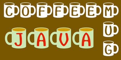 CoffeeMug has letters on coffee mugs. Upper-case letters have the handles to the left and lower-case characters have the handles to the right. The letters on the mugs are from the typeface InsideLetters. The typeface contains characters that will add color to letters. There are two ways to do this. One uses layers and the other a combination of characters, some with zero-width. A file in the gallery explains the ways that this can be done.
 - AT Move Artu by André Toet Design,
$39.95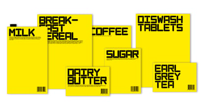 Artù ! Strano ma vero, strange but true. A beautiful, intelligent and lively Italian dog and a great friend, unfortunately no longer among us ... but his memory lingers. A typeface designed in Rosennano (Tuscany), its Italian, but executed in Amsterdam. This monospace typeface might prove to be extremely useful for household products like washing powder or any anything like that. Just use it in your designs, let it live! Concept/Art Direction/Design: André Toet © 2017
 - Hybi5 Finescript by Hybi-Types,
$12.50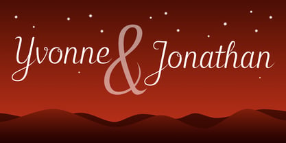 The Hybi5 Finescript is intended for the more reputable applications. It’s fine and elegant look makes it great for invitations, menu and concert. The Hybi5 Finescript is technically based on my Hybi5 font family, but with a significantly different appearance. The font contains a lot of accents, ligatures and special characters. Please be sure to set kerning to “metric” and spacing to “zero” in your layout app and please allow ligatures for a more smooth look.
 - Contamination by Kenn Munk,
$42.00Vowels produce 'end-characters'. These are used whenever a string of symbols start or end. Consonants make 'middle-characters'. Numerals are zero-width characters. these can be used whenever you feel like it, they will float above and below the string of symbols. Puncuation adds extra spice. Hold down 'shift' and you get the individual symbols mirrored. (very useful with the vowels.) Check my website for a more graphic representation and play, for gods sake, play! - Linotype Mega by Linotype,
$29.00Linotype Mega is part of the Take Type Library, chosen from the entries of the Linotype-sponsored International Digital Type Design Contests of 1994 and 1997. The fun schrift of German designer Till F. Teenck is available in three weights whose names are word plays in themselves. Mega in (which we hope the font will be) contains relatively light, somewhat irregularly-drawn characters which look as though they were printed by hand and the characters are set rather far apart from each other. This weight is good for short and middle length texts in point sizes of 10 and larger. Mega normal is anything but. The characters are the outline forms of Mega in and their larger width reduces the distance between them. This weight is generally a headline font. Mega out is a very heavy weight and is the filled-in version of Mega normal. The characters flow into each other and look almost like silhouettes. The reduced legibility makes this font suitable exclusively for headlines in larger point sizes. - De Fonte Plus by Ingo,
$39.00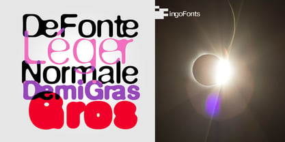 A variation of ”Helvetica according to the blur principle.“ The underlying typeface is ”Helvetica“, the only true ”run-of-the-mill“ typeface of the twentieth century. The distortion principle used simulates the photographic effect of halation and/or overexposure. The light weight, »DeFonte Léger«, nearly breaks on the thin points, whereas on those points where the lines meet or cross, dark spots remain. The characters are ”nibbled at“ from the inner and outer brightness. On the normal and semibold typestyles, »DeFonte Normale« and »DeFonte Demi Gras«, the effect is limited almost exclusively to the end strokes and corners, which appears to be strongly rounded off. The bold version »DeFonte Gros« is especially attractive. As a result of ”overexposure“, counters (internal spaces) are closed in, while characters become blurred and turn into spots; new characteristic forms are created which are astoundingly legible. The fat version »DeFonte Gros« is particularly appealing. “Overexposure” leads to drifted counters, letters blur into spots; new characteristic forms emerge, which are surprisingly easy to read.
 - CA Yoshiro by Cape Arcona Type Foundry,
$30.00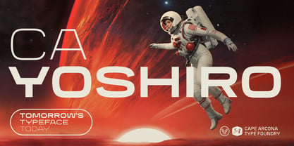 Tomorrow’s Typeface Today Are you ready to take your science fiction, action, military films, shows or video games to the next level? Our family of fonts brings a touch of nostalgia and a dash of modernity to your titles and typography. The CA YOSHIRO “Wide” style bears a striking resemblance to the iconic Eurostile typefaces of the 1960s. It has an immediate sense of familiarity. But what sets it apart is its contemporary, fresh sci-fi design. It’s the perfect blend of classic and cutting-edge, delivering an unprecedented, unconsumed style that promises to captivate audiences like never before. The CA YOSHIRO “Normal” style can also be used for a variety of other projects that require a normal width and just need to show a light technical touch without immediately suggesting a sci-fi reference. In addition, CA Yoshiro has subtle similarities to the monospace fonts commonly used on computer displays and screens. These fonts are the foundation of written programming code and sequences, lending a distinctive character to the digital realm.
 - LT Novelty - 100% free

- LT Diploma - 100% free

- Dastafarin - Unknown license

- Arwen - Unknown license

- Arupala Grotesk by Jetsmax Studio,
$15.00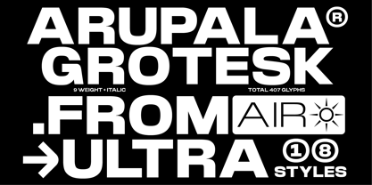 Arupala Grotesk is a Grotesk font this versatile typeface will grab readers’ Attention. This font was inspired by a character named H. Aroepala. This font is suitable for both formal and informal events and is also suitable for various types of print and digital media.
 - Kingdrops by Letterhend,
$19.00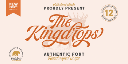 Kingdrops is a cool script typeface. This font perfectly made to be applied especially in logo, and the other various formal forms such as invitations, labels, logos, magazines, books, greeting / wedding cards, packaging, fashion, make up, stationery, novels, labels or any type of advertising purpose.
 - Athellia Script by Lindstrom Design,
$19.00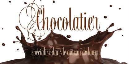 An upright condensed formal script. Athellia is right at home on packaging, labels, Menus, Headlines, invitations, and title design. NOTE: MyFonts does not display contextual alternates so many of the ‘o’ combinations do not display correctly here but do with open type alternates activated.
 - ENDEMIC Serif by WAP Type,
$20.00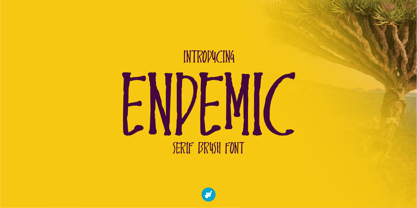 "Endemic" font is perfect for ethnic movie or game titles. or for titles, cartoon-themed writing, because this font is in the serif category but not too stiff or formal. Features: Uppercase, Lowercase Punctuation & Number, Support in Mac and Windows OS Multilingual Support ÀÁÂÃÄÅÆÇÈÉÊËÌÍÎÏÐÑÒÓÔÕÖØÙÚÛÜÝ
 - Hinelka by Awan Senja,
$14.00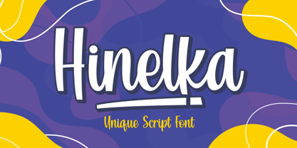 Introducing our newest cute serif typeface, Hinelka Unique Script. This font perfectly made to be in poster funny, and the other various formal forms such as invitations, labels, logos, magazines, books, packaging, fashion, make up, stationery, novels, labels or any type of advertising purpose.
 - P22 Bastyan by IHOF,
$39.95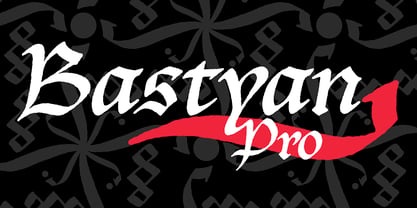 P22 Bastyan is a hybrid Italic Blackletter. This typeface resembles Carolingian miniscule scripts and has a timelessness that evokes formality but defies specific historical categorization. It is available in an optional Opentype Pro version with CE language support, multiple styles of figures, ornaments, and ligatures.
 - Florentine Script II by Monotype,
$29.99Based on script handwriting and engraving used in formal announcements and invitations, the Florentine Script font lends itself to typesetting in which an elegant mood is desired. Florentine Script, Citadel, Flemish Script, and Old Fashion Script have similar lowercase letters but unique flourished capitals. - XKnightMares by Ingrimayne Type,
$6.00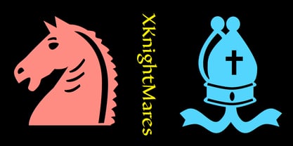 There are three XKnightMares fonts. Each has rather formal chess fonts. The key layout is a bit complicated; see the key guide for detailed information on how to position pieces correctly. In addition to making chess boards, some of the pieces make interesting decorations.
 - Elicit Script Variable by Monotype,
$156.99Elicit Script Variable Set is a single font file that features two axes: Weight and Contrast. Each axis has preset instances The Weight axis has instances from Extra Light to Bold. The Contrast axis has instances from Casual (low contrast) to Formal (high contrast). - Palace Script by Monotype,
$29.99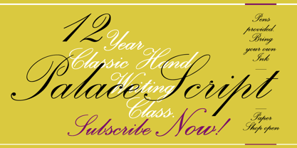 Palace Script is a formal English script from the 1920s. This typeface, inspired by centuries-old copperplate engravings, could add the perfect touch to any number of holiday cards. You could also make cute little names tags for all of your presents with Palace Script.
 - Forelle Pro by RMU,
$35.00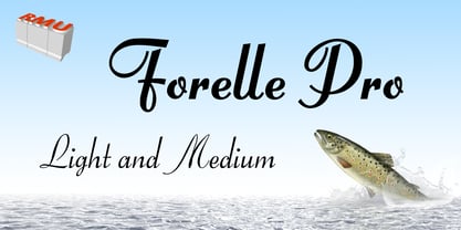 The basic forms stem from Erich Mollowitz' version which he cut for Trennert in 1936. These fonts were completely redrawn, extended with East European letterforms and some OpenType features. They are well suited for more formal invitations, headlines and subtitles, for diplomas and certificates.
 - Kalyant by Sign Studio,
$9.00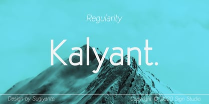 Kalyant prioritizes the element of readability in every use. A very formal and elegant form will be very good for offices. Character sets that support multiple languages will be very useful for communication documents between countries. Kalyant will add other styles in the next update.
 - Rippen - Unknown license

- Jefith by Twinletter,
$10.00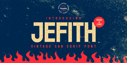 Jefith is a family of san serif fonts that are designed with great care by paying attention to the combination of each letter to create a beautiful impression and appearance, making it easier to answer your needs, both formal and non-formal needs. All Capital sans is charming and brave in its application, a font with a bold style and strong character makes your design look bold and bold to convey a message to consumers in every design, this font is equipped with rough and stamp variations This font is perfect for a wide variety of vintage, retro and various outdoor events, sporting events, branding, banners, posters, movie titles, food and drink, technology, quotes, clothing, and more.
 - Ronde Script by GroupType,
$19.00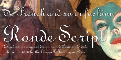 Ronde Script (Ronde meaning "A kind of script in which the heavy strokes are nearly upright, giving the characters when taken together a round look.") is based on the original design named Parisian Ronde released in 1878 by the Chappelle Foundry in Paris. Other versions of this script include Inland French Script, French Script, French Plate, and Typo Upright. Different type foundries tied to the releases of this design include Mayeur (Paris), Stephenson Blake (London), Bernhardt Brothers & Spindler (Chicago), and ATF (Elizabeth, NJ). This style of script has been a very popular choice in designing wedding invitations and so many other formal announcements for over 130 years. Its very readable, formal and elegant with an antique or retro feel.
 - Birthstone by TypeSETit,
$80.00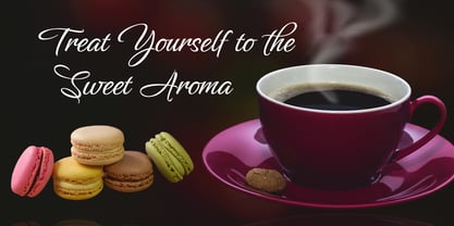 The Birthstone Family is a set of fonts that are not only diverse but perfectly compatible to interchange styles in a single block of text. There are 3 precious gems: Script, Casual, and Formal. Plus for added luster, there's Bounce (both Medium and Light weights) plus a Titling font— A truncated version that includes caps and ending swashed forms. You won't believe your eyes. All 4 styles are uniquely compatible to one another, but distinctly different. See how easily the fonts may change according to the needs of the look. The Pro version contains the three main styles: Script, Casual and Formal plus the lighter weight version of Bounce. You will also have lots of Opentype feature options.
 - FS Sally by Fontsmith,
$80.00 Bookish A little bit bookish, but quietly elegant and well-proportioned, FS Sally is a graceful font family. It’s a refreshingly uncomplicated design that brings sophistication to text and display type, and a distinctive aplomb to both large and small volumes of text. Hidden talents There’s more to FS Sally than meets the eye. Choose Standard for the Latin alphabet or Pro if you work with Cyrillic and Greek typography. There’s a large range of special features, including elegant small caps and a set of discretionary ligatures to add a traditional flavour to figures and fraction sets. Rhythmic There’s a rhythm and flow to FS Sally – the result of the classic but asymmetric design of its serifed feet and shoulders. The inward curve of the serif at the shoulder and the outward curve at the foot subliminally guide the eye through each letterform, and the flicked feet of the “a”, “d” and “u” add an extra kick of energy to the rhythm. The italic forms have their own flow, too, with a pen-like fluency that retains the formal discipline required for a text type. Regular to heavy FS Sally’s five weights, all with italics, cover every kind of print application. The regular weight is elegant in display and an easy read in longer texts. A subtle step up from the regular is the medium, which was created to deliver a stronger colour and finish in poorer printing conditions. The semibold offers a strong alternative to the regular at smaller sizes, and its intermediate feel suits it to sub-headings, title pages and calmer designs. The bold works excellently in book and title headings, and FS Sally Heavy lends weight and punch to poster headlines and logotypes.
 - FS Sally Paneuropean by Fontsmith,
$90.00Bookish A little bit bookish, but quietly elegant and well-proportioned, FS Sally is a graceful font family. It’s a refreshingly uncomplicated design that brings sophistication to text and display type, and a distinctive aplomb to both large and small volumes of text. Hidden talents There’s more to FS Sally than meets the eye. Choose Standard for the Latin alphabet or Pro if you work with Cyrillic and Greek typography. There’s a large range of special features, including elegant small caps and a set of discretionary ligatures to add a traditional flavour to figures and fraction sets. Rhythmic There’s a rhythm and flow to FS Sally – the result of the classic but asymmetric design of its serifed feet and shoulders. The inward curve of the serif at the shoulder and the outward curve at the foot subliminally guide the eye through each letterform, and the flicked feet of the “a”, “d” and “u” add an extra kick of energy to the rhythm. The italic forms have their own flow, too, with a pen-like fluency that retains the formal discipline required for a text type. Regular to heavy FS Sally’s five weights, all with italics, cover every kind of print application. The regular weight is elegant in display and an easy read in longer texts. A subtle step up from the regular is the medium, which was created to deliver a stronger colour and finish in poorer printing conditions. The semibold offers a strong alternative to the regular at smaller sizes, and its intermediate feel suits it to sub-headings, title pages and calmer designs. The bold works excellently in book and title headings, and FS Sally Heavy lends weight and punch to poster headlines and logotypes. - Enamela by K-Type,
$20.00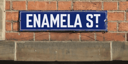 Enamela (rhymes with Pamela) is a monoline square sans that is available in normal width and condensed versions. Although rooted in the early years of sans serif type, the Enamela fonts have a timeless quality that is practical and unpretentious. The letterforms derive from vitreous enamel signage dating from the Victorian era and widely used in Britain for street nameplates, Post Office signs, the plates on James Ludlow wall postboxes, railway signs and direction signs, as well as for circular Automobile Association wayfinding plaques throughout the first half of the twentieth century. The quirky terminals, stemming from the compression of geometric type, invite comparison with the Charles Wright fonts used for UK vehicle registration plates. Enamela and Enamela Condensed are both available in three weights – regular, medium and bold – and as italics (optically corrected obliques). A commonly used alternative M with a vertex that touches the baseline is provided at the Alt-M (µ) keystroke on a Mac, or Alt-0181 on Windows. A commonly used G with a plain vertical throat, no crosspiece, is assigned Unicode FF27 (full width capital G).
 - VVDS The Dickens Tale by Vintage Voyage Design Supply,
$10.00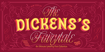 The Dickens's Fairytale – it's a new chapter of VVDS products - The collections of fancy display fonts which will include many typefaces that will be perfectly combined not only with each other, but also with other collections of this series. As a result, you will get a large collection of beautiful fonts and graphics that will help you create beautiful designs without having to look for anything else. All these collections are inspired by classic books design of XIX and XX centuries like Franklin's Library Classic Collection and modern publishing houses like Barnes & Nobel Collectible Editions. This collection is the first one and including 12 font files. The Serif presented in two styles - cutted and normal. The cutted style has two weights - Regular and Bold. Also, there are two types of shadows - block and offset. Plus decor for cutted serif. The cherry on top - curly calligraphic Script with Swirl calligraphy elements for decoration. The both of types has many Open Type Features as Oldstyle Figures, Fractions, Stylistic Alternates and ending lowercase letters for script. • OTF & WEB • Multilingual
 - Backstroke by Eclectotype,
$50.00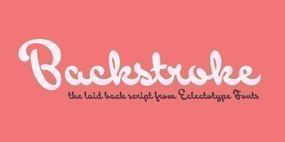 Normal and upright italic script fonts line a well-trodden path; left-leaning fonts (or "rightalics" as they're confusingly called), on the other hand, are a rarity. Here at Eclectotype Fonts we don't like to do things too conventionally, so here's Backstroke, a laid back script with a unique voice. With contextual alternates for start and end forms of certain characters, swash versions of L, Q and Z (surely the most used initial caps!), and a handful of stylistic sets, Backstroke is a restrained script. Stylistic sets are: 1. the start forms of i, j, m, n, and p are used always instead of only at word starts. 2. lower case ascenders get a whole lot loopier. 3. alternate versions of G, N and Y. 4. swash L, Q and Z. 5. swaps the default Polish script lslash for a more familiar version While fonts that lean the wrong way may be a bit more difficult to fit into your layouts than boring old regular italics, they will reward you with their individuality. Why not give it a go?
 - Core Sans DS by S-Core,
$20.00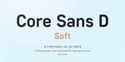 Core Sans DS is a rounded version of Core Sans D and a modern interpretation of condensed sans-serif typeface designed by S-Core and the whole family consists of 2 widths (Condensed, Normal), 7 weights (Thin, Light, Regular, Medium, Bold, Heavy, Black) with their corresponding italics. Core Sans DS features a condensed geometric construction and has a large x-height which enhances legibility. The family is ideal for signage, headline as well as body text. Core Sans DS is a part of the Core Sans Series such as Core Sans N SC, Core Sans N, Core Sans NR, Core Sans M, Core Sans G,Core Sans A, Core Sans GS and Core Sans ES. Letterform in this type family is simple, clean and highly readable. The spaces between individual letter forms are precisely adjusted to create the perfect typesetting. Core Sans DS supports complete Basic Latin, Cyrillic, Central European, Turkish, Baltic character sets. Each font includes proportional figures, tabular figures, numerators, denominators, superscript, scientific inferiors, subscript, fractions and case features.
 - Coconut Point - 100% free

- Kohelet - Unknown license


