10,000 search results
(0.039 seconds)
- Sanitation JNL by Jeff Levine,
$29.00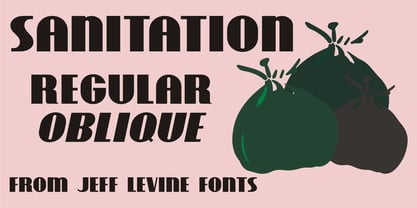 Sanitation JNL is a bold Art Deco sans design inspired by some stylized hand lettering on a 1930s-era WPA (Works Progress Administration) poster and is available in both regular and oblique versions. The topic of the poster was "Your home is not complete without a sanitary unit" and that was recommended by the State Department of Public Health. A "sanitary unit" is the formal name for what rural folks called an "outhouse", and it's presumed the target group were homeowners not hooked up to major sewer lines such as in those rural areas.
 - Gracela by Yukita Creative,
$14.00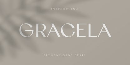 Introducing the Gracella font in the Elegant Sans Serif style. A versatile font that can be used for both formal and casual. Gracela is a regular style font, not too thin nor too thick, and very suitable for the needs of logos, branding, websites, Features. - Supports all languages in the world (37) - Versatile Single Font. - One font for all needs. Make sure you test out the fonts using one of our examples before making any purchases to know what you're getting yourself into. Thank you for taking care when choosing fonts!
 - Deco Design JNL by Jeff Levine,
$29.00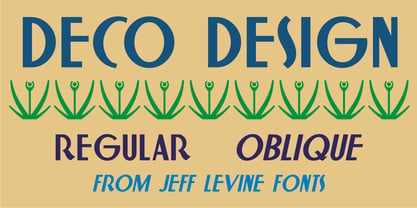 Hand lettering isn’t a perfect art form, and this is why it often has an appeal over formal typesetting. Individual interpretation can lead to variations in style, character shape and overall design concept. Case in point: The hand-drawn title for the1933 sheet music “Why Can’t This Night Go on Forever” is a simple Art Deco sans, however it mixes character widths and even angles the letter ‘C’ in a nonconventional way. Deco Design JNL is the digital version of this alphabet, which is available in both regular and oblique versions.
 - Morning Edition JNL by Jeff Levine,
$29.00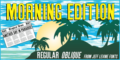 The front page headline of the April 6, 1917 edition of the Bemidji Pioneer [from Bemidji, Minnesota] says in extrabold letters: “State of War is Declared”. The subtext underneath reads: “President Signs Resolution 1:13 P.M., Passed by House 3 O’Clock this Morning”. Thus, the United States formally entered into World War I. However… that subtext was set in a sans serif type face which was a perfect addition to the numerous newspaper-inspired type revivals offered by Jeff Levine Fonts. Morning Edition JNL is available in both regular and oblique versions.
 - LTC Goudy Sans by Lanston Type Co.,
$24.95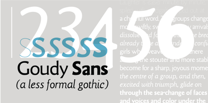 Goudy Sans Bold was originally designed by Fredric Goudy in 1922 as a less formal "gothic" and finished in 1929. The light was designed in 1930 and the Light Italic in 1931. Alternate letterforms are included in these three Goudy designs which are digitized true to their original design. In 2006, designer Colin Kahn drew "LTC Goudy Sans Regular" which is a medium weight version intended for text purposes. Kahn has also designed an experimental "LTC Goudy Sans Hairline" which has a skeletal almost mono-width stroke and results in a surprisingly elegant display face.
 - 1669 Elzevir by GLC,
$42.00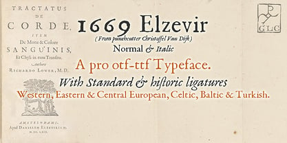 This family was inspired from the set of font faces used in Amsterdam by Daniel Elzevir to print the famous “Tractatus de corde...” the study on earth anatomy by Richard Lower, in 1669. The punch cutter was the famous Dutch Kristoffel Van Dijk. In our two styles (Normal & Italic), font faces, kernings and spaces are scrupulously the same as in the original. This Pro font covers Western, Eastern and Central European languages (including Celtic), Baltic and Turkish, with standard and “long s” ligatures in each of the two styles. The Roman (Normal) style contains a U stylistic alternate, and the Italique style A.
 - Mollen by Eko Bimantara,
$19.00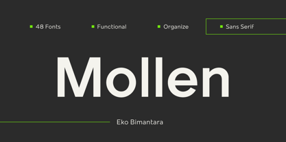 Mollen is sans serif font family that designed to be functional. Each glyphs are shaped by geometrical form with specific visual structure: Simple and clean form with low contrast stroke, rounded 'o' in the normal width, mix diagonal and straight cuts on terminals and finials. Low capitals, with flat top and low descenders. With this personality, Mollen meant be fit for modern, contemporary and technological nuance. Mollen consist of 48 font with 8 weight: From Thin to ExtraBold and 3 width: Condensed, Narrow and Normal. With each matching Italics. It also contain 425 glyphs and several opentype features.
 - Strong Display by XdCreative,
$29.00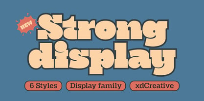 The "Strong Display Font" is a derivative of the Clinto slab serif font, originally designed by. Faldy Kudo. This font is specifically crafted to exude strength and impact, making it an ideal choice for display and headline usage. It incorporates the unique typographic feature of ink traps, enhancing its readability even at larger sizes. The font family comprises 6 distinct styles: "Normal, Normal Rounded, Medium, Medium Rounded, Condensed, and Condensed Rounded.” offering versatility in design choices. Additionally, the font provides multi-language support, ensuring that it can be effectively used for a wide range of global content and projects.
 - Plastic Toys by Trim Studio,
$12.00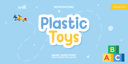 Plastic Toys is a basic display font for mom and kids crafter. It created to complete the normal type of font but need a playful and plasticy feel that crafter always needed. because of it feels, you can mix and match this style with various handbrush and normal strong font to get the feel of what your design needed Its perfectly suited for crafter and graphic artist to complete their design such as invitation, advertisement, poster, logo, birthday, product sign, and many more! Plastic Toys Font also Lightweight, even so contains All Standard glyphs and punctuations
 - Centrale Sans Condensed by Typedepot,
$29.00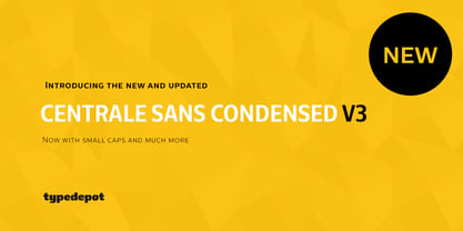 Centrale Sans Condensed is not just a "squished" version of our Centrale Sans family, it's designed as a stand alone typeface with the family characteristics in mind. It bears all the qualities of the normal width being even friendlier because of the closer relation it has with the humanist model. The condensed width is with 15% narrower than its normal sibling, which makes it precious space-saving tool. Centrale Sans Condensed also have 9 weights from Hairline to Extra Bold plus their matching italics. It includes Some OpenType features like discretional ligatures, tabular figures and stylistic alternatives.
 - Supra Mezzo by Wiescher Design,
$29.00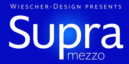 »Supra Mezzo« – designed by Gert Wiescher in 2012/13 – is an unusual addition to the Supra family, a weight in between the normal and the condensed width. This cut comes in very handy if you need to put lots of text into a relatively small space without loosing readability. The compactness with great legibility makes Supra Mezzo absolutely unique. The light and normal weights and the dominant x-height with its high ascenders make for easy reading of long copy. The heavy and x-light weights are great for elegant headlines. Supra is an OpenType family.
 - Anja Eliane - Unknown license

- Richmond Hill by BA Graphics,
$45.00A great look for formal announcements, business, high-end ads and many other applications. - Elegante by BA Graphics,
$45.00A very sophisticated formal design; great for packaging fine adds and many other applications. - LD Wedding by Illustration Ink,
$3.00This font is more formal. It is stylish and perfect for your wedding journaling. - SEISDEDOS DEAD - Personal use only

- Black Metal Logos - Unknown license

- Wildcard - Personal use only

- Broken Toys - Unknown license

- Bifurk - Unknown license

- DrunkenSailor - 100% free

- Abscissa - Unknown license

- Zig Zag ML - Personal use only

- Ganz Egal - Personal use only

- Roclette Pro by FoxType,
$25.00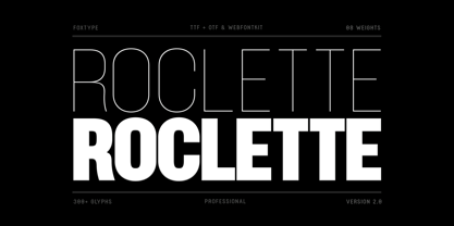 Roclette Pro Display is a Brand Elegant Typeface from Roclette powerful font family. It has a dependable and uncompromising style, with controlled letterforms and modern touches. It looks amazing in logos, magazines, and movies. Roclette Font would be perfect for branding, headlines, Captions, paragraphs, and posters. The various weights allow you to experiment with a wide range of applications. It's created to make an impression without sacrificing its beauty and readability. It's shown a clean, minimalist, warmth, quirky, yet still purposed to be versatile The Typeface includes Eight Weights - Thin, ExtraLight, Light, Regular, Medium, SemiBold, Bold and ExtraBold Numerals and extended punctuation (200+ Glyphs). Expert kerning and quality crafting. Normal, Italics, Outline and Outline Italics Included.
 - SK Barbicane by Salih Kizilkaya,
$9.99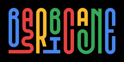 SK Barbicane is a family of typefaces named after Jules Verne's famous book, From the Earth to the Moon. Inspired by Jules Verne's foresight, it was designed with a synthesis of the future and the past. While it carries sharper and futuristic lines than the future, it also incorporates the organic structure of the past. All characters have equal dimensions in this font with mono weight and mono space. In this way, you can create regular typographic layouts in your designs. Consisting of two different families, Normal and Unicase, this font has a total of 12 different fonts and 5088 glyphs. In this way, it contains many typographic elements that you will need in your designs.
 - Logik by Monotype,
$25.00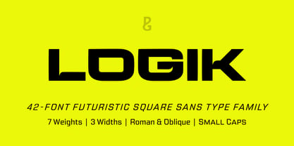 Logik is a futuristic square sans serif typeface. Its personality is defined by squared-off corners that you would normally expect to be rounded, this sharpness gives the glyphs an eccentricity that the eye quickly adjusts to. Sharp, incised/stylised ink traps along with slightly tapered/curved horizontals and verticals add to the character of each letterform. These subtleties combine to give Logik a distinctively futuristic aura. Logik’s main use would be for headlines, short runs of text, branding and display purposes – ideally suited for film and book titles, Logik could be widely used for sports, media and recreation purposes also. Logik comes in 7 weights (from Thin to Black) across 3 widths – Regular, Wide, and Extended. Each font covers all European Latin-based languages and includes Old Style Figures, Small Caps, and some Case-Sensitive Forms. Key features: 7 Weights in Roman and Oblique 3 Widths – Regular, Wide, Extended Small Caps Old Style Figures European Language Support (Latin) 550+ glyphs per font.
 - Herringbone by Elemeno,
$25.00Part of the Zoot Suite of offbeat handwriting fonts, Herringbone is based on a fast and sloppy formal script the designer has been using since he was a child. For use when handwriting fonts are too informal and script fonts too formal. Herringbone is a happy medium. For a bolder look, try Houndstooth. - Flaunters by Greentypestudio6789,
$7.00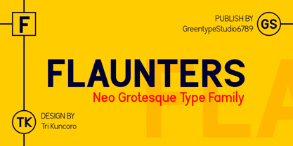 Flaunters is a sans serif neo-grotesque font with neat and beautiful letters. This font family comes with 14 fonts, consisting of 7 upright weights and matching italics, with 390+ characters. Flaunters is very suitable and looks amazing in designs such as posters, advertisements, banners, or your formal and non-formal design needs.
 - Houndstooth by Elemeno,
$25.00Part of the Zoot Suite of offbeat handwriting fonts, Herringbone is based on a fast and sloppy formal script the designer has been using since he was a child. For use when handwriting fonts are too informal and script fonts too formal. Herringbone is a happy medium. For a lighter look, try Herringbone. - TCF Plana by TypeCult Foundry,
$22.00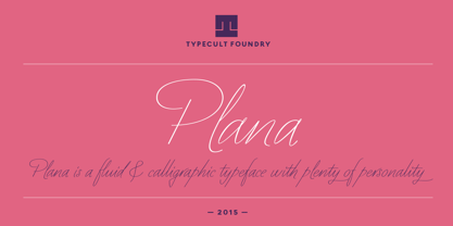 Very thin fluid strokes and high speed letters form this casual script entitled TCF Plana. TCF Plana is elegant and functional, expressive yet harmonious, with more bounce and irregularity of rhythm than usual formal script typefaces. TCF Plana was executed with a ball-point pen and then digitised so it would convincingly mimic handwriting by using a plethora of contextual alternates which makes the words look much more natural and beautiful.
 - Arabetics Symphony by Arabetics,
$59.00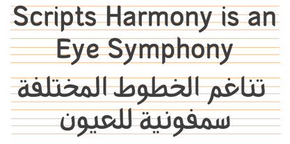 Arabetics Symphony is a Sans Serif Latin typeface with a comprehensive support for the Arabetic scripts, including Quranic texts. It is designed with a uniform glyph thickness and weight throughout, using a combination of simplified and clear open lines and curves and plenty of spikes and visual hints to compensate for the missing Latin serifs or traditional cursive Arabic calligraphic influence. This type family is suitable for both text and display applications. Additional Latin spacing is added to match an overall open-looking Arabic and is further maintained by a careful implementation of a typical Latin font kerning process. The design of this font family, including metrics and dimensions, was intended to make its Latin harmonize with other Arabetics foundry fonts. Arabetics Symphony fully supports MS 1252 Western and 1256 Arabic code pages, in addition to all the transliteration characters required by the ALA-LC Romanization tables. Users can either select an accented character directly or form it by keying the desired combining diacritic mark following an unaccented character. For Arabic, it fully supports Unicode 6.1, and the latest Arabic Supplement and Extended-A Unicode blocks. The Arabic design of this font family follows the Mutamathil Taqlidi design style with connected glyphs, emphasizing vertical strokes to bring added harmony, and utilizing slightly varying x-heights to match that found in Latin. The Mutamathil Taqlidi type style uses one glyph for every basic Arabic Unicode character or letter, as defined by the Unicode Standards, and one additional final form glyph, for each freely-connecting letter of the Arabic cursive text. Arabetics Symphony includes the required Lam-Alif ligatures in addition to all vowel diacritic ligatures. Soft-vowel diacritic marks (harakat) are selectively positioned with most of them appearing on similar high and low levels—top left corner—, to clearly distinguish them from the letters. Tatweel is a zero-width glyph. Keying the “tatweel” key (shft-j) before Alif-Lam-Lam-Ha will display the Allah ligature. Arabetics Symphony includes both Arabic and Arabic-Indic numerals, in addition to generous number of punctuation and mathematical symbols. Available in both OpenType and TrueType formats, it includes two weights, regular and bold, each has normal, Italic, and left-slanted styles.
 - Arabetics Latte by Arabetics,
$59.00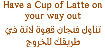 Arabetics Latte is a Latin Serif typeface with a comprehensive support for the Arabetic scripts, including Quranic texts. While its seemingly-idiosyncratic Latin design eliminates the excessive usage of serifs and offsets the visual effects of several geometrically-intense glyphs, its Times Romanesque proportions gives a full nod to the beginnings of Latin types and produces an overall stable look-and-feel of a classical Serif style, making it suitable for both text and display applications. Liberal spacing is maintained throughout to match that of the Arabic text and is further supplemented by a careful implementation of a typical Latin kerning. The overall design of this font, including metrics and dimensions, was intended to make its Latin harmonize well with most other Arabetics foundry fonts. Arabetics Latte fully supports MS 1252 Western and 1256 Arabic code pages, in addition to all the transliteration characters required by the ALA-LC Romanization tables. Users can either select an accented character directly or form it by keying the desired combining diacritic mark following an unaccented character. For Arabic, it fully supports Unicode 6.1, and the latest Arabic Supplement and Extended-A Unicode blocks. The Arabic design of this font family follows the Mutamathil Taqlidi design style with connected glyphs, emphasizing vertical strokes to bring added harmony, and utilizing slightly varying x-heights to match that found in Latin. The Mutamathil Taqlidi type style uses one glyph for every basic Arabic Unicode character or letter, as defined by the Unicode Standards, and one additional final form glyph, for each freely-connecting letter of the Arabic cursive text. Arabetics Latte includes the required Lam-Alif ligatures in addition to all vowel diacritic ligatures. Soft-vowel diacritic marks (harakat) are selectively positioned with most of them appearing on similar high and low levels—top left corner—, to clearly distinguish them from the letters. Tatweel is a zero-width glyph. Keying the tatweel key (shft-j) before Alif-Lam-Lam-Ha will display the Allah ligature. Arabetics Latte includes both Arabic and Arabic-Indic numerals, in addition to generous number of punctuation and mathematical symbols. Available in both OpenType and TrueType formats, it includes two weights, regular and bold, each has normal, Italic, and left-slanted styles.
 - Roijer by PeGGO Fonts,
$39.00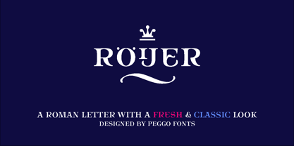 “Röijer” was born from a branding exercise done with “high care”, graphically developed thanks to the valuable help of designers Marcela Aguilera & Pedro Gonzalez, each letterform and every type design process was worked as a typographic jewel, as a strong bond between classical and fresh concepts (with a Lombardic and Art Nouveau touch). Röijer puts a dual capital model in your hands; a classic Roman and a fresh contemporary alternative, on each letter: the first located in a lowercase box looks formal and sober, while the uppercase box shows a glamorous and more daring look, ideal to being use at specific moments only. Röijer combine elegance and audacity in a very magistral way. It has 2 variants with 541 glyphs each one; a normal and a volumetric one, all with an ornaments set and a decorative objects set. Ideas that be useful not only for branding design but also for titling, headline composition, label design, fashion and luxury stuff.
 - Standard CT by CastleType,
$59.00 CastleType was commissioned in 1991 by San Francisco Focus magazine to digitize three members of the Standard family. This is a Continental lineale that was popular in Switzerland in the 1950s and later in the United States. A cousin to the classic sans serifs, Standard is an alternative that is considerably warmer and a bit more idiosyncratic. In 2008, CastleType released additional members of the Standard CT family to make it a complete typographic solution with three widths (normal, condensed, extended) of four weights each (Regular, Medium, Bold, and Extra Bold). Some of the original Standard fonts, particularly Standard Regular, appear to have been hastily designed (or perhaps too closely imitated Helvetica); these have been greatly improved in the CastleType versions with more harmonious proportions and other refinements. The three lighter weights of the Extended subfamily were designed from scratch based on the new Standard CT Regular and Standard CT Extended Extra Bold. More recently, four light weights (Light, Extra Light, Ultra Light, and Hairline) have been added to each of the three widths. The entire Standard CT family includes support for most European languages, OpenType features, arbitrary fractions, and a collection of geometrics, dingbats & fleurons.
 - Il Coliseum by Jonahfonts,
$30.00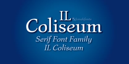 A formal text font designed for legibility, suitable for documents, books and intense text requirements.
 - Kresson Black by BA Graphics,
$45.00A beautiful very bold serfi face, formal legible design, with matching Italic, Powerful yet elegant. - Tesca by Nicolas Massi,
$25.00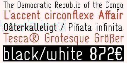 Tesca is a condensed modern grotesque typeface. Tesca is great for uses such as headlines or text body. Features Latin and non-latin glyphs. Three styles: Flaca, Normal & Gorda. (Uppercase & Lowercase). OpenType features include ligatures and basic fractions.
 - Specific by Fatih Güneş,
$12.00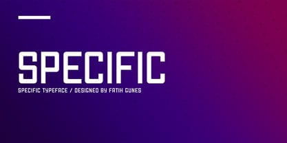 It has a higher uppercase structure than the normal ones. It has a condensed, rounded and squared character. It is a typeface which you can use in posters, packagings, newspaper & magazine ads, logos, banners, promo images & soccer uniforms.
 - Kutai by Eko Bimantara,
$18.00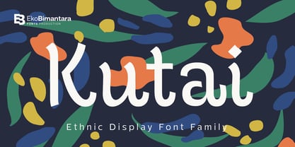 Kutai is an explorative typeface that created to pursue unique display typeface fuse with ethnic look. It's consist of three styles or instance; Normal, Tall and Taller which have different height between each other, especially the x-height.





