10,000 search results
(0.05 seconds)
- Aerle by Hackberry Font Foundry,
$24.95 My first font for 2009 was Aerle. It is a new dark sans serif font in my continuing objective of designing book fonts that I can really use. It made a little ripple in the industry, but more than that I found that I loved it with Aramus and Artimas — my latest book font family with the same proportions. In many ways, Aerle is a very different direction for me built on what I have learned on Aramus and other recent developments in my style. The concept came to me while using Bitstream's Mister Earl on a site online—though there is no direct reference. I wanted a more playful heavy sans with a much smaller x-height than I have been using lately, plus taller ascenders. As I was using Aerle, I constantly needed a light and bold version. The new direction I am taking is a result of a decision that my fonts, though I loved the character shapes, produced an even type color that is too dark or a little dense. Aerle was an attempt to get away from that look even though the letterspacing is quite tight. For Aerle Thin I pushed a little further in that direction and increased the letterspacing. The hand-drawn shapes vary a lot, many pushing the boundaries of the normal character. This gives a little looseness and helps the lightness in feel I am looking for. It will be interesting to see where this all goes. Most new type around the world is far too perfect for my taste. While the shapes are exquisite, the feel is not human but digital mechanical. I find myself wanting to draw fonts that feel human — as if a person crafted them. In most ways this is a normal font for me in that it has caps, lowercase, small caps with the appropriate figures for each case. These small caps were very small (x-height as is proper). So Aerle's small caps are a little oversize because they plugged up too bad at x-height size. The bold is halfway between. These size variations seem important and work well in the text. This font has all the OpenType features in the set for 2009. There are several ligatures for your fun and enjoyment: bb gg sh sp st ch ck ff fi fl ffi ffl ffy fj ft tt ty Wh Th and more. Like all of my fonts, there are: caps, lowercase, & small caps; proportional lining figures, proportional oldstyle figures, & small cap figures; plus numerators, denominators, superiors, inferiors, and a complete set of ordinals 1st through infinity. Enjoy!
 - Milk Made by loryn ipsum,
$12.00 Milk Made | a rounded retro font Milk Made is a fun rounded retro font inspired by mid-century magazine and print advertisements. Perfect for; retro brands, young brands, gen z branding, logos, social media, posters.
 - The Donald NF by Nick's Fonts,
$10.00Something about the swoopy loops in the uppercase characters of this typeface, originally called "Ronde", reminds one of the signature 'do of a certain real-estate-mogul-turned-TV-celebrity, and so this font was named. Delightfully different, this face can be playful or formal, as suits the the occasion. To complete its nineteenth-century creds, the font includes classic bishops fingers at the ASCII tilde and ASCII circumflex positions. Both versions of the font include 1252 Latin, 1250 CE (with localization for Romanian and Moldovan). - Taca by Rúben R Dias,
$42.00 Taca is a typeface built around a shape that Portuguese designer Rúben R Dias calls a “squircle” — neither square nor circle. We usually associate the rounded, convex box with the television screens of the 1960s and Aldo Novarese’s classic typeface, Eurostile. But whereas Eurostile is cold and machined, Taca is warm and rugged, as if it was molded from clay or carved from stone. Taca’s organic nature is also derived from another unique feature: rounded crotches at the right angles where perpendicular strokes meet. This subtle finish, along with blunt stroke endings, softens the otherwise rigid skeleton. With such a strong conceptual vision, Taca could be relegated to the bin of experimental designs, severely limited in their application. But that fate is usually born of a less experienced maker. As a teacher, designer, and letterpress printer, Dias is a type user, keenly aware of the functional requirements of good type. Taca is therefore not a slave to its concept, but a working font family, effective in various sizes and environments. Its lettershapes break away from the base shape whenever it makes sense for legibility, while still maintaining the flavor of the design as a whole. That said, a set of squircle-shaped alternates give the user the flexibility to get more stylized if the situation calls for it. Fitting to its functional aims, Taca has many of the features one expects of a proper text font: upper and lowercase figures, case-sensitive punctuation, and Extended Latin language support. The simplicity, openness, and squareness of Taca’s forms also make it an ideal design for the pixel grid of screen displays.
 - Zoya by MireyDesign,
$10.00 Zoya is a humanist sans serif typeface, a versatile font family that stands out with it's warm and natural feel. Humanist sans serifs have roots in calligraphy, their round, dynamic, open forms have higher stroke contrast than the other sans serif classifications. Can be used by any organization that wants to appear simultaneously modern, approachable, active and professional. FEATURES Four weights + Bold Outline / Italics / Numbers & Punctuation / Extensive Language Support / Long term support, free features and bug fixes The font family includes 10 fonts Zoya Light - delicate and edgy Zoya Bold - strong but approachable Zoya Regular and Semi Bold are the balance between the two Zoya Bold Outline - engaging + Italics USE Strong capitals and a smooth, open lowercase are effective in a variety of applications. This font is perfectly suited for headlines, posters, branding, packaging, presentations, logo, quotes, titles, magazines headings, web layouts, advertising, invitations, packaging design, books, and nearly any creative design.
 - Bistern by Letterhend,
$19.00 About the Product Bistern is a typeface which is inspired by vintage lettering sign and art. While this font has a victorian touch, it still looks bold and solid. Very suitable for for headline, logotype, apparel, invitation, branding, packaging, advertising etc with old school / retro theme. This typeface contains with beautiful decorative ornaments in vector format that ready to use to create a vintage lettering in sec. It also comes in uppercase, lowercase, punctuations, symbols & numerals, stylistic set alternate, ligatures, etc also support multilingual and already PUA encoded. Features : ornaments in vector format uppercase & lowercase numbers and punctuation multilingual alternates and ligatures swashes PUA encoded We highly recommend using a program that supports OpenType features and Glyphs panels like many of Adobe apps and Corel Draw, so you can see and access all Glyph variations. How to access opentype feature : letterhend.com/tutorials/using-opentype-feature-in-any-software/
 - Serif Medium - Unknown license

- Logisco by Ideabuk,
$16.00 Introducing Logisco - a sleek and versatile display font family that combines modern geometry with a retro-cool vibe. This six-font collection boasts soft, rounded corners that add a dash of playfulness to any project. Logisco Light, Regular, and Bold offer a range of weights to fit any typographic need, while the Stencil variations add a unique edge to your designs. Whether you're creating sleek logos or funky posters, Logisco has you covered with its stylish and versatile letterforms.
 - Aeroblock Layered Graffiti by Sipanji21,
$13.00 Aeroblock is an urban graffiti font characterized by Rounded edges and a bold look. Ideal for music posters, apparel designs, shirts, and streetwear, this font brings a touch of edginess to your projects. The unique style of "Aeroblock" makes it the perfect choice for street style or urban graffiti themes. Whether you want to create a strong and powerful statement or simply add a touch of attitude to your designs, "Aeroblock" is the font for you.
 - St Ryde by Stereotypes,
$- St Ryde is a humanistic sans-serif with a slight touch of a script typeface. The most significant aspect of the typeface is the combined sharp and round treatment of the stroke endings. The complete Ryde Family contains five weights including real matching italics, so you can choose from thin, light, regular, medium and bold. St Ryde has a wide range of characters, including small caps, lining proportional and tabular figures plus small caps figures, too.
 - Gratique by Lemon Studio Type,
$7.50 Gratique is a semi-rounded sans-serif typeface. The curvature of the corners fits perfectly and makes it look so cool. Gratique comes with 3 different font variants, namely medium, bold, and black. Gratique is perfect for headings, typography, branding, mockups, or any other design you need especially for a sans-casual style, it will work really well. FEATURES: - STANDARD CHARACTER SET -Case Sensitive Forms -Denominators -Fractions -Historical Forms -Standard Ligatures -Scientific Inferiors -Subscripts -Superscripts -Multilingual Support, etc.
 - UUeirdie by Ingrimayne Type,
$7.95UUeirdie is weird. The Condensed-Light style was derived from the star-serifed font Asterx by replacing the star serifs with a rounded flare serif. Widening that style resulted in UUeirdie-Regular and the bold was then constructed to complement it. The warped version was a result of play with a font distortion program. Although the glyphs have sharp corners, they do not have straight lines. The UUeirdie faces are rough, irregular, and maybe a bit creepy. - Roklet by Maulana Creative,
$12.00 Roklet is a semi slab serif font. With round bold stroke, fun character with a bit of ligatures and alternates. To give you an extra creative work. Roklet font support multilingual more than 100+ language. This font is good for logo design, Social media, Movie Titles, Books Titles, a short text even a long text letter and good for your secondary text font with sans or serif. Make a stunning work with Roklet font. Cheers, Maulana Creative
 - White Capel by Putracetol,
$24.00 White Capel - Modern Display Font is a bold, distinctive, and thoroughly contemporary typeface that exudes a trendy and up-to-the-minute vibe. Its soft, rounded letterforms lend it a unique and easily recognizable appearance, ensuring it stands out in any design. This font is perfectly suited for a wide range of applications, including logos, quotes, posters, branding, business names, and more. With its modern, sleek aesthetics, White Capel brings a touch of current style to your creative projects.
 - MC Fectron by Maulana Creative,
$16.00 Fectron is a semi round condensed sans serif font. With semi bold stroke, fun character with a bit of ligatures and alternates. To give you an extra creative work. Fectron font support multilingual more than 100+ language. This font is good for logo design, Social media, Movie Titles, Books Titles, a short text even a long text letter and good for your secondary text font with script or serif. Make a stunning work with Fectron font. Cheers, Maulana Creative
 - MC Barjon by Maulana Creative,
$15.00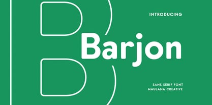 Barjon is a minimal classic contemporary sans serif font. Round Bold stroke, fun character with a bit of ligatures and alternates. To give you an extra creative work. Barjon font support multilingual more than 100+ language. This font is good for logo design, Social media, Movie Titles, Books Titles, a short text even a long text letter and good for your secondary text font with script or serif. Make a stunning work with Barjon font. Cheers, Maulana Creative
 - Stonecrop by Andrew Harper Fonts,
$5.00 Stonecrop is a font unified by bold, imposing lines as well as its use of rounded rectangles as the central stylistic shape. Stonecrop loosely conforms to the monospaced font style, with near-equal widths for all letters and numbers (but not all symbols/punctuation), however it does incorporate kerning for all types of glyphs where appropriate to aid in legibility. A perfect font for usages that demand consistency and precision, while still maintaining a quirky and stylized handwritten effect.
 - House Soft by TypeUnion,
$30.00 House Soft is the curvy, fun little brother of House Sans. Its exaggerated rounded corners give it a playful feel that will bring happiness and joy wherever it’s used. Like its big brother, House Soft is also made up of 100 weights in 5 useful widths (Compressed to extended) that make it a versatile font. From big bold headlines to playful brands House Soft offers the flexibility and uniqueness you and your project deserve. Go soft or go home.
 - Rudge by Adam B. Ford,
$9.00 Rudge is an intentionally rough sans-serif font. It was designed to share the look and feel of many “antique” fonts, although it lacks the standard serif look of those fonts. The corners are slightly rounded, the edges are wobbly, and the kerning is tight. It could be used as a faux “sloppy printing” font or just a more regularized hand-drawn font. It comes in six flavors: Light, Regular, and Bold, with italic versions of each.
 - Little Merry by Astageni,
$15.00 "Introducing Little Merry — the bubbly, round typeface that adds a touch of whimsy to your design endeavors! This fun and friendly script font boasts a bold style, perfect for sparking creativity in your projects. Whether you're crafting T-shirt designs, phone cases, greeting cards, invitations, mugs, or anything else you can imagine, Little Merry is here to infuse your creations with charm. Let your designs come to life with this delightful font and unleash your creative spirit!"
 - Audebaud by MADType,
$39.00 This wood type revival is a rare specimen, indeed. Audebaud is a charming and bold 19th Century Clarendon of French lineage. With its rounded terminals, and unique proportions; this font will instill a joie de vivre in any design. The design was inspired by the work of Constant Audebaud. Audebaud was an engraver of wooden type that was used for posters and the like. His work appeared in the 1880s in the Deux-Sèvres département of France.
 - MC Balwey by Maulana Creative,
$15.00 Balwey is a Compressed round sans serif Display font. Bold stroke, fun character with a bit of ligatures and alternates. To give you an extra creative work. Balwey font support multilingual more than 100+ language. This font is good for logo design, Social media, Movie Titles, Books Titles, a short text even a long text letter and good for your secondary text font with script or serif. Make a stunning work with Balwey font. Cheers, Maulana Creative
 - MC Garleo by Maulana Creative,
$12.00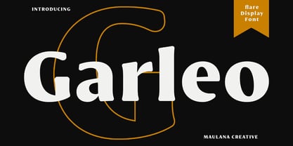 Garleo is a round flare serif Display font. Bold stroke, fun character with a bit of ligatures and alternates. To give you an extra creative work. Garleo font support multilingual more than 100+ language. This font is good for logo design, Social media, Movie Titles, Books Titles, a short text even a long text letter and good for your secondary text font with script or serif. Make a stunning work with Garleo font. Cheers, Maulana Creative
 - Biscuit Pro by Kustomtype,
$30.00 Biscuit is a rounded unique typeface, clearly and easy readable with upper- and lowercase. Perfectly applicable for big or bold tekst pages. This font family has an excellent legibility - both in print and on the web - and an optimized kerning. Biscuit is intentionally designed to be used as a display typeface in publications, packaging and al of your artwork and design. It's warm and cosy character suits extraordinary well for modern or vintage typography and corporate design.
 - AZN Unified by AthayaDZN,
$14.99 Introducing "AZN Unified" font by AthayaDZN. UNIFIED was inspired by the evolving sports world that recently just expanded into the digital verse. UNIFIED’s rounded and sharp look is representing its nature of unity, equipped with 4 different angles of corners, UNIFIED achieved its mixed modern style of a bold serif font. Language Support : Afrikaans, Albanian, Danish, Dutch, English, Estonian, Filipino, Finnish, French, Galician, Indonesian, Irish, Italian, Luxembourgish, Norwegian, Portuguese, Romansh, Scottish Gaelic, Spanish, Swedish, Swiss German, Uzbek (Latin).
 - Lemmy by Maulana Creative,
$14.00 Lemmy is a simply rounded sans serif font. With bold stroke, fun character with a bit of ligatures and alternates. To give you an extra creative work. Lemmy font support multilingual more than 100+ language. This font is good for logo design, Social media, Movie Titles, Books Titles, a short text even a long text letter and good for your secondary text font with sans or serif. Make a stunning work with Lemmy font. Cheers, Maulana Creative
 - Vidocq by Typogama,
$19.00 Vidocq is a single weight typeface designed for use in headlines and titles, inspired by the woodcut styles of the 19th century. Its rounded forms and dark stroke translate into a bold yet friendly appearance coupled with a narrow proportion that let’s it set well in condensed settings. Thanks to an extended character set and wide range of Opentype features that includes arrows and fleurons, Vidocq was created to allow designers to play with various styles while composing layouts.
 - Monotalic by Kostic,
$30.00 Monotalic was created as a fun experiment, exploring better solutions for the monospaced type design. Most monospaced (fixed-width) typefaces have the same main design problem regarding the lowercase – filling the empty space around l, f, i, j and r. That usually brings the addition of slab serifs to those narrow characters, causing many monospaced fonts to look and feel alike. Monotalic solves that problem by adopting the handwritten (or cursive) form for those problematic characters, which allows them to be defined in more strokes, thus getting a better distribution of form in that fixed-width space. On the other hand, cursive writing usually lacks the legibility of a Roman (Regular upright) style, so Monotalic was created to be a hybrid, taking the best of both worlds. Monospaced fonts today are mostly used for coding. Modern code editors use colored text in order to differentiate between different kinds of code. So, in that environment there’s actually no need for traditional text styling by adding Italics, Bold or other styles, because the code lines are overstated as it is. That is why Monotalic focuses on one style only, in three widths and four weights. The weights allow users to choose the perfect contrast of text on screen, depending on their monitor resolution and background color in the editor. Movie scripts are almost exclusively set in 12pt Courier. It became the industry standard because when set in the specific “screenplay format" it helps with the breakdown of the schedule and budgeting process of the film production. Although it looks completely different, text set in Monotalic (Normal width) will take the same amount of space as Courier.
 - Ginder by Craft Supply Co,
$20.00 Ginder – Bold Serif Font: Striking and Versatile Bold and Commanding Presence: Ginder – Bold Serif Font stands out with its strong, bold character. It’s perfect for titles and posters needing a powerful impact. This font captures attention effortlessly. Ideal for Titles and Posters: With its robust design, Ginder excels in creating striking titles and posters. It enhances visibility and readability. This font is a top choice for impactful visual designs. Adaptable Across Mediums: Despite its boldness, Ginder is surprisingly adaptable. It works well in both digital and print formats. This versatility makes it a valuable tool for various design projects. User-Friendly for Designers: Ginder is designed for ease of use, suitable for all skill levels. Its compatibility with multiple design platforms adds to its appeal. It’s a favorite among graphic designers for its simplicity and impact.
 - Micholas by Rockboys Studio,
$19.00 Micholas is a simple and casual serif font with an undeniably clean feel. With its neat and beautiful arrangement of letters, this typeface will look outstanding in both formal and non-formal designs.
 - Benoa by Creativemedialab,
$20.00 Benoa is a versatile font family for your design, consist of 6 weights from thin to black with dozens of alternates. Benoa works well with any style of design concept, from branding to a nice bold modern look! Benoa also available in Variable format, multilingual support, numbers, and currency symbols, and dozens of alternates.
 - OldStyle 1 - Unknown license

- Swiss 924 by Bitstream,
$29.99 An old narrow Grotesque from Stempel’s early days (possibly Information Bold Condensed) revived and revised for photocomposition.
 - Halau Spooky by Vintage Voyage Design Supply,
$12.00 Introducing you a cartoon font family straight for your Halloween or other horror events. A wide range of variations completely satisfy the most sophisticated font gourmet. From Thin to Bold horror sans styles and a fancy horror script. Also, 62 Halloween graphic elements come as a Graphic Style! Each font has Normal and Roughen Styles. All sans serif's come as filled, inlined and inline separately. 33 typefaces total. • Halau Script has two uppercase letters sets and a lot of alternates included swashes. Halau Sans also has few alternate symbols and pair of ligatures (fj, fi). Trick or treat, folks. Enjoy!
 - Luka by Nantia.co,
$12.00 LÜKA HandWritten Multilingual Font, is an elegant display font. Needless to say that the font supports a full set of Greek characters, Cyrillics, and an extended Latin character set with diacritics. In fact, it’s a unique font that has a great variety of applications with multilingual support. A thin, elegant yet crafty looking typeface. Of course, the wide range of language support of the font makes it ideal for international food packaging. In addition, you can use it on organic packaging design, for crafts and wedding invitations and social media content. Also, the font has four weights: thin, normal, bold and heavy.
 - GreenCherry by Vishwakarma Studio,
$10.00 GreenCherry typeface is for regular texts. I have designed every glyph with kept perfection in mind. I also retained symmetry throughout all glyphs. They look very premium when placed together. The typeface has 3 fonts - Thin, Normal & Bold. Every font has 210 glyphs and supports Western European languages. It has essential OpenType features like Kerning and Hinting. Hence you can use it wherever you want. It works very well with print media and web media as well. This typeface is suitable for Websites, Apps, Blogs, Book Publication, Stationery, Signage, and other Printing media. I am sure you will enjoy this typeface.
 - Comma Base by Martin Majoor,
$- Comma Base is a sans typeface for it has no serifs. No wait, it is a typical serif typeface because it has a high contrast. Strictly speaking, Comma Base is a missing link between serif and sans, offering the best of both worlds. Comma Base supports several OpenType features for advanced typographic control. It consists of 16 styles, 8 weights from Hairline to Ultra, in both roman and italic. Comma Base is a uniwidth font. This means changing a text from normal to bold doesn’t effect the set width, a professional feature that is highly appreciated by graphic designers.
 - Exec by Wiescher Design,
$35.00 I created my new »EXEC« sans font during the years 2018 to mid 2020. The Normal »EXEC«-family has 7 weights, ranging from Thin to Bold (plus 7 italics). This elegant Sans is suited for editorial, book text, advertising and packaging, logo, branding, small text as well as web and screen design. »EXEC« has advanced typographical support including ligatures, small caps, alternate characters, case-sensitive forms, fractions, super- and subscript characters. »EXEC« comes with a range of figures—oldstyle and lining figures, each in tabular and proportional widths. »EXEC« supports Basic-, Western-, and Central-European Latin-based languages.
 - Edessa JNL by Jeff Levine,
$29.00Edessa JNL is a Greek-styled alphabet found in an old book used by sign painters. Its simple, angular lines and clean approach add a taste of the past to your work. - Sales Slip JNL by Jeff Levine,
$29.00 Sales Slip JNL is derived from the core lettering of Sales Book JNL, an outline font with a cast shadow; modeled from wood type examples found in an old printer's supply catalog.

