10,000 search results
(0.905 seconds)
- As of my last knowledge update in April 2023, there isn't a widely recognized font specifically named "Panther" that is acknowledged across the major font platforms or in design communities. However,...
- Fauna Pro by Pasternak,
$12.00 Fauna Pro is the second generation of its previous version. Now it is more futuristic with a strange sci-fi spirit. Fauna Pro has more solid contours and thick letters. It compares with futuristic thematic, including such elements like robots, spaceships, electronics, cosmos, planets, nature, and modern architecture. Font family includes 6 font styles: extra light, light, regular, medium, semibold and bold. Every style contains 266 glyphs.
 - Rolan by Larin Type Co,
$12.00 Rolan This is a light elongated font that includes light, regular and bold weights, as well as these weights in a rough style. It is versatile and will perfectly fit into any project in both modern and vintage style, it is perfect for creating a logo, banners, flyers, labels, branding and much more This font family has only Capital letters and some of them are different.
 - Constellation Pro by Tilde,
$39.75 Constellation started with a simple geometric concept in the manner of Art Deco which gradually developed to a complete typeface, both upright and italic, total of seven weights. The concept allowed the font to be designed from Ultra Light in both very light and quite black styles. This Pro font is packed with all European and Cyrillic alphabets, small caps, variable figure sets and features .
 - VLNL TpLlum by VetteLetters,
$35.00 TpLlum is a typeface designed by TwoPoints for a festival in Barcelona called ‘Montjuïc de Nit’. Llum means light in Catalan. In the Montjuïc de Nit project the font was used in white over a dark grey background, letting the light of a backlit poster shine through. For this purpose the typeface had to be very bright, which was made possible by its heavy cut.
 - Havelock Titling by XO Type Co,
$40.00 Havelock Titling builds upon the essential geometry of Havelock , adding new weights for spacious, authoritative text. Made to combine with Havelock’s display capabilities for more traditional reading scenarios. Built on the same weight range as Rocinante Titling , which broadens your design options. Light matches Light, Bold matches Bold, and so on. Both Havelock and Havelock Titling collections are included in Havelock Complete for a lower price.
 - Love Wins by Resistenza,
$19.00 In 2007 we shared our first pride together. More than 1 million people took the streets of Madrid for this huge celebration … seeing the diversity of people supporting love was incredibly touching. Gay Pride is a celebration of freedom, human rights and the right to love whoever we want. It’s a memorial for the battles, the lives lost and the pain suffered while fighting for a growing list of equal rights. But let’s not forget there are still places where LGTBQ community is repressed and persecuted. As Letter crafters we love seeing the signs people design for their different pride parades, and we wondered… Why don’t we create a collection of handcrafted lettering to share some love and to add a typographic realness to the party? Love Wins Font is a series of 60 phrases handwritten with expertise and love specially designed to celebrate diversity. The lettering was crafted with different calligraphic tools creating diverse aesthetics. You can use them to create your signs, t-shirts, stickers, poster, banners.. all you need is to spread love during your Pride Celebrations (or day-to-day life!).
 - Helen Bg by HS Fonts,
$19.00 The font package Helen Bg Family is in 5 weights and two widths, 18 styles: Thin, Thin Italic, Light, Light Italic, Regular, Italic, Bold, Bold Italic, Black, Black Italic, Light Condensed, Light Condensed Italic, Condensed, Condensed Italic, Bold Condensed, Bold Condensed Italic, Black Condensed and Black Condensed Italic. Helen Bg is made with Bulgarian Design of Cyrillic and is recommended for the publications for Bulgaria. Other version with standard Cyrillic is available from HermesSoft Limited. Typeface design: Vassil Nikolov. Release date: 1991 - 96, HermesSOFT Design notes and Technical data Helen belongs to the typefaces from the humanistic sanserif grotesk fonts. The font is for wide use – from the classical typesetting to the display typography. In the Bulgarian Code Page are included all vowels with accents that are really necessary for the typesetting in Bulgarian language, and are not included in the Cyrillic Code Page: Helen Is available in OpenType PostScript and WEB font formats.
 - Squalo by Letritas,
$30.00 Squalo, the genesis The idea of this project called Squalo popped into my mind while I was working with excitement on some sketches. I was chasing after a strong typographical character, something that for me has to be crystallized in form which is always legible and functional. The concept The concept of Squalo arises from the observation of an athlete’s body: you notice that even if most are lean, they are also strong, cut and chiselled. The sport they play molds and modify their bodies. Just think, for instance, on a professional swimmer: during the competition every single muscle, tendon, tissue, cell is working to swim faster. Every single part is there to give strength and speed like in a “squalo” (shark in italian). Not as an eel, nor as a mermaid, nor as a hake. Just like a shark. If you take a quick look, you will notice that the width of the typeface is slightly more condensed than that of a standard sans serif. We designed Squalo this way specifically to assist and strengthen your concepts through stylized typography. We designed the joins and terminals (tip ends) of the characters A, V, W, Z, v, w, z, to create a feeling of “tension”, reinforcing the concept of shark, danger, caution, as well explicit, intentional movement. Pure strength. We wanted to recall the exact moment of the start of the 100 meters race: when the sprinter initially spreads all of his powerful energy. The italic version, starting with the former two typographical concepts of width and tension, emphasizes them. First of all, we compressed the characters 10 percent more, and slanted it 10 degrees to the right. With this movement I intended to convey the gorgeous feeling of tension in power and rapidity. The typeface has 9 weights, from “hair” to “black”, and two versions, “regular” and “italic”. All 18 fonts include small caps, unicase, tabular and oldstyle numbers, numerators and denominators, and much more. Squalo is an ideal typeface that I recommend for use in marketing campaigns, design of packaging, magazines, branding for tv programs, films, book texts, editorial, publications, logos, corporate projects, web texts, and graphic design in motion. Squalo supports the following languages: Abenaki, Afaan Oromo, Afar, Afrikaans, Albanian, Alsatian, Amis, Anuta, Aragonese, Aranese, Aromanian, Arrernte, Arvanitic (Latin), Asturian, Atayal, Aymara, Bashkir (Latin), Basque, Bemba, Bikol, Bislama, Bosnian, Breton, Cape Verdean Creole, Catalan, Cebuano, Chamorro, Chavacano, Chichewa, Chickasaw, Cimbrian, Cofán, Corsican Creek,Crimean Tatar (Latin),Croatian, Czech, Dawan, Delaware, Dholuo, Drehu, Dutch, English, Estonian, Faroese, Fijian Filipino, Finnish, Folkspraak, French, Frisian, Friulian, Gagauz (Latin), Galician, Ganda, Genoese, German, Gikuyu, Gooniyandi, Greenlandic (Kalaallisut)Guadeloupean, Creole, Gwich’in, Haitian, Creole, Hän, Hawaiian, Hiligaynon, Hopi, Hotcąk (Latin), Hungarian, Icelandic, Ido, IgboI, locano, Indonesian, Interglossa, Interlingua, Irish, Istro-Romanian, Italian, Jamaican, Javanese (Latin), Jèrriais, Kala Lagaw Ya, Kapampangan (Latin), Kaqchikel, Karakalpak (Latin), Karelian (Latin), Kashubian, Kikongo, Kinyarwanda, Kiribati, Kirundi, Klingon, Ladin, Latin, Latino sine Flexione, Latvian, Lithuanian, Lojban, Lombard, Low Saxon, Luxembourgish, Maasai, Makhuwa, Malay, Maltese, Manx, Māori, Marquesan, Megleno-Romanian, Meriam Mir, Mirandese, Mohawk, Moldovan, Montagnais, Montenegrin, Murrinh-Patha, Nagamese Creole, Ndebele, Neapolitan, Ngiyambaa, Niuean, Noongar, Norwegian, Novial, Occidental, Occitan, Old Icelandic, Old Norse, Oshiwambo, Ossetian (Latin), Palauan, Papiamento, Piedmontese, Polish, Portuguese, Potawatomi, Q’eqchi’, Quechua, Rarotongan, Romanian, Romansh, Rotokas, Sami (Inari Sami), Sami (Lule Sami), Sami (Northern Sami), Sami (Southern Sami), Samoan, Sango, Saramaccan, Sardinian, Scottish Gaelic, Serbian (Latin), Seri, Seychellois Creole, Shawnee, Shona, Sicilian, Silesian, Slovak, Slovenian, Slovio (Latin), Somali, Sorbian (Lower Sorbian), Sorbian (Upper Sorbian), Sotho (Northern), Sotho (Southern), Spanish, Sranan, Sundanese (Latin), Swahili, Swazi, Swedish, Tagalog, Tahitian, Tetum, Tok Pisin, Tokelauan, Tongan, Tshiluba, Tsonga, Tswana, Tumbuka, Turkish, Turkmen (Latin), Tuvaluan, Tzotzil, Uzbek (Latin), Venetian, Vepsian, Volapük, Võro, Wallisian, Walloon, Waray-Waray, Warlpiri, Wayuu, Welsh, Wik-Mungkan, Wiradjuri, Wolof, Xavante, Xhosa, Yapese, Yindjibarndi, Zapotec, Zulu, Zuni
 - Levato by Linotype,
$29.99 Levato, the first font designed by Felix Bonge, is an Antiqua that is full of character and is refined but by no means sterile. This typeface provides for a wide range of options for creating individual designs. It was not really Felix Bonge's intention to create a whole font family when, as a second year student, he began several exercises in contrast and proportion as part of the typeface design course of Professor Veljovi? at Hamburg University of Applied Sciences. However, these initial studies developed into a project that Bonge persisted with over the following years while working towards his degree. He continually had new insights and ideas that he was able to exploit for his font. Of particular importance, he claims, was a calligraphy seminar, which prompted him to completely rework his concept. It took him several years before his extensive font Levato™ was ready. Although the forms of Levato are ultimately derived from Renaissance Antiqua, Bonge has slightly increased the relative contrast in his version. This gives the font a graceful appearance that is further emphasized by the reduced x-height and the associated prominence of the ascenders. And, in addition, the relatively fine serifs, which are almost linear at their ends, infuse Levato with a hint of classical Antiqua á la Bodoni. At the same time, Bonge cleverly compensates for the sterilising tendency of this font form. Soft and rounded serif attachments and rounded line apexes offset the severe nature of the font and provide it with an aura of vivacity. This effect is promoted by the calligraphic-like foot of the lowercase h, n and m and the not quite horizontal bars of the uppercase E and F. Overall, Bonge has succeeded in creating a refined and yet very dynamic typeface. Levato is available in five weights; Light, Regular, Medium, Bold and Black, in each case with the corresponding italic versions. Bonge treats Levato Italic as a genuine cursive typeface. Its letters are thus slightly narrower than the analogous upright letters and their forms are considerably more curvilinear. All the versions of Levato boast an enormous range of characters to meet all possible requirements. In addition to four sets of minuscule and majuscule numerals for tabular and proportional typesetting, there are also small caps, numerous ligatures, ornamental characters and even swash variants of letters. With their generous, sweeping curves, the swash variants (available as OpenType versions) can be used for striking titling effects or as initials.
 - As of my last update in April 2023, I don't have specific data on a font named "Yum" created by Yum Productions, suggesting that it might not be widely recognized or it might be a newer, niche creati...
- As of my last knowledge update in April 2023, the font named "Triangler" by Tim Ko does not have a widely recognized or documented description in the major typographic and design resources available ...
- As of my last update in April 2023, the FC Basic Font doesn't stand out as a widely recognized typeface within the vast landscape of typography. However, based on the name 'FC Basic Font,' I can offe...
- Body by Zetafonts,
$39.00 Body graphic project at Behance Body is a type family designed for Zetafonts by Cosimo Lorenzo Pancini with Andrea Tartarelli. Conceived as a contemporary alternative to modernist superfamilies like Univers or Helvetica, Body tries to maximize text readability while providing a wide range of options for the designer. It comes in two variants (Body Text and Body Grotesque), each in four widths and four weights: regular and bold for basic typesetting, light and extrabold for display use. Body Grotesque applies to the sans serif modernist skeleton little imperfections and quirks inspired by our research in early 20th century type specimens. Curves are slightly more calligraphic and a light inverse contrast is applied to bold weights, giving the typeface a slight vintage appearance in display use. Body Text, on the contrary, challenges the modernist aesthetics maximizing horizontal lines and using open terminals for letters like “s” and “a” that appear normally dark in modernist grotesques. For both variants, the normal width family is slightly condensed in an effort to maximize space usage; the Slim width is provided for extremely dense texts or side notes while the Fit width is optimized for display usage as in logos, headings or titles. The Large width manages to look elegant in its light weight while becoming a valid heading or subtitle font in its extrabold weights. All the 64 fonts in the Body superfamily include a complete latin extended character set with small caps for over 70 languages, Russian cyrillic, open type positional numbers, stylist sets and alternate forms.
 - Wastrel by Typotheticals,
$5.00This font, similar in style to Phollick, is a light playful font that has a capacity for use in many applications. - FS Untitled Variable by Fontsmith,
$319.99Developer-friendly The studio has developed a wide array of weights for FS Untitled – 12 in all, in roman and italic – with the intention of meeting every on-screen need. All recognisably part of a family, each weight brings a different edge or personality to headline or body copy. There’s more. Type on screen has a tendency to fill in or blow so for each weight, there’s the choice of two marginally different versions, allowing designers and developers to go up or down a touch in weight. They’re free to use the font at any size on any background colour without fear of causing optical obstacles. And to make life even easier for developers, the 12 weight pairs have each been designated with a number from 100 (Thin) to 750 (Bold), corresponding to the system used to denote font weight in CSS code. Selecting a weight is always light work. Easy on the pixels ‘It’s a digital-first world,’ says Jason Smith, ‘and I wanted to make something that was really functional for digital brands’. FS Untitled was made for modern screens. Its shapes and proportions, x-height and cap height were modelled around the pixel grids of even low-resolution displays. So there are no angles in the A, V and W, just gently curving strokes that fit, not fight, with the pixels, and reduce the dependency on font hinting. Forms are simplified and modular – there are no spurs on the r or d, for example – and the space between the dot of the i and its stem is larger than usual. The result is a clearer, more legible typeface – functional but with bags of character. Screen beginnings FS Untitled got its start on the box. Its roots lie in Fontsmith’s creation of the typeface for Channel 4’s rebrand in 2005: the classic, quirky, edgy C4 headline font, with its rounded square shapes (inspired by the classic cartoon TV shape of a squidgy rectangle), and a toned-down version for use in text, captions and content graphics. The studio has built on the characteristics that made the original face so pixel-friendly: its blend of almost-flat horizontals and verticals with just enough openness and curve at the corners to keep the font looking friendly. The curves of the o, c and e are classic Fontsmith – typical of the dedication its designers puts into sculpting letterforms. Look out for… FS Untitled wouldn’t be a Fontsmith typeface if it didn’t have its quirks, some warranted, some wanton. There’s the rounded junction at the base of the E, for example, and the strong, solid contours of the punctuation marks and numerals. Notice, too, the distinctive, open shape of the A, V, W, X and Y, created by strokes that start off straight before curving into their diagonal path. Some would call the look bow-legged; we’d call it big-hearted. - FS Untitled by Fontsmith,
$80.00 Developer-friendly The studio has developed a wide array of weights for FS Untitled – 12 in all, in roman and italic – with the intention of meeting every on-screen need. All recognisably part of a family, each weight brings a different edge or personality to headline or body copy. There’s more. Type on screen has a tendency to fill in or blow so for each weight, there’s the choice of two marginally different versions, allowing designers and developers to go up or down a touch in weight. They’re free to use the font at any size on any background colour without fear of causing optical obstacles. And to make life even easier for developers, the 12 weight pairs have each been designated with a number from 100 (Thin) to 750 (Bold), corresponding to the system used to denote font weight in CSS code. Selecting a weight is always light work. Easy on the pixels ‘It’s a digital-first world,’ says Jason Smith, ‘and I wanted to make something that was really functional for digital brands’. FS Untitled was made for modern screens. Its shapes and proportions, x-height and cap height were modelled around the pixel grids of even low-resolution displays. So there are no angles in the A, V and W, just gently curving strokes that fit, not fight, with the pixels, and reduce the dependency on font hinting. Forms are simplified and modular – there are no spurs on the r or d, for example – and the space between the dot of the i and its stem is larger than usual. The result is a clearer, more legible typeface – functional but with bags of character. Screen beginnings FS Untitled got its start on the box. Its roots lie in Fontsmith’s creation of the typeface for Channel 4’s rebrand in 2005: the classic, quirky, edgy C4 headline font, with its rounded square shapes (inspired by the classic cartoon TV shape of a squidgy rectangle), and a toned-down version for use in text, captions and content graphics. The studio has built on the characteristics that made the original face so pixel-friendly: its blend of almost-flat horizontals and verticals with just enough openness and curve at the corners to keep the font looking friendly. The curves of the o, c and e are classic Fontsmith – typical of the dedication its designers puts into sculpting letterforms. Look out for… FS Untitled wouldn’t be a Fontsmith typeface if it didn’t have its quirks, some warranted, some wanton. There’s the rounded junction at the base of the E, for example, and the strong, solid contours of the punctuation marks and numerals. Notice, too, the distinctive, open shape of the A, V, W, X and Y, created by strokes that start off straight before curving into their diagonal path. Some would call the look bow-legged; we’d call it big-hearted.
 - Catalina by Kimmy Design,
$10.00 Earlier this year I visited a bakery in Newport Beach, CA and fell in love with the organic design and typography of the place. Hand-drawn menus, table cards, chalkboards, and wall quotes surrounded the charming spot. It inspired me to create a new font family based on the combination of hand drawn fonts. Included in this package are 5 font families, with 2 graphic ornament fonts. Each font family contains at least a light, medium and bold. Here is a breakdown of what's cookin' at Catalina's Bakery: Catalina Anacapa: Tall and skinny, this font comes in 3 weights for both sans and slab serif styles. It includes contextual alternatives (giving 3 versions of each letter), stylistic alternatives for select letters (A, K, P, Q, R, Y) and also includes Small Caps. Catalina Avalon: Based off Anacapa, this sub family has a high contrasting line weight. It comes in light, regular and bold as well as an inline alternative for both sans and slab serif styles. Avalon also includes opentype features such as contextual alternatives (giving 3 versions of each letter), stylistic alternatives for select letters (A, K, P, Q, R, Y) and small caps for each letter. Catalina Clemente: In a more standard width, Clemente is one of the two sub families that can be used for paragraph text as well as headlines. It's organically geometric in style and comes in ALL CAPS and lowercase, includes upright and custom italics, and has the opentype feature giving 3 versions of each letter. Catalina Script: A great compliment with the display sub-families, Catalina Script rounds out the package with a hand-drawn cursive flair. It includes contextual alternatives (giving 2 variations to each letter) as well as stylistic alternatives for many of the capital and lowercase letters. It has special ligatures for some letter combinations, and titling alternatives for all the capital letters. Catalina Typewriter: The second of the paragraph text sub-families, this typewriter inspired hand-drawn font family works great as either a display or paragraph text. It has contextual alternatives with 3 versions of each letter, and comes in both upright and custom italics versions. Catalina Extras! These two fonts go perfectly with the Catalina Family. They includes borders, frames, arrows, banners, flourishes and more. Catalina Flourish has all of it's options in a light and bold style, to use the light version type all lowercase letters, then to make something bold, used it's uppercase (or shift+) characters. For a breakdown of graphic/letter correlation, see the breakdown PDF. All of Catalina was drawn by the same hand, using the same ink and technique. While they contrast in their type styles, they work together perfectly to create one cohesive font family.
 - Extra Extra by Comicraft,
$19.00 EXCLUSIVE! Read all about it! The latest scoop from Comicraft is sure to be in all the newspapers today! The Times are a changin' -- comic book letterers everywhere can say a font farewell to typesetting the front pages of Planets and Bugles in Helvetica, Verdana or Gill Sans! Superhero's Pal, Johnny "Roshell" Olsen, was up all night writing copy for the late-night edition, making sure that your newspaper headlines and copy have a warm, pen lettered look... some might say a Rosen-glow! Put a little Extra Extra in your bylines and maybe there's a Pulitzer and an Eisner in your future! Not ready to purchase? Get ExtraExtra Engraved free with any purchase, or by subscribing to our newsletter at the bottom of this page. Features Seven fonts (Regular, Italic, Bold, Bold Italic, Heavy, Heavy Italic & Engraved) with upper and lower case alphabets.
 - Screamous by Fikryal,
$22.00 Screamous – Unique Display This font is very suitable to be applied in various aspects of design, and your branding. It’s perfect for logos, branding, title, social media posts, advertisements, product packaging, product designs, label, photography, watermark, special event, magazine, web designs, etc. Features : Multilingual Support If you have any questions please don’t hesitate to contact me follow my Instagram: fkryall Thank you
 - Creatify by Fikryal,
$18.00 Creatify – Font is a bold script font. It’s perfect for logo, branding, title, social media posts, advertisements, product packaging, product designs, label, photography, watermark, special event, magazine, web design, etc. Features : Creatify ( Uppercase, Lowercase ) Contextual alternates Stylistic alternate Ligatures Multilingual Support If you have any questions please don’t hesitate to contact me. follow my Instagram: fkryall Thank you Fikryal Studio
 - Lemon Mocktail by Fikryal,
$20.00 Lemon Mocktail – Display Serif This font is very suitable to be applied in various aspects of design, and your branding. It’s perfect for logos, branding, title, social media posts, advertisements, product packaging, product designs, label, photography, watermark, special event, magazine, web designs, etc. Features : Multilingual Support If you have any questions please don’t hesitate to contact me follow my Instagram: fkryall Thank you
 - Monas by TypeClassHeroes,
$14.00 Introducing Monas is a Modern Modern Display Font, access your OpenType features to access the large selection of alternate letters and ligatures. Use this font for any branding, product packaging, invitation, quotes, t-shirt, label, poster, logo etc. Feature Uppercase & Lowercase Number & Symbol International Glyphs Multilingual support Alternative Ligature Feel free to drop us a message any time Hope you enjoy it.
 - Yummy Foodies by Scratch Design,
$9.00Yummy Foodies is an authentic handwritten font, this font is complete with all punctuations and multi-languages support. This font will applicable to comic book text, poster, menu design, stationery design kit, presentation for education, youtube text and title, and many more with casual concept design. This font also supports for mac and windows. Enjoy this font, and make some cool stuff! - Moonart by Scratch Design,
$12.00 Introducing “Moonart” It's handwritten with natural and rough character. This font is suitable for designs that emphasize the authenticity of slightly rough writing. Perfect for creating Instagram quote posts, novel or book typefaces, branding, invitations, labels, packaging, stationery, etc. This is a full font, which features all uppercase and lowercase letters, numbers and punctuation, stylish alternates, multilingual, alternates and ligatures. Enjoy this font!
 - Mezitha by Koray Özbey,
$10.00 Mezitha is display font that has an ethnic view with modern style. It's suitable for branding, packaging, printing, poster designs, natural products etc. Mezitha Ornaments contains 3 groups of symbols. 1- Combining Ornaments 2- Repeating glyphs to create borders with finishes. 3- Single symbols. Most of the glyph has alternates and all of them has two version (thick and thin).
 - Amorphic by Ali Güzel,
$11.00 Chrome Balance is an experimental bitmap font created by photographing hand-modeled play dough and adding a chrome effect. It has a unique and dynamic look and is designed to accompany bold and simple designs such as album covers, posters etc.. The vector version of the same form has also been converted to the vector format, font named Amorphic. IG: algzl
 - Blushing by Crumphand,
$16.00 Hello, introducing new font, its called Blushing. Blushing is natural beauty handtype. im making this font for specific product. this font very match for your beauty product : Cosmetic, Cream product, Nail art, Spa & Beauty, Lipstick, Shampoo and etc. You can mix and match with regular font. what's included inside the font ? Uppercase Lowercase Numeral & Punctuation Multilinguals Standart Ligatures Thank You!
 - Bogota by Din Studio,
$22.00 Bogota is a modern and clean display (Serif) font create from our talented font designer. The design of Bogota will make your design more beautiful and inspiring. This font will suitable for any project, like branding, print template, logo and etc. The font also available in a thin version. Features: Accents (Multilingual characters) Alternates PUA encoded Numerals and Punctuation (OpenType Standard)
 - Komsomol by Hanoded,
$15.00 Komsomol (short for Kommunisticheskii Soyuz Molodyozhi) was the youth division of the Communist Party of the Soviet Union. Komsomol font was modeled on several Soviet propaganda posters which all had one thing in common: a very loud message in a very clear typeface. Komsomol is an all caps typeface which comes with extensive language support in order to educate the masses.
 - Sleepless by Gassstype,
$27.00 Introducing of our new product Sleepless is a hand drawn Horror Brush font and dramatic movement. This font is great for your next creative project such as logos, printed quotes, invitations, cards, product packaging, headers, Logotype, Letterhead, Poster, Label, and etc. Best for project that need horror vibes , horror poster, childrenbook, cartoon, comic . You can activate Ligature OpenType panel design more interesting.
 - Marcelo by Din Studio,
$29.00 Introducing the Marcelo engraved font. Marcelo font is designed to be used in display settings. Created by our talented font designer Donis Miftahudin. The design of typeface will make your design more beautiful and inspiring. This font will suitable for any project, like branding, print template, logo and etc. Features: Accents (Multilingual characters) 27 Alternates PUA encoded Numerals and Punctuation (OpenType Standard)
 - Champagne Toast by Fikryal,
$20.00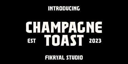 Champagne Toast – Display Serif This font is very suitable to be applied in various aspects of design, and your branding. It’s perfect for logos, branding, title, social media posts, advertisements, product packaging, product designs, label, photography, watermark, special event, magazine, web designs, etc. Features : Multilingual Support If you have any questions please don’t hesitate to contact me follow my Instagram: fkryall Thank you
 - Punch of Love by Sipanji21,
$15.00 Punch Of Love is a lovely display font that radiates charm. It features gorgeous hearts in each letter which give it an incredibly romantic feel. this font suitable for valentine day poster, logo, t shirt, event banner and etc. you can use this font for any design, apparel, kids logo, logo type, with many swash for make your design awesome.
 - Kwash Brush by me55enjah,
$14.00 Introducing Kwash Brush! A handmade brush typeface. Inspired by brush ink stroke character, Kwash Brush makes the messages you write have a more personal touch. This handwritten brush font containing upper & lowercase characters, numerals, and punctuation. Also, support multi-language (Latin simple). This brush font can be applied to any kind of purpose, from handwritten quotes, packaging merchandise, branding projects, etc.
 - Anything Script by Aldedesign,
$16.00 Anything Script is a stylish script font that features a varying baseline, smooth line, modern and with a depth love. For those of you who are need a touch of love and modernity for your designs or branding, it can be used for various purposes such as headings, wedding, invitation, signature, logos, branding, t-shirt, letterhead, signage, lable, news, posters, badges etc.
 - Glitter by Aga Silva,
$10.00 The fonts in this family of six files contain 62 original dingbats in 5 variants, and 26 original dingbats in 2 variants plus 10 tilable patterns (Glitter Medley). For best results use layered. Note: Please be aware that you may need to prepare those patterns in order to work with them in CAD-CAM or if you intend them for bolt cutter etc.
 - Good Monday by BaronWNM,
$14.00 Good Monday is a modern calligraphic style script font with a bold and thin touch like the one you get from writing with a brush. This font is traced from the handwriting so it looks very natural. Good Monday is perfect for use in invitation cards, fashion branding, shirt printing, product advertisements, posters, etc. This font has multilingual support, alternates, and ligatures.
 - Rolla Cossta by Gassstype,
$25.00 Rolla Cossta - Handwritten Brush Font . Introducing of designs look modern, unique and fun. It’s perfect for labels, quotes, posters, DIY projects, branding, packaging, greeting cards, websites, photos, photography overlays, signs, window art, scrapbooking, tags and so much more!our new product that inspired by Street Tagging, graffiti style with a fun theme very good for graffity poster, flyer, childrenbook, cartoon, comic etc
 - Hosrein Gomer by madeDeduk,
$16.00 Hosrein Gomer is a Modern Ligature Font, use this font for any branding, product packaging, headline, invitation, fashion, label, poster, logo etc. Feature Uppercase & Lowercase Number & Symbol International Glyphs Multilingual support Alternative Ligature Feel free to drop us a message any time and follow my shop for upcoming updates Shoot me on email at: dedukvic@gmail.com Hope you enjoy it.