This typeface appears to be straight out of a science fiction movie thriller. Mingo is a slightly condensed, somewhat vain gothic with thick vertical strokes proudly tapering downward. Capitals which are normally completely round are now square inside with curving outside corners. Lowercase letters carry the same design traits. And, in the capital A and H, crossbars extend on both sides helping give the face a pronounced retro look. Mingo Gothic is a close cousin to Raleigh Gothic and is an excellent choice for book covers and large display settings. Small caps, fractions, and alternate characters have also been developed for greater layout versatility. Mingo Gothic Bold is now available in the OpenType format. Some new characters have been added to this OpenType version as stylistic alternates, historical forms, small caps, oldstyle figures, ornaments, and f-ligatures. These advanced features work in current versions of Adobe Creative Suite InDesign, Creative Suite Illustrator, and Quark XPress. Check for OpenType advanced feature support in other applications as it gradually becomes available with upgrades.
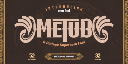
Metub by Twinletter, $17.00 
Introducing Metub, the superhero display font with a unique and powerful serif style that’s sure to make your designs stand out. Each letter is meticulously crafted to convey strength and individuality, making this font the perfect choice for bold and impactful projects. With 52 stylish alternate characters and 32 beautifully designed ligatures, Metub offers endless design possibilities that are sure to elevate your work to new heights. Whether you’re designing posters, logos, or branding materials, Metub is the ideal font for any project that demands a strong and unique aesthetic. And with multilingual support, this font is perfect for projects with a global reach. Give your designs a powerful edge with Metub today. What’s Included : - File font - All glyphs Iso Latin 1 - Alternate, Ligature - Simple installations - We highly recommend using a program that supports OpenType features and Glyphs panels like many Adobe apps and Corel Draw so that you can see and access all Glyph variations. - PUA Encoded Characters – Fully accessible without additional design software. - Fonts include Multilingual support

Based on the 1922 Klingspor model by German designer Rudolf Koch, this hand-drawn quill roman has an informal and curiously delicate appearance. The typeface was known in Germany as Koch Antiqua and in the rest of Europe as Locarno. Eve, as it was called in the United States, continues to enjoy great popularity in advertising and book publishing circles. This deluxe version includes display light, display heavy, and display black as well as the hard-to-find display light and heavy (Koch Kursiv) italics. Eva-Paramount, which is based on Morris Benton's 1928 ATF Paramount, has also been included. It contains a set of alternates characters that are in keeping with the light and heavy display letter styles. Eva-Antiqua is also available in the OpenType Std format. Alternates are now merged together into each style as stylistic alternates or as swashes. These advanced features currently work in Adobe Creative Suite InDesign, Creative Suite Illustrator, and Quark XPress 7. Check for OpenType advanced feature support in other applications as it gradually becomes available with upgrades.

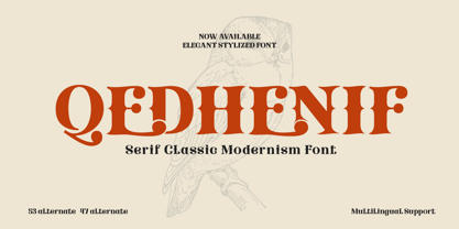
Qedhenif is a Serif Classic Modernism Font that boasts a retro classic style. With its sleek and sophisticated design, this font is perfect for creating a vintage look that’s both elegant and timeless. Its OpenType features include 53 stylish alternates and 47 beautiful ligatures, making it versatile and suitable for a variety of special projects. Whether you’re working on a branding project, packaging design, or editorial layout, Qedhenif’s alternate characters and ligatures add a touch of personality to your designs. And with its multilingual support, you can use this font for projects in different languages, reaching a wider audience. Explore the possibilities of Qedhenif and elevate your designs to the next level. What’s Included : - File font - All glyphs Iso Latin 1 - Alternate, Ligature - Simple installations - We highly recommend using a program that supports OpenType features and Glyphs panels like many Adobe apps and Corel Draw so that you can see and access all Glyph variations. - PUA Encoded Characters – Fully accessible without additional design software. - Fonts include Multilingual support -All Caps font

Boge LP is a new font family designed to communicate lucidly in text as well as in headlines and titles. The family consists of Regular, Italic, Bold, Bold Italic & Black. Character sets include a full compliment of multi-language support and fine-tuned kerning to make Boge™ a smart choice for professional quality typography from text to billboard-sized advertising. Regular and Bold styles include designed small caps and old-style numerals accessed as OpenType features. An original serif design, Boge blends traditional aesthetic with contemporary refinement. Its hallmarks are: clarity, readability, geniality, competence. The five related styles provide a strong palette for coloring words, text and ideas with quiet authority. Garrett Boge has been designing type for over 30 years, working with Apple, Microsoft, Adobe, Disney and numerous corporate clients. His background in calligraphy, commercial lettering, graphic design, and typography has been channeled into creating this namesake design. Boge Text joins his other popular faces — Spring, Florens, Bermuda, Spumoni, Longhand, Tomboy, Wendy — under the LetterPerfect Fonts brand, marketed through Monotype and its partners.

VTC Bloke is a revival of Miller & Richard’s classic metal typeface, ‘Egyptian Expanded’, including the three-dimensional, ‘Open’ style that was later introduced to the family. The roots of this typeface stem from the UK, where William Miller and his son-in-law Richard had their initial foundry in Edinburgh, Scotland. In addition to the beautiful and timeless type designs, the foundry gained a reputation for offering super small type sizes, designed for Bibles, dictionaries, documents, etc. Slab Serifs (or Egyptian Serifs) started to gain popularity in the early 19th century. It’s around this time, due to emerging industrial technologies, and an ever-expanding advertising industry, that type designers started to really experiment with letterforms that could help their clients distinguish themselves from the competitor, and catch people's eyes. The size of posters and advertising space was getting bigger, and bigger, and so was the type. All original letterforms have been re-drawn and cleaned up, with some more modern glyphs and characters added in. VTC Bloke supports Adobe Latin 1 Language Support.

Mestora is a classic and elegant retro serif with a modern twist. With its decent readability, Mestora is perfect for both display as well as body text. Inspired by all the retro aesthetics making a comeback, Mestora is perfectly suitable for creating nostalgic yet still clean and elegant designs such as logos, packaging, editorial, and more. Mestora FEATURE: Europeans languages Alternates Uppercase & Lowercase Ligatures SOFTWARE REQUIREMENTS: The regular fonts in the pack are widely supported by most software - To get the full functionality of the large selection of standard ligatures (custom connected letters) in the script font, any software that can read OpenType fonts will do. To generate all ligatures, please open Adobe Ilustrator - Type - Glyphs. Please drop me a message if you have trouble regarding either installing or using this font. 🌟While using this product, if you encounter any problem or spot something we may have missed, please don't hesitate to drop us a message. We'd love to hear your feedback in order to further fine-tune our products. Thank you! Skinny Type

Haigrast Serif is a font that combines classic and modern design elements to create a look that is both tasteful and fashion-forward. This serif font is regular but with a very modern feel, making it the perfect choice for designers looking to add a touch of sophistication to their work. The sharp, crisp lines and swash alternates in addition to the decorative letterings add a unique touch, making Haigrast Serif a versatile font that can be used in a variety of projects. Whether you're creating a stylish magazine layout, a cool fashion logo, or a balanced design piece, Haigrast Serif is the perfect font to make your work stand out. Designed by Mans Greback in 2023, this font is the perfect choice for designers who want to make a bold statement in their design work. The Haigrast Script family consists of six high-quality fonts: Regular, Italic, Bold, Bold Italic, Black and Black Italic The font is built with advanced OpenType functionality and has a guaranteed top-notch quality, containing stylistic and contextual alternates, ligatures and more features; all to give you full control and customizability. It has extensive lingual support, covering all Latin-based languages, from Northern Europe to South Africa, from America to South-East Asia. It contains all characters and symbols you'll ever need, including all punctuation and numbers.
As of my last update, there isn't a widely recognized font named "Naxalite." However, I can create a fictional description based on the name's historical and cultural significance. If a font were to ...
As of my last update in 2023, SquareType B, as crafted by the digital design entity digitalAM, presents itself as a contemporary embodiment of geometric clarity and digital boldness. This typeface, w...
Drift Wood, intricately designed by the renowned typeface artist Dieter Steffmann, embodies a unique blend of rustic charm and artistic flair, transporting one to an era that exudes both warmth and n...
As of my last update in early 2023, there isn't a widely recognized font specifically named "Avril Lavigne" officially affiliated with the artist or endorsed as part of her brand. However, the concep...
The Psacstroj font, designed by Milos Kunst, is a captivating typeface that embodies a unique blend of artistic innovation and functional elegance. This font, while fictional in this context, can be ...
Imagine if a bunch of rebellious pixels had a wild party on your screen, and the next morning, you find them trying to form letters with a throbbing headache. That, my friends, is the essence of "Hea...
As of my last knowledge update in April 2023, there isn't a widely recognized font specifically named "Panther" that is acknowledged across the major font platforms or in design communities. However,...
The font "Anna" is an artistic labor of love created by the talented designer Keith Bates. It stands out in the realm of typography with its distinctive charm and uniqueness. This font encapsulates a...
Hadriatic, a distinctive font designed by Iconian Fonts, stands as a testament to the ingenuity and creativity of contemporary typeface design. This font is characterized by its innovative approach t...
The "Year 3000 Bold Italic" font by Iconian Fonts is not just a typeface; it's a journey into the future of typography. Crafted by the talented hands at Iconian Fonts, a foundry known for its wide ar...
KR Hockey Dings by Kat Rakos is an interesting and unique font that taps into the spirit and enthusiasm of hockey culture. Crafted with creativity and a playful heart, this font isn't your typical te...
As of my last update in early 2023, there isn’t a specific font universally recognized by the name "Pink" that could be easily pinpointed within the vast landscape of typography. However, let's stret...
Picture this: you're about to pen a love letter, the old-fashioned way. You dip your quill in ink, but instead of pressing it to parchment, you tap away at your keyboard and, voilá, out comes Jayne S...
I'm sorry, but it seems there might be a bit of confusion regarding the existence of a font named "Wooden Log" by Tokokoo. As of my last update, I don't have information on a font by that specific na...
The Action Man Extended font, conceived and crafted by Iconian Fonts, is a dynamic and versatile typeface that captures the essence of movement and agility. As part of the broader Action Man font fam...
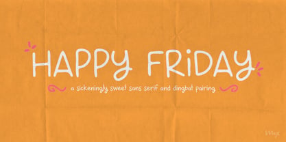
HAPPY FRIDAY is a font that looks ahead to the long weekend. This typeface is cute and clean, but with an undercurrent of sickening sweetness. The font turns up the volume on your social media posts, making them stand out from the crowd. Along with HAPPY FRIDAY MIX, an adorable set of dingbats made up of doodles and swashes, this font pair is perfect for your marketing collaterals and your at-home DIY projects. MIX HAPPY FRIDAY comes with the following glyphs: ABCDEFGHIJKLMNOPQRSTUVWXYZ abcdefghijklmnopqrstuvwxyz 0123456789 !@#$%^&*()`~♥✿•· ÷×+−±≈=≠≥≤[]<>:;’”,.\|/?{}“”‘’-–—_ …‚„©®™‹›«»°¹²³ªº¡¿₱¢€£¥½¼¾¶§№† ÁÀÂÄÃÅĂĀĄÆĆĈČÇÐĐÉÈÊËĖĒĘĜĤIÍÌÎÏĪĮĴŁŃÑŇ ÓÒÔÖÕŌŐØŒŔŘŚŜŠŞȘŤȚÚÙÛÜŮŬŪŰŲẂẀŴÝŶŸŹẐŽŻÞẞ áàâäãåăāąæćĉčçðđéèêëėēęĝĥıíìîïīįĵłńñň óòôöõōőøœŕřśŝšşșťțúùûüůŭūűųẃẁŵýŷÿźẑžżþß MIX HAPPY FRIDAY MIX (Dingbats) comes with the following glyphs: ABCDEFGHIJKLMNOPQRSTUVWXYZ abcdefghijklmnopqrstuvwxyz 0123456789 !@#$%^&*()
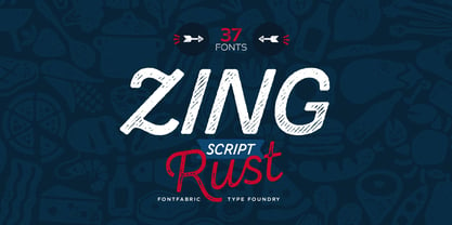
Zing Script Rust is created to add extra vitalness in your designs, highlighting it’s unique charm. It is being fully programmed with OpenType features—including the smart Contextual Alternatives, Swashes and Standard Ligatures — in order to visualize the characteristics of a true script. Zing Goodies As a dessert we serve you Zing GoodiesTM that tops off the whole package, making it the extraordinary delicacy! It has 4 basic forms—Bakery, BBQ, Banners and Words —with two style each, which contain plenty of adorable icons for any food and taste, elaborated banners, ribbons and ornaments, and even beautiful selection of useful words accentuating your design.
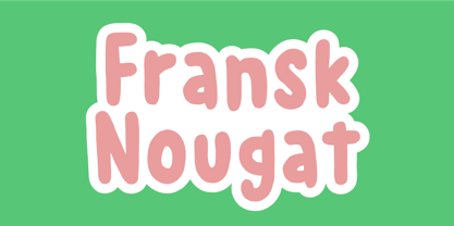
Let me tell you a secret: This font has got absolutely nothing to do with nougat or France. I just love nougat, and I actually ate some while finishing this font! My wife is a good at making cakes, and lucky for me is that she too adores nougat - that way I often get delicious cakes with nougat :) Well, back to the font - a handmade rounded sans-serif, comic, organic, all-purpose with a playful attitude. Goes very well in both UPPERCASE and lowercase. I'd say you can use this for pretty much anything, but categories such as organic, packaging, kids product or sweets come in mind!
Alright, prepare yourself for a typographic voyage to the land of "Rational Integer" by Tepid Monkey Fonts, where numerals and letters coexist in a harmonious utopia devoid of irrationality.
Ration...
As of the last update, Obscure Actions is a distinctive typeface crafted by the talented Keith Bates, a designer known for creating fonts with unique character and depth. This font stands out due to ...

In comparison to the powerful and commanding original, Sancoale Gothic is a more sober version of Sancoale. The medium contrast between thick and thin strokes makes for a typeface that stands out with striking clarity in longer texts, yet is very readable. This new addition to the Sancoale family is a perfect alternative if you want to use a different style than the original family. Using the utmost care and restraint, the designer strove to avoid overbearing futurism in favor of a typeface with clean lines and clear forms. Show your customers the world with Sancoale Gothic, a versatile sans with a wide range of styles, from delicate thins to bold, hefty weights that dominate the page and screen with confidence and futuristic flair. A fresh, friendly voice for all kinds of uses, from corporate statements to fashion, Sancoale Gothic is a versatile sans with a wide range of styles, from delicate thins to bold, hefty weights that dominate the page and screen with confidence and futuristic flair. Sancoale Gothic has a distinct personality, which allows you to create a wide range of projects, including posters and websites. The Sancoale Gothic fonts come in many varieties, so you can go with a light or thick weight, depending on what fits your project best. With their sweeping curves, the heavy fonts are meant for huge headings on posters and websites. The Sancoale Gothic family is made up of 48 distinct styles, with 660 glyphs and supports 70 languages, allowing you to communicate with your customers all over the world. Small Capitals and other OpenType features abound! The design is sleek with no stems or spurs in the default character set, but OpenType alternates have alternates with stems. OpenType capable applications such as Quark or the Adobe suite can take full advantage of the automatically replacing ligatures and alternates. The superfamily offers an array of optical sizes, contrasting weights, and contrasting optical sizes to discover the right balance, contrast, and optical size for your design. Prepare to be blown away by Sancoale Gothic’s smooth curves and captivating allure. Sancoale Gothic is perfect for both a contemporary and forward looking style. Sancoale Gothic is both practical and unique, in a standalone capacity or with the companion Sancoale fonts. Use it to make an impact today.

This best selling series has now been extended to include a new member, Blue Goblet Drawn. Blue Goblet is hand-drawn by the artist, Cory Godbey, and is organic, charming and exuberant. Characters bounce and dance above and below the baseline and x-height, making this a whimsical and fun script. Not only is Blue Goblet Drawn a excellent choice, it also is also a versatile member of a wide family of different fonts. You can use it side by side with the original Blue Goblet fonts, and there are a wide range of ornaments available in the supplemental ornament sets--over 370 illustrations! These illustrations include doodley frames, lovely florals and other text ornaments that can be inserted into your text and resized at will. This makes the Blue Goblet series a great pick when you want a type system for a very unique and consistent look. The Blue Goblet series also continues to expand, making any of these family members a valuable investment for the future. Blue Goblet Drawn comes in three weights and three widths in each weight, with complementary italics for maximum impact for a total of eighteen pro fonts. The compact thin weights are delicate and tall, while the Regular has just enough heft for those situations where subtlety doesn't work. If you don't need the professional features, there are three stripped down fonts that include only the basic character set! Blue Goblet Drawn also includes auto-replacing ligatures that make it appear that the script was drawn by the artistís own hand--just for you! Blue Goblet Drawn also includes a wide variety of alternates that can be accessed in any OpenType enabled application. Blue Goblet includes over 190 additional glyphs and is loaded with features including an even more unique alternate alphabet. Included are swash alternates, style sets, old style figures and small caps. Please see the informative PDF brochure to see these features in action. OpenType enabled applications such as the Adobe suite or Quark can take full advantage of the automatic replacing ligatures and alternates. This family also includes the glyphs to support a wide range of languages. Blue Goblet Drawn is a great choice for friendly display type in children's books, packaging, organic packaging or other unique applications. Use Blue Goblet whenever you want to inject a handmade sense of fun and whimsy to your designs. Give the Blue Goblet series a whirl today!

Savigny began as an offshoot of Le Havre. Le Havre met my design objective of a geometric sans serif with a strong art deco touch. Le Havre’s primary inspiration came from the art deco titling of the 1930’s, and the lower case was just icing. The art of the 1930’s is of particular interest to me, and I love the art deco era and its art, and the simplicity of geometric shapes. I am mostly interested in designing display typefaces. In many ways Le Havre was the exact opposite of another popular insigne offering, Aviano Sans. Le Havre has very high ascenders, a lower case and is very condensed. Aviano Sans has no lowercase and extremely extended capitals. With the rise of webfonts I began to see Le Havre being used frequently online. It’s short x-height and very tall ascenders made it difficult to read in on screen text settings as it was intended as display type. With this observation, I felt that there is more room for a geometric sans in the insigne catalog. So I set about to design a new geometric sans using the successful skeleton of the Le Havre family. Although I planned to extend the Le Havre line, the new family is so drastically different I decided on a new name: Savigny. The face evolved and began to take on a few humanist touches. Designed from the very beginning as a webfont, the design is open and pleasing to the eye, with a tall x-height. To optimize it for onscreen settings, the spacing is generous. In addition, it includes extended and condensed members, making it insigne’s first superfamily. The family includes over 100 OpenType alternate characters. These include several style sets. Some are stemless, others are purely geometric, and in a nod to Savigny’s origins, Art Deco titling alternates. Please see the informative .pdf brochure to see these features in action. OpenType capable applications such as Quark or the Adobe suite can take full advantage of the automatically replacing ligatures and alternates. This family also includes the glyphs to support a wide range of languages. Savigny is a great choice for a professional designer who wants a well rounded typeface family that is ready for the web.
The Clearface types were originally designed by Morris Fuller Benton in 1907. Their forms expressed the Zeitgeist of the turn of the 20th century; typical and distinguishing characteristics are the forms of the a" and the "k." The ATF version did not include an accompanying Italic. In 1978, ITC's Victor Caruso was licensed by ATF to develop a new serif typeface and matching italic based on the forms of Clearface. The result was ITC Clearface, a serif typeface with marked stroke contrast and italic weights. The teardrop-formed endings of the lowercase a, c and f (also found in Caslon) define the character of the face. The type's design is also distinguished by its small -- almost slab -- serifs, a large x-height, and little stroke contrast. ITC Clearface, with its historical touch, is good for both texts and headlines, but its slightly condensed nature performs at its best when it is allowed its space.
Inspired by the MacFarland series in the 1912 ATF catalog, Apparel is a typeface that shares similar functional characteristics with Times New Roman and Caslon fonts yet it has its own personality: A great choice for high-impact design. Apparel is a contemporary, classy and fresh serif typeface with a laid-back attitude that best suits your design needs. Its medium-large x-height makes it ideal for headlines and brand identity design. Apparel also includes a version, with a greater contrast between thick and thin strokes, for use in even larger sizes. The font comes with italic styles which can be used individually or in combination with the upright variant. Moderately slanted italics are also available as OpenType Stylistic Alternates. Each font style supports more than 200 Latin-based languages, as you would expect from Latinotype fonts. Apparel also includes a basic Cyrillic set, old style & lining figures, fractions and alternates, among other OpenType features.
Perva by Eller Type, $30.00 
Perva is a suite of three eye-catching fonts inspired by display types from the 19th century. This unconventional family has three different font styles that can be used individually or combined to build a playfulness multi-typeface design system. It is suitable for titling, posters headlines, book covers, packaging, social media, and branding. Perva brings together a Slab serif font, a.k.a Antique or Egyptian; a Reverse-contrast or Italian; and an Old English Blackletter. The design is inspired by the display types listed as “Typographic monstrosities” in Thomas C. Hansard’s book Typographia (1825). What he found absurd was understood here as interesting and enjoyable to introduce a contemporary approach of the types widely sold by foundries such as Bruce’s New York Type-Foundry and Caslon Foundry. Each of the three fonts holds around 400 glyphs, covering the languages of Northern, Western, Central, and Southern Europe. Opentype features include case-sensitive forms and a couple of alternates for the Blackletter style.
As of my last update in April 2023, "Radion" is not a widely recognized font name within major typographic resources or font collections. However, based on the typical attributes of font naming and d...

Adelphi is a geometric sans, redefined for the northern side of the English Channel. Typographic modernism was a late arrival in Britain — due partly to the Second World War and to the strong local type tradition. This delay provided for fruitful divergence, thus modernism was not adored in quite the same way as it had been in Germany and central Europe. It was instead rethought and repurposed against the backdrop of the bleak British weather and postwar social reform – a continental fashion statement reshaped into a more humanist variant. Likewise, when crafting Adelphi, Nick Job reimagined the constraints that defined the geometric sans as a genre. Whereas other typefaces seem overly bound by the rules, Adelphi feels relaxed and approachable. Elementary square and circular shapes are merely implied. A keen observer may notice that the uncomplicated letterforms occasionally reveal a subtle naïveté associated with early Grotesques. Brunel’s bridges and Harry Beck’s tube map spring to mind alongside the Bauhaus and Futura. But Adelphi is by no means nostalgic! It is a contemporary, comprehensive, and durable system with a pragmatic set of features. These include a wide array of weights, ‘uniwidth italics’, and variable extenders that go from tall and flat in Adelphi Text to short and sharp in Adelphi Display, with default Adelphi standing midway between these two extremes. You can set the extenders to your preference in the all-inclusive variable font or use one of the three static fonts that come packed together, priced as a single font. The pan-European support for Latin, Cyrillic and Greek scripts already makes for a vast character set, but Adelphi takes things a step further by including alternate glyphs to satisfy the DIN1450 legibility norm, a range of ordinals that can be used to create specialist compositions in all three scripts and two kinds of fractions and arrows. Play with the alternates or use it as-is. Either way, this understated beauty will carry you through.
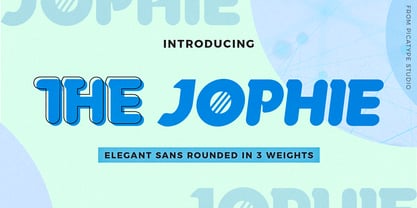
Introducing The fashionable Jophie Modern round font display. I try to make the family font as much as possible The round and diagonal versions are great for applications that are more friendly and fun and as the name suggests. You can uniquely stack various parts of this font making it very fun to use together :) The Jophie includes 3 regular, italic, outline, clean and modern fonts, thus creating more variability. The Jophie sans that cannot be blamed for diversifying your headlines, visual identity branding, posters, logos, magazines, etc. What's Included The Jophie Regular The Jophie Italic The Jophie Outline Thank for looking, and I hope you enjoy it.
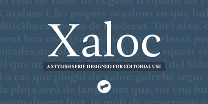
Xaloc by Vanarchiv, $20.50 Xaloc was designed for editorial use in books, magazines and newspapers. This typeface family contains different font versions for different optical sizes; Caption, Text, Subhead and Display, all of them with different x-height proportions and contrast. Its serifs are asymmetrical and its letterforms have geometric modulated strokes that emulate the calligraphic variations. Its design approach enhances text flow and continuous reading. Xaloc was based on Ricado Santos’ Tramuntana, which has the same skeleton, proportions and serifs with a more mechanical design. Xaloc is the Catalonian name from the Mediterranean wind that comes from the Sahara and reaches hurricane speeds in North Africa and Southern Europe.
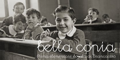
Bella Copia is a font dedicated to the world of childhood, to the writing of primary school children, but can also be used to compose texts or express essential concepts. It can be used for food, fashion, logos and much more. The clarity in the sign wants to express simplicity and immediacy. As far as possible, what is "not needed" has been taken away from individual glyphs. In the illustrations an attempt has been made, by combining images with fonts, to express the concept of cleanliness, simplicity and clarity. It is composed of 314 glyphs to try to embrace as many languages as possible.
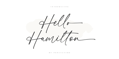
Proudly Present The New "Hamilton // Classy Calligraphy Font" Hamilton is modern classy calligraphy font, this font come with beautiful ligature and lovely alternate. Hamilton has a very beautiful stroke and will be very suitable if applied to wedding projects, invitations, fashion, and much more. Feature and what will you get: Uppercase and lowercase Number and punctuation Beautiful ligature Lovely alternate PUA Encoded and multilingual support I really hope you enjoy it – please do let me know what you think, comments & likes are always hugely welcomed and appreciated. More importantly, please don’t hesitate to drop me a message if you have any issues or queries. Thank you

