1,965 search results
(0.024 seconds)
- Alghera Pro by Red Rooster Collection,
$60.00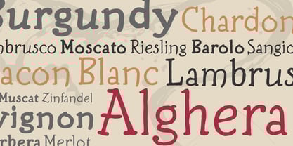 Alghera Pro is a casual script font family. It was digitally engineered in 1996 by Pat Hickson of P+P Hickson and Steve Jackaman of International TypeFounders, Inc. (ITF). Jackaman revamped the family in 2017 and added wider language support to include Western, Central, and Eastern European languages. Alghera Pro has a hand-written, antique feel, and was inspired by an old label on a bottle of Portuguese wine. As with all the Red Rooster “Pro” versions, the family contains a 40% larger glyph set and improved designs.
 - Chelsea by Red Rooster Collection,
$45.00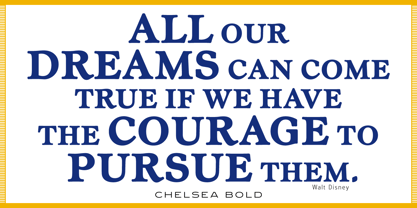 Designed by Les Usherwood. Chelsea is a ‘modern’ Old Style serif font family designed by Les Usherwood (Typsettra) in the early 1980’s. Steve Jackaman (ITF) digitally engineered the family exclusively for ITF’s Red Rooster Collection in 1993. Usherwood drew influence from Frederic Goudy’s 1911 creation ‘Kennerley Old Style’ when designing Chelsea; Chelsea, however, tends to be wider with a taller x-height. Chelsea has the clean and upscale feel that is present in all Usherwood creations, and its legible design lends itself to projects of any size.
 - Modern Elvish by Typelove Fontworks,
$9.00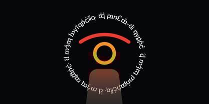 Modern Elvish is a humanist sans serif typeface created for the Tengwar “English” mode as popularized in the Lord of the Rings books and films. I imagined the famous elves of this lore living in contemporary times and needing a no nonsense modern typeface for their branding, communications and UX design. Use this typeface for your RPG, LARPing or Cosplay needs. This typeface uses advanced font features such as ligatures and contextual alternates to convert any English text. I would recommend typing in English first, then converting to a font of this typeface.
 - Pleasure Point by Comicraft,
$39.00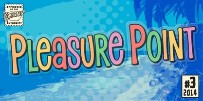 Slocals! Check out the action of our radical new font, PLEASURE POINT! It's Bananas, Totally Tubular, Stoked and ready to ride some waves. Back in his grom days, Comicraftsman John JG Roshell could be found down at Pleasure Point, waiting for The Big One, and this is IT! Don't be a criddler, paddle hard and rip this font to your motherboard to keep it real every time you gun, rail or tail. And if you get rag dolled, dude, don't blow out your squeaker. Pleasure Point will hang loose and chillax you to the max.
 - Nelson by Laura Worthington,
$25.00 Evocative of paint on weathered wood, Nelson’s engraved capital letters are as rustic and confident as the Old West. Combine the engraved face with bold and rough versions to create handsome wordmarks, or use Nelson to captivate customers of food packaging, restaurant menus, and roadside attractions. See what’s included! Engraved • Ornaments • Rugged • Bold *NOTE* Basic versions DO NOT include swashes, alternates or ornaments These fonts have been specially coded for access of all the swashes, alternates and ornaments without the need for professional design software! Info and instructions here: http://lauraworthingtontype.com/faqs/
 - Nazhdak by ParaType,
$30.00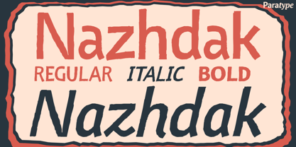 Nazhdak is a handwriting sans serif of three styles sketched with a felted pen and digitized afterwards. Designed in 2001 under the impression of Erik van Blockland's FF Kosmik typeface. Nazhdak is searching and investigating boundaries between regular and irregular typefaces. In spite of ragged letterforms and general laxity the face is rather good for small sizes, and in large sizes it completely shows its crude fascination. The main destinations are small informal text compositions and display typography. Nazhdak was designed by Zakhar Yaschin and released by ParaType in 2009.
 - CA Slalom Compressed by Cape Arcona Type Foundry,
$40.00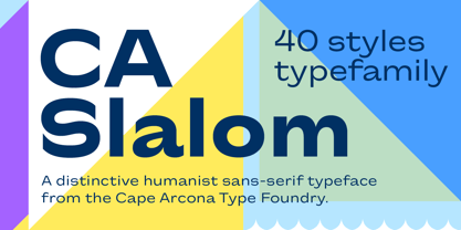 The starting point for CA Slalom was the aspiration to create a contemporary interpretation of classics like Gill and Antique Olive in terms of aesthetics, flexibility and usefulness. The outstanding S soon became the visual hook and starting from the extra bold extended weight, CA Slalom evolved into a huge family with four widths. It’s rather round instead of squarely with stroke-ends pulled deep and a relatively low x-height. This gives CA Slalom a taste of its own, and although it is clearly contemporary, it has the potential to become a classic.
 - ITC Binary by ITC,
$29.99ITC Binary was designed by Mauricio Reyes in 1997 as a semiserif font with a pronounced stroke contrast. A distinguishing characteristic of this font is that many of the lower case letters seem to be missing a small piece of their forms, either at the base line or x-height. Setting the letters together makes an impression of waviness which draws the attention of the reader. Binary is a reserved, elegant font which should be used in point sizes of 10 or larger and only in headlines and short to middle length texts. - Kedem ML v1 AAA by AlefAlefAlef,
$105.00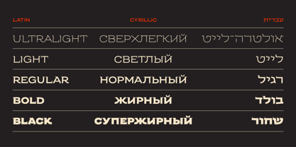 Kedem is a multilingual serif font inspired by heritage posters from the time of Israel’s national founding. The font is characterized by wide letters set at unusual angles, distinctive negative spaces, an upbeat cadence and a free and nostalgic spirit. Kedem spans five weights, including “Ultralight” – a monoline inline style. As the weight of Kedem increases, the contrast between its serifs and the shape of its letters is magnified. Kedem supports Hebrew, English and Russian (designed by Anna Khorash), as well as 181 additional Latin and Cyrillic languages.
 - Toadstool by Hanoded,
$15.00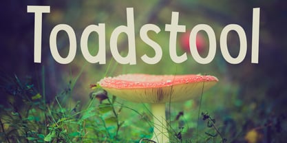 My kids love toadstools, especially the red capped ones with the white spots (they’re called Amanita muscaria, a.k.a. fly agaric - in case you’re wondering). A couple of months ago you could find loads of them in the forest, but now they’ve all disappeared. Toadstool font will not disappear, however. It is a very legible, clean and neat text font with an uneven baseline, slightly bouncy glyphs and more diacritics than a forest has mushrooms. Use if for packaging, kids’ book covers and posters. This toadstool is the non-toxic variety, so go nuts.
 - Madden by Typogama,
$19.00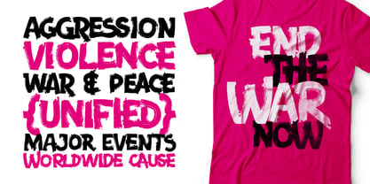 Madden is a bold, single weight typeface designed for use in titles, editorial design, branding or any other setting that requires capturing attention. With a bold, rugged stroke, inspired by the wide brush used in hand made protest signs, this typeface exploits Opentype features to randomly replace letters set in a line of text, thereby simulating the erratic and irregular letterforms that could be create by a manual writing. Madden is designed to give you an expressive and impactful typeface that will grab attention and shout your message.
 - Spark Sans by Primitive Spark,
$5.00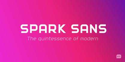 Spark a revolution for a better future with Spark Sans. Super clean and geometric, this display typeface is ideal for tech, transportation, electronic music, revolutionary products or other disruptive ideas that move us beyond the present. Spark Sans has a relatively high x-height and squared off curves that give it a distinctive look while still maintaining a minimalist aesthetic. The design originated with custom lettering for the Primitive Spark identity, which became the foundation for the bold style. With 260 glyphs, Spark Sans is a great choice for many languages with Latin characters.
 - Altemus Stars by Altemus Creative,
$11.00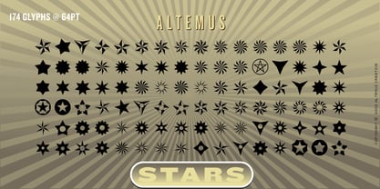 Stars contains 174 characters; a variety of solid and dimensional star designs with from three to twelve points, pentagrams, sheriff stars, stars of david, outline stars, burst stars and airforce stars. Stars Two contains 174 characters; a variety of five pointed outline stars with centers, star designs composed from various geometric shapes with from three to eight points, jagged stars, quilt stars, outline stars, starfish, arrow stars, burst stars, drop shadow stars, ragged starbursts, double stars and air force stars. Stars Three is a collection of 174 star designs.
 - ALS Neuch by Art. Lebedev Studio,
$63.00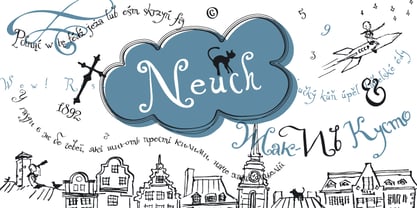 Neuch is a neat typeface for greeting cards, children's books, labels and signs, handmade goodies packaging, and other cheerful designs. Drawn with a sharp-tipped ink pen, the letters kick their legs up and down, stretch out their tails, and hop along gaily, as if not obeying any rules. The cute characters look like they are one big family—they get into arguments, mix noisily and good-humoredly, push each other, yet always stick together. Neuch can speak several languages and has ligatures, decorative elements, and even a cat and a dog.
 - Hines by Craft Supply Co,
$20.00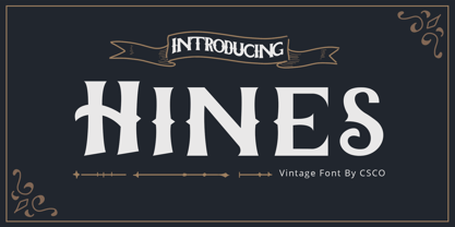 Unveiling Hines – The Vintage Font Masculine Nuance Firstly, Hines bursts forth with a strong, masculine nuance. Explicitly crafted, it resonates with the robust vibes of custom motor cultures and similar realms. Vintage Charm Additionally, the font carries a vintage charm. Its classic serif details are infused with a tough, rugged aesthetic, making each letter captivating and rich with character. Tailored for Customization Moreover, Hines is meticulously tailored. Suitable for custom motor artworks and more, it harmonizes perfectly with themes of strength, adventure, and craftsmanship, enhancing the project’s vibe.
 - Dungeon by Red Rooster Collection,
$45.00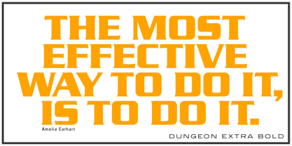 Dungeon is a glyphic font family that combines elements of both sans serif and spur serif typefaces. It was designed exclusively for the Red Rooster Collection in 1998 by Steve Jackaman (ITF). The family is loosely based on Dick Jensen’s famous design “Serpentine,” which was created for the Visual Graphics Corporation (VGC) in 1972. Dungeon is available in four weights, each of which is optimized for legibility at any size. The family’s masculine feel has helped it to turn up in a variety of projects, ranging from brand identity to advertising.
 - Portsmouth Second Fleet by Open Window,
$19.95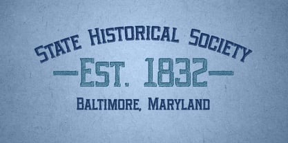 Portsmouth Second Fleet is the rag tag, wild bunch companion to Portsmouth. It is a strong, sturdy typeface with historical character. Its inspiration comes from the height and strength of the wooden tall ships that sailed into port in their day. With caps and small caps, this typeface is great for headlines or subheads for design projects that need a historical or retro feel, such as from the 1940s and earlier. Two different styles that can be layered allow for different colored drop shadows, outlines and fill for even more customization.
 - ITC Novarese by ITC,
$40.99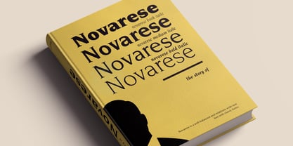 Novarese font is the work of designer Aldo Novarese. He created 218 typeface cuts but as he was writing his book, Alfabeta, he decided to include only those he considered indispensable. He divided his fonts into 4 categories and in the designing of Novarese, took the best characteristics of each group and combined them into this font. In the style of Latin stone scripts of the second century BC. Novarese is a well-balanced and relatively wide text font with classic forms. ITC Novarese™ font field guide including best practices, font pairings and alternatives.
 - Haverj by ParaType,
$30.00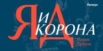 An original typeface designed for ParaType in 2004 by Armenian designer Manvel Shmavonyan. Based on the lettering created in 1970s by outstanding Armenian type designer Henrik Mnatsakanyan (1923-2001) of the same name. In Armenian ‘Haverj’ means ‘Eternally’. The face resembles many regular text serif fonts but elements like serifs and terminals make it eccentric and a little bit funny. The shape of diagonal legs in capital K and R resembles book lettering of the 1950s—60s. Using it in text, advertising and display typography may lead to surprising effects.
 - Nisse by Typoforge Studio,
$30.00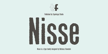 Say hello to a new Typoforge member! Nisse is a display font family that consists of 4 styles (including italics). The regular and rough versions differ in the amount of wear. It’s inspired by Rex typeface first published by „The Jan Idzikowski and Co. Foundry“ in 1930. Nisse has a high amount of detail making it ideal for large prints and poster design. It is specified by a huge amount of automatic alternates. Each basic latin letter has five versions, the numbers have thee versions and extended latin letters have two versions.
 - Banshee by Adobe,
$29.00The wind howled, the night grew long, and British type designer and lettering artist Tim Donaldson created the typeface Banshee. This dramatic display face is modeled after one of Donaldson�s handwritten lettering styles. Banshee began as letters rapidly written by Donaldson with one of his homemade ruling" pens. The letterforms are firmly rooted in the tradition of classical chancery italics. With its ragged lines and counters, Banshee realistically captures the irregularity of pen and ink on paper, lending an immediacy to packaging, advertisements, posters, and invitations that few digital typefaces can match." - Saffron Grotesk by S6 Foundry,
$20.00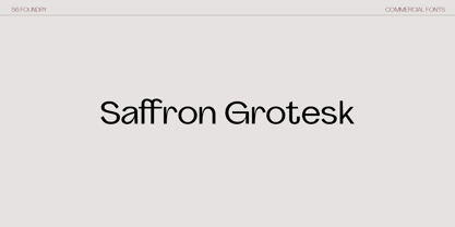 Saffron is an elegant contemporary neo-grotesque sans-serif typeface with strong stylistic geometric contrasts, drawing on the aesthetics and the typographic standards of Swiss modernism. The distinctive wide-open stance was designed to give the right visual consistency for branding and communications. This authentic and original typeface represents the shifting contemporary aesthetics. Saffron is perfectly suited for headlines, large-format prints, brand identities, social media, advertising, editorial design, posters, magazines, logos, headings, and more. The Saffron family includes six weights, with their relative italics with over 700 glyphs and multi-language support.
 - Bike Decals JNL by Jeff Levine,
$29.00Bike Decals JNL captures the fun and nostalgia of the 1950s and 1960s when kids all around the country ran to their local five and dime or hobby store to purchase water applied decals. The "cool" thing would be to customize your bike, little red wagon or anything that would be fair game with various racing symbols, weird space creatures or other unusual images. In this font, Jeff Levine has put his own spin on some of the classic designs of yesteryear, drawing from scratch some of the most popular of their day. - Argus by Red Rooster Collection,
$45.00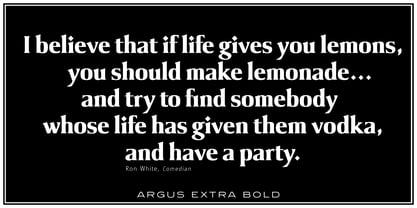 Designed by Les Usherwood. Argus is a flared serif font family. Its analog form was designed by Les Usherwood (Typsettra) in the 1980’s, and Paul Hickson (P&P Hickson) and Steve Jackaman (ITF) designed the digital version exclusively for the Red Rooster Collection in 1992. Argus is an expressive, graceful typeface that was inspired by Baroque typography. Its diamond-shaped punctuation shares similarities with other glyphic typefaces, such as Arthur Baker’s ‘Baker Signet.’ The font family gives a beautiful gravitas to any project, whether it be packaging, motion picture, or magazines.
 - Aprex Sans by S6 Foundry,
$20.00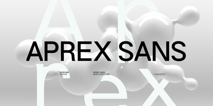 Aprex Sans perfectly balances the minimalist quality associated with contemporary sans with flair within the width of the counters and comfortable, breathable apertures. — Throughout weights and sizes, the typeface has great legibility and good contrast between positive and negative space, making it stunningly versatile. — With a seamless combination of contemporary details and classic styles, Aprex Sans draws inspiration from the mid-century humanist and grotesque typefaces, and its solid and straightforward structure is characterized by angular connections between curves and stems. Aprex Sans is geometric in nature with humanist qualities rooted in the Swiss tradition.
 - Jus Hangin PB by Pink Broccoli,
$16.00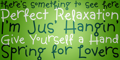 Jus Hangin was inspired by the lettering on the cover of the 1999 Counting Crows album, “This Desert Life”. It was one of those child-like lettering styles that was just begging to be fleshed out and made into a typeface that was as wild and carefree as the lettering inspiration. With an open spacing format, and an exuberant baseline bounce, Jus Hangin is fun to typeset with, while alternates and double letter ligatures keep things from getting repetitive. You’ll find Jus Hangin is ready and waiting to announce your festivities.
 - Bearskin by Hanoded,
$15.00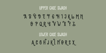 NO! I don’t have a bearskin rug, nor a fur collar on my jacket. I believe fur should only be worn by its first owner. I have no idea why I called this font Bearskin: maybe I was influenced by one of the Viking novels I am reading - they’re full of Berserkers - but that name was already taken. Anyhoo, Bearskin font is a nice handmade all caps font. A little rough here and there, but with a lot of character as well. Bearskin comes with swashes, so you can have a ball!
 - Savoye by ITC,
$29.99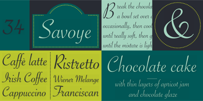 Savoye was created by Alan Meeks in 1992. The spirit of the Jugendstil lies behind the design of this font. Graceful upright letters combine to create delicate, flowing word figures. The light stroke contrast and slant to the right emphasize the liveliness of Savoye. Generous capitals contrast with small, demure lower case letters whose distinguishing characteristic is their high ascenders. This contrasts beautifully with the relatively reserved descenders. The capitals can also be used as initials combined with other alphabets. Savoye is the perfect font for invitations, greeting cards and other personal correspondence.
 - Cat e Poultry by Proportional Lime,
$19.99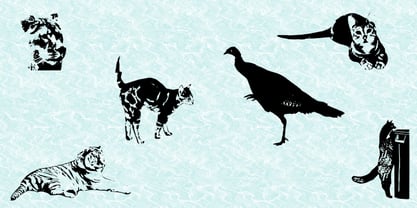 Love them or hate them Cats are one of the most successful animals on the planet. If they had thumbs we would all be in trouble. Fortunately for us these four legged sharks have managed to domesticate us and we are able to coexist peacefully. So this font is to share the joy of being blessed with the presence of such noble animals be it those of the Pantherinae Felidae or the not so humble Felis Catus (Domestic Cat). Why the Turkey? Well... you will have to buy the font to find out.
 - Katlynne by Ryan Williamson,
$5.00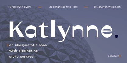 Katlynne is unpredictable. Katlynne is erratic. Katlynne is beautiful. Katlynne is an alternating contrast, sans serif type family. Arbitrarily separating the characters into ‘rounder’ and ‘straighter’ letterforms to determine what contrast each glyph will take. Katlynne is inspired by the observations made while watching the inexperienced use of broad tip pens. I found how and when individuals rotated their pen gave a visually intrusive, if not also pleasantly conspicuous effect. Often, the pen would naturally rotate horizontally (vertical contrast) on the rounder letterforms, and vertically (reverse contrast) on the straighter ones. This is more or less the formula Katlynne adopts as the contrast changes throughout the styles. Katlynne’s severity of contrast varies from ‘Negative Three’ to ‘Positive Three’ in four weights. With a central style ‘Book’ being the sensible, low contrast font in the family. Within the family there are four weights with 7 contrast styles, with complimenting true italics. Giving a total of 56 fonts! Katlynne's array of options works for creating stylistic similitude within layouts, where conspicuous title faces are needed with a cohesive text face to compliment. Alone, the ends of the contrast spectrum (Negative and Positive Three) create striking word forms for advertising, packaging and anywhere else a loud voice is needed.
 - Poeta Color by Tarallo Design,
$14.99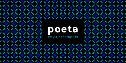 Poeta Color is an ornamental font for making patterns and decorating text. It contains floral and nature motifs. The symbols are versatile enough for simple decoration or thematic seasonal and holiday moods. Designers can use Poeta to make unique lines, fields, borders, or ornamentation within or around text. Try replacing a basic straight line with repeated symbols. Make a background to add visual interest to a design. Use the forms to decorate a chapter title or to mark the end of a magazine article. Replace a letter in a word with a symbol to create a memorable statement. This font began with sketches of patterns seen in ceramic tiles around Sicily. It is named Poeta because Sicily is an island rich in poetry traditions. Below is some helpful technical information. Using this font is simple. Install it and type. Symbols will appear instead of letters. Choose the precise symbols through a software’s glyph palette. Use the type/character menu controls to vary the spacing and density of patterns. All fonts are vector-based, OpenType, and fully scalable. Six of the fonts have different color or grey combinations. One of the fonts (solid) is a standard font. The font previews on this website will only display the font in black. See the slides to get an idea of the colors. Be assured that the colors are present in the files and will appear when loaded on the computer. The colors that are in each font: Primary: red, yellow, blue Secondary: orange, green, purple Tertiary: red-orange, yellow-orange, yellow-green, blue-green, blue-violet, red-violet Diverse: many different warm and cool colors Grey: three different greys from light to dark Gradient: a greyscale gradient Solid: standard font and can be colored normally Software that supports color SVG fonts: Photoshop, since 2017 llustrator, since 2018 InDesign, since 2019 QuarkXPress, since 2018 Pixelmator Sketch
 - akaFrivolity - 100% free

- Ciseaux by Wilton Foundry,
$29.00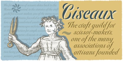 Ciseaux was inspired and is dedicated to the art of paper cutting. Early paper cutting artists were often royalty, but it soon became a folk art practiced by commoners whose cutouts decorated their homes. By the seventeenth century it had spread throughout the world. The Japanese called it Mon-kiri, the German's Scherenschnitte and Turkey even boasted a guild devoted to the art form. In Poland the designs were traditionally symmetrical and often used layers of colors to form pictorial collages. When Russian invaders confiscated scissors, villagers were found to cut their intricate designs with sheep shears! The art form later developed into cutting out elaborate designs of nature scenes and people, celebrating special occasions and even decorating legal documents. Ciseaux letterforms mimic paper cutting art in its shapes with a rather loose and almost joyous rhythm. The overall effect is somewhat earthy and natural yet it has an element of sophistication that cannot be ignored. Just like paper cutting, Ciseaux can be used for special occasions like invitations, brochures, identities, restaurant menus, and if you dare, some awesome looking paper graffiti. Available in TT, PS and Opentype for Mac and Windows.
 - Rolfter by AlienValley,
$13.00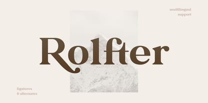 Introducing Rolfter, a classic serif typeface with many features including ligatures, tons of alternates and multilingual support. All the ligatures and alternates can be accessed by installing just one font file. LIGATURES & CONTEXTUAL ALTERNATES We recommend that you turn on both ligatures and contextual alternates for best results. You can do this in either Photoshop or Illustrator. Photoshop: Open the "Character" panel via Window - Character and check the standard ligatures and contextual alternates icons at the bottom left corner of the panel. Illustrator: Open the "OpenType" panel via Window - Type - OpenType and also check the standard ligatures and contextual alternates at the bottom of the panel. OPTIONAL ALTERNATES These are optional alternates that can be used depending on your current design. We recommend moderate use of these for optimal results as using too many can easily make the font unreadable. To access these you need to open the following panels depending on your software: Photoshop: Window - Glyphs (Note that this panel may not be available in earlier PS versions) Illustrator: Type - Glyphs You will then have access to all the glyphs inside the font file to use them as you like.
 - Pavement - Unknown license

- Martial Arts JNL by Jeff Levine,
$29.00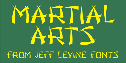 The 1946 foreign publication entitled "100 Alphabets Publicitaires" ("100 Advertising Alphabets") collects a number of interesting and attractive lettering samples for design inspiration. One such example is Asian-inspired and was re-drawn as the digital type face now named Martial Arts JNL.
 - Streamwood JNL by Jeff Levine,
$29.00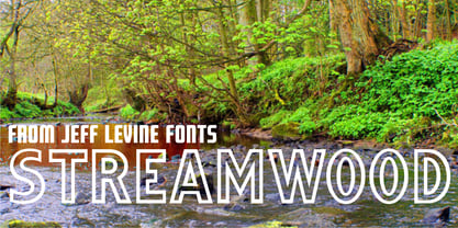 Streamwood JNL is an outline sans wood type re-drawn from vintage source material. The design bears strong resemblance to Woodlawn JNL; but is a bit narrower and has a much different set of numbers as well as a more stylized letter "Q".
 - Panopticum by Vladislav Ivanov,
$20.00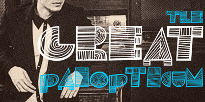 Panopticum is a Vladislav Ivanov font family with 3 styles- Panopticum,Panopticum Re and Panopticum Broken. Panopticum is a custom font which is applicable for any type of graphic design - web, print, motion graphics, etc. and perfect for t-shirts and logos.
 - Somatype Skwosh by ArtyType,
$10.00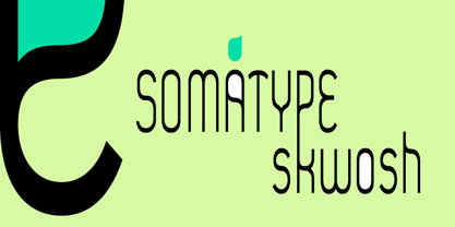 Somatype Skwosh was born out of a desire to ignore traditional rules for condensed character forms in favour of contrasting vertical and horizontal thicknesses and the interesting shapes produced by re-scaling along only one axis. Somatype Bold was the starting point.
 - Art Department JNL by Jeff Levine,
$29.00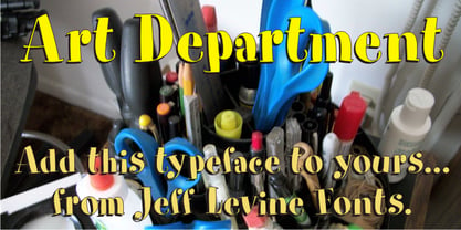 Art Department JNL is a fun, casual serif typeface which fits perfectly with any number of visual projects. This is one of the many hand-lettered alphabets found in various Speedball® lettering textbooks that has been re-drawn digitally by Jeff Levine.

